Posts filed under Fountain Pens

Pilot Vanishing Point Gun Metal Black Matte Fountain Pen Review

I didn't need another Pilot Vanishing Point. I already had two: the famed Black Matte, which became one of the "pens who shall not be named" on the podcast, and a retro Black Faceted model, which is a mainstay of my collection. So why did I NEED this new Gun Metal Black Matte Vanishing Point? I rarely need any new pen, but this one I had to have.

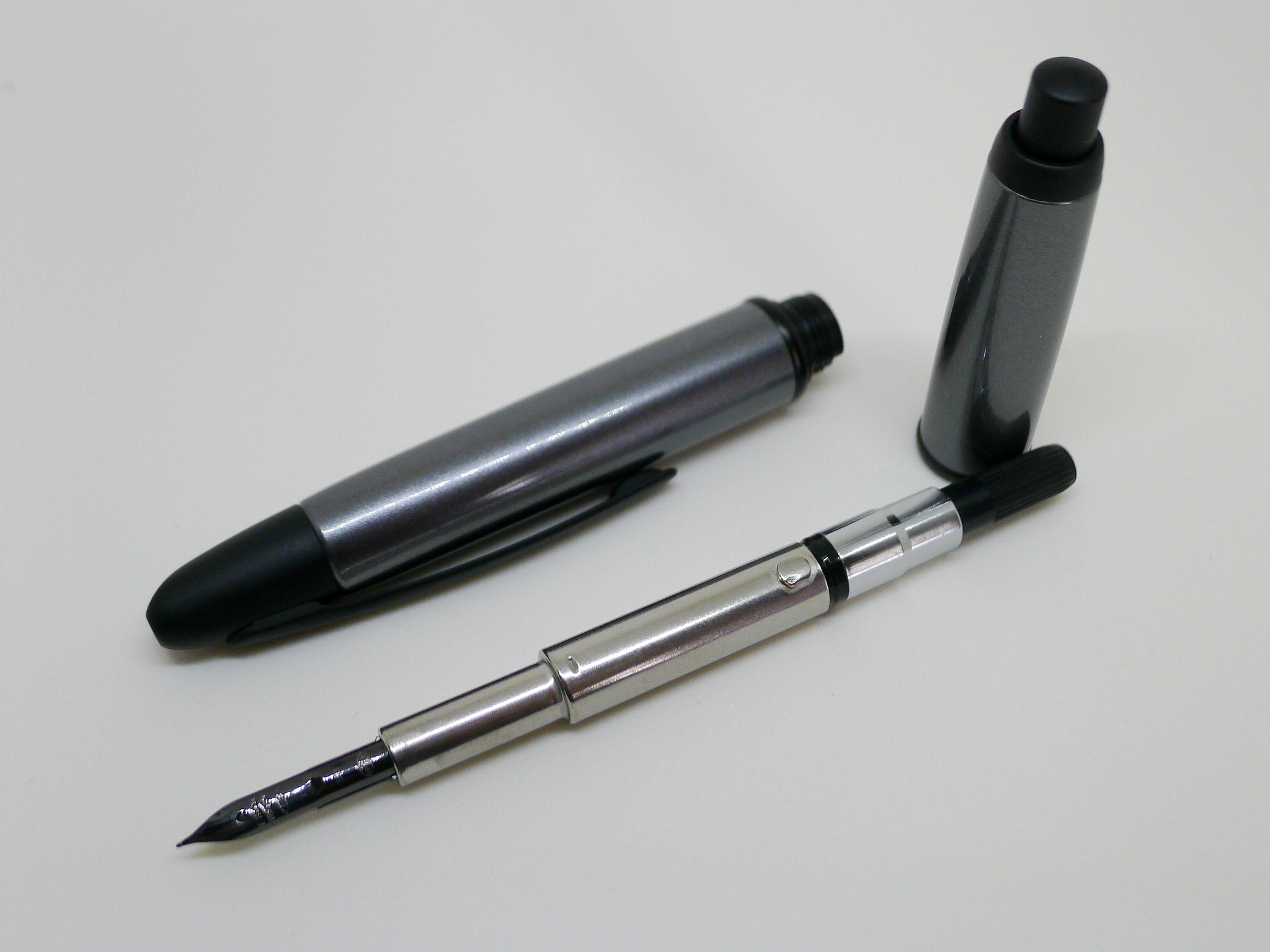
It took a while for me to get on the Gun Metal bandwagon. I wasn't sure of the color scheme at first, but after seeing multiple pictures of it and checking it out in person I went for it. The barrel is slightly different than the full black matte version, with the grey area being smooth as opposed to a satiny matte feel, which is reserved for the tip, clip, middle band, and knock. It's quite a stunning look, especially in person.

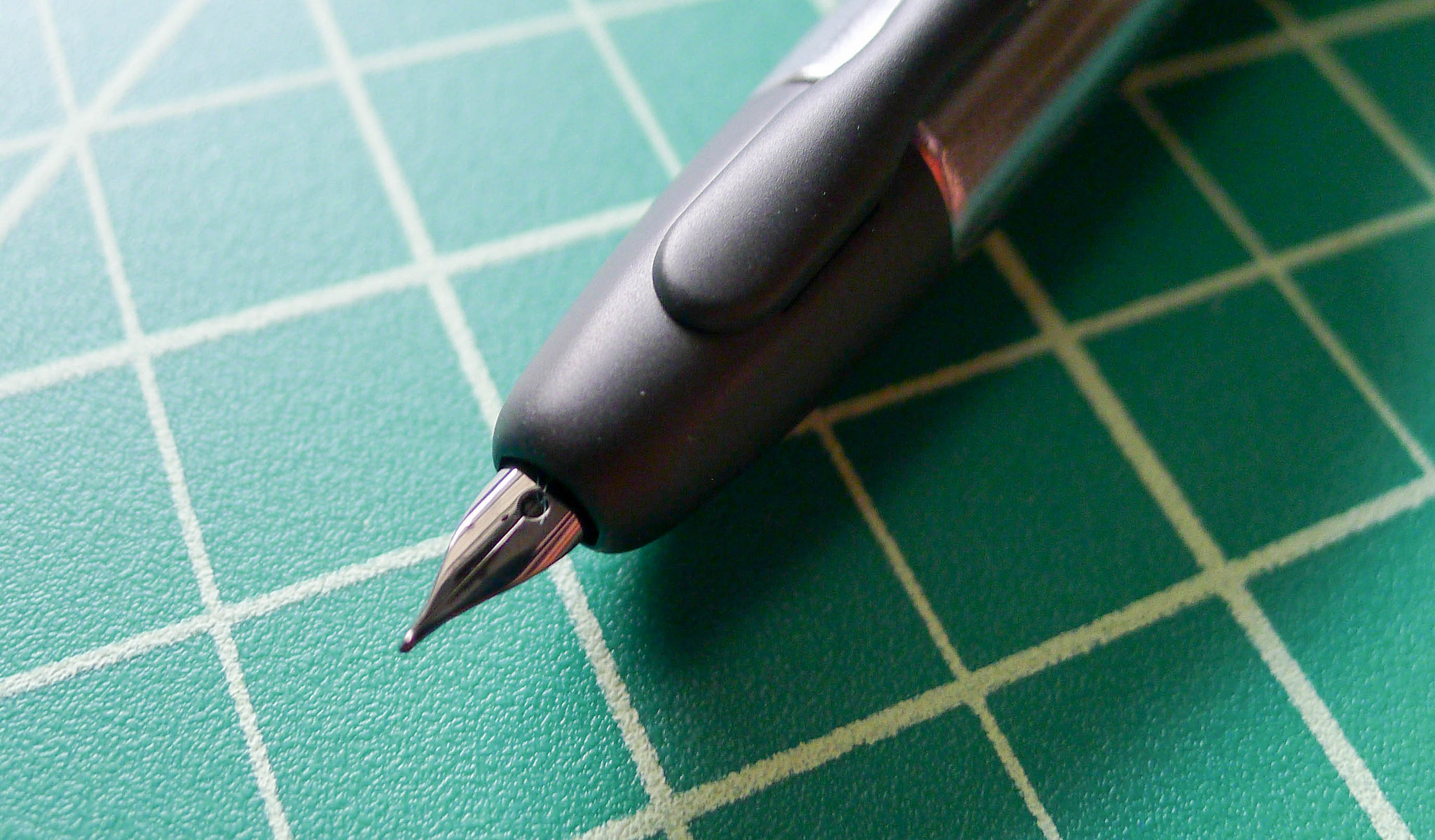
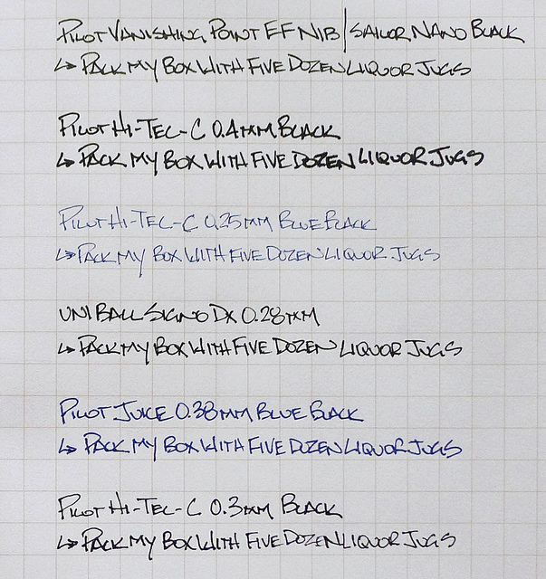
It also sports one of the recently introduced black nib units, which I am in love with. I went for the EF nib, which is ridiculously small, even for me. I never recommend this size to anyone but I love it. Paired with a well lubricated ink like Sailor Nano Black, this nib writes wonderfully smooth and consistent. But boy is it fine. You really need to manage your writing angle with this one to make sure you are hitting the sweet spot.

Many people have asked what fountain pen best compares to the Pilot Hi-Tec-C 0.3 mm/0.4 mm gel ink pens. Pilot's EF nibs, as found in the Penmanship (which can be swapped into the Metropolitan or Prera) and the Vanishing Point, are the closest I have found. Looking at the writing sample in my Field Notes it is closest to the 0.28 mm Uni-ball Signo DX and 0.3 mm Hi-Tec-C, so that seems like a good range. Ink and paper will cause this to vary of course.

But back to this whole idea of needing this pen. Although yes, I got this pen for free as part of my JetPens sponsorship, I still couldn't justify it without selling one of my current Vanishing Points. I didn't see myself actively using two similar pens, so my trusty black matte VP, one of my first big fountain pen purchases, has found a new home. More than any other fountain pen I own, the Vanishing Point is made to be used, anywhere and everywhere. That is this pens job, so having one sitting around collecting dust would be doing it a disservice.

My friend Mel found the words I was struggling to find about my Field Notes Butcher Orange, and it applies here too: "By using it, it is now truly yours and you've fulfilled its purpose." Words to live by.

(JetPens is an advertiser on The Pen Addict and I received this product at no charge.)

Posted on July 21, 2014 and filed under Pen Reviews, Pilot, Vanishing Point, Fountain Pens.

Esterbrook SJ Fountain Pen Review

The Esterbrook SJ is the second of the two Esterbrooks I bought at the 2014 Atlanta Pen Show back in April. The first was an Esterbrook Dollar Pen, which I talked about back in May. Like I said then, Esterbrooks weren't on my list when I went to the show, but they snagged me while I was there, and now I'm pretty sure I've caught the bug.

Quick recap

Both of these pens were purchased from Carl Daniel, which I heartily recommend. Carl was friendly, helpful, and taught me a lot about these pens in the few minutes we spoke. He had dozens of Esterbrooks on display at his table, and it took me two or three passes to decide which ones I wanted. More accurately, it started off as picking one pen, but I failed at that goal and ended up deciding on two.

The SJ was the second pen that I picked up from Carl. I had already nabbed the Dollar Pen and spent several minutes looking at and handling the SJ models he had. For some reason, I enjoyed the size and weight of the SJ models compared to the regular J models. After that, I just had to narrow down the color. In the running was a blue, copper, and red model. I ended up going with the red because it caught my attention more out of the bunch. Today, I'm still extremely satisfied with my choice of color, but I'll definitely be expanding my collection to include other nice colors.

The pen

This particular pen came with a 1554 nib installed, which is a really fine nib originally meant for accounting work. With a regular grip and pressure, the line is very similar to a Japanese fine. I guess they designed the fine line to write in those tiny ledger lines. At any rate, it's a great nib considering how old it is. It isn't a new-from-stock nib like my other one, and it's also seen better days. It appears to have some damage to the point, but nothing that causes any performance problems. It's just a bit scratchy on some papers, which is normal anyway given the super-fine point.

Since it's such a fine nib, I don't use it nearly as much as my Dollar Pen. I prefer a smoother, larger nib when doing general writing, so I typically reserve this pen for more detailed stuff. With that said, I really want to find a new nib for the SJ because I want to use it more. Since the nibs are easily swapped, I can find something that suits my writing style and add this pen to the daily rotation.

With any Esterbrook, it can be difficult to pin-point an exact year of production, but this SJ was probably made somewhere between 1948 and the late '50s. Either way, it's doing a remarkable job of staying relevant and delightful. It still blows my mind that a pen this old can still be such an excellent writing instrument.

Size

The SJ is longer and slimmer than the Dollar Pen. The only other fountain pen that has a comparable width is the Hero 529, which the Esterbrook blows out of the water. Personally, I love the form factor. There are times when writing that I wonder if the larger cousin, the J, would fit my hands better, but I can't get over how sleek and modern the SJ design is.

The SJ is just a bit taller than the Dollar Pen, which means it's a small pen. Once posted, both pens are almost identical in overall length. They both feel spectacular in-hand.

Filling mechanism

Like the Dollar Pen, the SJ has a lever filling mechanism. It works just as well as the Dollar Pen, if not a bit better since the lever has more of a grip to it. The SJ lever has a semi-circle shape at the end, while the Dollar Pen has a flat, short grip. My clumsy fingers can operate the SJ lever much easier.

Again, it doesn't hold much ink, but that's not a big deal. At any rate, it's fun to fill and is hassle- and mess-free.

Writing

I've touched on it a bit already, but I'll go into some more detail about the writing experience with this pen and nib.

The nib is super-fine, and makes a crisp, sharp line. I currently have it inked with Iroshizuku kon-peki, which works flawlessly on all the paper I own. I've never had problems with it being clogged, skipping, or drying after a few minutes of uncapped rest. The ink does tend to become extremely saturated and thick if left for more than a week in the pen. That being the case, it gets cleaned pretty often.

Apart from being scratchy, the nib does a beautiful job. It's firm and dependable. From the naked eye, it looks like the point has a small slant to it. This creates an italic effect on some papers. It probably wasn't designed this way, but I love it.

This is a great pen, but I don't use it as much as I would like because of the nib. Super-fine nibs are useful in certain situations (for me), but I prefer something like a fine or medium for most writing. If I can find one, I'd love to swap the nib out for an Esterbrook stub nib of some kind. I hear those are really difficult to acquire, but I'll keep my eyes open for one.

Overall

The SJ is a fantastic pen, and I'm so pleased that I bought it back in April. I went from knowing nearly nothing about Esterbrooks to becoming a fan of the brand and learning everything I can about them. It's so interesting to show people these pens and hear them talk about how they remember one that their parents used or that they personally used when they were young. These pens are a legacy, and it's really awesome to own and use a part of history. And, at the end of the day, it's still just a pen, and it does that job remarkably well.

(You can find more from Jeff online at Draft Evolution, Twitter, and App.net.)

Posted on July 16, 2014 and filed under Esterbrook, Fountain Pens, Pencil Reviews.

Hero 529 Fountain Pen Review

The world of inexpensive Chinese fountain pens is something I've recently fallen into, and I've had mixed results so far. My most recent impulse buy is a Hero 529 fountain pen. For less than $3 (sometimes less than $2), you get a fountain pen shipped from China. There's something completely unbelievable about that, but it's the real deal.

So, what do you get from a $3 fountain pen? Well, not much.

When you consider the functions of a pen, a few things that come to mind are: it writes, it's comfortable to hold, it keeps ink from drying out when not in use, it clips to a pocket, and it's reusable. Lots of pens cover these basic characteristics. But there's another characteristic that many of my favorite pens have that's difficult to quantify: they're delightful to use.

That's where the Hero 529 falls short and the main reason it will probably not see very much action after this review. It's not fun to use, and it actually detracts from my writing experience. These are harsh words for a pen, and I should probably back them up. So, here we go.

Aesthetics

The Hero 529 is black -- I never saw any other options in my search. From what I can see, it's also only available in a fine nib. The material of the body and cap is cheap plastic. Each part of the pen has a slightly different shade of color, adding to the low-quality look. The metal clip is silver and actually does a good job as a clip, but it also looks like plastic.

The main thing that does it for me is the silver label on the cap of the pen. I was really disappointed when I realized it wasn't a sticker that could be removed. I'm not sure why it's there. In the top part of the rectangle are Chinese characters, and the bottom part says "fountain pen" in a script font. Why? The pen would look a bit classier if the silver stamp wasn't there.

There's also a plastic gem in the top of the cap that feels a little loose to the touch.

Uncapped, the grip section is textured in a hatch pattern, although it doesn't really provide any real grip. The texture is very slight. The nib is hooded by the end of the grip section, which gives it a unique look.

Overall, it looks like a $3 pen, and that's fair. No problem.

Writing

The pen writes fairly smoothly. I'm sure that a little nib smoothing would help a bit, but I'm not really interested in working on it.

It's a very light and narrow pen and handles well either posted or unposted in my hand.

The nib can be finnicky regarding the angle of attack. I have to be very mindful when writing with this pen of whether I'm holding it at the right angle. If it changes by a degree or two, it skips and stops writing.

Again, it works, but not in a way that makes me want to continue using it.

Overall

This is a perfectly good pen for $3, and I'm really impressed that a functional fountain pen can be made at that price.

Unfortunately, this pen just isn't enjoyable to use. It asks a lot of the writer and introduces constant distractions and speed bumps along the way. There's nothing wrong with buying a $3 pen just to experiment, and I certainly don't feel like I wasted my money. I'm just disappointed that I now own a pen that I'm certain will never be used.

It's fun to experiment with different pens, but every now and then you end up with a dud. I guess that's just part of the game. At least I have plenty of other delightful writing instruments to use instead. After all, it's not fair to hold a $3 pen to high standards. In this case, you definitely get what you pay for.

(You can find more from Jeff online at Draft Evolution, Twitter, and App.net.)

Posted on June 25, 2014 and filed under Fountain Pens, Hero, Pen Reviews.