Posts filed under Ink Reviews

Sailor Kobe Ink No. 37 Island Blue Ink Review

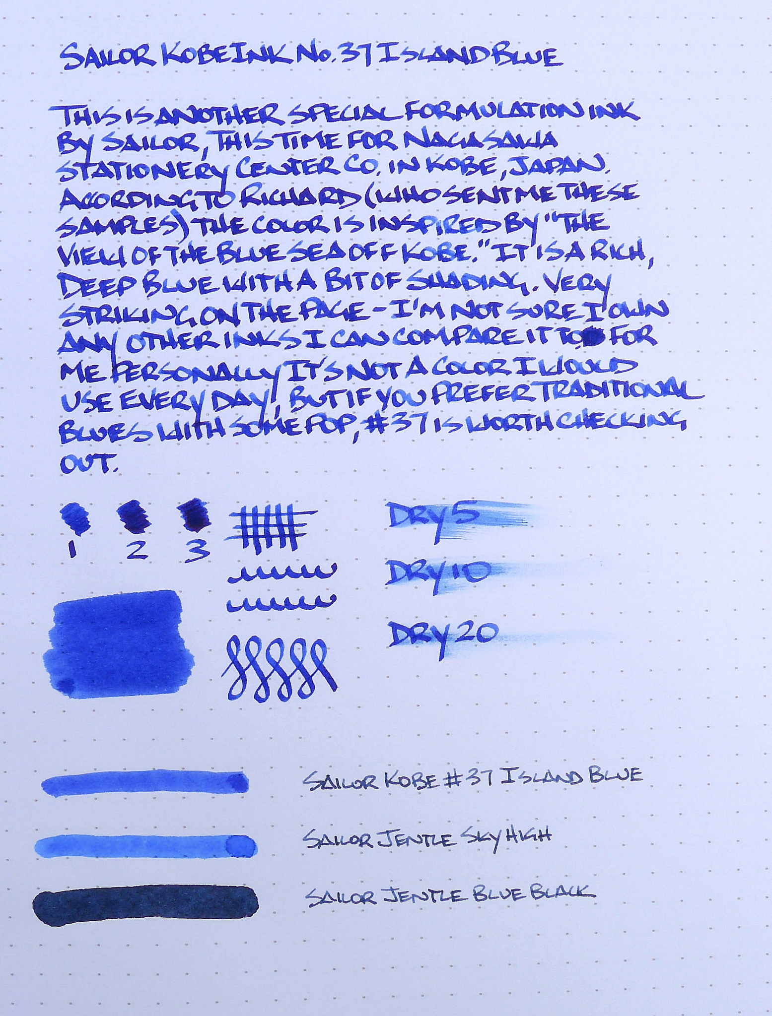
I'm relatively certain that if I lived in Japan I would be broke. Just setting foot in a store like the Nagasawa Stationery Center would cause a wallet-gasm, if not outright bankruptcy. And then to learn they have their own shop exclusive line of inks, from Sailor no less? Well, let's just say I'm very lucky to have amazing readers who are helping me keep my wallet in check and my marriage intact.

Sailor Kobe Ink No. 37 Island Blue is another sample from a batch that Pen Addict reader Richard sent over, and a beautiful one at that. This color is inspired by "the view of the blue sea from Kobe", and if that is actually the case I need to book a plane ticket. It is a saturated ink, but vibrant at the same time. There is some shading too, which adds to its beauty. I don't have many other standard blues to compare it to, but it is unlike any other blue ink I have tried.

Prior to this review, Sailor was already one of my favorite fountain pen inks. Across the board, they perform perfectly with any pen, nib, and paper combo I've come up with. None of their inks have ever stained any pen, and they are easy to clean. Now, only if these great Japanese options were easy to buy.

Posted on August 4, 2014 and filed under Ink Reviews, Sailor.

Noodler's Turquoise Ink Review

As I continue down the long and winding road of fountain pen inks, I'm learning that I actually enjoy trying new inks more than pens at this point in my journey. The good news is, there are hundreds (thousands?) of different, unique inks to try. The bad news is, well, there are hundreds of different, unique inks to try. So, as long as I ignore the part of this journey that involves paying for inks, it's a win-win situation. Tired of a pen you've had for a while? Find a new exciting ink for it. It's instantly a new pen (almost).

The latest ink that has landed in my daily rotation is Noodler's Turquoise. This is another ink from the awesome Joe Lebo – thanks Joe! He really does have great taste.

Noodler's Turquoise is a classy, interesting blue-green ink that delights me every time I use it. To the unknowing eye, you might think it's a black or dark blue on first glance. But, on second glance, you notice the green lying on top of that dark blue foundation. And after looking closer, you spy just a touch of shading in certain letters. It's turquoise! This is what keeps bringing me back to this ink. You can use it every day because it isn't wild, but it's still really interesting and adds some flair to the every day carry.

When you get down to it, this is a great ink. It's well-behaved, has nice writing qualities, and looks great. My main caution is for the left-handed writers. This is a slow-drying ink. I've definitely smudged a lot of writing while using this ink, and I'm right-handed. Fair warning.

That said, it hasn't stopped me from filling the ink into pens again and again. It's a new favorite.

The ink is saturated and a bit on the wet side, but not very. I never have any skipping or starting issues with it, and it keeps up with my fastest writing, scribbling, and doodling.

There's a tiny bit of shading when writing quickly with a small nib – XF to M. Wider, specialty nibs really bring out the personality of this ink. I only have a calligraphy nib (2.0mm!), but I know that this ink would be great in a small stub. I need to get one of those pronto. Despite my terrible attempt at some form of fancy script in the title, you can see some of the shading aspects from the wide 2.0mm nib I used.

This ink does not like cheap paper. It bleeds and feathers like crazy on cheap notebook paper and copy paper.

Lastly, there's a small amount of sheen to the ink that also adds personality. It's a very small amount, and absorbant papers pretty much remove all sheen, but it's great when it works.

I've never really settled on a real-life example for this ink color, but I keep coming back to something like the ocean on certain days. It's a dark blue with green swimming around in the dark depths. Maybe it's just me, but I like to get lost in colors like this. It's a favorite, and I'll be buying my own bottle soon, along with a stub-nib pen.

(You can find more from Jeff online at Draft Evolution, Twitter, and App.net.)

Noodlers Turquoise Review.jpg
Posted on July 23, 2014 and filed under Noodler's Ink, Ink Reviews.

Platinum Blue Black Ink Review

Platinum Blue Black is an ink I should have loved right out the gate, but it has taken me some time to come to grips with it. There is nothing inherently wrong with the ink. It flows well, dries fast, has some shading, and is a nice color. But it's not a blue black, and that bothered me more than it should.

Do you ever get hung up on something silly like that? I'm my own worst enemy when it comes down to the minutia of things. I've talked about my eye-opening experience with tip sizes recently and the enjoyment I am getting from branching out. I need to apply that type of thinking more often.

Like in the case of Platinum Blue Black. Despite high recommendations, I have barked about it in the past about not being a blue black ink, but almost a traditional blue or even royal blue instead. I don't even consider it a dark blue. But does it matter? If you ask me for a blue black ink recommendation I'll never mention this one but if you ask me for a good blue ink it ranks pretty highly for all of those reasons I stated in the first paragraph.

In fact, once I got over being a dummy about this ink I have committed to using it full time. In cartridge form. In my Kikyo Blue Nakaya Piccolo. Call me insane, but it seems like a perfect fit and I have been enjoying this combo for a month now, with no end in sight.

(JetPens is an advertiser on The Pen Addict and I received this product at no charge.)

Posted on July 18, 2014 and filed under Ink Reviews, Platinum.