Posts filed under Fountain Pens

Sailor 1911 Standard Music Nib Review

What is a music nib? That is a question I have wondered for years. I know generally what they are all about: A wider than normal nib suited well for writing musical scores. But how does it work, and most importantly, how will it work for me? Thanks to my friends at Goldspot Pens, I was able to get a Sailor 1911 Standard with Music Nib on loan to see what it is all about.

When you have a non-standard nib like a music nib, it becomes the singular reason you are buying the pen. The barrel feel and design are obviously important in the grand scheme, but they are secondary considerations to how the nib performs. As is the norm with all of Sailor's nibs, the music nib performed wonderfully.

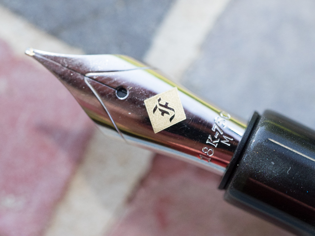
From a design perspective, the majority of music nibs are designed with two slits and three tines. This is to allow for big ink flow, which is a staple of music nibs. Sailors music nib is more traditional in that it has a single slit and two tines, but the tip of the nib is designed in such a way as to keep that same big ink flow. That was clear once I started writing with it using Sailor's Shigure ink. There were no issues putting this beautiful purple ink down on the page.

Top view

Top view

As I learned while researching this nib, music nibs are designed to hit the page more vertically than standard nibs, and at approximately a 90 degree angle. Picture your normal fountain pen writing grip where the nib hits the page at around a 45 degree angle. Rotate the pen in your hand counterclockwise (if you are a righty) until the nib hits the page at a 90 degree angle. Then move the barrel into a more vertical position instead of laid back as you would normally. Now become Mozart!
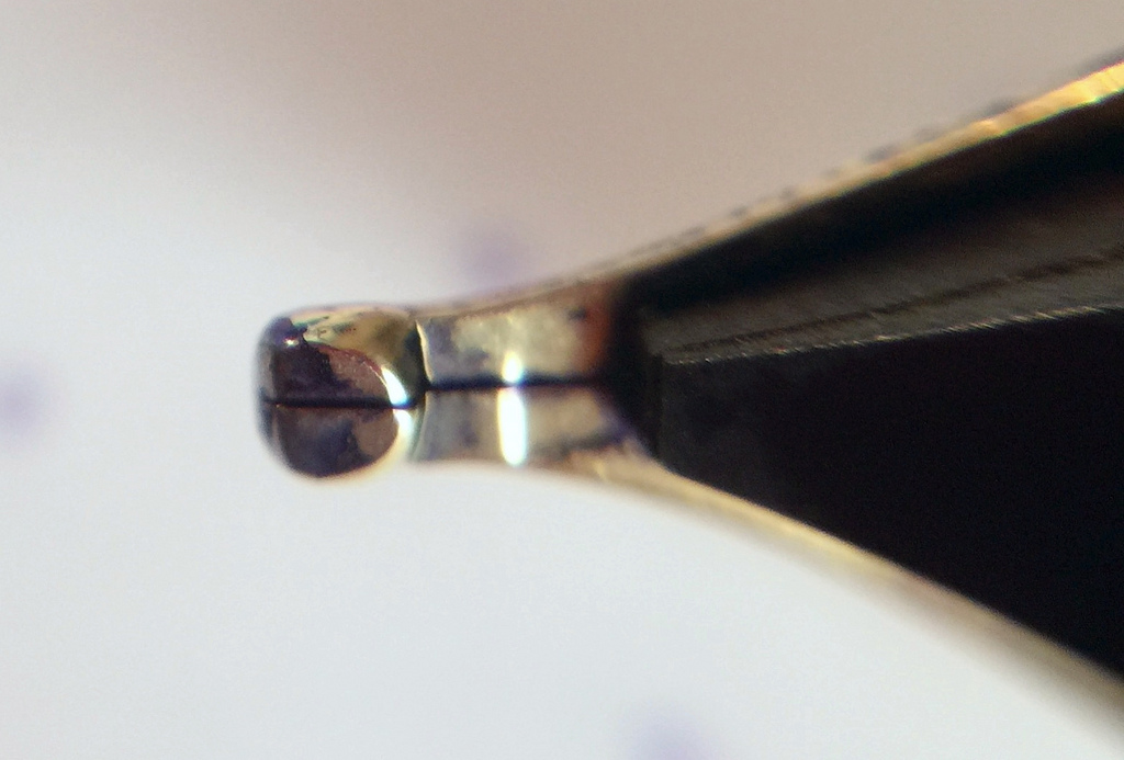
Side view

Side view

Once I realized this, well after my handwritten review mind you, all I could think of is isn't this what an architect grind is supposed to accomplish, without all of the angle adjustments? Wide horizontal strokes, thinner vertical strokes. Seems like it would do the trick. The thing is, no one uses a music nib for its named use these days anyway.

Bottom view

Bottom view

What the modern age of music nibs brings to the table is a thick, luscious line, perfect for large, sweeping writing. Big block lettering, cursive flourishes, and fancy styling. That's what this music nib is good at. Think of it as a chisel tip marker in a fountain pen nib. Go big or go home.

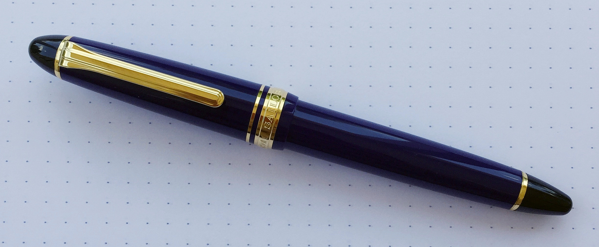
As I worked my way through this review my early prediction came true. It really is all about the nib. Sailor's 1911 barrel is excellent in its own right, with black, rounded ends set off by strongly colored resin barrels. I'm not a gold furniture guy but it's hard to argue how sharp these pens look.

Your writing style and planned use is the determining factor in purchasing a pen with a music nib. I've seen some amazing work with nibs like the one found in this Sailor. It's not a daily writer for me, but if I want to put some ink down on the page this is the way to go.

My thanks to Goldspot Pens for loaning me this pen for review. It will be heading back to its rightful home later this week, and I wish it safe travels!

Posted on May 18, 2015 and filed under Fountain Pens, Pen Reviews, Sailor, Music Nib.

The TWSBI 580 AL Orange, With A Twist

(Jeff Abbott is a regular contributor at The Pen Addict. You can find more from Jeff online at Draft Evolution and Twitter.)

If you've never had the pleasure of owning a TWSBI pen, I hope that this review can change your mind. For the money, they're nearly impossible to beat. They feel great, write well, and offer one of the most economical ways to try out a true piston filler mechanism. In a word, TWSBI pens are fantastic.

The most recent TWSBI that I've fallen in love with probably won't surprise many of you — the 580 AL. My first TWSBI was a 540 in Amber, so it seemed fitting that I should pick the orange version of the 580 AL. Yep, I'm pretty happy with my choice.

TWSBI madness

If you follow TWSBI very much, you'll probably know that the orange model of the 580 AL was limited, and they're pretty much sold out at this point. I bought my pen from Pendleton's Pens, and it looks like he still has some of the orange in stock. If you were wanting one of these, I'd hop to it. And if you get one of these pens, you get a huge advantage over the stock TWSBI because it's been pre-tuned by Mr. Pendleton to his signature BLS — Butter Line Stub — grind. This is probably half of the reason I love this pen so much (possibly more than half).

Before I get into the delicious nib, let's take a look at the outside of the pen. The 580 is a full-size pen. It's mostly demonstrator, but the grip section and piston mechanism is aluminum. In the case of my pen, the aluminum is anodized orange, which looks fantastic next to the clear plastic. Like all other TWSBIs, the plastic body is fairly high quality with a great feel to it. The clip is a little weak, but I've come to expect that from the brand. It works fine, but don't expect it to perform at a tactical level.

The 580 is a great length for me unposted. You can technically post this pen, but it becomes comically large at that point. Unlike the 540 before it, the 580 has a bit of shiny trim around the grip section and the piston knob. The shiny metal does a great job of offsetting the clear plastic and subdued aluminum. When you throw in the fact that I have some shimmery blue ink in the pen, the 580 is visually stimulating. You can't shake the impulse to pick this thing up when you see it. For me, it's a great design and aesthetic.

Like I mentioned earlier, this is a piston filler fountain pen. All that means is that the back of the pen has a knob that you can twist to operate the piston filler. Basically, the body of the pen acts like a giant cartridge converter and can hold a large amount of ink. I haven't measured it exactly, but I'd guess it holds around 1.5 ml of ink. And, you always have a very clear view of how much ink you have left as this is a demonstrator body.

The "Elegant Butter-line Stub / Cursive Italic" nib

Ah, the nib. This grind is Pendleton Brown's signature style, and I love it. Basically, it's a mix between a stub and cursive italic, or a cursive italic with "soft" edges. For anyone new to nib grind magic, stub and italic grinds give a nib a nice variance of line width when writing. Generally, a stub grind is much smoother on the paper since the corners of the nib tip are "softer," or ground down a bit. The stub is smooth, but doesn't afford you as much line variation, nor is the variation as crisp as the italic. On the other hand, the italic grind creates sharp lines with more dramatic line width variation. On the downside, they usually have a small "sweet spot," and if you stray from that, then the nib feels scratchy and might even hang on the paper in extreme cases.

All that to say, the BLS grind is a perfect marriage of the two styles. It provides an elegant amount of line variation while remaining incredibly smooth and effortless. If you're new to custom nib grinds, I'd highly recommend trying this one first. You can buy one of Pendleton's pre-tuned TWSBIs, or you can send in a pen of your own for him to grind. Definitely check him out for nib work — he's super nice and he got my order out to me extremely fast. He even sent me an email with a picture of the pen and a writing sample before he shipped it.

I chose a medium nib with the BLS grind for my TWSBI 580. In case I forgot to mention it earlier, I love this nib. It's smooth, right between wet and dry, and provides fantastic line variation. It's not crazy like a flex nib, but it's also not as subtle as my fine Franklin Christoph nib. I really like the medium nib range for this type of grind, although I might need to buy a broad nib now. You know, for science.

The TWSBI 580 is a fantastic pen that I highly recommend. It's Brad's #1 pick for the "Top 5 Fountain Pens $50-$100" category, and it performs at a much higher bracket if you ask me. With that in mind, this BLS nib grind takes the 580 to another level of bliss. If you're in the market for a TWSBI, check out Mr. Brown's selection, or send him a pen of your own to try out some of that buttery goodness.

Posted on May 13, 2015 and filed under Fountain Pens, Pen Reviews, TWSBI.

Franklin-Christoph Model 19 "1901" in Smoke and Cinnamaroon: A Review

(Susan M. Pigott is a fountain pen collector, pen and paperholic, photographer, and professor. You can find more from Susan on her blog Scribalishess.)

I don't know why I never considered purchasing a Franklin-Christoph fountain pen. I've seen a few photos of their pens in ice acrylic, and those didn't interest me. But after Franklin-Christoph came out with their monster 1.9 music nib, I found myself on their Web site looking at their pen offerings. One caught my eye: the Model 19. I liked the shape of the pen, and I saw they were working on a new color combination that I thought was unique and gorgeous–smoke with cinnamaroon bands.

I haunted the site daily, wondering when the new color would come out. Finally, I emailed them to get the date and received a response almost immediately: "They're done and should be on the Web site tomorrow!" The next day I ordered one.

The pen arrived a few days later, but I made myself wait until Friday, my writing day, to open it. It was well-packaged, and by that I mean an outer postal box, an inner postal box, bubble wrap, and packing paper around a plain white cardboard box with the Franklin-Christoph logo.

Inside was a maroon leather zip pouch with the pen, two blue ink cartridges, a couple of Franklin-Christoph business cards, and a Mike Masuyama card verifying that my medium 18K nib was ground by him into stub.

The pen is large. The barrel is .61 inches in diameter, and it's certainly the fattest pen I've used. It's a good thing they included the pen pouch, because Model 19 absolutely won't fit in my Franklin-Christoph Penvelope.

Penvelope.jpg

Although the barrel is wide, the grip gradually narrows from .50 inches to .425 closest to the nib. So, while the pen itself is much wider than my other fountain pens, when you compare the grips, they aren't drastically different.

Its length is more typical of fountain pens: 5.50 inches capped, 5.1 inches uncapped, and 6.62 inches posted (though I would never post this pen). At only 28.35 grams without ink, the pen isn't heavy for its size.

Made of thick acrylic, this version has swirls of dark and light gray with beautiful sheen. The cinnamaroon bands sparkle and offer a truly unusual contrast to the smoke colors.

The clip is rhodium plated and etched with four diamonds. I never use the clip on my pens, but this one seems sturdy.

The cap top is inscribed with the Franklin-Christoph logo, and "Franklin-Christoph" is etched into the cap where ordinarily you might find a cap ring.

The nib is a single-tone, rhodium-plated 18K gold nib with minimal styling. A yellow diamond with the logo adorns the nib. I'll admit I don't like this nib's design (the stainless steel nibs are actually prettier). The etched yellow diamond clashes with the rhodium plating of the nib. I wish they had simply etched the logo into the nib itself (like they do on the stainless steel nibs) and added scroll work.

I like the size of the nib and the stub doesn't catch on the paper like some of my italic nibs do. Although the nib has no flex, it's springy, and you can get a little line variation if you press down.

I've noticed a few hard starts and a tiny bit of skipping with this nib. Normally I wash a new nib thoroughly before inking it, but I failed to do that this time. When I change ink, I'll do a good cleaning and see if the skipping stops. The problem may be related to the converter. I noticed that the ink pooled in the middle of the converter after the pen had been lying on its side for the evening. I had to force the ink down using the knob to get it flowing again.

The pen uses cartridges or an included converter. The cartridges look minuscule next to this big pen. The converter seems adequately sized, but I'm not impressed with its performance so far. It lacks a metal ball to keep the ink flowing. And, unlike other models in the Franklin-Christoph line, apparently you can't turn the Model 19 into an eyedropper.

Unfortunately, this pen is simply too wide for my small hands. I noticed that, after just a few pages of writing, my wrist felt fatigued, a problem I've not encountered with my other fountain pens. It's not the weight of the pen; the large barrel seems to be the main issue.

Franklin-Christoph offers a lifetime warranty on the pen, which tells me these pens are built to last. There's also a generous 30-day return policy, no questions asked.

You can order the Model 19 from Franklin-Christoph with a stainless steel nib in a variety of sizes for $195. If you want it with the impressively-sized music nib either in shiny stainless steel or the new stealth shadow, you'll pay $205. With 18K nibs from EF to B the cost is $285. For a Masuyama specialty nib in stainless steel you'll pay $210 and $300 for an 18K.

Pros

  • Stunning pen at a reasonable price. The smoke design with the cinnamaroon bands is unique and beautiful.
  • An amazing variety of nib choices in both steel and 18K gold.
  • Very light pen considering its size.
  • The Masuyama medium stub writes beautifully (but see below under cons).
  • Comes with a handy zippered pen pouch. You'll need this, as the pen won't fit in normal-sized pen loops or pen cases.
  • Prompt and courteous customer service.
  • Comes with a lifetime warranty.

Cons

  • This pen is large. If you have small hands it might not be comfortable for you.
  • I prefer piston-fillers over cartridge/converter pens. But converters are often easier to clean.
  • The converter does not move the ink to the feed without some user intervention, which is bothersome. This could be due to the ink I was using (Diamine Red Dragon). Some inks flow better than others.
  • My nib had some hard starts and a little bit of skipping, perhaps due to the converter/feed flow problem.
  • I don't particularly like the 18K nib design, but this is purely personal taste.
Posted on May 8, 2015 and filed under Pen Reviews, Franklin-Christoph, Fountain Pens.