Staedtler makes fountain pens?
That was my first reaction when Staedtler PR reached out to me asking if I wanted to take a look at their new fountain pen lineup. Ok great, this will be a school pen along the lines of the Pelikan Twist, right? A good pen, no doubt, but aimed at the beginner/student market.
Oh how all of my assumptions were wrong.
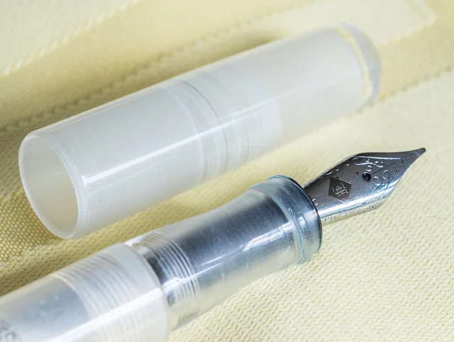
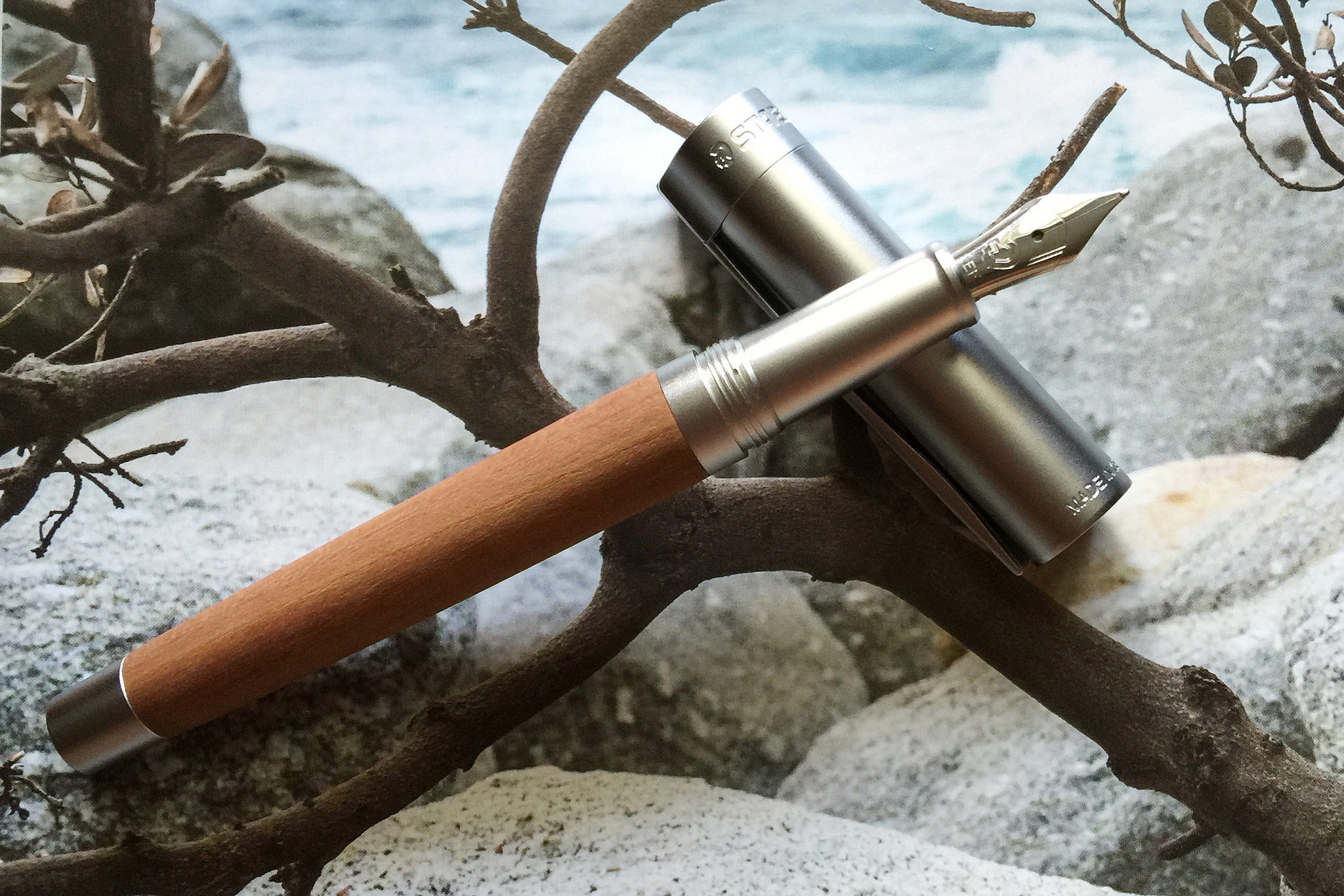
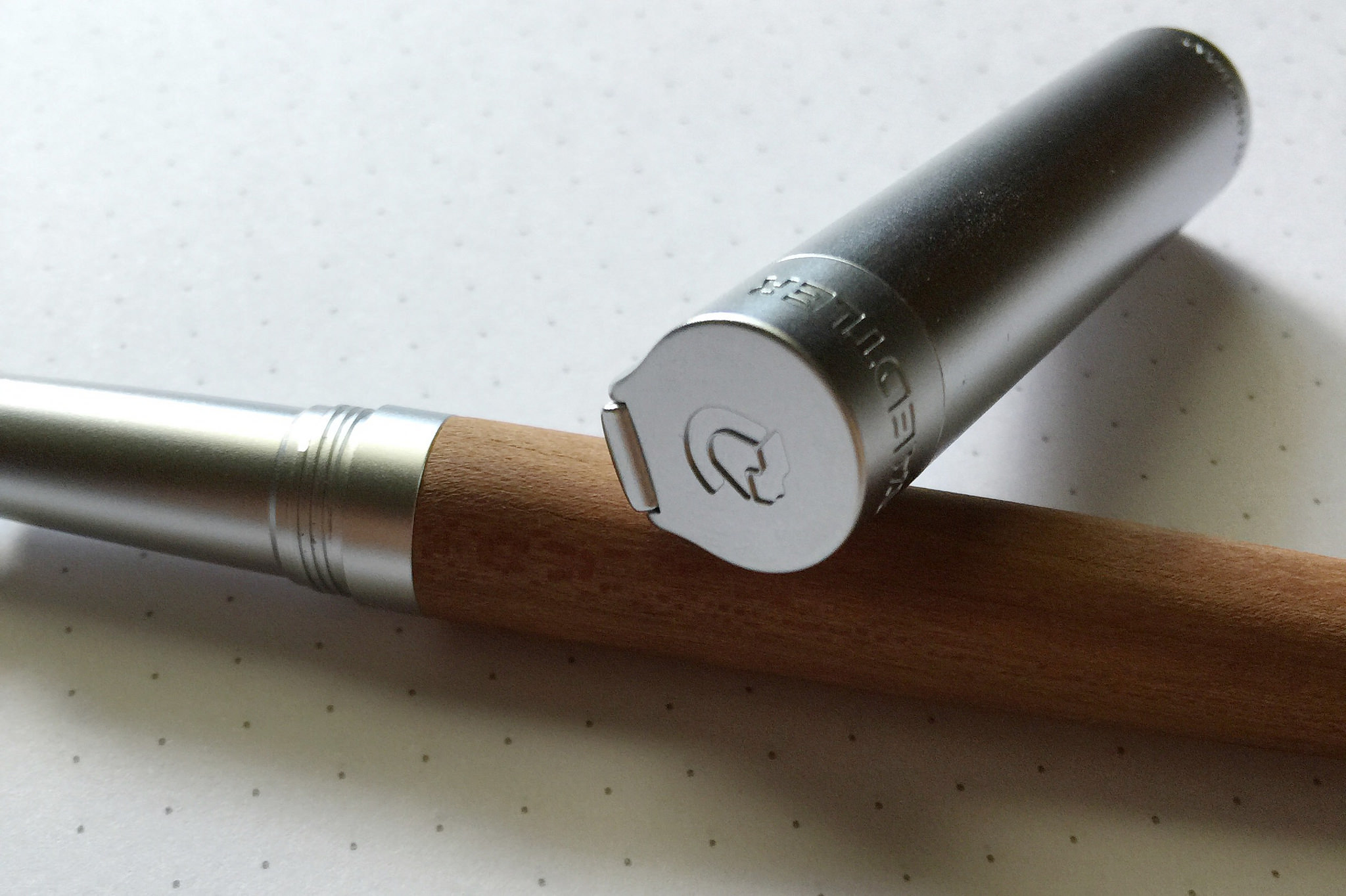
Staedtler has introduced The Intium Collection, a premiun linuep of pens which contains two fountain pen models: The Resina, with it’s sharp, irridescent resin barrel, and the one they sent me, the Lignum, a wood barrel fountain pen.

When unboxing it for the first time I was immediately impressed. The plum wood is a warm caramel color and is set off nicely by a brushed steel cap and section. The feel of the pen is rock solid as well. You pick it up and you call tell it is a well-constructed writing instrument. Every bit of it is tight and on point.
The clip design on the Staedtler Lignum is a knockout. It’s wide and long, running nearly the full length of the cap, but is set at a low profile to give it a clean, sleek look. It is tight, but not overly so, giving it the perfect pocket tension when attaching and removing. Very well implemented.
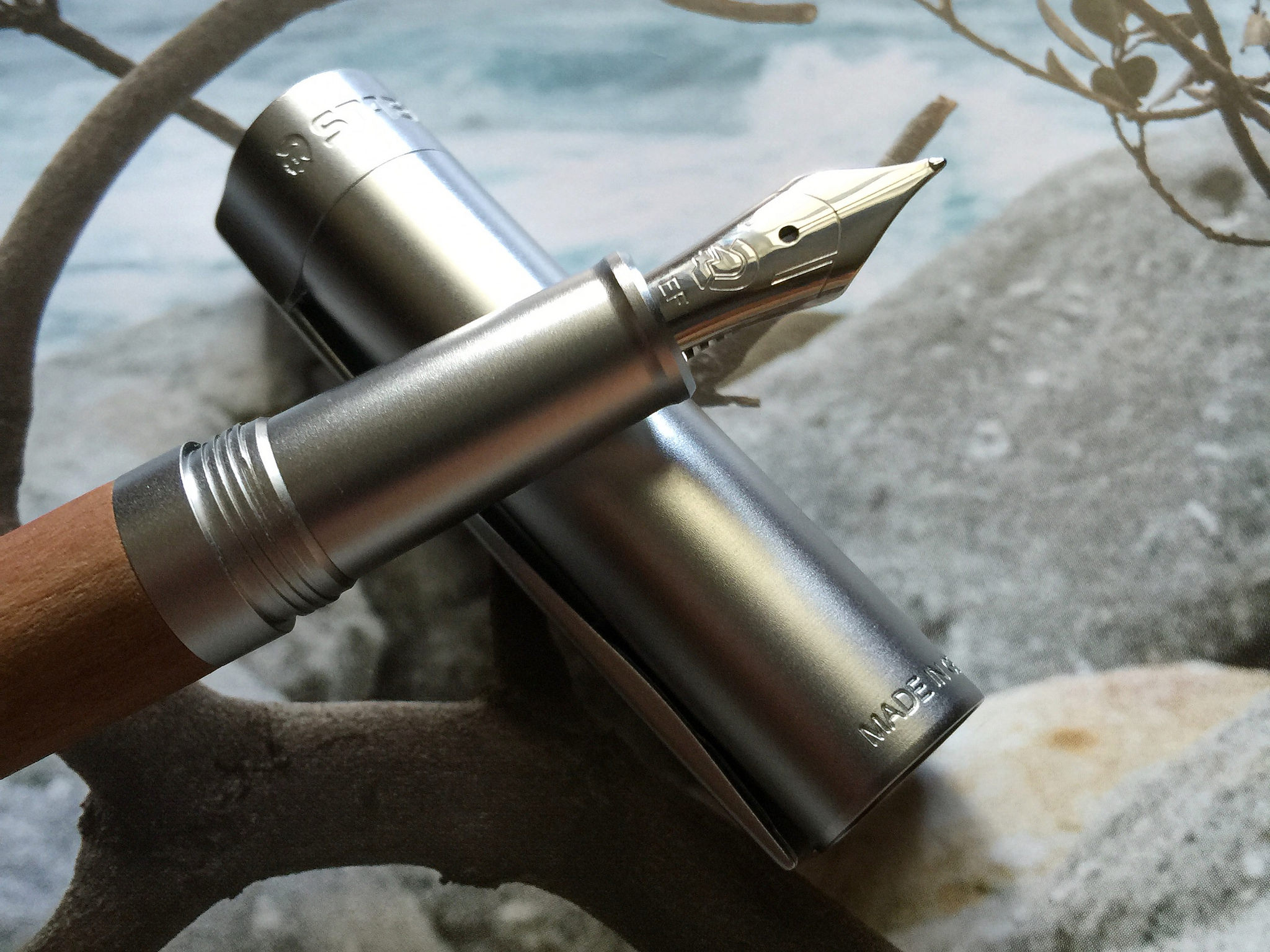
Inking it up, I was a little nervous putting the nib to the page, not knowing if the steel nib would live up to the standard the rest of the pen had already set. Once again, my worries were quickly brushed aside with the first stroke. This is one of the cleanest, sharpest writing steel extra fine nibs I have ever used. I was so impressed, I emailed my contact at Staedtler to find out more. I asked point blank who made the nib:
“Our nibs, along with all other components/articles within our Premium Collection with the exception of the inks, are manufactured in Germany. As the nibs are manufactured specially for the STAEDTLER Premium Collection, this is proprietary information.”
I figured that was as good as I was going to get. ;) It’s a splendid nib though, and it better be due to the cost of the pen.

Price is one of my main concerns with the Lignum. MSRP is $279, street price is closer to $225. For a steel nib pen at that price it better be good, and this one is. Still, perceived value will be at the forefront of most buying decisions, and many will balk when they can get a gold nib pen for half the cost in some instances. In situations like this, I always like to refer people to Brian Gray’s excellent article “In Praise Of Steel Nibs.”
My other concern is minor, and more of a question in my head than anything. The plum wood barrel is unfinished. Meaning, there is no coating, lacquer, etc. on top of the wood to seal it. It’s essentially raw, smooth wood. It feels great, but I wonder if natural oils in the hand will stain it, or, more concerning, stray fountain pen ink. To be determined.
The Staedtler Intium Lignum impressed me. I know this because as I was using it I kept stopping writing to look at the pen quizzically, as if to say "is this really happening?" I kept waiting for the other shoe to drop, and it never did. It was an enjoyable experience, and I think Staedtler has something nice on their hands here.
My thanks to Staedtler for sending me this pen at no charge for the purposes of review.

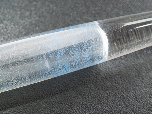
Familiar looking ink bottle...