Posts filed under Ink Reviews

Diamine Oxblood Ink Review

(Jeff Abbott is a regular contributor at The Pen Addict. You can find more from Jeff online at Draft Evolution and Twitter.)

Oxblood is one of those words that took me a while to comprehend as a child. Why is the word "blood" in the name, and what does it have to do with an ox? My first memory of hearing this term was in relation to the color of a leather belt. I'm not confident I could tell you why this is still a standard color in some product lines, but it's probably fair that most people understand what the color looks like.

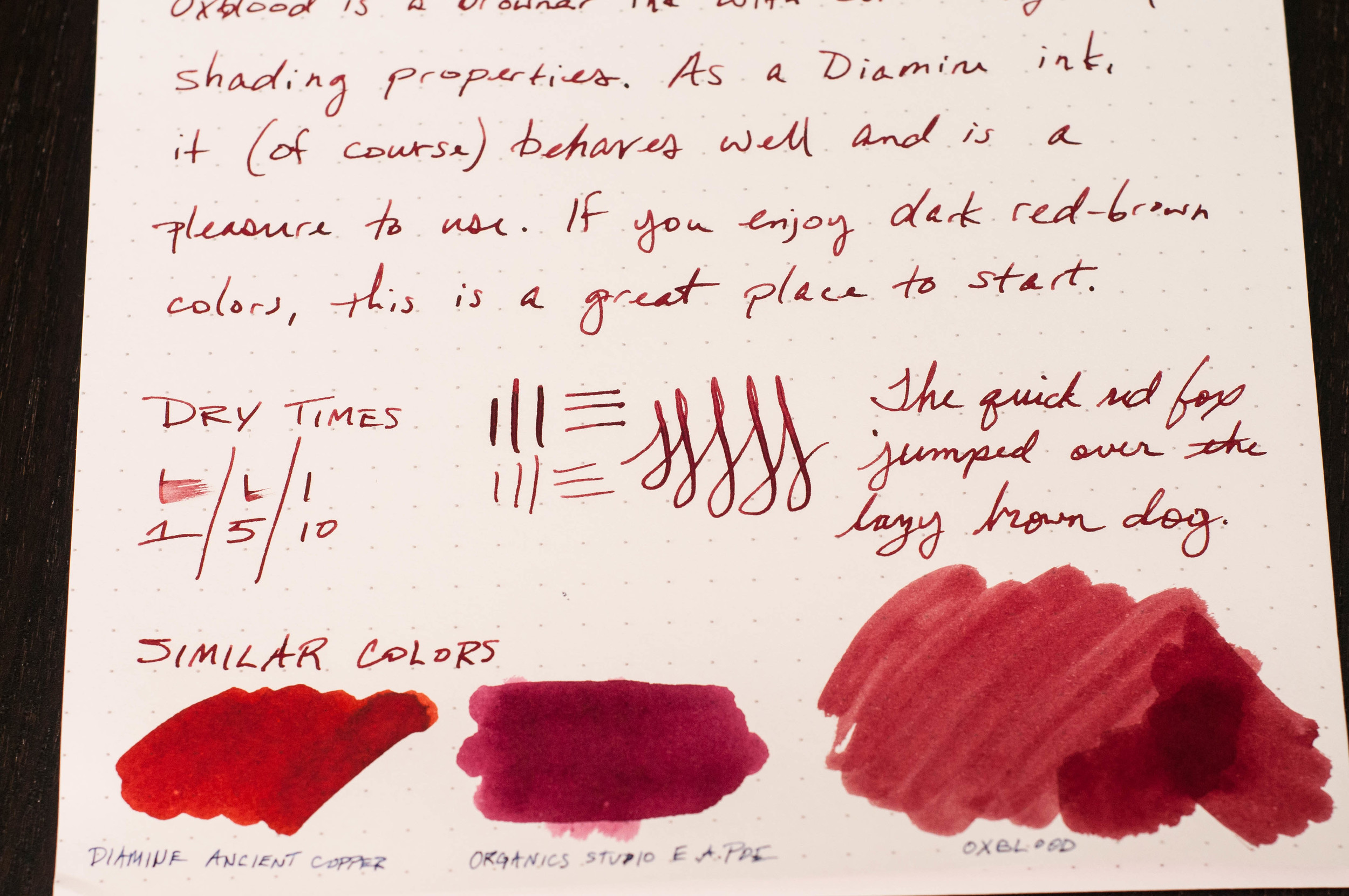
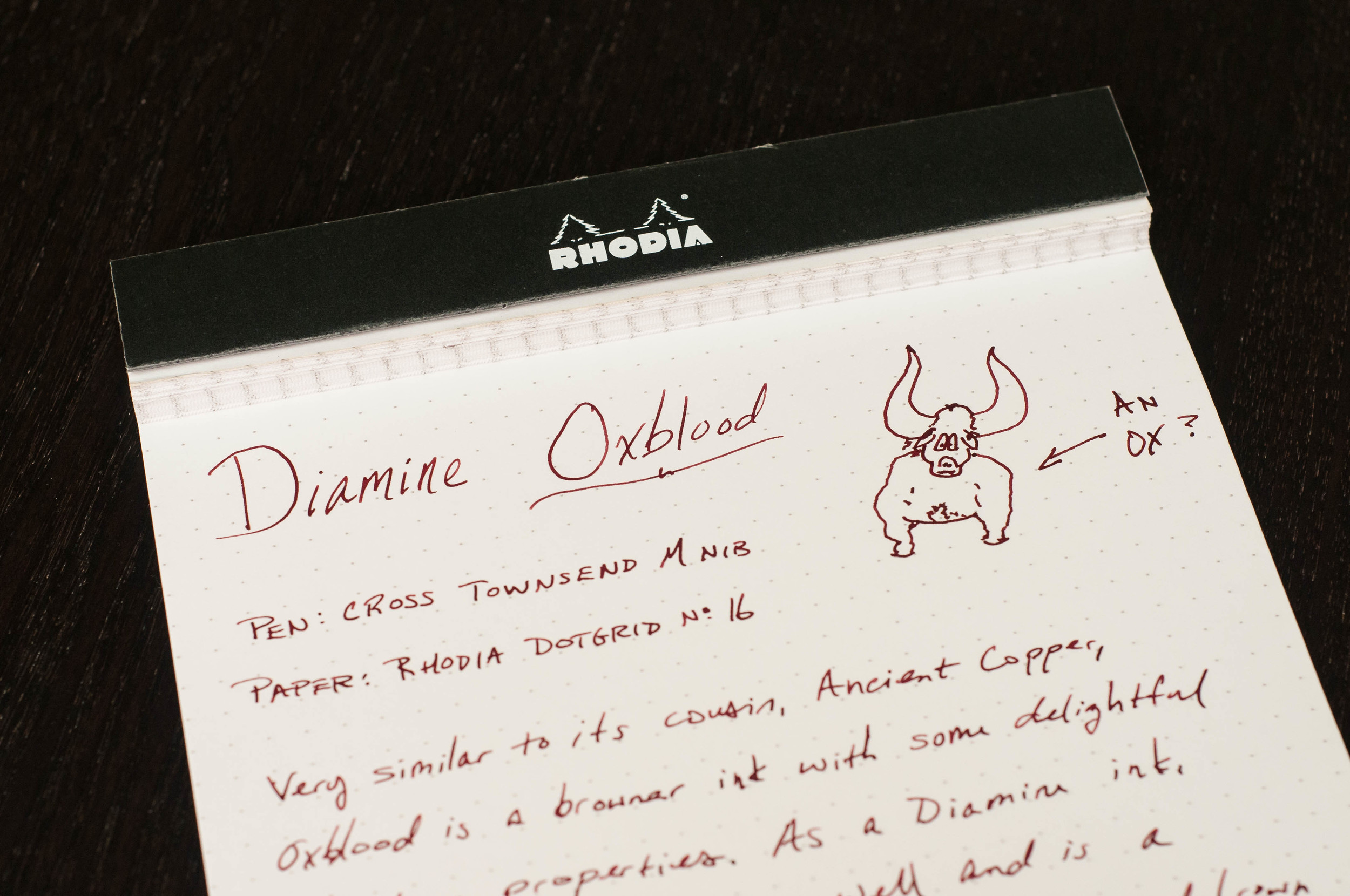
Diamine Oxblood is what I consider the standard oxblood color. It's not too dark, but it has plenty of dark red and brown mixing together to look like a shady blood color. I happen to be a fan of inks with this color scheme, but I understand it's also not for everyone. Either way, you'll know quickly after seeing a sample whether the color is for you. If it is, then Diamine is the one to start with.

I've written previously about a couple other red-brown inks that I really enjoyed: Diamine Ancient Copper and Organics Studio Edgar Allen Poe. These are both great inks in their own regard, but they're just a little off from the standard red-brown color I associate with a classic Oxblood. They're great inks and provide their own unique color and properties that make them great daily writers.

Diamine Oxblood is also a great daily writer. Let's get into the specifics of how this ink performs.

First off, the color is subtle, but deep and rich. It's a wonderful combination of reds and browns that I enjoy seeing on the page. Funny, I like the color of this ink, which is similar to blood, but I hate the sight of actual blood. Go figure.

Like every other Diamine ink I've used, it performs well. The ink has never dried up in my pens after a couple idle days, and it always starts straight away when I start writing. No hard starts, no skipping, or anything negative when it comes to ink flow and starting/stopping. The ink is right in the middle of the scale when it comes to lubrication and wetness. There's a pleasant amount of shading if you're using a pen with a larger nib, like a medium or larger German nib. In smaller nibs, you still get the great color, but the shading characteristics are diminished.

Dry time was average, coming in at just under 10 seconds for normal writing. You'll get smudges if you close a notebook too quickly after writing, and left-hand writers will have some issues with the long-ish dry time depending on the grip style.

When it comes to the color and how it compares to similar inks, I think it's the standard for Oxblood. Ancient Copper is also a red-brown ink, but it has more orange (copper) tones that make it more brown than red in certain light. Organics Studio Edgar Allen Poe is a much darker ink that also has some very light purple tones at times. E.A. Poe is one of my all-time favorite inks, but it's not a standard Oxblood in my opinion. Doesn't mean it's not gorgeous.

Overall, this is a fantastic ink that I think you should try if you are interested in dark reds and red-browns. As far as Oxblood goes, this is my standard in terms of color, shading, and behavior. On JetPens, you can order this ink in three different sizes/formats. It's available in a 30ml sample bottle, a full-sized 80ml bottle, and an 18-pack cartridge format.

(JetPens provided this product at no charge to The Pen Addict for review purposes.)

Posted on November 4, 2015 and filed under Diamine, Ink Reviews.

Tom Norton Walnut Drawing Ink Review

(This is a guest post by Nick Folz. You can find more of Nick and his work on his blog, Smallberry Drive, Twitter, and Instagram.)

Let’s get the obvious misnomer out of the way: Walnut Ink is not made of walnuts. Instead, it aims to look like the walnut inks of antiquity, without some of those ink’s shortfalls. Before synthetic and India inks were widely available, lots of people made inks from walnut husks, people like Leonardo da Vinci and Rembrandt. Walnuts are plentiful, naturally occurring and it is actually fairly easy to make, but you don’t really want to boil walnut husks every time you want to ink something up. One of the side effects of walnut inks is that they are not completely acid free, so they slowly eat away paper as time marches on and would also lighten from the original dark or near black to the brown hues we associate with older illustrations. What is unique about Tom Norton Walnut Drawing Ink is that it aims to ape the aged look of walnut inks, with the added benefit of being acid free and easy to use and manipulate.

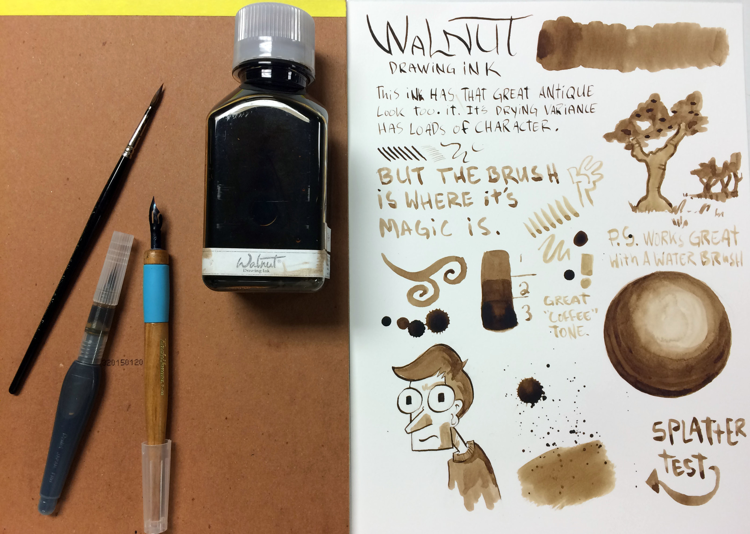
To show my bias early, I usually lean towards India inks. They dry fast, are waterproof and have a pleasant thickness to them. So when I inked up a brush with Walnut Ink I was surprised how light you could go with it. One dip of a brush can get you a wide variety of tones, largely dependent on how much of it you lay down at a time. The closest analogy I can think of is watercolors, which is not a bad thing. This comparison is double apt since this ink is not waterproof, so you can blend line work that has dried when you are laying in fills or shading. You can even go in with just water to spread out what you already have on the page. Working with an ink that was not waterproof threw me for a loop at first, but once I knew what to expect I really got into it and found it more forgiving that previously expected.

Brown can be a problematic color. Brown is one of those weird colors that can vary wildly yet always fall under the same header of “brown.” The problem is the way most of us make brown, by mixing the three primary colors or, in some cases, red, yellow and black. There is no brown in a rainbow, and the “B” in “ROYGBIV” sure ain’t “Brown.” Instead of a mix of two colors, you need three. That added variability adds an unwieldy aspect to this nondescript color. Despite the many pitfalls surrounding this moody hue, Walnut nails it with their pigment. It is a warm, inviting sepia tone that has a fantastic range, especially when you vary how you apply it. When using a nib, this can reach almost black depths. Brushes will give you everything from “strong coffee stain” to “old paper patina.” The overall look of this ink is vintage, imbibing everything on the page with a look of lost years. The first thing I drew with it was not a great drawing, but the look of the ink and the wash of sepia made up for any lack of skill on my part.

On another drawing, I went in with nibs first to get the rich dark browns for line work, and then went back with brushes to do the dark shading with pure ink. Once all of that dried, I washed up light areas with a mix of ink and water. I really like the end product and was very happy with the variety of tones I got with this one ink.

If you have ever enjoyed a good inkwash or watercolor, this is right up your alley and I can’t recommend it enough. If you are looking for a way to make a project you are working on look “aged” or “antique,” look no further. If you are looking for the next great fountain pen ink or a waterproof ink, look elsewhere. It is a versatile ink that is fun to use and would be a strong tool for any artist to have around. You can find more info about Walnut Ink at their website or check out a dealer near you.

(Disclaimer: This product was provided for me free of cost but I am not otherwise being compensated for this review. The opinions contained are my own.)

Posted on October 29, 2015 and filed under Ink Reviews.

Pelikan Edelstein Amethyst Ink Review

(Jeff Abbott is a regular contributor at The Pen Addict. You can find more from Jeff online at Draft Evolution and Twitter.)

Pelikan Edelstein inks are usually highly regarded for their excellent qualities and colors, so I was pretty psyched to get a chance at their new 2015 ink — Amethyst.

To be honest, I had to look up the color because it didn't immediately pop out in my mind. I'd call it a medium purple, which is pretty close to the gem that probably inspired it.

After inking it up in a German EF nib, I was off to the races. The first impressions of the ink were great, and they didn't let up either.

Behavior

The ink is extremely smooth and lubricated, even in a slightly scratchy EF nib. I was actually surprised by the smoothness because the pen isn't usually that smooth with other inks. I'm still impressed by the smoothness of the ink, and that gets even better with a wider nib. I used the ink in a M nib as well, and it wrote like oil on glass, but didn't cause any bleed or pooling issues despite the generous flow.

The ink also doesn't have any issues starting after not being used for several days. Non-ordinary colors (like purple, red, green, etc.) normally have mixed results when it comes to reliability after a few days of storage, but Amethyst has no trouble at all. Again, pretty impressive.

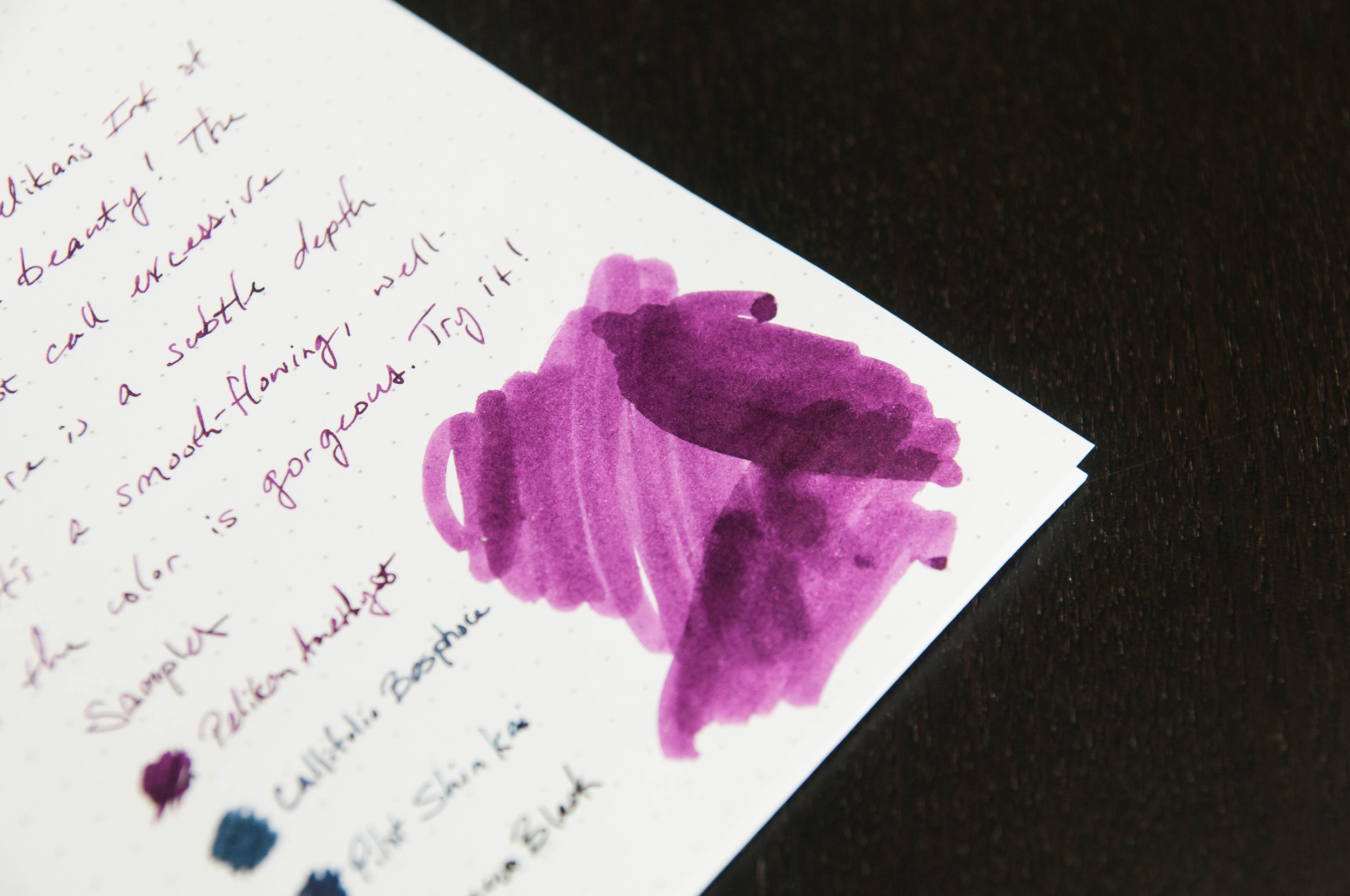
Now, one of my favorite qualities of this ink is the shading. If you look at an amethyst gem, you don't see a single shade of the color. You see several different shades since there are different angles, thicknesses, and gem qualities. The Amethyst ink captures these qualities beautifully. The shading properties aren't incredibly dramatic, but they're beautiful and striking without being flamboyant. This is an ink that does extremely well in a broad or flat nibbed pen (like a stub or italic).

This is an elegant ink with some great surprises in store. People definitely notice the character.

Color

The color of the ink is very similar to the gem. Pelikan did a fantastic job matching the color. In use, it's a medium purple. If you're using it in a smaller nib, it looks entirely professional for most things. In a wider nib, it exhibits a nice range of light to medium dark purples. In any nib, it looks great and shows its character well.

Overall

In all, this is a solid ink and represents the Edelstein brand very well. It's the newest ink to the lineup, and it compliments the rest nicely. If you're interested in purple inks, Pelikan Edelstein Amethyst should be on the top of your list.

(Goldspot Pens provided this product at no charge to The Pen Addict for review purposes.)
Posted on October 14, 2015 and filed under Ink Reviews, Pelikan.