
It has been nearly a year since I wrote the review for the Zebra 301A above - things sometimes have a way of getting overlooked in my Flickr stream. Re-reading what I wrote last January though, my first thoughts still hold true today.
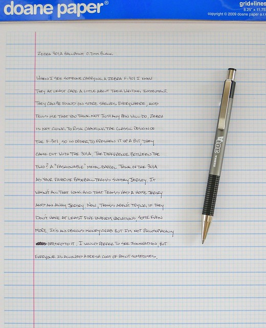
When I see someone using the traditional Zebra F-301 Ballpoint I know they at least care a little about the pen they are writing with. It is a good pen, even a little bit above average, and many people swear by it. I won't go that far but I do understand its appeal. With the 301A, Zebra has gone after those same customers by applying a fresh coat of paint to an already good pen, but did nothing to take it further than that.
The 301A comes in four barrel colors - blue, gray, maroon, and gold - with the same grip and knock as the F-301. The font on the barrel has been "upgraded" too, but I liken it more to a logo you would find at the $2.99 t-shirt shop down at the boardwalk. It is not as classy as the old logo, and combined with some of the new colors it is downright disappointing.
Unlike the original, I have never seen one of these in use by anyone other than myself. I missed the mark in not reviewing this pen when it first came out, but Zebra missed the mark by not making a real upgrade to one of the anchors of their product line. Bring me an F-301 with an emulsion ink refill and then we can talk.


