Posts filed under 3 Oysters

3 Oysters Hwangto Ink Review

(Sarah Read is an author, editor, yarn artist, and pen/paper/ink addict. You can find more about her at her website and on Twitter. And check out her first novel, The Bone Weaver’s Orchard, now available where books are sold!)

I am really digging the lineup of 3 Oysters inks, and the lovely golden yellow of Hwangtowas high on my list to try. Their colors are inspired by the cityscape of Seoul and the bottles and boxes show beautiful Korean designs.

Hwangto means yellow soil, and it refers to the rich clay earth that is believed to purify sacred places and keep bad fortune away. It's a beautiful, saturated color. It's not too pale to read and it shows some gorgeous shading. Chromatography shows it's a pretty pure goldenrod color, with some darker orange added in. It pools in a lovely tangerine color.

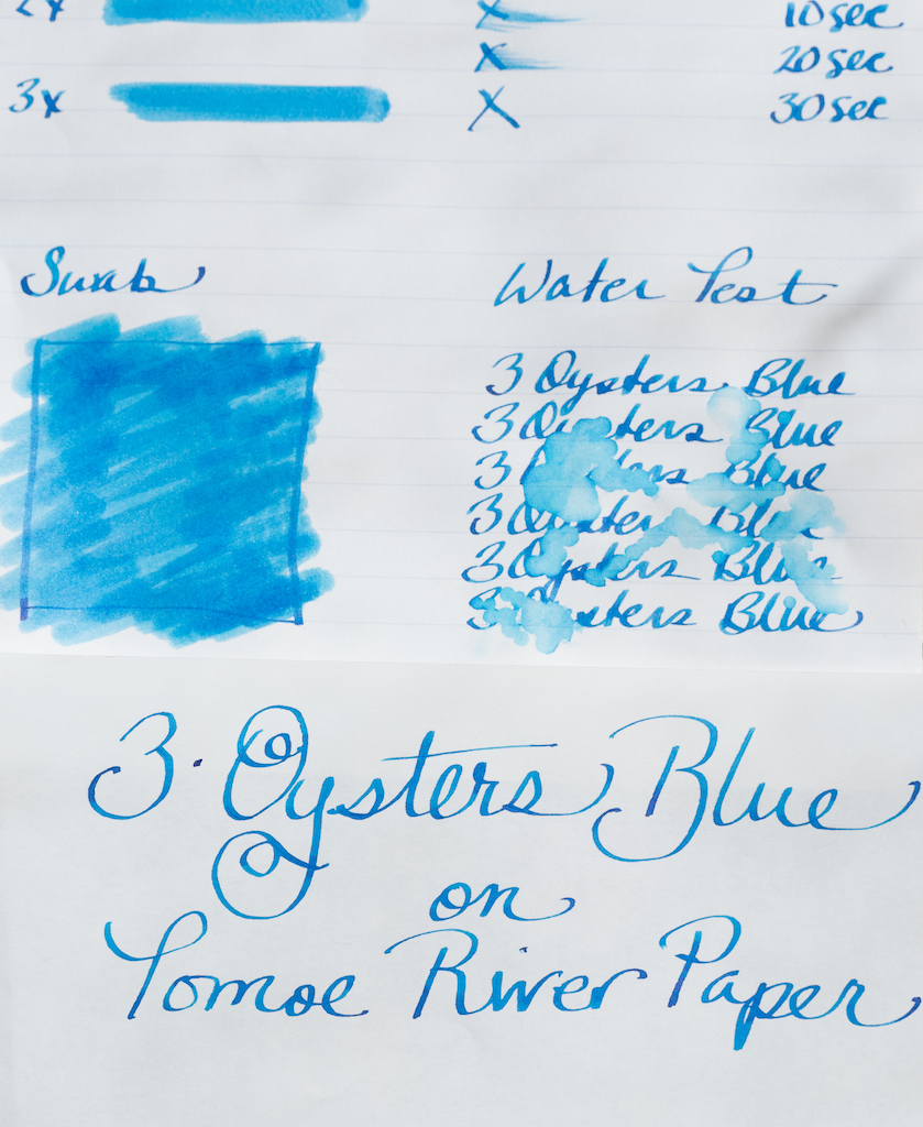
The ink is water and dye based and is specially formulated to be pH neutral. It is very safe for pens. I didn't see any sign of sheen on either Clairefontaine paper or the swatch card. The ink does feel a bit dry, but actually has a longer dry time of around 25 seconds. I saw no bleeding or feathering on any fountain pen friendly paper I used. The ink is not water resistant, but my drip test didn't completely wash away the lines, even when the water was wiped away.

The 38 ml bottles are interesting. They're rectangular blown glass, but one back corner of the bottle is flat, so it can be balanced on that edge. This is supposedly to make it easier to get the last drops of ink out of the bottle, even when you need both hands to hold the pen. It makes me a little nervous, though. It isn't super stable balancing on one corner.

This color fits into a noble family of golden-apricot-tangerines. It shares some similarity with Diamine Autumn Oak and Noodler's Apache Sunset, but it's different enough from all the others that you can easily justify adding it to the collection.

(JetPens provided this product at no charge to The Pen Addict for review purposes.)


Enjoy reading The Pen Addict? Then consider becoming a member to receive additional weekly content, giveaways, and discounts in The Pen Addict shop. Plus, you support me and the site directly, for which I am very grateful.

Membership starts at just $5/month, with a discounted annual option available. To find out more about membership click here and join us!

Posted on July 25, 2019 and filed under 3 Oysters, Ink Reviews.

3 Oysters Ink Delicious Blue and Delicious Chilli Red: A Review

(Susan M. Pigott is a fountain pen collector, pen and paperholic, photographer, and professor. You can find more from Susan on her blog Scribalishess.)

3 Oysters Ink is made in Seoul, South Korea. The inks are formulated with pure, ionized water and dye-based colors. I received two colors for review: Delicious Blue and Delicious Chilli Red.

The inks come in glass 38ml bottles with black caps. The bottom corner of the bottle is cut so that you can angle the bottles for easier filling, though I’m not convinced the bottles are all that stable when angled. Thankfully, they are tall and deep, not squat and flat like Sailor bottles, so it’s easy to fill even large pens.

Delicious Blue

Delicious Blue is a basic blue ink leaning more towards turquoise than navy. It’s a rather flat color with a tiny bit of shading but no sheen. It’s definitely darker when I write with my Blue Pumpkin nib (in a dip pen) than with my Leonardo Stub nib.

In my initial ink testing, I used Maruman Septcouleur Paper which is a pure white 75gsm paper. Delicious Blue remains a consistent color whether you’re writing or swabbing. It is fairly wet and is not waterproof.

My chromatography test reveals that the color is a mid-range blue with a tiny bit of violet.

I also tested the ink on Tomoe River Paper and on a Life Renover notebook. It remains consistent on each kind of paper. In the second photo, I compared the Maruman paper with Tomoe River and couldn’t see much of a difference. Tomoe paper generally brings out sheen if an ink has any, and Delicious Blue does not.

Chilli Red

Although the spelling (“Chilli”) drives me to distraction since I’m from New Mexico and chile is chile, this color is definitely a hot red. In swabs it leans more toward orange than burgundy.

Like Delicious Blue, Chilli Red is a rather flat color that exhibits some shading but no sheen. Although the color is rich when I use my Blue Pumpkin nib, in swabs it washes out pretty easily, turning almost coral. This is also true for wider nibs, such as my super-wide Handwritmic pen used in the first Chilli Red photo above. It’s a very wet (even watery) ink that takes a long time to dry. It is obviously not waterproof.

Chilli Red is much more interesting when you do a chromatography test. It has lots of pink, dark pink, and orange.

The ink performed consistently on the Maruman paper, Tomoe River Paper, and in the Life Renover notebook. The second picture compares the ink on Maruman and Tomoe.

I’m sad to say that I’m not all that impressed with 3 Oysters ink, at least in these two colors. Both Delicious Blue and Delicious Chilli Red are flat, basic colors. You can get a bit of shading from them, but they don’t have any sheen at all (which may please those of you who don’t like sheeny inks). I’m also not too keen on how washed out Chilli Red becomes in wider nibs.

I’m not going to give up on 3 Oysters yet. I’d like to try some of their more interesting colors, such as Hwangto.

You can purchase Delicious Blue and Chilli Red from Vanness Pens for $18.00 (38ml) or $2.50 (4ml sample).

(These inks were purchased from Vanness Pens with a reviewer’s discount.)


Enjoy reading The Pen Addict? Then consider becoming a member to receive additional weekly content, giveaways, and discounts in The Pen Addict shop. Plus, you support me and the site directly, for which I am very grateful.

Membership starts at just $5/month, with a discounted annual option available. To find out more about membership click here and join us!

Posted on May 17, 2019 and filed under 3 Oysters, Ink Reviews.