Posts filed under Pen Reviews

Ti2 Techliner Laser-Engraved Brass Shorty Pen Review

(Sarah Read is an author, editor, yarn artist, and pen/paper/ink addict. You can find more about her at her website and on Twitter. And her latest book, Root Rot, is now available for pre-order!)

The Ti2 Techliner is one of those perfect marriages of form and function. It's so good! And it's so pretty! Functional, reliable, and lovely. And while this pen is definitely for me, it won't be for everyone.

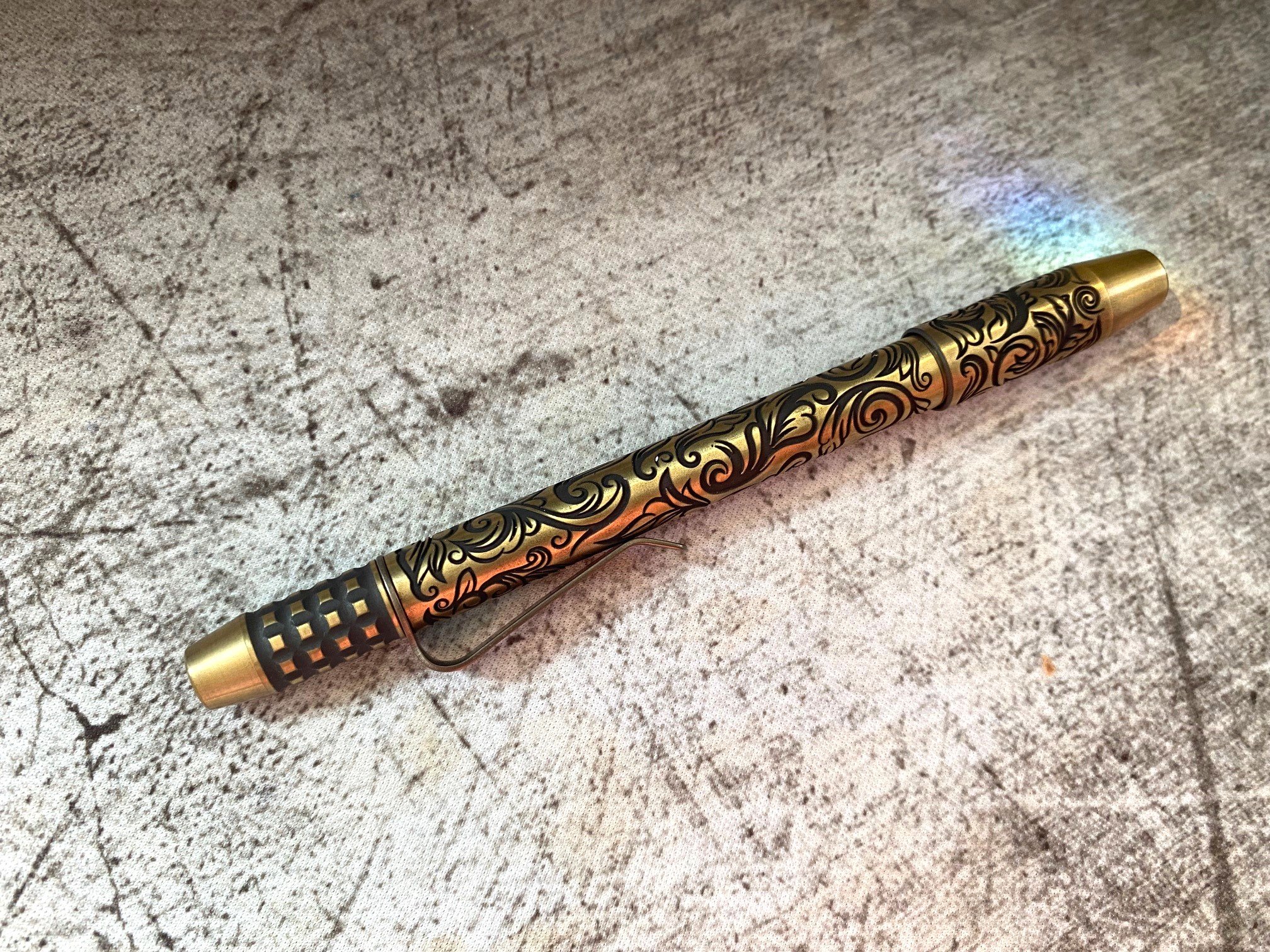
Do you like heavy pens? Okay, good, because this solid brass beast is very heavy. It's well balanced, though, so my hand has not gotten tired, even when I'm writing for a long time or trying to take rapid notes during a meeting. The knurled grip section also adds to the comfort of holding the pen. The texture gives extra control and there's no chance of your grip slipping as you write.

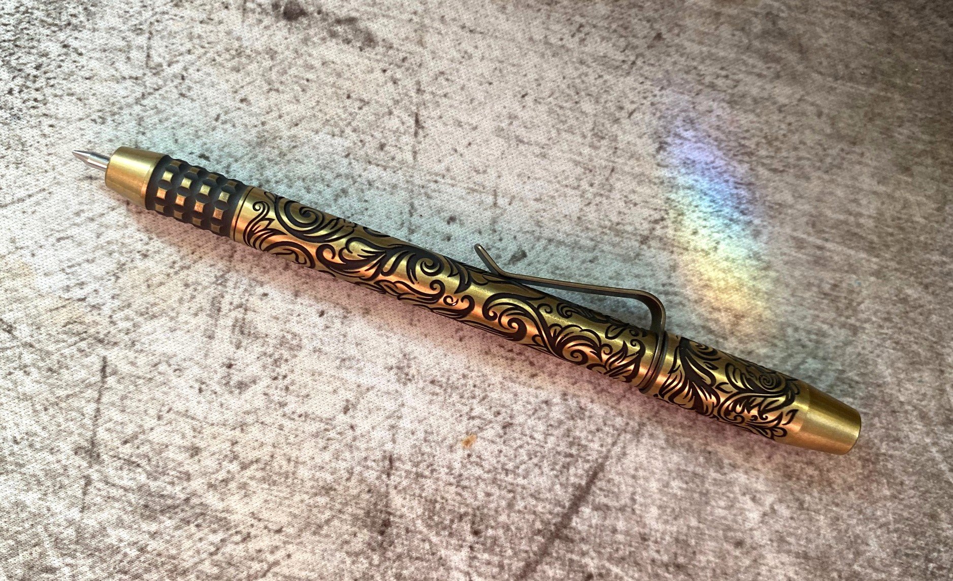
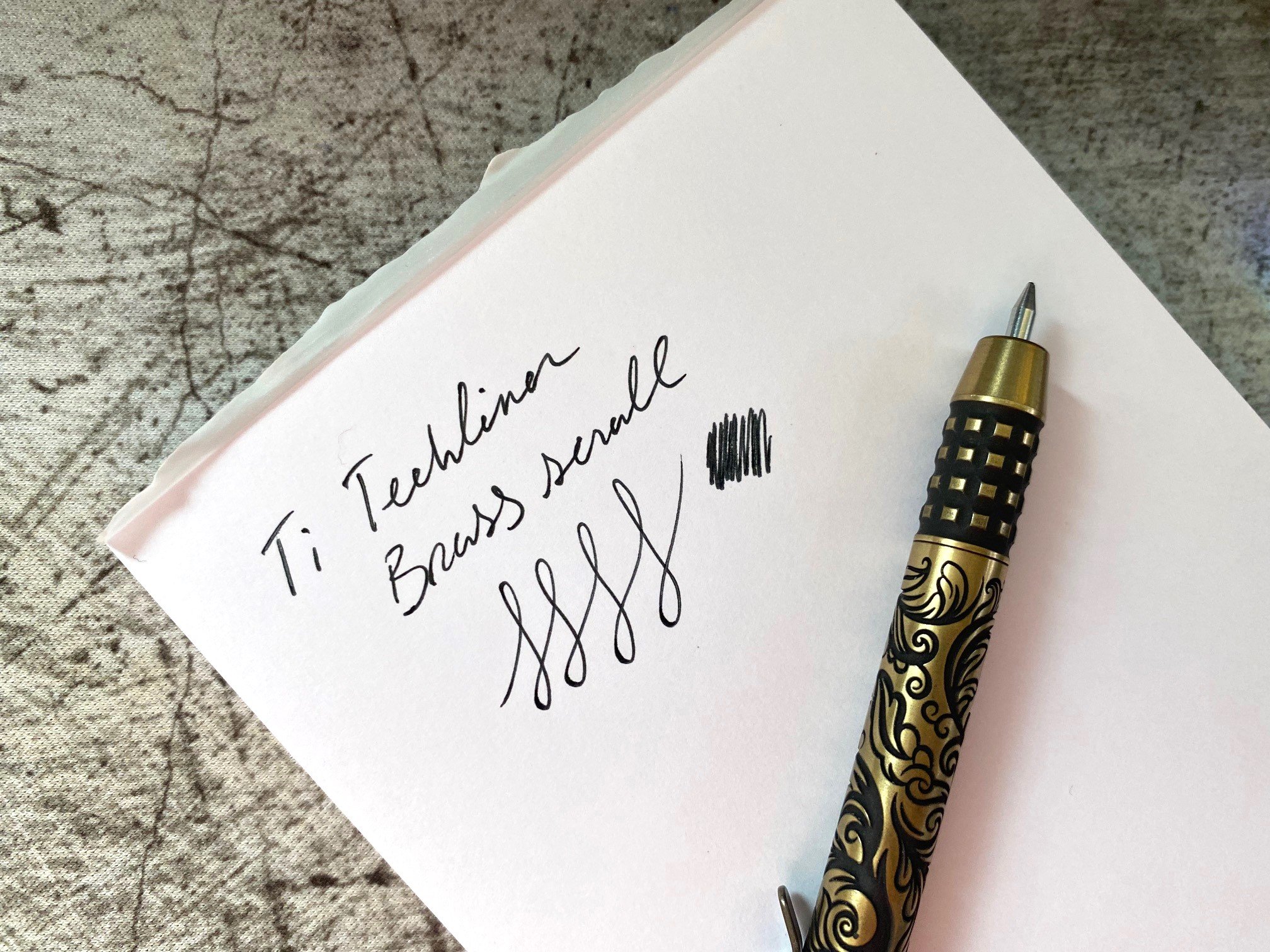
The body of the pen is covered in an engraved scroll pattern in Victorian floral designs. After the engraving, the brass was acid washed and tumbled, giving it a matte finish that looks like gold satin. The overall effect is very elegant, and with the design imposed on the industrial shape of the Ti2 body, it's all very Steampunk.

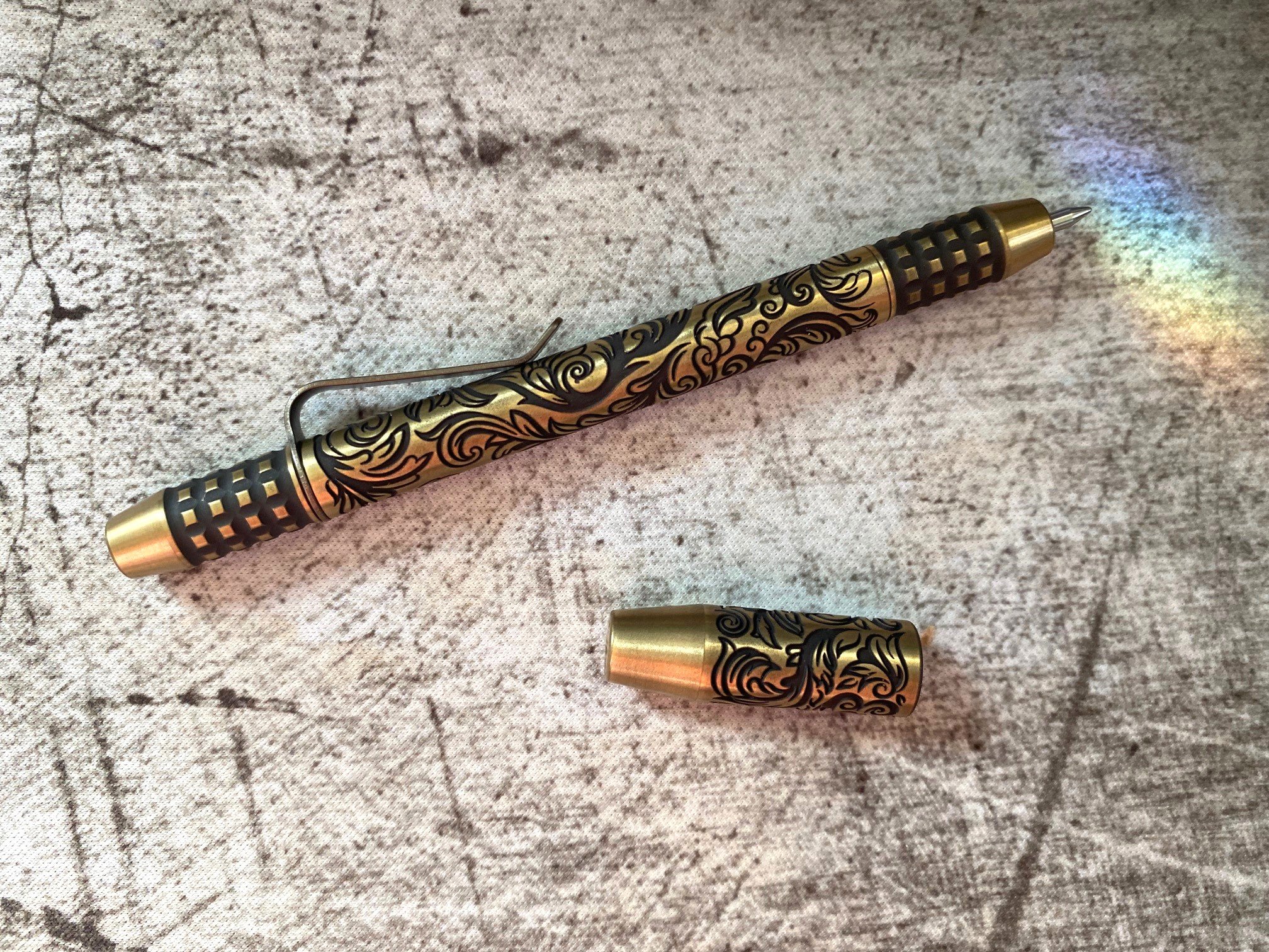
One of my favorite features of this pen model is the magnetic cap. The magnets are strong and pull the cap on with a satisfying snap. It's perfectly fidget-worthy. The back end also has a magnet, so the pen posts securely with no fear of losing the cap.

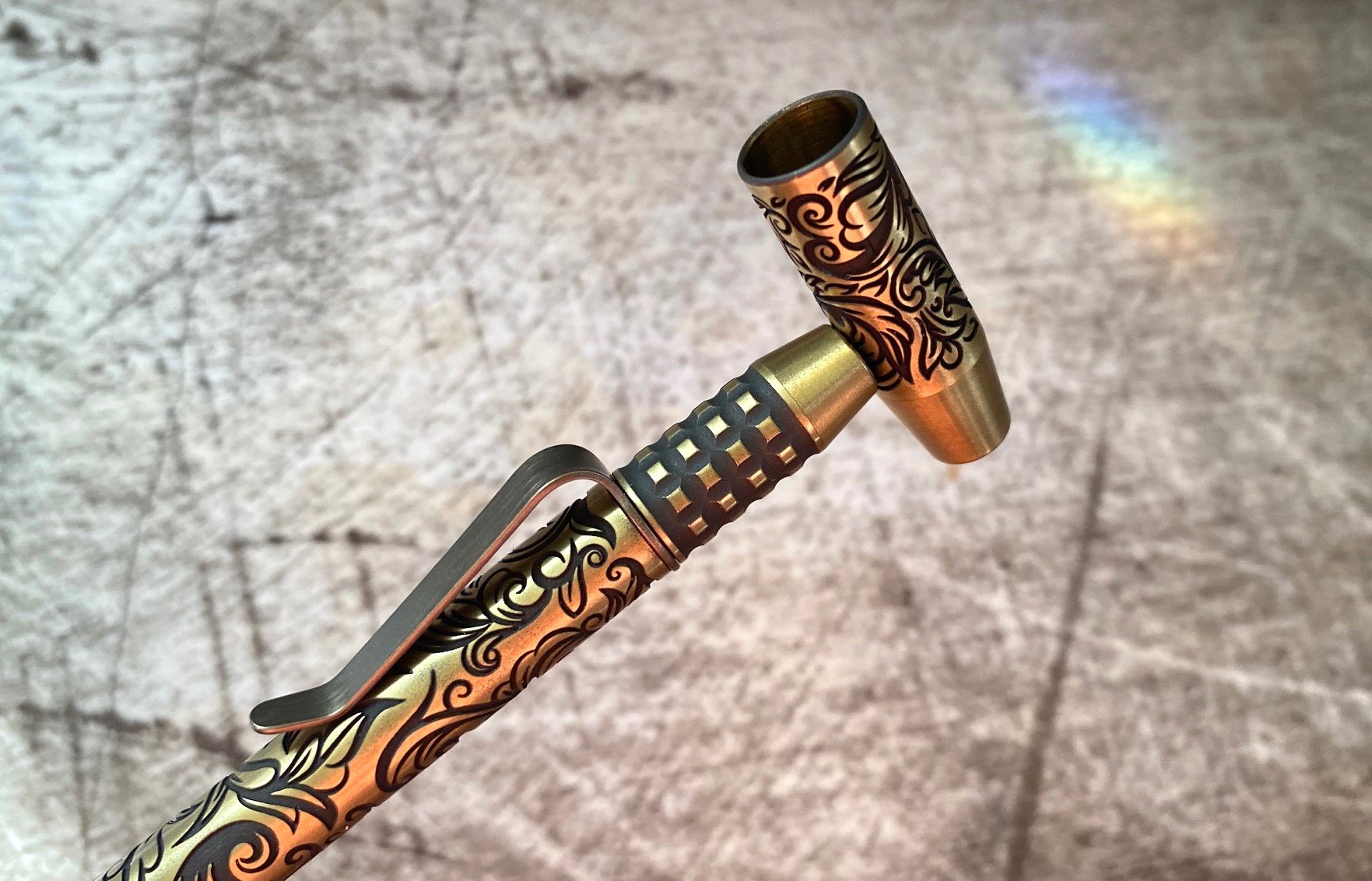
The clip is firm anodized titanium. It doesn't have much flexibility, but the swoop shape makes it easy to use. It's also removable if you prefer to go clipless. The pen disassembles for your customization convenience.

This Shorty model takes a Pilot G2 refill, or any similar style, which provides a nearly endless list of color and tip size options. It comes with an 0.7 mm black G2 refill, which is great, but I'm excited to switch it out for something snazzy. I think this pen deserves purple.

Overall, the writing experience is great, and this glam pen has caught a lot of eyes around the office. A few have been almost penabled, though the $164 price tag sent some into shock. It is a lot. Admittedly too much compared to similar pens. But this one is unique, with a lot of fancy extra-ness about it, so I'm not surprised that some of that extra rubbed off on the price tag.

Overall it's well made, writes great, and looks awesome. If you don't mind a heavier pen and like the aesthetic, it's well worth it. I feel like a 19th Century space pirate when I use it, and that's priceless.

(JetPens provided this product at no charge to The Pen Addict for review purposes.)


Enjoy reading The Pen Addict? Then consider becoming a member to receive additional weekly content, giveaways, and discounts in The Pen Addict shop. Plus, you support me and the site directly, for which I am very grateful.

Membership starts at just $5/month, with a discounted annual option available. To find out more about membership click here and join us!

Posted on May 16, 2024 and filed under Ti2 TechLiner, Pen Reviews.

Lamy AL-Star Aquatic Fountain Pen Review

(JetPens provided this product at no charge to The Pen Addict for review purposes.)

We're well into 2024 now, and Lamy have already dropped some special edition colors for the year. For the AL-Star, one of those colors is Aquatic, and it's gorgeous.

The Lamy AL-Star Aquatic fountain pen is a special edition of the aluminum line that features a couple of subtle differences (aside from the metal color) that stand out from the standard lineup. The first thing I noticed was the bright blue finial on top of the cap. This is normally black, but Lamy went with a cobalt blue to complement the blue cap and body. Additionally, the grip section of this pen is a translucent dark blue that also looks great next to the metal body.

Everything else about this pen is what you'd expect for an AL-Star. The clip and nib are both black, which I think is a good choice to pair with the bright blue body and dark section. Like other AL-Stars, the nib is interchangeable if you decide you want a change later on. Swapping out the nib is an easy process of pulling one nib out and pushing a new one on the feed assembly.

The Aquatic edition is a turquoise color that I find really appealing. The blue is really light, the green is very toned down, and there's a colder, darker gray/silver hue that also comes through to really set it apart from other teal/turquoise editions. When looking at the marketing photos online, it's easy to think that this isn't much different from the Pacific edition from a few years ago, but it's easy to see just how different they are when side by side. Where Pacific is bright, cheery, and brilliant, Aquatic is a bit more subdued and calm.

The pen came with the standard blue Lamy cartridge, and that's what I chose to ink the pen with. Something about the dark blue grip section made the standard blue ink a good choice in my mind. It started writing just a few minutes after inserting the cartridge, and the fine nib is smooth, crisp, and responsive — exactly what I'd expect from a Lamy steel nib.

If you're new to Lamy, then pay attention to the contoured grip section as it favors a more standard tripod grip position (thumb, index, and middle fingers). If you grip the pen differently, then you should consider whether or not an opinionated grip section like this will work well for you. Since Lamy pens are generally accessible and easy to find, you either already know if you like their grip design, or you haven't had a chance to try one out yet. If you're in the latter camp, this gorgeous special edition is a great one to take for a spin.

At $38, the Aquatic AL-Star is a great pen for the money (and same is true for all AL-Stars) — regardless of where you fall in the AL-Star vs Safari rivalry! The special editions are the same price as the normal AL-Star line, which I think is even more reason to go for the special colors over the standard options. The AL-Star is a great writer and ready for years of service with a little care and maintenance. The Aquatic edition is now one of my favorite colors of the AL-Star that I've seen over the past few years. If the color grabs your eye, better nab one before they're gone!

(Vanness Pens provided this product at a discount to The Pen Addict for review purposes.)


Enjoy reading The Pen Addict? Then consider becoming a member to receive additional weekly content, giveaways, and discounts in The Pen Addict shop. Plus, you support me and the site directly, for which I am very grateful.

Membership starts at just $5/month, with a discounted annual option available. To find out more about membership click here and join us!

Posted on May 8, 2024 and filed under Lamy, AL-Star, Fountain Pens, Pen Reviews.

Sailor Manyo Koke & Pro Gear Slim Summer Rain Review

(Kimberly (she/her) took the express train down the fountain pen/stationery rabbit hole and doesn't want to be rescued. She can be found on Instagram @allthehobbies because there really are many, many hobbies!.)

I needed to ink up one more pen before heading to the Chicago Pen Show this weekend so I decided to ink up the Sailor Pro Gear Slim, Summer Rain because I needed a teal blue pen in the pen binder when I realized, gulp, that I was supposed to have done a review of this pen and the ink that Brad got from Dromgoole’s at the Atlanta Pen Show … TWO YEARS AGO! Eek! Better late than never right? (Editor’s Note: Kimberly now has a meeting scheduled for Monday, post-Chicago show. -B.D.)

Sailor Koke is a part of a dual shading series that is a continuation of their Manyo line, and includes Fuji, Hinoki and Ayame. There are other Manyo inks which are also dual shaders like my favorite Nekoyanagi, Haha and others, but this series specially says “Dual shading” on the box/bottle and was released around late 2021/early 2022.

Sailor Manyo Koko and Col-o-ring swatches.

As in the past, all swatches were done on Col-O-Ring cards using a Kakimori steel dip nib, while writing samples were done with a TWSBI Go with a Medium nib and a Lamy Vista with a steel Medium nib. The TWSBI Go is a wetter writer and the Lamy is a drier writer, so these two give me a good idea of how an ink will look from different pens. This time around, I also included a writing sample from the Sailor Pro Gear Slim, Summer Rain with a Medium Fine nib. The notebook used for writing samples is from Endless Recorder with 68 gsm Tomoe River paper. Dry times may be a bit slower on 52gsm TR or faster on other papers like Rhodia, copy paper, or with drier or finer nibs, etc.

Sailor Manyo Koke is a dusty teal blue with purple shading. You don’t get much of the purple shading in drier or finer nibs, but you can see it in the larger swatches and smears.

Writing sample on 68 gsm Tomoe River Endless Notebook. You get more shading from the Vista compared to the Saiior or Kakimori, but not as much purple since it’s a drier nib.

Hello, purple! It’s definitely there on the swatch, but you’ll have to take my word that it’s there in the word “writing” too, it’s just impossible (for me) to photograph.

Chromatography of Koke shows the mostly turquoise-blue tones with just a wee hint of purple before shading to yellow.

Inks similar to Koke: Laban Poseidon Green and Diamine Blue Peppermint, both of which were a bit too green and the latter has shimmer, and both Pelikan Edelstein Aquamarine and Papier Plume Carolina in My Mind were a touch too blue.

What makes this color more unique are the purple chromashading as well as the dusty, muted nature of this ink. It was difficult finding closer matches as the inks leaned too green or blue or were too bright or saturated.

Koke dried really quickly with the Vista (less than 30 seconds) but took over a minute to dry with the TWSBI. You can see the purple that’s left over when I did the smear.

Even though this is a somewhat dry ink, it behaved well in the Lamy Vista (the driest of the three pens), the Sailor and the TWSBI Go. I liked the color the most from the TWSBI because its wet line results in the purple chromashading. I didn’t get much if any purple from either the Lamy or the Sailor, though the based color is still lovely. I can’t wait to ink it up in a Pelikan next time.

Moving onto the pen, which is the Sailor Pro Gear Slim, Sounds of Rain series, Summer Rain. It is a Pro Gear Slim that has matte textured cap and barrel with translucent colored finials and a thick gold trim band at the base of the cap. The other pens in the Sound of Rain series is Spring Rain, Autumn Drizzle, and Winter Rain.

At first glance, this seems like “yet another Sailor Pro Gear Slim” but there is one major differentiator - the nib. The easiest way to tell a Pro Gear Slim apart from a Pro Gear (aside from the slight increase in length and girth with the Pro Gear) is that the Pro Gear Slim usually sports a 14kt gold nib, while the Pro Gear has a larger 21kt gold nib. The Sailor Sounds of Rain series pens, while being Pro Gear Slim in size, have 21kt gold nibs, but they aren’t as large as the Pro Gear nibs. This isn’t the first time that Sailor has done something like that but it does make things confusing!

Sailor Pro Gear Slim Nuts, Summer Rain and Pro Gear Mojito.

I aligned the nibs, so you have to look at the bottom to see the length differences, (the first two are the same length and the third is longer.)

The nibs from the PGS Nuts and Summer Rain as the same, even though the latter has the 21kt gold nib. The 21kt gold nib on the PG is bigger (longer and wider) than the other two.

But how do they write? I unintentionally had MF nibs inked up in the two other Sailors, which made it perfect for comparison purposes. I didn’t notice much, if any, difference in line width, nor between the nibs’ stiffness nor wetness. Even the larger PG’s 21kt gold nib didn’t really feel any different from the other two. I know some people will swear that their Sailor 21kt gold nibs are softer/bouncier than their 14kt gold nibs, and I’m not feeling any difference. It’s possible that this is due to my very steep writing angle, so keep that in mind.

These inks (Montblanc, Sailor and Jacques Herbin, respectively) have different characteristics and flow, but the lines were pretty similar.

There is a significant price difference between the Summer Rain series ($450 MSRP, $360 street price) and a different PGS Limited Edition like the Manyo series ($350 MSRP, $280 street price) and that’s primarily due to the difference in nib’s gold content. As I said earlier, I couldn’t really tell the difference between the PGS Nuts’ 14kt gold nib and the Summer Rain’s 21kt gold nib, so whether the aesthetics of the pen justifies the added price tag is a very personal decision. I really like the matte texture as well and I don’t think Sailor tends to do that very often on the regular PGS lineup. But, as you probably already know, Sailor’s gonna Sailor, so it’s difficult to put any semblance of rhyme or reason to their pricing, lol.

Sailor Manyo Koke ink is available at Dromgoole’s for $24.00 for a 50 ml bottle and the Sailor Pro Gear Slim Summer Rain pen sells for $360 on their website. You can also get the Koke ink as part of a 4 - 20ml bottle set for $60.

(Disclaimer: Both the Sailor Manyo Koke ink and Sailor Pro Gear Slim Summer Rain were purchased at a discount from Dromgoole’s. The other pens, inks, Col-O-Rings and notebook are mine.)

Posted on May 3, 2024 and filed under Sailor, Fountain Pens, Ink Reviews, Pen Reviews.