Posts filed under Bung Box

Bung Box Sweet Potato Purple Ink: A Review

(Susan M. Pigott is a fountain pen collector, pen and paperholic, photographer, and professor. You can find more from Susan on her blog Scribalishess.)

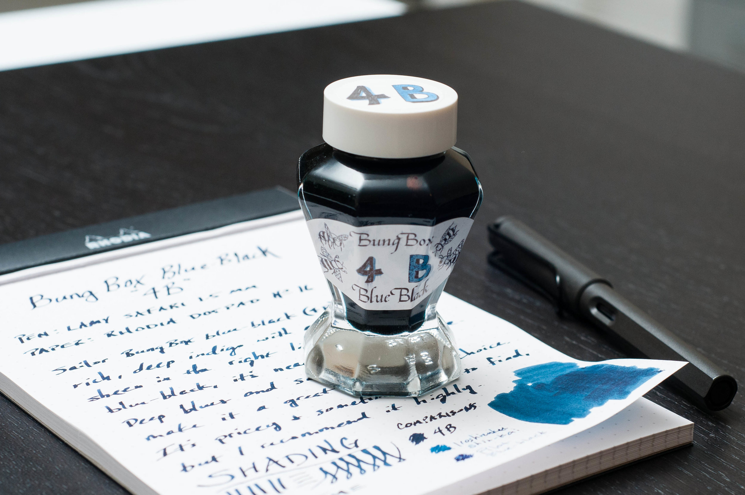
Bung Box inks, which are made by Sailor, are truly to-die-for inks. I hoard my First Love Sapphire (review here) in its gorgeous bottle for special occasions.

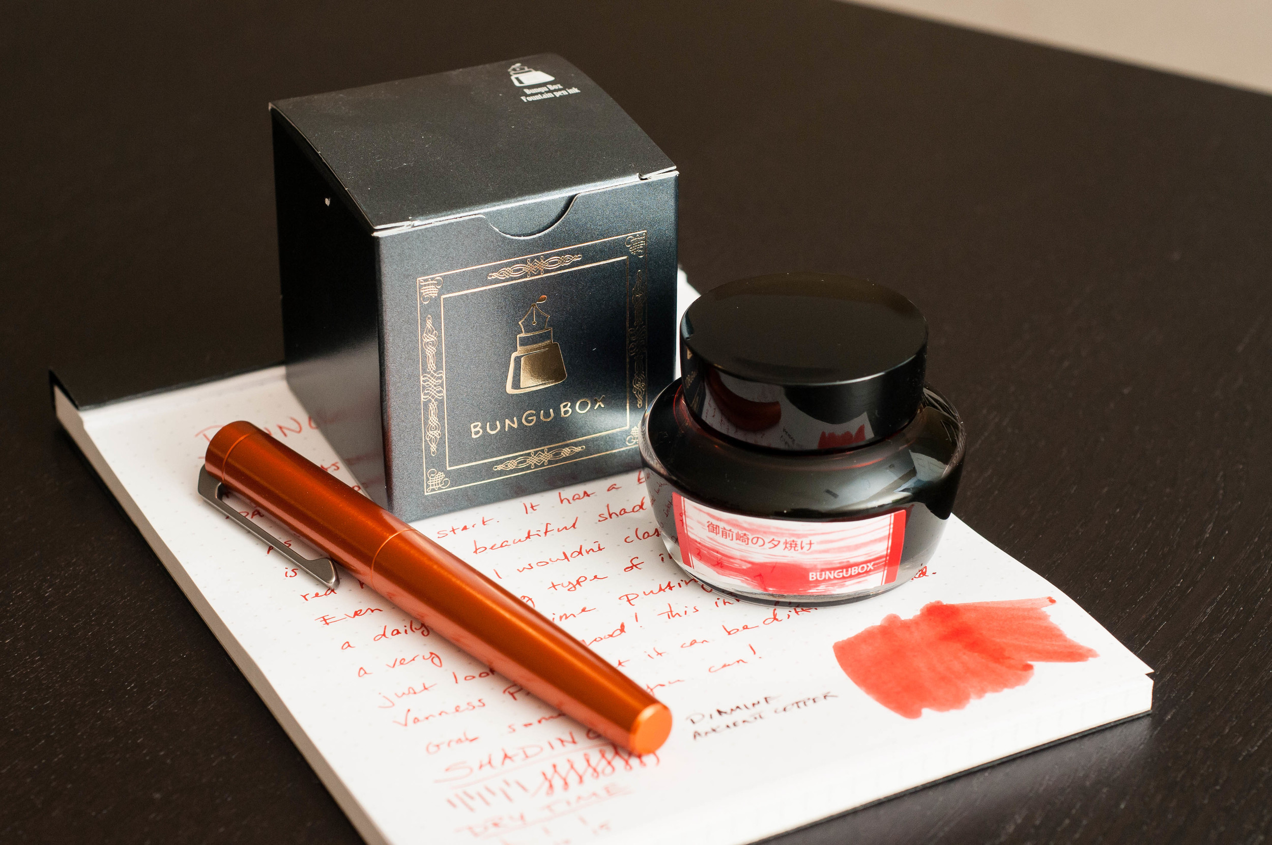
Because Bung Box inks are so expensive ($43.00 per bottle at Vanness), it’s hard to shell out the money for one of these inks, especially now that they are packaged in the boring, regular-shaped Sailor bottles.

Photo credit: Vanness

Still, I am fascinated by the Bung Box colors, with awesome names like “Clown Tears,” “Fresh Oranges of Lake Hamana,” and “Ink of the Witch.” Samples cost $5.00 for 4ml at Vanness, so I ordered 4B (which seems to be many people’s first choice for a blue-black ink; Jeff reviewed it recently) and Sweet Potato Purple.

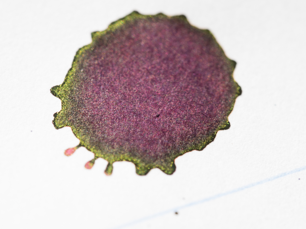
Sweet Potato Purple is a lovely, deep burgundy ink. It is one of the most interesting inks I’ve done chromatography on, with shades of pink, purple, orange and blue—so much complexity.

In my ink tests, it dried fairly quickly, so I would call it a medium-wet ink. It is not waterproof. It doesn’t exhibit much shading or sheen in my tests with a TWSBI stub nib.

But in the ink splats you can see some pretty green-gold sheen.

In wide nibs, the ink shades and sheens beautifully.

I tried to find some close matches to this ink, considering how expensive it is. The closest is Diamine Tyrian Purple which I reviewed here. But Tyrian doesn’t have the depth or complexity of Bung Box Sweet Potato. None of my other purple/burgundy inks were even close.

So, even though it hurts my pocketbook, this is one ink I’m going to have to purchase.


Enjoy reading The Pen Addict? Then consider becoming a member to receive additional weekly content, giveaways, and discounts in The Pen Addict shop. Plus, you support me and the site directly, which I am very grateful for.

Membership starts at just $5/month, with a discounted annual option available. To find out more about membership click here and join us!

Posted on January 27, 2017 and filed under Bung Box, Ink Reviews.

Bung Box Blue Black Ink Review

(Jeff Abbott is a regular contributor at The Pen Addict. You can find more from Jeff online at Draft Evolution and Twitter.)

As I experiment with more blue-black inks, it's becoming more clear that "blue-black" can mean a number of things. It doesn't always mean that the ink is just a really dark blue. Sometimes, the ink also has some green, gray, or purple hints as well. Some are darker than others, some shade well, and the list goes on. Blue-blacks are not created equal, which has made the process of trying new ones pretty exciting.

Quite a while back, I picked up a bottle of Bung Box Blue-Black, but in the bustle of moving, settling, and catching up on work, it got buried in the ink box for quite a while. Imagine my surprise when I was organizing my inks a few weeks back and discovered this little unopened gem! After that, I inked it up immediately to give a whirl in everyday writing tasks. While I wasn't very impressed at first, this ink won me over after a few days.

The color of this particular blue-black is undeniably indigo. There are no traces of purple or gray in this ink, but you can see some green in the swatch in my photos. In normal writing, I can't see any green. It's dark, rich, and blue all the way. Depending on the individual character of the pen you're using, it may be lighter or darker, but even in my "dry" pens, it's fairly dark.

There is some shading seen in this ink, but I wouldn't call it dramatic. It's subdued and classy, with just enough shading to be noticed if you're looking. Of course, the wider the nib, the more chances of tapping into the shading potential of this ink.

One surprising characteristic of this ink that I didn't notice for a while is a slight red sheen. It only comes out in certain lighting, but it's definitely there. Again, it's a subtle sheen and you have to look for it while holding the paper at a particular angle.

The writing experience is top-notch. This is a well-behaved ink that writes smoothly and is gentle on pens. The dry time is a little slow (coming in around 20 - 25 seconds in the 1.1mm stub), but does dry quicker than the test in my pictures if you're using a smaller, dryer nib. Still, it's something to consider if fast dry time is important to you (as in, this isn't a better option).

The only downsides I can see are the price and availability. It's pricey (over $40 usually) and not well-stocked, but that's generally true of all Bung Box inks. Vanness Pens is a good place to purchase this ink, and they typically have it in stock in a 50ml bottle or a 4ml sample vial.

Overall, I've been really happy with this blue-black! It's a rich, dark shade of blue, and it has subtle shading characteristics that make it stand apart from other blue-blacks. This is a high-quality choice for blue-black fans to try out at some point.


Enjoy reading The Pen Addict? Then consider becoming a member to receive additional weekly content, giveaways, and discounts in The Pen Addict shop. Plus, you support me and the site directly, which I am very grateful for.

Membership starts at just $5/month, with a discounted annual option available. To find out more about membership click here and join us!

Posted on September 14, 2016 and filed under Sailor, Bung Box, Ink Reviews.

Bungubox Sunset of Omaezaki Ink Review

(Jeff Abbott is a regular contributor at The Pen Addict. You can find more from Jeff online at Draft Evolution and Twitter.)

One of the greatest things you can ever hope to do when it comes to buying new inks is to have the opportunity to try the inks before you make your choice. Like I wrote about with my Akkerman purchase at the 2016 Atlanta Pen Show, Vanness pens provided a testing station that had a couple dozen inked pens that you could try at any time. I think I tested out every single ink they made available, but I only picked two inks to come home with me. Obviously, one of those was the Akkerman Passage Blauw. The other ink was a tad uncharacteristic for me: Bungubox Sunset of Omaezaki. It was uncharacteristic because this is a bright orange ink...something that I've never ventured into when it comes to ink colors. Short story: I'm glad I took the leap.

Omaezaki is a city located in Shizuoka Prefecture, Japan, which is at the very tip of the Omaezaki Peninsula. Being a surf town, the sunset orange seems fitting against the other blue ink that uses the same namesake. The flag of Omaezaki also features a similar orange color as the backdrop.

Now, back to the ink. As far as I understand, the Sunset of Omaezaki ink is a limited edition for this year. It really caught my attention at the testing table because it had a subtle shading effect instead of a basic highlighter-orange color. It's bright and pops off the page, but it also has character.

Being a Bungubox ink, I had no concerns about it being a poor performer in my pens, and I was correct to assume. This is a fabulous ink. The writing performance is on par with other Bungubox and Sailor inks, which is to say it's an exceptional ink. I haven't noticed any hard or skippy starts, no problems when writing, and easy clean up.

When writing with this ink, the nib is lubricated to provide a smooth writing experience. The ink isn't overly wet, but does a nice job of keeping a good level of flow in the different pens I've tried it with. My favorite characteristic of the ink is the shading. It's not a dramatic level of shading like some inks, but it's enough to catch my eye and make me smile. In the areas where ink pools up slightly, the ink takes on a darker, red-orange hue that I love. The normal color of the ink is a brighter orange tone that you can't miss.

The dry time on this ink is another huge plus. In my tests, the ink was consistently dry and resisting smudges by 10-15 seconds. That's impressive.

Another thing to note about this ink is that it does produce a smell when you're writing. It reminds me of certain art supplies or paints — nothing offensive, but just something that you notice. Most fountain pen inks are fairly odorless unless you try really hard to notice a scent. This one hits your nose while you're writing in a proper position where the pen is a good 2+ feet from your nose. It's not an unpleasant smell, but it's worth mentioning. I happen to like the smell.

The bottle is exactly like other Bungubox and Sailor ink bottles. I love the shape of these bottles more than any other (yes, even the Akkerman bottles) due to the sleek design. These bottles feature an ink well system that allows you to ink up your pens even if the ink level in the bottle is low. It's a nice feature that I wish all ink bottles included.

I'm brand new to the world of orange inks, but I think I might be in the market to try some more. I've always heard great things about Iroshizuku Fuyu-gaki, so that might be my next experiment. Either way, this Bungubox ink is a huge win for me. I'm loving this ink and find myself using it pretty heavily during the day, even though it's not a standard "business" or "work" color. It's just too pretty and exciting to let it sit all day.

Also, if you happen to own any Karas Kustoms pens with the orange anodized finish, it matches this ink perfectly.


Enjoy reading The Pen Addict? Then consider becoming a member to receive additional weekly content, giveaways, and discounts in The Pen Addict shop. Plus, you support me and the site directly, which I am very grateful for.

Membership starts at just $5/month, with a discounted annual option available. To find out more about membership click here and join us!

Posted on July 20, 2016 and filed under Bung Box, Ink Reviews.