Posts filed under Nahvalur

IKKAKU by Nahvalur Gradient Urushi Fountain Pen Review

The story of Nahvalur as a brand has been an interesting journey, to say the least. As a stationery fan, it has been fun to see them begin with what many would consider an entry level fountain pen, continue to refine that same pen model over the years, and quickly escalate into new models, materials, and designs. Slow and steady has not been their mantra, and so far, it is working out.

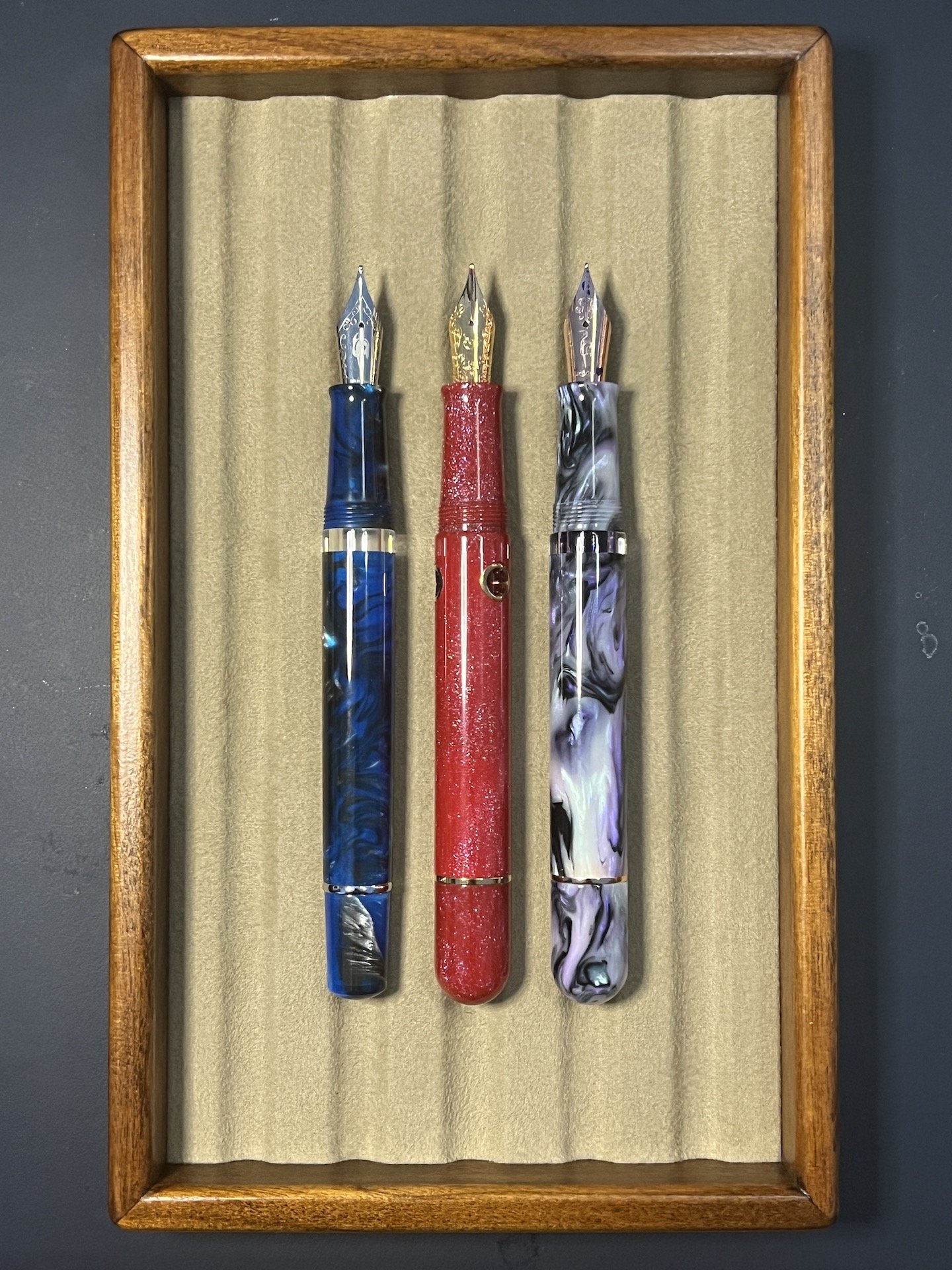
The IKKAKU series, for example, is the pinnacle of their product range. Think Namiki, as it relates to Pilot - a sub-brand of the more well-known main lineup, where all bets are off as far as creativity and craftsmanship go. IKKAKU has already seen close to ten designs released, with the latest - the three pen Gradient Urushi Collection - launching earlier this month.

Each of the Cinnabar Red, Vermillion, and Scallion Green - the model I have been loaned for this review - go through a months-long creation process. Urushi lacquer art requires the repetition of coating, sanding, polishing, and drying dozens of times to end up with the finished product. I love the light, airy feel these pens and this process brings to my own writing experience.

I chose the Scallion Green model to review for two reasons: One, while each pen has a raden gradient sprinkled down the cap, it is most noticeable in this model, and two, the transition into the black grip section was the most visually appealing of the three models. Both Cinnabar Red and Vermillion have a much harsher transition, and on a pen defined by its gradient, I think it could be better represented into the section.

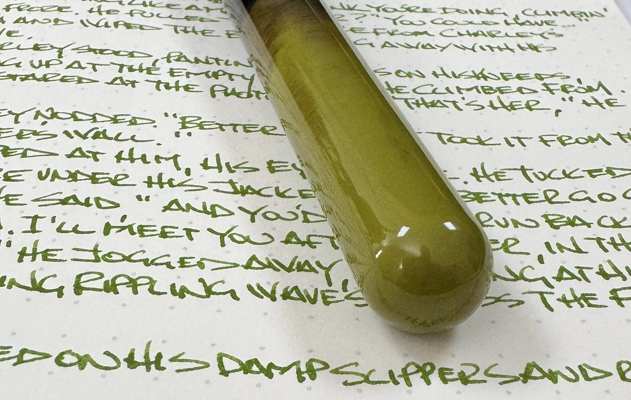
Speaking of gradients, the layering application of the urushi looks wonderful. As someone who owns a range of different urushi pens with different finish qualities, I appreciate this one as much as any. The Scallion Green color is darkest, and deepest, at the end of the barrel, and slowly gets lighter as it traverses down the barrel, ending with stray green brush strokes in black lacquer. The solid black then transitions into the aforementioned galaxy of raden, with the heaviest application near the top of the cap. All three pens follow this same pattern, with their respective colors.

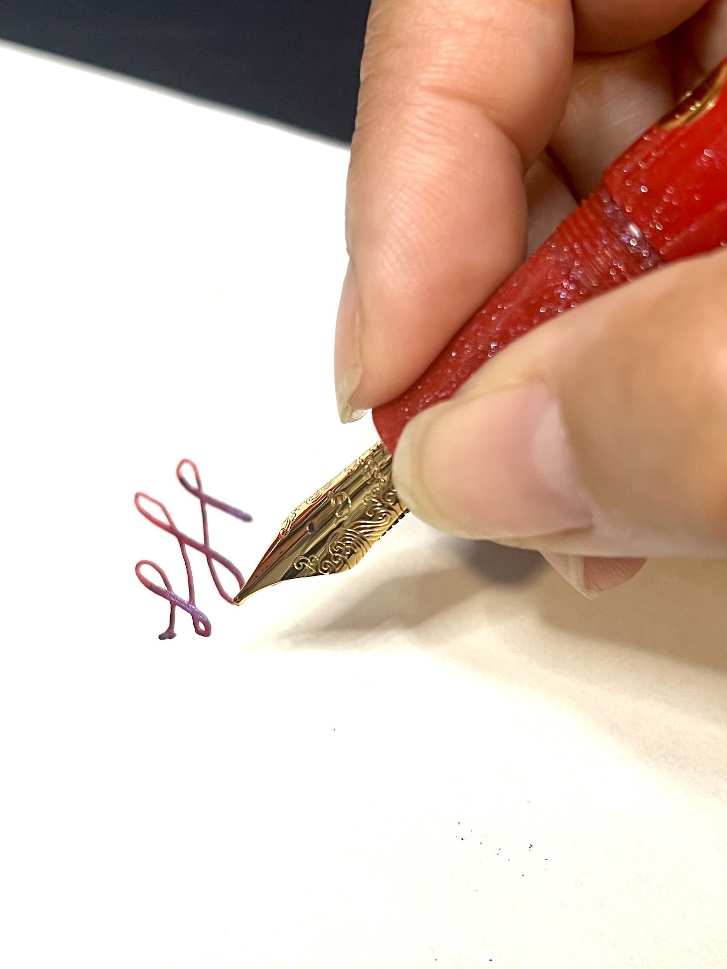
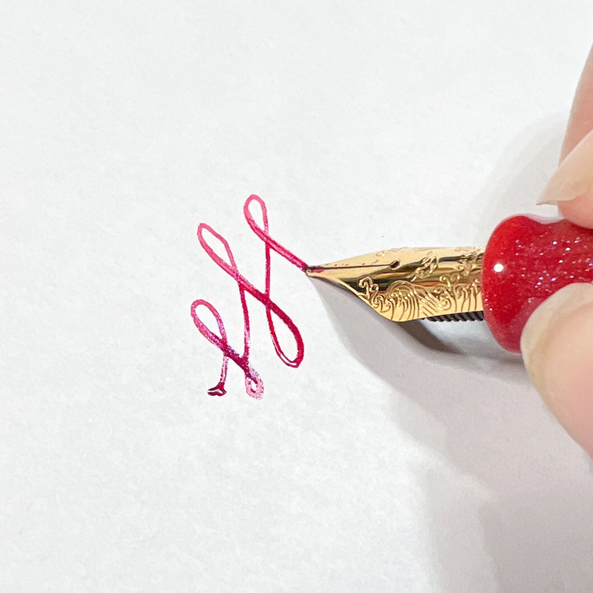
The pen is fitted with a Fine 14K gold nib, manufactured in-house by Nahvalur. Combined with the feed, I have found the flow to be excellent, and would even call it a wet writer as it is currently set up. Obviously, there are specific ink and paper characteristics to consider, so your mileage may vary. The nib is soft, with a little bounce in it, so the lines are wide for a Fine nib, at least as compared to something like a firm steel Jowo Fine nib. The line width relates closely to the German manufacturers (Faber-Castell, Lamy, Pelikan,) more than anything else. The nib was smooth and properly aligned right out of the box, and I didn’t have to adjust it at all. I have enjoyed writing with this pen from the moment I inked it up.

While you will see rare instances of urushi lacquered pens with a piston-filling mechanism, that is an outlier, so Nahvalur uses the standard international cartridge/converter filling system. All of my urushi pens use a similar setup, and work well.

The final, and possibly most important, talking point of the IKKAKU Gradient Urushi pen is the price. At $699 for any of the three models, this is an expensive pen. That said, I believe it is priced fairly for the amount of time and the level of craftsmanship required to produce pens like these.

Nakaya Piccolo, left. Nakaya Portable, right.

Pilot Custom 743, top. TWSBI ECO, bottom.

If I were to break it down even further and focus on my personal value proposition for this pen, I’d want to see two changes to better justify adding this pen to my collection. First off, the grip section needs to be lacquered to match the barrel. This goes for the model I reviewed, but even more so, the other two models. Different brands handle this differently, and there is no wrong way, but it is something I would like at this price point. Secondly, I want a more substantial, and unique, clip design. I’m not a fan of this thin style of clip Nahvalur likes to use on many of their pens, and it stands out to me even more here. If IKKAKU is your premium offering, differentiate the clip somehow.

Red stripe ebonite base.

I like what Nahvalur is doing with their brand as a whole. A company who can make quality pens at every price point will always have my attention. I look forward to the continued experimentation of not only their standard pens, but with the IKKAKU lineup as well.

(Nahvalur loaned this product to The Pen Addict for review purposes.)


Enjoy reading The Pen Addict? Then consider becoming a member to receive additional weekly content, giveaways, and discounts in The Pen Addict shop. Plus, you support me and the site directly, for which I am very grateful.

Membership starts at just $5/month, with a discounted annual option available. To find out more about membership click here and join us!

Posted on February 26, 2024 and filed under IKKAKU, Nahvalur, Fountain Pens, Pen Reviews.

Nahvalur Horizon Twilight Fountain Pen Review

(Jeff Abbott is a regular contributor at The Pen Addict. You can find more from Jeff online at Draft Evolution and Twitter.)

The Nahvalur Nautilus is a fountain pen that I really enjoy using, and it's also fun to see the different materials and colors that they experiment with. Outside of the Nautilus, I haven't tried any of the few other body styles that Nahvalur offer, but that changed recently. The Nahvalur Horizon is a more traditional shape, but it has all the magical goodness that I've come to love from my Nahvalur pens.

The Nahvalur Horizon is a line of pens that feature beautiful pearlescent materials (made by Starry Night Resins) that dance and shimmer as light changes around them. The colorway that I have is called Twilight, and it's a mixture of creamy pearl, dark and medium greens, some silvery grays, and reddish-browns. This iridescent quality is so beautiful in person and is paired with a dark gunmetal finish on this model. I'm a big fan of anything with iridescence, so I'm really loving this pen.

Like all Nahvalur designs, the Horizon's cap has a wavy bottom that carries the maritime theme. There's a small narwhal in the center of the scroll design on the cap band, but there's no other branding on this pen. The clip is a simple shape that works well with the cigar shape of the pen. And, it's really strong and has no problem attaching the pen to whatever can fit under the clip opening.

Unlike the Nautilus, this pen doesn't have the unique porthole ink windows, but it does have a traditional, large ink window that gives you a good view into how much ink is left in the reservoir. The piston filler mechanism operates smoothly and the reservoir holds plenty of ink for long writing sessions.

The grip section on the Horizon is a good size and doesn't taper, but there is a sudden diameter change next to the ink window where the body slims down to the grip. Interestingly, the threads on the grip section aren't at the top where it meets the body (which is the most common location for cap threads); instead, the threads are on the very end of the grip. This provides a really clean grip section with no threads getting dirty under your fingers while writing. And, they're at the very end of the section so that your fingers don't notice them as you're writing either — the threads serve as a boundary for letting your fingers know that you're getting close to touching the nib or feed (ink fingers ahead!).. I really like this placement, but I know that it isn't everyone's cup of tea.

The Horizon is equipped with one of Nahvalur's own #6 steel nibs that has some lovely decorative scrolling and the same dark gunmetal finish as the rest of the trim. The stub variant that I have in this pen is similar to a broad stub, and it is capable of laying down some really thick, juicy lines while also staying very thin and crisp when making left/right lines. The nib is smooth on paper and flows easily, and the lines are crisp at the edges and transition flawlessly from wide to thin widths as you move the pen. I've noticed that the ink takes one down stroke to start flowing properly, but it's smooth sailing after that. Ink flow is terrific and I've been really happy when writing with this nib.

The nib paired with the body of the Horizon is a really comfortable writing experience. It's a "full-sized" pen, meaning it's about the same size as a Lamy Safari. As such, I don't like posting the cap when writing. The cap can securely post to the back of the pen, but it messes up the balance of the pen for my grip style.

The Nahvalur Horizon is available in Twilight (seen here), Dawn, Dusk, and Aurora. Seriously, good luck choosing one from that lineup — they're all beautiful. There are also plenty of nib options from the typical EF to B, and then some of the colorways also have some extra nib options like the stub shown here and a double broad. This is a fantastic writing instrument that doubles as a piece of art. At $168, they're also a fair price for what you get.

(Pen Chalet provided this product at a discount to The Pen Addict for review purposes.)


Enjoy reading The Pen Addict? Then consider becoming a member to receive additional weekly content, giveaways, and discounts in The Pen Addict shop. Plus, you support me and the site directly, for which I am very grateful.

Membership starts at just $5/month, with a discounted annual option available. To find out more about membership click here and join us!

Posted on February 7, 2024 and filed under Nahvalur, Fountain Pens, Pen Reviews.

Nahvalur x Enigma Stationery "Brilliant Bunny" Nautilus Fountain Pen Review

(Kimberly (she/her) took the express train down the fountain pen/stationery rabbit hole and doesn't want to be rescued. She can be found on Instagram @allthehobbies because there really are many, many hobbies!.)

I have been a fan of the Nahvalur pens for a couple years now - I could have sworn I’ve written more reviews than the recent review about their Galen exclusive - so when the opportunity came up to review one with a gold nib, I said sign me up, even if it’s red! Little did I realize, it was a special Nahvalur Nautilus pen, created for Enigma Stationery, named Brilliant Bunny.

The Nahvalur Nautilus Brilliant Bunny was released earlier this year by Enigma Stationery in honor of the Year of the Rabbit which started on January 22, 2023 and goes to February 9, 2024 (at which point the Year of the Dragon begins). Only 50 pens were made for this edition.

Following the Nautilus’ nautical theme, this submarine-shaped pen sports 3 circular “portholes”, which function as ink windows and remain visible when capped. The Nautilus has a yellow gold-colored clip and cap band with the same wave pattern and logo as similarly-sized Nahvalur models (I compared it to another Nautilus as well as a Voyage). The pen does not post. For this exclusive, the Brilliant Bunny was made from a bright red resin mixed with “teal, blue and purple sparkle” and comes with a yellow gold-colored 14kt gold nib in Medium with the Nahvalur logo.

I like the design of the 14kt gold nib more than the steel version. You can also see how this yellow gold nib compares to their rose gold.

The Nautilus next to the Schuylkill (left) and Voyage Tromso (right.)

They are quite similar once uncapped, though the Schuylkill is a touch less girthy than the other two.

Since I had a good experience inking up other Nahvalurs with shimmer ink, I went for a matchy matchy red shimmer ink and picked Wearingeul Dracula. I had no problem with either the ink flow or seeing shimmer on the page, even when I didn’t use the pen for a few weeks (I deliberately set aside review pens for days and weeks at a time to test both evaporation and flow). As with all shimmer inks, to prevent clogging, periodically tilt the pen up and down so that the shimmer particles don’t all settle into the nib/feed.

The sparkles are subtle, which makes it difficult to photograph, but much easier to see in person, and pairs perfectly with Wearingeul Dracula.

The Nautilus feels balanced and comfortable in hand. It has a short, smooth step from the cap edge and threads, and tapers towards the nib where it flares to prevent your fingers from sliding forward.

I hold my pens pretty close to the nib, but neither the threads nor step felt intrusive when holding the pen further back.

The pen worked flawlessly each time, producing a nice, wet line. The nib is nice and smooth and softer than its steel counterpart. I could get a wee bit of line variation if I tried to “bounce” the pressure while writing, but I don’t recommend flexing the nib, but I did a little, for science :-) The softness of the 14 kt gold medium means that the line is a tad bit broader than the steel medium.

Writing sample on 68 gsm Tomoe River in an Endless Recorder.

Comparison of the Nautilus with the 14kt gold medium, steel medium as well as Platinum 3776 14kt gold medium, TWSBI Eco Steel Medium Architect and Sailor Pro Gear Slim 14kt gold medium.

Getting this bit of line variation made me nervous. I had to use more than my usual pressure (which, according to Pilot’s handwriting analysis, is fairly light). I don’t recommend pushing it further than this.

I’ve had this pen inked up for over 2 months and used it about a dozen times. Like other Nahvalur pens, cleaning the pen is pretty easy: you can either use the piston to get water in/out of the barrel or you can unscrew the nib unit and syringe clean it. Just be careful not to blast it too hard or you may get water behind the piston. If that happens, you can also disassemble the pen with a Nahvalur wrench (I don’t believe it was included with this pen since the Bossman literally handed me the pen by itself at one of the shows, lol).

L to R: Leonardo Momento Zero, Leonardo Momento Zero Grande, Nahvalur Brilliant Bunny, Pelikan M800, Visconti Homo Sapiens.

Pros:

  • Lovely bright red pen with gorgeous shimmer
  • Piston-filler
  • 14kt gold nib is smooth and wrote well
  • Very comfortable in hand

Neutral:

  • Nib writes slightly broader than steel medium
  • Slightly girthy pen
  • Pen does not post (I didn’t take posted comparison pictures for this reason)

Cons:

  • Only nib option is 14kt Gold Medium - I understand having just the 14kt gold option, but it would have been nice if it was also available in Fine.
  • Price point? - I struggled with whether this was a Con or a Neutral, as there are plenty of gold nib piston pens that cost more than this pen (like Pelikan M6xx and M8xx), but also some that cost less (like the Pilot Custom Heritage 92). But there aren’t many in this price range that are made from a custom resin either.

I knew that I’d enjoy this pen (as I already have a Nautilus which I liked) but was pleasantly surprised by the smoothness and wetness of the 14kt gold nib. As of this writing, it is still available on the Enigma Stationery website for $295 USD.

(Disclaimer: Thank you to Dan of Enigma Stationery for sending us this pen for review. All other items in this article are my own.)

Posted on August 18, 2023 and filed under Enigma Stationery, Nahvalur, Fountain Pens, Pen Reviews.