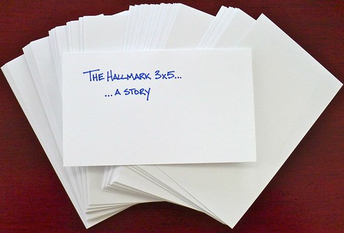
I have followed Aaron Mahnke for a while now, either directly via his Twitter feed, through his Read & Trust network, and even through his design work and various blogs. He is quite prolific - and I didn’t even mention that he writes fantasy novels! That would be enough to keep a normal person busy for years, but not Aaron. His latest project - the Helvetindex Card - has recently launched, and Aaron was kind enough to send me a pack to review.
If you have been around these pages for any length of time, you know I am a fan of the index card. I find them useful for a wide variety of tasks - notes, to do lists, brainstorming, mind mapping - just about any task you can throw at them. Best of all, they are highly portable. Throw them in your pocket, toss them in a bag, rock a Hipster PDA, and you are good to go! So, how do the Helvetindex Cards stack up?
The first thing that grabs you is the design. I love the layout, especially the room allocated for headers and footers. Regardless of the paper I write on, I always have a header of some type - either the date or topic - so I love this aspect of the card. The writing space has a white background with tiny plus signs in a grid pattern, very similar to any dot grid pad you have used. They are unobtrusive, but still provide a guideline or framework if you need them.
The paper stock is 3” x 5” premium 100 lb. uncoated cover stock, but to me, the cards look and feel like they have a coating on it of some type. This caused some inks not to work very well with the Helvetindex Cards, while some did just fine.
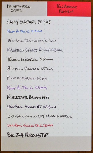
Unsurprisingly, fountain pen ink performed poorly. The card stock essentially rejected the ink, giving it a washed out look and taking forever to dry. You can see the Lamy Safari and Kaweco Roller (which uses fountain pen ink cartridges) writing samples on the card above.
The ink type that caught me off guard though were the hybrid ballpoint inks, and not just one of them. Every single one I tested looked like I was laying down the yellow dashed line down the middle of a freshly paved road. I couldn’t figure it out for the life of me. Take the Uni-Ball Jetstream 0.5mm for example. I made sure the pens were primed before writing on the card, and even tried multiple cartridges out, but they still did poorly. I could write the same text on any other scrap paper and it worked fine, but then I would go back to the Helvetindex Card and it would skip. Similar pens like the Pentel Vicuna and the Pilot Acroball performed the exact same way.
The saving grace for me is that gel ink works just fine, especially since that is my ink of choice. There was no skipping, and the drying time was reasonable. The colored gel inks remained bright as well. I was worried that the large tipped liquid ink pens like the Bic Z4 would be a problem too, but there were no issues to speak of there.
Despite the various ink issues I had, I still love these cards. The design and layout is perfect for me - I just have to pay attention to which pen I am using.


