Posts filed under Fountain Pens

Pilot Kakuno Fountain Pen Review

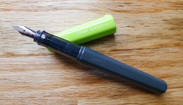
Pilot Kakuno

What is the best fountain pen for beginners?

I get this question all the time. My stock answers are the Lamy Safari and the Pilot Metropolitan but of course the real answer is "it depends."

The Pilot Kakuno will be joining - and maybe even replacing - the pens mentioned above as one of my favorite fountain pens for beginners.

Instagram has been a great resource to see what pens are hitting the Japanese market before makng their way to the US market, and pictures of the Kakuno have been popping up in my feed for months. I was in love with the simplicity of this pen before even getting my hands on it, and now that it is here I love it even more.

Let's be clear about one thing up front: The Kakuno is marketed towards school children in an effort to learn how to hold the pen properly and help improve their penmanship. Lamy did the same thing in the ABC fountain pen with their now commonplace grip design.

Pilot Kakuno

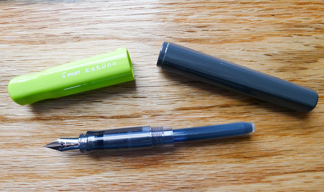
Marketing aside, this pen is for anyone who can appreciate great design and excellent performance. The plastic barrel and cap feature a hexagonal shape to keep the pen from rolling off the desk, with an added bump on the cap if the pen starts to get away from you. There is also a groove in the cap to help with removal.

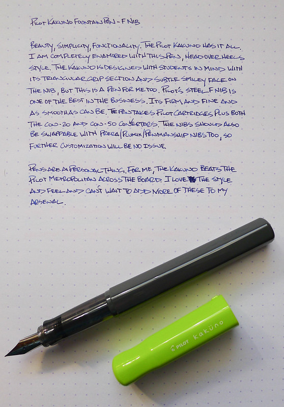
The nib is standard Pilot quality. For those not playing the home game, standard Pilot quality is code for awesome. The F nib in my pen performs identically to other Pilot nibs found in the Prera and the like. It's fine, firm, and consistent. I'm assuming it is also swappable with other sizes (like the EF in the Pilot Penmanship or italic in the Plumix) but I haven't tried yet. I'm having too much fun writing with it as-is!

Pilot Kakuno

If there is any "gotcha" with this pen it is that there is a smiley face on the nib. It is there so kids know when they see the face they are holding the nib in the right direction. I thought it might detract from my use of the Kakuno but it is barely noticeable from a normal writing distance. Besides, what is more fun than a smiley face nib?

I see the Kakuno becoming a staple in Pilot's lineup, even moreso than the Metropolitan. The barrel is a blank slate, calling out for a huge range of colors and designs, and likely even some Japanese marketing tie-ins which are popular. Pilot could take this anywhere, especially with such a strong price point and the ability to use Pilot's ink converters.

For me, I'm taking it everywhere. It is highly portable, fun to look at, comfortable to hold, great to write with and downright cool. There is no doubt I will be adding more to my collection.

Pilot Kakuno

(JetPens is an advertiser on The Pen Addict and I received this product at no charge.)

Posted on December 19, 2013 and filed under Fountain Pens, Pilot, Pen Reviews, Kakuno.

Esterbrook J Fountain Pen Review

Esterbrook Capped.jpg

(This is a guest post by Garrett Kubat. You can find more from Garrett on Twitter @gazkubat.)

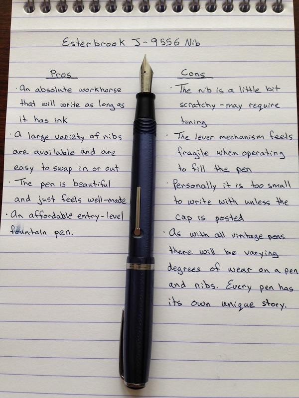
The Esterbrook J is my first vintage fountain pen. Of the pens that I own it is one of the most consistent workhorses that I can rely on to write. It writes when I need it to and only stops when the nib leaves the paper. The reliability is a huge plus in this vintage fountain pen. Reliability means that it can go from a novelty item to something that can be used every day. My estimates put this particular fountain pen to have been manufactured around 1948. I came to this conclusion by the fact the pen and lid both have the black plastic "jewels" on the ends. If someone more knowledgeable than I has a more accurate estimate I would be glad to hear it.

I purchased the pen from Brian and Lisa Anderson on their wonderful website for $60.00. They had others for sale that were cheaper, and I had read that eBay regularly sold them for even around half the price, but I was smitten by the blue colour and how I knew it would be a functional pen. Pens are beautiful, but I would rather have an ugly pen that wrote than a gorgeous one that didn't. That being said I was able to have the best of both worlds with this pen. This particular pen seems to be in a near flawless condition with no worn spots or scratches.

Esterbrook Clip.jpg

I would credit Brian and Lisa with the exceptional restoration I assume this pen received, but the state of the pen also speaks to how well these pens were made. They were made to be an affordable pen that used cheap but durable materials and were solidly crafted. It feels durable and write consistently, just like another amazing pen: The Lamy Safari. There are obvious differences but the two greatest similarities are they are long-lasting and reliable.

One element that makes this pen unique amongst the pens I own is the filling mechanism. Within the pen is an internal sack that can be depressed by the lever on the barrel of the pen. When the sack is depressed and the nib placed in ink all you do is push the lever back flush with the pen and allow the ink to flow into the pen. The ink capacity is not up there with say a TWSBI but it holds enough that I am not worried about running out of ink if I take the pen with me for the day.

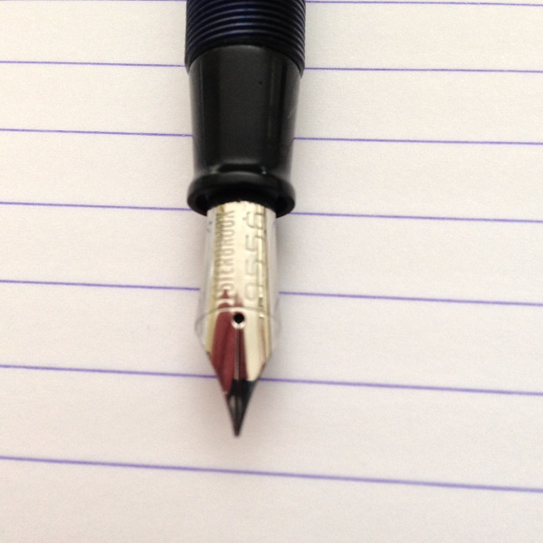
Esterbrook 9556 Nib.jpg

This is an excellent choice to begin the vintage fountain pen journey with. The pens come in a variety of colours as well as other models like the LJ (Full length but slimmer than the J) and the SJ (shorter and thinner than the J). They can be found at a relatively affordable price and the large amount of nibs available makes these extremely versatile. An extensive list is available on Esterbrook.net, which is managed by the aforementioned Brian Anderson. I only have the 9556 (Fine Writing) and the 9555 (Gregg Shorthand) but I would love to get my hands on a stub nib.

This is my only vintage fountain pen so I can't compare it to others but I would say it stacks up well to a Lamy Safari, it was made to last and (most importantly) write.

Esterbrook ProsCons.jpg
Esterbrook Writing Sample.jpg
Posted on December 16, 2013 and filed under Esterbrook, Fountain Pens, Pen Reviews.

Monteverde Artista Crystal Fountain Pen Review

Monteverde Artista 1.jpg

Let me tell you about the second fountain pen I bought -- The Monteverde Artista Crystal -- with a transparent body. First off, I didn't really know a Lamy from a Pilot. I was just interested in all the pens. My personal taste hadn't developed yet, and I was open to anything new that crossed my path. The Monteverde did just that one day on JetPens when I was browsing. It had been a rough week, so I made an impulse decision to reward myself. You do that too, right?

My first impressions of the pen were very positive. It came in a nice box and wrote like a dream instantly. I've had the pen for over a year now, and it still surprises me by how pleasant it is to use.

The appearance of the pen isn't very special when you see pictures of it online. It's much more striking in person. It's smaller than you might guess -- The same length as a Retro 51 when it's capped. Because of the size, I typically write with this pen posted. That seems to give it the perfect weight for my hand. The chrome accents set the pen off and make it look more professional than other demonstrators in the price range.

Monteverde Artista 3.jpg

One of the things I noticed right from the start was the transparent feed. All of the other fountain pens I use have black or dark colored feeds. I was delighted to see the feed change colors as the ink absorbed into the feed along the tiny channels.

The nib is one of my favorites that I own. Keep in mind, I have a limited collection, and I'm sure there are much better nibs out there, but I really enjoy this nib. Writing is smooth, flow is consistent, and line width variation is subtle. When using a blue or lighter ink like Kon-Peki, you can see how the nib behaves with different strokes.

My only complaint is that sometimes the flow seems to dry up and the only way to fix it is to twist the converter a bit to force the ink into the feed. I'm not sure if this is a fault in the converter or the feed because I've never used any cartridges with this pen. It's a minor problem, and it hasn't bothered me enough to do any more research or troubleshooting.

Monteverde Artista 4.jpg

Because of the chrome accents, the part of the pen that I grip (the part closest to the nib) has a nice weight to it. Plastic pens are usually very light, but this pen has good weight in the right place. The chrome accent on the converter is also a nice touch, since it's a demonstrator body.

Cleaning this pen is extremely easy because it completely disassembles. The nib unit unscrews from the body, and then the feed unit separates from the nib. The converter also disassembles completely, which makes cleaning and drying much quicker.

Monteverde Artista 2.jpg

To sum it all up, this is a good pen. Now that I own more fountain pens, I don't know that I would buy one of these after just seeing a picture online. But I think I'd be missing out if that were the case. A major con for me was that only one nib size is available (medium). I don't mind so much now -- it's part of the pen's personality. The only other con is the price, but I think the sub-$40 range of this pen is fair for the quality of materials and the experience.

The Monteverde Artista Crystal is available on JetPens in four colors, but I think transparent is the right choice.

Monteverde Artista 5.jpg
Posted on December 13, 2013 and filed under Fountain Pens, Monteverde, Pen Reviews.