Posts filed under Pen Reviews

Guest Review: Cult Pens Mini Fountain Pen

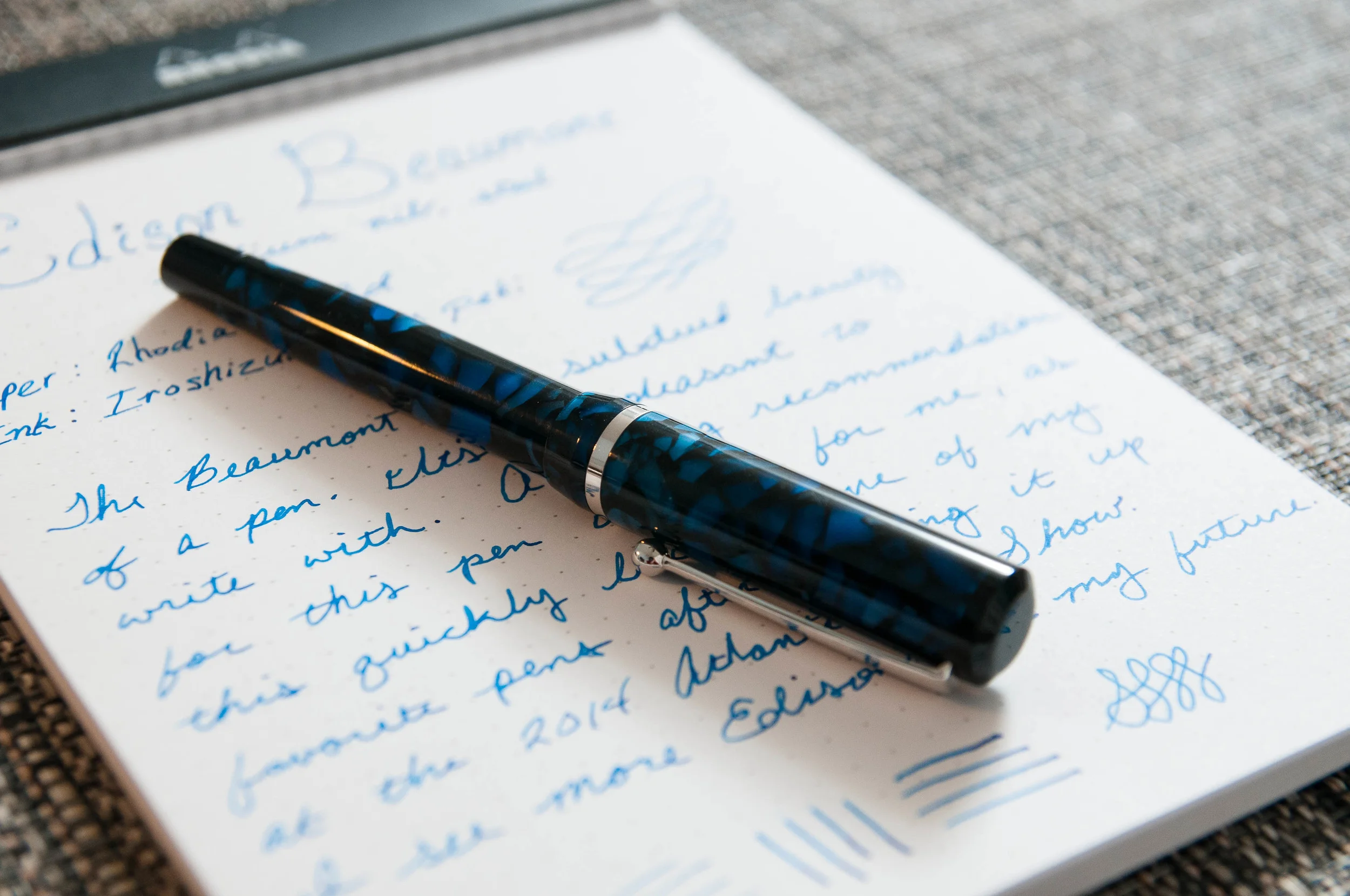
(This is a guest post by Ron Gilmour, one of the lucky winners of the Pen Addict 100 giveaway. Thanks for doing this Ron!)

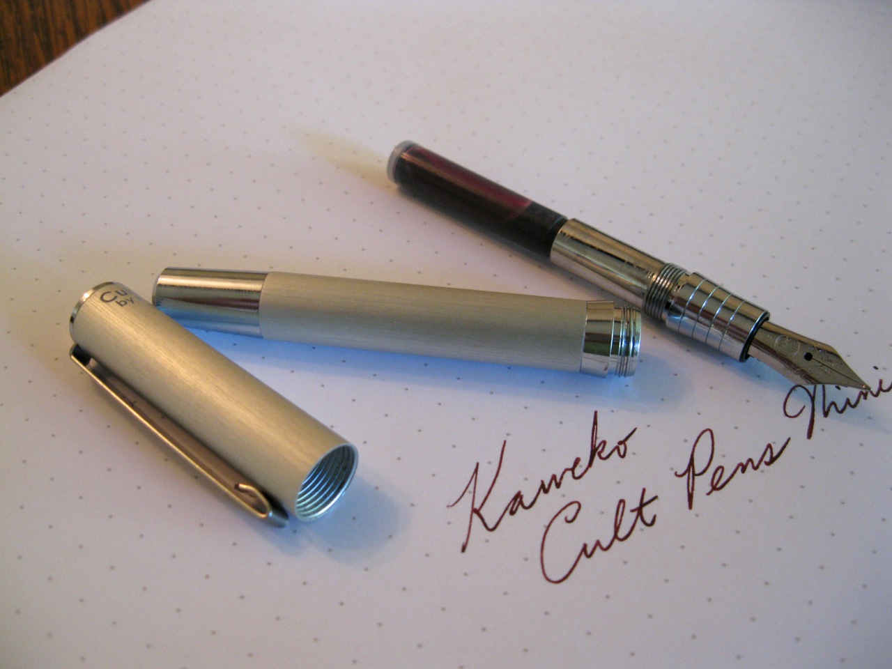
Several weeks ago (in April 2014), the Pen Addict Podcast celebrated its one-hundredth episode with some excellent giveaways. I was lucky enough to win one of the prize packages. The centerpiece of my package was a Cult Pens Mini fountain pen, made for the UK retailer Cult Pens by Kaweco.

Appearance & Design

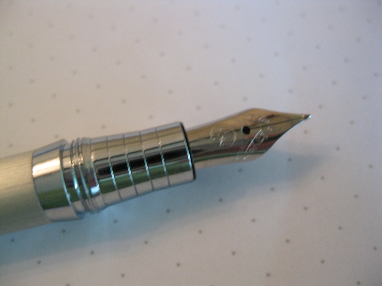
This is a very attractive pen, at least if you’re into the German industrial look. Worshipers of the Lamy 2000 will love this. The body is made of anodized aluminum (or should I say “aluminium”?) with a brushed finish. This is not only attractive, but has a nice satiny feel in the hand. The center band, finial, blind-end, and grip section are all shiny, nickel/chromium-plated brass. The contrast between the brushed body and the shiny trim gives the pen a lot of visual interest.

The clip is flat and plain with a nice curved-under end to prevent snags when being pushed over the edge of a pocket.

The center band flares out from the body width (9.5 mm) to the width of the cap (10.5 mm). Seeing the pen closed, you might think that the band was part of the cap. The grip section is smooth, with four latitudinal grooves, presumably to make the section easier to grip. Smooth metal sections are among my least favorite pen features, so I was glad to see Kaweco think of this. As it turns out, I find it more comfortable to hold this pen above the grip section, with my fingers resting on the raised center band, so the section grooves are a moot point.

Fun design fact: the length of the brushed aluminum part of the cap is exactly equal to that of the brushed aluminum part of the body. This makes for a pleasant symmetry. Also, when you post the pen, a bit of the shiny blind-cap is still visible, forming a shiny boundary between the two brushed sections, so this symmetry is still there to entertain you when the pen is posted.

The pen is branded “Cult Pens / by Kaweco” at the top of the cap, opposite the clip, in an appropriate sans-serif typeface.

Construction and Quality

The pen feels every bit as solid as the Bauhaus aesthetic makes it look. Everything fits together perfectly. Perfectly machined threads and solid posting.

Weight & Dimensions

This is a true mini pen: seriously teensy weensy. Capped, it’s 105 mm (4.1 inches). Posted (and you will want to post it), it’s 123 mm (4.8 inches). Posted, the pen is shorter and slimmer than a Kaweco Sport. Since this is by far the smallest pen in my collection, I can’t really point to any similar-sized pens. This size range, I think, was more common among the “purse pens” of the 30s and 40s than it is among current market offerings.

Nib & Performance

The pen came with a fine steel nib. I’d say it’s on the finer side of fine for a western nib, certainly finer than a Pelikan fine. (Which is just about perfect for my taste!)

The pen wrote beautifully out of the box, with a consistent line of medium wetness. No tweaking required.

Filling System

This pen takes short international cartridges. Kaweco makes a converter that is available separately (the same converter used for the Sport and associated models). I don’t have one of these, so can’t comment on how it works. I do have a syringe, so I’ll probably just keep re-filling cartridges.

(Aside: The prize package also included a pack of Diamine Deep Dark Red cartridges. This is a gorgeous, dark-red-going-on-brown ink that is exclusive to Cult Pens. If you find yourself ordering the pen, you may as well get some uniquely English ink while you’re at it.)

Cost & Value

At £29.95 (about $50 US), I’d say this pen is a very good deal. It’s a solid, easy-to-carry mini pen that feel like it will last forever. The bad news for those of you not in the UK is that you’ll pay another £10 for delivery, but that’s per order, so you can treat that as a shopportunity and stock up on other stuff.

Many thanks to the Pen Addict and Cult Pens for gifting me this great pen!

Posted on June 16, 2014 and filed under Kaweco, Fountain Pens, Pen Reviews.

Edison Beaumont Review

The Edison Beaumont was my final purchase at the 2014 Atlanta Pen Show, and it was completely unplanned. I thought I had finished my shopping for the day, but I kept coming back to the Anderson Pens booth and getting caught by the blue flakes that make up this pen. When I finally decided to pick it up, that's when my decision was made. Unscrewing and posting the cap and then holding the pen in the writing position was all it took. After a brief test, it was mine – my very first Edison pen.

Let's just say it won't be my last, either.

Aesthetics

The Beaumont is a bit unassuming. It's not flashy or ornamental. It's pretty, but in a subdued sense. I think that's even more true for the model I bought – the Sapphire Flake. The dark blues tend to go unnoticed unless under bright light. When it has the appropriate light, it's gorgeous. That being said, I think the other three colors might get more attention due to their lighter palette.

The reason I bring that up is that this pen is a true workhorse. It's built to write, but I'll talk about that a bit later.

There's a combination of medium to dark blues on a background of black. The saturation of the blue is fantastic, and there's a sparkly quality to the resin that's hard to describe. Let's just say, it's nice to look at. Apart from the body and cap, the Beaumont has silver accents and a nice #6 nib with the Edison logo on it. The black grip has a great convex shape that makes writing very comfortable for me.

The pen is made of resin, so there's a slight smell sometimes, although it's somewhat faded since I first bought it. Now I only smell the resin when I unscrew the section to refill the converter with ink.

The build quality of the pen is outstanding. The tolerances are tight and it feels like a very high-quality instrument. On top of all that, it remains light, making it a great pen for long writing sessions.

It's pretty, it's comfortable, and it writes like a dream. I can't really think of any other way to put it.

Size-wise, I'd say it's a medium size. It's not full size, but it also isn't a pocket pen. The clip is just the way I like it – springy, but not so tight that it's difficult to clip onto things. That's been a real problem for a few of the recent pens I've acquired – they almost require two hands to clip them to a pen case pocket or a shirt pocket. The Beaumont is just right. Easy to clip, but also secure.

Writing

From day one, I haven't had a single complaint about how this pen writes. It's smooth, has great ink flow, and never has any starting, stopping, or skipping issues. Perfect. From what I understand, Brian Gray inspects and tunes each pen before it leaves his shop, so that's probably why it writes so beautifully.

If left sitting for a while, the feed tends to become overly saturated, which means there's more ink being put down on the page for a few sentences. It's a minor complaint, but if anyone knows how to adjust it, I'd like to know.

Being a steel nib, there isn't much flex to be had, but it's also very consistent in the line it does put down. I opted for a medium nib, which is great, but I think I'll go for an italic next time to get more character out of the ink. That's another great thing about this pen – the nib is swappable.

Like I said earlier, this pen is so enjoyable to write with. It's light, perfectly balanced for my hand, and the nib never causes any issues. The pen completely gets out of my way and I'm left to focus on the words and the page. Until using this pen, I never realized how much I crave that quality in a pen. In many cases, a pen has quirks that are forgivable but cause distractions while writing. I hope the pen has the same perfect balance for most hands, because it's absolutely fantastic.

It makes writing pleasant and effortless.

Conclusion

The Edison Beaumont is a great pen that I can't recommend enough. If you're like me, it might not look like much until you pick one up and try it out. It gets out of the way while writing, and looks great when not in use. That's pretty much exactly what I want in a pen.

I've always been fascinated by the process of creating the Edison pen barrels and caps, and I can't wait to add more Edisons to my collection. Part of the reason the process is so fascinating is that no two pens are the same. They are all unique.

If you're in the market for a great pen, you can find them at Anderson and Goulet with steel and 18k gold nibs. The steel versions run around $150, while the gold versions run around $275.

I can't recommend these pens enough. The Beaumont is definitely in my top 3!

(You can find more from Jeff online at Draft Evolution, Twitter, and App.net.)

Posted on June 11, 2014 and filed under Edison, Fountain Pens, Pen Reviews.

Craft Design Technology Chrome Ball Point Pen Review

Craft Design Technology is a unique Japanese stationery brand whose mission statement is to marry "modern design with Japanese heritage of traditional craft and technology innovation." Their beautiful green packaging has been on my radar for a while and when Rikumo reached out to me offering a couple of products for review I was excited to take a look.

The first item I chose from Rikumo was the Craft Design Technology Chrome Ball Point Pen - Item 22, CDT's take on the classic business ballpoint. This is the type of pen I picture in my grandfather's shirt pocket, on my dad's office desk, or in a Mad Men client meeting. It exudes style and class.

Most pen companies in the 1950's through 1970's leaned heavy on this design and CDT has done their best to refine it. The chrome barrel is a stunner. It is so shiny it is hard to photograph for a hack like me, but in person it makes a statement. I could do without the CDT branding - just their logo would have been nicer - but I would be lying if I said I didn't like the whole "Item 22" thing. Something about that cracks me up. It is so Japanese, and I love it.

As with all writing products in this line, the chrome ball point is built in conjunction with Pentel and therefore uses Pentel refills. The 0.8 mm ballpoint is average at best. The darkness of the ink is excellent, but it is prone to being messy and there is even some spidering (a string of ink between letters/words when lifting the pen of the page.) In the abstract it looks fine, but on closer inspection I expect more.

Getting down to brass tacks, the Craft Design Technology Chrome Ball Point Pen is a value proposition. At $65, this is not a cheap pen, so are the benefits worth the price? I don't think so. The design is excellent and CDT's goals are admirable, but the value isn't there. There is a long list of pens that I would choose over Item 22.

There are Craft Design Technology items that look like they would suit my writing needs better and I hope to try out more soon. This is a company that is well worth keeping an eye on. Big thanks to Rikumo for sending me this pen for review. Be sure to check out their online shop for more wonderful Japanse imports or drop in to their brick and mortar store if you are in Philadelphia area.

Posted on June 9, 2014 and filed under Ballpoint, Pen Reviews, Craft Design Technology.