Ink Links

-- Budget Review: The Pilot Desk Pen (THE PENVENTORY)

-- Schweizer Handmade Fountain Pen (SBREBrown)

-- Huckleberry Woodchuck Bullet Pencil (All Things Stationery)

-- Review: Mitsu-Bishi Nano Dia B (My pencils draw worlds)

-- Staples Gold Series Legal Pad (Pen Pursuit)

-- Platinum 3776 Century Chartres Blue Fountain Pen Review (THE UNROYAL WARRANT)

-- Maruman Mnemosyne Inspiration Pad review (Pens! Paper! Pencils!)

-- Pen Review: Franklin-Christoph 02 Intrinsic (The Pen Habit)

-- Noodler's Black Swan in English Roses ink review (Peninkcillin)

-- Lamy Scala (The Pencilcase Blog)

-- Double Ink Review: Sailor Jentle Miruai and Nioi-Sumire (The Gentleman Stationer)

-- Palomino Prospector Review (The Finer Point)

-- Swabbing 10 Year Old Ink (Fountain Pen Quest)

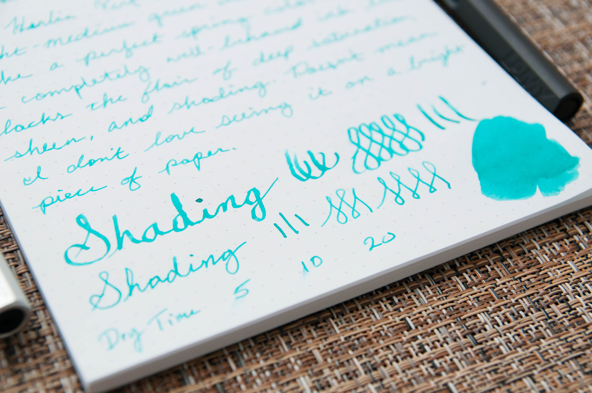
-- Fountain Pen Ink Review: Akkerman #15 Voorhout Violet (Pen Paper Ink Letter)

-- DC Pen Show 2014 (Massive Post!) (Inkdependence!)

-- My Short List Of Favorite Fountain Pens (An Inkophile's Blog)

-- 078 - The Pen is Mightier (Technical Difficulties)

-- TWSBI Diamond 580 Fountain Pen Review (Write to Me Often)

-- Nock Co. x Dudek Modern Goods Idea Dock Review (Modern Stationer)

-- Bulb Fillers (Crónicas Estilográficas)

-- [Guest Post] Pilot Custom 74 Fountain Pen Review (Ed Jelley)

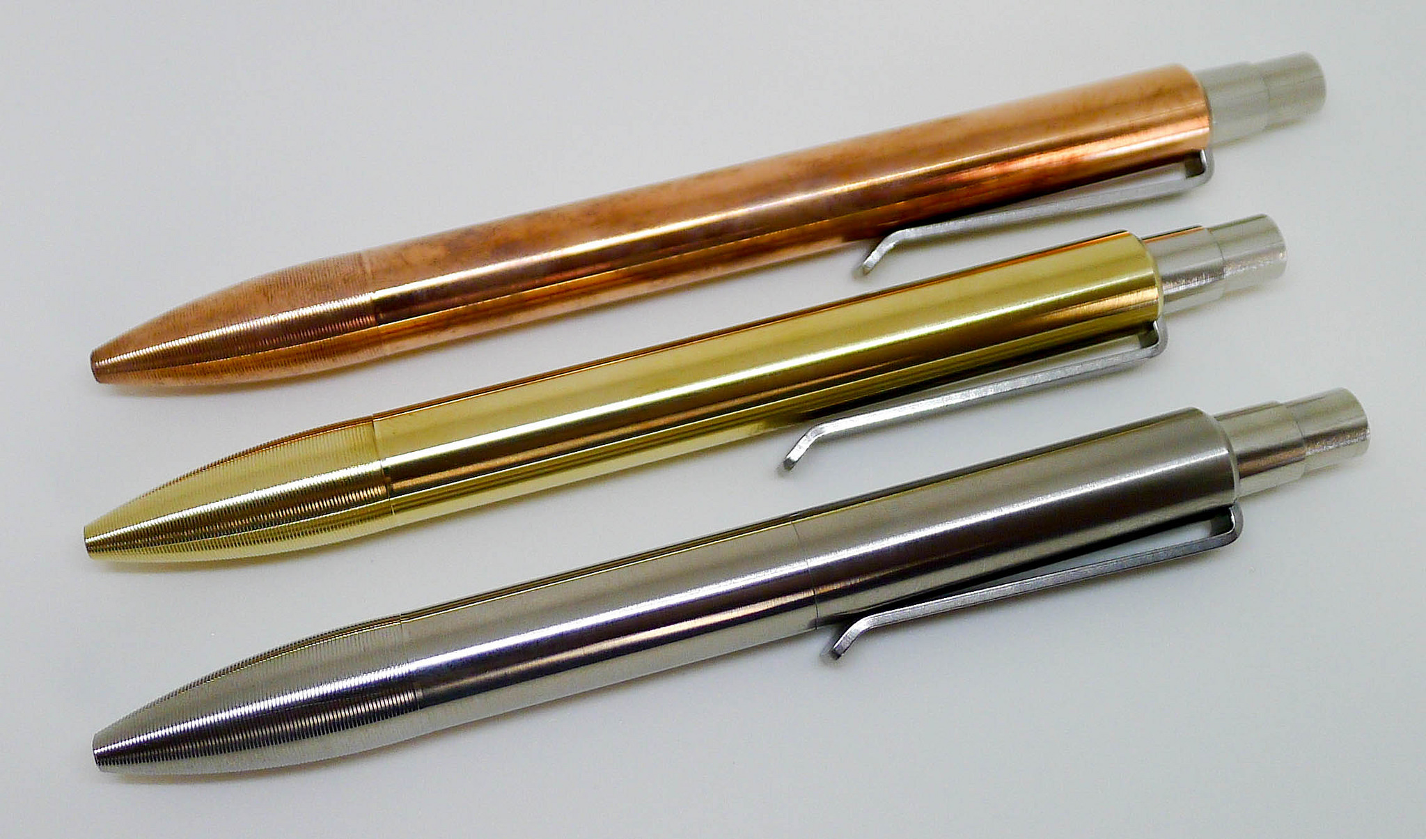
-- Restoring a grenade (Bleistift)

-- Private Reserve Sonic Blue: Ink Review (Ionsomnia)

-- Kaweco Elite – Pen Review (My Pen Needs Ink)

-- Pilot Falcon SF Review (The Passionate Penman)

Posted on August 16, 2014 and filed under Links.

Tactile Turn Mover and Shaker New Materials

I am a big fan of what Will Hodges did with the original Tactile Turn Mover in aluminum, and now with his latest Kickstarter he upped his materials game by adding brass, copper, and titanium into the mix.

In talking to Will about what changes he made (besides materials) from the previous project one interesting item came up. A new machine is in place to manufacture the brass and copper parts, giving those pen bodies a smooth to the touch finish. I can easily tell the difference between these and my aluminum Movers. It's not something I would have ever known, noticed, or cared about before because the original pens are so nice, but now that I have all these pens side by side I can say how good this change really is.

An ancillary result of the machine upgrade is the seam in the barrel is almost invisible. It already was barely noticeable in the first place but these are really hidden. In the prototypes I got you can see the seam in the titanium model but Will assures me that is not how the final version will appear. The brass and copper look flawless, even in this early stage of manufacturing.

The new materials Kickstarter project has already eclipsed the original aluminum barrel project, and having these pens in hand I can certainly see why. There are five days left to get in on the action - don't miss out!

Posted on August 15, 2014 and filed under Kickstarter, Tactile Turn.

J. Herbin Verte Réséda Ink Review

As I venture into more non-standard ink colors, I'm discovering that I really have an affinity for red and green inks in particular. They've become the main focus of my obsession lately, and I don't see any signs of it losing steam. One of the first inks I tried in this vein was J. Herbin Vert Réséda.

Vert Réséda is a light-medium green ink that makes me think of spring bloom. It's a happy, beautiful color and always puts me in a better mood when I start writing with it. It seems silly, but it's actually a real "property" of the ink in my book.

I don't have any pure greens to compare this ink to, but this one is a well-behaved easy-going ink that has worked perfectly in every pen I've tried – even the ones that tend to write on the dry side.

It's a well-lubricated ink that never stutters or skips, and it does a great job of not bleeding through the page. Even the ink swap I did in the writing sample is hard to see from the other side of the page. I haven't seen another ink do that. Most of them bleed through a bit.

There are some things it lacks, however, and I call those things "flair." Saturation, sheen, and shading are light or non-existent in this ink. I don't know enough about this color range to tell you if that's normal, but for this particular ink, it's very lightly-saturated, has no sheen, and has very light shading properties. The shading is hardly there at all in a regular nib, but it comes out more in the 1.5 mm nib I used. Personally, I would love more shading in this beautiful color. I think it would give it more character. I'd love to find a similar ink with more shading properties.

Overall, I've been very pleased by this ink. When I ordered it, I didn't think I would use it very often, but I've actually used it quite a bit for general writing and notes. It's an everyday ink for me. It's not eclectic enough to take a backseat for special occasions.

I'm happy with my initial dive into the green inks, and I'm pretty sure I'll be trying more. I think I'll set my sights on some of the Diamine offerings next.

(You can find more from Jeff online at Draft Evolution, Twitter, and App.net.)

Posted on August 13, 2014 and filed under Ink Reviews, J. Herbin.