(This is a guest post by Jonathan Bemis. You can follow him on Twitter @jtower42.)
There comes a time in nearly every pen geek’s life when he or she thinks, “I’ve never tried a fountain pen. I wonder if I’d like it? It seems like a cool thing, but there are so many choices, and fountain pens can be EXPENSIVE. Where do I start? How do I choose?”
We’re going to try to sort through some of those questions with today’s review of some of the very likely suspects for a “first ever” fountain pen. The only way to really learn fountain pens is to experience them, and hopefully this will help you select a first fountain pen that leads to a positive experience for YOU.
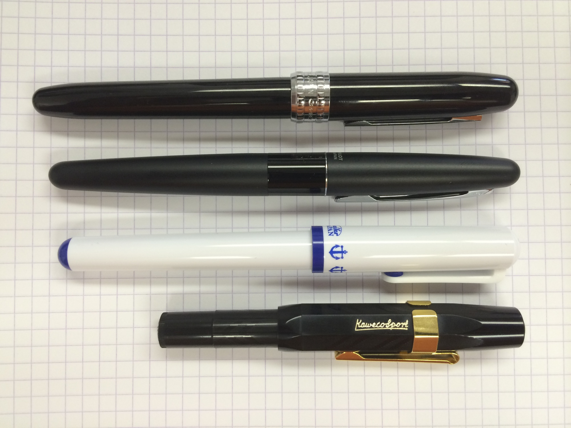
Pens Compared: Pilot Metropolitan, Platinum Plaisir, Sailor Clear Candy, Kaweco Classic Sport
Selection Criteria (and exceptions): Defining this category isn’t easy. There are lots of decent, inexpensive pens out there, so I felt like I had to make some assumptions about the person asking for a recommendation. First, I assumed the person was an adult. I figured that a child getting into fountain pens (at least in the U.S.) would already have a parent or other adult figure that was knowledgeable about pens; I bought my daughter a Pilot Kakuno for her ninth birthday, but I already knew something about fountain pens. So that assumption eliminates the “kids’” or “student” pens like the Pelikan Pelikano, Pilot Kakuno and Lamy ABC. Second, I assumed they might use the pen at work or in a professional setting, and would therefore not want a pen that was too “out there” in terms of appearance or form factor. Finally, I set a price ceiling of $25 for a first pen. This may be controversial, in that it eliminates the Lamy Safari, which is very commonly recommended for first-time fountain pen users. I chose fine nibs for all pens except the Sailor Clear Candy, which comes only in a “fine-medium.”
I also eliminated a few pens somewhat arbitrarily, just because. Feel free to disagree with my capricious choices. I eliminated the Sheaffer VFM for no good reason other than I have never had a Sheaffer and that Shaeffer is owned by Bic. (I told you this was arbitrary.) I also ruled out the Pilot Varsity because as a disposable pen, it is not quite as “nice” as the other pens on this list. Finally, I chose the Platinum Plaisir over the Platinum Preppy for sort of the same reason; I felt the simple but traditional look of the Plaisir would be more appealing than the sticker-covered clear barrel of the Preppy.
Comparison criteria: 1. Appearance/form factor 2. Feel in hand 3. Nib performance 4. Paper performance
Method: All four pens will be inked up with Organics Studios Blue Merle, which is a well-behaved dark blue-black ink. Being a “third-party” ink, there should be no advantage or disadvantage that might be gained by using inks from Pilot, Platinum, Sailor or Kaweco, all of whom manufacture inks that presumably are designed for use in their pens. Writing samples will be done on this random white legal pad I held my breath long enough to retrieve from my office’s supply room.
This is a reasonably nice-looking pen, glossy black with a silver-colored cap band. I find the cap band to be too bulky for the overall size of the pen, and I think the pen would look better if it were not quite so broad. The clip might be the nicest looking thing on the pen; it is silver-colored with a black “racing stripe” down the middle. The pen comes in something like 10 different colors from black to pink to navy blue, so there’s sure to be a color that speaks to you.
The body and cap are anodized aluminum and feel reasonably solid. There is a rather unpleasant-sounding “tink” when it is set on my glass-topped desk. The section is clear plastic with visible feed fins. It’s a cool look, but distinctly “un-executive” and doesn’t quite match the classic look of the body and cap. I believe the section and feed are shared with the $4 Platinum Preppy, which probably helps keep costs down. It also shares a “love it or hate it” feature with the Preppy, which is the color-matched nib. My black Plaisir has a black nib, which I think is pretty cool, but all the other colors match as well, and you may want a purple pen but not want a purple nib.
The pen feels good in hand. The section is long enough that my fingers don’t rest on the small step connecting the section to the body. The section is also nearly perfectly straight with no taper or pinch. The pen is long enough to write with unposted, but the cap is light enough that posting doesn’t make the pen back-heavy. In fact, the pen was remarkably well balanced for a pen this inexpensive.
The nib is as stiff as a nail, which is par for the course for many Platinum nibs. The stiffness of the nib is truly a personal choice for the user to make. Generally, a stiff nib will lay down a more consistent line than a flexible one, and a stiff nib may allow for smaller handwriting and more detailed work. The Plaisir’s stiff nib lays down a moderately wet ink flow and has no scratchiness, and feedback is a barely detectable whisper.
On the cheap office paper, there was significant feathering and heavy show-through, but because of the fine, consistent line, there was little to no bleed-through. You might be able to get away with using this pen on cheap paper if you only write on one side of the page, but it won’t be pretty.

The Metropolitan has an aluminum barrel and cap, and a plastic section. My choice was the “Plain Black” style, which is matte black except for a shiny black band where the barrel meets the cap. The section is held into the barrel by a silver-colored collar, and a thin reveal line of the collar separates the cap and barrel, which I think is a classy touch. I don’t personally like most of the other Metropolitan colors – it comes in gold, violet, white, silver and black, and except for the Plain Black and Plain Silver, the shiny band around the middle has a geometric or animal print pattern. I think that detracts from the overall appearance of the pen, but that’s personal preference. The nib has a subtle Art Deco-esque pattern etched, which I like.
The pen is weighted well. It might be a touch heavy towards the nib unposted, but when posted, it balances perfectly. The build feels solid; the aluminum feels thicker or heavier than the Platinum, and the section, despite being plastic, does not feel cheap or flimsy. There is a sharp step between the barrel and the section, but I have tried gripping the pen a number of ways, and the step doesn’t interfere.
I was prepared to rave about how awesome the Metropolitan’s nib is, until one sentence left in my written sample. All of a sudden, I started to get some hard starts, and then the nib just went dry. I could not get it going again until I unscrewed the barrel and gave the converter a little squeeze or two. Then the flow started up again with no problems, and I was able to finish. I had been using this pen prior to the written sample and had no issues, and am not prepared to say this is an actual issue. I do know that prior to that hiccup, I was thrilled with the nib. It is firm, but less stiff than the Platinum. It lays down a smooth, fine line and glides across the paper with no scratchiness.
On the office paper pad, there was moderate showthrough and little bleedthrough except when I flexed the nib to show line variation. Feathering was moderate, perhaps a little less than the Platinum. I was generally pleased with the performance of the Metropolitan on the cheap paper.

I almost didn’t include this pen based on its appearance. It comes in a range of colors, but all of them (as the name implies) are candy-colored and loaded with kid appeal. I selected what looked to me to be the most professional-looking color – white with blue trim and blue Sailor logo anchors around the base of the cap. Despite the more casual aesthetic, I felt like I needed to include the entry-level model from one of the legendary Japanese pen manufacturers.
The pen is plastic. Plastic body, plastic cap, plastic clip, plastic section, plastic pen. The only metal on the whole thing is the nib. However, it’s molded well, with no rough parting lines or gate vestiges. Being all-plastic it’s quite light; unposted, it’s very insubstantial. Posted, it’s nicely balanced for such a light pen. The barrel diameter is comfortable in hand, and while the threads are underneath my fingers, because they are plastic, they are not sharp and uncomfortable the way metal threads can be.
The nib is stiff and has a substantial amount of feedback. It’s not quite scratchy, but neither is it smooth. I was reminded of another writing experience during testing that I couldn’t quite place. Taking a wild guess, I grabbed my Uni-ball Jetstream 0.38 and jotted down a few sentences. Sure enough, that was it. The feel of the Sailor was very similar to a fine-tipped hybrid ballpoint, and that’s not at all a criticism. It is, however, a fairly specific feel – some people love that experience, and others may not. There was no skipping and no hard starting. The Clear Candy just wrote a tight, fine line with no issues.
On the cheap notepad, the Sailor Clear Candy performed the best of all four pens, with just a hair less feathering and showthrough than the Metropolitan. There was nearly zero bleedthrough, and I could almost see using the backside of the paper.
The Kaweco (pronounced kuh-VAY-ko) was another pen I considered not including in this review. It has a unique compact design that looks quite different from a “normal” pen and might give the first-time fountain pen buyer pause. But the Classic Sport is ubiquitous, well-regarded and from a well-respected German pen manufacturer. I also figured that the first-time fountain pen buyer might like the sturdy, compact design.
The Classic Sport is, like the Sailor Clear Candy, constructed entirely out of plastic. The nib is steel, of course, and there is a gold or silver button (depending on the color and model you get) on the top of the cap that might be metal or might be metallized plastic. You can get the Classic Sport in several basic but rich colors, and the identical Ice Sport comes with clear barrels and colored translucent caps for the same price. The pen does not come with a clip, but you can purchase one for about $3, which would technically vault the price of this pen over the $25 price ceiling of this review.
The cap is octagonal and threads very deeply onto the barrel, which makes the capped pen quite short, as you can see in the photos. Uncapped and unposted, the pen by itself is very short, probably too short to comfortably use for anything beyond jotting down a phone number or reminder. The magic of this pen comes when it’s posted. The cap posts very solidly, but not quite as deeply as it caps. It’s easier to see in the photos, but the practical effect is that the pen, when posted, is about 50% longer than when unposted. This makes it longer than the (unposted) Metropolitan, Plaisir and Clear Candy. The point is it’s a very clever design that makes for a compact pen to carry and a comfortable pen to hold for writing.
The Classic Sport is balanced well, perhaps a bit shaded towards the nib, but not in a noticeable or unpleasant way. The octagonal barrel may annoy some people who don’t like to feel edges when they write, but I don’t find it bothersome.
While I love this pen (I actually have two in my personal collection), the nib is a touch finicky. It’s an extraordinarily well-made nib, smooth and wet. In fact, it is the smoothest nib out of all four pens, and the only one with a touch of flex. However, it doesn’t behave well with some papers. On the cheap office paper, it feathered and bled like crazy, going so far as to leave dots of ink on the writing surface of the next sheet of paper. This phenomenon illustrates an important rule of thumb about European vs. Japanese nibs. For the same nominal size of nib, the European nib will lay down more ink than a Japanese nib. It’s not quite as simple as adding or subtracting a size, (e.g., a Japanese Medium is equivalent to a European Fine), but that can be a good rule of thumb. So the fact that the Kaweco was wetter and laid down a lot more ink than its Japanese counterparts is no surprise.
On high-quality paper (like Rhodia or Clairefontaine) the Kaweco really shines. But because a first-time fountain pen buyer isn’t likely to have a good stock of high-quality paper, I am forced to dock some points from the Kaweco. If you are reading this, I am not recommending this as a first fountain pen. But if you like the experience of writing with a fountain pen, go pick up some nice notebooks and make the Kaweco Classic Sport (or Ice Sport) your SECOND pen.

Summary
See the Grades photo for how I felt each of the four pens performed in each of the four comparison criteria. Another criterion for you to take into consideration is value for the price. The Platinum Plaisir and Pilot Metropolitan both graded out equally well, with the Plaisir getting the nod in nib performance and feel in hand, and the Metropolitan winning in appearance and performance on cheap paper. Either pen would make a great first fountain pen – both are attractive, comfortable, well-performing pens. However, the Metropolitan is $7 cheaper, and performs better on cheap paper, which is all you are likely to have at first. However, you could use that $7 and get a fantastic notebook with amazing paper that will immediately enhance your fountain pen experience. A Clairefontaine A4 size (about 8.5” X 11”) staplebound notebook can be had for $6, or a top-staplebound Rhodia A5 (about 6” X 8”) for $5.50. So, combining performance with value, I have to give the top spot to the Metropolitan.

Winner: Pilot Metropolitan Runner-up: Platinum Plaisir Recommended: Sailor Clear Candy, Kaweco Classic Sport (or Ice Sport). Not recommended: None