Posts filed under Pen Reviews

Rotring Tikky Graphic Drawing Pen 0.1 mm Review

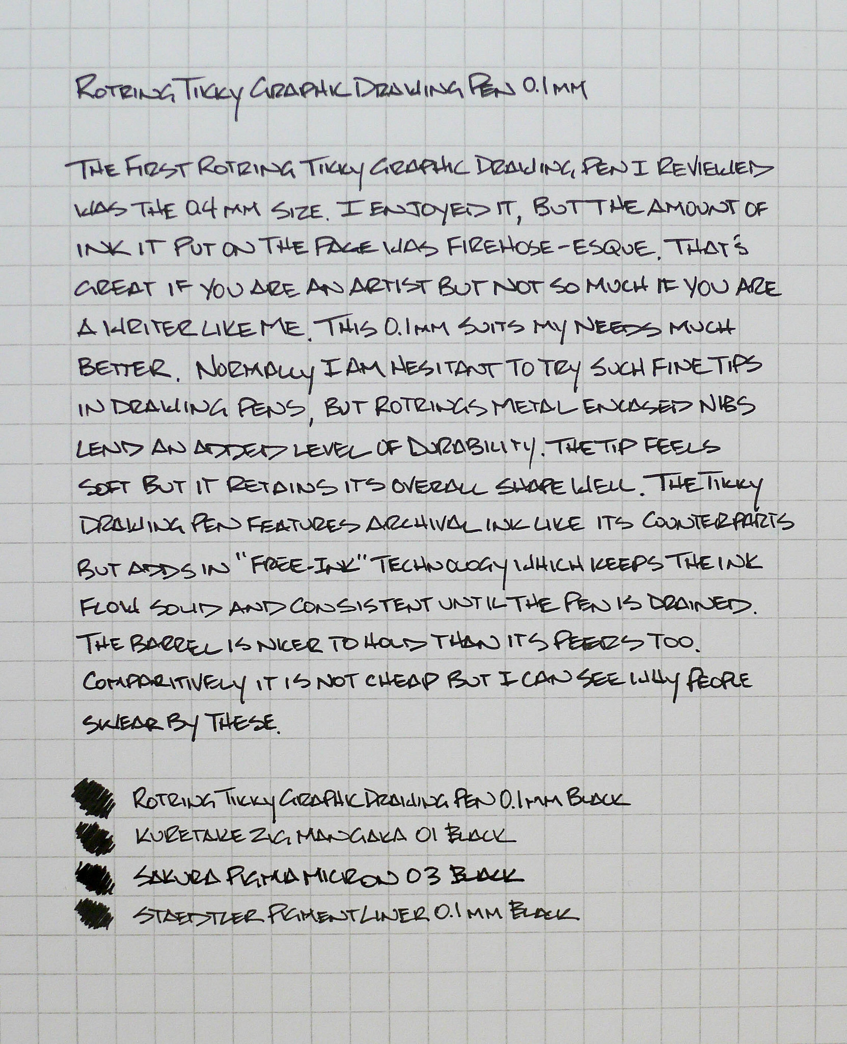
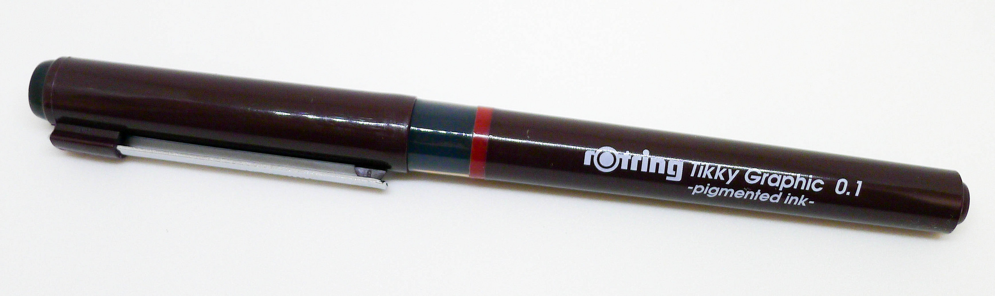
A few years ago I reviewed the Rotring Tikky Graphic Drawing Pen in the 0.4 mm tip size. I enjoyed the build quality of the pen but the 0.4 mm tip size spews ink. Not in a terrible mess kind of way, but it goes on heavy. Great for artists, not so good for my writing style.

With all the praise this pen gets and my love for drawing-style pens I knew I had to pick up a smaller size. I went as small as they make (0.1 mm) and my writing is much better off for it.

The Tikky Graphic Drawing Pen has three main features. One, the ink is archival, which most other pens in this category have. Two, it has a metal encased nib to help with tip durability, which a few of its competitors have. And three, Rotring's Free-ink technology makes the ink flow consistently down to the last drop, which no one has that I am aware of.

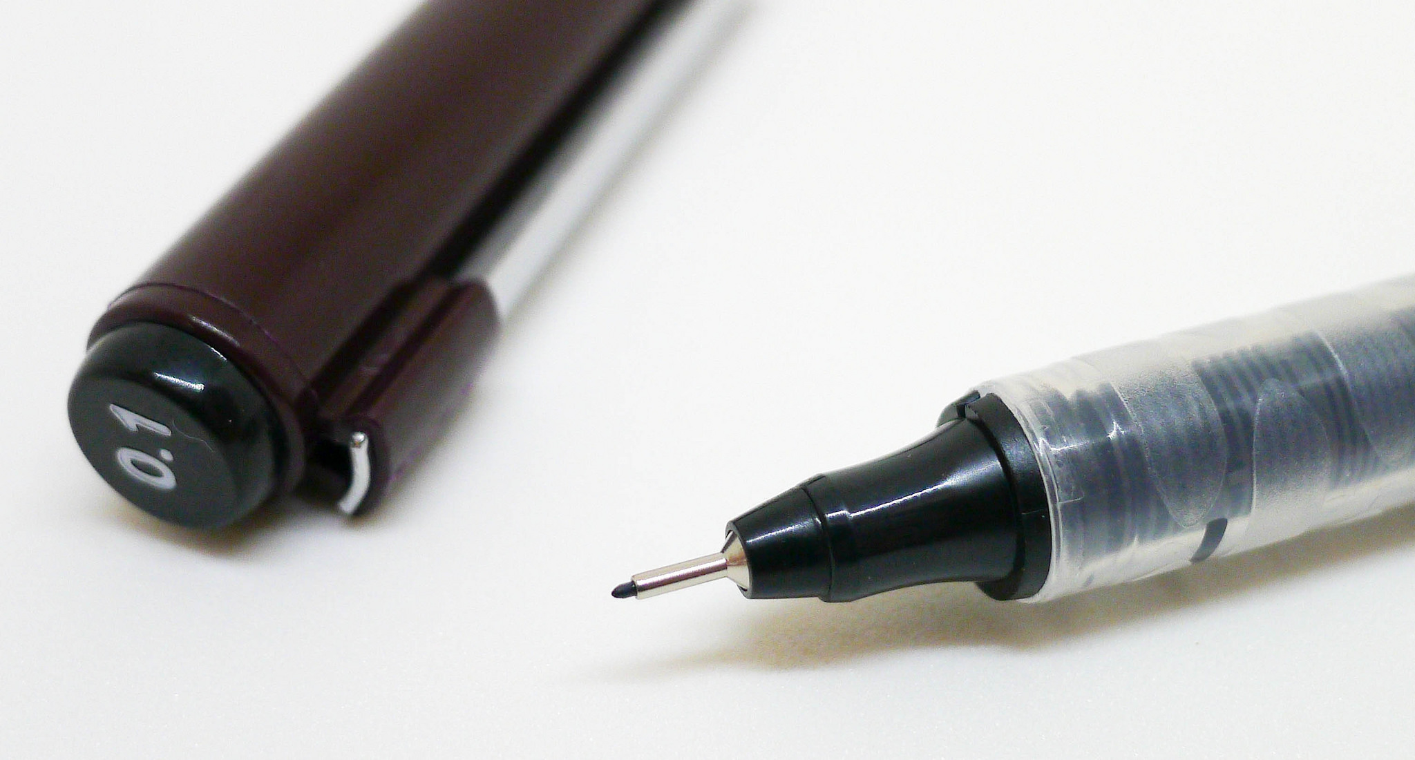
While feature one is great, and three is nice to have, I'm a fan of anything that makes fiber and plastic tips more durable, especially when dealing with 0.1mm tips. It usually doesn't take long for drawing pen tips to show some sort of breakdown but this one has help up well so far. More use will be needed to see if any real issues pop up but it is tracking nicely at this point.

Ink darkness is important to me too, and the Rotring fares well there. On its own, I thought for sure the Tikky would be the darkest ink I would test, but to my surprise the Sakura Pigma Micron took that title. I've always felt the Micron was lighter than others so this comes as a surprise. I did use the 03 Micron so the line was wider but I don't think it affected the darkness. My favorite Kuretake Zig Mangaka falls in the middle of the range.

Overall, I can see why this is a popular drawing pen. It is more expensive than many ($3.60 at JetPens) but it offers added features that make up for some of that cost. If you are in the market for a durable, dark drawing pen then the Rotring Tikky is worth a look.

(JetPens is a sponsor of The Pen Addict and I received this product at no charge.)

Posted on October 17, 2014 and filed under Pen Reviews, Rotring, Drawing Pen.

Lamy 1.5 mm Stub Nib Review

(Jeff Abbott is a regular contributor at The Pen Addict. You can find more from Jeff online at Draft Evolution and Twitter.)

When I wrote about the Pilot Plumix several months ago, I said that it wasn't a large enough variation for my tastes. Well, I tried the other end of the spectrum with a 1.5mm Lamy calligraphy nib, and I can't say the same thing about this one. This nib makes a voluptuous line, but doesn't quite cut it for me in the everyday writing area. Still, it's a fantastic nib and loads of fun.

The Lamy 1.5mm calligraphy nib fits on almost any Lamy fountain pen very easily. Just slip off the normal nib from the feed, and slide the 1.5mm nib on. If you have a Safari, Vista, or AL-Star lying around, this is a great way to try out a well-made calligraphy nib. There are many other options, but rarely for this price.

First looking at the nib, you can't really tell it apart from the other Lamy nibs. Then, you notice the blunt tip and the large "1.5" stamped on the top and realize how wide it actually is. I really had no idea it would be that wide. Little did I know.

I put the nib on a Safari that I had lying in a drawer, and promptly filled it up with some green ink. In my rush, I didn't think to pick out an ink that has great shading qualities, so I was little disappointed to find that the finished product looked a bit like a magic marker line—wide and wet. After a quick flush, I filled it with J. Herbin Rouge Hematite. What a difference that made. It no longer looked like a magic marker line, but a sophisticated and interesting line of varying widths, shades, and hues.

This nib was made to be used with calligraphy lettering. I don't do much calligraphy lettering, and I certainly don't claim to be any good at it. Using this nib and experimenting with the variations, I wanted to practice lettering a lot more. Expert lettering really takes a lot of skill and practice, and I really admire anyone who can make it look fluid and consistent. They've put a lot of practice into it, and they can make it look as easy as scribbling in a Field Notes book propped up on my knee.

That said, I didn't really find much place for this nib in my everyday writing. For one, you have to write really big in order to form letters and words (as opposed to big blobs of ink). Second, since the nib is wide and requires a bit more from the feed system, there are consistent starting issues. They're never difficult to get rid of, and I found that they're actually very predictable, but they're still frustrating in general writing practices.

For me, this nib gives me two things: the ability to play and experiment with large, ornate lettering, and a nib that provides a great showcase for inks that have excellent shading properties. This nib is more about creating art, and much less about writing things down.

If you're even the slightest bit interesting in calligraphy nibs, and you already have a Lamy, I can't think of a better way to try out a calligraphy fountain pen (I'm not counting disposable porous tip pens here) than the Lamy nibs. They have other sizes besides the 1.5mm, which are 1.1mm and 1.9mm. I just recommend getting an ink that shades well to go with it!

Posted on October 15, 2014 and filed under Fountain Pens, Lamy, Pen Reviews.

Parker IM Premium Fountain Pen Review

In its heyday, Parker was on top of the pen and pencil world. Anyone who was anyone owned a Parker, with many of their classic designs still highly sought after to this day. The last couple of decades haven't been so nice to this once elite brand though. Their offerings have been mostly mediocre in my view, and are getting lapped by competitors who offer more for less.

I was honestly not excited when I heard about the latest Parker fountain pen releases, but one thing caught my eye: They used the word Vacumatic in the product description. Along with the Duofold and the 51, the Vacumatic is classic Parker design at its best. I own a Vacumatic and it remains one of the most intriguing and beautiful pens I own. Just that one little mention had me anxious to see what Parker had up its sleeve.

The Parker IM Premium pays homage to the original Vacumatic's horizontal stripe design, and they pulled it off well. The Emerald Pearl model I received from JetPens shares a bit of the color scheme with my classic Vac, but the materials and functionality are completely different.

First off, this is an aluminum barrel pen, unlike the resin barrels of yesteryear. So, no translucency through the barrel, but rather a solid, lightweight metal replacement. Secondly, this is a cartridge/coverter filler, meaning no fancy vacumatic filling action, which is likely a cost issue. This is not your grandfathers Vacumatic, and based on the naming, it isn't supposed to be.

The IM Premium is a good quality entry level fountain pen - that's what it is designed to be. I think Parker pulled it off well here, too. It has a classic look while retaining a modern style. The traditional Parker arrow clip is there, but they mix in a brushed metal section to give it an up to date feel.

One thing that caught my eye when first unboxing it was the scale of the nib compared to the pen body. It is small - smaller visually than I am used to. Once I inked it up with the provided blue ink cartridge it wrote so well I no longer noticed the size. The medium stainless steel nib is smooth and the line width is controlled and just the proper width. The ink flow was spot on. And the blue ink color itself? Really, really nice, which was another surprise.

I didn't think it would happen, but I am enjoying this pen. Either Parker has been doing a better job of late (I dig their Jotter 60th Anniversary Edition), or I am turning into my grandfather. Neither of those would be a bad thing.

(JetPens is a sponsor of The Pen Addict and I received this product at no charge.)

Posted on October 13, 2014 and filed under Fountain Pens, Parker, Pen Reviews.