Posts filed under Pen Reviews

Pilot Parallel Calligraphy Pen Review

(This is a guest post by Nick Folz. You can find more of Nick and his work on Twitter, Instagram, and Tumblr.)

The Inkiest Pen

The Pilot Parallel is one of those pens that will turn heads. It doesn't look like any pen I have ever used and it doesn't write like anything else either. It is mainly a calligraphy pen, and I must admit my ignorance and tell you that I am not really a calligraphy person, but more of an illustrator who's a fan of handwriting.

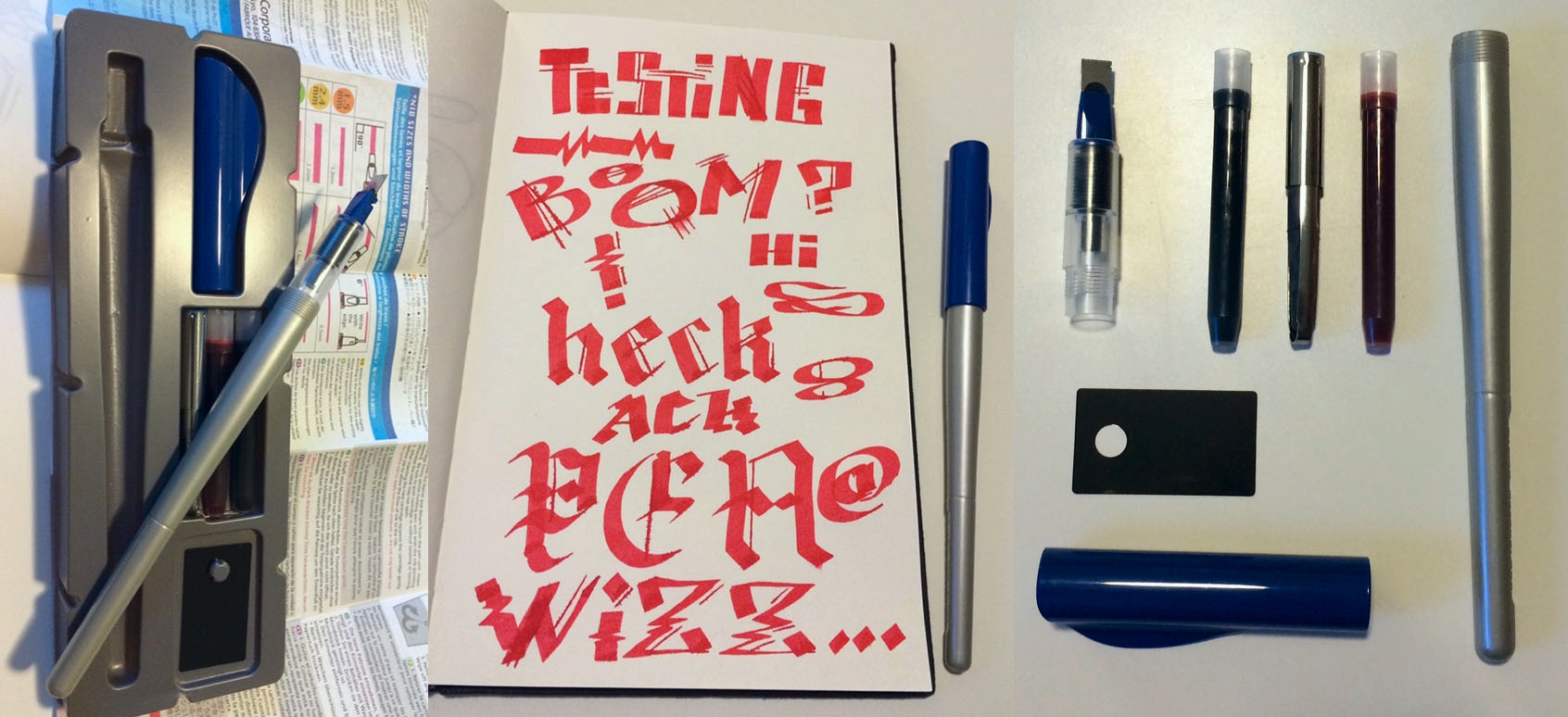
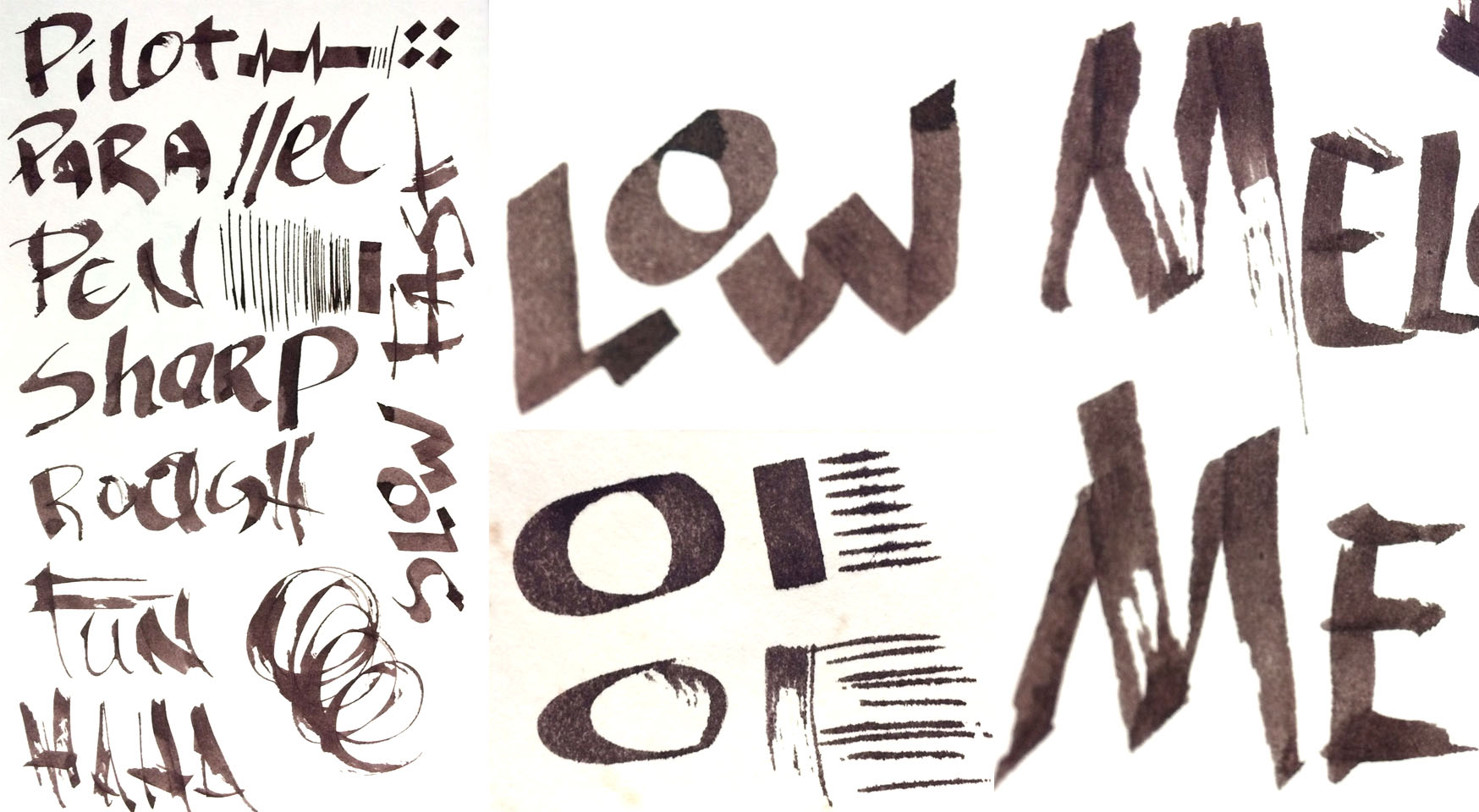
The concept is simple, the flat blade (I am using the 6mm model) drops a super thick line when pulling it perpendicular to the blade line, and a super thin line when pulling it parallel. The result is a line that can vary wildly and makes the special lines required if you are doing calligraphy. It comes with a pocket guide for some starter calligraphy, but the most fun I had with the pen is when I was pushing it in a wildly sloppy manner and getting unreproducible results.

Basics

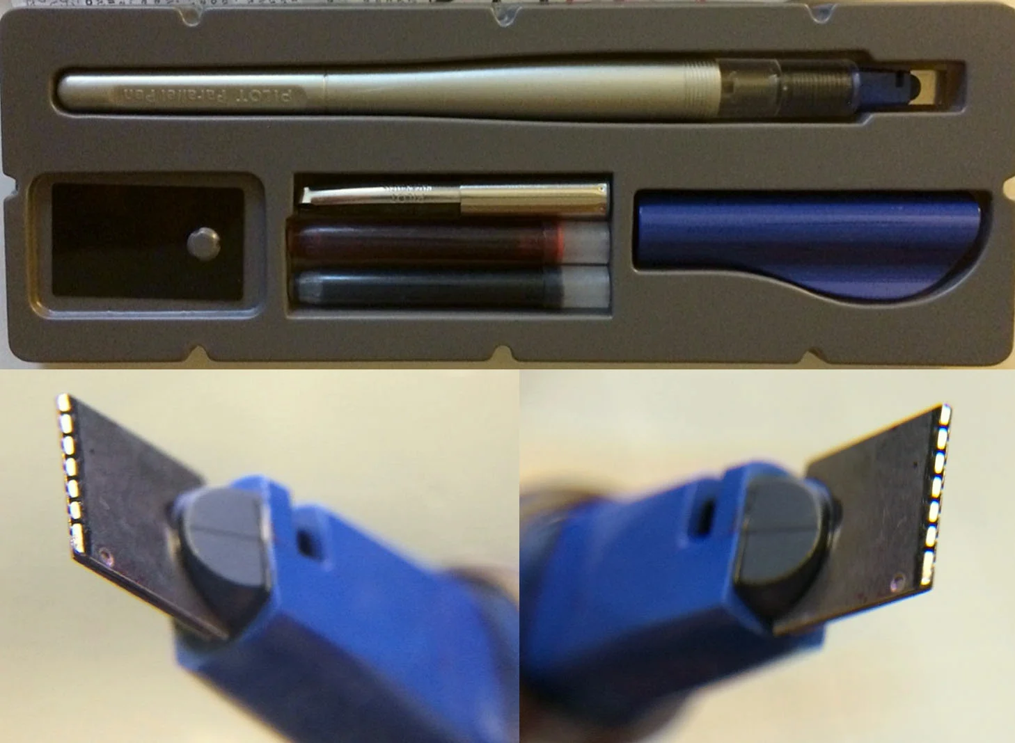
This pen is not for looks: plastic body, plastic cap. The cap has a bit of a fin to it, screws on tight to the tapered, brush-shaped body. The nib screws into the body and takes ink cartridges. The pen can go through a cartridge in a few sittings, to be expected when you are laying down such a thick line. The nib is flat, built out of what looks like a folded over piece of aluminum, but is actually two parallel pieces of metal that have tiny, interlocking teeth at the tip. The pack it comes in has one black cart, one red cart, one converter (for cleaning) and a cleaning sheet.

The Ink Problem

Look, no one likes buying tons of cartridges, especially if their favorite ink isn't sold that way. Even if you do like the convenience of the cartridges, you are going to be burning through them. The solution is pretty easy, just body fill the damn thing. What you'll want to do if you are body filling the pen is grab some plumbing tape and wrap the threads of the nib section (not more than twice) to make sure you get a good seal on it. It will act as a gasket and, boom, tons of ink, no leaking.

I've seen it as a detail note on several ink reviews, "I'm testing this ink with a Pilot Parallel." There is good reason, if an ink has facets revealed through different volumes drying at different times (I'm looking at you Emerald of Chivor) and you don't have any fancy dip nibs, this pen should be your go-to. The ink supply is slightly inconsistent, leading to the variation of how much ink is dropped even on one stroke. Sometimes the top of a line will be super saturated and dryer at the end, sometimes the opposite. I actually like this about it and don't consider it a drawback. It lends itself to a more interesting set of lines in the end.

Pilot makes of big deal of being able to blend inks by touching the tips of two Parallel Pens together to make gradients. That would probably be cool, but I just have the one pen and probably wouldn't do it that often even if given the chance.

Where It Fits

Look, I'm a Pilot fanboy. The pen that got me into pens in the first place was the Precise V5, which will always have a place in my heart and messenger bag. I have long been a fan of their products and have yet to find a sub par item they make. The Parallel is no exception, it works wonderfully and besides some minor issues (leaky body when body filling which, admittedly, it is not made for, and some sub-par aesthetics) I would easily recommend this product. The problem is, for what? Outside of the calligraphy enthusiast, the ink tester, and the font fanatic, this pen would be hard pressed to find an audience among the office supply crowd.

When I got this pen it was the one I was most excited about, but found myself pulling it out, doodling for a few minutes and then switching to something else fairly quickly. So I tossed it into my bag and would often grab something else when I sat down to draw. The problem seems obvious: I'm an illustrator, not a calligrapher. But here is when I started clicking with this pen. I often add some lettering to an illustration near the end. Sometimes it's as simple as a thought bubble with a "!" in it. Sometimes it is someones name or a label. I would dig this out of my bag and it can do what no other pen or brush can do. I like the smooth, block style lines it can do but I LOVE the distressed, unruly script you can get out of it. I feel like a hat's off is in order for Pilot mass producing such a niche pen, and in multiple sizes. You can find the Pilot Parallel at JetPens in four sizes from 1.5mm to 6mm.

Pros:

Nothing else like it, at least that I have seen. Works well right out of the box. Comes with one black and one red cart, as well as a converter and a cleaning sheet. Also has a robust care and calligraphy tip sheet. Can be used many different ways, clean and crisp or loose and rough.

Cons:

Designed for carts and have to mod for body filling. Plastic body and cap, aesthetics not a strong point. Will use all your ink.

When I think of drawing utensils I also think of what verbs they give me. My pencil's verbs are Start, Sketch, and Erase. My roller ball pen's verbs are Line, Detail, and Finish. My brush's verb is Vary. My Sharpie's verb is Fill. What the Parallel really does that makes it worthwhile for me is it gives me a verb that my other pens could do, but not as well. Letter.

(Disclaimer: This product was provided for me free of cost but I am not otherwise being compensated for this review. The opinions contained are my own.)

Posted on September 2, 2015 and filed under Pilot, Pen Reviews, Calligraphy Pens.

TiScribe EDC Fountain Pen Video Review

I've been wanting to make the leap into video content for a while now and I'm happy to introduce The Pen Addict Channel on YouTube. I'm just getting my feet wet, so expect many changes as I learn what works and what doesn't as I move forward.

First up is the TiScribe EDC Fountain Pen which is currently an active project on Kickstarter. Kelvin sent out several review samples for this pen and I thought this was a good opportunity to provide my thoughts a bit differently.

Check out the video and let me know what you think!

The PenAddict.com video review of the TiScribe EDC Fountain Pen. This pen can be found on Kickstarter at http://kck.st/1gDYArB. Kelvin has made a couple of changes since this review was shot so check them out here: https://youtu.be/WkA-lP_B1PM

Posted on August 25, 2015 and filed under Kickstarter, Pen Reviews, Video Review, TiScribe.

Graf von Faber Castell Walden Woods Fountain Pen Review

(Susan M. Pigott is a fountain pen collector, pen and paperholic, photographer, and professor. You can find more from Susan on her blog Scribalishess.)

I don't typically order super expensive, limited edition pens that come in boxes that are fancier than the pens they house. But Chatterly Luxuries had a good price on the Walden Woods pen, and because I'm working on an MA in English in Creative Writing (I totally need another "practical" degree), this pen appealed to me. I love the fact that the barrel has Thoreau's handwriting etched on it. I appreciate that the ash wood used for the pen is reclaimed from naturally-fallen trees at Walden Pond. I am pleased that my purchase of this pen means a new tree will be planted at Walden Pond by the American Forests organization. All these factors combined with the great price led me to purchase the pen. I bought it for $395 (retail $750), which is still quite expensive.

I waited to open this pen until I turned in my grades for Summer II. It was my reward for surviving the term (and it was a doozy). The packaging was impeccable. A thick, outer cardboard box protected the beautiful wooden box within. The lid of the wooden box is unadorned except for a small logo and the Graf von Faber Castell name.

The box opens smoothly and silently–I mean look at that hinge mechanism! And this is just the box!

A cream-colored, molded insert houses the pen and information about it. A well-designed booklet gives a brief history of Henry David Thoreau's two-year experiment at Walden Pond which became the basis for his book, Walden, or A Life in the Woods. The Walden Woods Project, which formed in 1990 to protect Walden Pond from development, is also discussed, as well as the partnership with the American Forests organization. A card with warranty information is enclosed and there's a small cloth for cleaning. The insert that houses the pen and information comes out, so with a pen tray cut to size, the wooden box can be repurposed for pen storage.

The Walden Woods pen is a limited edition of 2006 pens, each individually numbered. Mine is number 1268.

Unlike Graf von Faber Castell's yearly limited edition pens, which can be quite ornate (and cost thousands of dollars), the Walden Pen is understated. It has a beautiful platinum-plated cap with a spring-loaded clip that is easy to operate.

The finial is concave and unadorned other than grooves etched around the edge.

The Faber Castell logo appears just above the top of the clip.

"Graf von Faber Castell Germany" is imprinted around the bottom of the cap, and just above that, in tiny letters, is a credit for the quote used on the pen.

The grip is made of the same platinum-plated metal, and so is the bottom of the barrel which is convex and sports the grooves around its base.

The ash-wood barrel feels smooth to the hand. It's hard to tell whether Thoreau's quote is actually etched into the wood or just painted on (the descriptions I've read use the word "etched," but the words don't look or feel like they are carved into the wood). The quote is written in black and stands out nicely against the light color of the wood.

The quote chosen for the pen is beautiful:

"So we saunter toward the Holy land; till one day the sun shall shine more brightly than ever he has done, shall perhance shine into our minds and hearts, and light up our whole lives with a great awakening light, so warm and serene and golden as on a bank-side in Autumn."

~Henry David Thoreau, Walking

The nib is a two-toned, 18K gold medium. It started up immediately after I inked the pen, and I've had no problems with skipping, hard starts, or scratchiness. I inked it with Iroshizuku Ina-Ho because I thought the golden color of that ink matched the ash wood nicely. The nib is smooth, but firm without any springiness.

Because the grip is metal, it becomes slippery under my sweaty fingers. It is small in diameter (I don't have a caliper, but it's less than 10mm at the thinnest point), and my hand cramps up while writing. I may eventually have the nib ground to an oblique italic so that I can rotate the pen into a more comfortable position. Plus, the medium nib lacks personality in my opinion.

The pen is a cartridge/converter filler, but no cartridges were supplied, an oversight for such an expensive pen. I use the converter anyway, but I think cartridges should have been included for those who don't use the converter. The converter works smoothly and draws up ink without any difficulty.

At 135mm (5.31 inches) capped, 130mm (5.11 inches) uncapped, this is a medium length pen, just a little longer than a Pelikan M600 capped. The pen is fairly heavy due to the metal construction. I could not find a specific weight in any of the literature or online. In spite of this, it feels balanced in the hand unposted. Posted it is 173mm (6.8 inches) in length and is unwieldy. The cap is simply too heavy and throws the balance off.

I am interested to see how the wooden barrel reacts with the natural oils in my hand. I don't know if the ash will darken over time, or if the wood has been coated to prevent that. My main concern about the light ash wood is what will happen if I accidentally get ink on it. Will the ink wipe off or will it stain the barrel? I am unwilling to test this, even for the sake of a Pen Addict review, sorry.

This is my first Graf von Faber Castell pen. I like many things about it, and it is definitely unique. But, it's not the most comfortable pen I've written with. My hand grew fatigued fairly quickly due to the small grip combined with the weight of the pen.

Nevertheless, I can't wait to take this pen to my English classes. I hope Thoreau's spirit channels itself through the pen to make my poetry better. I can always hope, but so far no poems have magically emerged from my Walden pen.

Pros

  • Simple design with understated elegance
  • Fans of Henry David Thoreau would probably love this pen
  • The Walden Pond ash wood and Thoreau's writing on the barrel make this pen unique
  • The nib is beautiful and well-made (though I don't like the medium point and will probably send it to a nibmeister)
  • For every purchase of this pen a tree will be planted at Walden Pond
  • The beautiful wooden box that houses the pen can be used as a pen box with the addition of a tray (but, honestly, I'd rather just have a simple cardboard box and a lower price)

Cons

  • Expensive, even on sale
  • Fairly heavy pen
  • The grip is metal and narrow in diameter which may make it difficult for some people to write comfortably
  • Cartridge/Converter filler, which can be a plus or minus depending on your perspective, but no cartridges are supplied with the pen which seems an odd oversight
  • The pen is no longer being manufactured, and remaining units are limited
Posted on August 21, 2015 and filed under Faber-Castell, Fountain Pens, Pen Reviews.