Posts filed under Monteverde

Monteverde Scotch Brown Ink Review

(Jeff Abbott is a regular contributor at The Pen Addict. You can find more from Jeff online at Draft Evolution and Twitter.)

Brown inks are certainly a rich and deep well of the fountain pen ink options out there today, but I've never really done more than dip my toes in this color. Who wants to use brown ink, right? Well, it's not as bad as it sounds. I've tried a couple, and I've always been pleasantly surprised after using them. Browns can be beautiful, so don't judge them by their name.

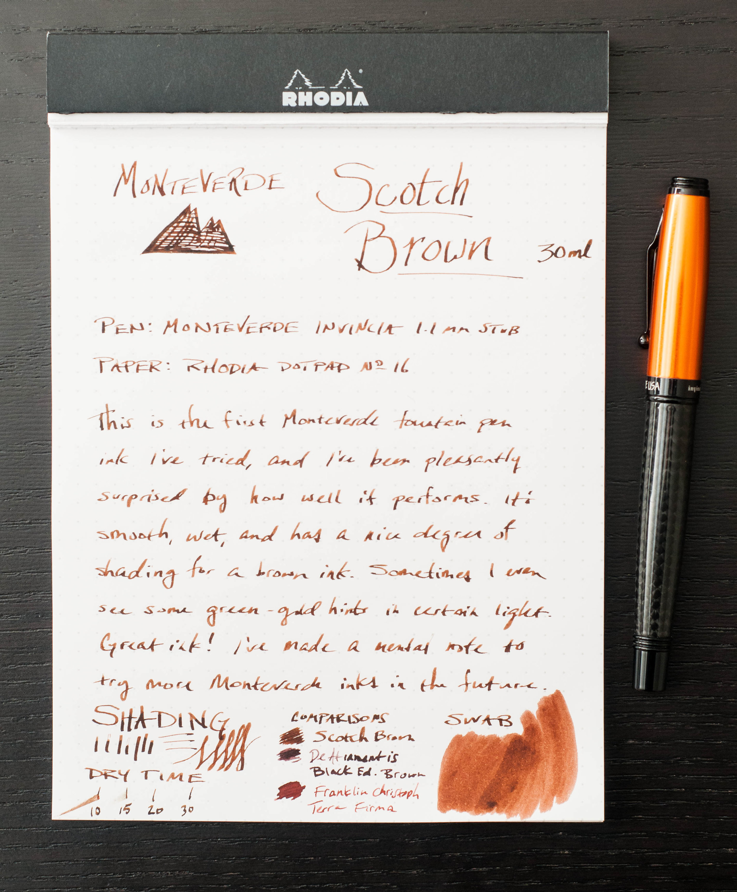
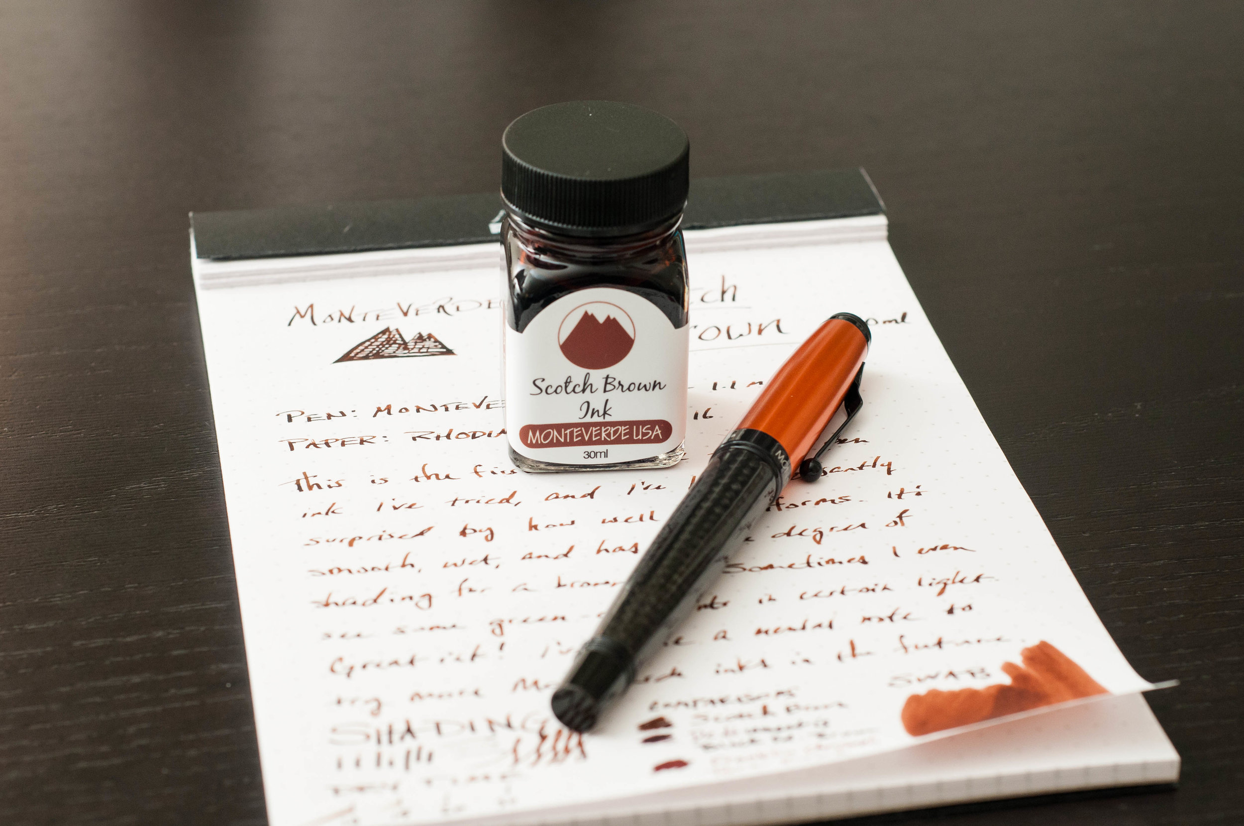
I've always had good experiences with my Monteverde pens and gel/roller ball refills, but I've never actually tried any of their many fountain pen inks. When Brad sent over a bottle of Scotch Brown, I was excited to try it out and see how well it performed. Also, I had to see how closely it resembled they whisky color.

Upon opening the clear plastic box that the bottle is packaged in, I noticed some info printed on the back side of the color card that promoted Monteverde ITF technology. Interesting, right? Well, ITF stands for "Ink Treatment Formula," and it really just means that the ink is formulated to flow well, resist drying in the nib, and lubricating the feed. With other inks, this normally isn't advertised as a trademarked ink technology, so it struck me as a bit odd. Despite that, this ink definitely gets a good score in my "does it behave well?" system.

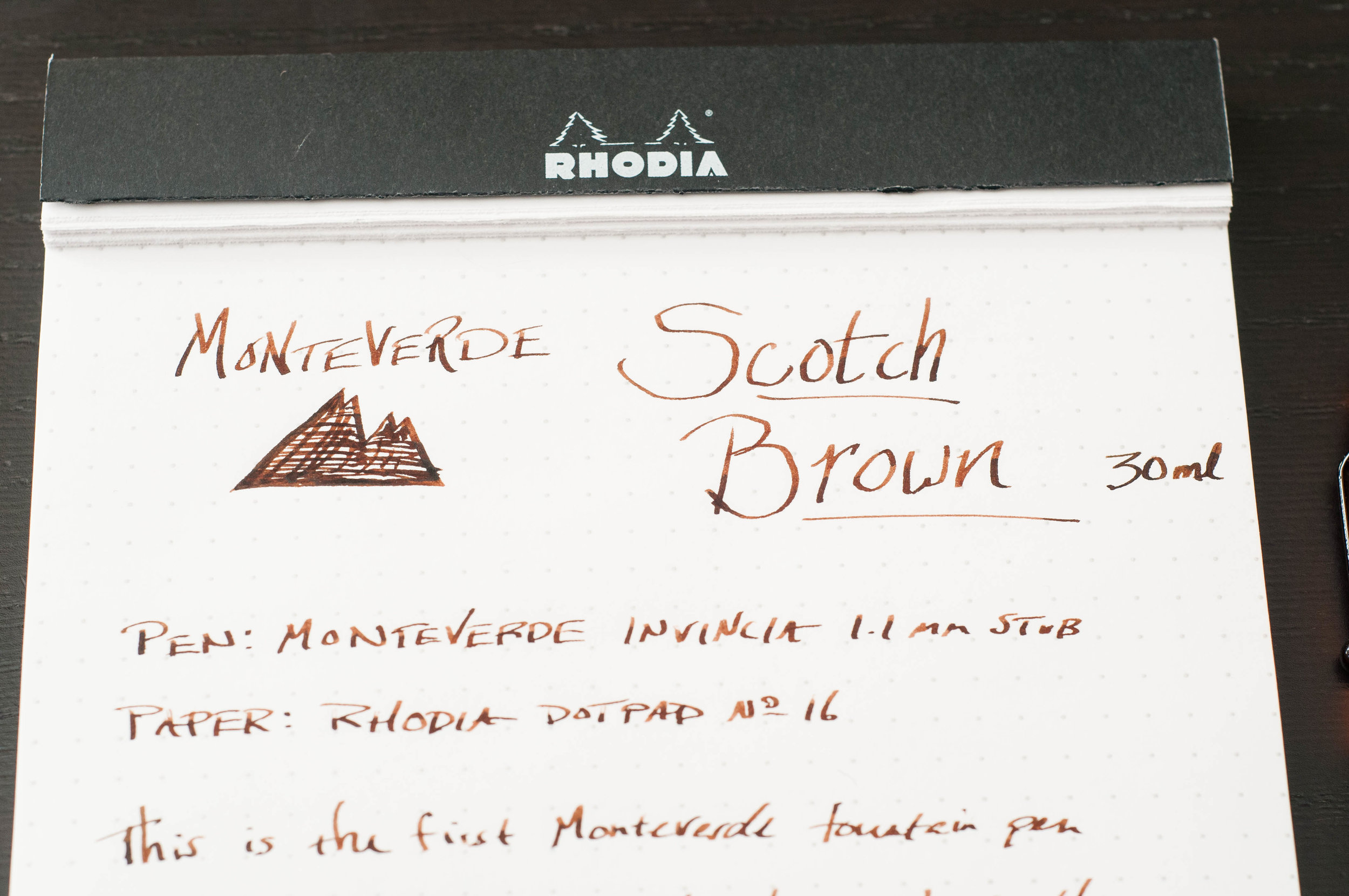
Scotch Brown is a medium brown ink that looks darker than most scotches I've seen. Still, it's a warm, pleasant color that looks great on the page. It's light enough that you can easily tell that you're using a brown ink. In some cases, I can even detect a hint of a green-gold sheen. If you want something more business friendly, you might want to look for a black-brown.

Given the medium hue, that provides opportunities to shade and vary depending on how ink is distributed on the page. I'm happy to report that this ink does a great job of shading from light to medium brown. In certain areas where the ink pools, it takes on a coffee or milk chocolate color, while the lighter areas remind me of rich caramel or whisky. It's a delicious color, but I can't say that I've tasted the ink.

So, how does the Ink Treatment Formula perform? Well, it behaves nicely in the pens I've tried. Ink flow is exactly what I expect, and it has no issue keeping up with fast writing. Dry time is in the unimpressive (but still good) range of about 15-20 seconds. It also does a good job of keeping the ink from drying on the nib when the pen is left uncapped for a couple of minutes. Even when it does dry, it easily starts up again after a couple of squiggles.

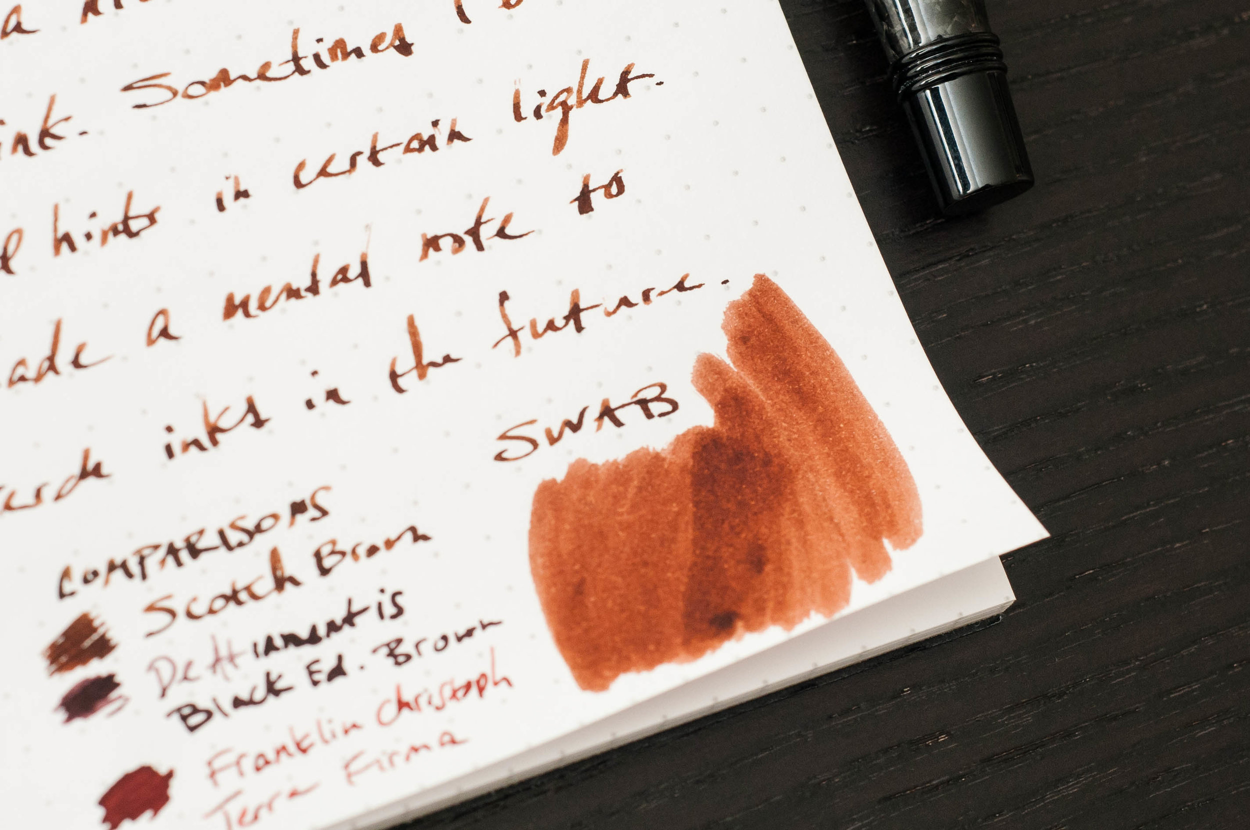
Show-through isn't terrible for a medium to dark color. The ink doesn't soak through the page, creating dark impressions on the back page. I've also been unable to detect any signs of feathering on the premium (Rhodia, Apica, Leuchtturm) papers I've tried with it. Overall, a solid performer.

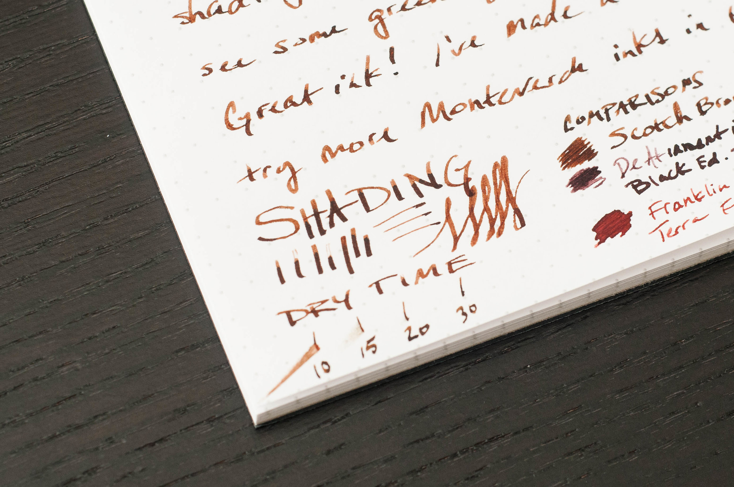
In my book, this is a well-behaved ink, with or without the fancy technology to back it up. It easily ranks with Diamine as far as behavior goes, and that's a compliment. Once again, I'm being drawn in by a brown ink, and it's surprised me again. I'm not sure I'm predisposed against browns, but it's something I aim to cure. This Scotch Brown is a delicious color, and it's working well to change my perceptions. I'll also be delving deeper into the Monteverde line of inks. This Emerald Green is calling my name.

The pricing for Monteverde inks isn't bad, either. Monteverde Scotch Brown is available at JetPens as a 30ml bottle for $8.00, and the big brother 90ml bottle is only $16.00. For those of you following along at home, that's 3 times the ink for only twice the price. I'd recommend trying an ink before buying that much of it, though.

(JetPens provided this product at no charge to The Pen Addict for review purposes.)


Enjoy reading The Pen Addict? Then consider becoming a member to receive additional weekly content, giveaways, and discounts in The Pen Addict shop. Plus, you support me and the site directly, which I am very grateful for.

Membership starts at just $5/month, with a discounted annual option available. To find out more about membership click here and join us!

Posted on March 15, 2017 and filed under Monteverde, Ink Reviews.

Monteverde Invincia Orange Carbon Fiber Fountain Pen Review

(Jeff Abbott is a regular contributor at The Pen Addict. You can find more from Jeff online at Draft Evolution and Twitter.)

My experience with Monteverde is fairly limited, as I only have one fountain pen from the company. That being said, that one fountain pen is one of my favorite and most dependable pens I own.

The Artista was a complete impulse purchase — I had no clue about the company at the time, but I liked how it looked. That pen grew on me quickly for its smooth writing experience, mesmerizing demonstrator body, and silver accents. I still highly recommend that pen to new fountain pen users as a 2nd or 3rd pen after trying out cheaper pens.

Trying out a Monteverde Invincia had me excited from the start. I've seen these pens at every pen show I've been to and have always been drawn to the design and colors. For some reason, I'd never pulled the trigger. Well, I finally had a chance to try one out and put it through the paces. The Invincia, like the Artista, is a solid fountain pen that many people will enjoy.

Look and feel

The Invincia has a nice heft to it that lets you know that the barrel and cap are made of some type of metal. It's not as heavy as a Karas Kustoms Ink, but not as light as a Pilot Metropolitan. It's a nice weight when writing unposted.

The model I have is the Orange Carbon Fiber. Now, the name implies that it's made out of an orange-colored carbon fiber material, but that's (sadly) not the case. Instead, the cap is a bright, shiny orange and the body is made of a carbon fiber (or carbon fiber imitation — I'm not good at telling the difference). Overall, it's a stunning combination of textures and colors. I love the dark gray carbon fiber mixed with the bright orange pop.

The clip is a unique shape, and one that I've only seen from Monteverde. It has a sharp angle just outside off the cap, but has a nice ball shape at the end to make clip use easy when clipping or removing it from different things.

The cap is a twist off, but only requires a quick turn to cap or uncap — not like your average screw lid. It's somewhere between a friction cap and a screw cap. I really like the secure motion of using the cap on this pen. I never have to wonder if I'm over-tightening or if it's really secured. The cap posts perfectly, but makes the pen feel a bit too top-heavy, so I normally write with it unposted.

The grip section is made of metal, and is very smooth and nicely contoured. There's a nice lip at the end of the grip to provide a place for your finger tips to rest when writing. For me, the grip section is very comfortable. Even though it's smooth, I haven't had any issues with grip or slippiness.

The nib on this pen is one of the most striking visual pieces. It's a long, elegant shape, but it's also completely black. It has minimal branding etched into it, so that shiny black goodness can really take the spotlight. I'm never expecting a black nib when I open a pen, and this one still delights me when I uncap the pen. It's a really well-shaped nib and the black color really sets it off.

Writing

A pen might look and feel amazing, but a bad nib can ultimately ruin it. These pens come with a range of nib options, from Fine, Medium, Broad, and Stub. The stub nib is a 1.1mm nib that lays a very nice line. I have the stub version, and I've mostly been happy with it.

First, the good things about the nib. It's smooth, flows well, and makes some fantastic line variations from the stub nib. Even though they call it a stub, it has some distinct line edges that resemble a couple of italic nibs I have. Stub nibs usually have softer edges, but each manufacturer interprets these nib sizes and specifications differently. In the case of Monteverde, it looks like the value a crisper line over a forgiving position. And that brings me into the bad part of the nib.

When you move into specialized nibs, one of the first things you'll encounter is certain characteristics and nuances that only exist in specialized nibs. For example, stub and italic nibs have a large flat edge designed to create dramatic line variation. The trade-off in these nibs is that there's a small "sweet spot" when using the pen. You have to hold the pen a certain way against the paper in order to keep it writing smoothly. If you rotate either way, it will either scratch, skip, stop, or a combination of all three.

In the case of the Monteverde stub nib, it has a fairly small sweet spot. It's nothing that I classify as a deal-breaker, but it is something that causes me some frustration. Like all pens, it has a personality when it comes to writing, and I've come to learn how it likes to be treated when writing. When held properly, it really is a beautiful, well-behaved nib.

That being said, specialized nibs create specialized opinions. What I dislike about a nib, another person might love. So, take my quibble with a grain of salt.

Overall

As a pen, the Invincia is beautiful, eye-catching, well-balanced, and fun to use. I love the amount of variation I can get from the steel stub nib, and I love the weight and feel of the pen in my hand when writing. Apart from my own nib preferences, this pen has no downsides for me. I'm happy that it's part of my collection alongside my Artista.

You can find the Invincia in a variety of colors and nib types from Goulet Pens. As I'm writing this, they have black, blue, lime green, and orange in stock, all of which look as nice as this one.

(Goulet Pens provided this product at no charge to The Pen Addict for review purposes.)

Posted on March 23, 2016 and filed under Monteverde, Fountain Pens, Pen Reviews.

Monteverde Artista Crystal Fountain Pen Review

Monteverde Artista 1.jpg

Let me tell you about the second fountain pen I bought -- The Monteverde Artista Crystal -- with a transparent body. First off, I didn't really know a Lamy from a Pilot. I was just interested in all the pens. My personal taste hadn't developed yet, and I was open to anything new that crossed my path. The Monteverde did just that one day on JetPens when I was browsing. It had been a rough week, so I made an impulse decision to reward myself. You do that too, right?

My first impressions of the pen were very positive. It came in a nice box and wrote like a dream instantly. I've had the pen for over a year now, and it still surprises me by how pleasant it is to use.

The appearance of the pen isn't very special when you see pictures of it online. It's much more striking in person. It's smaller than you might guess -- The same length as a Retro 51 when it's capped. Because of the size, I typically write with this pen posted. That seems to give it the perfect weight for my hand. The chrome accents set the pen off and make it look more professional than other demonstrators in the price range.

Monteverde Artista 3.jpg

One of the things I noticed right from the start was the transparent feed. All of the other fountain pens I use have black or dark colored feeds. I was delighted to see the feed change colors as the ink absorbed into the feed along the tiny channels.

The nib is one of my favorites that I own. Keep in mind, I have a limited collection, and I'm sure there are much better nibs out there, but I really enjoy this nib. Writing is smooth, flow is consistent, and line width variation is subtle. When using a blue or lighter ink like Kon-Peki, you can see how the nib behaves with different strokes.

My only complaint is that sometimes the flow seems to dry up and the only way to fix it is to twist the converter a bit to force the ink into the feed. I'm not sure if this is a fault in the converter or the feed because I've never used any cartridges with this pen. It's a minor problem, and it hasn't bothered me enough to do any more research or troubleshooting.

Monteverde Artista 4.jpg

Because of the chrome accents, the part of the pen that I grip (the part closest to the nib) has a nice weight to it. Plastic pens are usually very light, but this pen has good weight in the right place. The chrome accent on the converter is also a nice touch, since it's a demonstrator body.

Cleaning this pen is extremely easy because it completely disassembles. The nib unit unscrews from the body, and then the feed unit separates from the nib. The converter also disassembles completely, which makes cleaning and drying much quicker.

Monteverde Artista 2.jpg

To sum it all up, this is a good pen. Now that I own more fountain pens, I don't know that I would buy one of these after just seeing a picture online. But I think I'd be missing out if that were the case. A major con for me was that only one nib size is available (medium). I don't mind so much now -- it's part of the pen's personality. The only other con is the price, but I think the sub-$40 range of this pen is fair for the quality of materials and the experience.

The Monteverde Artista Crystal is available on JetPens in four colors, but I think transparent is the right choice.

Monteverde Artista 5.jpg
Posted on December 13, 2013 and filed under Fountain Pens, Monteverde, Pen Reviews.