Posts filed under Calligraphy

Desiderata BAMF Pump Piston Fountain Pen: A Review

Desiderata BAMF Pump Piston Fountain Pen Review

(Susan M. Pigott is a fountain pen collector, pen and paperholic, photographer, and professor. You can find more from Susan on her blog Scribalishess.)

The Desiderata Fountain Pen Company was established by Pierre Miller, a chemist, musician, and writer who makes fountain pens. His goal is to create pens that are well made, accept a variety of nibs, and offer an excellent flex-nib writing experience for those who desire it.

I'm on Pierre's mailing list. And when I received a notification about his newest creation, the BAMF Pump Piston Fountain Pen, I set an alarm on my iPhone, and as soon as orders opened, I placed mine. In part, I wanted this pen simply for its name--a name I cannot publish here--because when I saw it engraved on the pen, I laughed aloud, long and hard. I knew I needed this pen after the year I've had (and I'm not even talking about COVID).

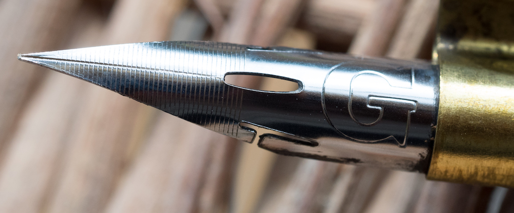
But I also wanted the pen because it offers a unique combination of features: an innovative pump piston filling system that holds a lot of ink, a beautiful black ebonite exterior with a red ebonite grip and feed, and the ability to use a Zebra G calligraphy flex nib with a fountain pen system.

I've been on a never-ending quest to find a modern flex fountain pen because I have an anti-Midas touch with vintage pens. Believe me. I touch a vintage pen and it crumbles in my hands. I've also tried straight and oblique calligraphy pens with dip nibs. I am so bad at dipping, resulting in ink blobs, spatter, and all-around ugly calligraphy.

I've also tried multiple modern pens, including the Aurora Anniversary Flex Nib, the Noodler's Triple Tail Flex Nib, the Scribo Feel flex nib, and many others. My conclusion: Meh. Some are absolute duds. Others offer decent flex but aren't really calligraphy worthy. And others are just out of my price range right now (like the Scribo, not to mention the Montblanc Calligraphy 149).

Pierre's pens offer a wonderful middle ground: reasonable price, calligraphy flex nib (with other nib options), and a filling system so you don't have to dip the nib. Woot!

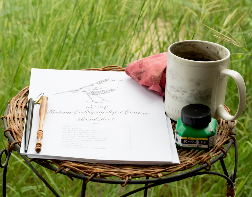
The BAMF pen comes in no-frills packaging: a small flat rate USPS box and some soft paper padding taped around the pen.

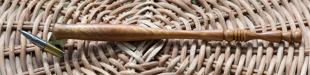
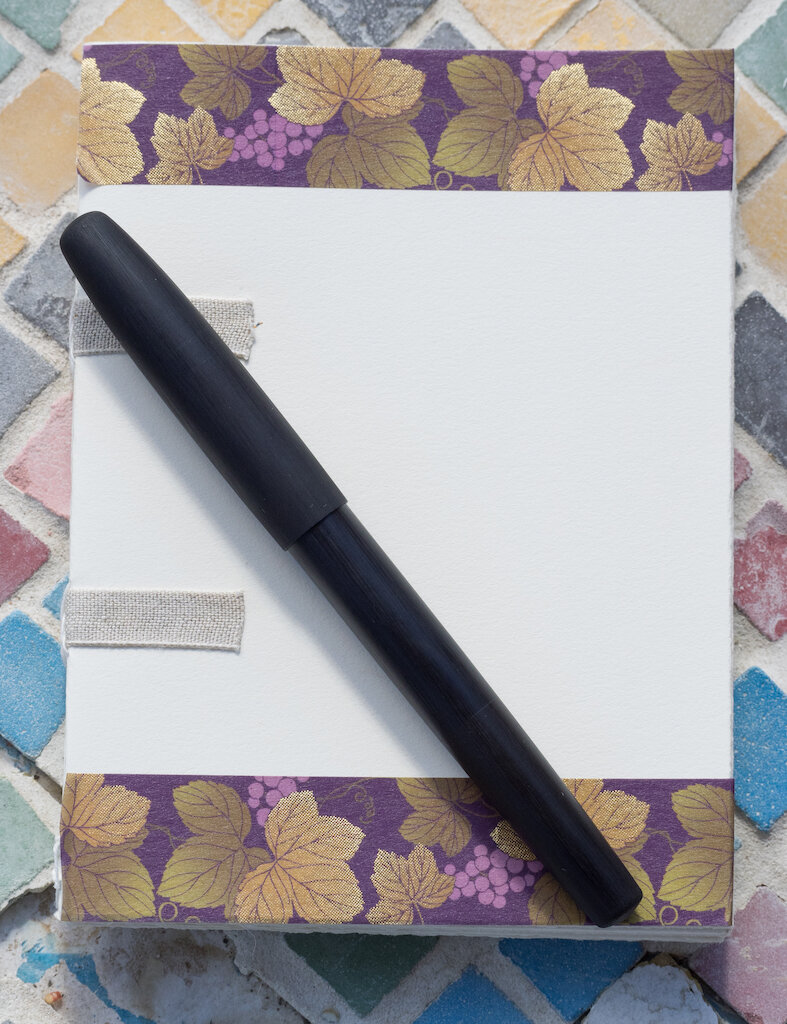
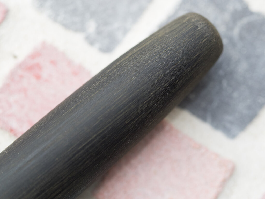
The pen is made of black ebonite--the body has a gloss finish and the cap has a brushed finish.

Desiderata BAMF Pump Piston Fountain Pen Body
Desiderata BAMF Pump Piston Fountain Pen Brushed Cap

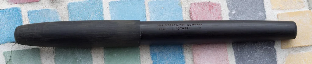
There's no clip or any ornamentation on the pen other than "Desiderata Pen Company" and "BAMF" (spelled out) engraved on the barrel. This is not a pen you want falling in the hands of a child who can read and who wants to know what those words mean. I've kindly blurred them out for the photo.

Desiderata BAMF Fountain Pen

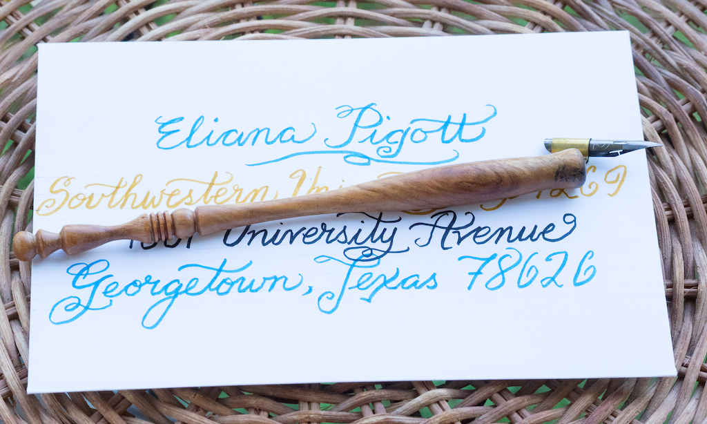
The pen is 150mm/5.9 inches capped, 140mm/5.51 inches unposted (with the Zebra G nib installed), and 178mm/7 inches posted (but I couldn't get the cap to post securely at all). The pen is light, weighing only 15 grams capped without ink.

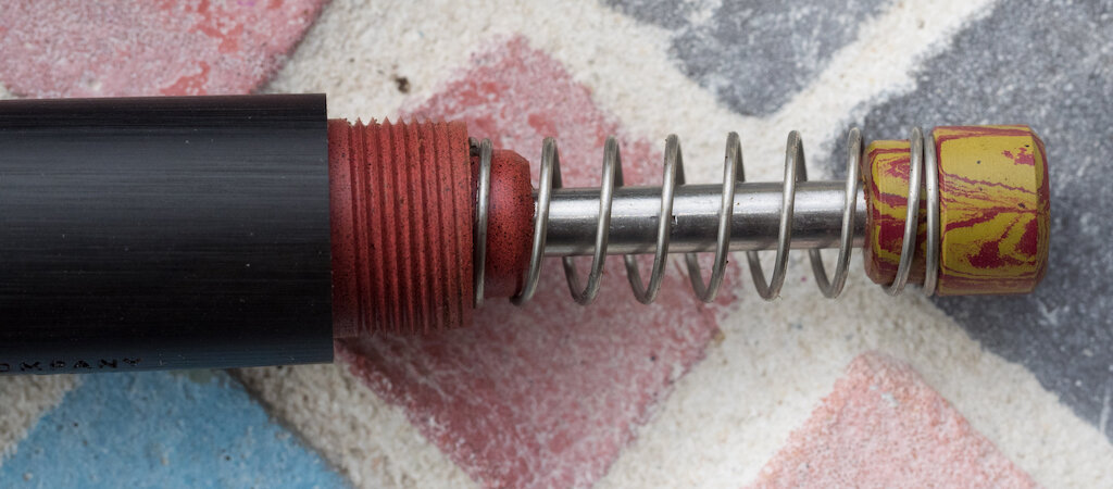
It has slightly rounded ends and a small drop from cap to barrel. The blind cap blends so well into the barrel that you wouldn't know it's there. I'm glad I watched a review of the pen before I received it, because I would've tried to unscrew it at the grip end.

Desiderata BAMF Fountain Pen Disassembled

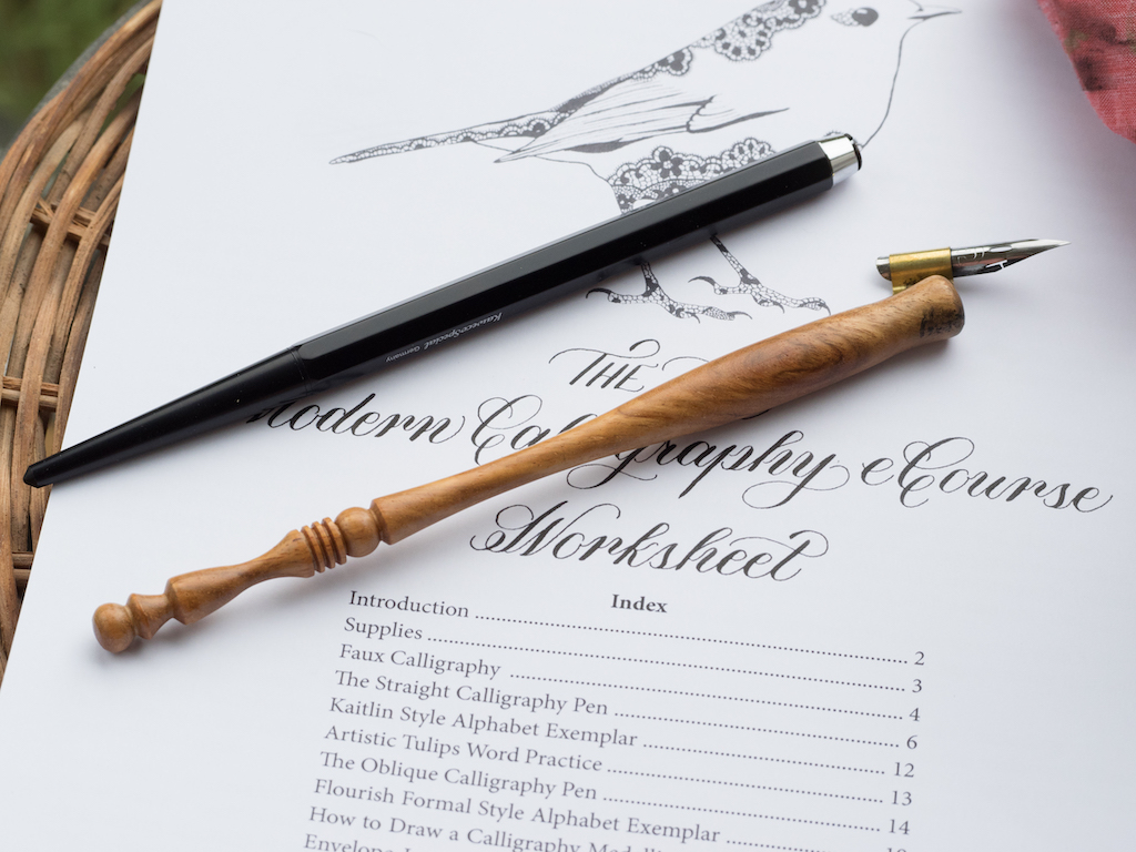
The grip is made of polished red ebonite which offers a classy contrast to the black pen.

Desiderata BAMF Fountain Pen Grip
Desiderata BAMF Fountain Pen Grip Close

The filling system is all kinds of cool. Pierre calls it a "Pump Piston." You open the blind cap to reveal more red ebonite (where the blind cap screws onto the barrel), a spring, and a swirled ebonite button. Once you're ready to ink the pen, you simply put the nib into your ink and press the pump several times until no more bubbles come out. Clean off your nib and section and you're ready to write (well . . . sort of, see below).

Desiderata BAMF Fountain Pen Pump

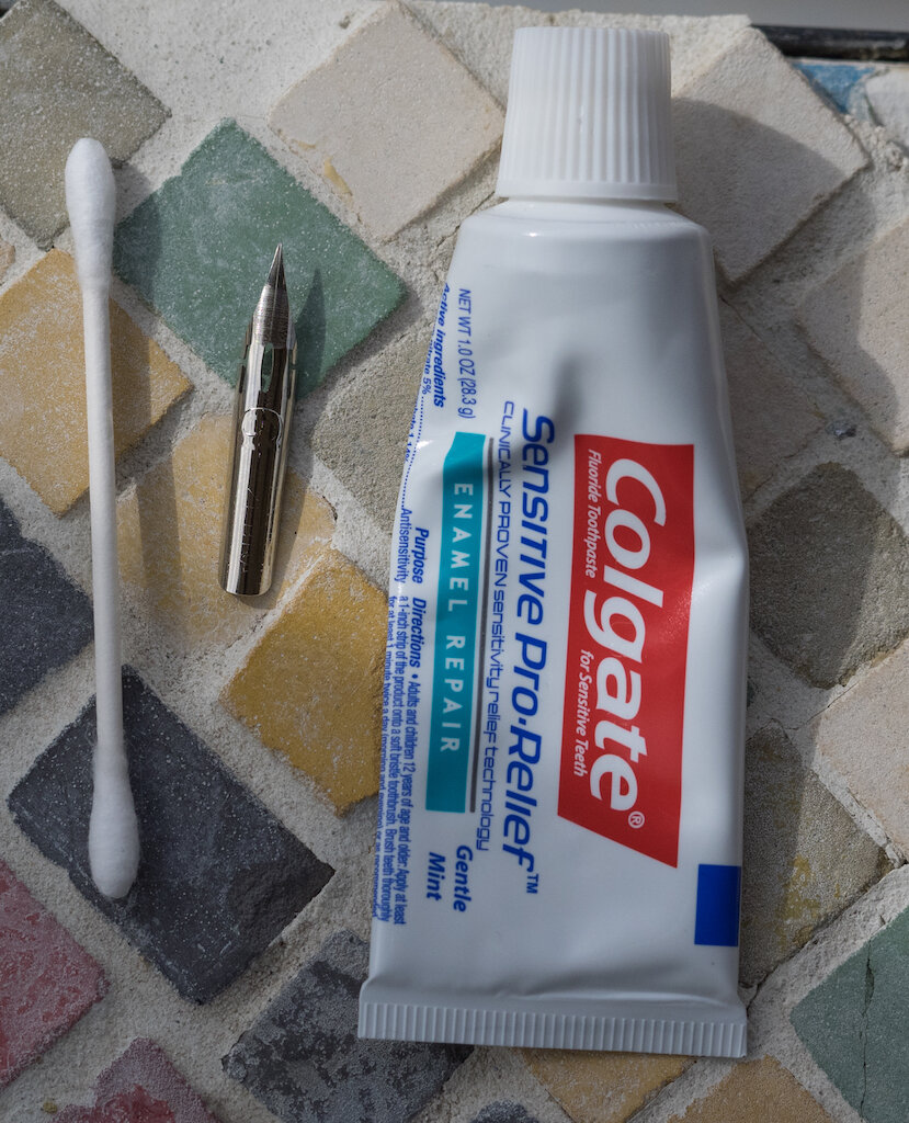
I opted for the Zebra G nib (you could also choose a JOWO nib in various sizes or a Nemosine .6 italic) and the red ebonite feed.

Desiderata BAMF Fountain Pen Nib
Desiderata BAMF Fountain Pen Feed

I read all of Pierre's instructions and watched his video on how to prep the pen for writing. The first step was to remove the nib and feed (which are friction fit) and to clean both of them. I used toothpaste to clean the Zebra G nib because that's what Pierre used. I rinsed the ebonite feed well.

Desiderata BAMF Fountain Pen Cleaning Supplies
Desiderata BAMF Fountain Pen Cleaning

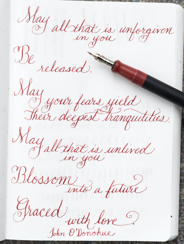
Then I inked the pen up with Robert Oster Red Candy, sat down at the table, and began to play with the pen. I knew from watching Pierre's video that I would have to work with the nib to get it to write properly. It took some time to get the ink flowing, and even then I encountered railroading and skipping. But I kept at it. After awhile, the pen started writing more consistently, and I could do an entire page without problems.

Desiderata BAMF Fountain Pen Alphabet

That said, if I paused for even a short amount of time, the ink stopped flowing. I had to start all over, drawing circles, licking the nib to stimulate the ink, flexing lines to get consistent flow. This happened every time I paused or between writing sessions.

Desiderata BAMF Fountain Pen Lines and Swirls

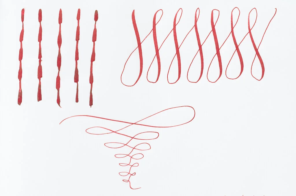
It may just be a characteristic of using a calligraphy nib on a fountain pen. Or, I may need to clean the nib more thoroughly. Or, it may be a matter of breaking the nib in. Regardless, as fiddly as the nib is, it is so much better than having to dip it in ink!!!! I really hate dipping.

Desiderata BAMF Fountain Pen Words
Desiderata BAMF Fountain Pen Words 2
Desiderata BAMF Fountain Pen Close Letters

I am absolutely thrilled with my BAMF. As a beginner calligrapher, I truly appreciate a pen that allows me to practice without having to deal with dipping problems. I can focus instead on creating my letters, practicing words, and developing better spacing. Yes, having to restart the pen after every pause is irritating, but it doesn't take long, and I suspect it's user error rather than the pen's fault.

Desiderata BAMF Fountain Pen Donohue

Sadly, the BAMF is no longer available. Pierre makes his pens in small batches, so it's first come first served. Let us hope there will be another iteration of this pen. Your best bet, if you're interested in Pierre's pens, is to sign up for his newsletter (the sign up is at the bottom of the About page).


Enjoy reading The Pen Addict? Then consider becoming a member to receive additional weekly content, giveaways, and discounts in The Pen Addict shop. Plus, you support me and the site directly, for which I am very grateful.

Membership starts at just $5/month, with a discounted annual option available. To find out more about membership click here and join us!

Desiderata BAMF
Posted on October 30, 2020 and filed under Desiderata, Fountain Pens, Calligraphy, Pen Reviews.

The Postman’s Knock Modern Calligraphy eCourse: A Review

(Susan M. Pigott is a fountain pen collector, pen and paperholic, photographer, and professor. You can find more from Susan on her blog Scribalishess.)

I’ve been wanting to take a calligraphy course ever since I started using fountain pens. I wanted to learn how to form fancy letters and to improve my regular writing as well. Unfortunately, I could not find an in-person course in Abilene, so I gave it up as a lost cause.

Eventually, I started looking for calligraphy courses I could take online. I found several, but some were over $100, and I wasn’t sure I was ready to commit so much money as a beginner. That’s when I found The Postman’s Knock Beginner’s Modern Calligraphy eCourse. The basic course costs $25 plus supplies. I thought that was a reasonable price to dip my pen into. The $25 fee includes a downloadable calligraphy course worksheet packet and six lessons (some lessons have multiple videos).

Supplies

The supplies recommended for the course were:

  • Any pen or pencil (no cost)
  • A Nikko G nib. I bought a pack of three from JetPens. ($4.30)
  • A starchy potato (I had one in the fridge)
  • A straight pen with a universal insert. I already had a Kaweco Special pen, which I reviewed on Pen Addict here (no additional cost).
  • A brass-flanged oblique pen. I purchased this from PaperInkArts for $14.95 + 3.50 shipping ($18.45)
  • Sumi or India Ink. I bought a 60ml bottle of Kuretake Sumi Ink from JetPens for $11.00.
  • 32# Laserjet Paper. I purchased a ream from Amazon for $14.86.
  • A piece of tightly woven cotton cloth. I initially used a microfiber cloth, but later found an old napkin that worked better (no cost).
  • A cup or mug for tap water. I used an old faded mug (no cost).

My supplies cost a total of $48.61. So, I paid a total of $73.61 for the course plus the supplies.

The Course

The Beginner’s Modern Calligraphy Course contains six lessons plus a short homework video. Lesson 1 takes you through the supplies you need for the course.

Lesson 2 teaches you faux calligraphy using any writing instrument. I didn’t really find this lesson all that helpful, since I knew I wanted to learn dip-pen calligraphy, but I gave it a try with mixed results.

My attempts at faux calligraphy weren’t the best.

Lesson 3 introduces you to using the straight calligraphy pen using a modern form of calligraphy called Kaitlin Style, created by Lindsey Bugbee from the Postman’s Knock. I enjoyed this lesson because it teaches you the basics of how to use a straight dip pen, first by learning down and up strokes, and then by creating letters. You graduate to writing individual words.

I struggled using the straight pen, mainly because you have to angle the paper so much to get a proper angle.

Plus, even though I dipped and tapped the pen to remove excess ink, my letters often came out blobby and fat.

I emailed Lindsey to ask about this problem (because you’re supposed to have access to email support with the cost of the course), but I never received a reply. I don’t know if this was because my question was asked by someone else in the comments section, and I didn’t see the response, or if my email just got overlooked. I eventually discovered for myself that I had to blot the nib on a paper towel after dipping and before writing to avoid excess ink.

At the end of the lesson, Lindsey provided a traceable project using Amy Style calligraphy. I didn’t exactly feel “proud” of this project since I just traced the letters and didn’t do the calligraphy myself. But, it was good practice.

Lesson 4 teaches you how to use an oblique calligraphy pen with a more formal calligraphy style.

This was my favorite lesson. I definitely prefer the oblique pen holder to the straight pen. Even though the oblique holder takes a little bit more practice, in the end you are able to hold your hand at a more natural angle and let the pen do the rest. I also much prefer the formal calligraphy style. I still had some problems with blobs, but not nearly as many, and I felt like my calligraphy improved somewhat with this lesson.

In Lesson 5, you learn how to create a calligraphy medallion. Although this was a fun project that required you to practice different kinds of strokes, in the end, I didn’t find it all that useful. I would have preferred more lettering practice. Still, after a couple of attempts, I created a reasonably good medallion.

Lesson 6 describes how to create calligraphy envelopes. This was the most challenging lesson of all, because, depending on the style of envelope you want to create, you have to do some measuring and centering. Plus, you have to draw guidelines. I honestly didn’t feel like I was ready for this lesson because I needed more lettering practice. But after several failed attempts, I managed to create a fairly adequate envelope. I sent my daughter, who is a freshman at Southwestern University, her first letter in this envelope.

The last video is simply a reminder to do some homework exercises and to practice. Although you are given two reference alphabets (Kaitlin Style and Flourish Formal), the Beginner’s Calligraphy packet doesn’t include additional practice sheets. For that you must purchase other packets from The Postman’s Knock. I’m planning to purchase the Premium Calligraphy Worksheet Set: Flourish Formal Style ($10.00) as soon as I get more toner for my printer. Obviously, that’s $10 more on top of the supplies and original course, which gets me to about $85. That’s still cheaper than other online courses I considered.

Overall, I was pleased with The Postman’s Knock Modern Calligraphy eCourse. It was not overly expensive, and the supplies were easy to acquire. Lindsey is an excellent teacher, and the videos were never too long or overwhelming. As a beginner’s course, it doesn’t go into too much depth, but instead introduces you to two different alphabet styles, calligraphy medallions, and envelopes.

The main weaknesses of the course were:

  • The course did not offer enough writing practice. The two writing lessons essentially let you practice the alphabet once and write a few words. This just wasn’t sufficient to feel competent writing words on my own.
  • Because the course is taught through video lessons, there is no way to know if you are holding your pen correctly or writing letters properly. You can’t ask Lindsey to check your style and correct any potential problems. That is, of course, why taking an in-person course is preferable.
  • I was disappointed that when I emailed a question to Lindsey, I never received a response. I checked my spam folder to make sure a response wasn’t accidentally sent there, but it wasn’t. Part of what made the course appealing to me was that, supposedly, you could obtain personal assistance when needed.
  • The course does not teach you about spacing between letters, drawing calligraphy guidelines, or other technical aspects of calligraphy.

If you’re like me and can’t find a face-to-face calligraphy course, I recommend this one from The Postman’s Knock. As I explained, it won’t make you proficient in calligraphy, but it gives you a sample of different writing styles and a taste of other things you can do with calligraphy. It’s a good starting place, and from here, the best thing you can do is practice.

(I purchased the course and supplies with my own funds.)

Posted on October 19, 2018 and filed under Calligraphy, Online Courses.