Posts filed under Pennonia

Pairings Party: Kaweco Sport Marble Ocean, Pennonia x SultilsAttila Stormy Meadow

Kaweco Sport Marble Ocean, Pennonia x SultilsAttila Stormy Meadow

What do you do when you have one of the best-looking Kaweco Sports ever released, and one of the wildest inks ever made, sitting on the desk right next to each other?

🍍🖋️🍍Pineapple Pen!🍍🖋️🍍

The Kaweco Sport Marble Ocean Fountain Pen and Pennonia x SultisAttila - Viharos Tisztás, translated as Stormy Meadow, look like they were made for each other. Marble Ocean features a Blue and Green swirl pattern throughout the barrel, with some translucent areas mixed in, and Stormy Meadow is a bright Green with a matte Blue “shimmer,” which is definitely something to discuss further.

The Sport Fountain Pen is an all-time favorite of mine, but I did something for the first time when filling this one: I eyedroppered it. Traditionally, this is a straightforward operation with the plastic barrel of the Sport, but I’ve avoided doing so in the past. Why? The Sport is the perfect pocket pen, and I’m known to toss mine around a bit when on the go. I don’t even use those terrible little Kaweco converters, just whatever short international cartridge I’m feeling. Cartridge usage is safer.
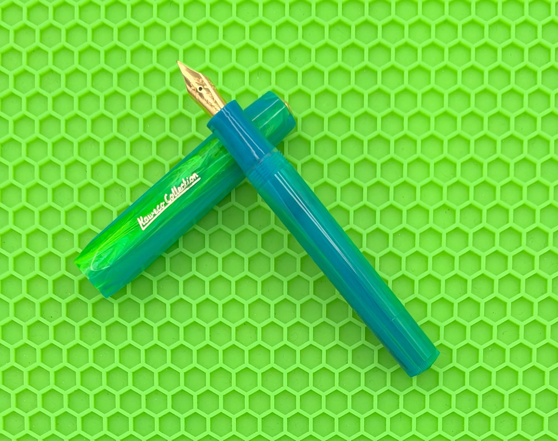
That said, converting this pen to an eyedropper is simple, especially with the new threaded nib unit Kaweco is starting to use. A little silicone grease on the nib housing threads, and a little on the barrel connection threads, and you are good to go. This one hasn’t left the desk yet, but the seal has been perfect so far, with no leaking or burping.

The ink flow is wonderful, too, which I was concerned about. Stormy Meadow is considered a shimmer ink, and I have an Extra Fine nib in this pen, so that feels a little bit like playing with fire. Not only has there been no issue with ink flow, I’d argue it has been exceptional. It writes consistently wet from when I uncap the pen until I’m done.

As I mentioned earlier, the shimmer particles in this ink are matte, not shiny. Instead of a glittery line on the page, this one has more of a flat coat. The base ink color is Green, and the matte pigment is Blue, with the end result showing a wonderful mixture of the two. The effect on the page is what looks like a Green ink with Blue shading, and it’s kind of awesome.
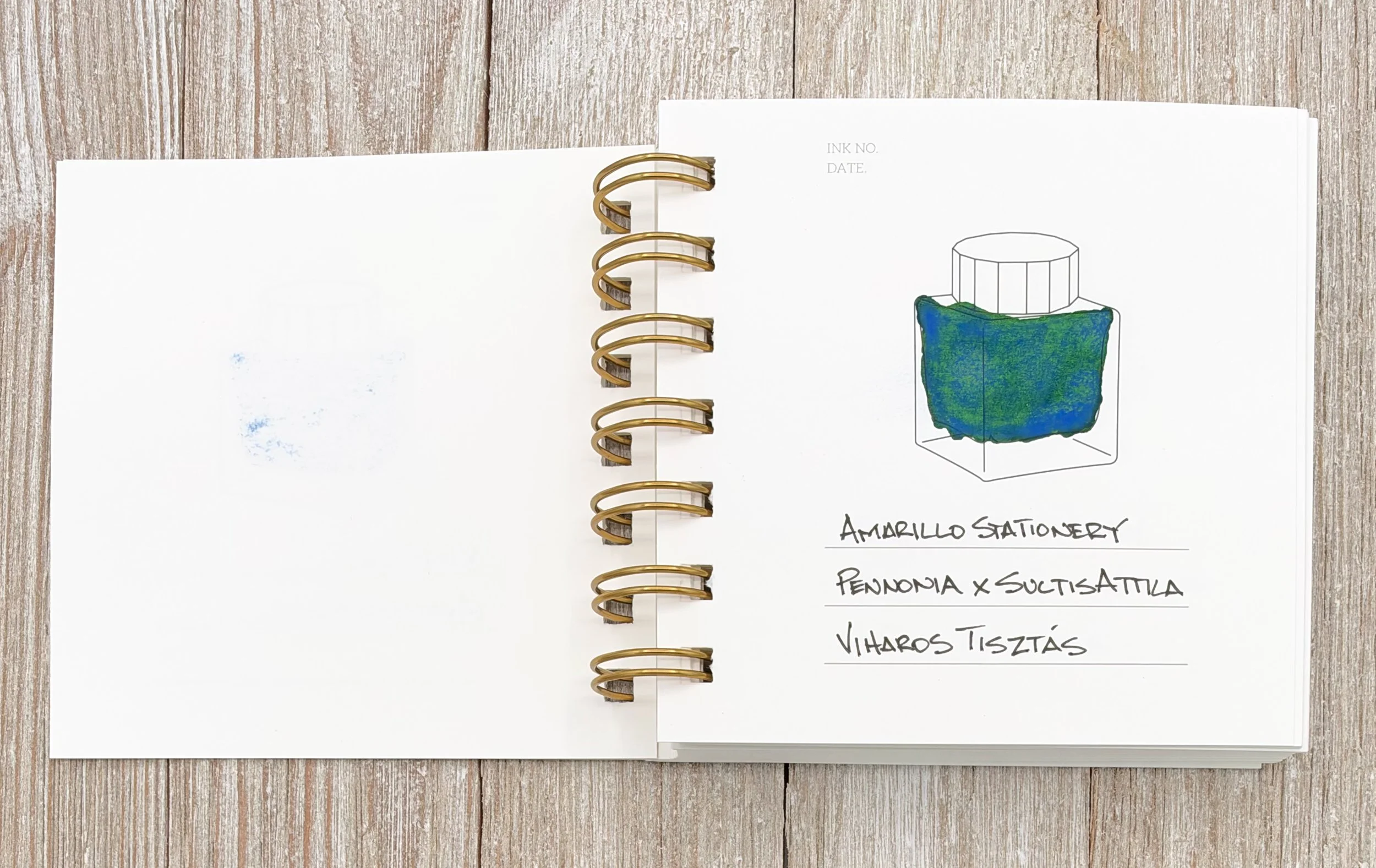
SultilsAttila Stormy Meadow

The left side of the page shows some of the matte dust transfer.

As awesome as this ink is, there is a downside: the matte shimmer behaves like graphite on the page. When the ink dries, you can run your finger across the page and the powdery surface will transfer onto your fingers, and leave behind smudges. If you are active in your notebook, it will transfer onto the previous pages. If you are left-handed … well, you get the picture.
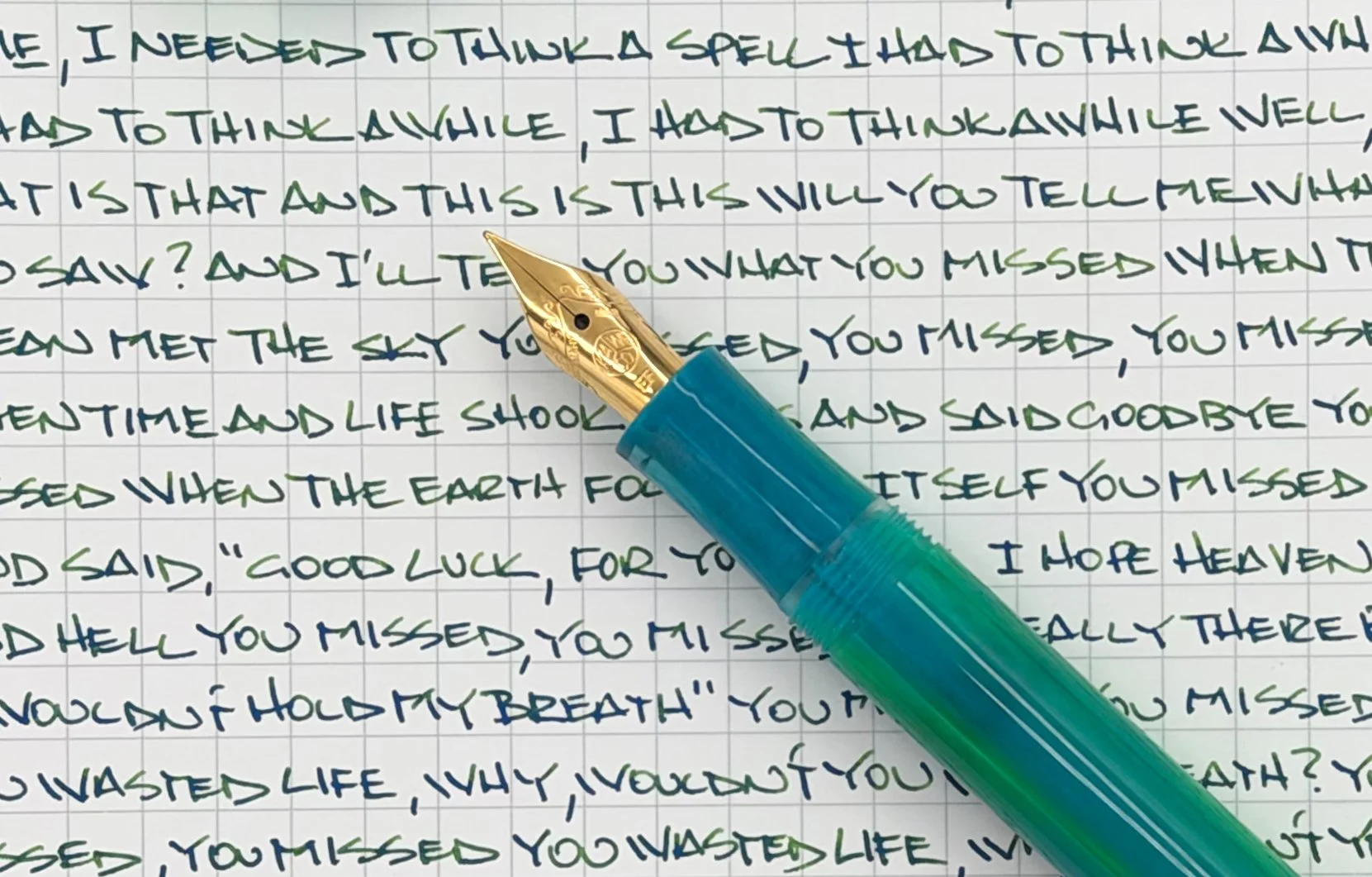
SultilsAttila Stormy Meadow Writing

Amazing results on the page, even from an Extra Fine nib.

Why would you use an ink with this level of downside? It’s beautiful on the page, the effects are unique, and it’s downright fun. Would I use it as my journaling ink? No. Would I use it in most other short-form writing situations? Yes. My biggest surprise is just how well it works from this Extra Fine Kaweco nib. I had low expectations, which were exceeded by miles.
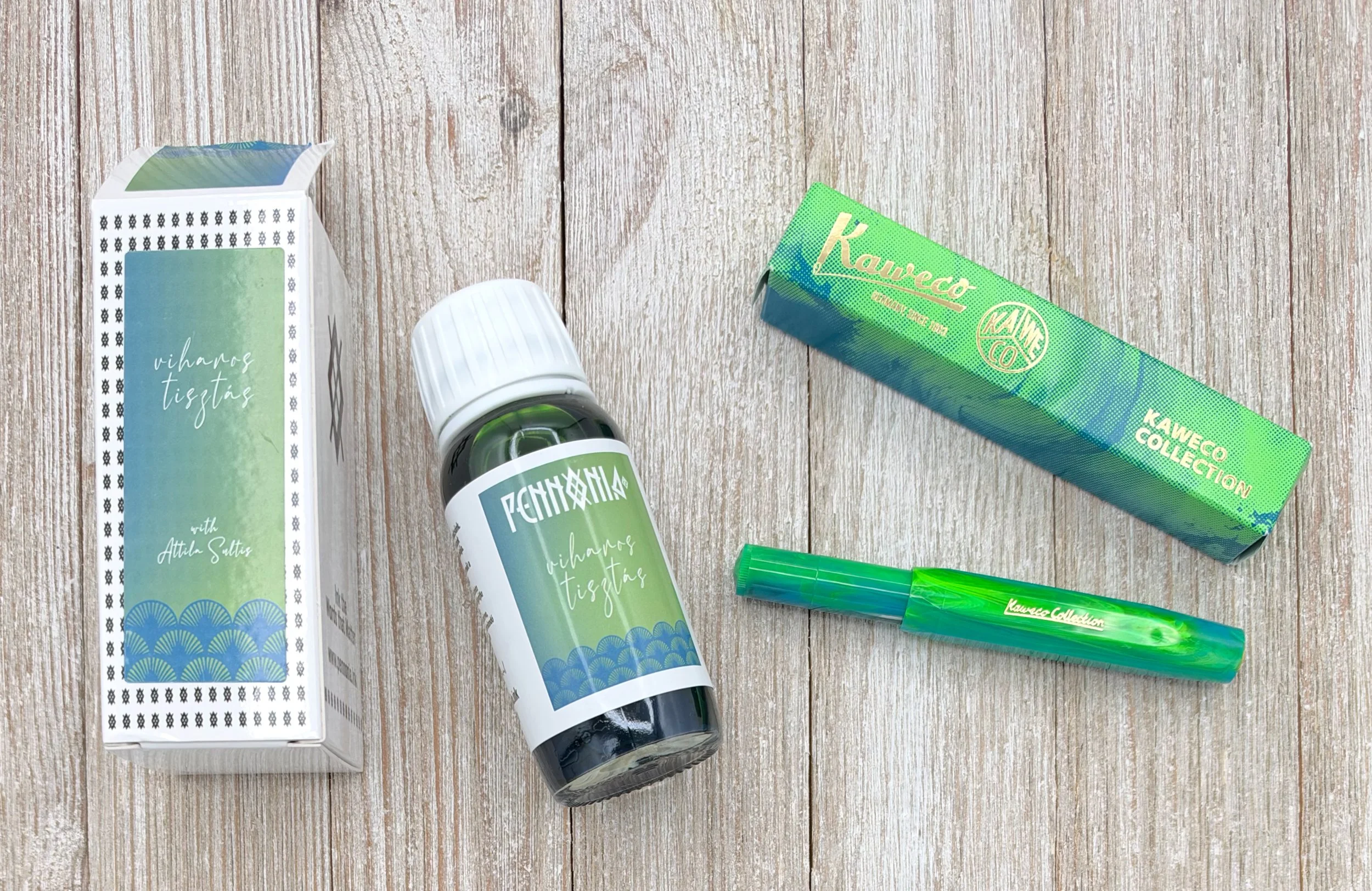
Pairings Party: Kaweco Sport Marble Ocean, Pennonia x SultilsAttila Stormy Meadow

I’m thrilled with how this pairings party turned out, but I have a few questions for you:

  • Would you eyedropper a Kaweco Sport?
  • Would you use a matte “shimmer” ink?
  • Would you use a matte “shimmer” ink in an Extra Fine nib?

I feel like I did everything I wouldn’t normally do with this setup, and it worked out perfectly. It looks like more experimentation is in the cards, and in my pens!

(Vanness Pens provided the Kaweco Sport at a discount, and Amarillo Stationery provided this ink at no charge to The Pen Addict for review purposes.)


Enjoy reading The Pen Addict? Then consider becoming a member to receive additional weekly content, giveaways, and discounts in The Pen Addict shop. Plus, you support me and the site directly, for which I am very grateful.

Membership starts at just $5/month, with a discounted annual option available. To find out more about membership click here and join us!

Pairings Party: Kaweco Sport Marble Ocean, Pennonia x SultilsAttila Stormy Meadow Writing
Posted on September 28, 2026 and filed under Pennonia, Kaweco, Ink Reviews, Fountain Pens.

Pennonia x Stationery Universe Morpho Ink Collection Review

(Kimberly (she/her) took the express train down the fountain pen/stationery rabbit hole and doesn't want to be rescued. She can be found on Instagram @allthehobbies because there really are many, many hobbies!.)

When I went to the St. Louis Pen Show last year, Tori Woods of Stationery Universe gave us some sneak peeks at her upcoming ink collaboration with Pennonia. At the time, she was still deciding between a few color samples, so I wasn’t sure what the end product would look like. Needless to say, I couldn’t wait to find out!

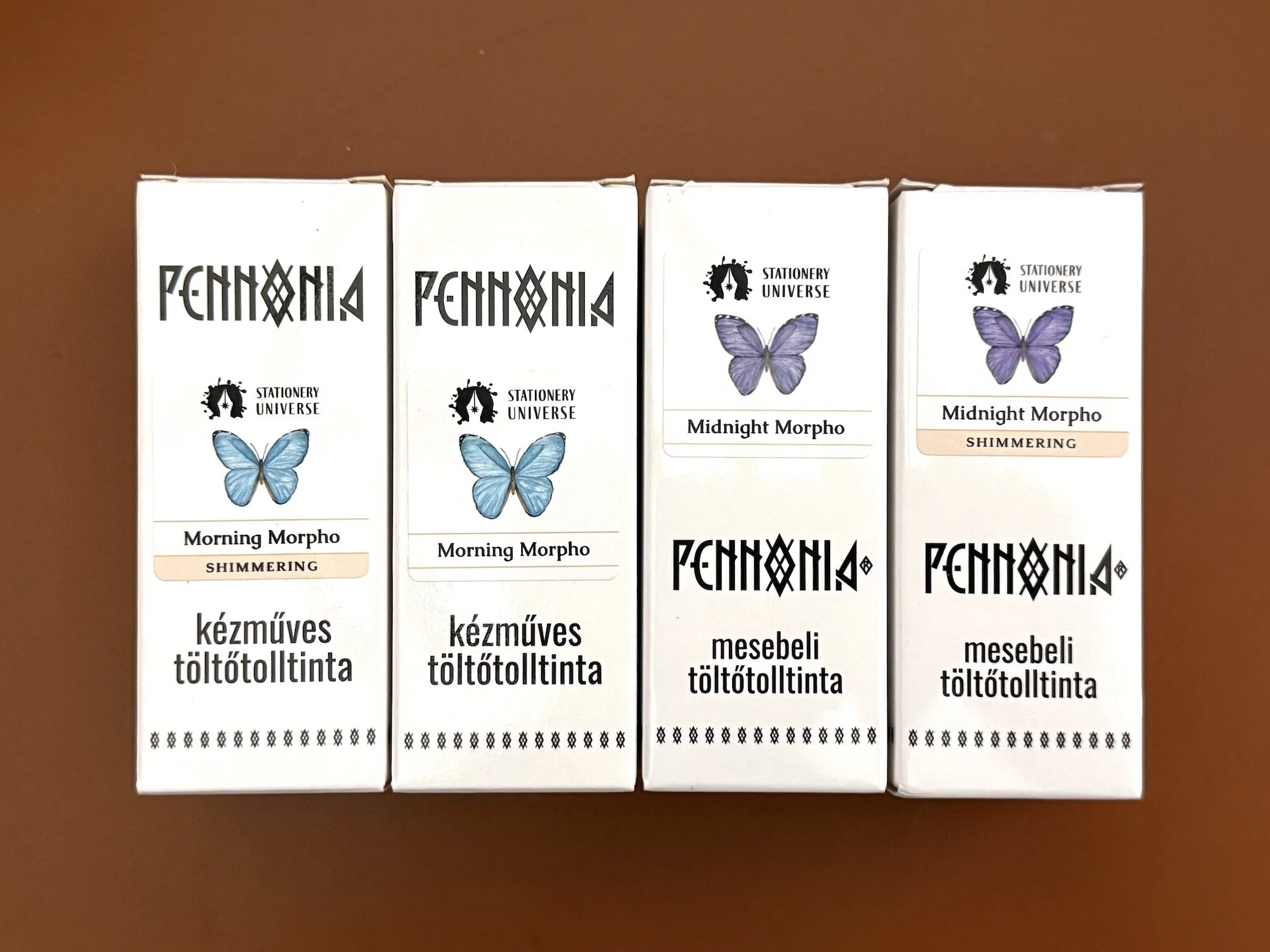
Tori was inspired by the Morpho aurora butterfly to create the Morpho Collection, a set of four inks, in two colors (Morning Morpho & Midnight Morpho), in formulations with and without shimmer.

Pennonia x Stationery Universe Morpho Collection, The butterfly labels help you see what colors are in the bottle.

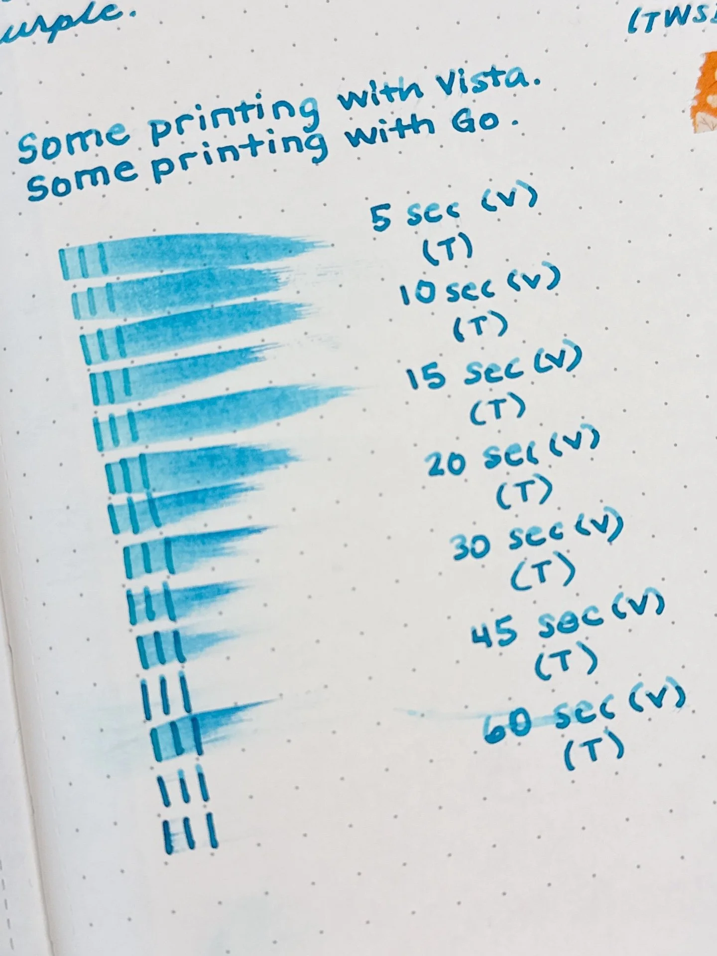
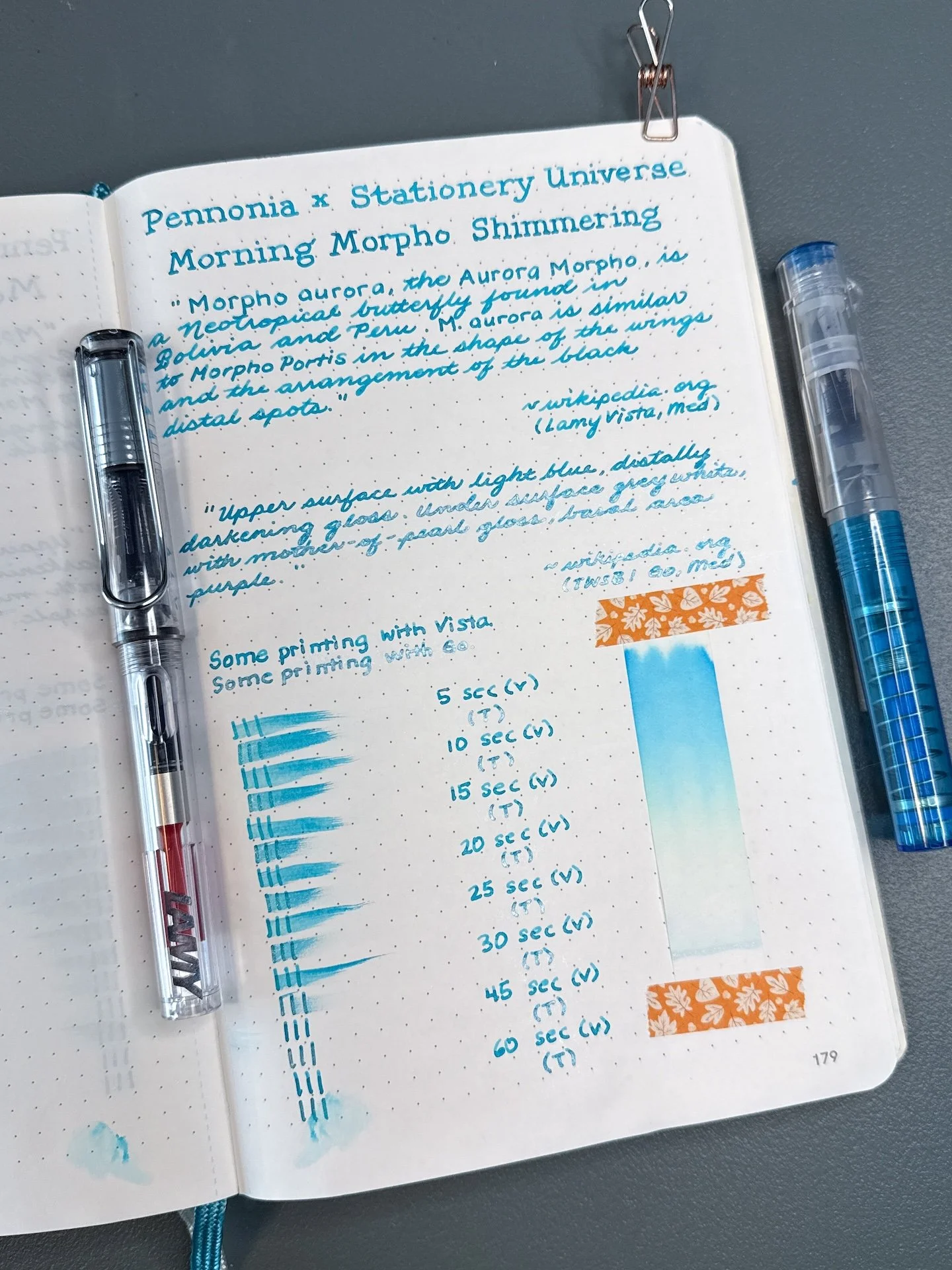
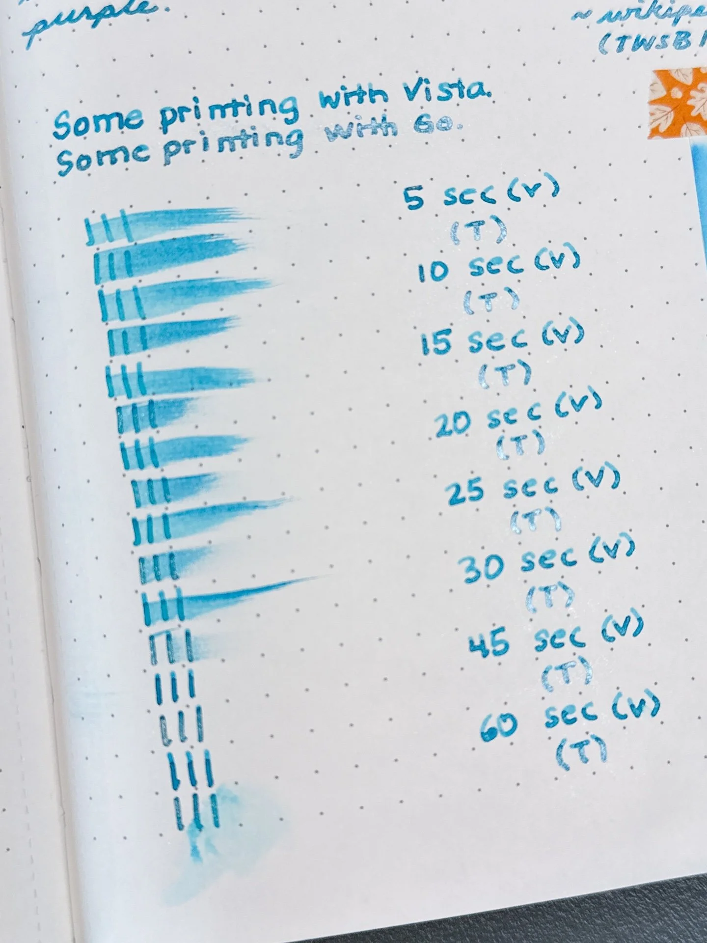
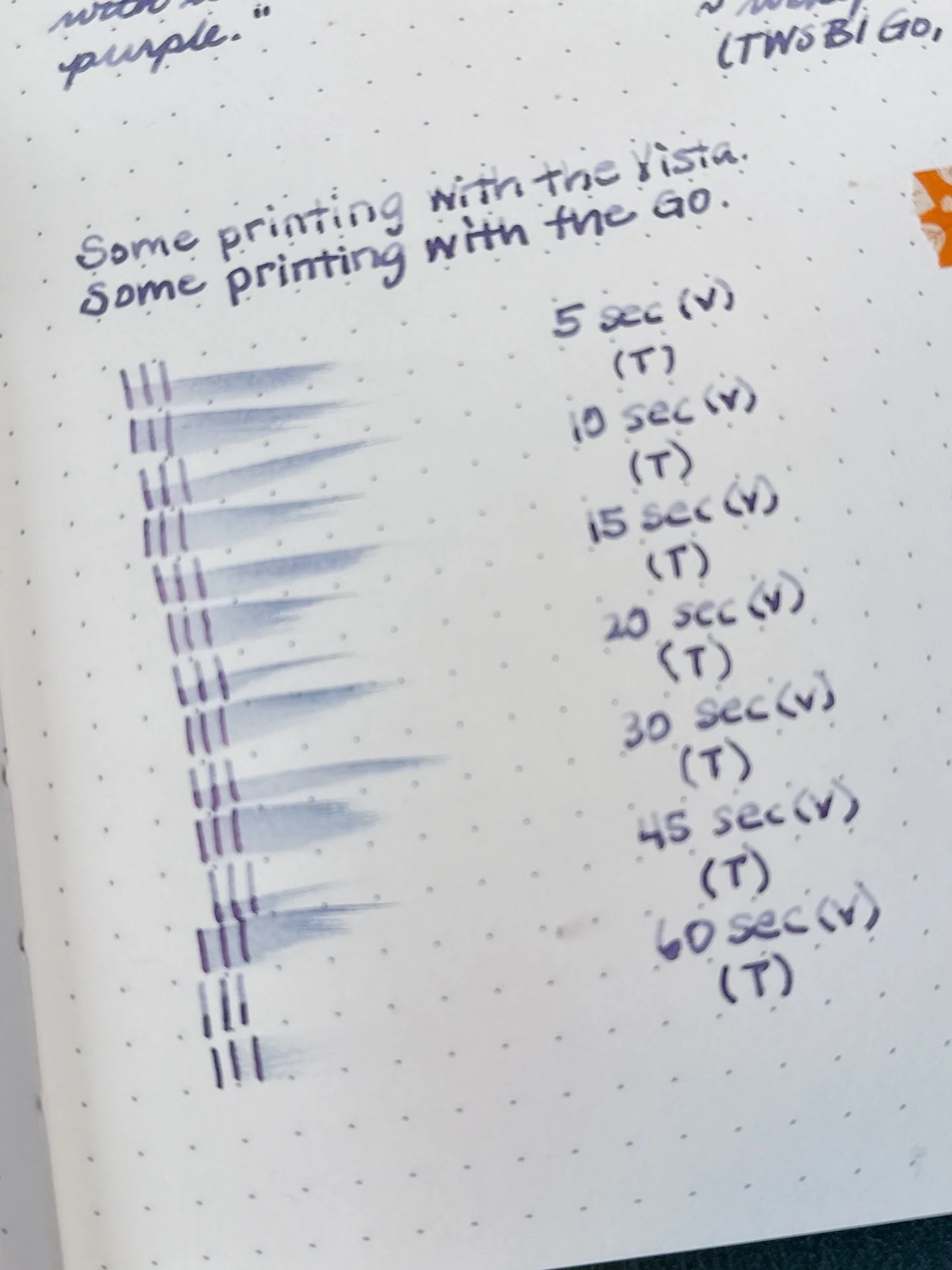
As usual, all swatches were done on Col-O-Ring cards and also Wearingeul Instant Film Color Swatch cards, using a Kakimori steel dip nib and writing samples were done primarily with a Lamy Vista with a steel Medium nib and a TWSBI Go with a Medium nib. The notebooks used for writing samples are from an Endless Recorder and Odyssey Notebooks, both with 68 gsm Tomoe River paper. Dry times for the Vista are shown with “(V)” and the Go will be shown below that with a “(T)”. Dry times may be a bit slower on 52gsm TR or faster on more absorbent papers like Rhodia, copy paper, Cosmo Air Light, or with drier or finer nibs.

Side note: Photographing inks is not easy. My photo editing skills are mediocre at best, so I prioritize swatch/writing sample accuracy over paper or background color accuracy. Even then, it doesn’t always work out – it could look great in the Lightroom app, and then less great when I export to my phone, or great on phone, and less great when I upload to the Bossman’s Dropbox, etc.

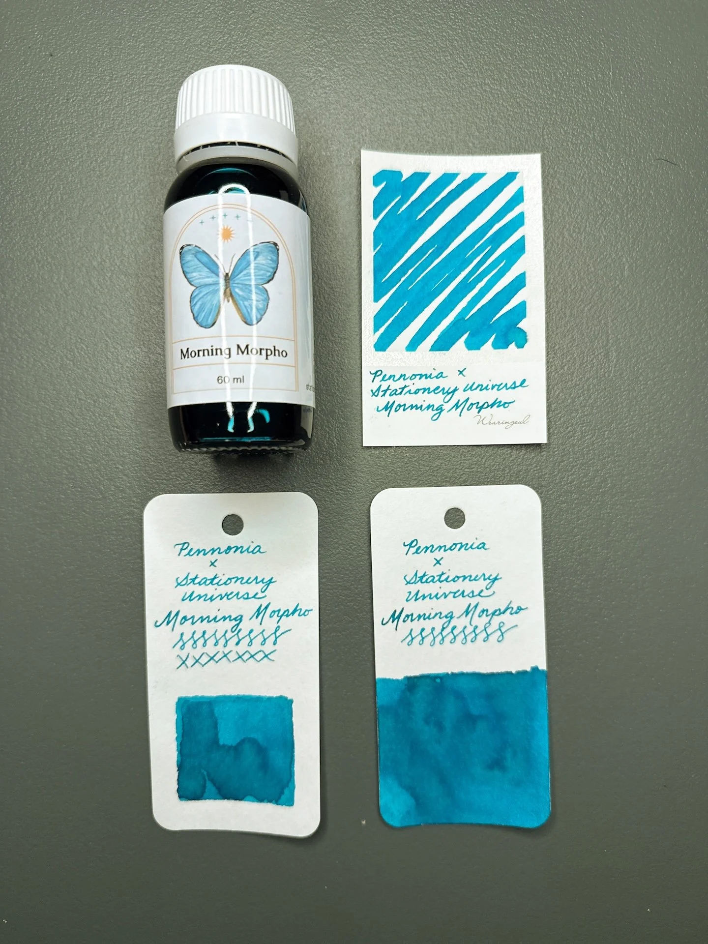
Morning Morpho and swatches.

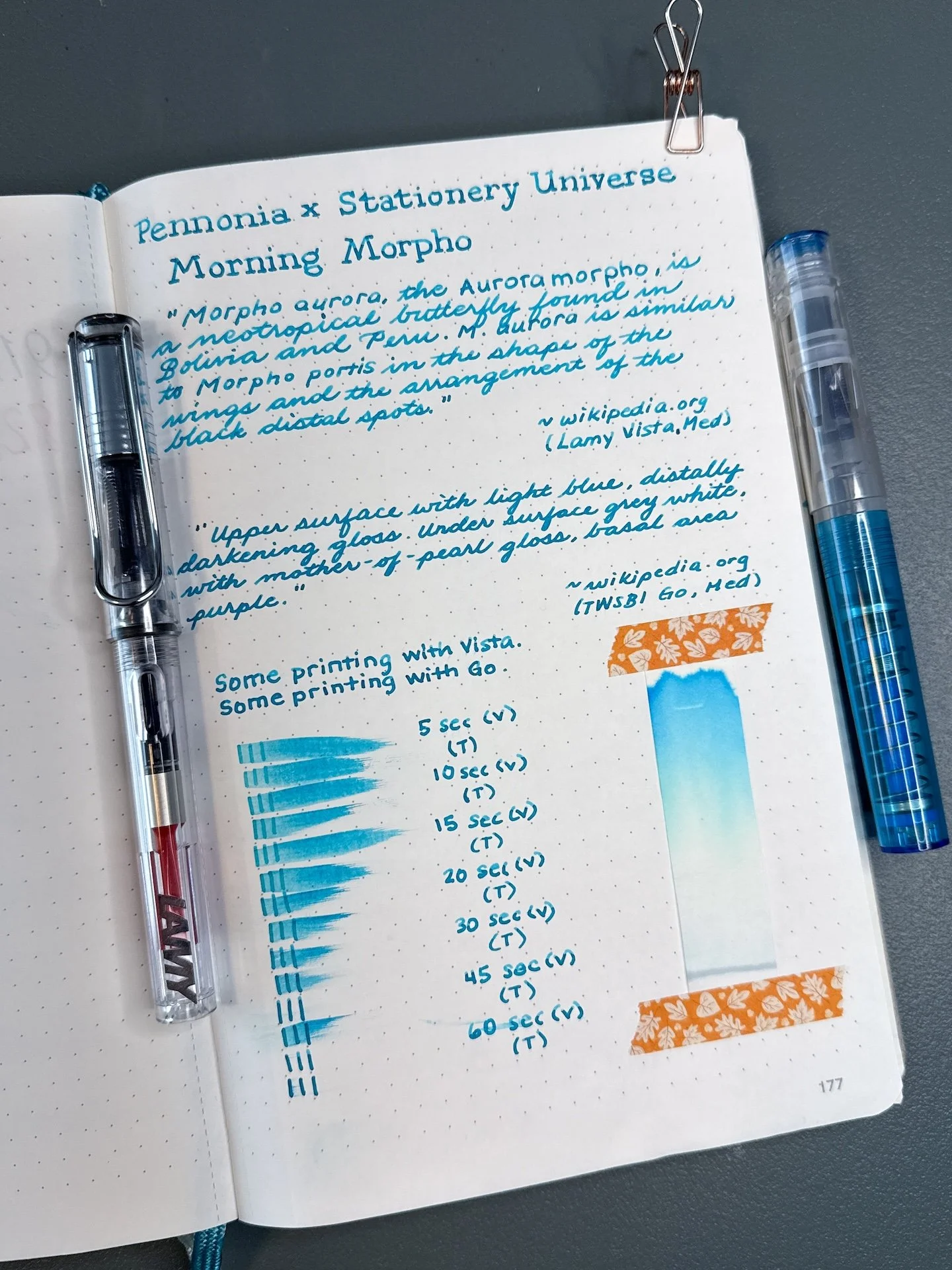
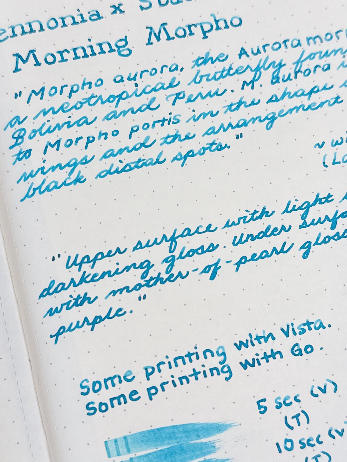
Morning Morpho is a turquoise-leaning teal that looks more turquoise in drier pens and a bit more green (but still very much a blue teal) in wetter pens. In the TWSBI Go, the line is more saturated while the drier Vista shows off a bit of the shading. There was no sheen from either pen. It had average to fast dry times in both pens.

Morning Morpho writing sample.

You can see the Morning Morpho’s shading, as well as its more turquoise color, from the Vista (top) versus a more saturated writing sample from the Go.

Average dry time for Morning Morpho. Not surprising that the wetter Go’s writing sample took longer to dry.

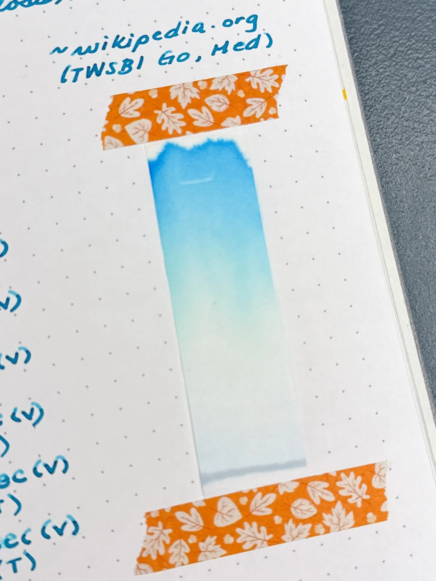
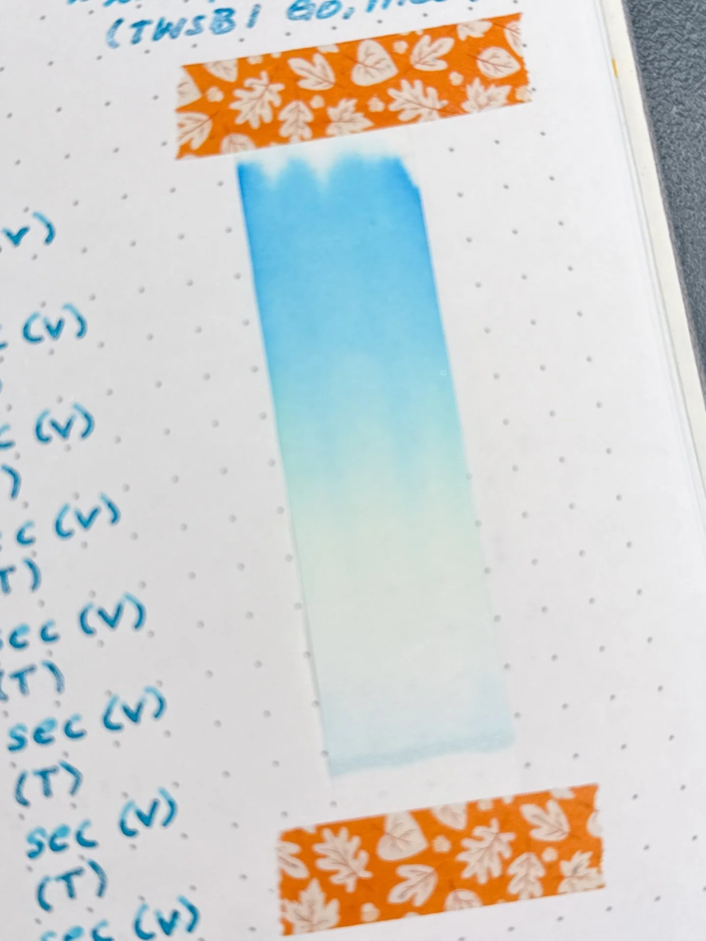
Chromatography from Morning Morpho - A straight forward turquoise chromatography with a touch of light yellow in the middle.

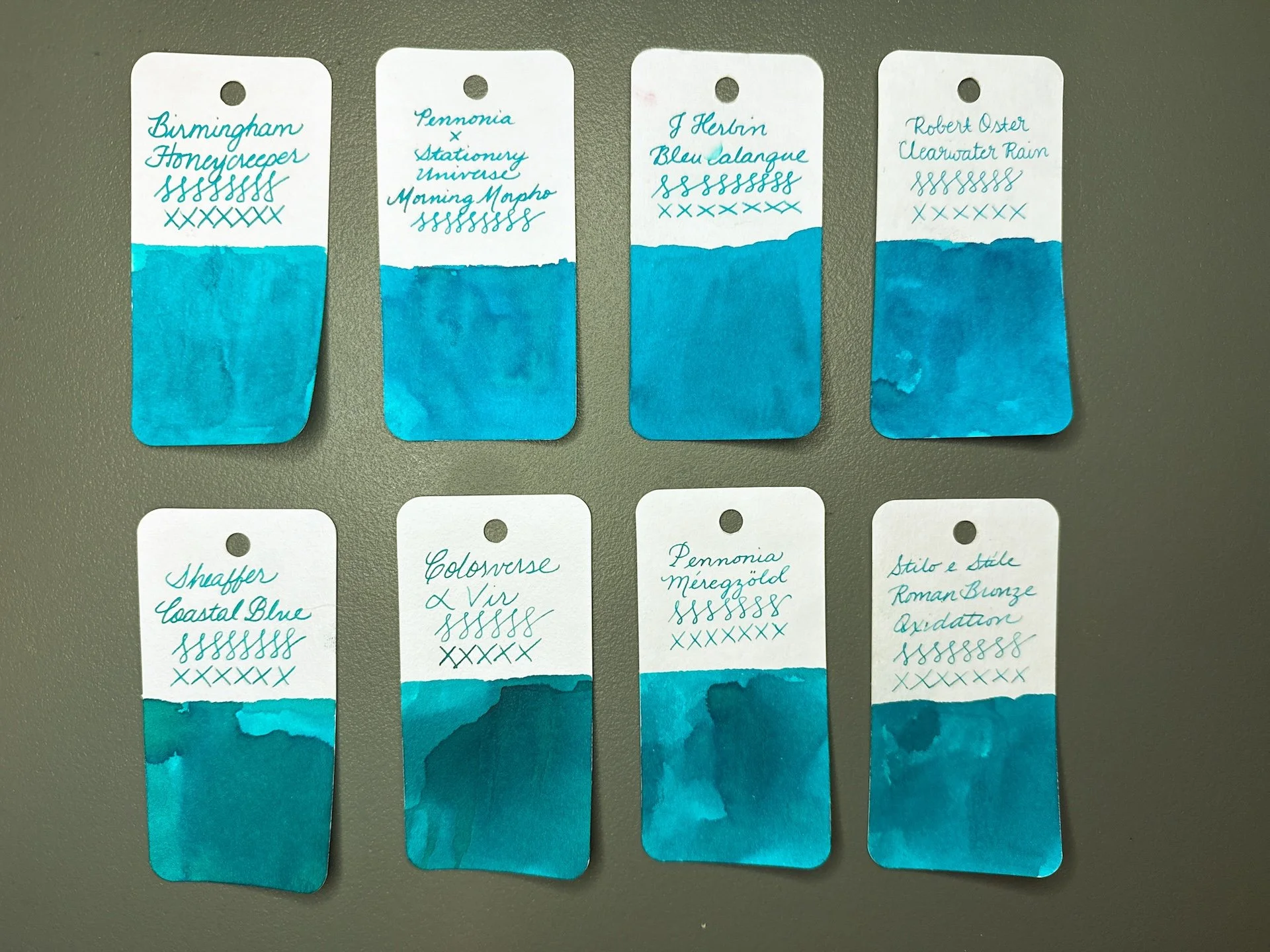
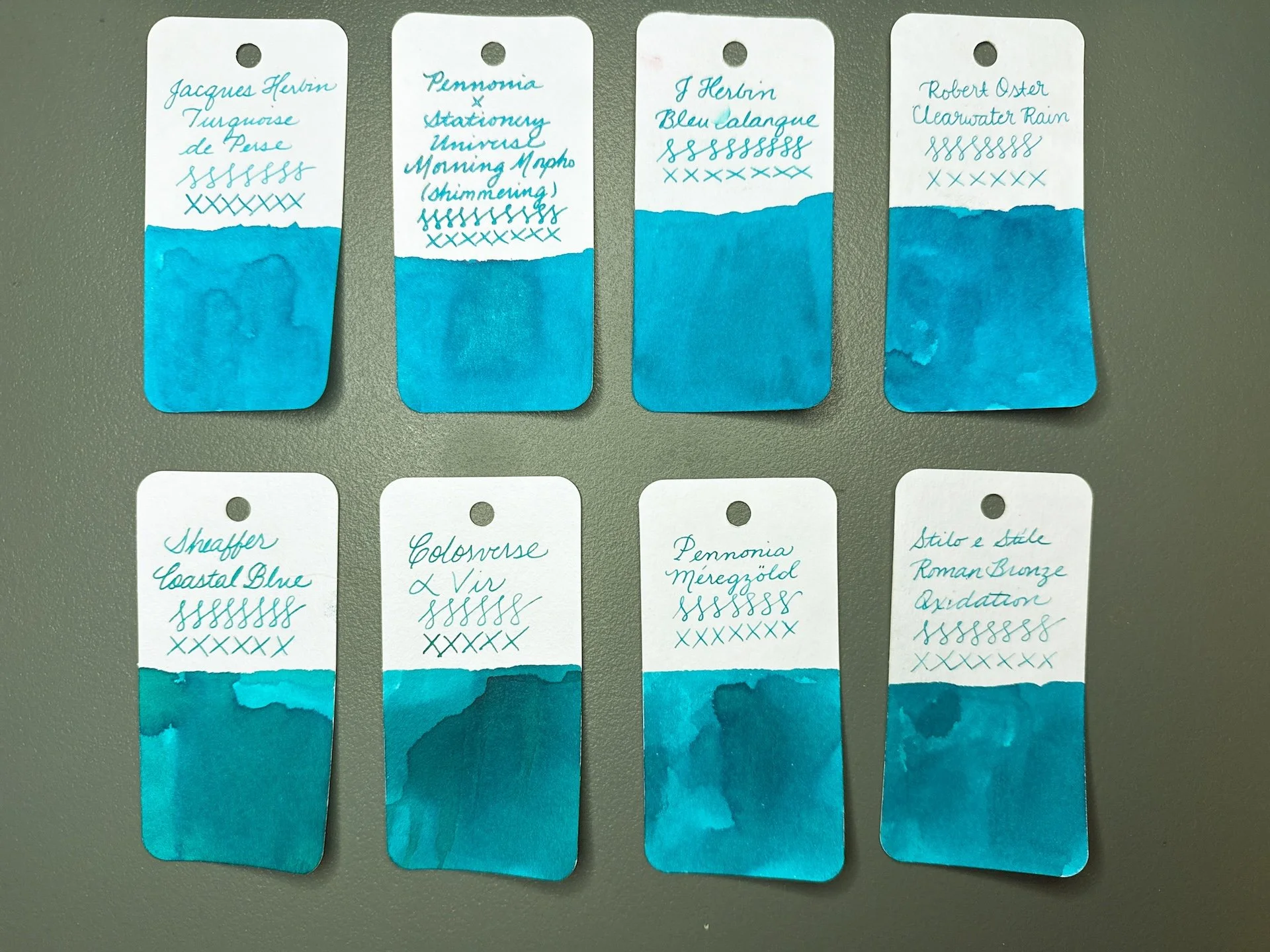
Inks similar to Morning Morpho: Birmingham Honeycreeper (a bit too too blue, too bright), J Herbin Bleu Calanque and Robert Oster Clearwater Rain are probably the closest, but needs a touch more green), Sheaffer Coastal Blue, Colorverse a Vir, Pennonia Meregzold, and Stilo e Stile Roman Bronze Oxidation lean too green (but are closer when viewed irl).

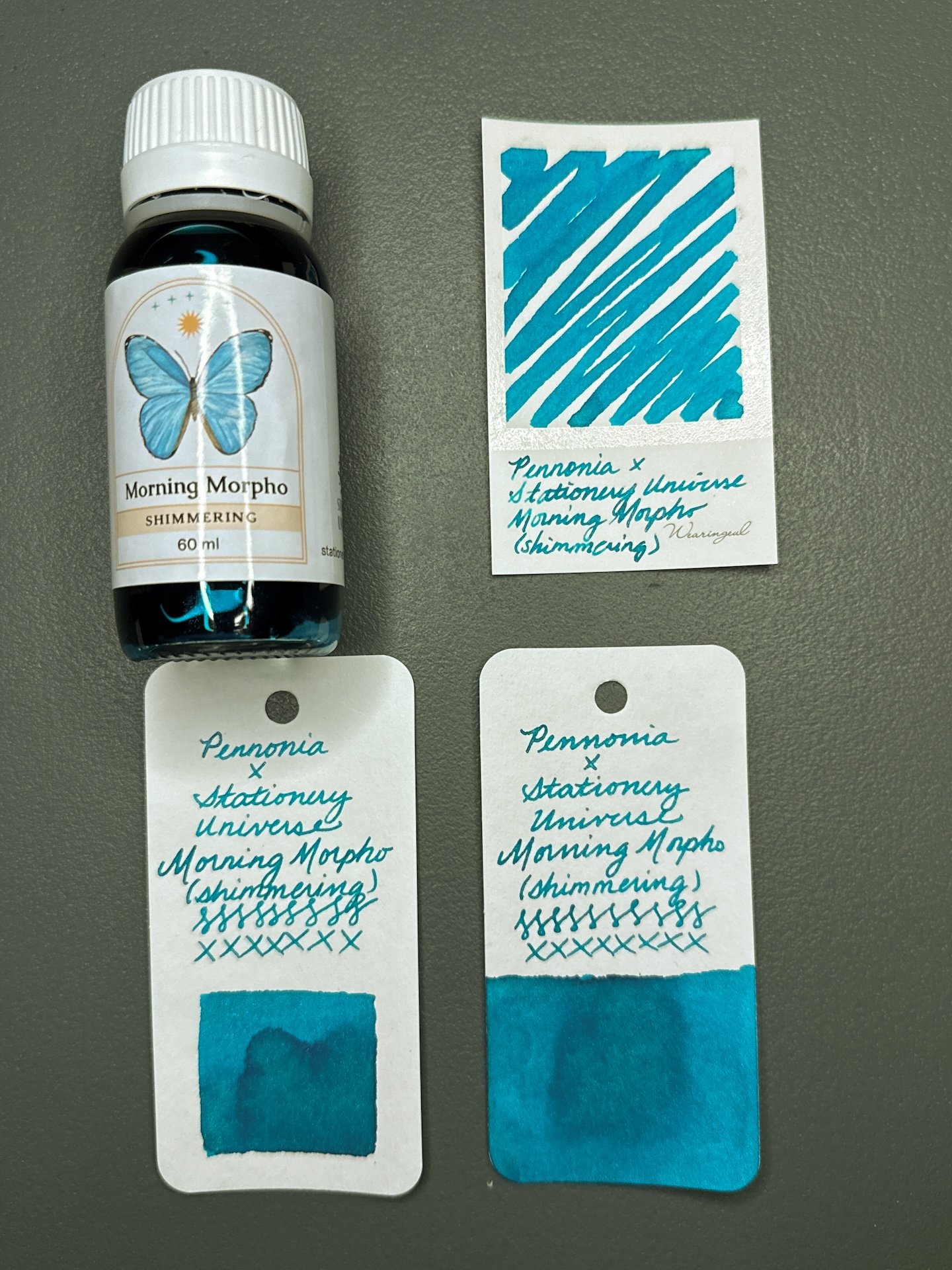
Morning Morpho Shimmering and swatches.

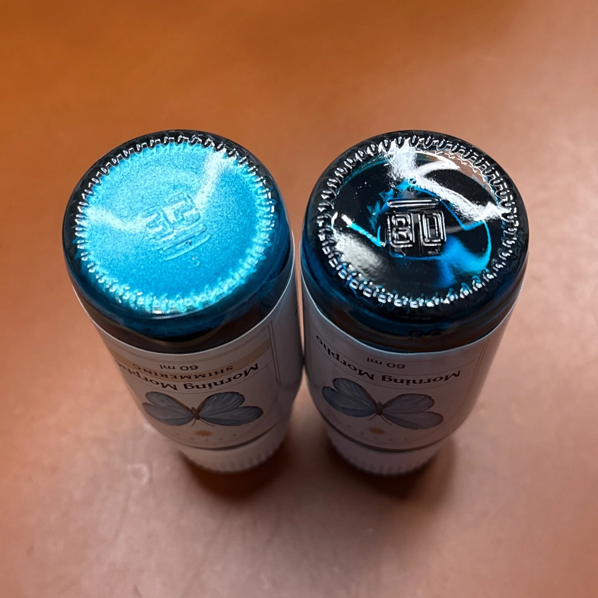
Guess which one has Morning Morpho Shimmering? (hint, it’s the one on the left.)

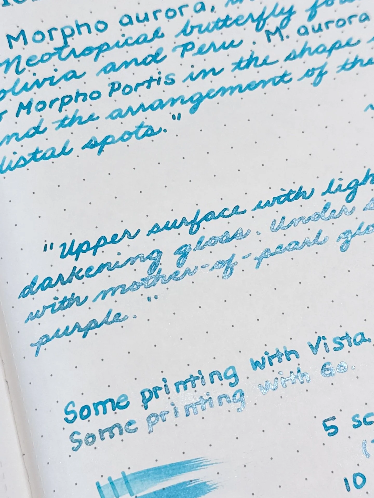
Morning Morpho Shimmering has the same base ink as the above Morning Morpho, but with the addition of pearlescent turquoise shimmer particles. Lamy Safari-based pens, like the Vista, can be a bit ink-stingy with their nib/feeds (one of the reasons why they tend to lean drier compared to other pens) - this has the added effect of making shimmers less obvious in the Vista writing sample. Friction-fit TWSBIs like the Go, Eco, Swipe, have a more generous flow, resulting in more shimmer flowing onto the paper. The turquoise shimmer also makes the ink look lighter in some angles.

Morning Morpho Shimmering writing sample.

Morning Morpho Shimmering doesn’t shimmer much from the Vista (top) but is definitely there from the wetter Go.

Shimmer PSA: As with any shimmer in any pen, periodically “rotate” the pen nib up and down, so the shimmer particles have a chance to disperse. If your feed looks saturated with shimmer, or seems to be clogging the feed, you can try to gently flood the feed with ink (either by gently twisting the converter or piston, or lightly pressing the spring or button) and then retracting the converter/piston/spring/button to “suck up” the shimmer particles back into the converter/barrel. Always do this over a sink or paper towel, not over your precious writing or art 🙂

While the shimmer version didn’t have significantly different dry times, I was a little surprised that both pens’ writing samples didn’t smear as much when wet (nevermind my wet finger smudge on the bottom, that was me, not the ink or paper).

Chromatography from Morning Morpho Shimmering - Same chromatography as above - turquoise/teal with some yellow in the middle. Shimmer particles are too heavy to travel up the strip so there isn’t anything sparkly to see.

Inks similar to Morning Morpho Shimmering are the same as above, but I swapped out Birmingham Honeycreeper with Jacques Herbin Turquoise de Perse since it is a shimmer ink. That is also a wee bit more turquoise than Morning Morpho, but is pretty close.

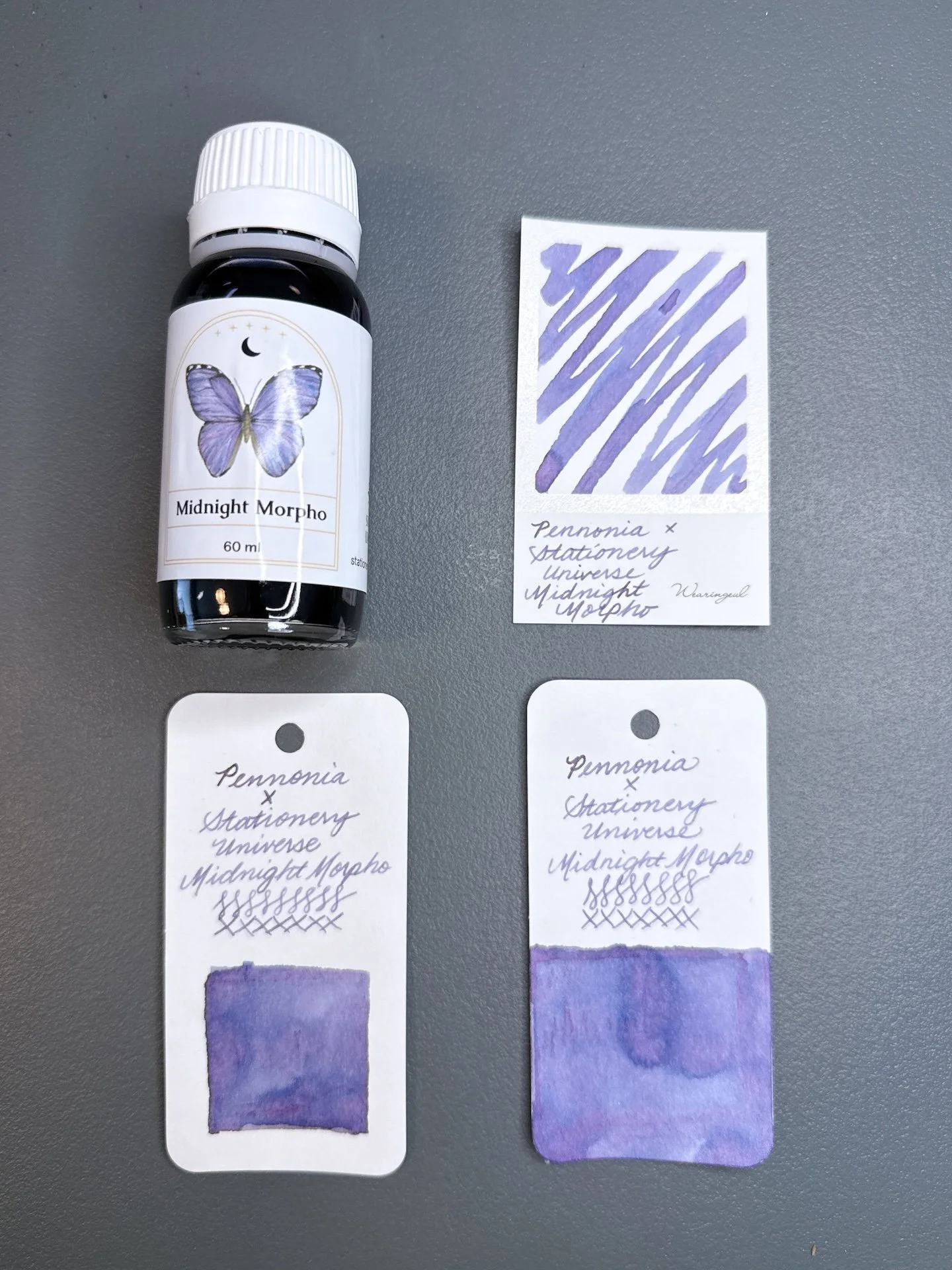
Midnight Morpho and swatches.

Midnight Morpho is a chroma shading dusty purple ink. In swatches, you can see shades of blues and even pinks, especially when more ink is laid down. Compared to Morning Morpho, Midnight Morpho is a bit drier, which is common amongst chroma-shading inks. I wouldn’t say that it was too dry in the Lamy Vista, but it flowed better from the TWSBI Go. There was no sheen from either pen, and dried slightly faster than Morning Morpho (average to fast dry times).

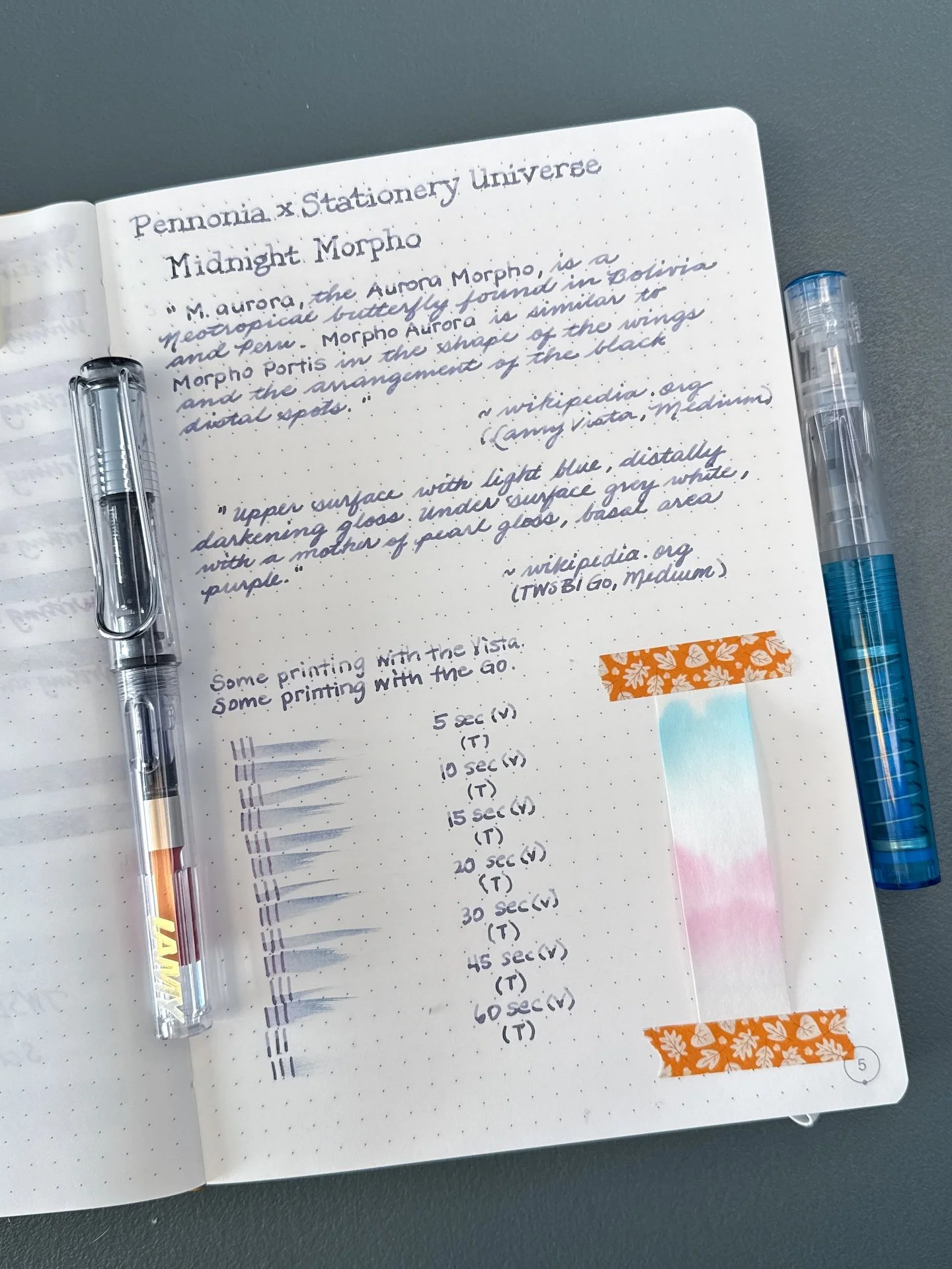
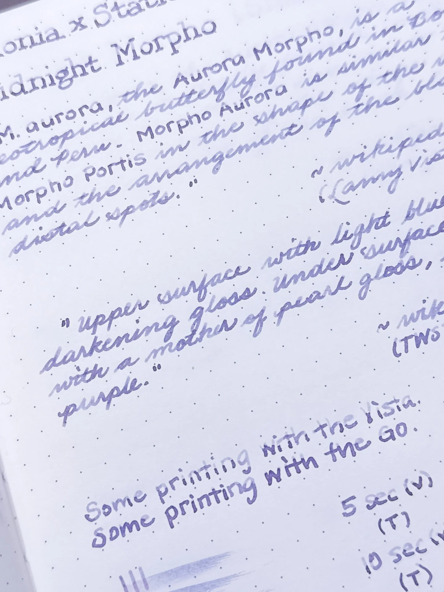
Midnight Morpho writing sample.

You can really see Midnight Morpho’s shading from the drier Vista (top) but the slightly wetter line from the Go still shows some dual shading as well.

Midnight Morpho has a decent dry time.

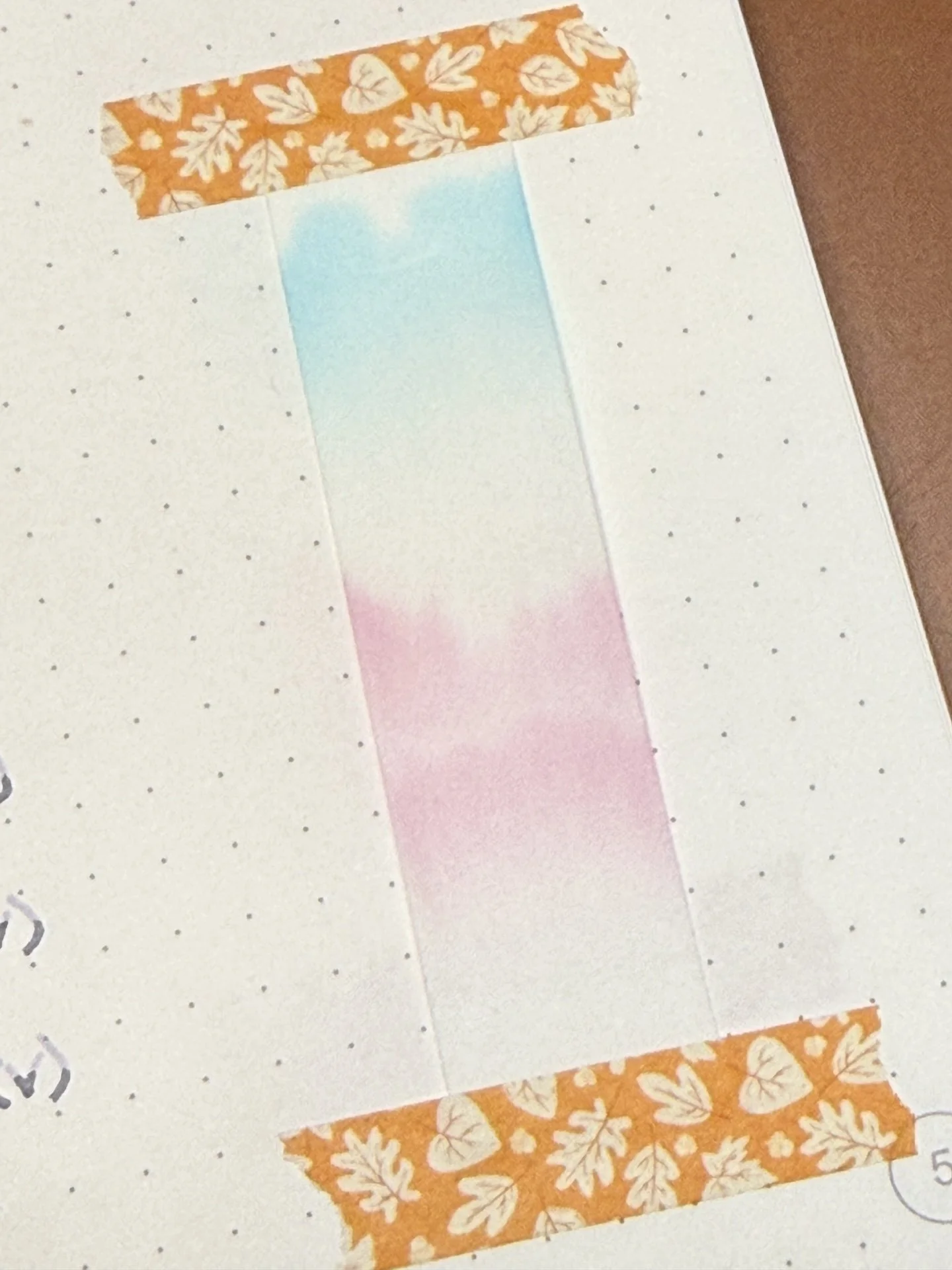
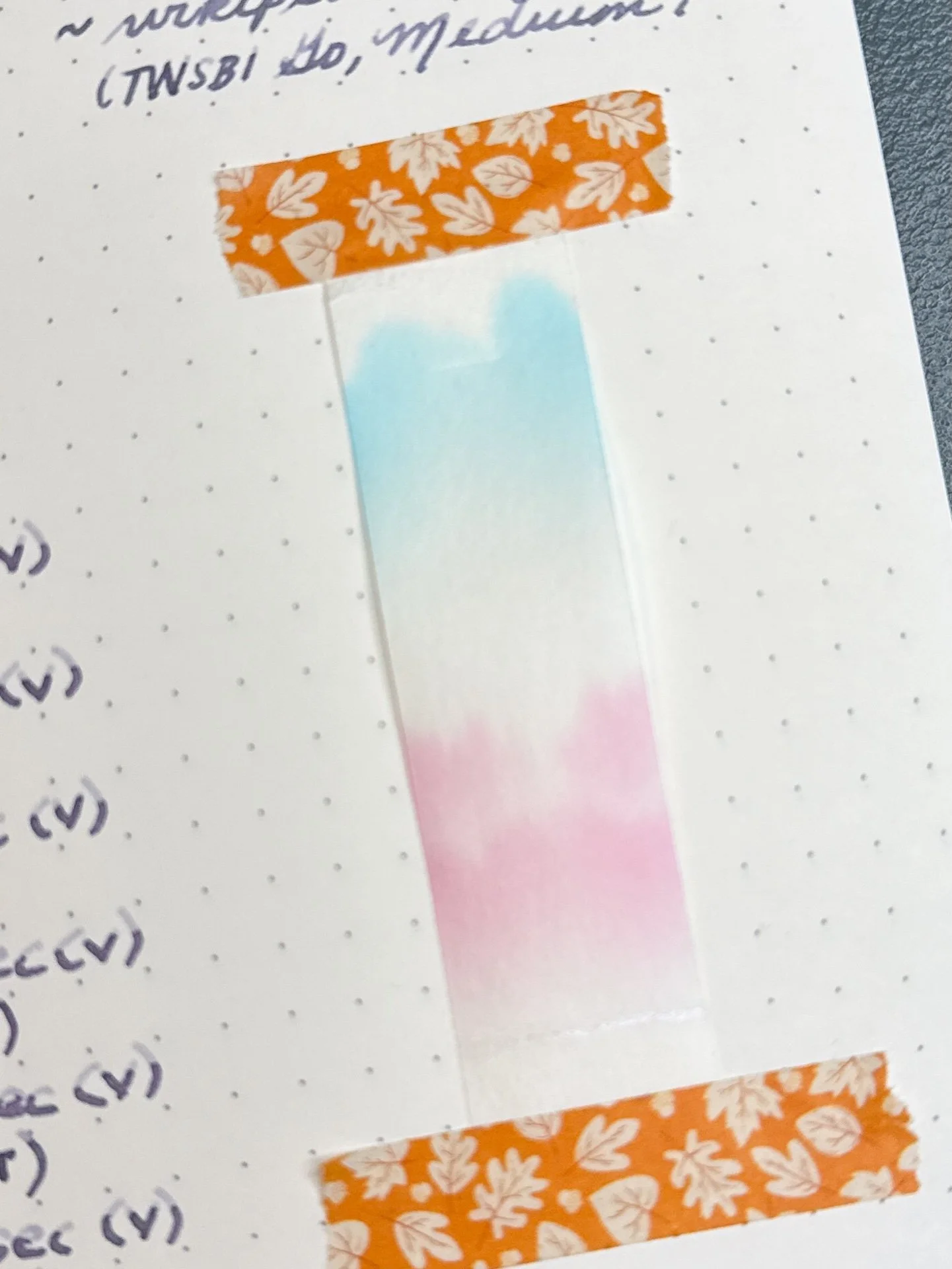
Chromatography from Midnight Morpho starts with pink before separating from the turquoise.

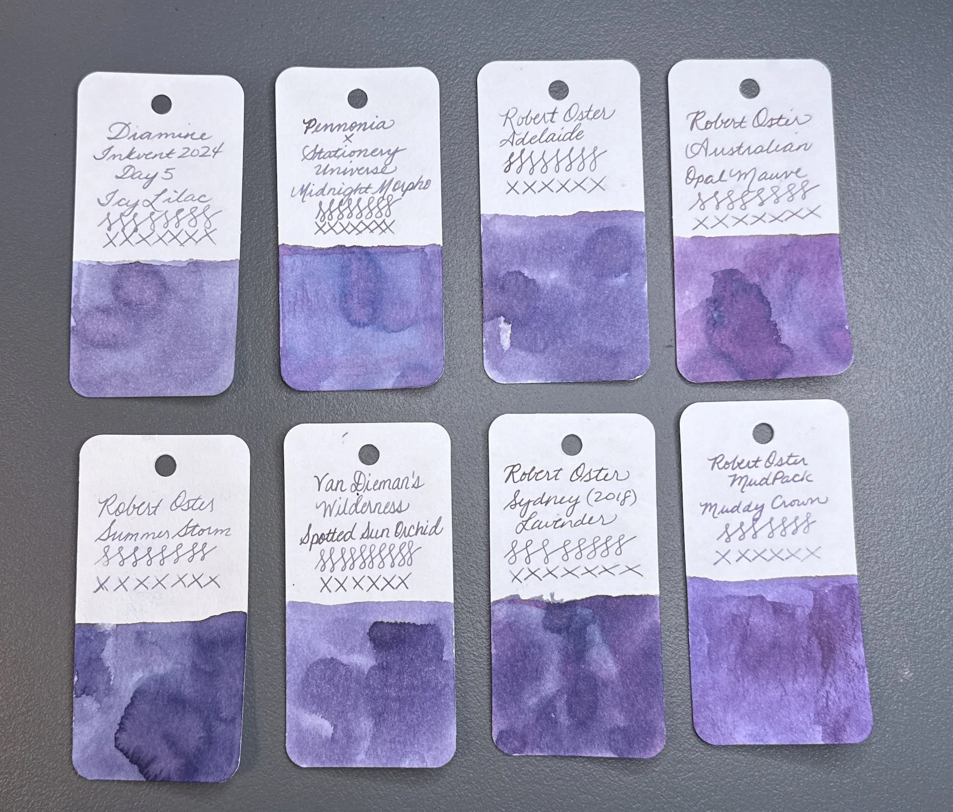
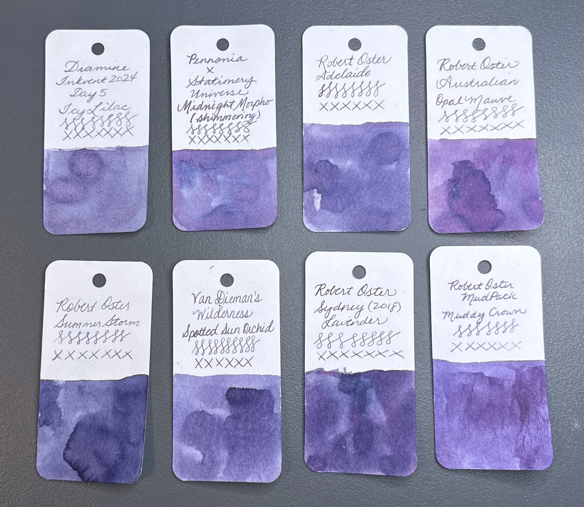
Inks similar to Midnight Morpho: Diamine Icy Lilac (from Inkvent 2024), Robert Oster Adelaide, Robert Oster Australian Opal Mauve (too red), Robert Oster Summer Storm, Van Dieman’s Spotted Sun Orchid, Robert Oster Sydney Lavender, Robert Oster Muddy Crown. Most of these didn’t have the touch of blue that Midnight Morpho has - Icy Lilac is probably the closest.

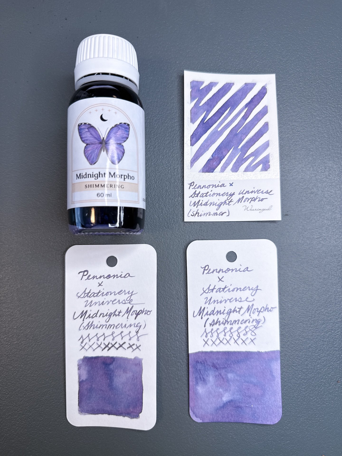
Midnight Morpho Shimmering and swatches.

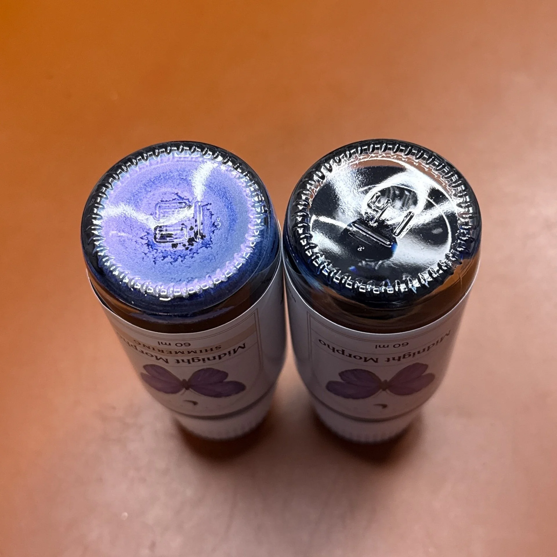
Midnight Morpho has plenty of shimmer in the bottle but it’s harder to see in writing and swatches.

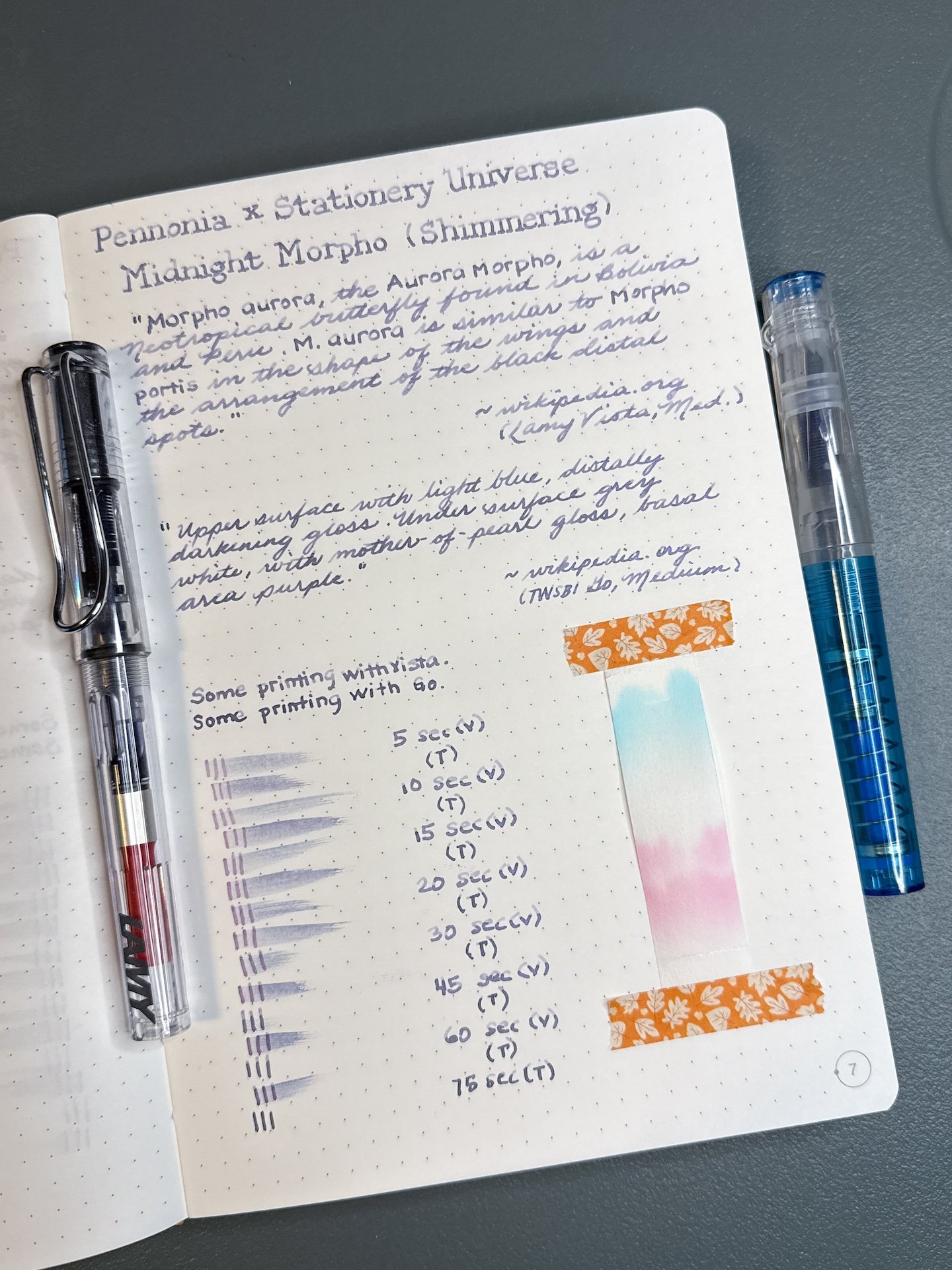
Midnight Morpho Shimmering has the same base ink as its non-shimmering sibling, but this one has a purple pearlescent shimmer! The purple shimmer almost disappears against the purple ink.

Midnight Morpho Shimmering writing sample.

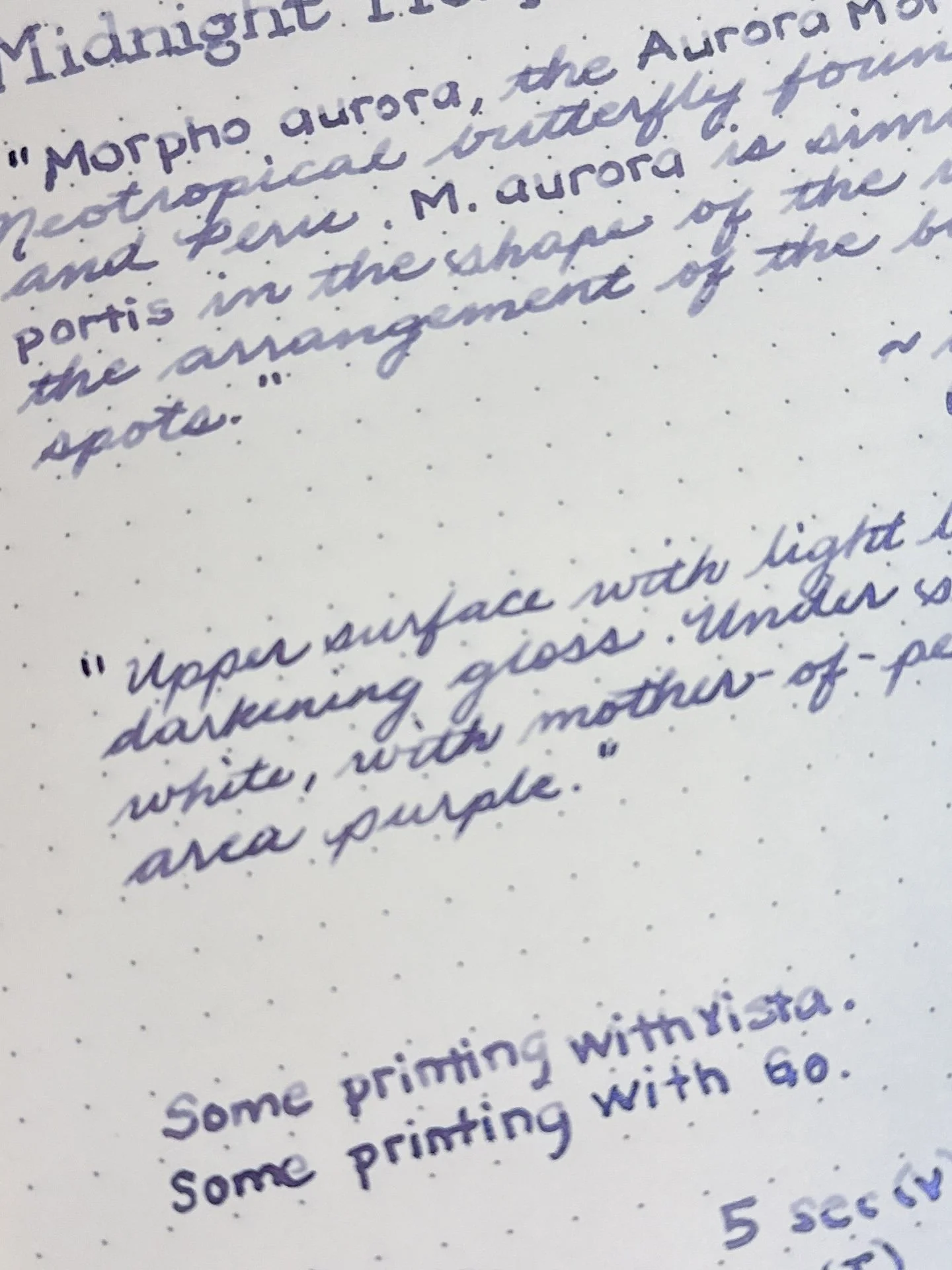
Midnight Morpho Shimmering’s shading is more dramatic from the Vista (top) but there is still some shading with the wetter Go.

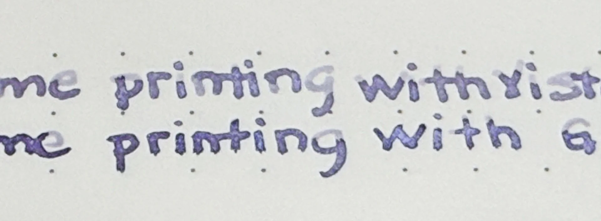
Virtually impossible to tell from pictures, but there is shimmer in both of those writing samples, particularly the bottom half of the word “printing” on the top line and “with” on the bottom line.

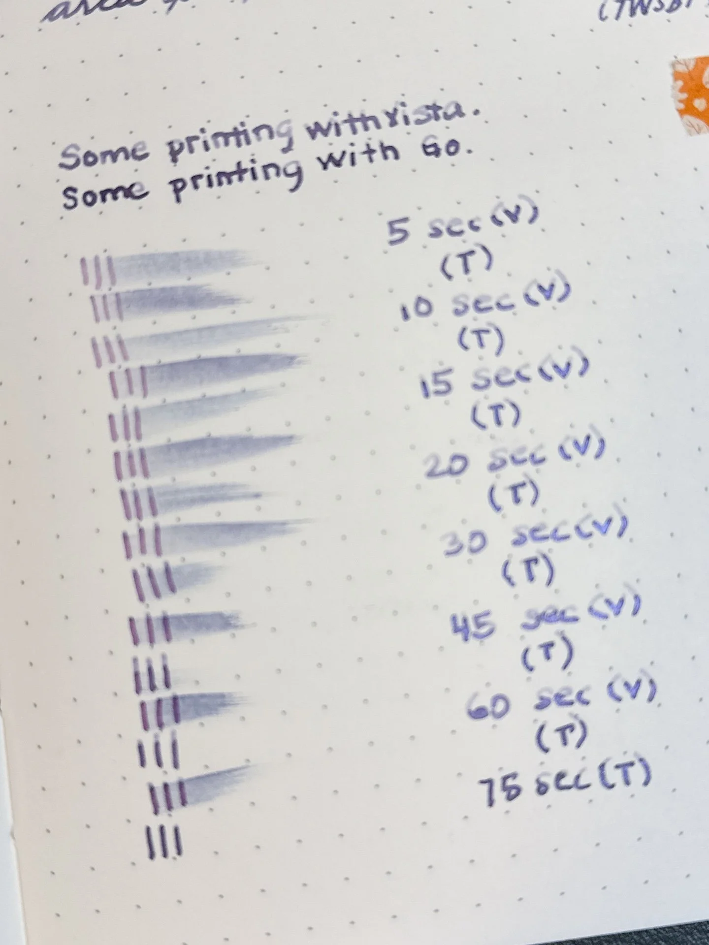
Dry times for the Midnight Morpho Shimmering.

Chromatography from Midnight Morpho Shimmering - Same chromatography as above - starting with pink on the bottom and then a small break before more pink, then a bigger gap before you get to the turquoise/teal on top. Shimmer particles are too heavy to travel up the strip but you can see a little bit of shimmer at the very bottom.

Inks similar to Midnight Morpho Shimmering are the same as above. I don’t have any inks similar in color that had shimmer, besides Diamine Icy Lilac.

All of the inks behaved well, and cleaned out easily. I like seeing how different pens can produce similar but different results with the same ink.

Of the four inks, I think I’d pick Midnight Morpho because it is such a beautiful ink - hard to say if I’d pick it with or without shimmer. You definitely want a wetter writer if you want to see more of the shimmer.

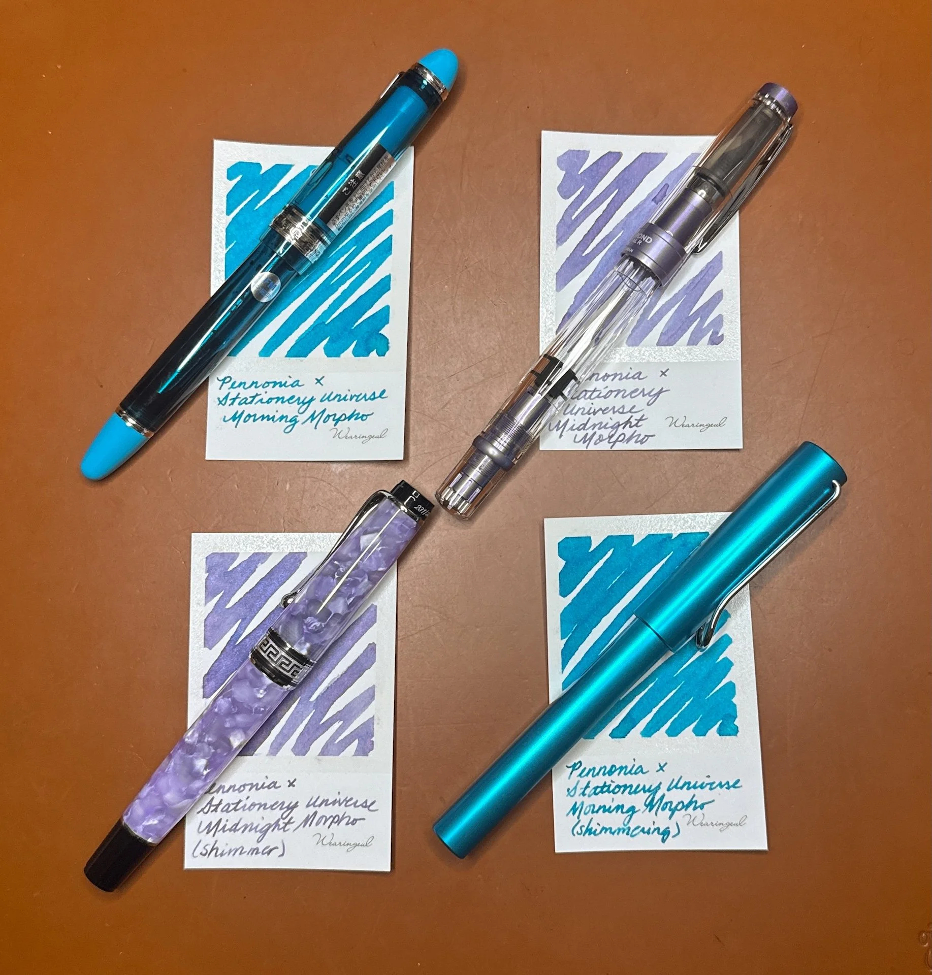
Some pens I’d match with these inks (clockwise from upper left): Pilot x Bungubox Custom 823 Fujiyama Blue; TWSBI 580 ALR Purple, Lamy AL-Star Pacific Blue; Aurora Optima Lila.

The 60 ml ink bottles of the Stationery Universe Morpho Collection cost $20/bottle for non-shimmer and $22 with shimmer.

(Disclaimer: Thank you to Tori Woods of Stationery Universe for providing these inks for review. All other inks are my own.)

Posted on January 30, 2026 and filed under Pennonia, Ink Reviews.

Pennonia Strigoi Ink Review

(Sarah Read is an author, editor, yarn artist, and pen/paper/ink addict. You can find more about her at her website and on Twitter. And check out her latest book, Out of Water, now available where books are sold!)

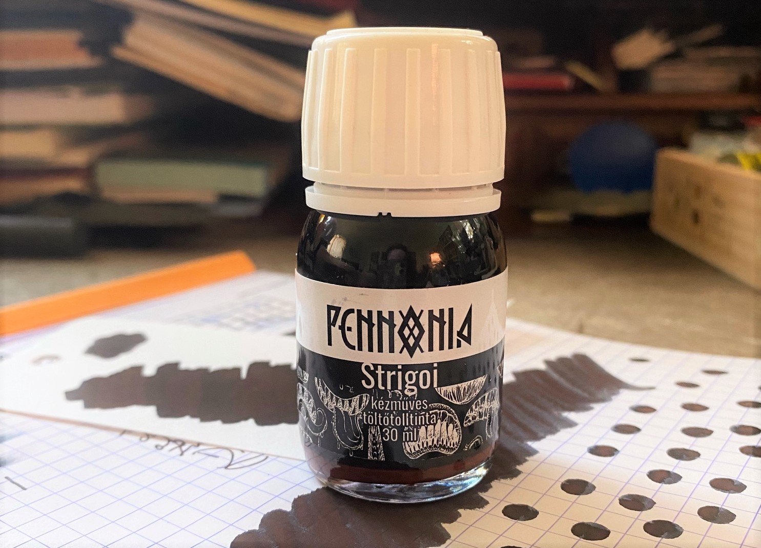
This 2022 limited edition ink from Pennonia, Strigoi, is inspired by a Romanian legend about a spirit that rises from the grave, transforms into animals, turns invisible, drinks blood, and is believed to be the inspiration for the character Dracula. The ink is described as black with red micro pigments, but that's a simple description for what is a very complex ink.

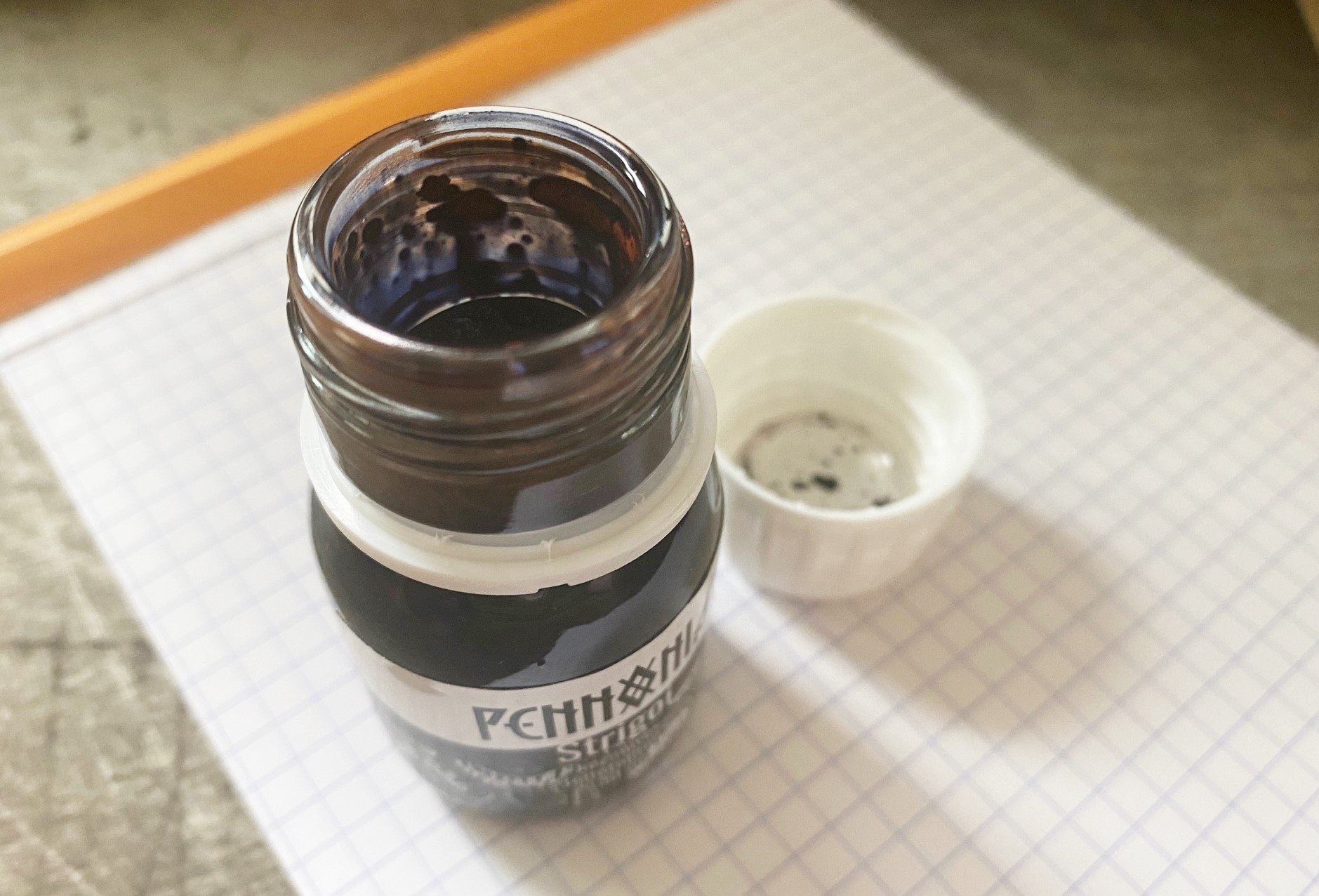
The standout word there is micro pigments. Huh? In this ink, the micro pigments are a very fine sediment in the liquid that adds a matte texture to it--like the opposite of a shimmer. The red pigment is a very earthy tone, like the grave clay of the Strigoi. It does settle to the bottom of the bottle quickly, and it takes a bit of shaking and mixing to get it redistributed--which means it's also going to do that in your pen. The website does caution against putting this ink into a fancy or fussy pen. And if you're not fond of pen cleaning (like me), you'll want to proceed with caution. Because I know myself, I only filled the converter partway, so I know I'll run out more quickly and, in theory, clean the pen sooner. I let some of the pigment settle in the neck of the bottle so I could mess with it, and it has the texture of clay--thick and kind of sticky. It feels a bit wrong to put it in a pen, and I admit I might hesitate to do so, except... It looks So. Freaking. Awesome.

Y'all, this one is super hard to photograph, so I'm going to do my best to describe it. Calling this ink "black" is like calling the ocean blue. Sure, some of the ocean is blue, but it's also green, and aqua, and even brown, etc. This ink has a lot of sneaky color going on. To me, it looks like a navy charcoal color, like a shadowy version of a blue black. The chromatography really shows off the complexity, with the red-brown clay at the bottom, then the ink splitting into lilac and a bright teal. The Pennonia alchemists were flexing. The deep red matte of the pigment looks as though it's resting on top of that navy charcoal, giving a 3D effect, almost like it's casting a shadow. It doesn't show up as much in written lines, but the matte effect is still there. I don't think this ink would work with a fine or extra fine nib.

While the pigment gives the ink a dry feel, it actually takes an eternity to dry. Somewhere between 30 and 40 seconds it finally chilled out. And while the inkiness washes away easily in water, the pigment stays behind, so a small spill won't eradicate your writing. I wouldn't call it waterproof, but there is an element of permanence. As for color comparisons, I've got nothing. I'm not aware of any similar inks.

This 30ml bottle is only $16 at Vanness Pens, which is a great deal for a vial of undead blood-drinking spirit. And for ink, if that's what you're buying.

(Vanness Pens provided this product at a discount to The Pen Addict for review purposes.)


Enjoy reading The Pen Addict? Then consider becoming a member to receive additional weekly content, giveaways, and discounts in The Pen Addict shop. Plus, you support me and the site directly, for which I am very grateful.

Membership starts at just $5/month, with a discounted annual option available. To find out more about membership click here and join us!
Posted on August 10, 2023 and filed under Pennonia, Ink Review.