
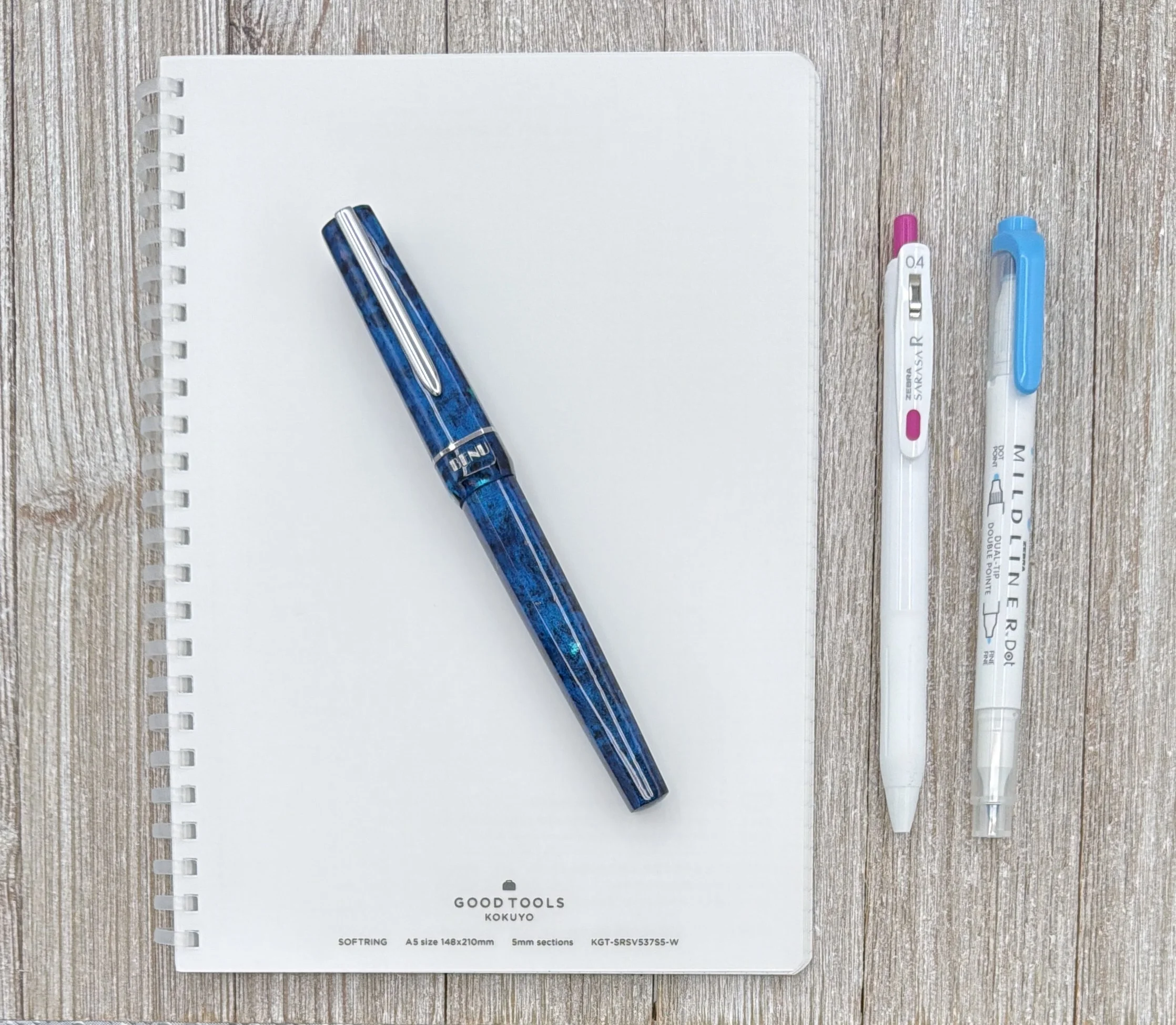
Kokuyo got me before with the Perpanep range, and once again, they have landed right in my wheelhouse with their Good Tools lineup, specifically the Soft Ring A5 Notebook.
As best as I can tell, the Good Tools collection is Kokuyo’s way of offering a curated group of desk accessories. Everything seems to be accounted for - from pens and paper, to scissors and staplers. A basic white aesthetic runs through all of the products (did they get ahead of Pantone?) with only a few pops of color seen throughout the full lineup.
I’m a sucker for this look, but I wasn’t into the pens, and I don’t need any of the accessories. So, where did that leave me? Paper. Specifically, the Soft Ring A5 Graph notebook.
To cut directly to the chase, this notebook is perfect for me. Maybe I think that because I had zero expectations going into it. It was an add-on to an order, and I had no plans for it outside of testing some gel ink pens inside of it, or using it as part of a giveaway. It has quickly become a notebook I reach for more than most, even for fountain pens, and even for ink swatching.
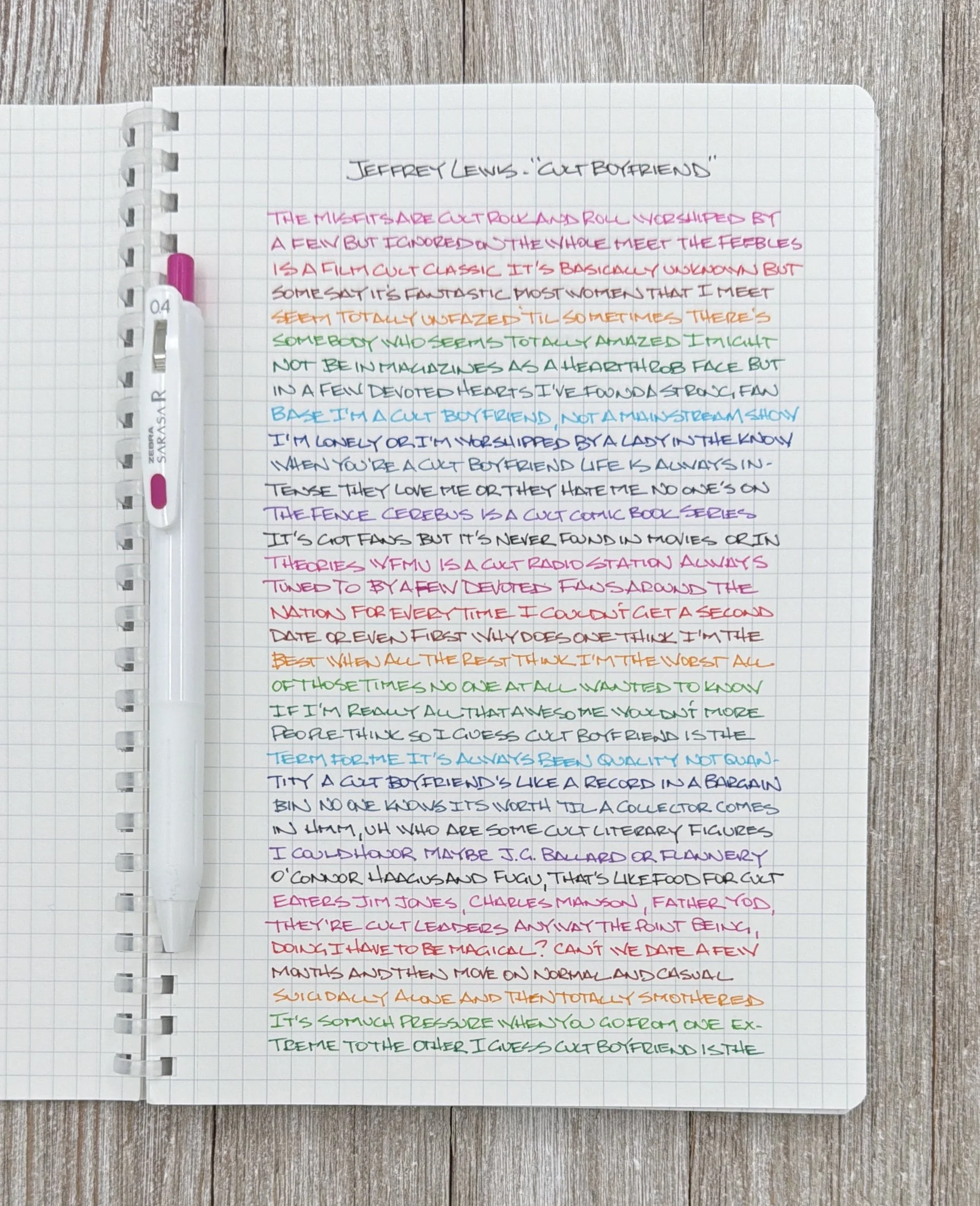
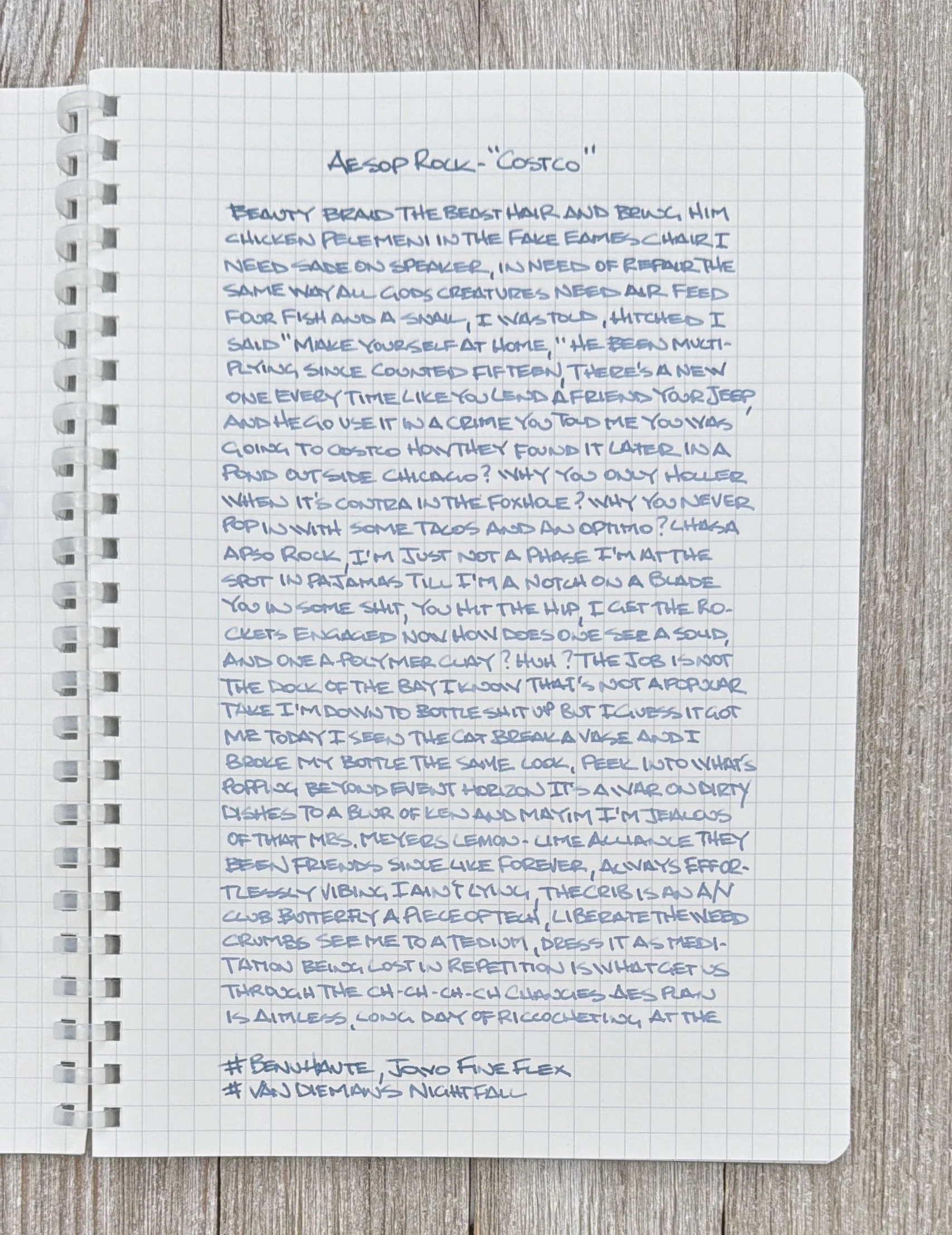
The 0.4 mm Zebra Sarasa R colors pop off the page.
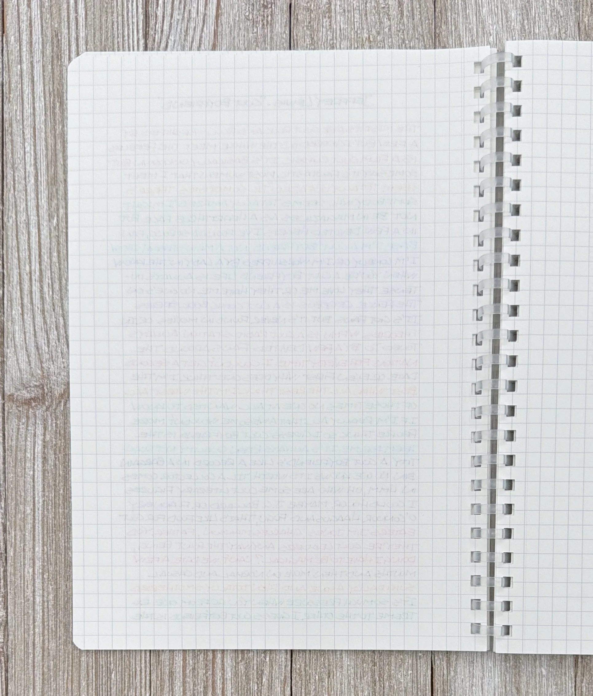
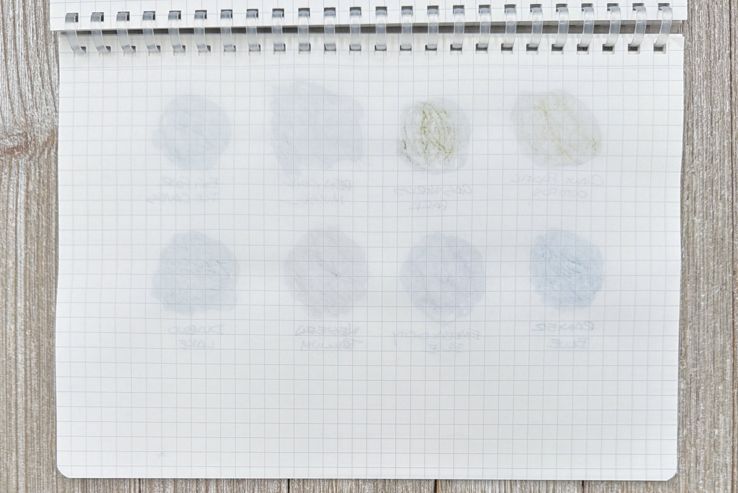
More of a shadow on the backside, as opposed to ghosting.
That it holds up well to a lot of ink on the page shouldn’t surprise me - Kokuyo has always been a good choice for that. My issue has always been formats. The Kokuyo Campus product lineup is great, but I never dialed in which one of the many (MANY!) options is for me. They make for great recommendations though, because the quality is always there.

Smooth for fineliners.
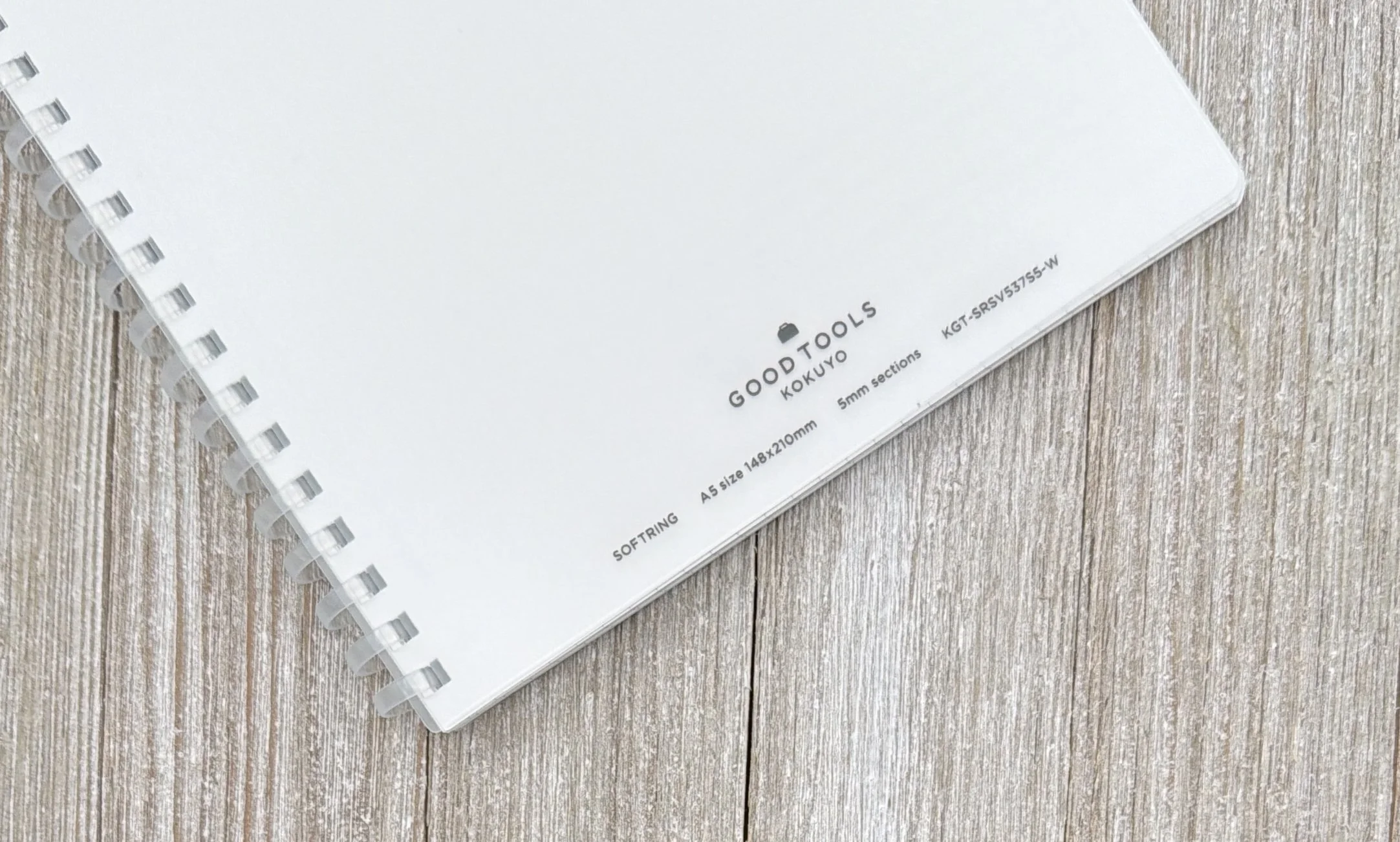
The Good Tools Soft Ring nails everything that I’m looking for in a product. For starters, the plain design looks fantastic. I can keep it clean like it looks now, or I can customize it in many different ways with stickers, art, washi, or whatever. The A5 size is perfect for a desk or on the go, and the Soft Ring binding won’t scratch up anything it lays on or next to, like wire binding would. The page perforation is clean, and the Grey 5mm grid is exactly the right shade to provide guidance, and stay out of the way.
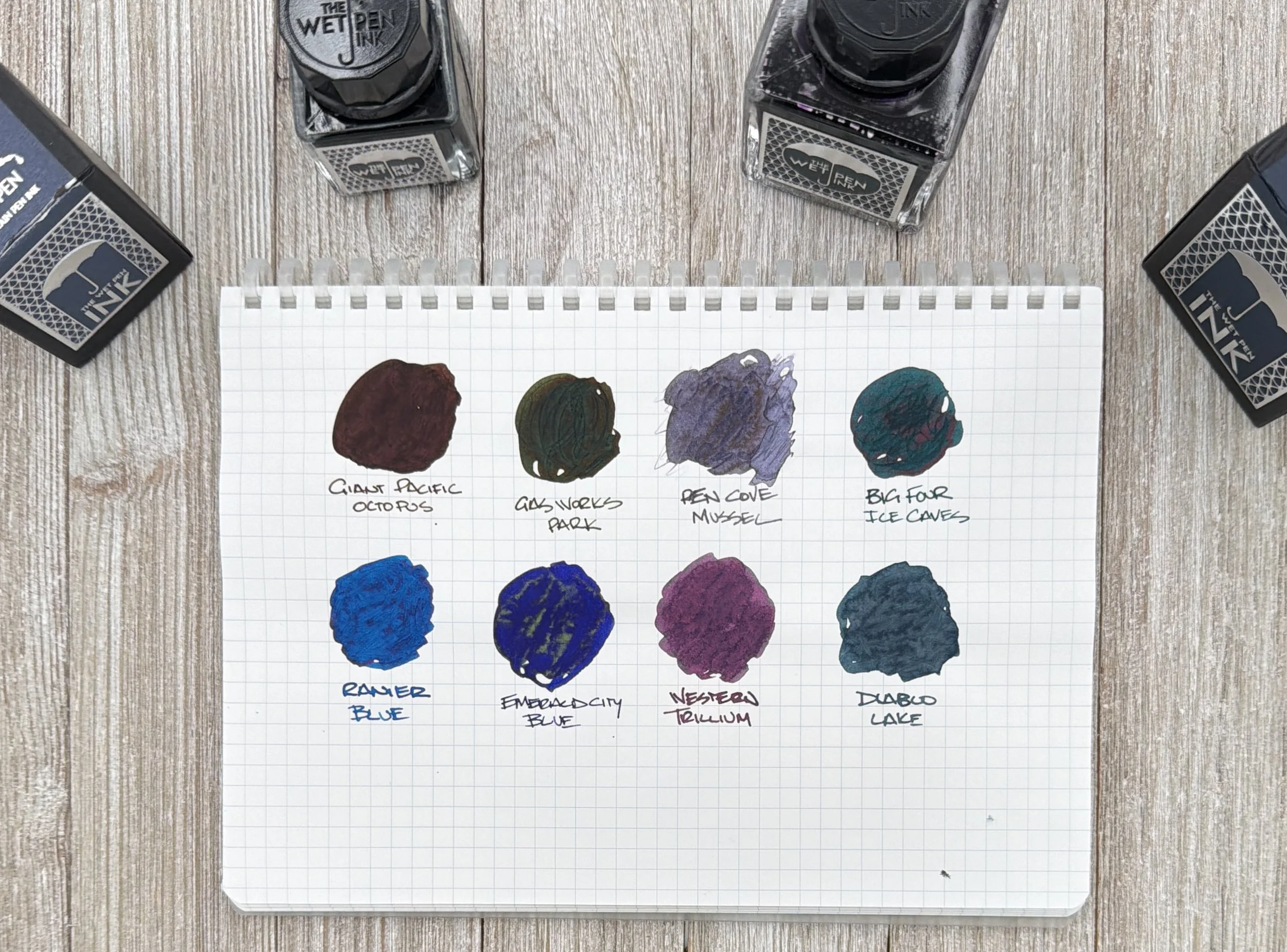
Ink swatches with the Kakimori Steel Dip Nib.
Gas Works Park went through the back, only because I ran a second layer over the top and the steel nib breaks up the page. I even added water to Penn Cove Mussel, which is second from the top left, and nothing went through.
It’s right there with the Kokuyo X Platinum Preppy Perpanep, which is about as high of praise as I can give. For less than $20 combined I can have a brilliant pen and paper combo. What am I doing with my life? 🤣
Van Diemans Nightfall is part of their Dual Shader series, and while the full color range isn’t S-Tier like it would be on classic Tomoe River 52 gsm paper, it shows off a lot, especially in the right light.

Almost nothing on the back side.
Kokuyo’s prices are always reasonable, and $10.50 for 70 sheets (140 pages) - in either Graph or their popular Dotted Line format - is exactly that. Unless you require a hard cover notebook, I think the only thing holding this notebook back are the lack of a Dot Grid, or even a Blank page. On quality alone, it’s more enough to be your primary paper in most situations.
I said I didn’t need anything else from the Kokuyo Good Tools lineup, but I guess it is time to take another look after all of this fawning over a plain white notebook.
(JetPens provided this product at no charge to The Pen Addict for review purposes.)
Enjoy reading The Pen Addict? Then consider becoming a member to receive additional weekly content, giveaways, and discounts in The Pen Addict shop. Plus, you support me and the site directly, for which I am very grateful.
Membership starts at just $5/month, with a discounted annual option available. To find out more about membership click here and join us!


