(Kimberly (she/her) took the express train down the fountain pen/stationery rabbit hole and doesn't want to be rescued. She can be found on Instagram @allthehobbies because there really are many, many hobbies!.)
When Bryce Gillet from Luxury Brands of America sent me a tester set of Platinum 3776 pens for review, he also sent the new 3776 Century Travia as well! I didn’t have a lot of time with it before I have to hand it back to them (insert sad face and trombone), so I wanted to do a quick review with first impressions of the pen. And what better way to test out a pen than to handwrite a review? (As in the past, I type out my article first so I can get all the editing done, and then copy it by hand afterward.)
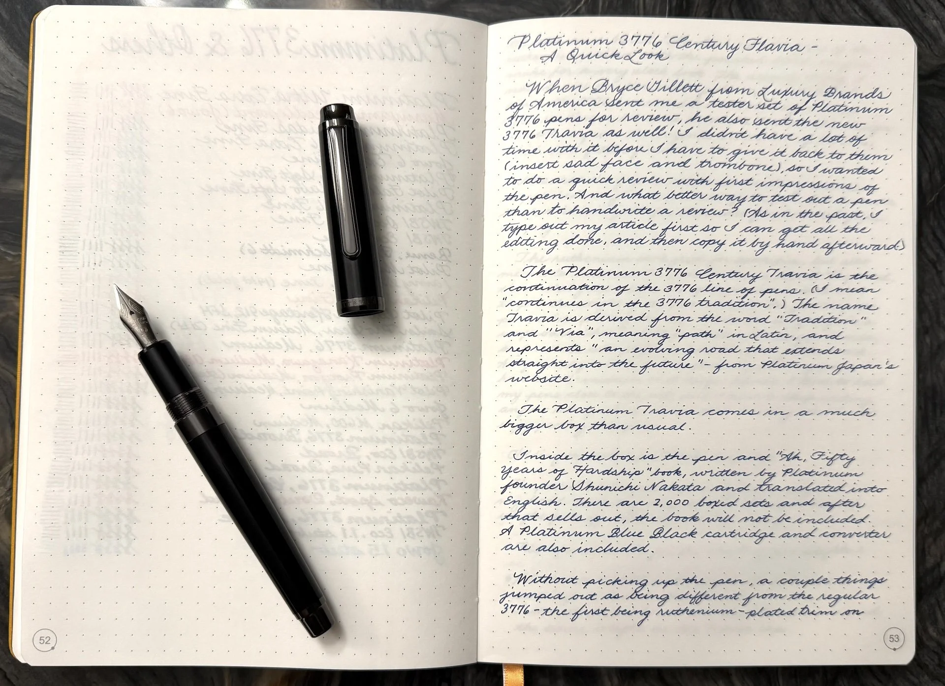
The Platinum 3776 Century Travia continues in the Platinum 3776 tradition. The name Travia is derived from the words “Tradition” and “Via”, meaning “path” in Latin, and represents “an evolving road that extends straight into the future” - from Platinum Japan’s website.
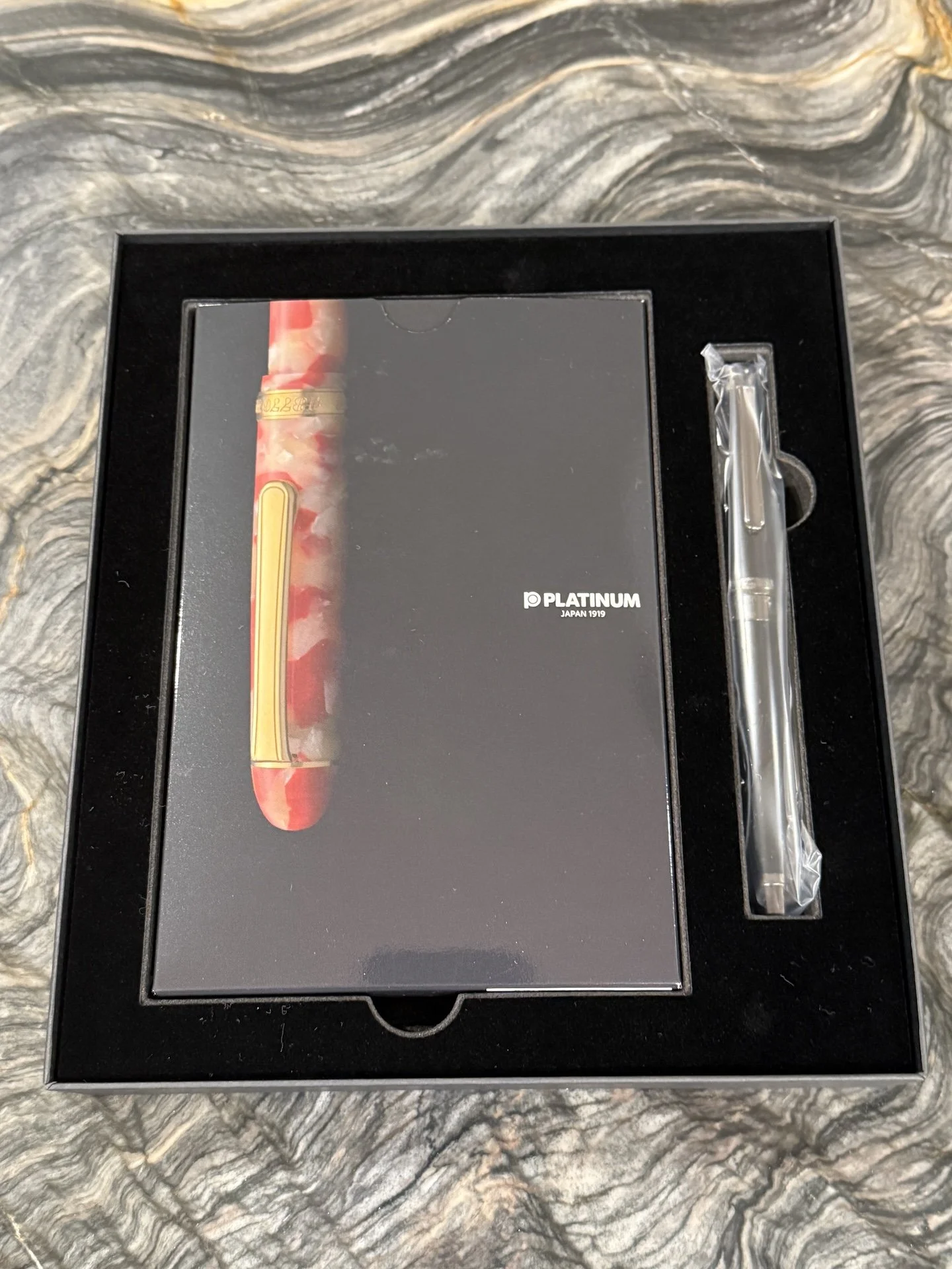
Inside the box is the pen and “Ah, Fifty Years of Hardship” book, written by Platinum founder Shunichi Nakata and translated into English. There are 2,000 boxed sets and after that sells out, the book will not be included. A Platinum Blue Black cartridge and converter are also included.
Without picking up the pen, a couple things jumped out as being different from the regular 3776 - the first being ruthenium-plated trim on the cap and barrel. The dark metallic grey of the ruthenium paired with the polished black acrylic make for a very sleek look. The second thing I noticed were the flat ends of the cap and barrel, since the 3776 has rounded ends, aka cigar shape. After reading a bit more about the Travia, this design element is from the original 1978 version of the 3776, which had flatter finials.
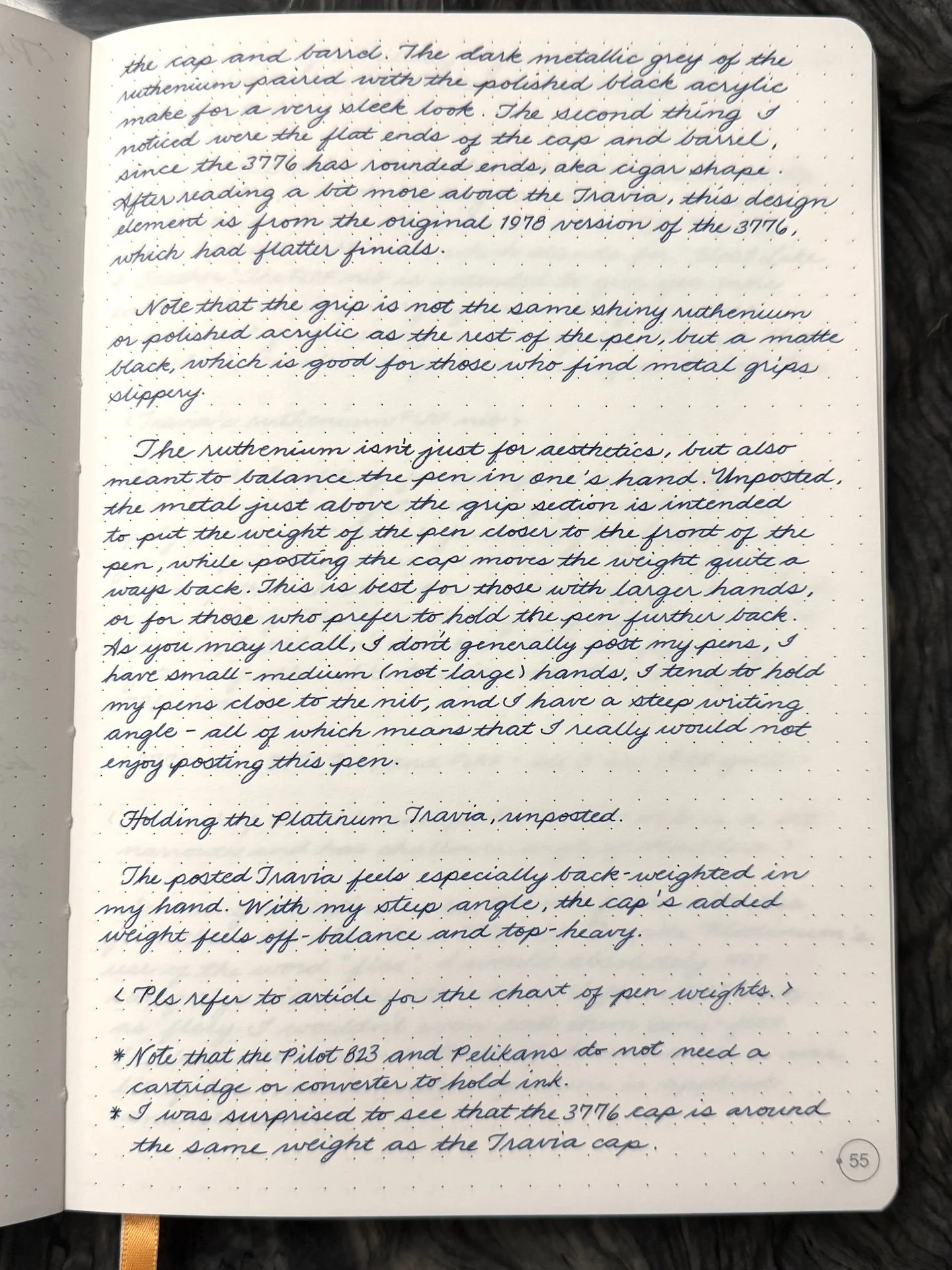
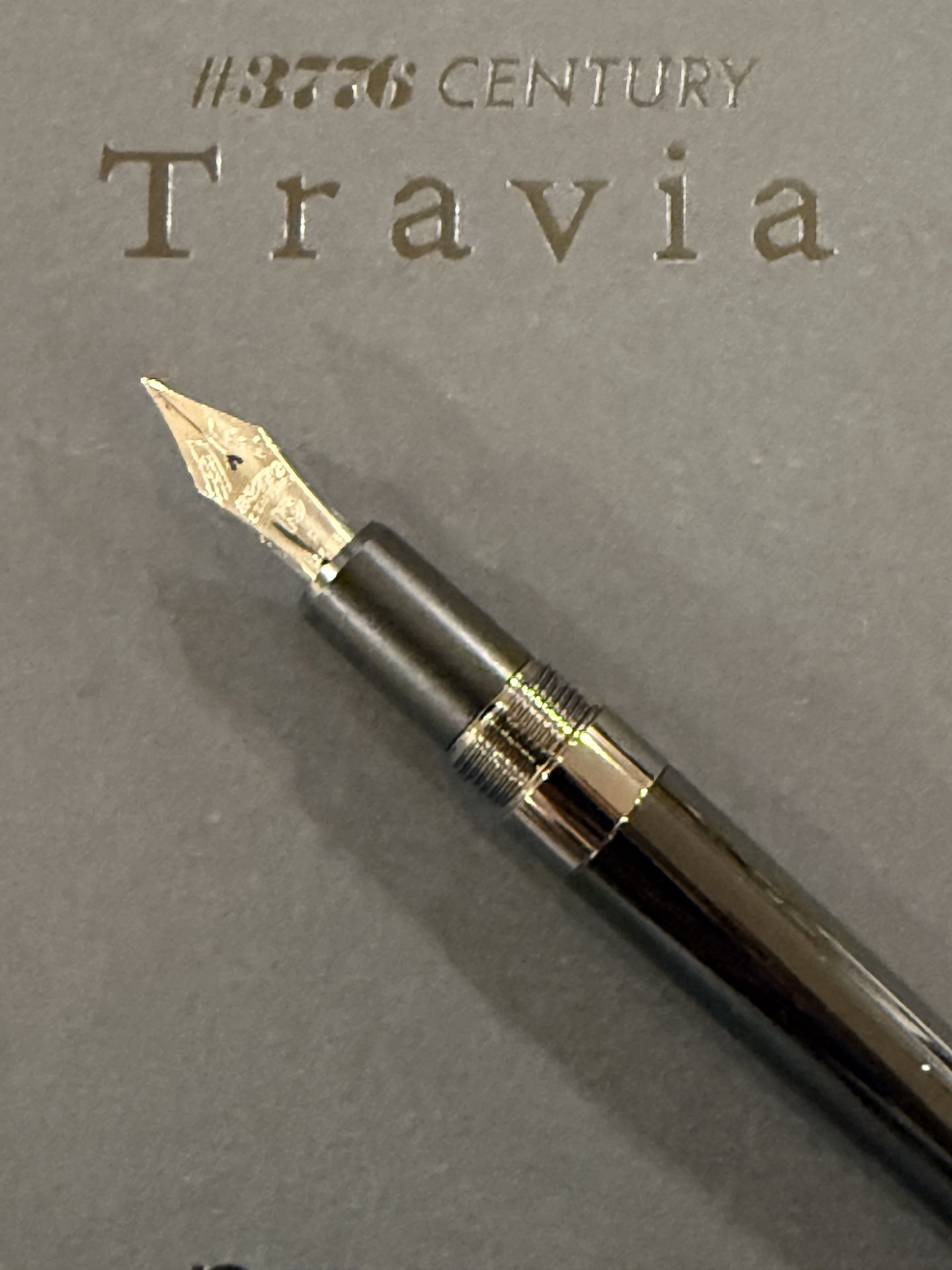
Note that the grip is not the same shiny ruthenium or polished acrylic as the rest of the pen, but a matte black, which is good for those who find metal grips slippery.
The ruthenium isn’t just for aesthetics, but also meant to balance the pen in one’s hand. Unposted, the metal just above the grip section is intended to put the weight of the pen closer to the front of the pen, while posting the cap moves the weight of the pen quite a ways back. This is best for those with larger hands, or for those who prefer to hold the pen further back. As you may recall, I don’t generally post my pens, I have small-medium (not-large) hands, I tend to hold my pens close to the nib, and I have a steep writing angle - all of which means that I really would not enjoy posting this pen.
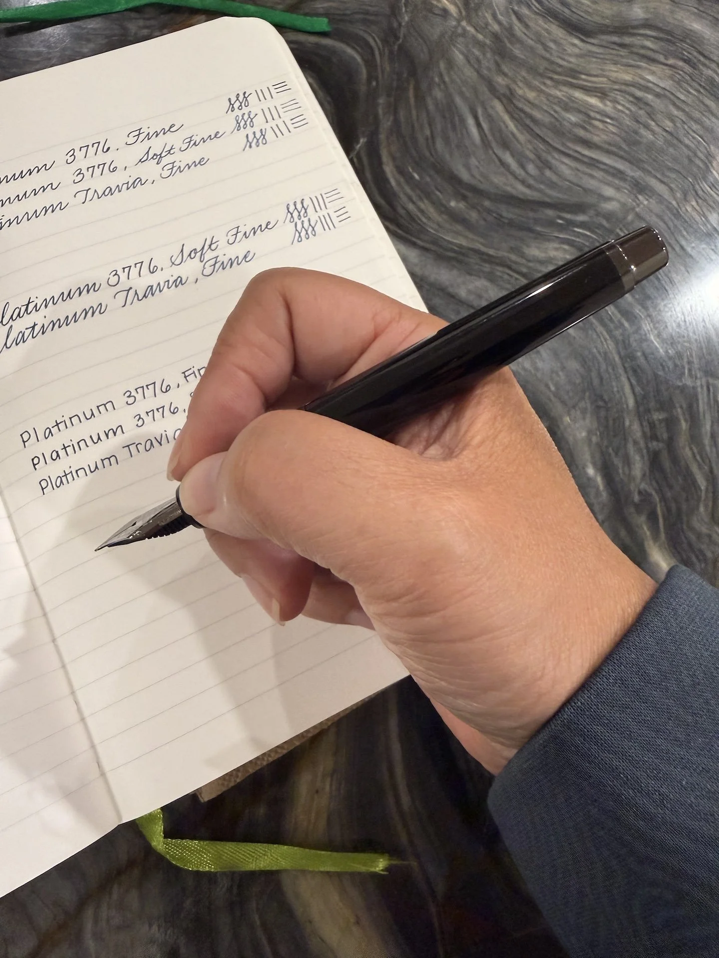
Holding the Platinum Travia, unposted.
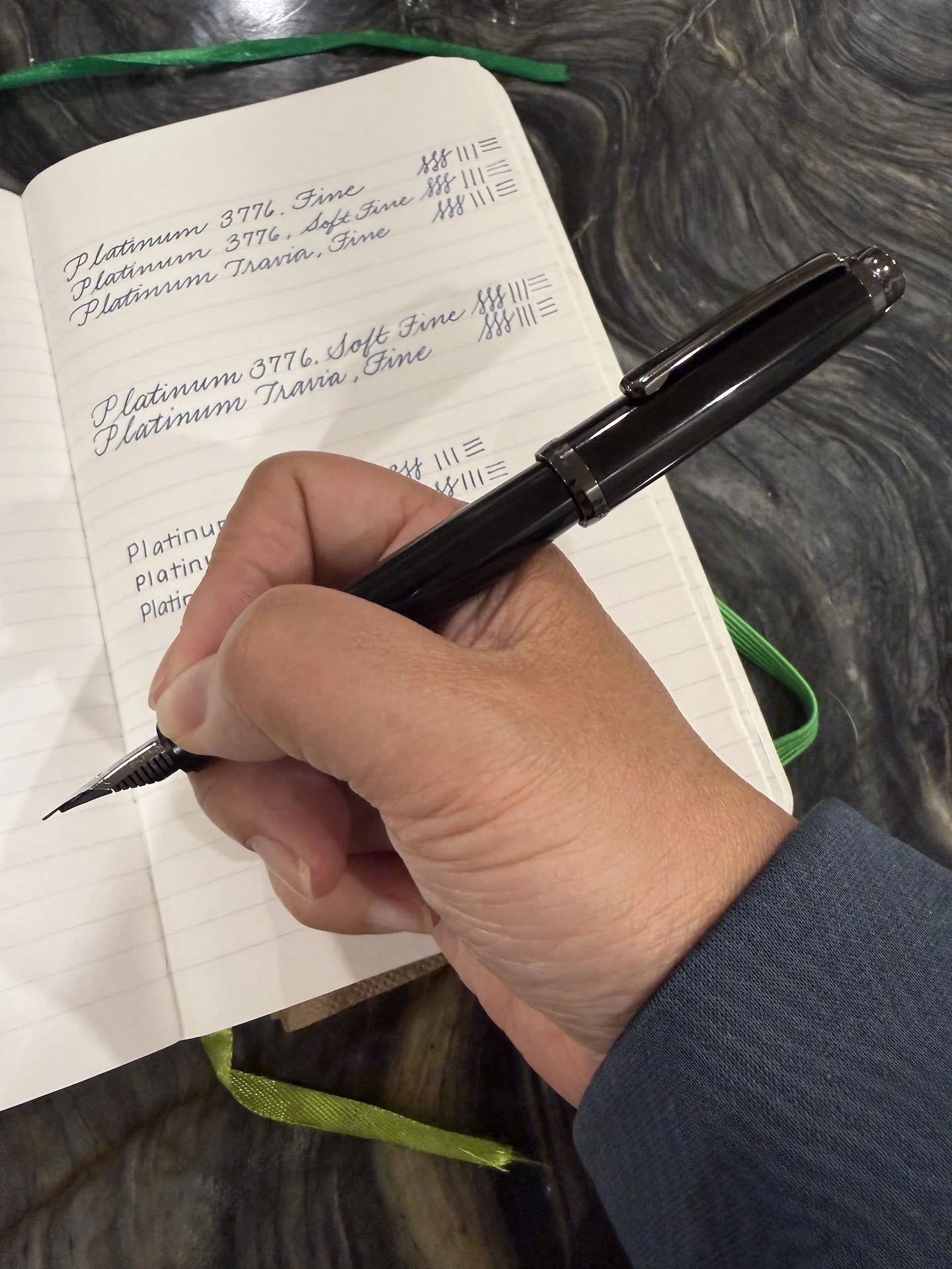
The posted Travia feels especially back-weighted for my hand. With my steep angle, the cap’s weight feels off-balance and top-heavy.
Specs:
Pen Type
Cap
Rest of pen (empty)
Total (Posted)
Platinum Travia
.361 oz / 10.23 g
.69 oz / 19.57 g
1.051 oz / 29.80 g
Platinum 3776
.368 oz / 10.43 g
.342 oz / 9.71 g
.71 oz / 20.14 g
Pilot Custom 823
.342 oz / 9.68 g
.665 oz / 18.91 g
1.007 oz / 28.59 g
Pelikan M600
.244 oz / 6.93 g
.395 oz / 11.18 g
.639 oz / 18.11 g
Pelikan M800
.305 oz / 8.66 g
.721 oz / 20.44 g
1.026 oz / 29.10 g
Esterbrook Estie
.320 oz / 9.06 g
.573 oz / 16.24 g
.893 oz / 25.3 g
Note that the Pilot 823 and Pelikans do not need a cartridge or converter to hold ink.
Also, I was surprised to see that the 3776 cap is around the same weight as the Travia cap.
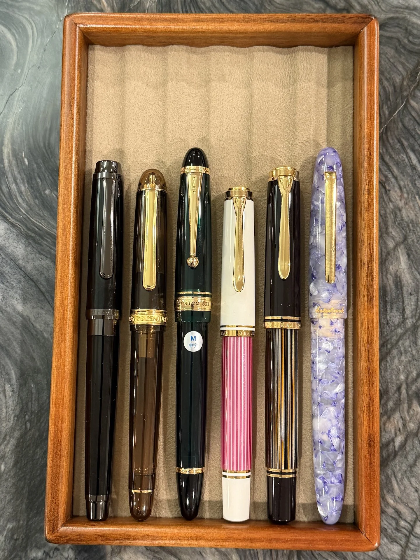
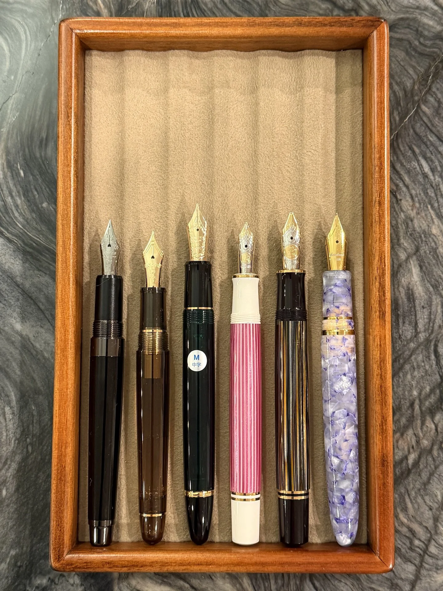
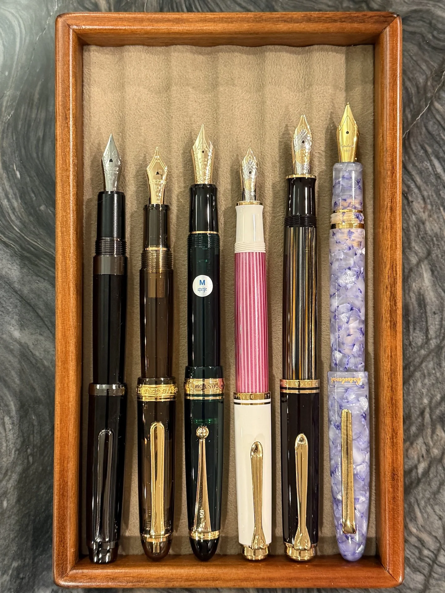
Comparison of similarly sized pens (capped): Platinum Travia, 3776, Pilot Custom 823, Pelikan M600, Pelikan M800, Esterbrook Estie.
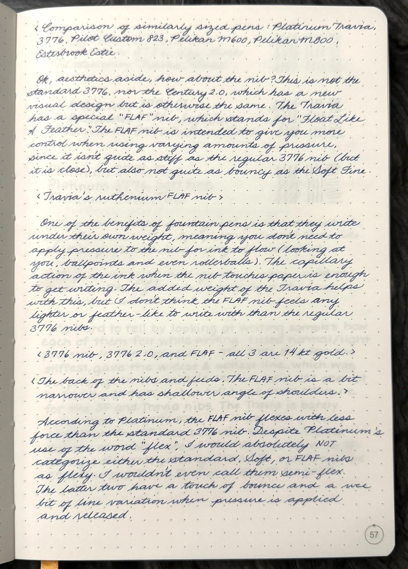
Ok, aesthetics aside, how about the nib? This is not the standard 3776 nib, nor the Century 2.0, which has a new visual design but is otherwise the same.The Travia has a special “FLAF” nib, which stands for “Floats Like A Feather”. The FLAF nib is intended to give you better control when using varying amounts of pressure, since it isn’t quite as stiff as the regular 3776 (but it is close), but also not quite as bouncy as the Soft Fine.
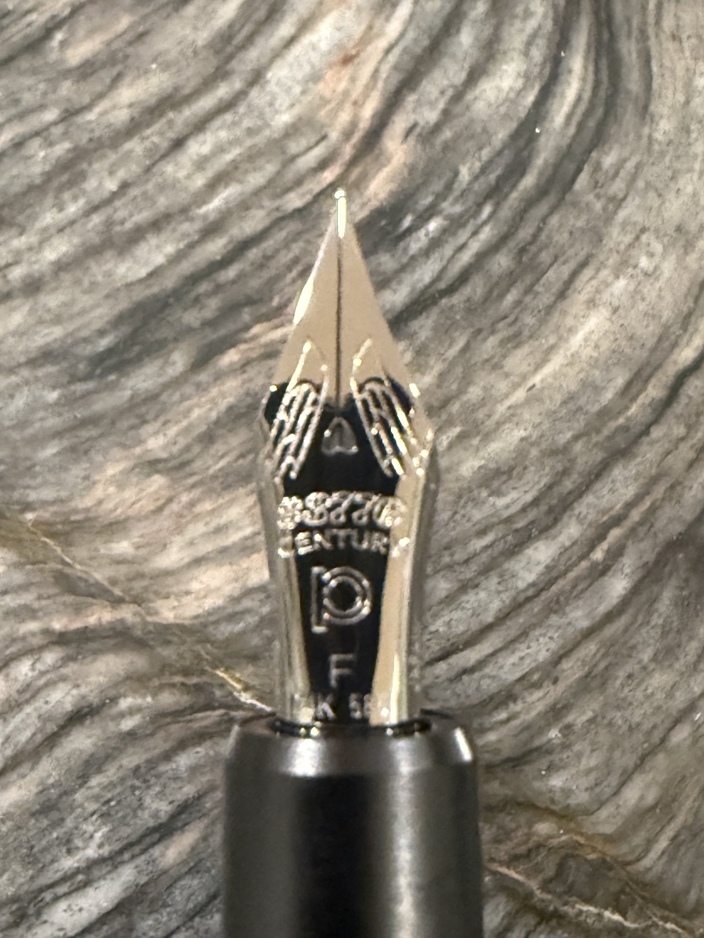
Travia’s ruthenium FLAF nib.
One of the benefits of fountain pens is that they write under their own weight, meaning you don’t need to apply pressure to the nib for ink to flow (looking at you, ballpoints and even rollerballs). The capillary action of the ink when the nib touches paper is enough to get writing. The added weight of the Travia helps with this, but I don’t think the FLAF nib feels any lighter or feather-like to write with than the regular 3776 nib.
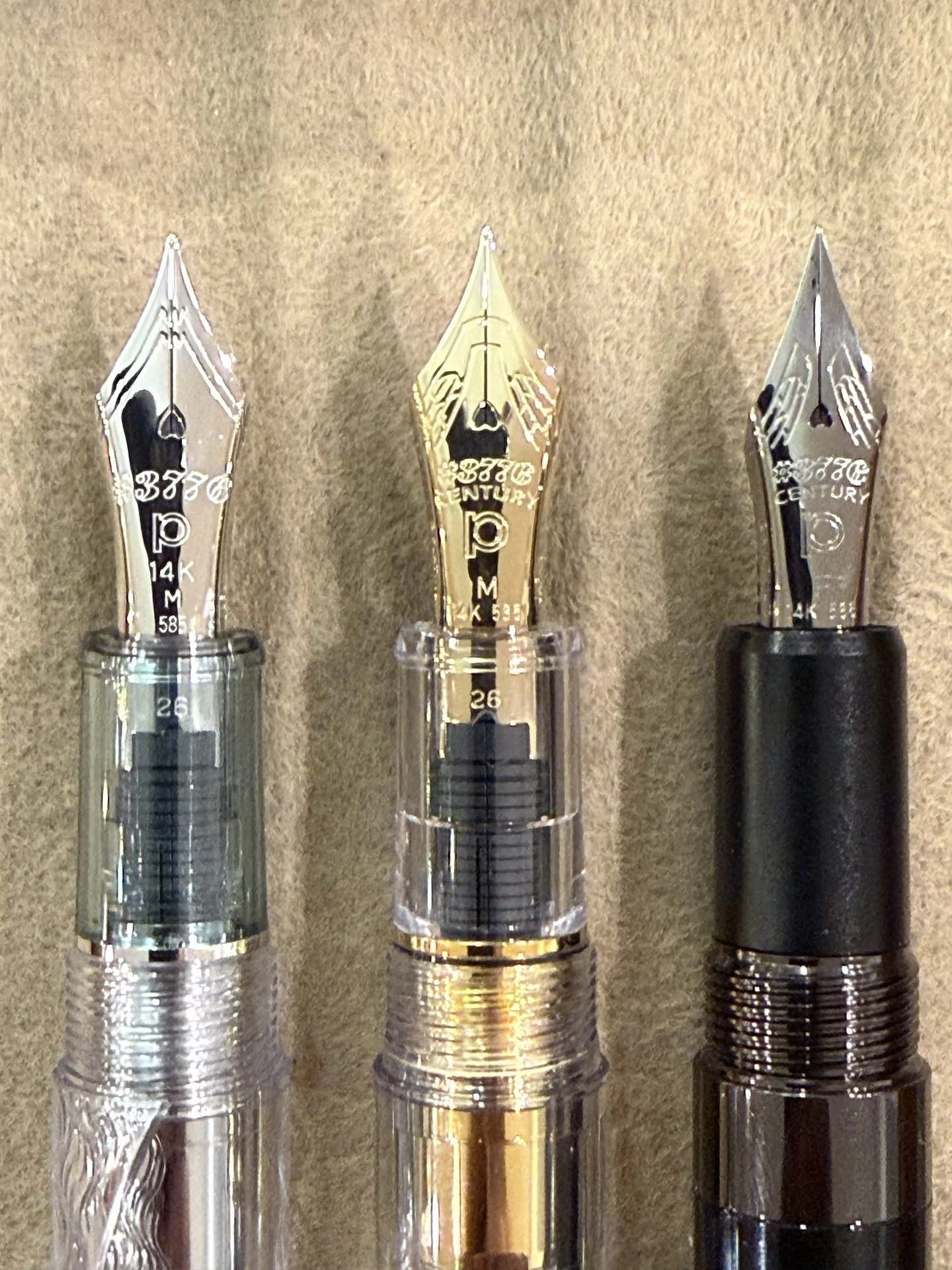
3776 nib (left), 3776 2.0, and FLAF (right) - all 3 nibs are 14kt gold.
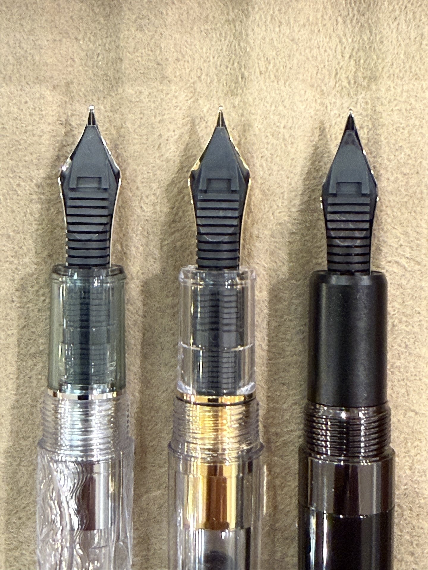
The back of the nibs & feeds. The FLAF nib is a bit narrower and has shallower angle of shoulders.
According to Platinum, the FLAF nib flexes with less force than the standard 3776 nib. Despite Platinum’s use of the word “flex”, I would absolutely NOT categorize either the standard, Soft, or FLAF nibs as flexy. I wouldn’t even call them semi-flex. The latter two have a touch of bounce and give a wee bit of line variation when pressure is applied and released.
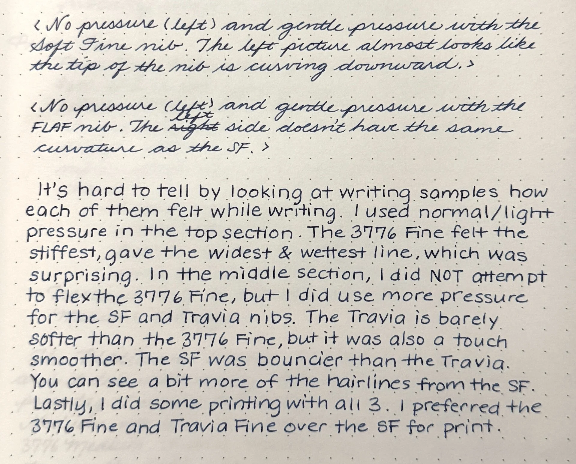
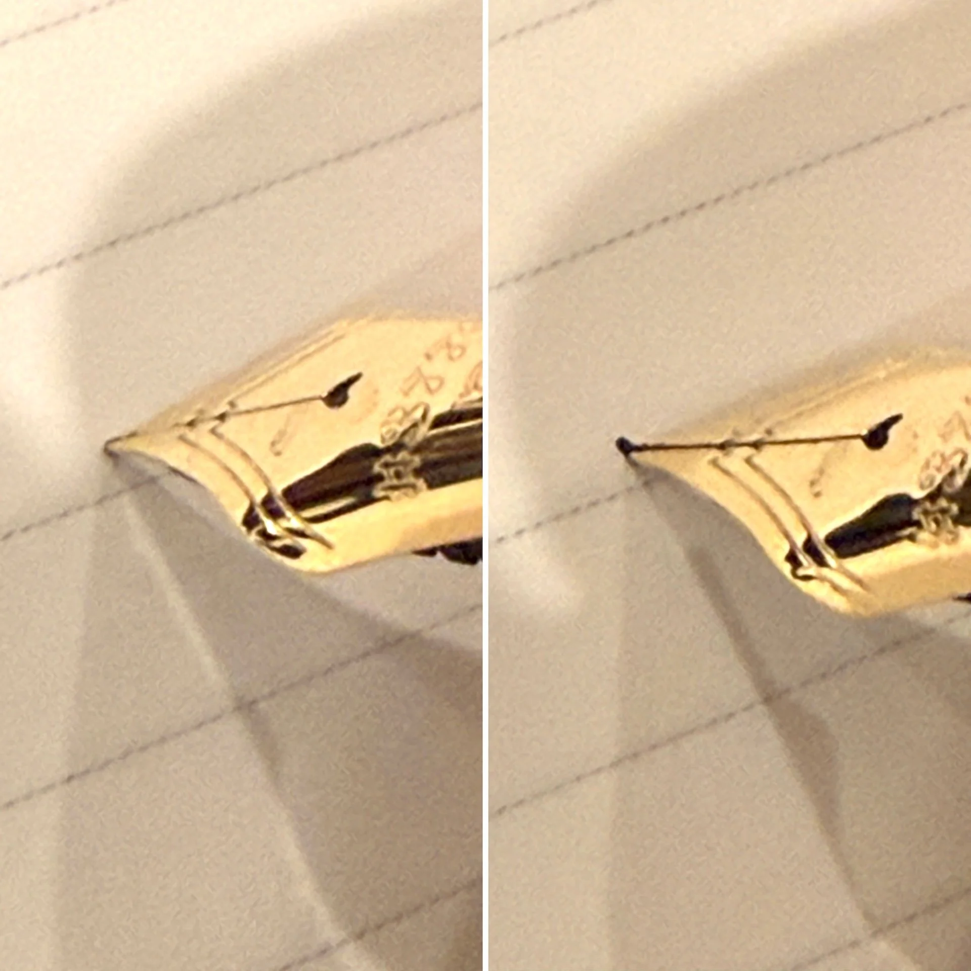
No pressure (left) and gentle pressure with the Soft Fine nib. The left picture almost looks like the tip of the nib is curving downward.
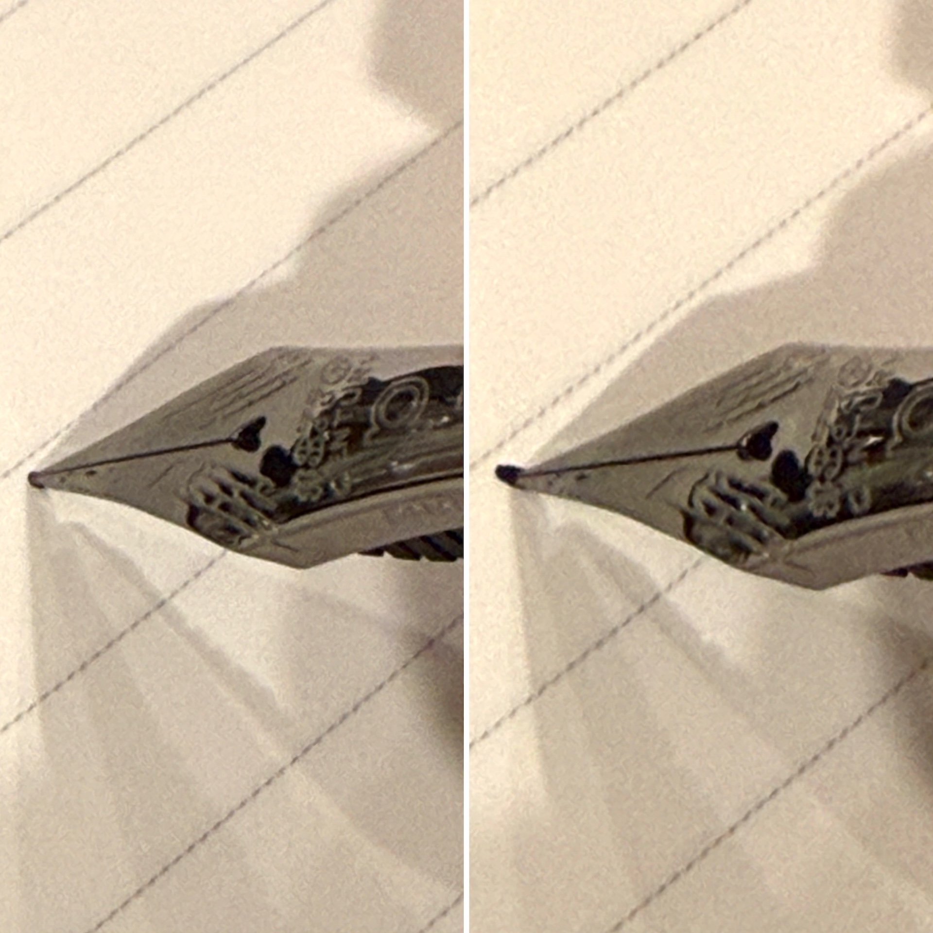
No pressure (left) and gentle pressure with the FLAF nib. The left side doesn’t have the same curvature as the SF.
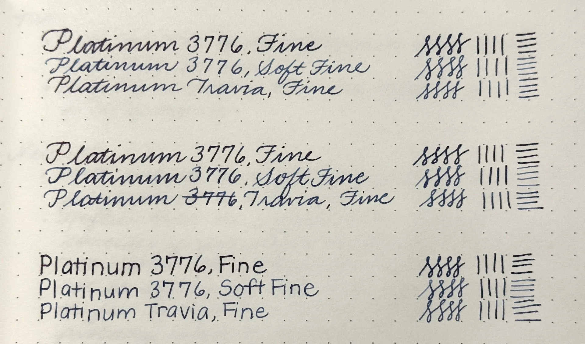
Writing samples of the Platinum 3776 Fine, Soft Fine, and Travia Fine nibs.
It’s hard to tell by looking at writing samples how each of them felt while writing. I used normal/light pressure in the top section. The 3776 Fine felt like stiffest, gave the widest & wettest line, which was surprising. In the middle section, I did NOT attempt to flex the 3776 Fine but I did use more pressure for the SF and Travia nibs. The Travia is barely softer than the 3776 Fine, but it was also a touch smoother. The SF was bouncier than the Travia. You can see a bit more of the hairlines from the SF. Lastly, I did some printing with all 3. I preferred both 3776 the Fine or the Travia Fine over the SF for print.
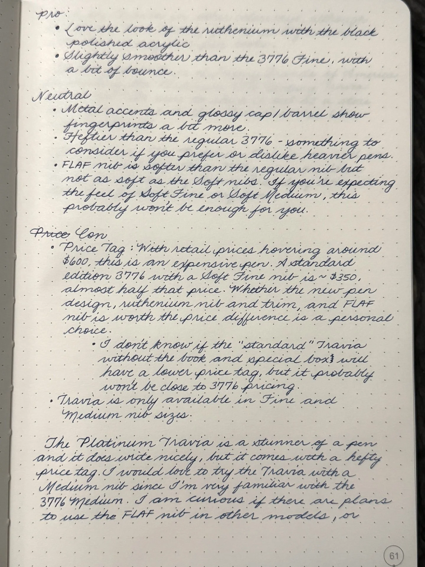
Pro:
- Love the look of the ruthenium with the polished black acrylic
- Slightly smoother than the 3776 Fine, with a bit of bounce
Neutral:
- Metal accents and glossy cap/barrel show fingerprints a bit more.
- Heftier than the regular 3776 - something to consider if you prefer or dislike heavier pens.
- FLAF nib is softer than regular nib but not as soft as the Soft nib. If you’re expecting the feel of Soft Fine (or Soft Medium), this probably won’t be enough for you.
Con:
- Price tag: With retail prices hovering around $600 (and about to go up,) this is an expensive pen. A standard edition 3776 with a Soft Fine is around $350, almost half that price. Whether the metal accents and FLAF nib is worth the price difference is a personal choice.
- I don’t know if the “standard” Travia and without the book and special box will have a lower price tag, but it probably still won’t be close to 3776 pricing.
- Travia is only available in Fine and Medium nib sizes.
The Platinum Travia is a stunner of a pen and it does write nicely, but it comes with a hefty price tag. I am curious to know if there are plans to put the FLAF nib in other models, or have the Travia in other colorways though this Black Pen Society gal is pretty enamored with how classy this pen looks.
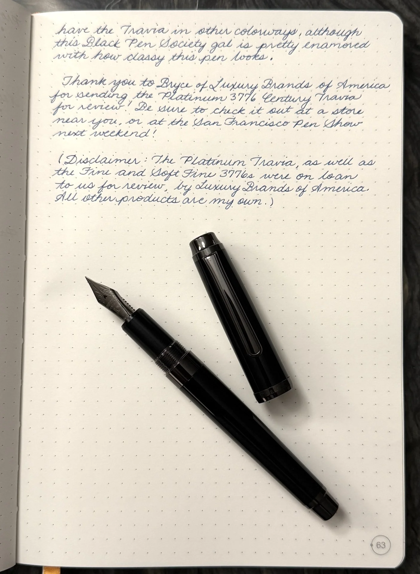
Thank you to Bryce of Luxury Brands of America for sending the Platinum 3776 Century Travia for review! Be sure to check it out at a store near you, or at the San Francisco Pen Show next weekend!
(Disclaimer: The Platinum Travia, as well as the Fine and Soft Fine 3776s were on loan to us for review, by Luxury Brands of America. All other products are my own.)
Enjoy reading The Pen Addict? Then consider becoming a member to receive additional weekly content, giveaways, and discounts in The Pen Addict shop. Plus, you support me and the site directly, for which I am very grateful.
Membership starts at just $5/month, with a discounted annual option available. To find out more about membership click here and join us!