Posts filed under Visconti

Reflections on Some Currently Inked Pens

(Kimberly (she/her) took the express train down the fountain pen/stationery rabbit hole and doesn't want to be rescued. She can be found on Instagram @allthehobbies because there really are many, many hobbies!.)

Despite being in this rabbit hole for 6.5 years, I continue to learn not just about pens, inks and all that, but about my preferences and habits. There isn’t a right or wrong way to be in this hobby and what works for someone may or may not work for you. For some reason during the past few weeks, a few of my currently inked pens were good reminders of lessons I’ve learned along the way.

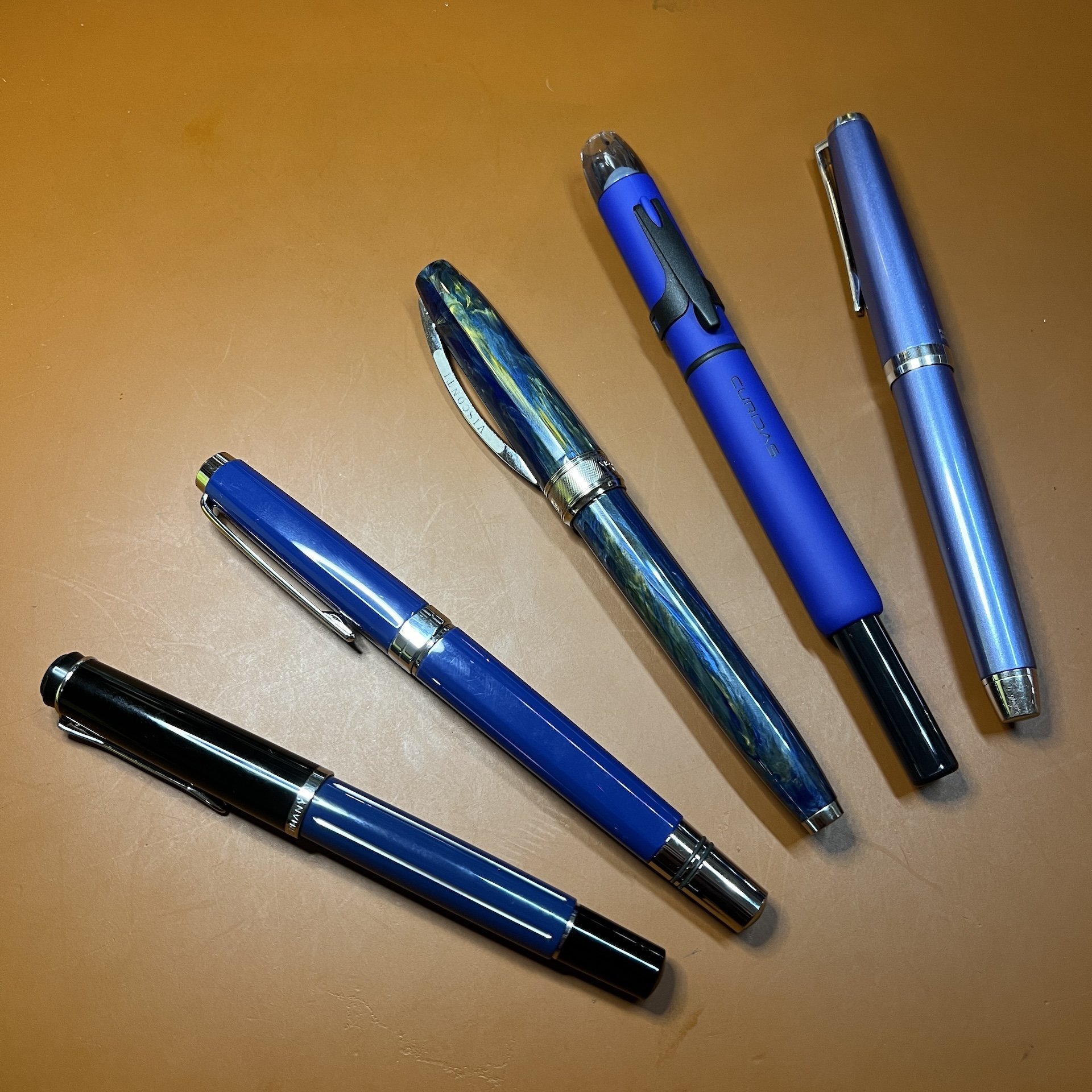
On the surface, there isn’t much that is similar among these pens, other than they all happen to be blue! (Bottom to top: Pelikan M215 Blue Stripe, TWSBI Classic Blue, Visconti Van Gogh, Platinum Curidas, Pilot Falcon/Elabo.)

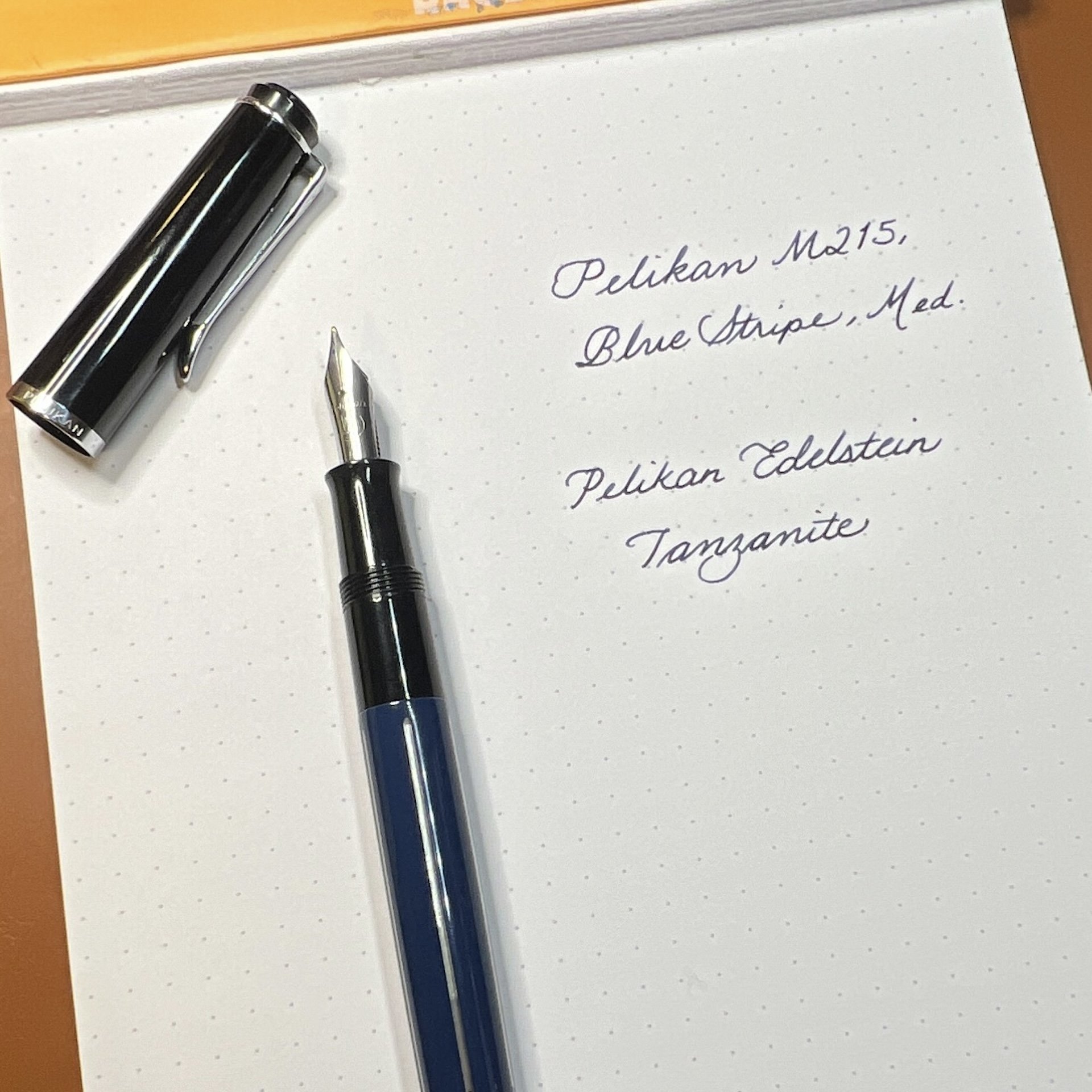
Pelikan M215 Blue Stripe

Hard to tell from this picture but there are silver colored stripes on the barrel of this pen.

  • Patience (and research), Grasshopper - I have wanted this pen for 3-4 years (maybe longer) and have seen it on eBay for very high/ambitious prices. And I am definitely not one for patience. But I also don’t want to overspend. Doing research ahead of time, including reaching out to folks who have better pulses on the Pelikan secondary market, made it easier for me to pounce on a listing that was finally in the right price range.
  • Inks & pen combinations matter - As I mentioned in recent ink reviews, inks behave differently in different pens (and also on different papers too). This M215 is currently inked up with Pelikan Edelstein Tanzanite, which is a lovely blue-black ink. Is it a shocker that this is a good matchup? No, not really, but I haven’t used this ink since I first tried it, gulp, way back in 2017, in a Lamy Safari. I absolutely hated the combination because it felt like writing with sand and I wondered if I should dump the ink out of the pen and get rid of the sample. What I didn’t know then, was that Lamy pens can be on the drier side and that Pelikan inks are also on the drier side (to compensate for their wetter nibs), so that combination was doomed from the start. What’s sad is that I was hesitant to try the ink again, even though I learned more about pens and inks since 2017. I’m glad I decided to try the ink in this pen, because it flows just perfectly from this pen, and it’s a great match colorwise, too. I’ve also since learned that it’s ok to empty out a pen if the ink just isn’t doing it for you. Life’s too short to write with a bad combination.

TWSBI Classic, Blue

  • Oldie but goodie - One of my first TWSBIs is the Classic, in Turquoise. I love the non-demonstrator look but I don’t really think about them as much because I usually want a demonstrator when I want to ink up a TWSBI. I needed to ink up a blue pen so I decided on the blue Classic. It had a Fine nib and even though Mediums are my usual jam, I just shrugged and inked it up anyway. Then I wrote with it and was shocked at how much I liked the Classic AND the fine nib. It is so easy to ink up the latest acquisitions and forget about the older pens (and inks). I try to balance that urge by having a mix of old and new pens in the “to-be-inked-next” tray. I do this with inks too. It’s like discovering a lost treasure.

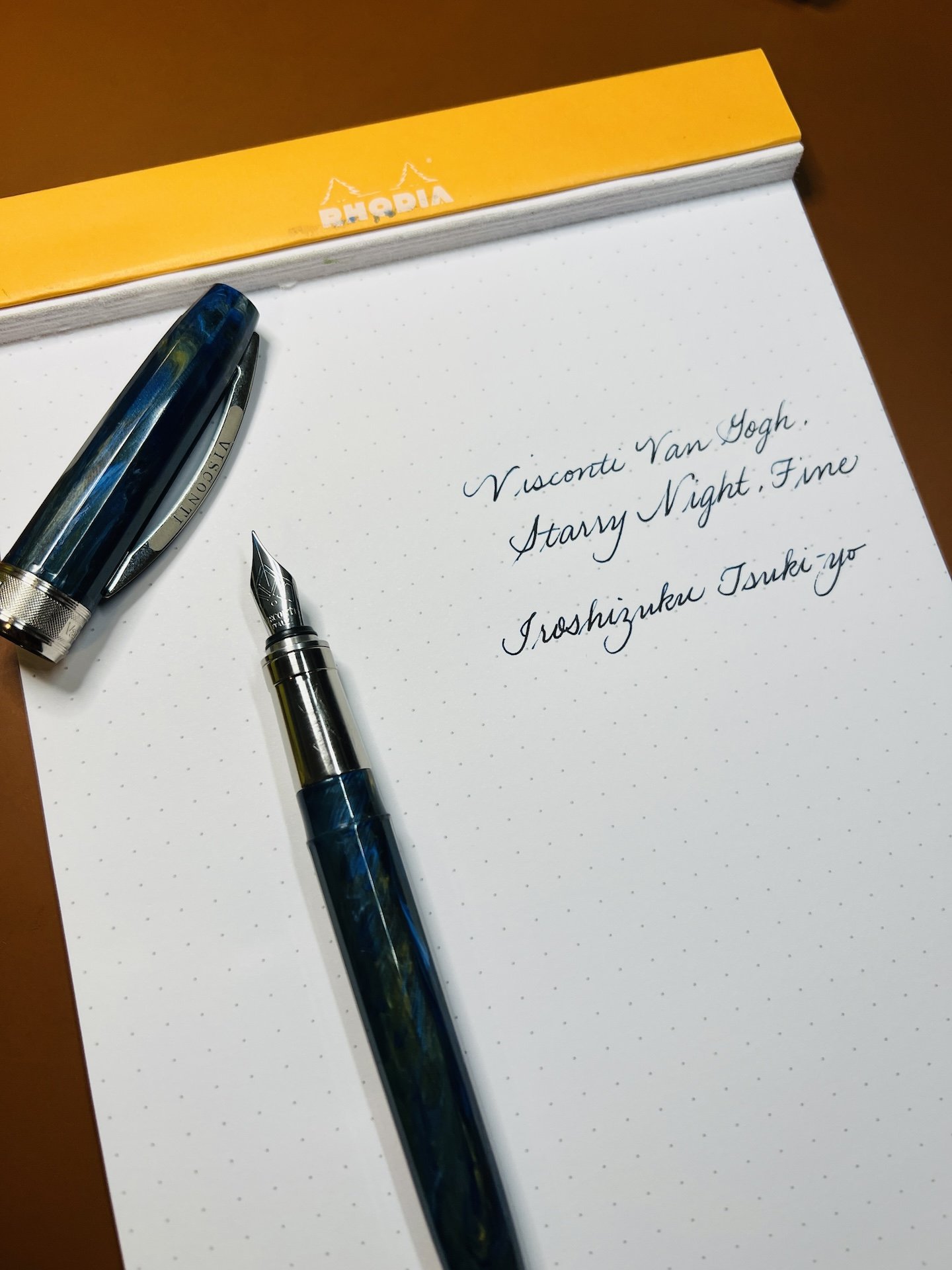
Visconti Van Gogh, Starry Night

  • It’s ok if looks are important - As a Van Gogh fan, and more specifically of Starry Night, I love this pen. Not because it is an amazing writer (I mean, it writes fine) but because looking at it makes me happy. It makes me think about my favorite piece of art and that makes me happy. People place different levels of importance on the nib vs the appearance and that’s one of the many wonderful things about this rabbit hole. My personal pen preference emphasizes looks over writing (probably 65:35 as long as the nib doesn’t write poorly). In the end, as long as you’re happy, whether it’s with the looks, the nib (or both), it’s a win in my book.
  • Oldie but goodie, this time with ink - I inked this up with an ink that I once loved but sorta put by the wayside (shame on me) - Iroshizuku Tsuki-yo. When everyone was raving about Shin-kai (cough cough, Bossman), I instead fell in love with Tsuki-yo. With all the deluge of inks that currently exist and continue to be released, it’s easy to get caught up in the latest “must-have ink”. I had forgotten how much I liked that ink and I’m glad I decided to use it again.

Platinum Curidas, Matte Blue

  • It is not a popularity contest - Not gonna lie, the Platinum Curidas is probably one of the more polarizing pens when it comes to looks, nock length, design, etc. And yet, I still love it. I have the original demonstrator finishes but I love this Matte Blue with black trim. The Medium steel nib gives me the perfect line width. Do I love it more than the Vanishing Points or Decimos? Probably not, but I still love it, even if it’s not for everyone, and that’s what matters.
  • Don’t judge an ink before using it - I bought a sample of Taccia Ukiyo-e Hiroshige-Ruri and after swatching it, I thought “yet another dark blue ink” and was glad that I hadn’t bought a bottle. After pairing it up with the Curidas though, I’m loving the richness of this blue ink, along with its subtle sheen that can even been seen on Rhodia, and am now adding it to my “bottles to buy” list. It’s another reminder that I shouldn’t judge an ink too quickly!

Pilot Falcon/Elabo, Metal Blue

  • They can’t all be winners - The Pilot Falcon (or Elabo in other markets) is a pen that has a fun, bouncy nib that can give some line variation, which I generally love, but there’s something about this one that isn’t doing it for me. I really like the plastic version of this pen with a Soft Fine nib, but I don’t think it’s the minimally- added weight. The Akkerman Delfts Blauw ink is flowing just fine so it’s not that. Maybe it’s the Soft Medium nib which feels blobby and almost squeaky. I really want to love it, but I don’t, so I think it’s better to part ways, than to have it stay in the collection untouched and unloved.
  • It’s hard saying goodbye - Despite everything I just wrote about the pen not being a good fit, it’s still really hard for me to decide to sell a pen. I just have to remember that someone else will enjoy it more than I do and that I can use the proceeds to get something else, like that bottle of Taccia Hiroshige-ruri :-)

None of these things are earth-shattering or new in any way, but I don’t usually have these revelations when I’m writing with my pens. So when they do pop up, it’s worth taking a moment to pay attention to what they’re trying to teach me.

Posted on November 17, 2023 and filed under Fountain Pens, Pilot, Pelikan, TWSBI, Visconti, Platinum.

Visconti Sepia Ink Review

Visconti Sepia

(Sarah Read is an author, editor, yarn artist, and pen/paper/ink addict. You can find more about her at her website and on Twitter. And check out her latest book, Out of Water, now available where books are sold!)

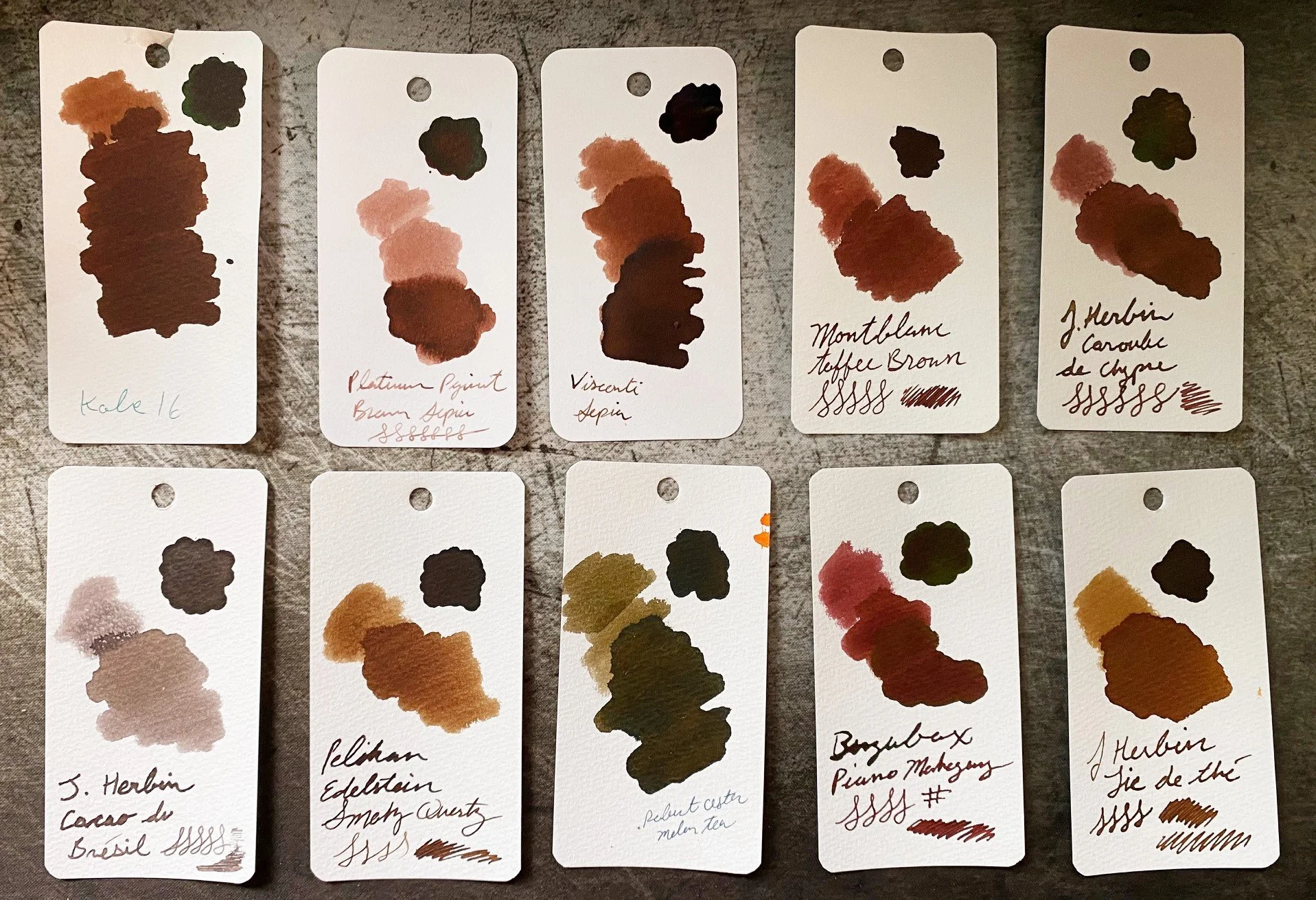
Sepia is such a good staple ink color. Or colors, I should say, as "sepia" seems to be a catchall label for anything brownish. Visconti's Sepia is a classic brown. It's the color of milk chocolate and teddy bears, and while I would say that it's more standard brown that what I, personally, would consider sepia, it's a great ink.

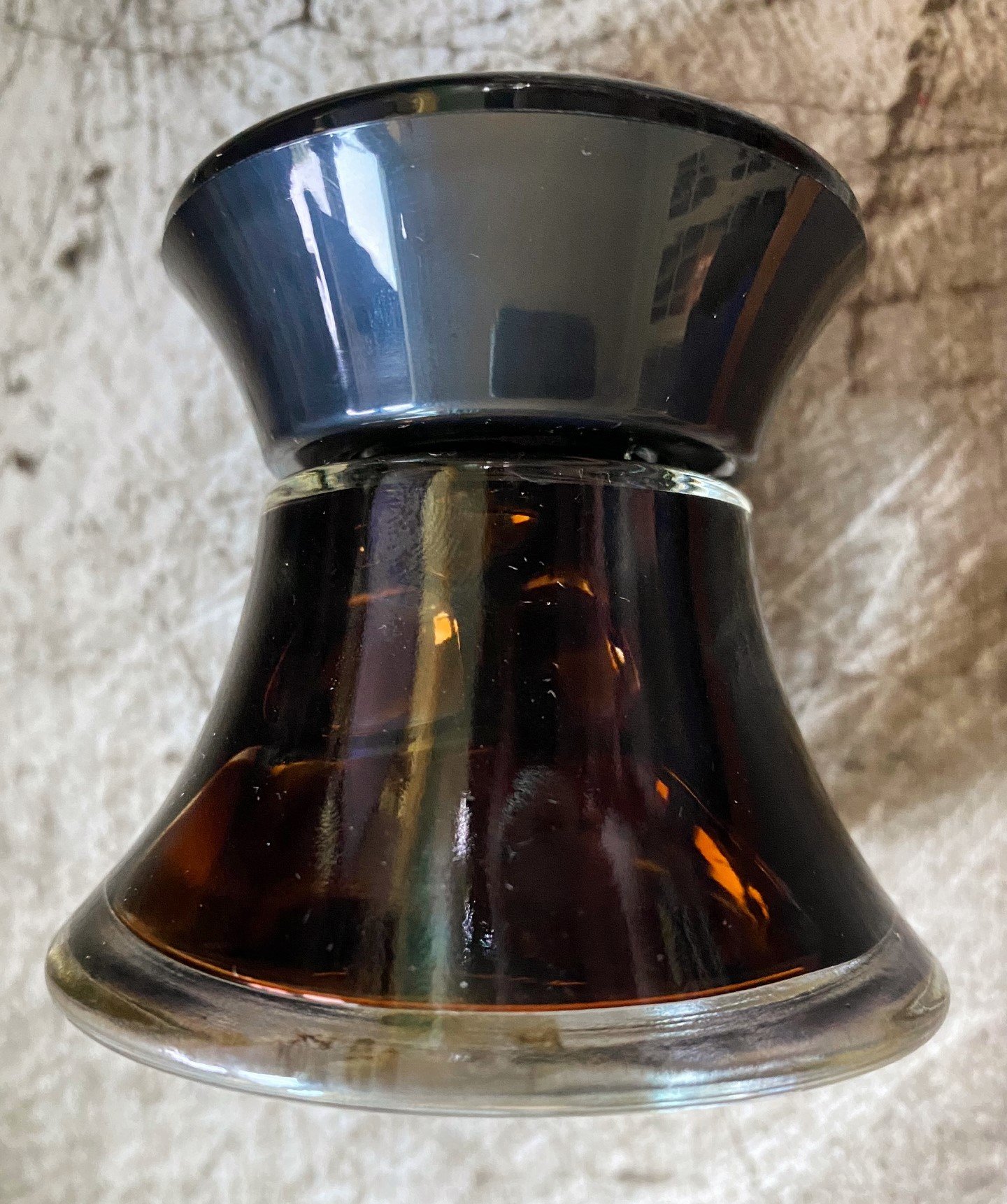
The ink comes in a glass bottle with a unique, very Visconti V shape. The wide base makes it easy to fill from. You would have to try pretty hard to knock this bottle over. I do wonder if filling will be trickier when the ink becomes shallow, but there is a plastic insert in the bottle that is designed to prevent that challenge. I can't say how well it works, as I never seem to get to the bottom of any of my ink bottles.

Visconti Sepia

While the color of this ink is very rich, it's otherwise fairly plain. There's almost no shading, no shimmer or sheen. It's a utilitarian brown. It also doesn't bleed or feather. It does have an unusually long dry time, which surprised me a little, as the ink feels dry when writing with it. It also has a little bit of water resistance. Where water drops were dabbed or wiped away, you can still see faint lines where the ink was. It wouldn't be enough to prevent catastrophe if a notebook was soaked, but it might survive a sprinkle.

Visconti Sepia

Chromatography for this color started off fairly predictable--a warm brown separating into shades of other orangey-browns, but then it gave us a surprise pop of violet-blue at the end. Perhaps that's to cool the color down a bit, though it still reads warm to me on the page. Compared to similar browns, it most closely resembles Mont Blanc Toffee, though it goes much darker with heavier application.

Visconti Sepia

This is a rather large bottle of ink, clocking in at 50ml, and it sells $35. I think that's slightly expensive, but color-wise, not a bad choice if your favorite flavor of sepia is chocolate.

(Vanness Pens provided this product at a discount to The Pen Addict for review purposes.)


Enjoy reading The Pen Addict? Then consider becoming a member to receive additional weekly content, giveaways, and discounts in The Pen Addict shop. Plus, you support me and the site directly, for which I am very grateful.

Membership starts at just $5/month, with a discounted annual option available. To find out more about membership click here and join us!

Visconti Sepia
Posted on October 6, 2022 and filed under Visconti, Ink Reviews.

Visconti Van Gogh Fountain Pen Review

Visconti Van Gogh Fountain Pen Review

(Sarah Read is an author, editor, yarn artist, and pen/paper/ink addict. You can find more about her at her website and on Twitter. And check out her latest book, Out of Water, now available where books are sold!)

Most of my experience with Visconti pens has been staring at them through the glass of a display case, thinking "no way" but feeling a little bummed about it. Because they're gorgeous, but overpriced. So having the chance to try one out at last is priceless.

The packaging certainly makes an impression. The box is textured like a paint canvas and has the image of a Van Gogh painting on top, presumably whichever painting inspired the color scheme for your pen.

Visconti Van Gogh Fountain Pen

My pen is the Orchard in Blossom, with a beautiful blue-grey sky base, with pops of delicate floral colors and splashes of green grass. The pens are meant to look like the painter's oil palette as he creates his masterpieces, and they've nailed that look beautifully.

Visconti Van Gogh Fountain Pen

It has rose gold trim, though other versions have different trim to correspond with their respective paintings. The pen body and cap are gently faceted and taper at each end. There is a wide cap band with "Visconti Italy" on one side and "Van Gogh" on the other. The bottom finial is plain, while the top has the Visconti V logo. It has the classic Visconti Ponte del Vecchio clip, made to look like the iconic bridge in Florence, Italy. It is a hinged clip, so the whole thing lifts easily and clips securely.

The cap has a magnetic closure with a very satisfying click. It does post securely, but you risk scratching that gorgeous finish. The grip section is smooth metal with a slight ridge at the end to keep your fingers from sliding.

Visconti Van Gogh Fountain Pen

The pen takes cartridges or a converter, and it comes with a converter and a bottle of ink, which was a lovely surprise. The ink is a rosy purple to match the blooms in the painting. It's a great ink with lots of character that shades in different purple tones.

Visconti Van Gogh Fountain Pen

The nib in my pen is a rose gold-plated steel nib. It is beautifully etched. But it has some mild QC issues, which is not unheard of for Visconti. This nib is meant to be a Fine, but whoa. The slit in this nib is very wide, a canyon compared to the average nib. It's enough to affect the capillary action and made it difficult to get ink flowing at first. But once it got started, it flowed like a fire hose in a very wet, broad line. It writes with a controlled dribble. It didn't take long to write the pen empty. It's smooth and pleasant to use--I don't dislike the way it writes, but it's definitely not performing as it's supposed to.

Visconti Van Gogh Fountain Pen

Given the nib issues and the price ($260 for a steel nib, yikes), it's not a pen that I can fully recommend, despite its other qualities. If you're fortunate enough to be in a place where you can try one or peek at the nib, or purchasing from a vendor that does nib checks, then I'd say it's definitely worth looking into. I still really like this pen. If money was no object, there are three other colors I'd get! But it's not perfect, and at its price point, it really should be.

(JetPens provided this product at no charge to The Pen Addict for review purposes.)


Enjoy reading The Pen Addict? Then consider becoming a member to receive additional weekly content, giveaways, and discounts in The Pen Addict shop. Plus, you support me and the site directly, for which I am very grateful.

Membership starts at just $5/month, with a discounted annual option available. To find out more about membership click here and join us!

Visconti Van Gogh Fountain Pen
Posted on March 10, 2022 and filed under Visconti, Fountain Pens, Pen Reviews.