Posts filed under Papier Plume

Papier Plume x Stationery Universe First Blossom Ink Review

(Kimberly (she/her) took the express train down the fountain pen/stationery rabbit hole and doesn't want to be rescued. She can be found on Instagram @allthehobbies because there really are many, many hobbies!.)

At the 2026 Chicago Pen Show, Tori Woods of Stationery Universe released her First Blossom collection. Inspired by the blooms in her neighborhood, she collaborated with Papier Plume to make these inks a reality. And like a dingbat, I kept forgetting to buy the First Blossom inks. Thankfully, she was at the St Louis Pen Show, and so was the Bossman, which means free ink for me! That also means I gotta earn my keep, so let’s get to it!
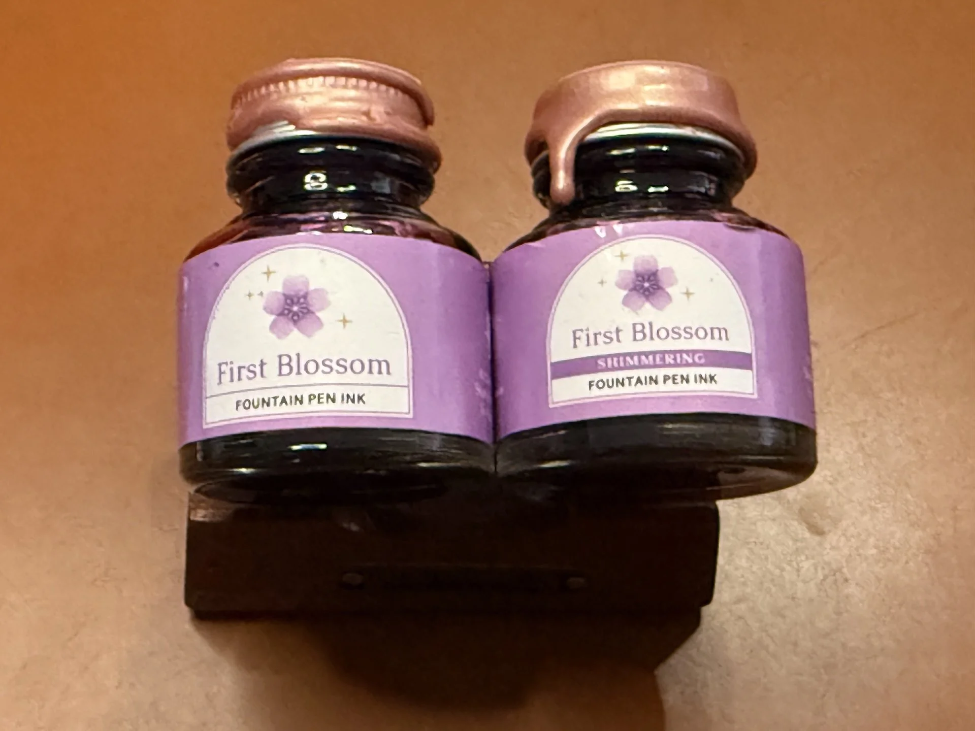
Papier Plume x Stationery Universe First Blossom and First Blossom Shimmering.
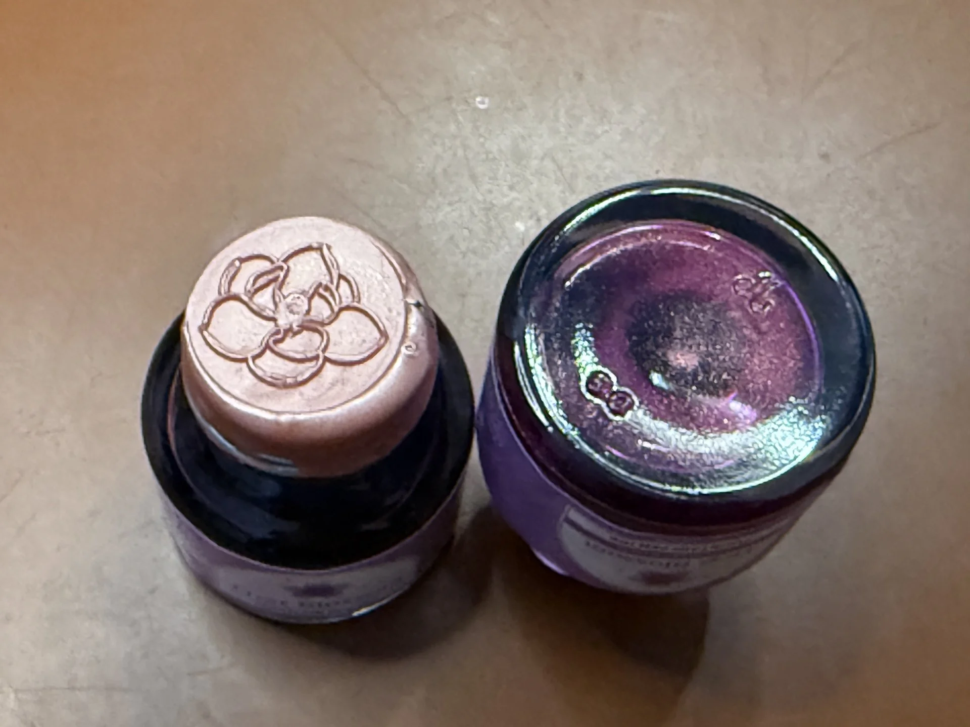
I love that Papier Plume dips the caps in wax and uses a wax seal on top! The one on the right is the Shimmering one - even with a rapid flip, the shimmer dispersed pretty quickly.

As usual, all swatches were done on Col-O-Ring cards and also Wearingeul Instant Film Color Swatch cards, using a Kakimori steel dip nib and writing samples were done primarily with a Lamy Vista with a steel Medium nib and a TWSBI Go with a Medium nib. The notebooks used for writing samples are from an Odyssey Notebook, with 68 gsm Tomoe River paper. Dry times for the Vista are shown with “(V)” and the Go will be shown below that with a “(T)”. Dry times may be a bit slower on 52gsm TR or faster on more absorbent papers like Rhodia, copy paper, Cosmo Air Light, or with drier or finer nibs.

Side note: Photographing inks is not easy. My photo editing skills are mediocre at best, so I prioritize swatch/writing sample accuracy over paper or background color accuracy. Even then, it doesn’t always work out – it could look great in the Lightroom app, and then less great when I export to my phone, or great on phone, and less great when I upload to the Bossman’s Dropbox, etc.
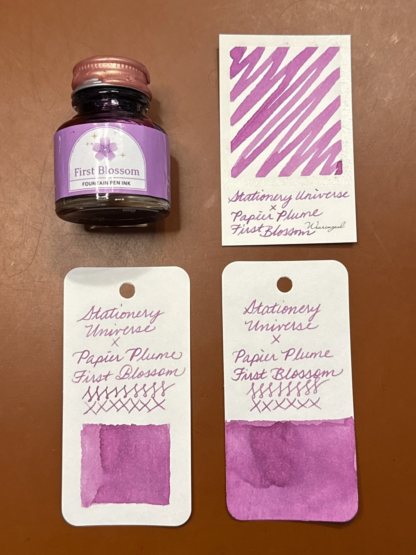
First Blossom and swatches.

First Blossom is an ink that is difficult to describe: pinkish purple, or purplish pink, or purple leaning muted hot pink, maybe muted magenta? Either way, it is a lovely color. In the TWSBI Go, the line is more saturated while the drier Vista shows off a bit of the shading. There was no sheen from either pen. It had average to fast dry times in both pens.
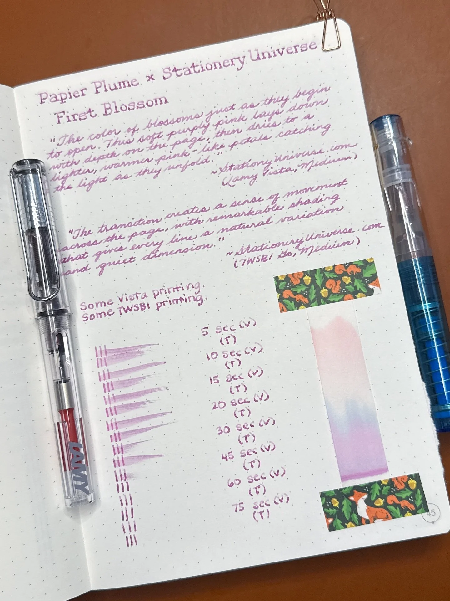
First Blossom writing sample.
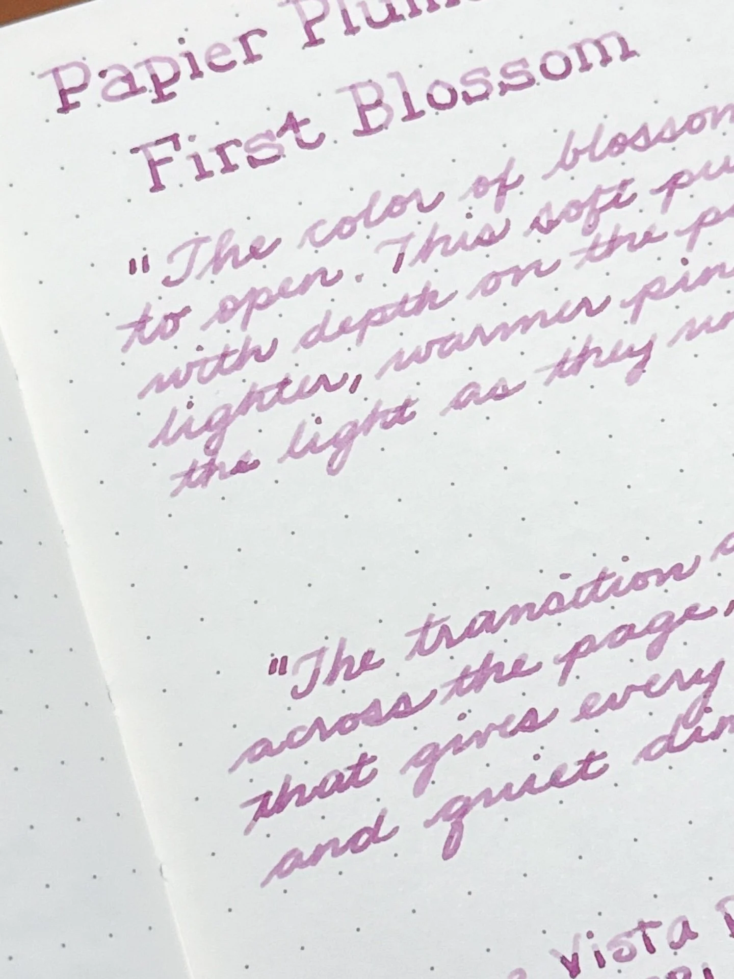
You can see the First Blossom’s shading from the Vista (top) versus a slightly more saturated writing sample from the Go.
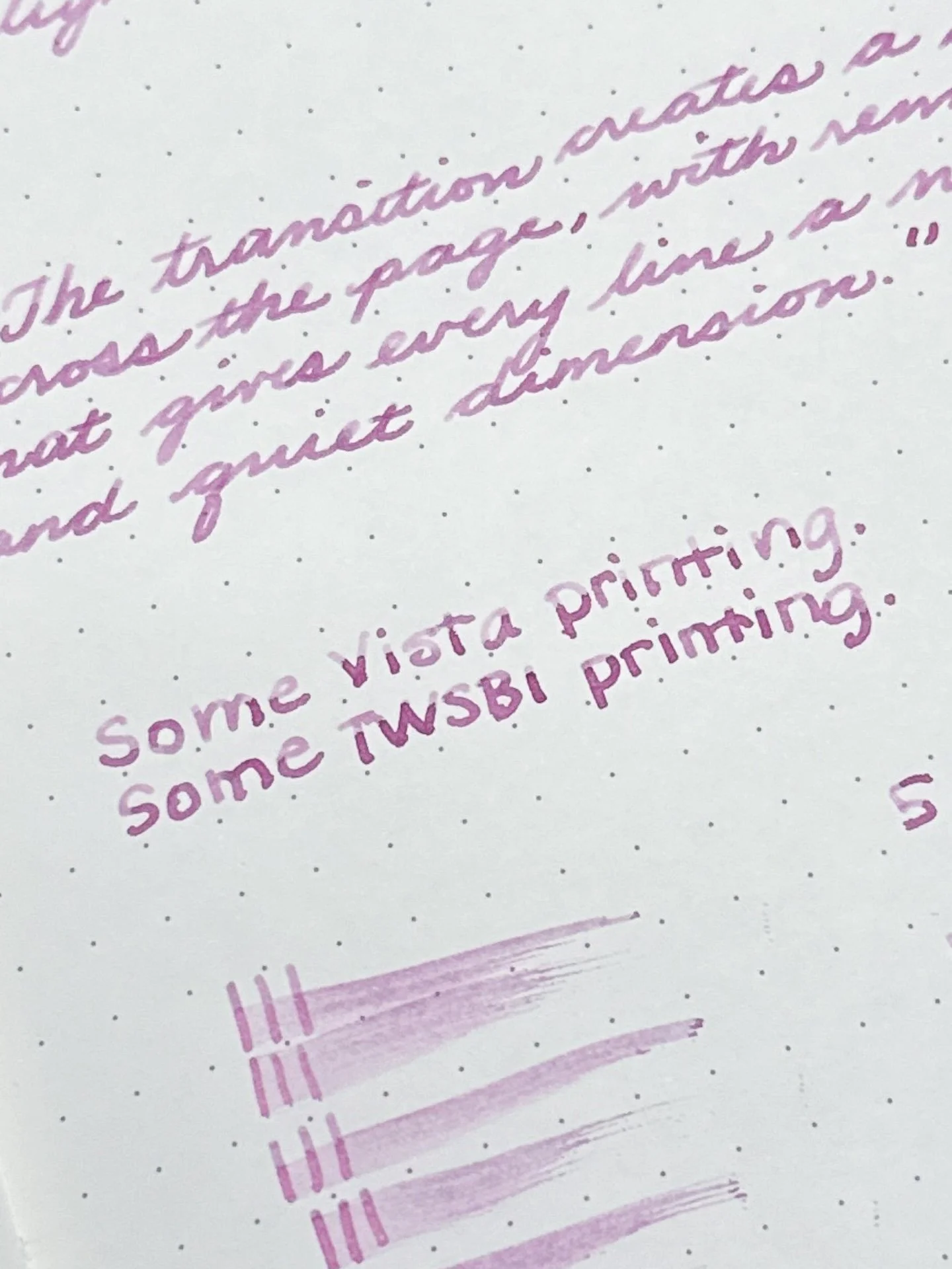
You get more shading when printing due to the pooling of ink at the bottom/end of the stroke. As you can see, there is shading from both pens, with more showing from the Vista than the Go.
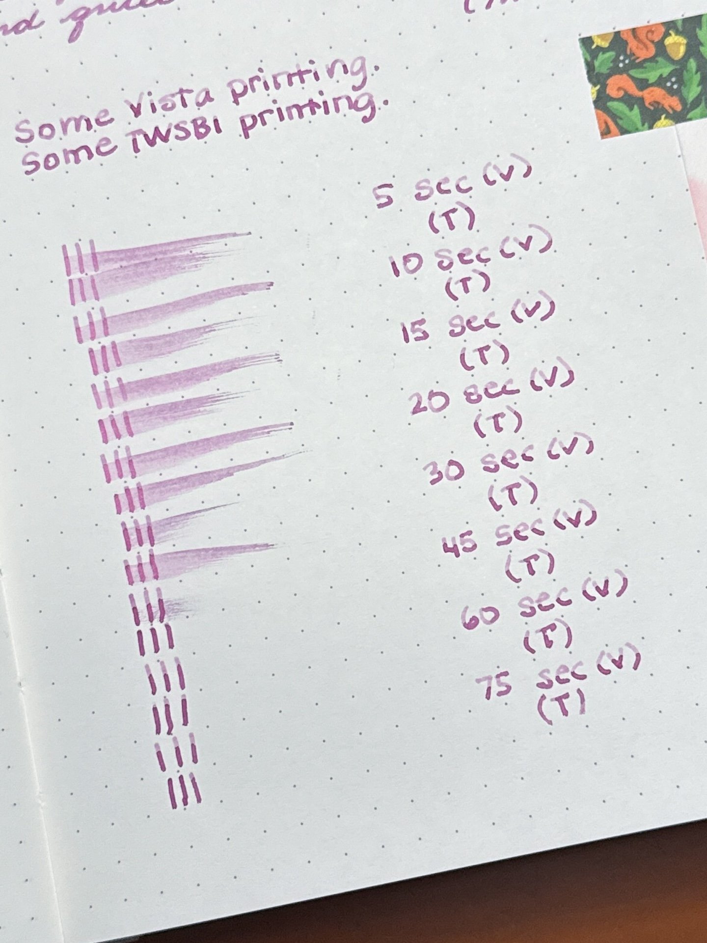
Pretty fast dry time for First Blossom. I was surprised that the ink dried a little faster from the Go initially, but both were dry in around 30 seconds.
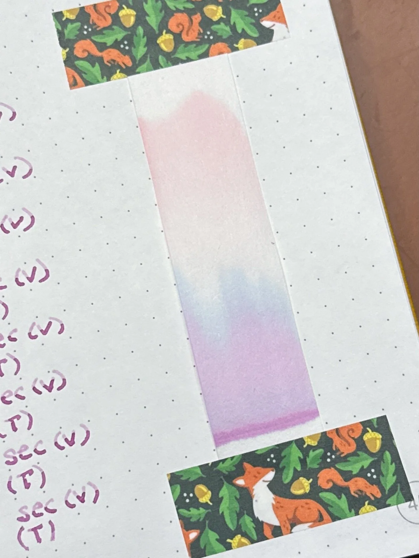
Chromatography from First Blossom - a colorful spread of magenta/purple at the base, to blue, then to a peachy pink up top.

I will save the comparison photos for later since the two inks have the same base, the only difference being shimmer vs none.
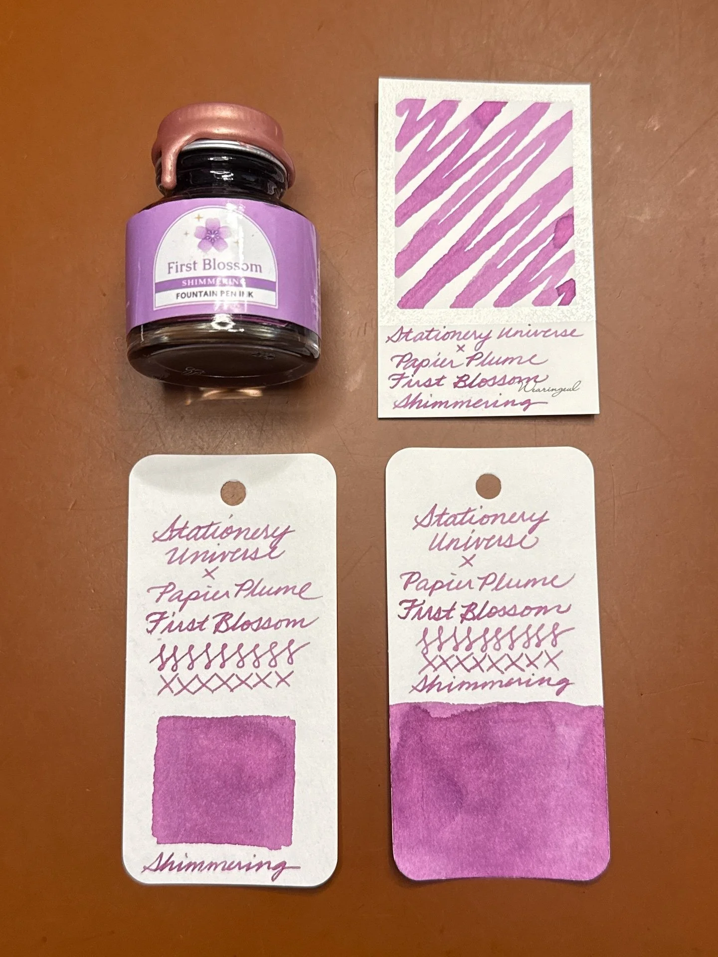
First Blossom Shimmering and swatches.

First Blossom Shimmering has the same base color ink as the above First Blossom, but with the addition of rose gold shimmer particles. Lamy Safari-based pens, like the Vista, can be a bit ink-stingy with their nib/feeds (one of the reasons why they tend to lean drier compared to other pens) - this has the added effect of making shimmers less obvious in the Vista writing sample. Friction-fit TWSBIs like the Go, Eco, Swipe, have a more generous flow, resulting in more shimmer flowing onto the paper. The rose gold shimmer, while lovely, is subtle and difficult to see against the pink-toned ink, and was very difficult to photograph. You need more heavy-handed swatching to get the shimmer to show through.
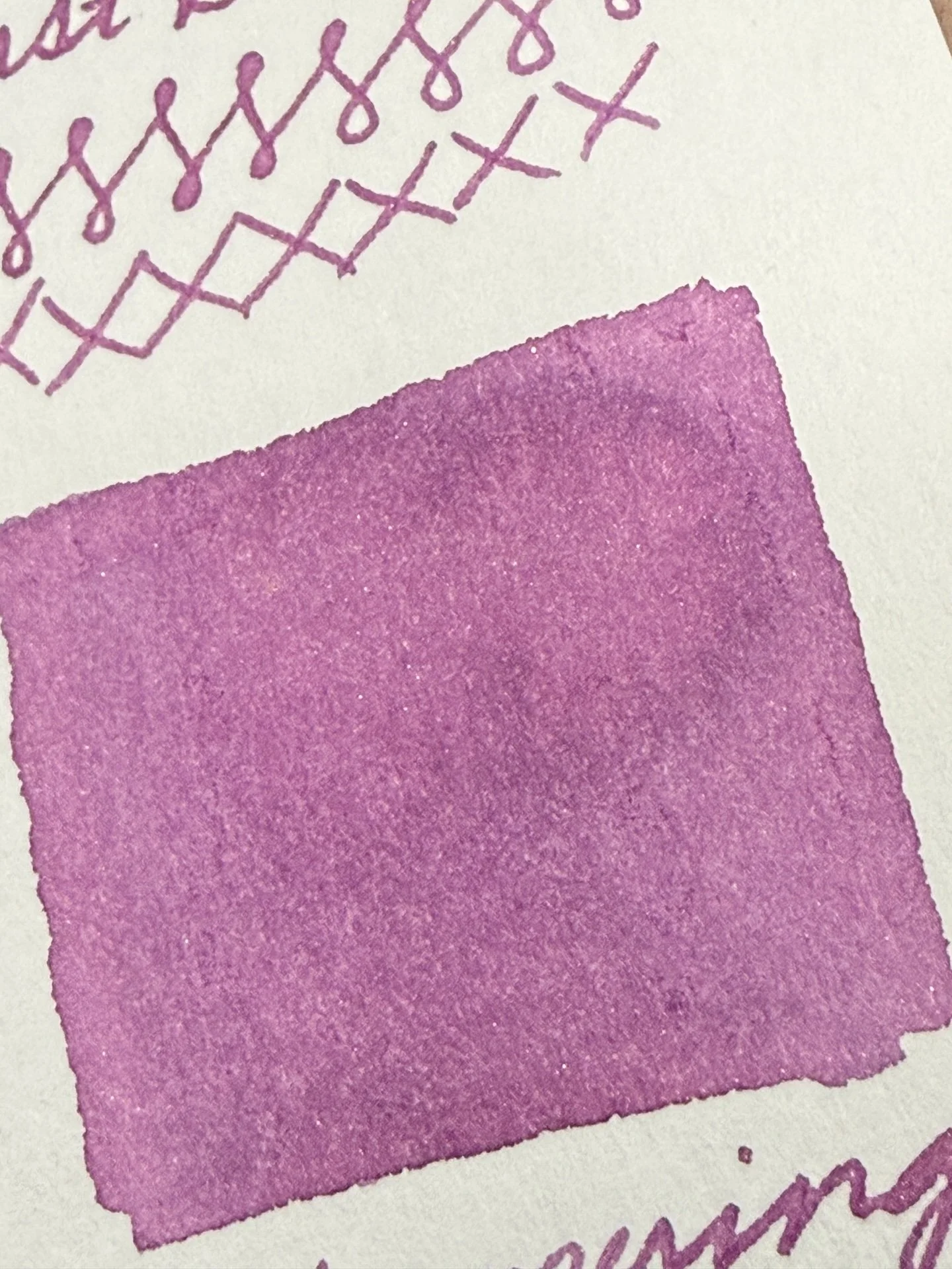
The parts that look like white specks in the upper middle section are actually the shimmer particles. There are a few random specks throughout this swatch.
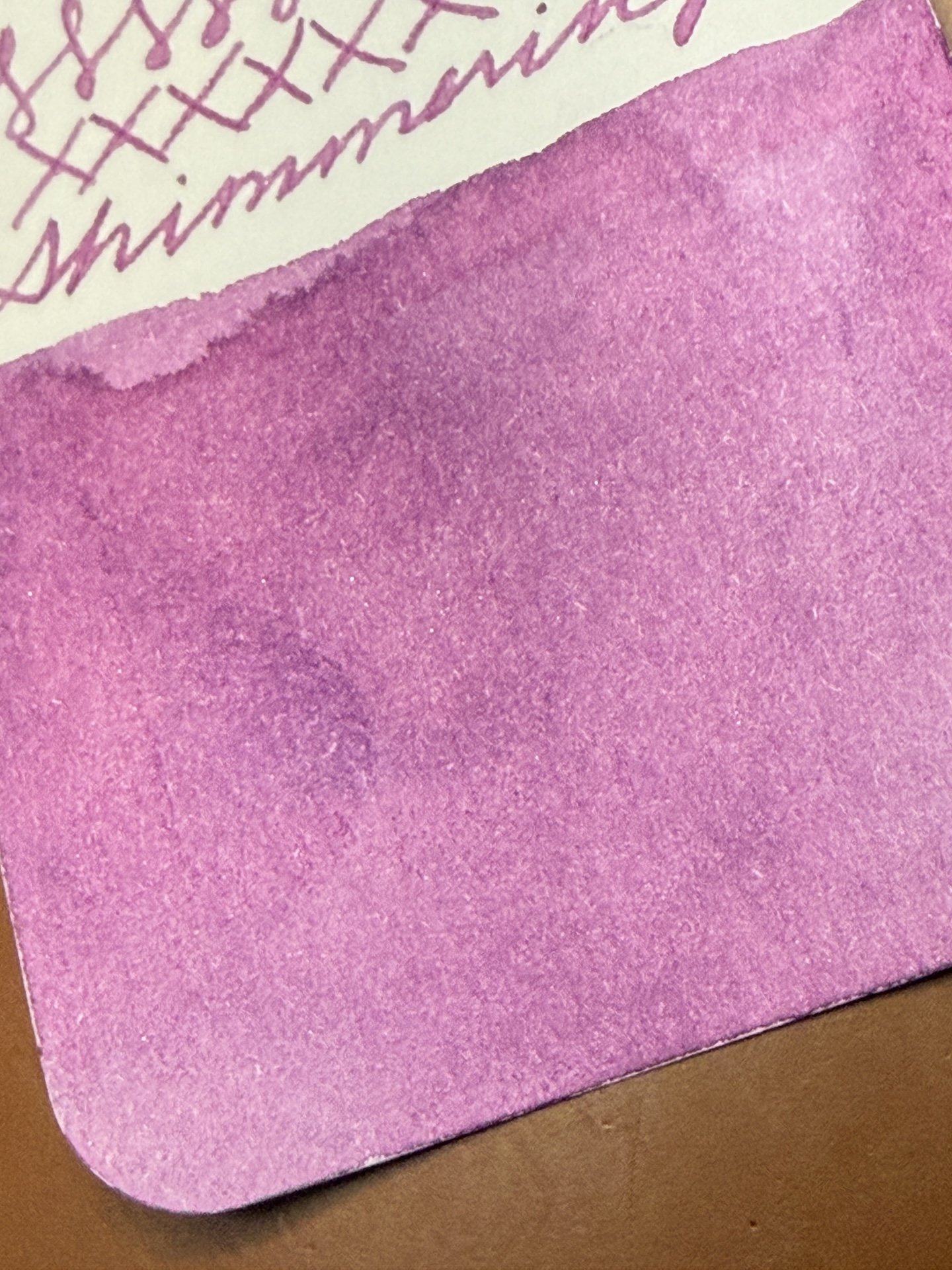
Some more impossible-to-photograph flecks of shimmer.
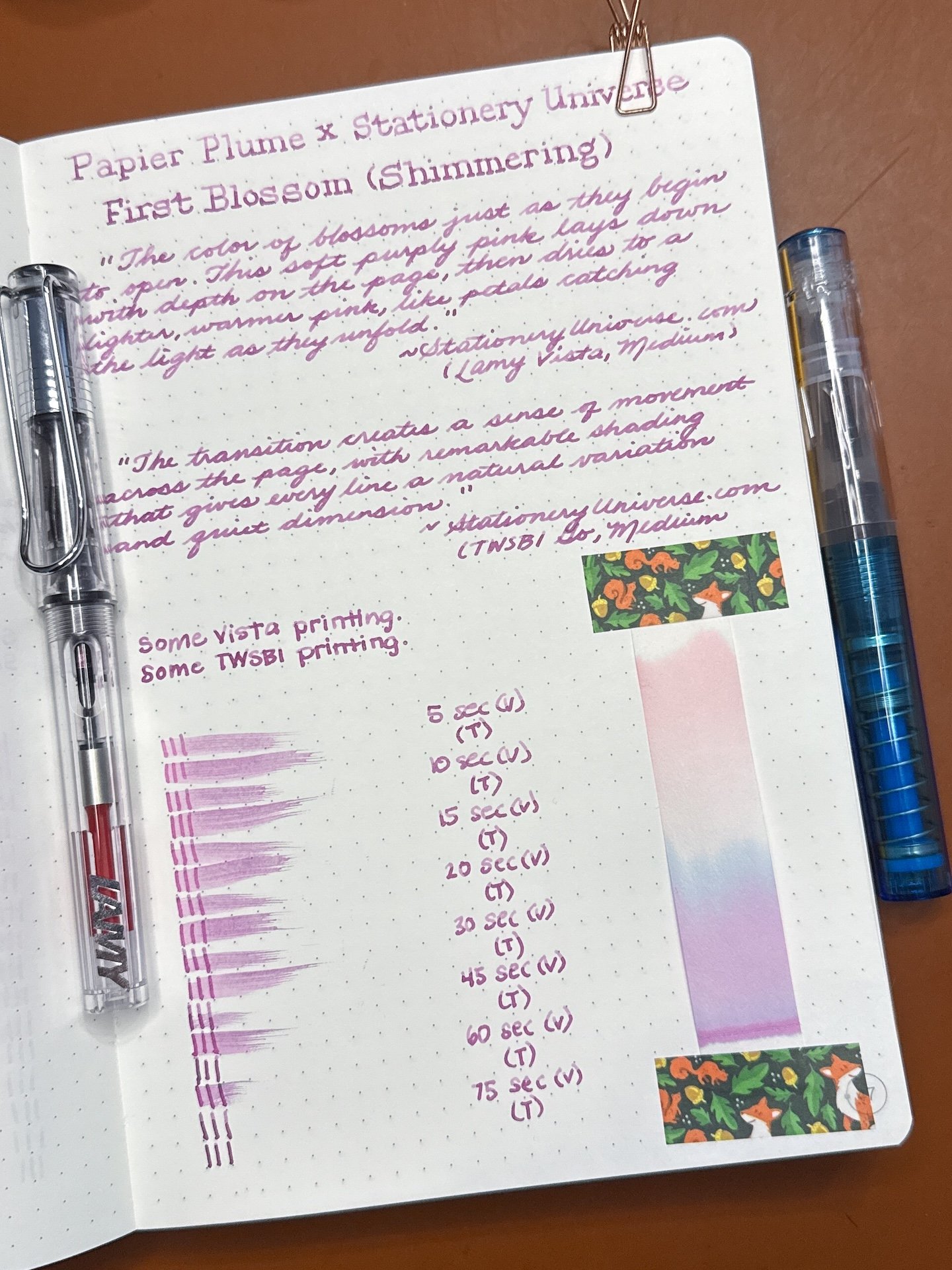
First Blossom Shimmering writing sample.
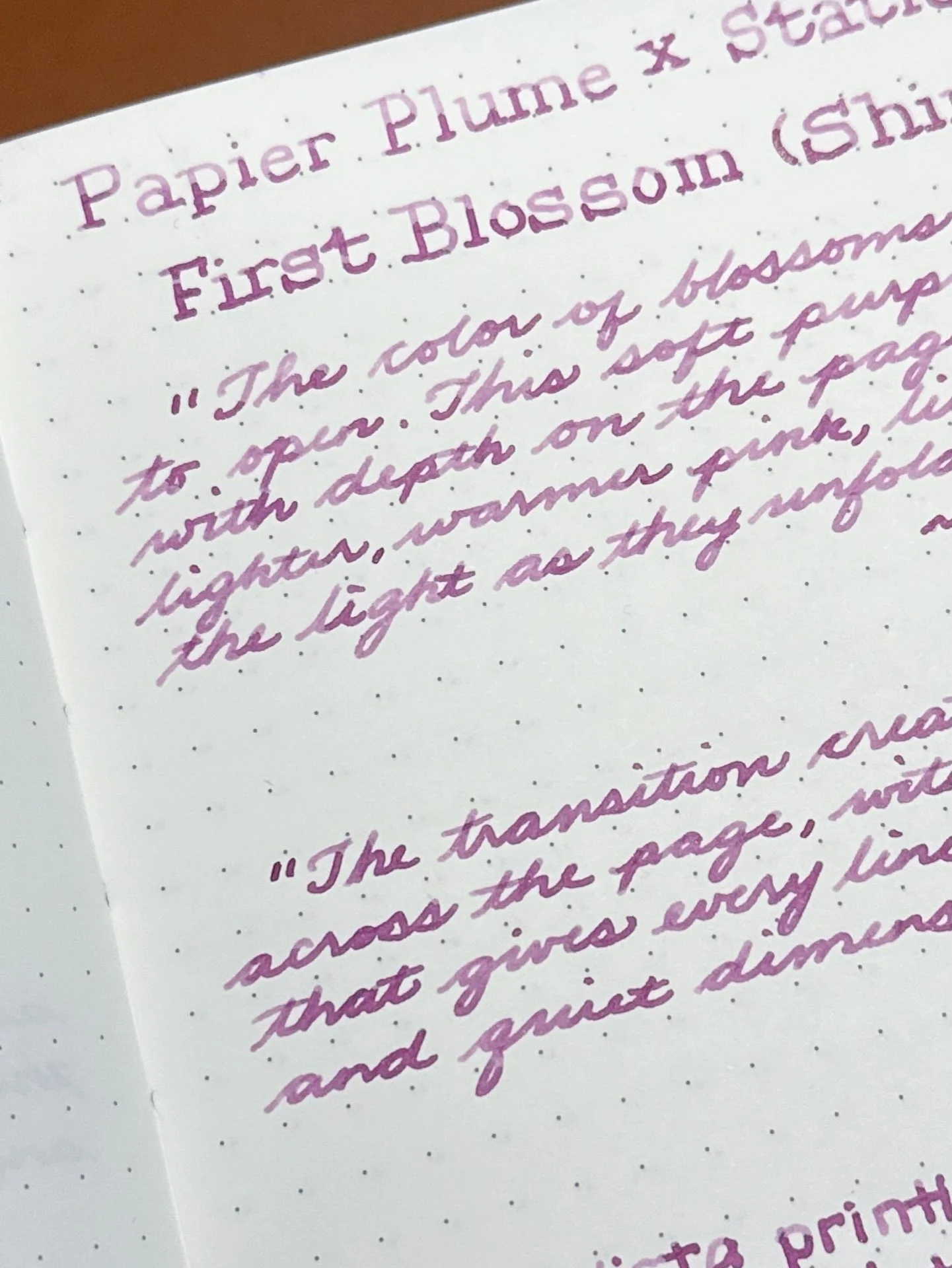
First Blossom Shimmering doesn’t shimmer much from the Vista (top) and is occasionally there from the wetter Go. As with the non-shimmering version, the shading is more noticeable from the drier Vista.
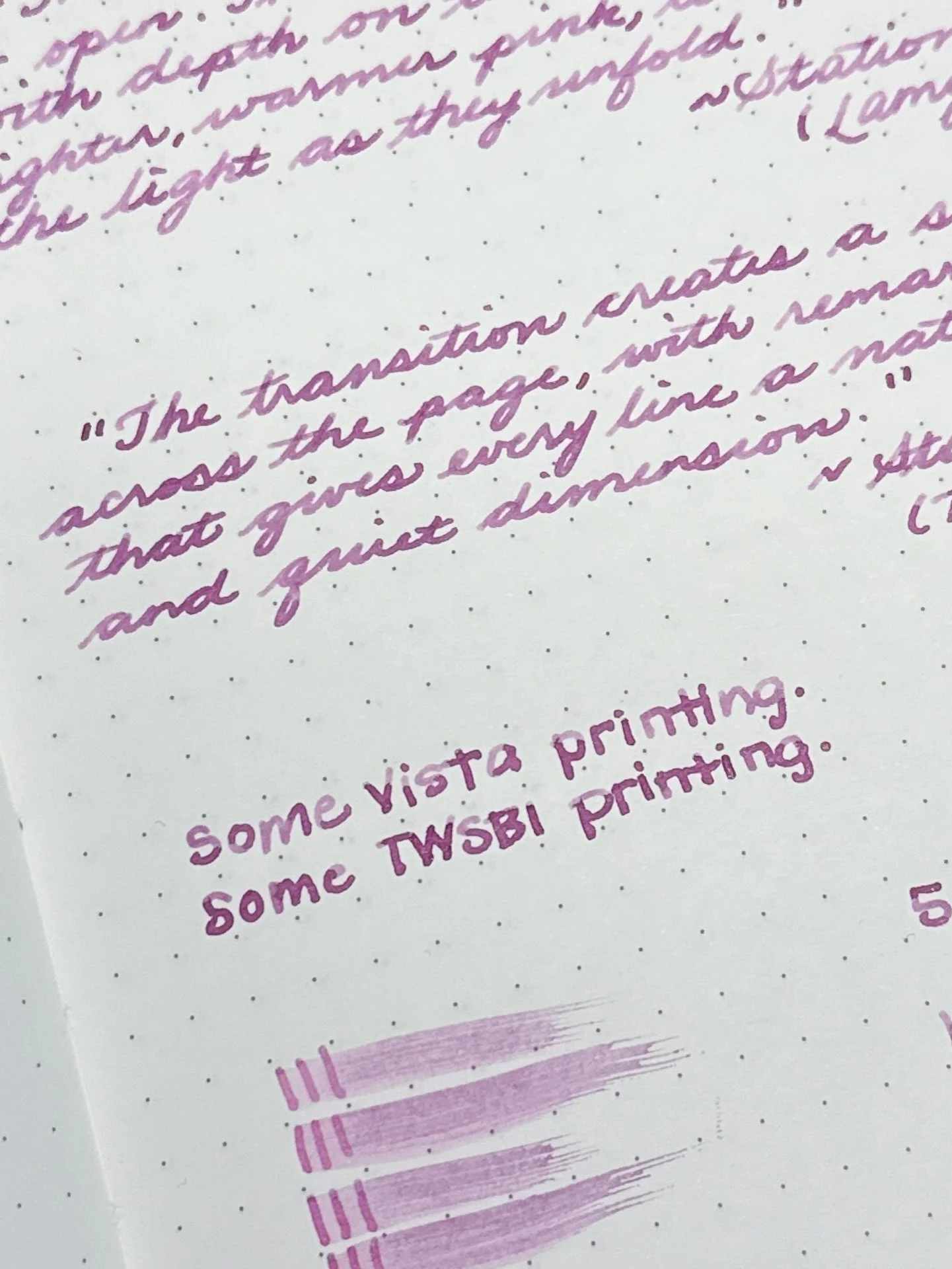
Printing with the First Blossom Shimmering. Same difference in shading as above.

Shimmer PSA: As with any shimmer in any pen, periodically “rotate” the pen nib up and down, so the shimmer particles have a chance to disperse. If your feed looks saturated with shimmer, or seems to be clogging the feed, you can try to gently flood the feed with ink (either by gently twisting the converter or piston, or lightly pressing the spring or button, if applicable) and then retracting the converter/piston/spring/button to “suck up” the shimmer particles back into the converter/barrel. Always do this over a sink or paper towel, not over your precious writing or art 🙂
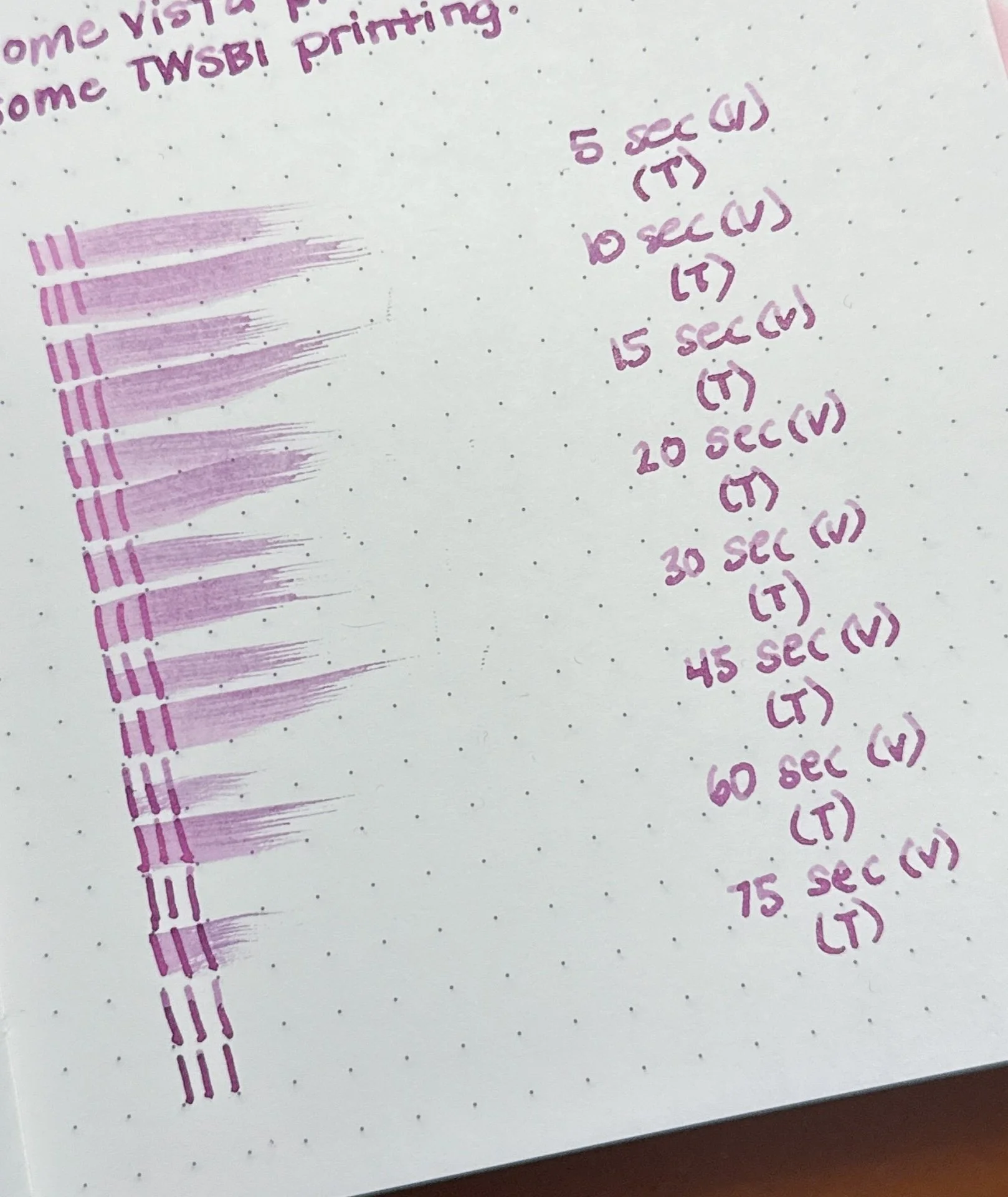
This time the TWSBI’s dry times took longer than the Vista, no idea why.
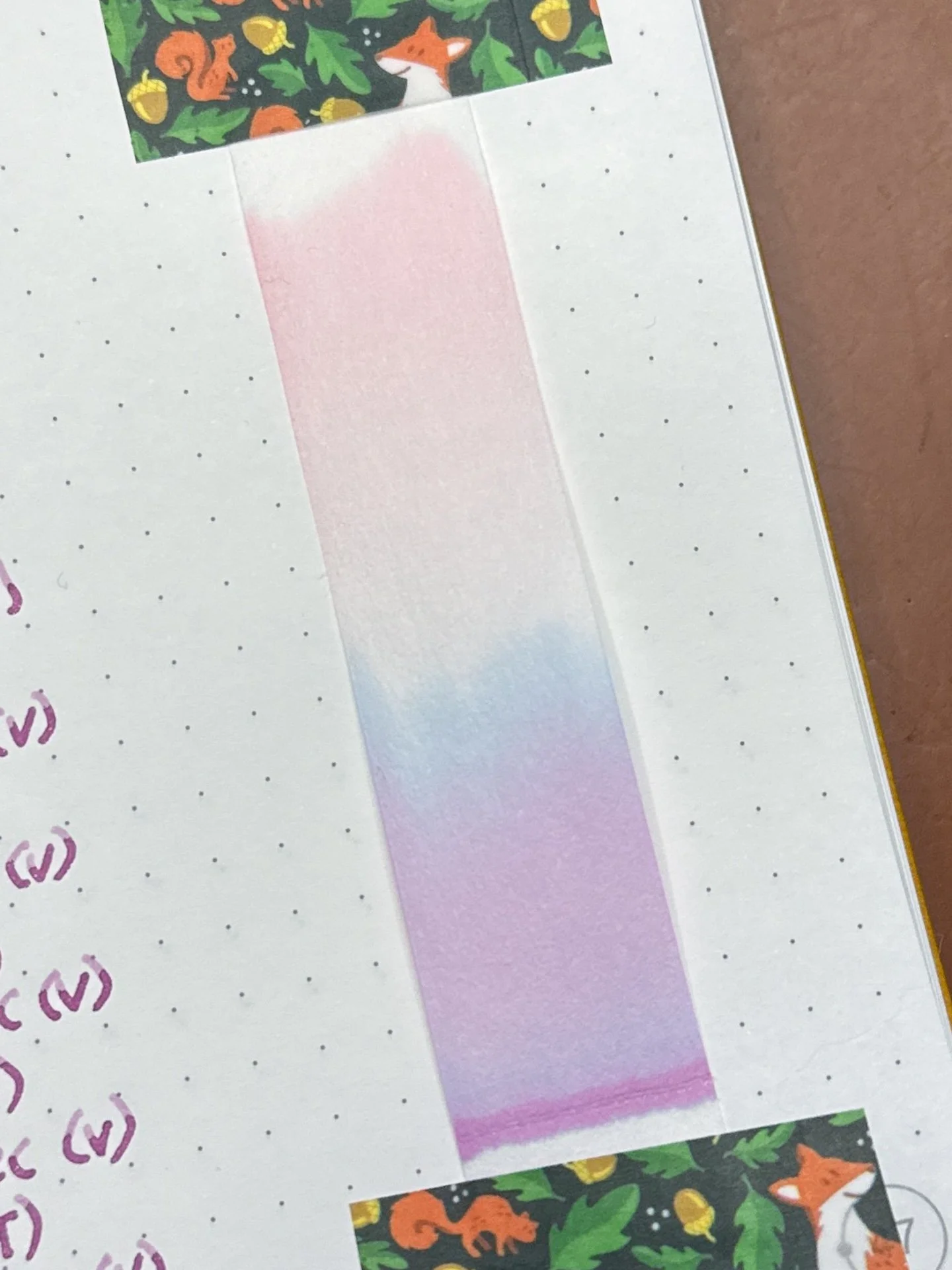
Chromatography from First Blossom Shimmering - Same chromatography as above - magenta to blue to peachy pink.
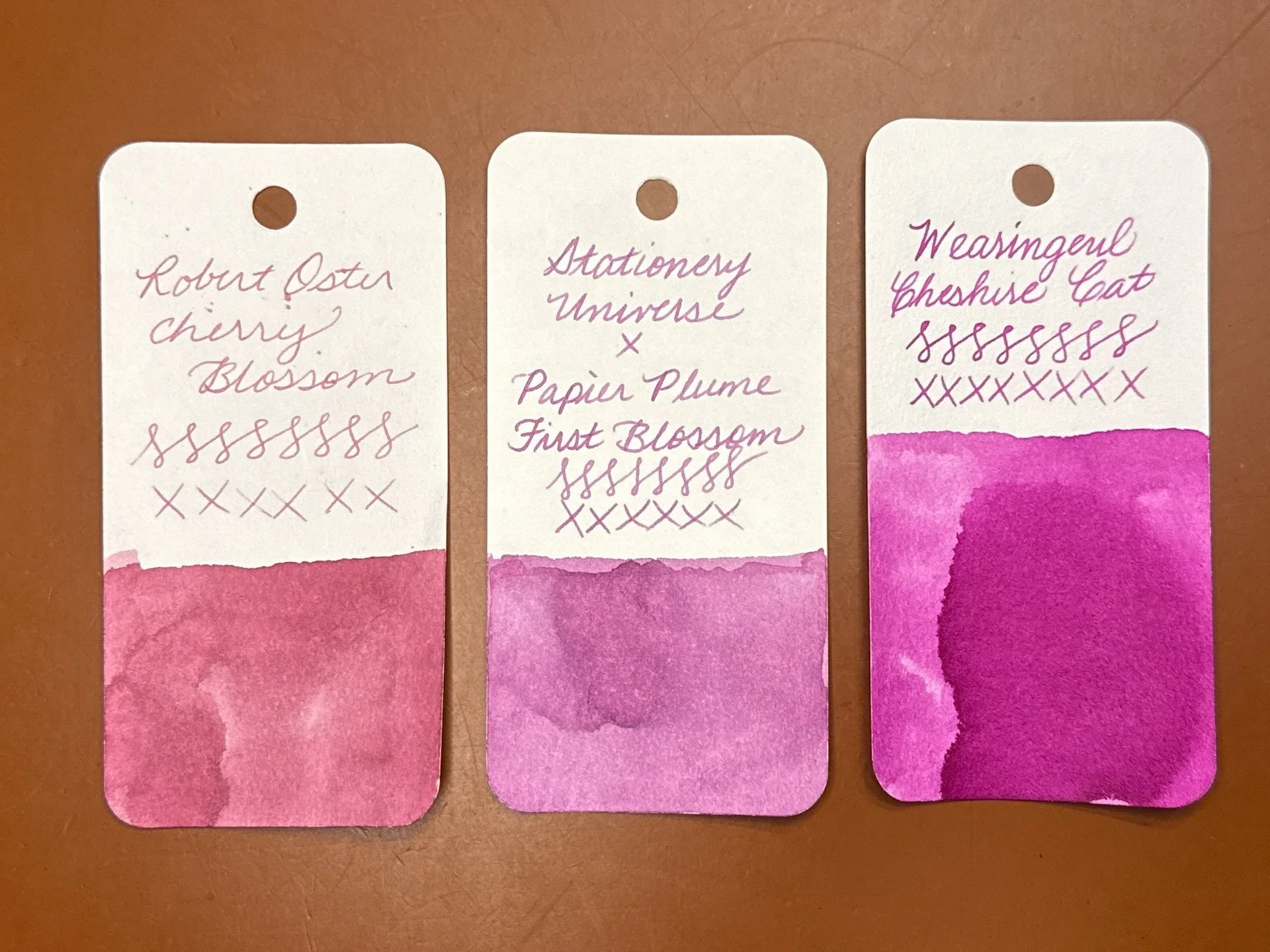
When I said that I didn’t know what color First Blossom is, I wasn’t joking. I looked through the Pinks in my Col-O-Rings and my Purples (where the Magenta swatches typically are) and neither really fit the bill. Robert Oster Cherry Blossom (representing dusty pinks) and Wearingeul Cheshire Cat (on team magenta) were close but no cigar.
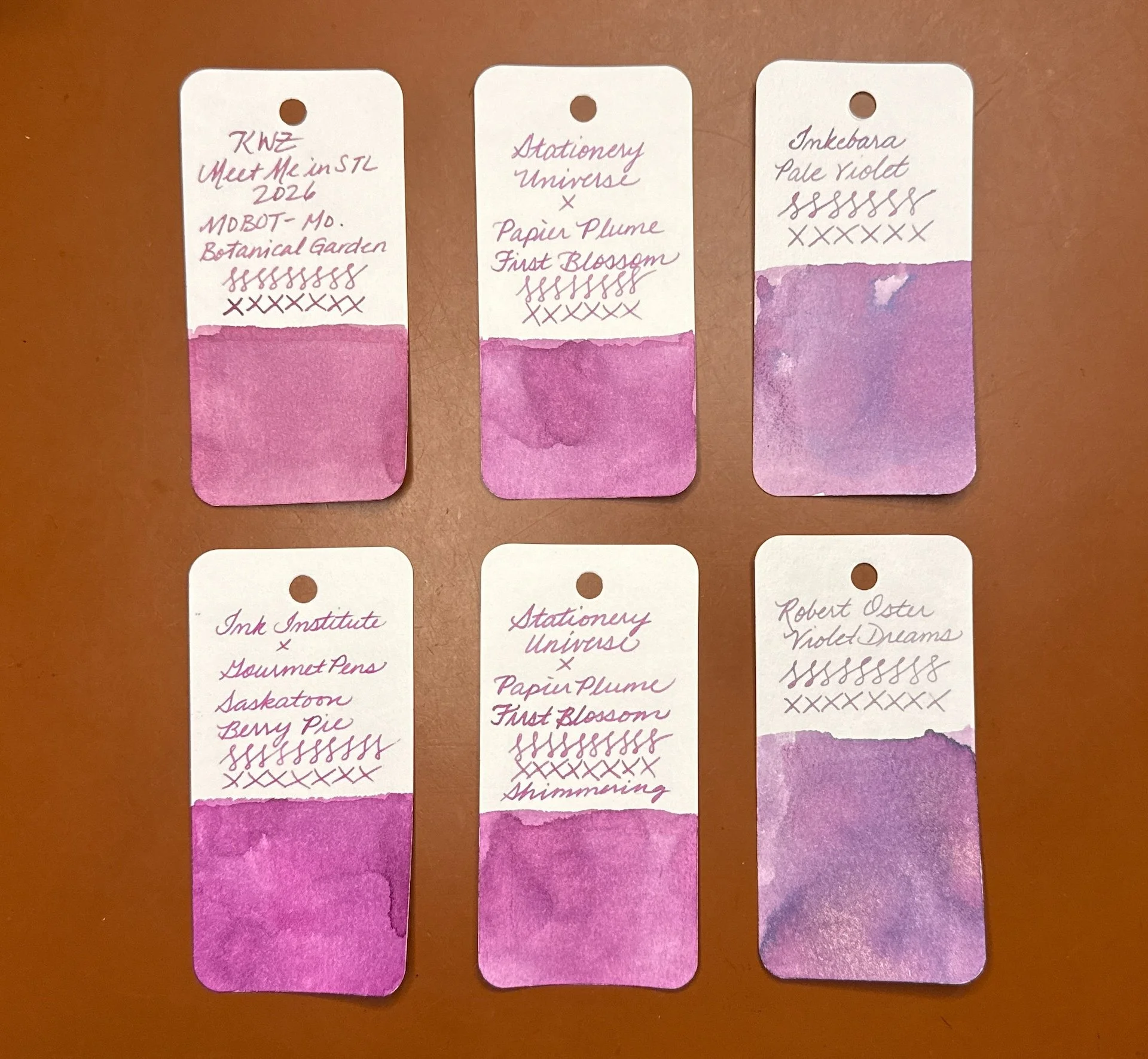
Here are some inks from both the pink and magenta/purple parts of the spectrum that kinda look similar to First Blossom (top middle) and First Blossom Shimmering (top middle): KWZ Meet Me in St. Louis 2026 MOBOT (Missouri Botanical Garden) (fairly close match but a bit too dusty pink), Inkebara Pale Violet (too purple, but I do love this color), Ink Institute x GourmetPens’ Saskatoon Berry Pie (too purple and too bright, but probably the closest otherwise), and Robert Oster Violet Dreams (too purple).

Both of the inks generally behaved well, though they are a touch on the dry side, so I recommend using them with wetter pens if you want a more saturated line and especially if you want to see more of the shimmer. Both inks also cleaned out easily. I like seeing how different pens can produce similar but different results with the same ink.
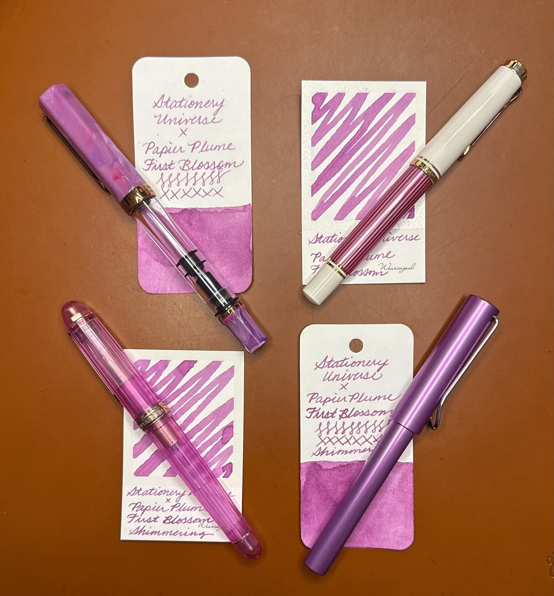
Some pens I’d match with these inks (clockwise from upper left): TWSBI Fluorite, Pelikan M600 Pink, Lamy AL-Star Lilac, Platinum 3776 Nice Lilas. (I’m currently leaning towards inking Shimmering in the TWSBI since I have a juicy Broad nib in it.)

The 30 ml ink bottles of the Stationery Universe First Blossom ink cost $13/bottle for non-shimmer and $15 with shimmer. Definitely worth checking out if you like this unique color!

(Disclaimer: These inks were purchased at the 2026 St. Louis Pen Show from Stationery Universe at regular price.)

Posted on July 10, 2026 and filed under Stationery Universe, Papier Plume, Ink Reviews.

A Trio of 2025 Chicago Pen Show Inks

(Kimberly (she/her) took the express train down the fountain pen/stationery rabbit hole and doesn't want to be rescued. She can be found on Instagram @allthehobbies because there really are many, many hobbies!.)

One of my favorite things to get at a concert, show, event, or shop, is something that reminds me of the occasion, whether it’s a t-shirt, bag, or sticker that makes me remember that event. In the case of pen shows, it’s no surprise that I am a sucker for show-exclusive inks!

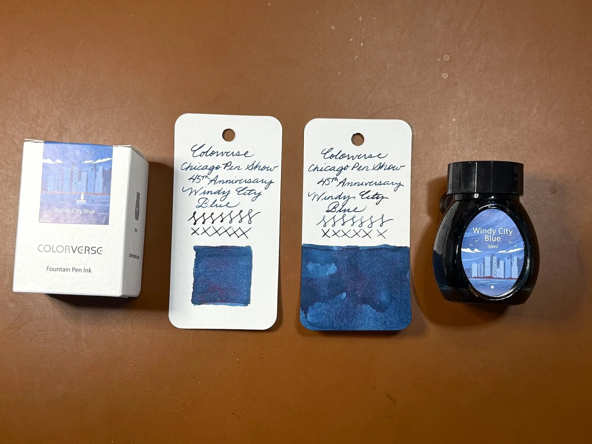
At the 2025 Chicago Pen Show, I bought several bottles of ink, but 3 of them were specifically made for this show! The first one is the official show ink, Windy City Blue, made by Colorverse to celebrate the show’s 45th anniversary. The second one is Papier Plume Lake Michigan Springtime. And last, but not least, is Anderillium’s Chicago River Green.

Note: I add swatches to similar color family inks in both the Hobonichi Weeks and 68 gsm Tomoe River notebook. Unlike the Col-O-Ring swatch card comparisons, the Weeks and TR swatches might not be that close to the ink in question.

2025 Chicago Pen Show Inks

L to R: Colorverse Chicago Pen Show 45th Anniversary Windy City Blue, Papier Plume Lake Michigan Springtime, Anderillium Chicago River Green.

Despite the box and bottle’s lighter blue color, the Windy City Blue is more of a darker blue-leaning teal.

You can see a hint of red/purple sheen in wetter parts of the swatch and writing sample.

Swatch/writing sample of Windy City Blue on 2022 Hobonichi Weeks, which has slightly cream-colored paper, along with Anderillium Indigo Bunting Blue, Montblanc Leo Tolstoy, Montblanc StarWalker Blue Planet.

Swatch/writing sample on 68 gsm Tomoe River Endless Recorder notebook. Accidentally added an “s” to the ink name, oops.

Inks similar to Windy City Blue: Rohrer & Klingner Verdigris, Robert Oster Lake of Fire is the closest match, Van Dieman’s Hanging Lake, New Brew Space, and Robert Oster Great Southern Ocean are also close but a touch too blue.

I’m eager to put Windy City Blue in either the Sailor x Cult Pens Pro Gear Slim, Midnight Sky Blue or the Leonardo x Figboot on Pens Momento Zero, Carolina Midnight.

I love that Papier Plume dips their ink bottle caps in wax and then stamps the top.

My swatches of Papier Plume Lake Michigan Springtime look fairly green but I’ve seen some swatches where it has more teal to it. I double checked with some friends who agreed that theirs is also more green in real person but looks a bit more teal in photos.

First/only swatch/writing sample of Lake Michigan Springtime in the Hobonichi Weeks. This looks more teal than on the Col-O-Ring cards.

A green leaning teal on TR 68, but still fairly green.

Inks similar to Lake Michigan Springtime: Waterman Harmonious Green, Jacques Herbin Vert Metropolitain, Wearingeul Tick Tock Croc, Diamine Velvet Emerald, Iroshizuku Sui-gyoku (this and the Diamine are a touch too blue), Diplomat Deep Green (a bit too dark.)

The Kaweco x GoldSpot Pens Sport, Transparent Turquoise (which is way more of a teal than turquoise), and the greenish parts of the Aurora Optima, Azzurra are both good matches for Lake Michigan Springtime.

Anderillium Chicago River Green is a pleasantly bright, spring green ink.

Chicago River Green in the Hobonichi Weeks along with Pennonia x Inkdependence Hens & Chicks and Anderillium Green Kingfisher Green.

Inks similar to Chicago River Green: Diamine Appletini (too yellow), Papier Plume 2019 SF Pen Show Marina Green, Robert Oster Envy (both of which are close but still too yellow), Organics Studio Frog Green Shimmer, Diamine Merry & Bright (the closest), Van Dieman’s Wasabi (second closest.)

Anderillium Chicago River Green would look great in the Taccia Spotlight Forest Eye or the Kaweco x Cult Pens Apple Green.

Even though I can find similarly colored matches for all 3 inks, I still love having them as souvenirs of this year’s Chicago Pen Show. The inks cost $15-20 per bottle and are a great way to remember a fun pen show. If you didn’t get a chance to snag them, you can reach out to Roger Wooten, (show organizer) to see if they are willing to sell/ship the Colorverse ink. You can order Anderillium Chicago River Green from Atlas Stationers. Papier Plume is currently sold out of Lake Michigan Springtime but you can add it to your wishlist in case they decide to make more.

(Disclaimer: All 3 inks were purchased by me at the show at regular price.)
Posted on May 23, 2025 and filed under Anderillium, Colorverse, Papier Plume, Ink Reviews.

Papier Plume ReBirth Ink Review

(Sarah Read is an author, editor, yarn artist, and pen/paper/ink addict. You can find more about her at her website and on Twitter. And her latest book, Root Rot, is now available for pre-order!)

You know what's better than New Orleans? Artists in New Orleans. And what's even better than that? Artists in stationery shops in New Orleans. So this Tony Hollums inky collaboration with Papier Plume is obviously fabulous.

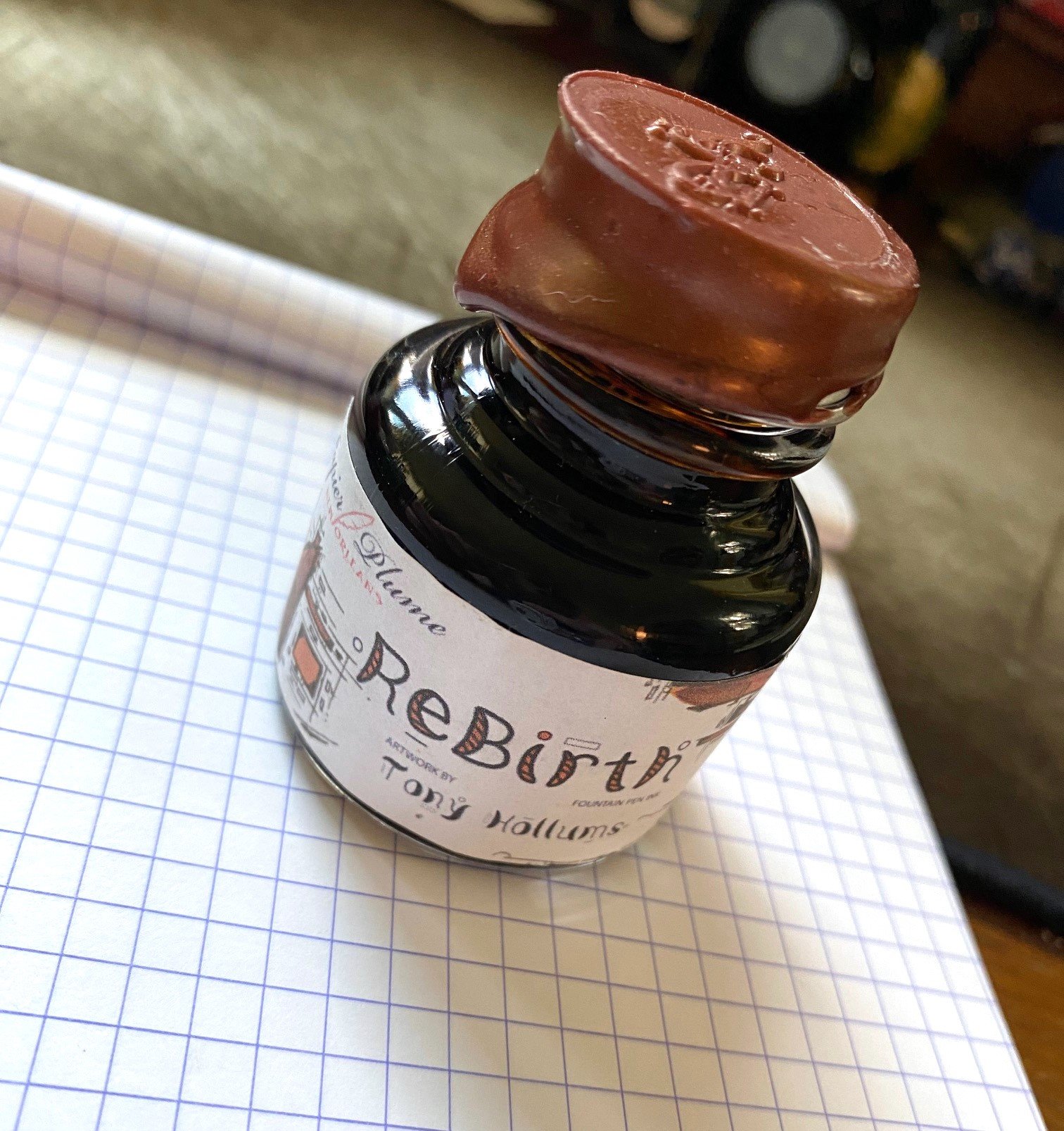
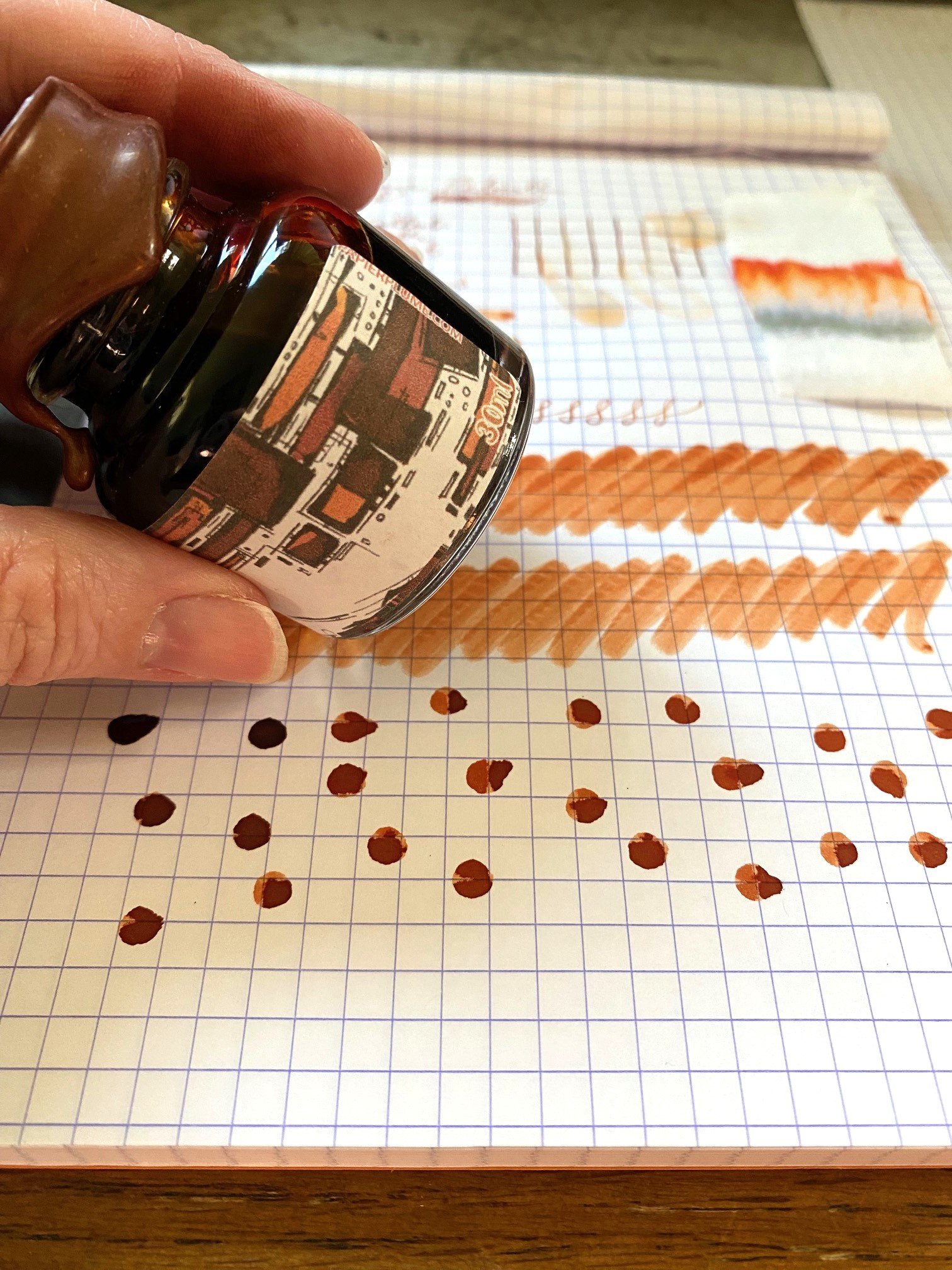
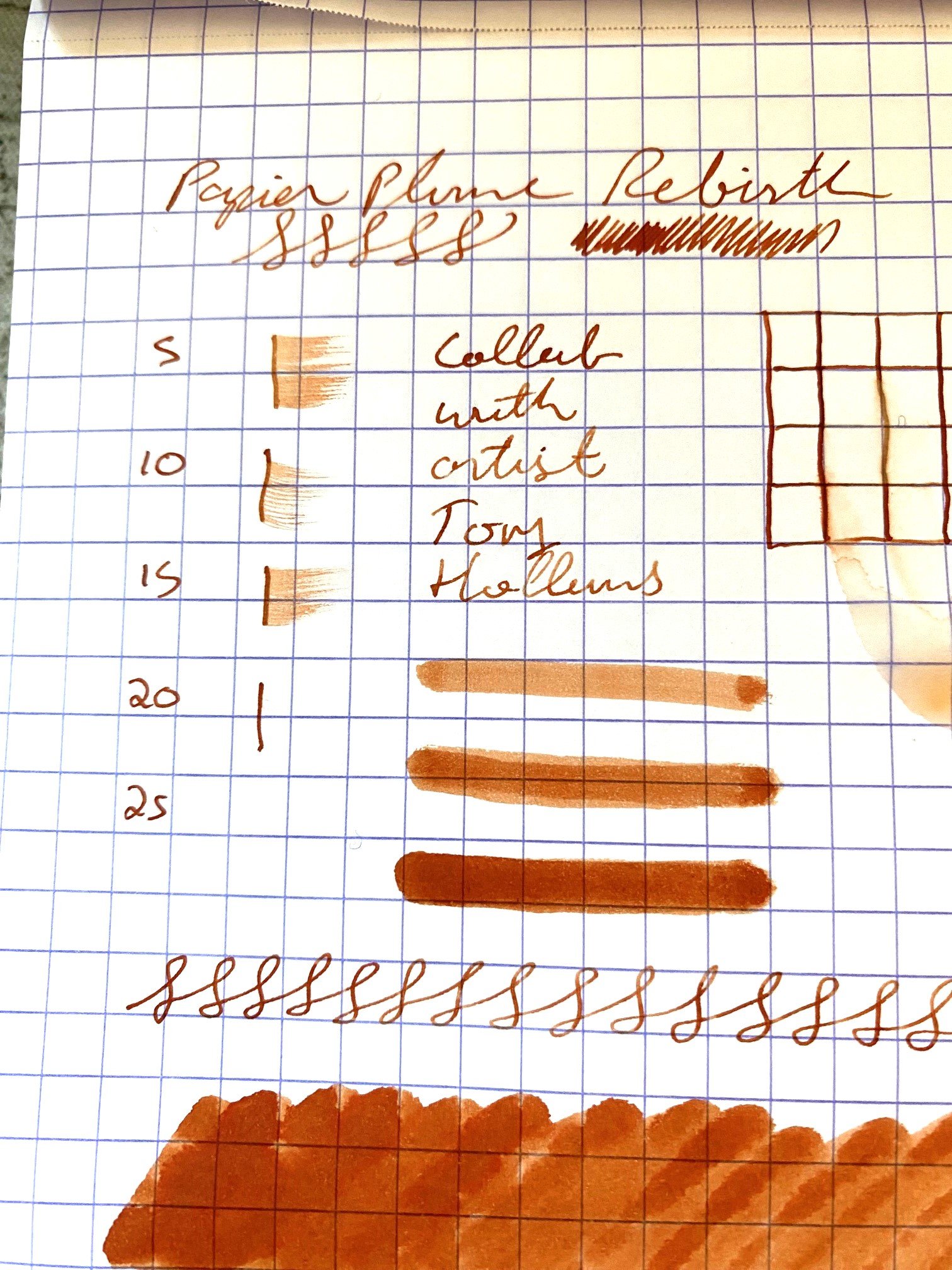
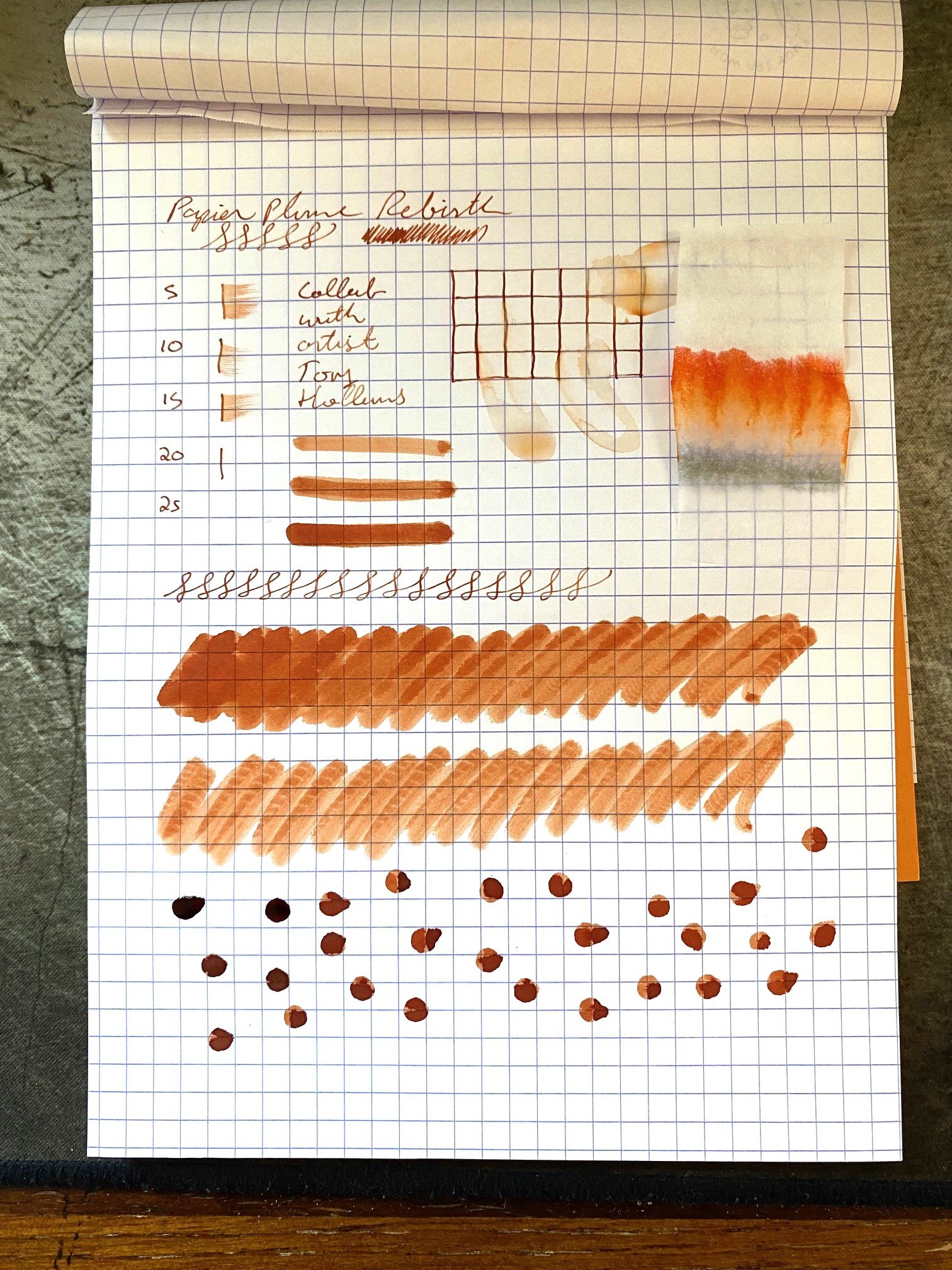
Brown inks with a vintage vibe are my favorites, so I was very excited to give ReBirth a try. This color tone skews more orange, giving it a very warm tone. It's giving copper or rusted iron, it's giving cinnamon, and where it shades, it's giving leather.

And it shades brilliantly. This can really be seen in Tony's artwork, which is used for the bottle's label, but it shows up even in writing with an extra fine nib. There is no sheen or shimmer to this ink. In fact, its dried state almost seems to have a matte finish to it, so it looks like terra cotta or dry clay.

The ink does feel a little bit dry when writing with it, and it dries quickly on the page, between 15 and 20 seconds.

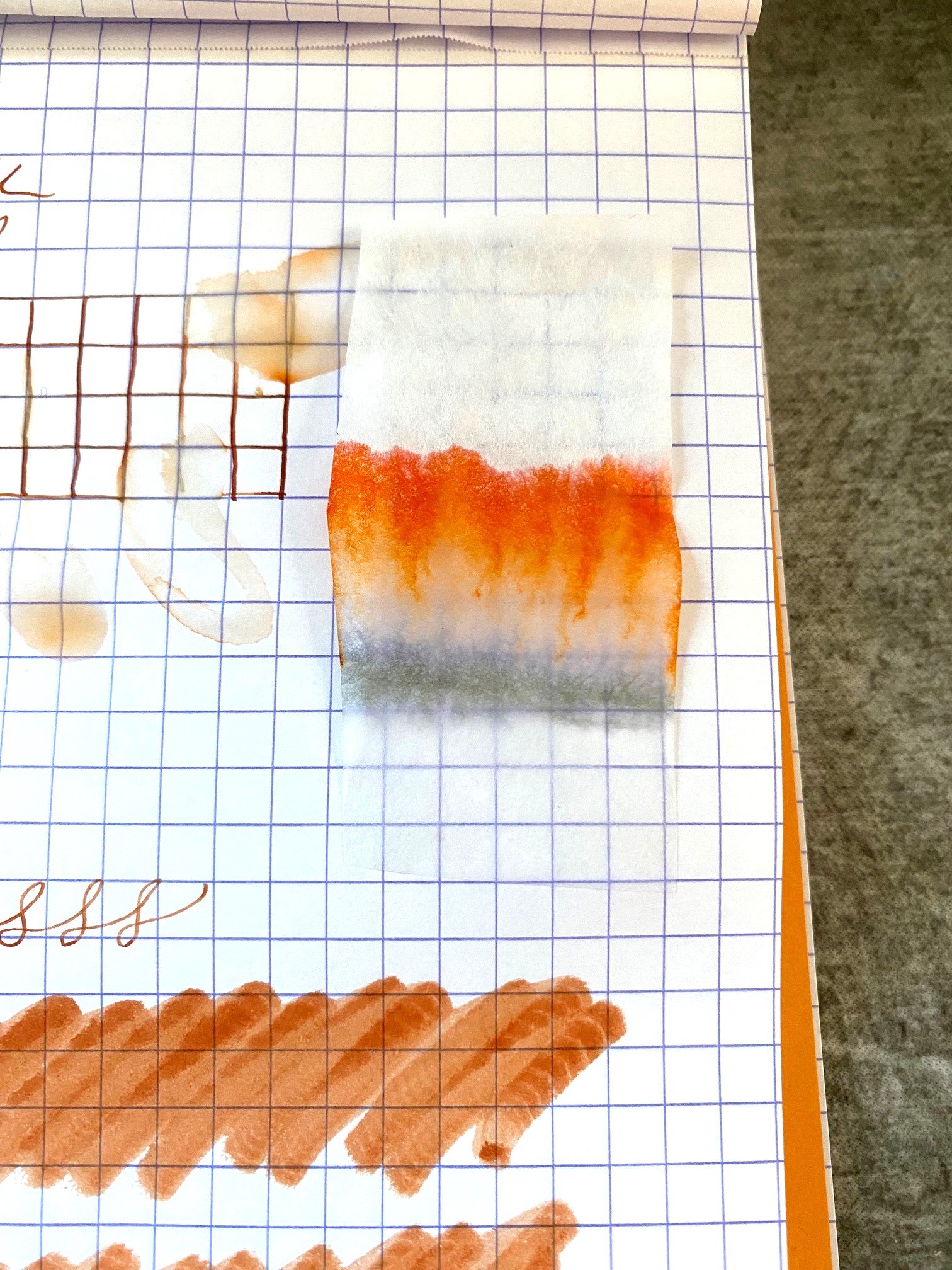
Water drop tests show some water resistance. The coppery color washes away, but faint lines remain. This shows up in the chromatography, too, where a grey line stays put on the filter paper, while the orange tones travel up the sheet and split into a yellow and pink.

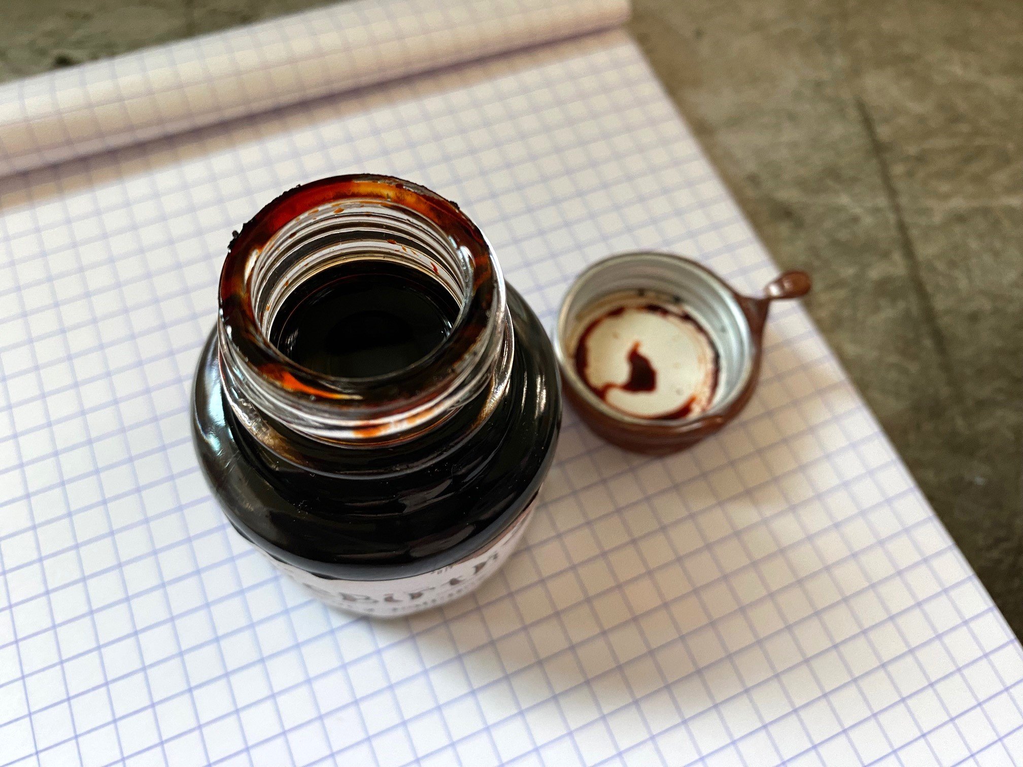
The ink comes in a blown glass bottle with Papier Plume's signature wax-sealed lid. Arguably my favorite ink bottle style available. The bottle holds 30ml of ink and it sells for $10. That's an "of course I want it" reasonable price. It is a limited edition, however, and bottles are becoming scarce.

This is a color I think I'll use often. The orangey-brown is perfect for autumn, while the whole effect sill makes me think of New Orleans, which is one of my favorite places on Earth.

(Brad purchased this ink from Papier Plume at the 2023 Washington D.C. Pen Show.)


Enjoy reading The Pen Addict? Then consider becoming a member to receive additional weekly content, giveaways, and discounts in The Pen Addict shop. Plus, you support me and the site directly, for which I am very grateful.

Membership starts at just $5/month, with a discounted annual option available. To find out more about membership click here and join us!

Posted on October 5, 2023 and filed under Papier Plume, Ink Reviews.