Julia (she/her) is a brand designer and a long time stationery lover who shares her adventures in fountain pens, inks, planning, and journaling over on YouTube (@Julia-here) and Instagram (@hi.juliahere).
Background & Prep
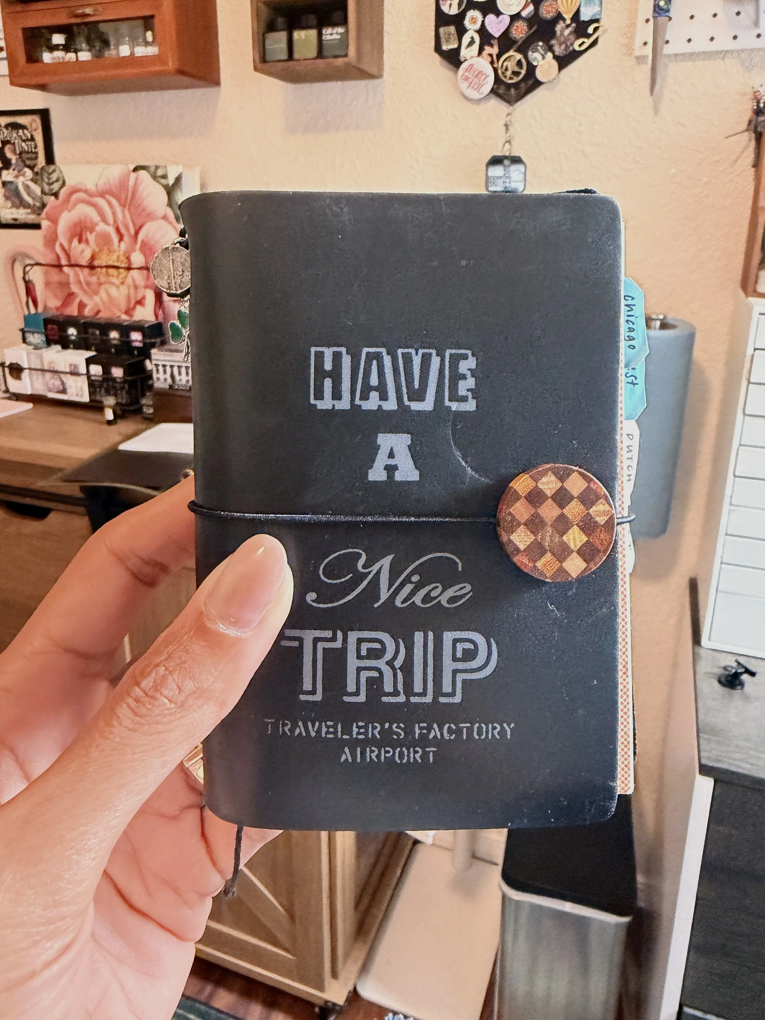
Hey there! Julia here! I recently attended the 2026 Dutch Pen Show in Utrecht, Netherlands, and I'm excited to tell you all about it! But first…some background. Three years ago, my husband and I visited the Netherlands, even stopped in Appelboom, and didn't know that the then one-day Dutch Pen Show was scheduled for the day after we flew out. I tried frantically to change our tickets, but there was no fiscally responsible way to do it. So! Being able to attend this year felt like a full-circle moment, especially since I’m now more firmly grounded in the fountain pen hobby three years later.
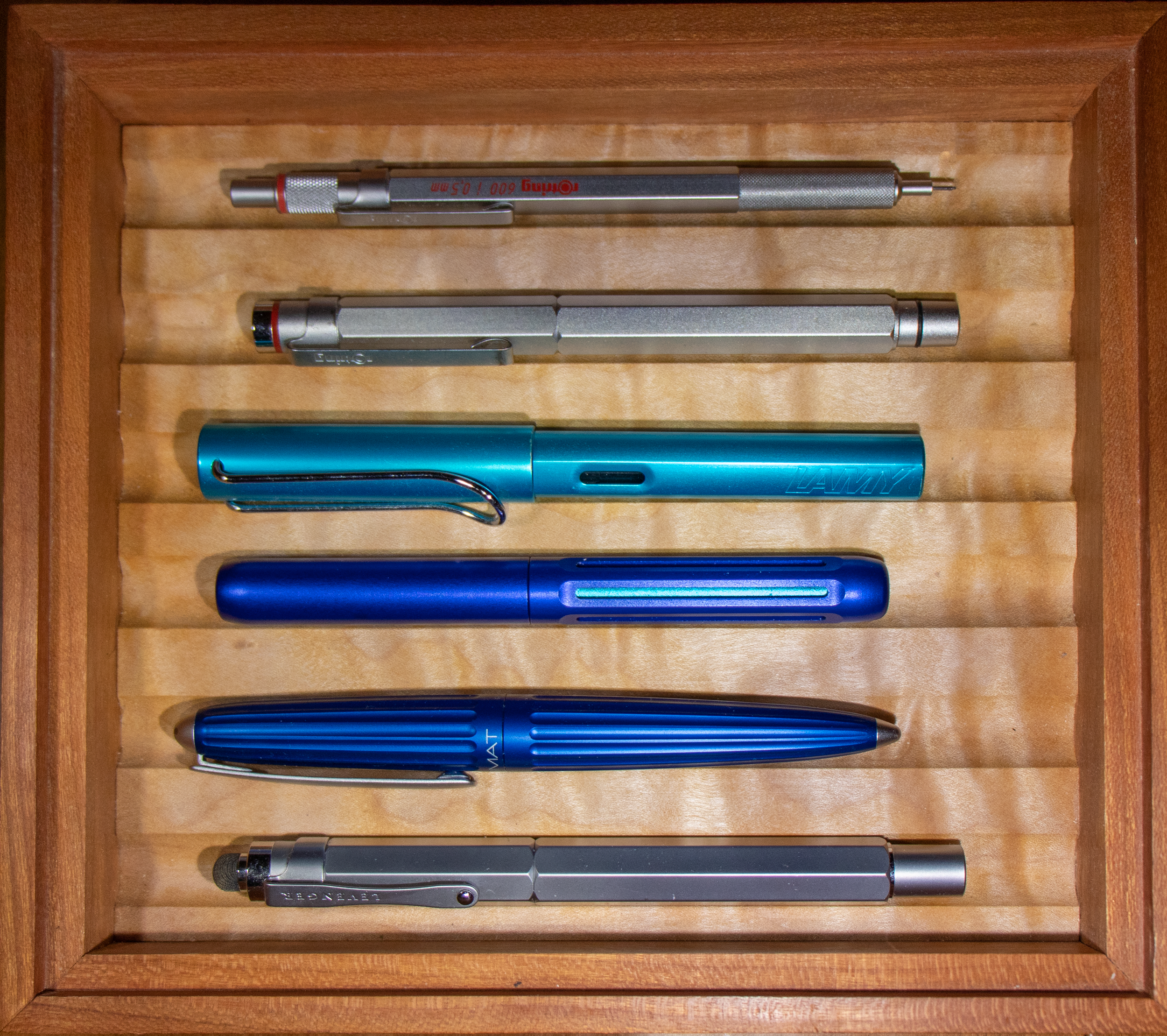
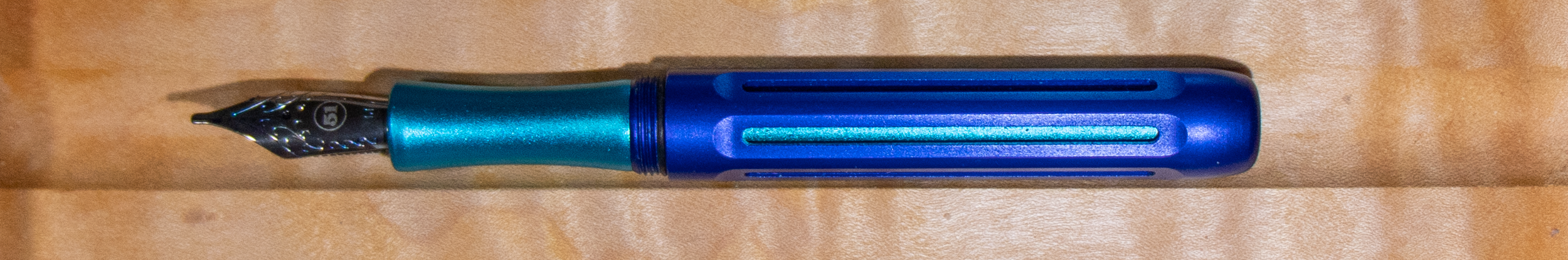
To prep, I made several spreads in my passport Traveler's Notebook (TN) insert, complete with wishlists, my show schedule, a nib stat chart, a place for testing pens, and more. I do have a video going into more detail about the pens I took along and the insert setup if you're interested.
My Pen Show Passport TN.
Before the Show
Other than my usual TN prep and combing through the vendor list and links on the Dutch Pen Show website before the show, I really wanted to plan my first couple of stops and get first dibs on a Drewnem Pisane floral pen, as well as grab one of a few card size TNs that I'd heard Misc. Stationery brought along (per their Instagram story the night before). One thing that made pre-planning a little tricky: the floor map was not available on the Dutch Pen Show website ahead of time. The morning of the show, I had a friend send me a photo of the physical map, which was available in person before doors opened. Honestly, not having that resource in advance gave me a bit of anxiety. I wasn't able to plan my first moves the way I'd have liked. It's probably a small insignificant thing for most, but worth knowing going in for those who to like to (over?) prepare. As for the queue: with a VIP early entry ticket, I was able to enter an hour before general admission. The line slowly started to build just minutes before doors opened rather than hours beforehand, and while there wasn't a clearly organized queue — more of a friendly blob of people funneling through — everyone was genuinely respectful and relaxed. No rushing, no jostling. Really refreshing, honestly!
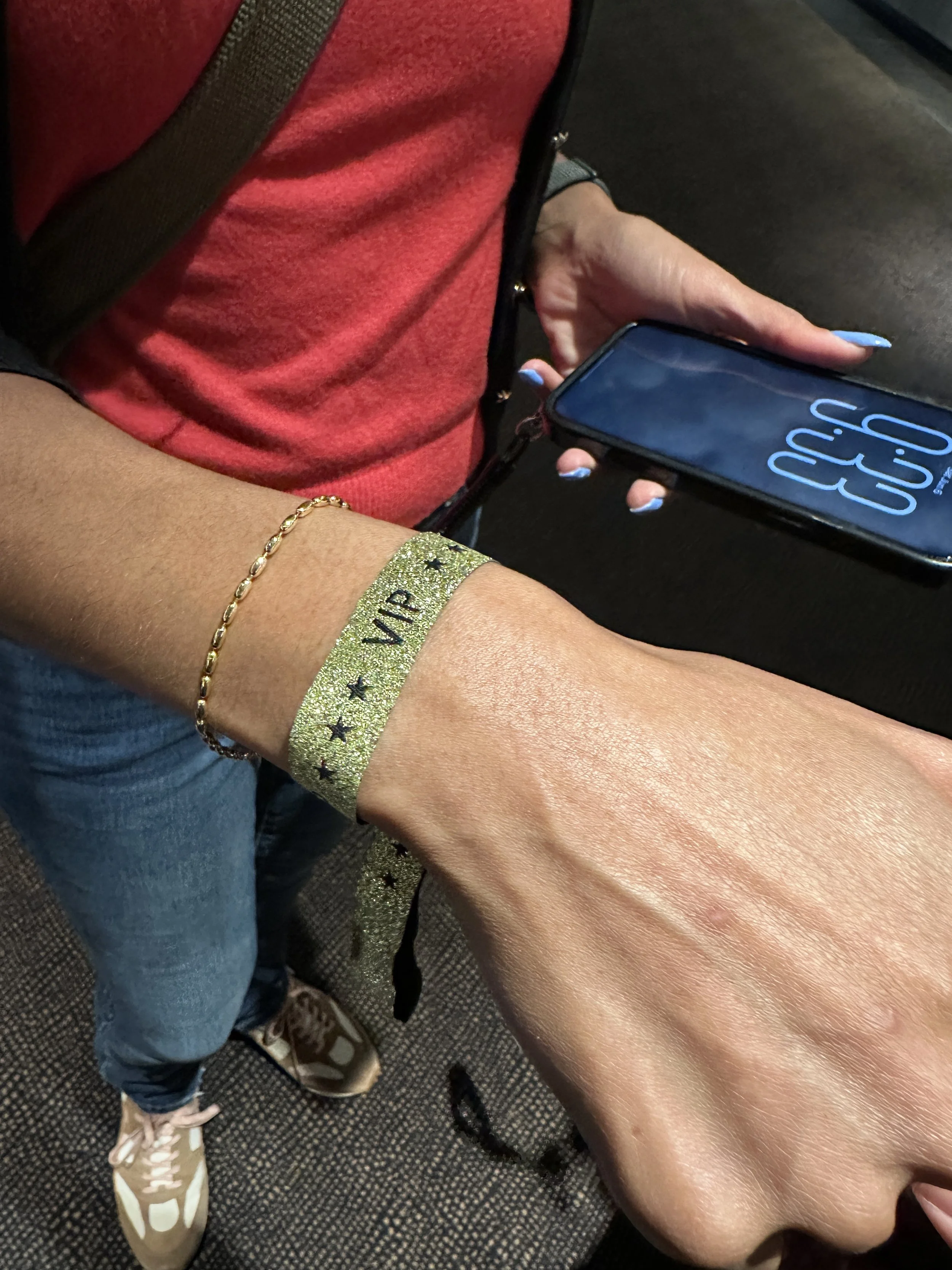
VIP wristband ready to go about 30 minutes before doors open.
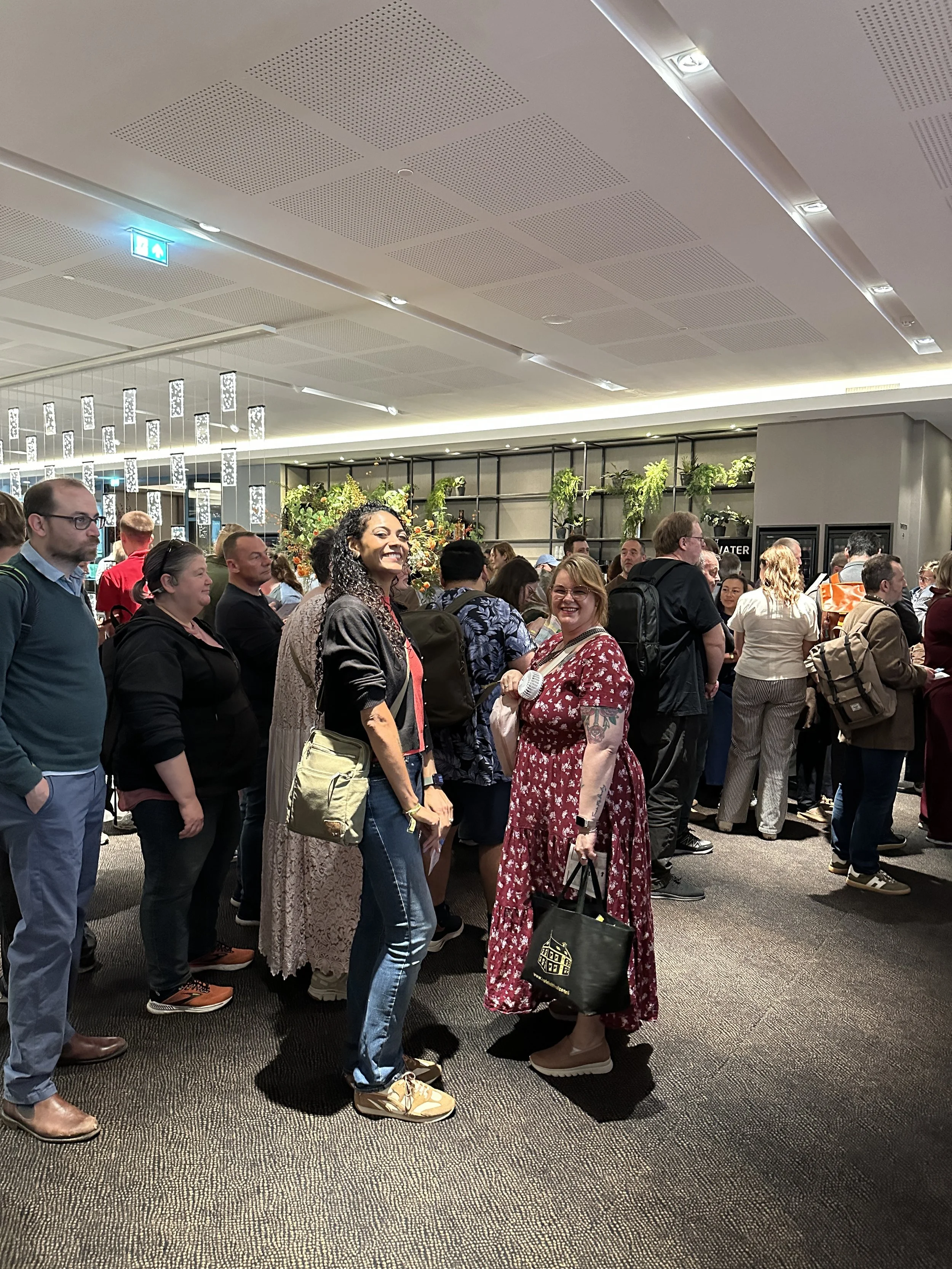
Queuing as the doors open with Kirsten Tebbens @kirstentebbensjournals.
Entering the Show: The Swag Bag
The VIP early entry ticket came with a swag bag, and I have to say — this is probably one of the best bags I've received at any pen or stationery show. Let me hit the highlights!
The official show ink was in there: Robert Oster Love Letters, a vibrant red with a subtle bronze sheen. It’s worth noting that Love Letters wasn't the only show exclusive floating around. Tono & Lims had a couple as well and Robert Oster Dutch Caramel was another show exclusive offered by other vendors.
Beyond that, the bag included inks from Ferris Wheel Press, Diamine, Shanghai Stationery, Pennonia, and Callifolio — six bottles total, which is kind of wild! The bag also included two ballpoint pens: a mini turquoise pen from Black Forest Pens out of Germany and a Pelikan ballpoint from P.W. Akkerman. There was also a (possibly new?) letter stamp set from Esterbrook, exclusive stickers from Helen at Coffee Monsterz Co., several sketchbooks and notebooks, discount cards from vendors, and more. I was impressed!
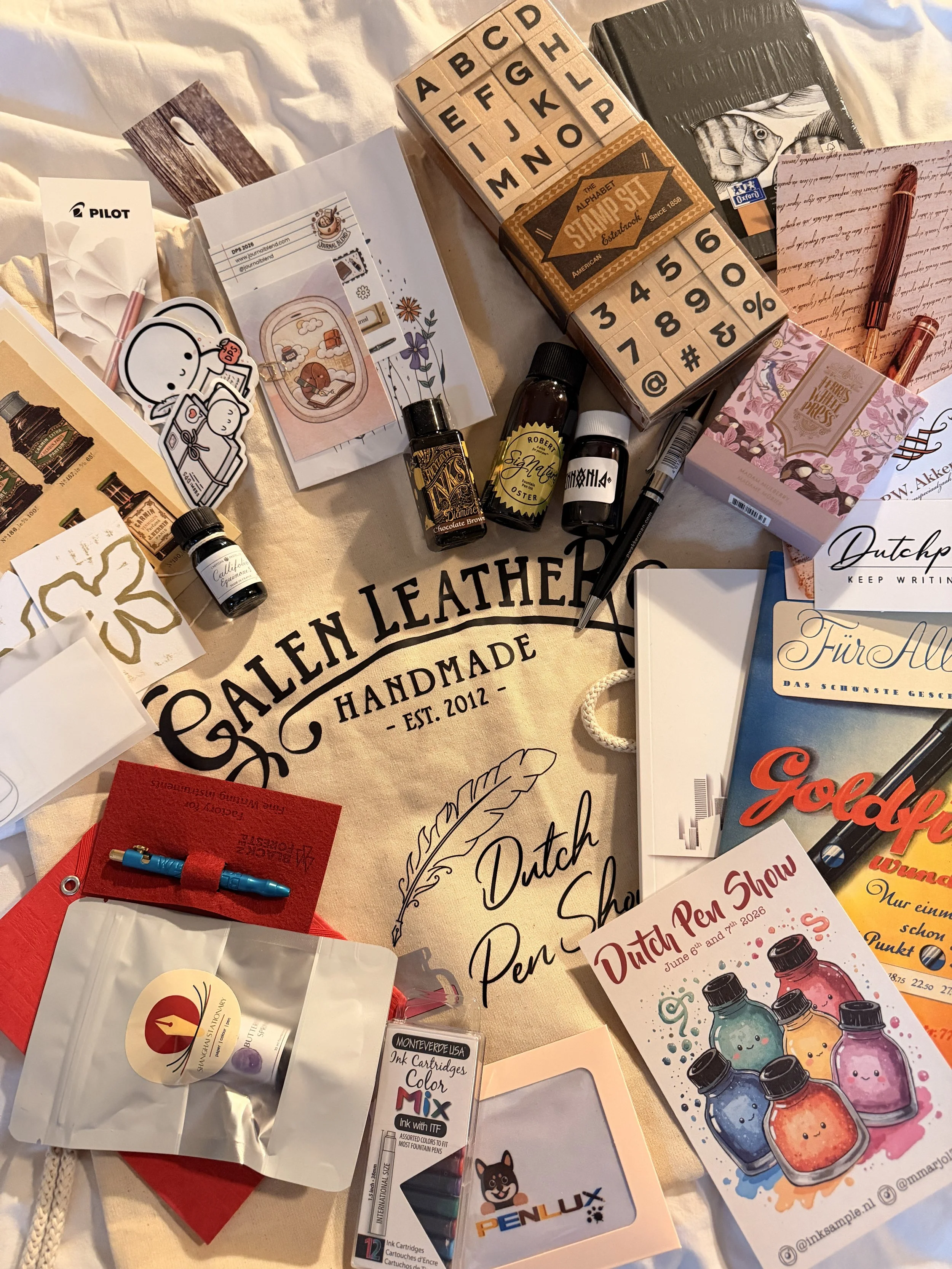
The Dutch Pen Show swag bag contents.
Show Layout
The Dutch Pen Show was held at the Van der Valk hotel and spread across three areas: the Nieuwegracht room (the larger ballroom), the Oudegracht room (a second ballroom), and the Foyer connecting them. Everything was on one floor, which made navigation pretty manageable; though I'll mention upfront that signage was minimal throughout (more on that in a bit — I’m a brand identity designer by profession so get ready for nerdy branding observations!).
The table layout looked a little snug on paper, but in practice there was generous floor space for attendees to browse, take breaks, and move between vendors without feeling crushed or in the way of others. There wasn't any obvious organization by vendor type, but with the map in hand it was easy enough to work through. One standout layout feature to note: the ink sampling station as well as the workshop rooms was situated outside the main show floor, near the entry point, and there were also seating areas near the workshop rooms that were separate from the show floor entirely. Having a little breathing room to sit, think about a potential purchase, rest your feet, or catch up with a friend felt really thoughtful.
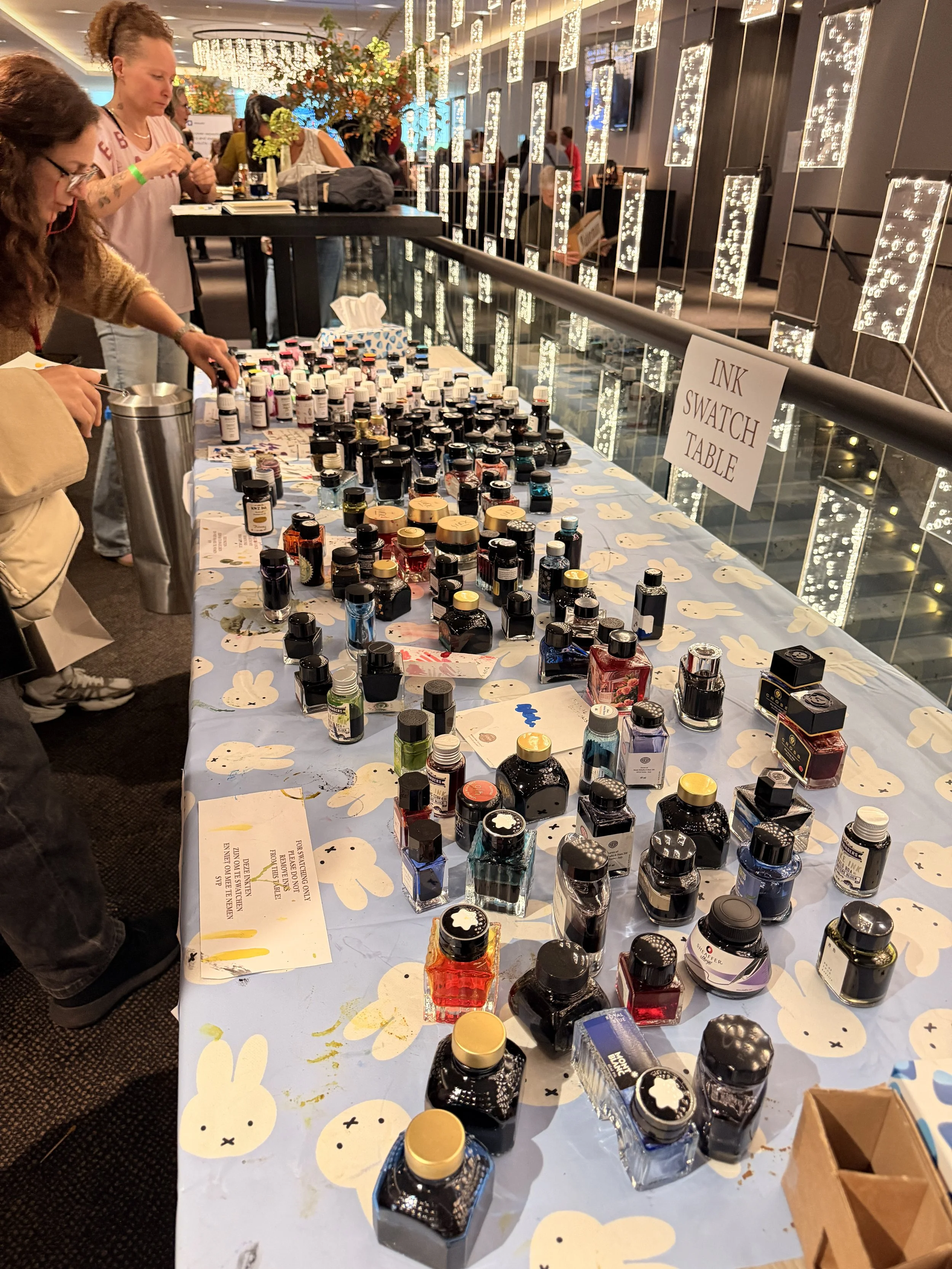
The ink swatching table, outside of the main shopping area of the show.
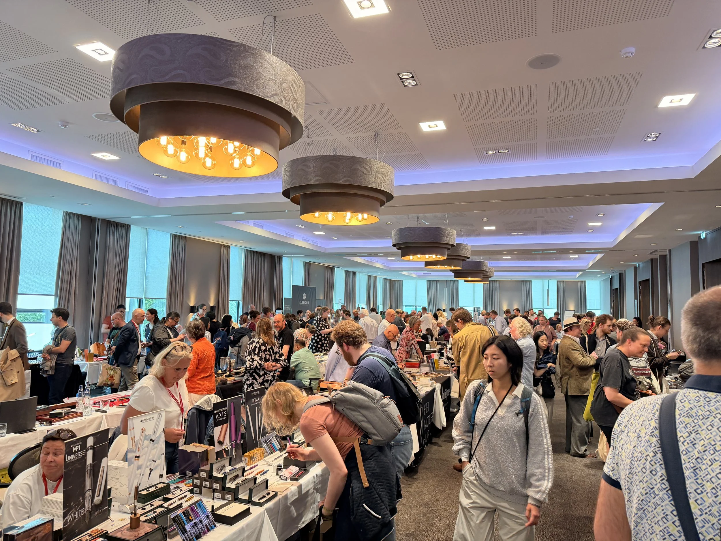
The Nieuwegracht (larger) ballroom at 2:41pm opening day. This was probably the most foot traffic of the day.
Show Experience: During the Show
Day 1 vs. Day 2
My friend Kirsten and I decided on the fly to split our approach across the two days. Day one was for wishlist items and pen vendors, getting in the priority stops in early. Day two was reserved for inks, stationery, workshops, and nib grind appointments. My very first stop was Misc. Stationery, where I was on a mission for that card size TN, and Drewnem Pisane was my first pen stop.
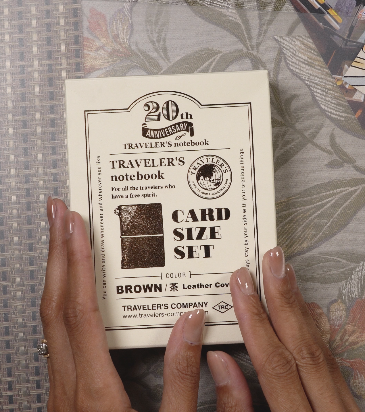
The Traveler’s Notebook 20th Anniversary Card Size Set in Brown.
Making our first pen stop at Drenem Pisane’s table.
Vendor Mix
The Usuals There were plenty of pen show familiar faces: Ferris Wheel Press, Esterbrook, and Galen Leather were all there, along with some frequents from the San Francisco and LA shows — Yamamoto, sEy, Bungubox, Toyooka Craft, and others. I love all of these vendors, but having been lucky enough to shop with them recently, I didn't make them a priority this time around. When at an international show, I try to focus my energy on what's unique to the specific show, regionally (I try is the key!).
Nibmeisters All five nibmeisters were lined up together in the larger ballroom: Anabelle (Opus Cineris), Thomas Ang, Jose (Nib Lab), CY (Kyuseido), and Matthew Chen. More on my time with them a little later!
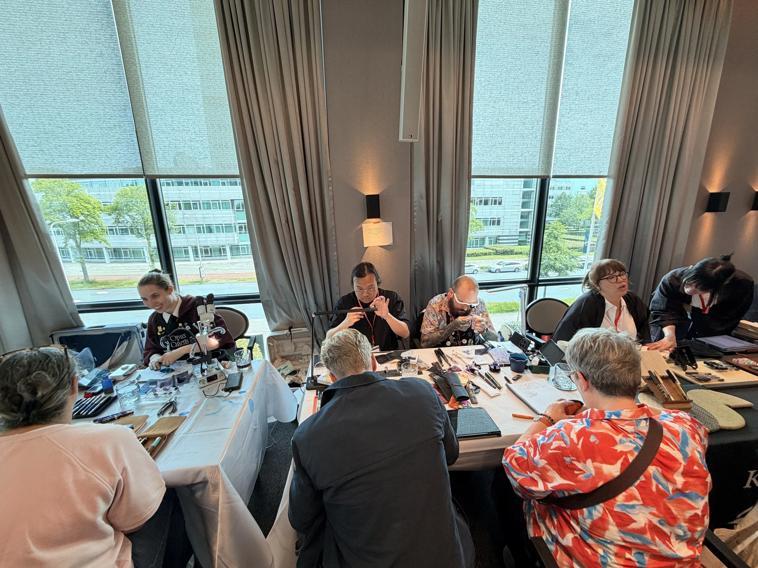
The “Nibmeister Alley”.
Vendor Highlights & New to Me
One of the things I loved most about this show was how many new-to-me makers and vendors there were to discover. Here are some that stood out:
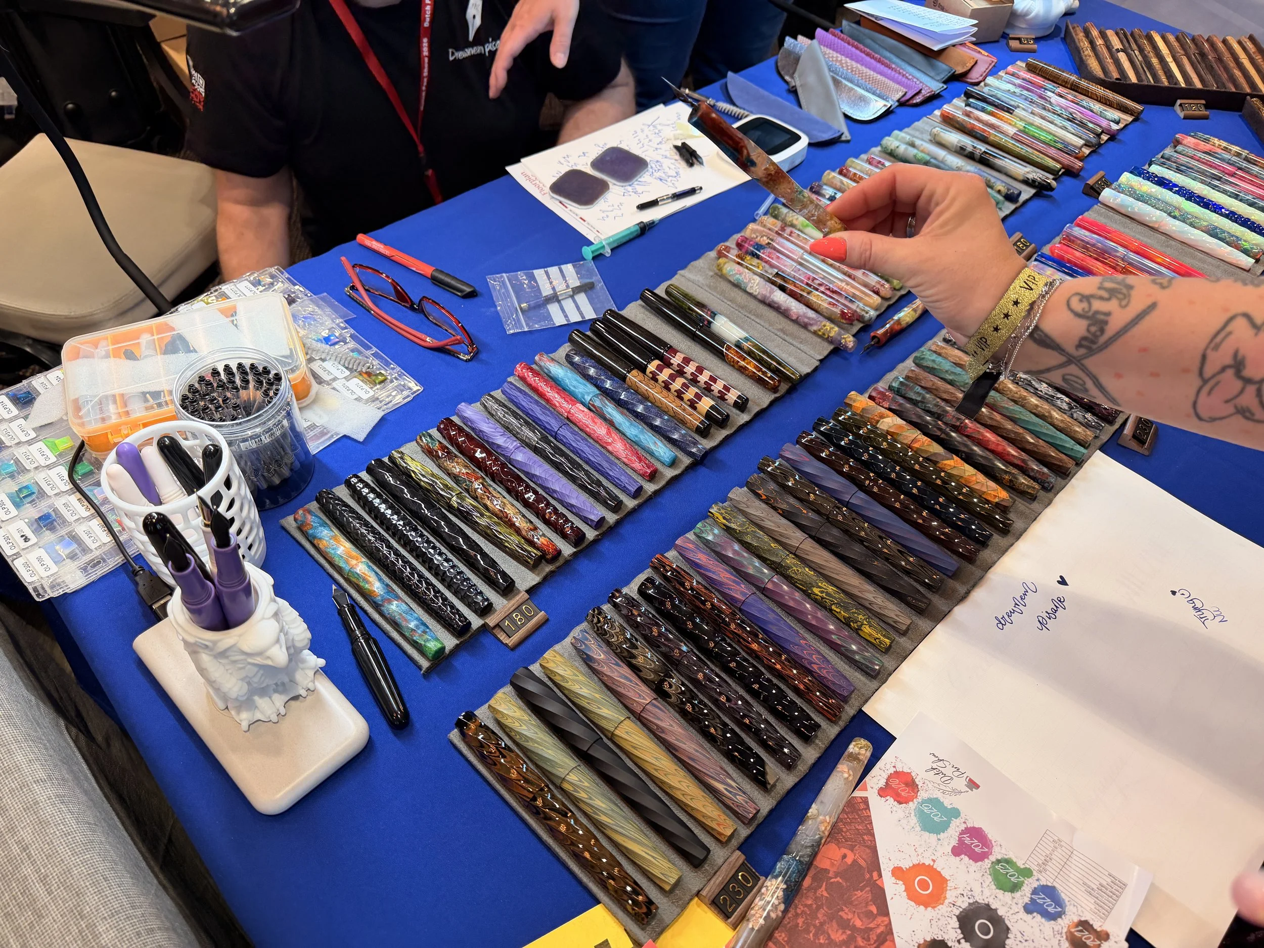
Drewnem Pisane – As you now know, this was my first pen stop! Drewnem Pisane a husband and wife team out of Poland. Their table had two very distinct vibes: dreamy, ethereal floral semi-transparent pens filled with flowers, seeds, and other elements suspended in resin, and more architectural twisty pens. They work across a wide range of materials: stabilized wood, synthetic opal, ebonite, carbon fiber, and each piece is one of a kind. This was my first stop for a reason.
Ink Sample NL — This was a really clever concept. They had a large wall display of ink swatches, each numbered, and a little ordering sheet where you'd write down the numbers of the ink samples you wanted. You'd hand it off and they'd pull your samples from a drawer system behind the wall. Perfect for lightweight travelers like myself, and a nice nudge toward trying before committing to a full bottle. They also had a mystery sample vending machine, which was super cute!
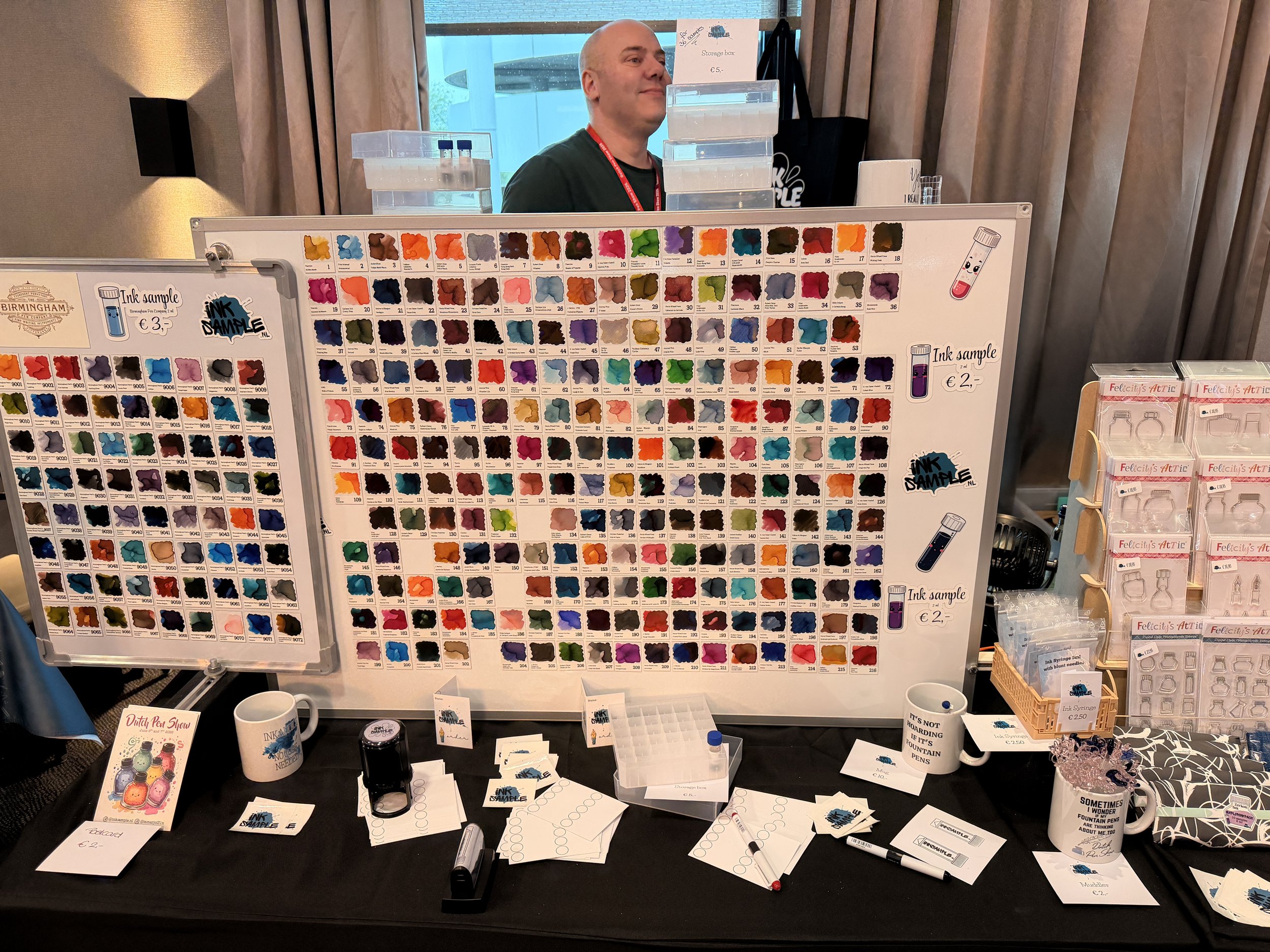
The Ink Sample NL sample ordering wall.
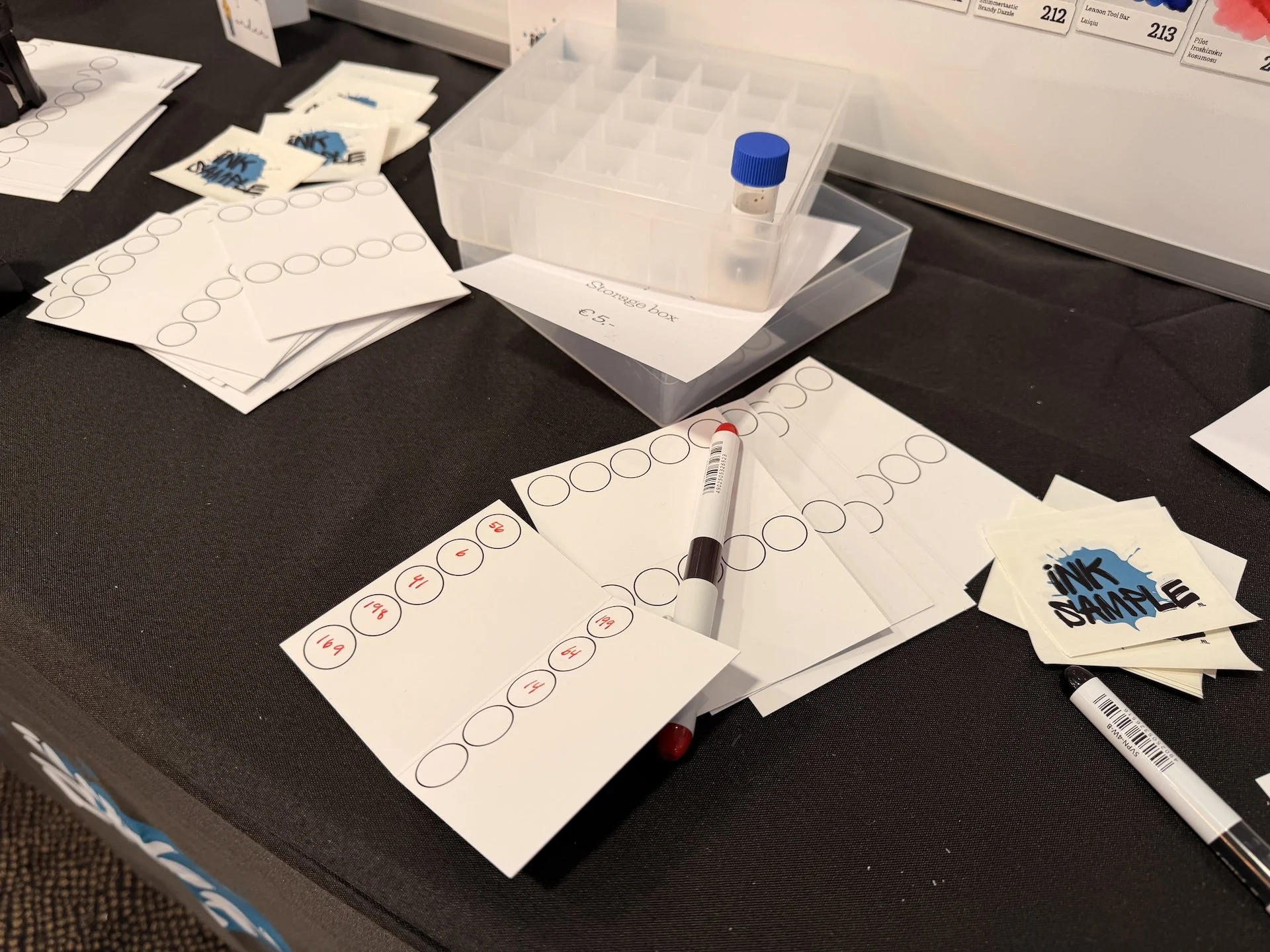
The Ink Sample NL sample ordering sheet.
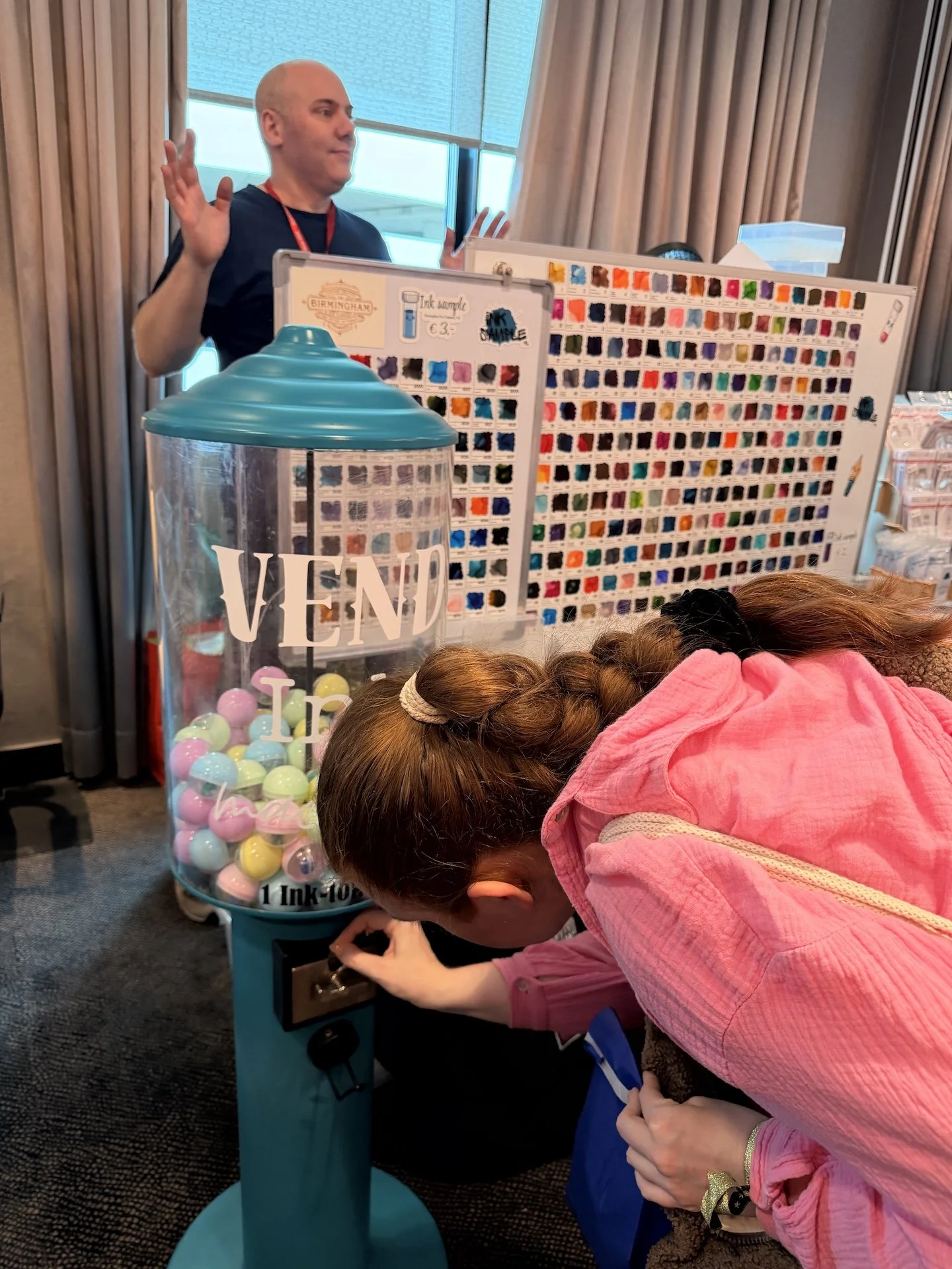
The Ink Sample NL mystery sample vending machine.
P.W. Akkerman — Technically not new to me; I'd briefly stepped foot in their shop in The Hague three years ago, but was short on time and didn't get to look around as much as I wanted. Getting to spend more time with them here was a treat. They're an iconic Dutch ink brand, known for their distinctive bottle shape with a ball mechanism inside that floods the top well for easy filling.
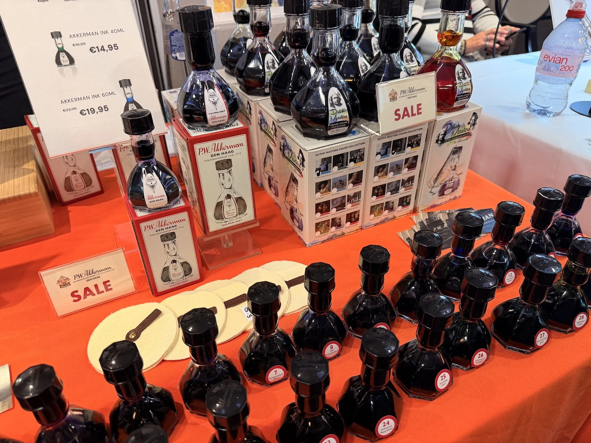
The P.W. Akkerman inks displayed at the Dutch Pen Show.
Skaban Studio — Skaban Studio’s table felt like home with beautiful swirly resin pens that we're used to seeing in the US at this point, but executed really well here. Great mixes of swirls alongside matte and flat resins, high quality, and comparably affordable. I really enjoyed that they included small placards of where some of pens’ inspirations came from. They were also just a pleasure to talk to!
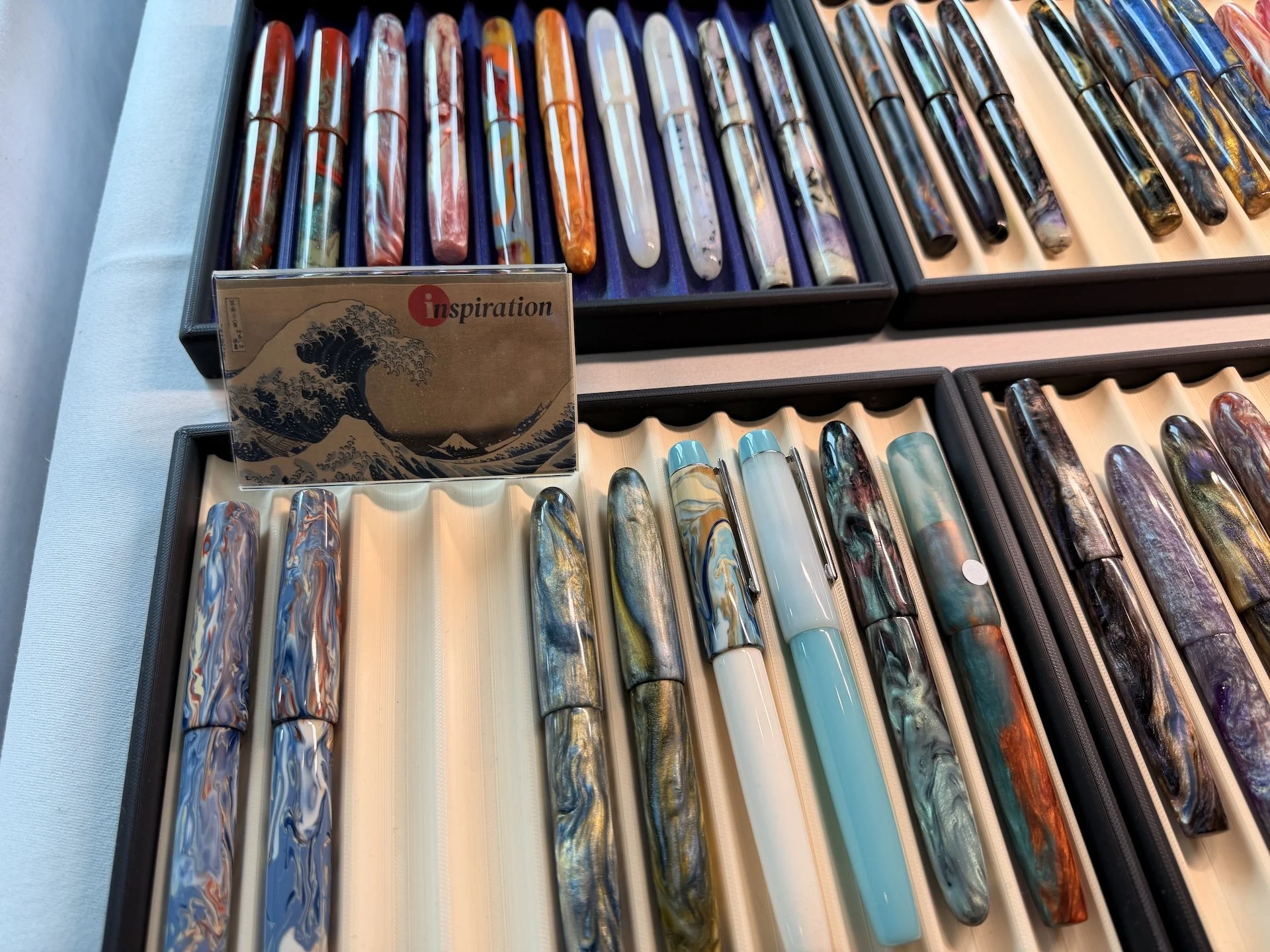
The Skaban Studio pen table pens with Great Wave inspiration placard.
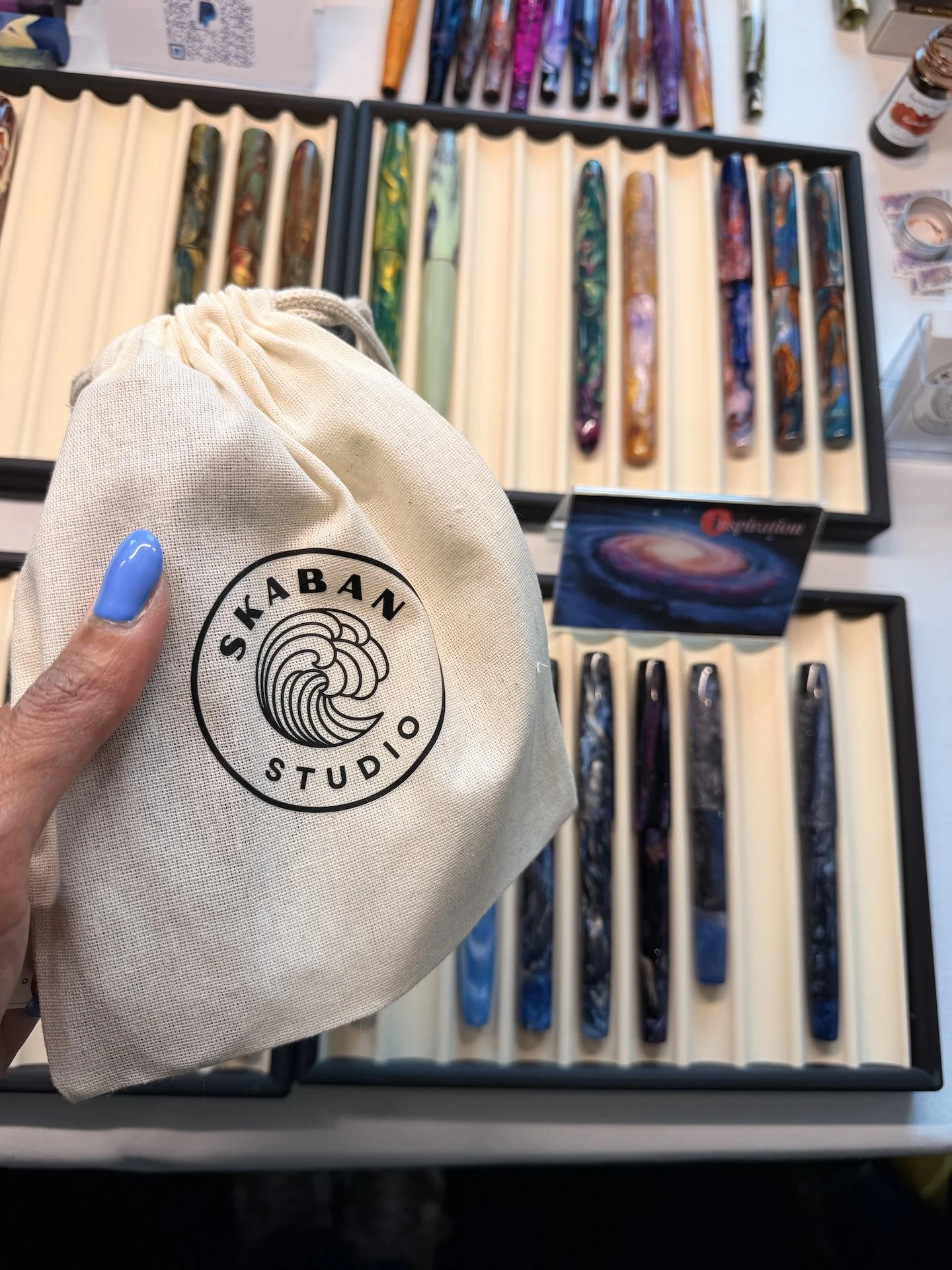
The Skaban Studio pouch I received with my pen purchase.
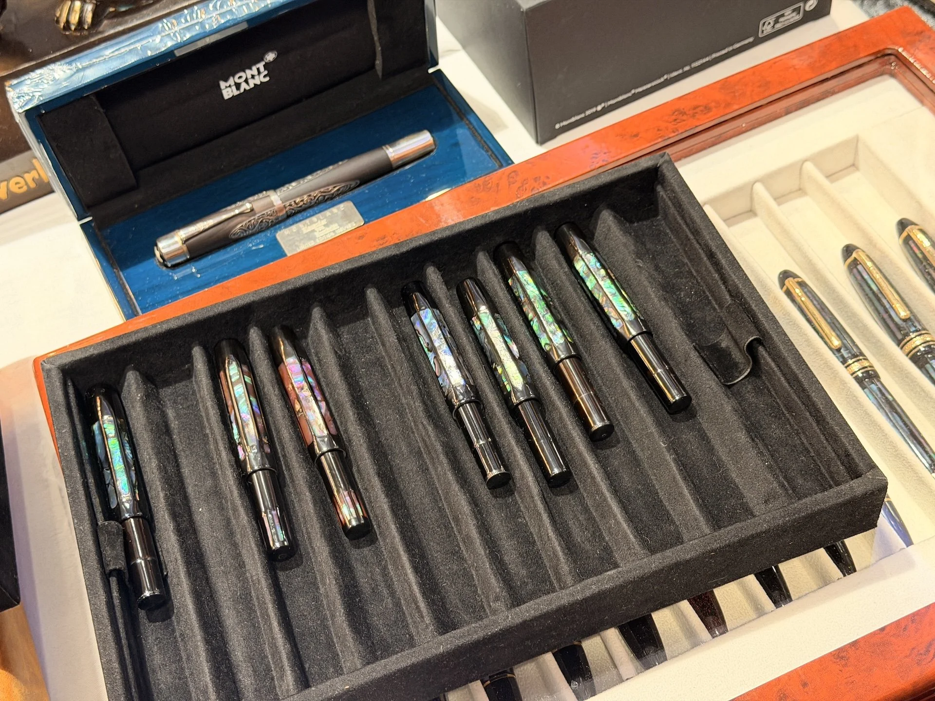
PenMeester — PenMeester was a table of more mass-produced pens with beautiful custom urushi, raden, ishime work on them — absolutely out of this world stunning! But what drew me in here was the nib jewelry: nib-shaped necklaces and earrings with engravings of different brand insignias. Sailor, Montblanc, and Pelikan were some of the ones that caught my eye.
Pendors — a Hungarian maker working in wood, acrylic, TruStone, and ebonite, with jewels placed beautifully in the pens themselves. Really lovely work.
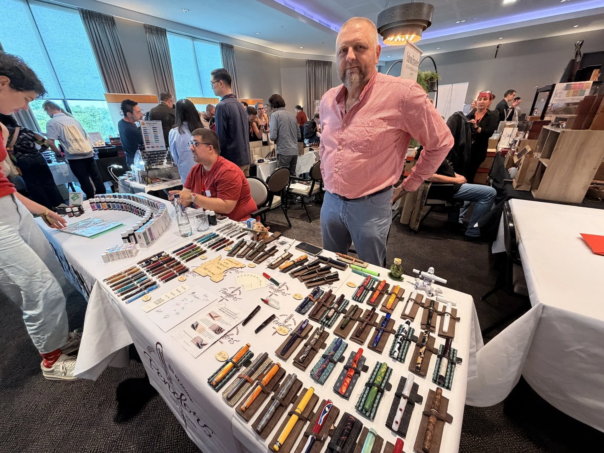
Pendor’s Sándor with his beautiful fountain pens.
Anıl Gökçe — This table was consistently busy, and for good reason. He had custom-laid raden and mother of pearl Kaweco Sports that were absolutely mesmerizing! We spent a lot of time at his table just (creepily?) staring at pens and people watching others’ amazement as well.
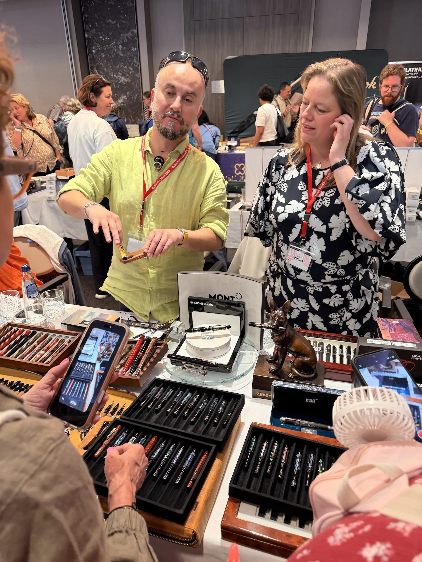
Anıl Gökçe talking to potential customers at his table.
Anıl Gökçe’s custom mother-of-pearl inlaid Kaweco Sports.
Shanghai Stationery — This duo is based out of the Netherlands and were super fun to talk to. Their inks are beautiful, well-lubricated, and I'll be talking more about them in a moment.
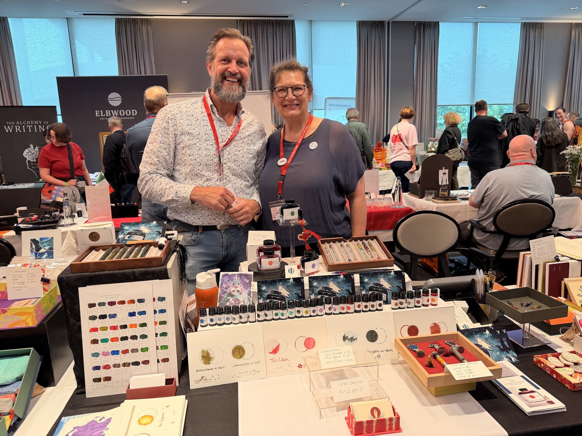
The owners of Shanghai Stationer, Emile and Astrid, at the 2026 Dutch Pen Show.
Bossert & Erhard — This is a highlight I didn't expect. This legacy brand (which was again, new to me) had a live craftsperson at the table etching a pen and nib under magnification, with the work projected on a nearby television so passersbys could watch in real time! Seeing just how delicate and precise that work is, projected large enough to actually follow, felt super special and unique. It definitely made me stop and watch.
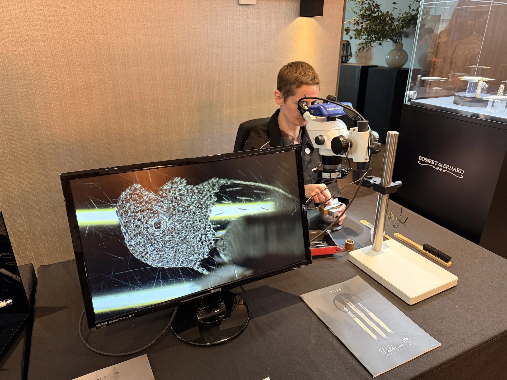
A Bossert & Erhard craftsperson etching a pen nib in real time during the show.
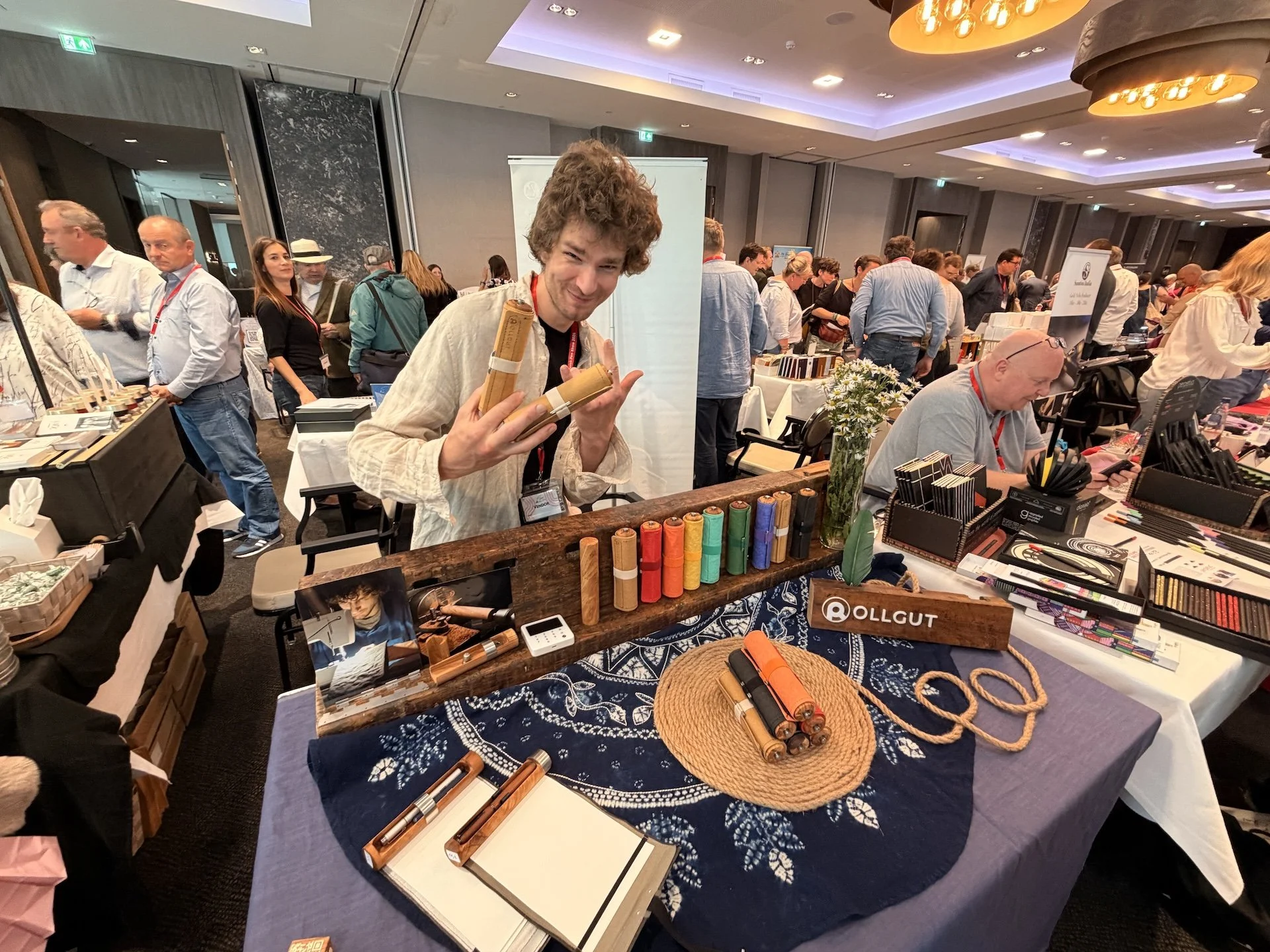
Rollgut — This was a refreshing find as well! The Rollgut is a rolled pad with a little pen pocket, seemingly aimed at urban sketchers and people who write or draw in nature. It was really interesting to see that kind of innovative design thinking at a pen show. It fits in the stationery/pen lexicon but also feels different.
ZekPens — ZekPens had an amazing selection of hand-painted pens; no two were the same, and I really enjoyed the maximalist and surrealist nature of the art.
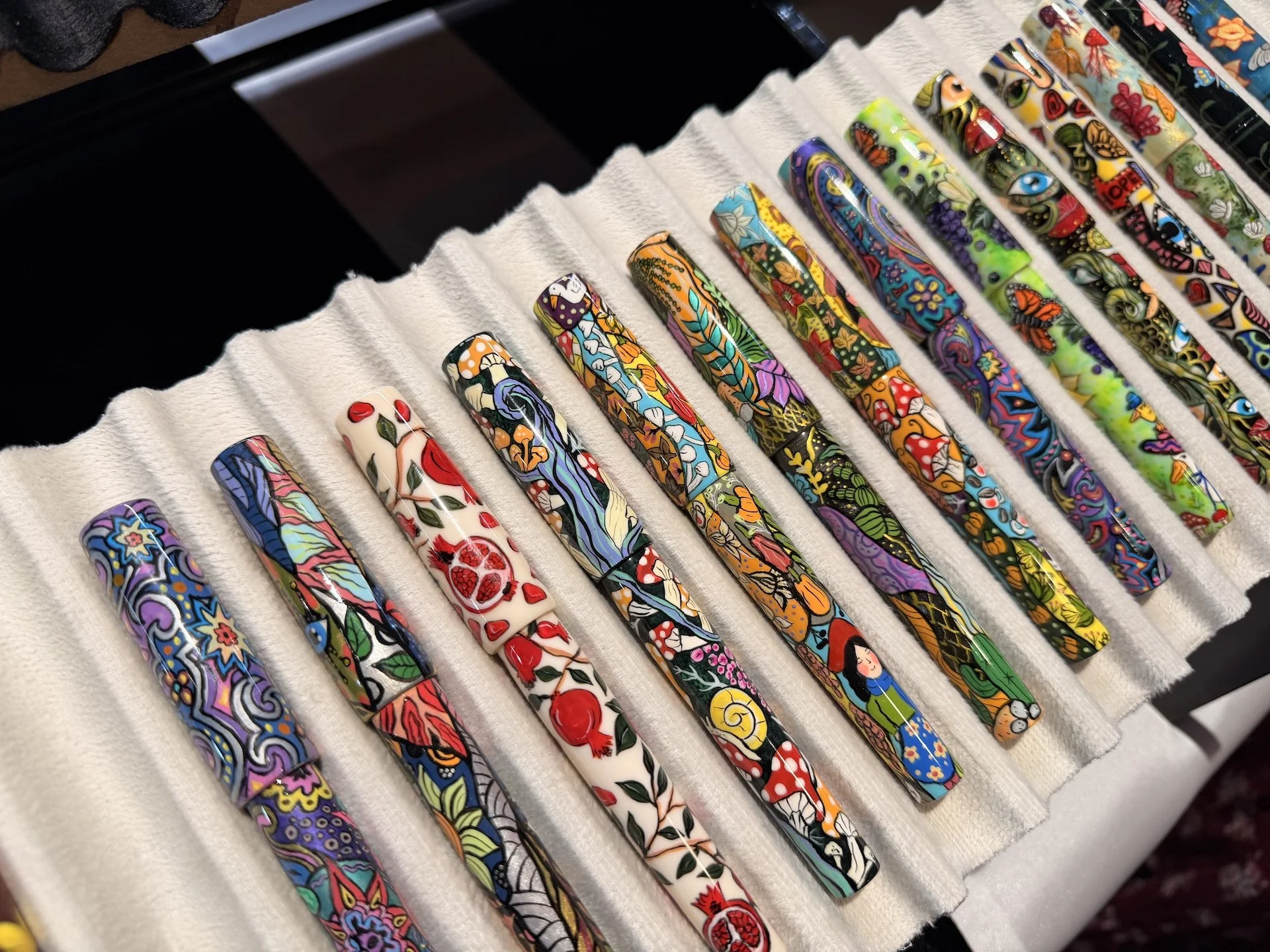
Some of the ZekPens selection at the 2026 Dutch Pen Show.
AbleSnail — These pens were so impressive! Greg Wiszniowski is a silversmith who makes stunning pens in ebonite mixed with intricate metalwork engravings. I picked up this nib unit for a pen friend of mine back in the States, and it’s stunning. The level of detail with both the nibs and the pens is definitely top-tier.
Payments
Cards were mostly accepted, but with so many international vendors in attendance, PayPal seemed widely preferred. Cash was also more useful than I expected, and the main benefit of having it on hand was that several vendors offered a discount for cash payments, which was a nice incentive. One important practical note: there is no ATM conveniently located at or near the Van der Valk Hotel. The closest one is apparently about a 20-minute walk away, so plan ahead. Bring plenty of cash, but also be prepared to be flexible with payment types… and definitely have a PayPal account set up before you go.
Karma Table & Silent Raffle
The karma table was one of those lovely pen show inclusions that makes the community feel like a community. There were pens, inks, stationery items, and even bagged stationery kits that people had put together and/or dropped off that were all free to take. I dropped off the Ferris Wheel Press ink from my goodie bag (already had it at home) and ended up finding something I had been looking for for a few months: a purple transparent Sheaffer No Nonsense with a fine nib.
There's a little backstory there. A few months ago I found a black Sheaffer No Nonsense with a fine italic at an antique store somewhere rural in New Mexico. I did some nib work to smooth it out and it writes great, but I'd been wanting a regular fine nib for it. And there, at the karma table at the Dutch Pen Show, was exactly what I was looking for. It was so funny and so serendipitous to find the very pen I'd been looking for there of all places. And since I gave an ink to take a pen, it still felt like a true karma trade.
The silent raffle was also quite novel: when you entered the show, you received a Dutch Pen Show flyer with a numbered ticket stapled to it. You'd walk over to the raffle table and check whether your number was on an item. If so, it was yours. I didn't win anything, but the consolation prize was also super fun: you got to cast a vote for the theme and ink color of the 2027 Dutch Pen Show. I loved that touch.
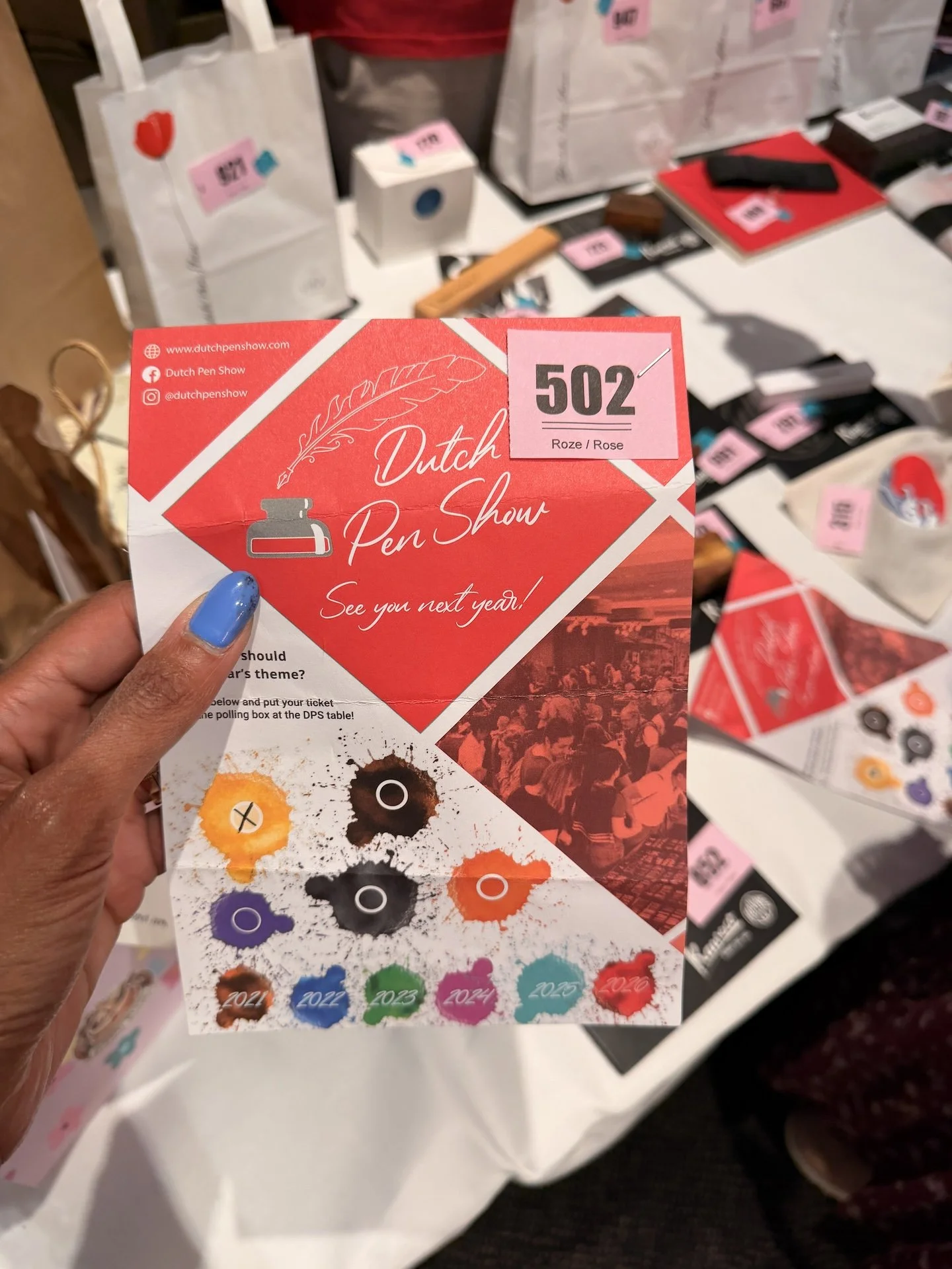
My silent raffle flyer/ticket along with some of the raffle prizes.
Workshops
Fude Workshop with André Massee
Sponsored by Private Reserve, this workshop was given by the incredibly talented André Massee.
The class was really informative and took us from basic strokes all the way to a finished traced piece, with André talking us through his techniques the whole time. There is one caveat worth mentioning: the class was scheduled to be given in English but was conducted mostly in Dutch, with occasional English commentary. I was still able to pick up tips throughout; and honestly, having a degree in visual art helped me read context and follow along even when I couldn't follow the language. I'm not sure I would have fared as well without that background. Despite the language barrier, I still absolutely enjoyed it. It was really nice to spend relaxed, low-pressure time with a nib I've been wanting to work with more.
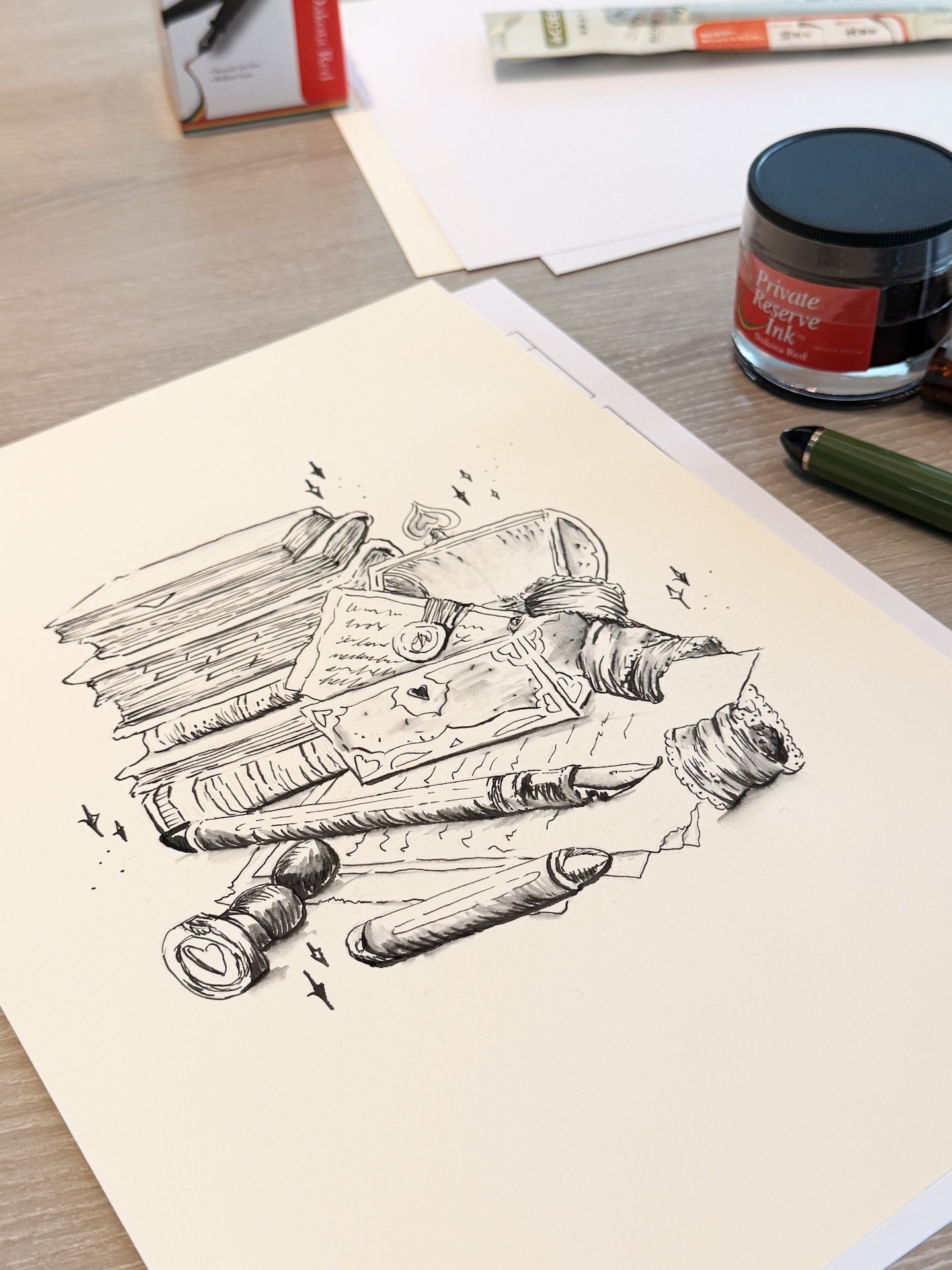
Final artwork from the Fude workshop.
Ink Mixing Workshop with Diamine
I took an ink mixing workshop with Courtney from Diamine. She was super knowledgeable and sweet, and happens to be the person in charge of making the Inkvent calendar (and yes, I absolutely pressed her for information on that). This workshop was not in the usual workshop rooms, but instead in a somewhat quiet corner of the Foyer.
In the workshop, we used CMYK inks — cyan, magenta, yellow, and black — to mix a custom color of our choice. I'd made an ink with Sven at the Chicago Pen Show just a few months ago matching my husband’s eye-color; however, I took the photo in super bright studio lights and wanted another go at matching his eyes as they are hazel, greenish with brown undertones in everyday natural lighting. We got a little direction on the front end before Courtney let us loose with the ink droppers and a palette. She was around for any color theory questions or if anyone needed extra help getting to the color they were trying to get. I got pretty lucky and got it on the fourth try. The color is lovely, and feels like a spot on match. I called it: Cam’s Eyes, Dark. We gave Courtney the recipe to the winning mix, and she mixed large 80ml bottles for us to come pick up just an hour or so later. Highly recommend this or any of the ink mixing opportunities at a show you’re attending.
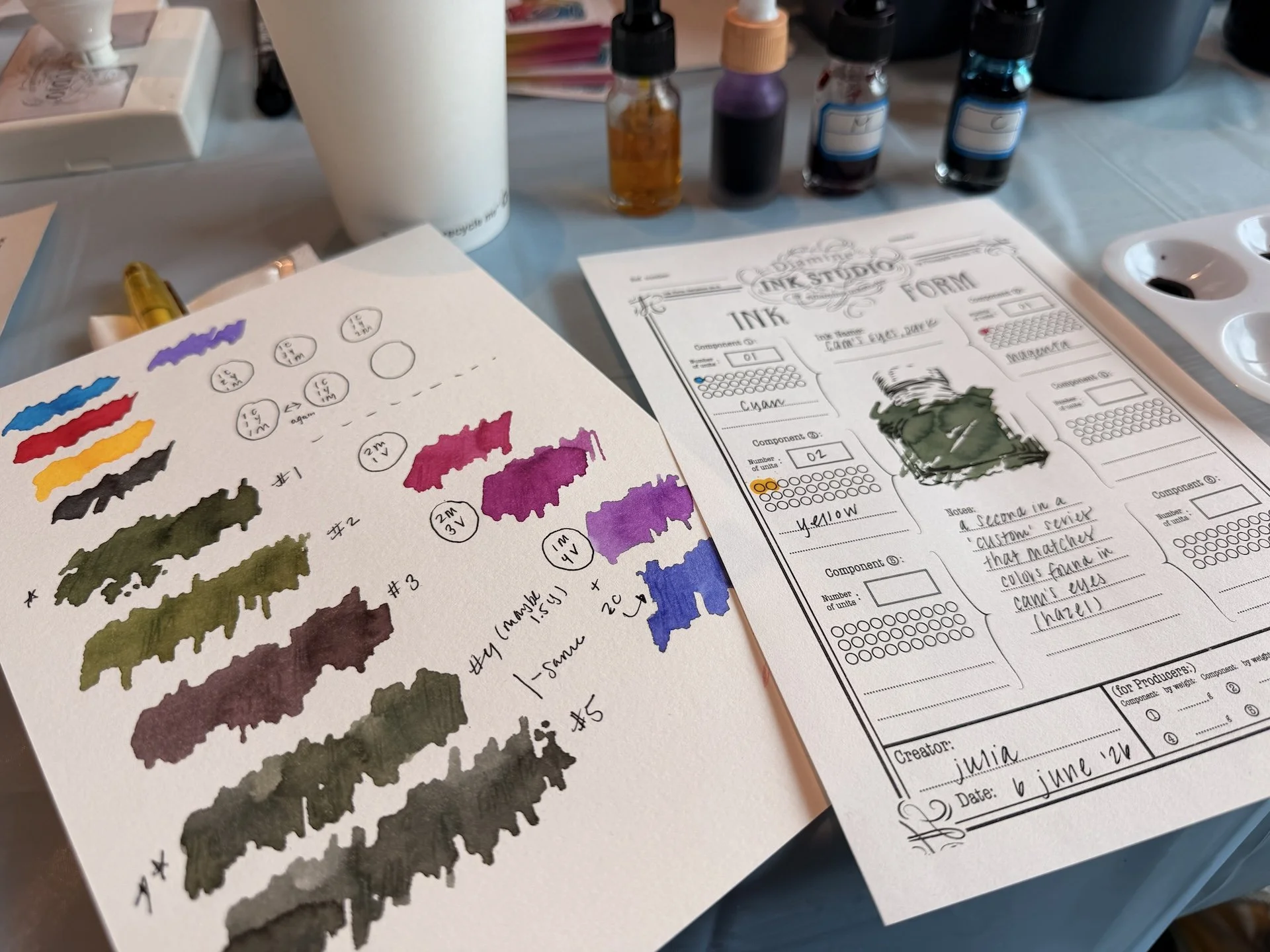
My ink mixing progress and final color, Cam’s Eyes: Dark, from the Diamine Ink Studio ink mixing workshop.
Nib Tuning & Smoothing Seminar with Lenny Eiger
The night before this workshop, I'd had the pleasure of writing with some of Lenny's tuned pens at an after-dark hangout, and they were all incredibly smooth and juicy writers. So I was very excited to get into his seminar and understand his techniques better (because it definitely seemed as though we had similar taste in ideal writing experience). It has been about two years since I'd taken a class like this, and it was definitely time for a refresher.
The seminar ran a little late due to some supply issues and was therefore a touch rushed, but even so, there was so much good information was packed in! We each got a useful kit of nib tuning and smoothing supplies, covered common nib issues and how to address them, and worked on our own pens throughout. I brought along a fine Cypress nib that was ok to write with but a little drier than I wanted it to be. With feeder gauges and polishing paper, I was able to open things up a bit, and I've come away newly inspired to troubleshoot nib issues on my own again with a little more confidence. Lenny was super knowledgeable, and I thought was a great instructor for what could definitely be a tough workshop to teach.
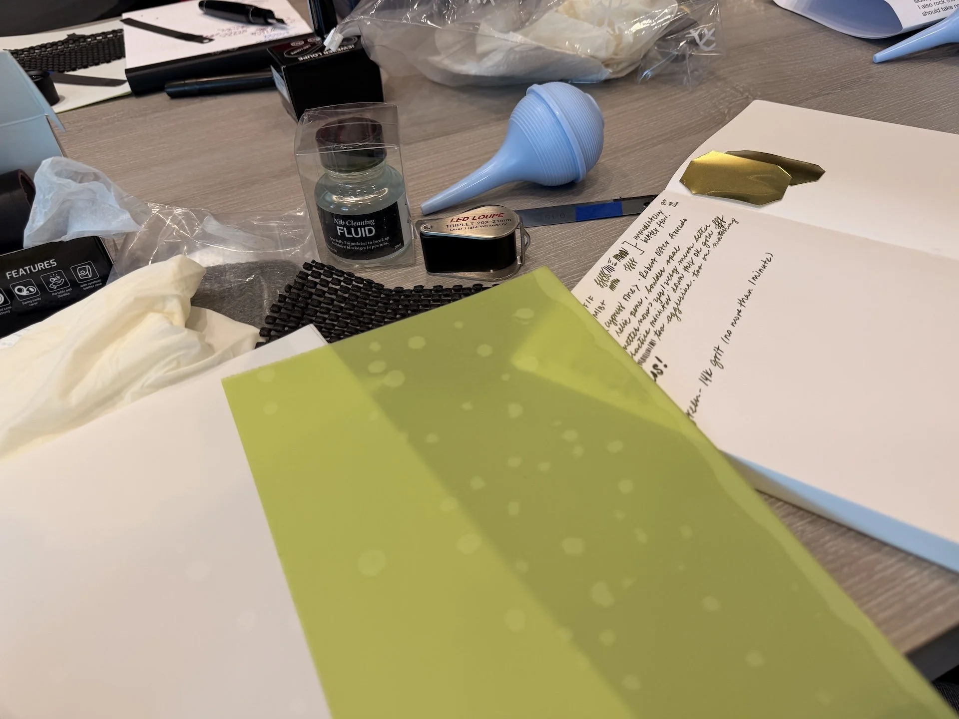
Some of the nib smoothing, tuning, and cleaning supplies we were given for the workshop.
Pen Show After Dark
The after-dark hangs were exactly what you'd hope for: good people, good drinks, and big clear baggies of ink samples being passed around of course! The hotel bar and lobby area had plenty of room for everyone who wanted to hang out, and the vibe was a bit more relaxed and wrapped up earlier than the US show after-hours I've experienced. That's neither a complaint nor a critique: I, for one, appreciated it. I like my sleep, haha.
Pen show after dark is always a special kind of experience, though. It's the best time to chat with vendors, nibmeisters, and fellow enthusiasts outside of the show floor. Everyone's excited to share their latest pens or pull out their entire collection for you. If you're not around pen people in your day-to-day life, there's really nothing quite like it.
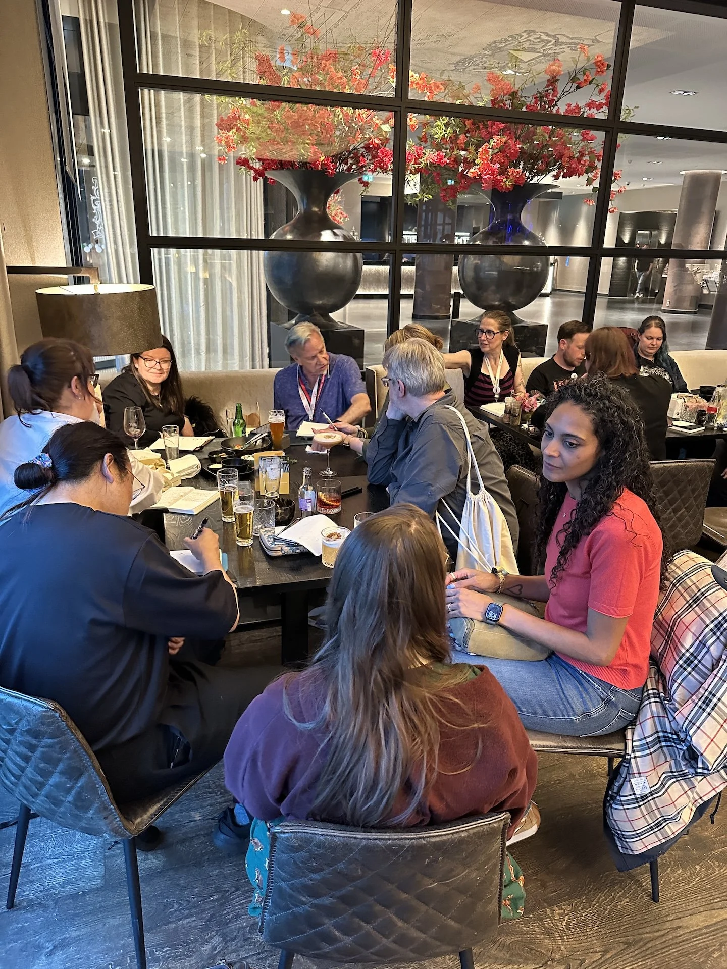
Pen Show After Dark hangs in the hotel bar/lobby area.
The Surrounding Area & Exploring Utrecht
The show was held at the Van der Valk Hotel Utrecht, and while I didn't stay there myself (we were on a backpack-only trip and needed access to laundry), I did get to see the rooms, and they look fabulous. Highly recommend staying there if you can. The hotel bar and restaurant were excellent across multiple meals: great service, great food, and a really comfortable place to decompress during/after the show.
For an alternative hangout, my husband and I stumbled upon the ElevenBar, a really cool bar just a very short walk from the hotel, tucked in among office and apartment buildings: easy to miss. The beer was good (and noticeably less expensive than hotel bar prices), and the tables are huge which I immediately thought of it being perfect for spreading out pens, inks, and journals. They're open late too, which makes it a solid option for after-dark hangs as well.
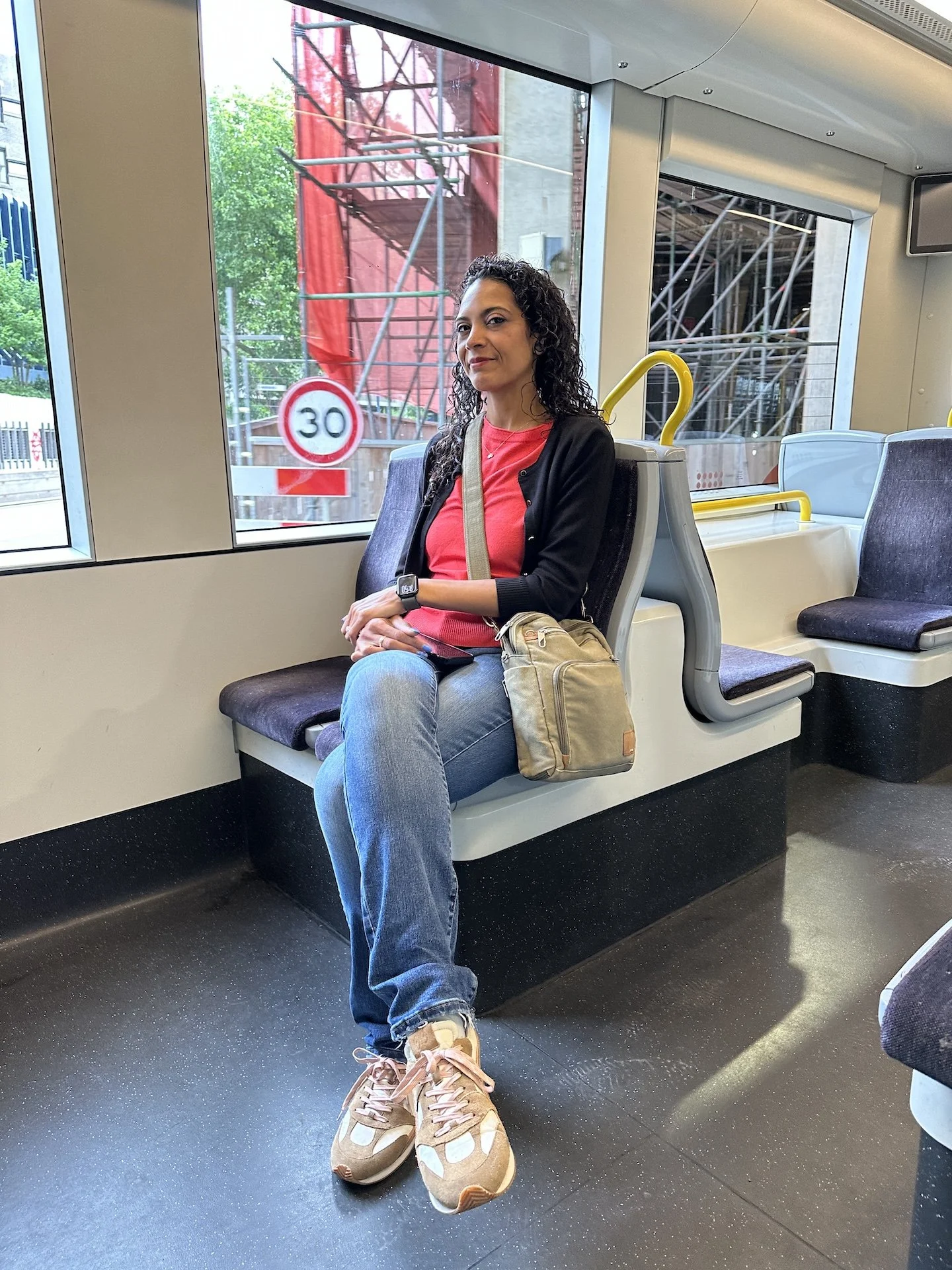
Beyond those two spots, there's not much in the immediate area around the hotel, so plan to hunker down once you're settled in for the evening. However, there is a tram stop nearby that gets you into the Utrecht City Centre in about 15 minutes. It's very easy to use: just tap your phone to pay when you board and again when you exit, and yes – it’s absolutely worth making the trip.
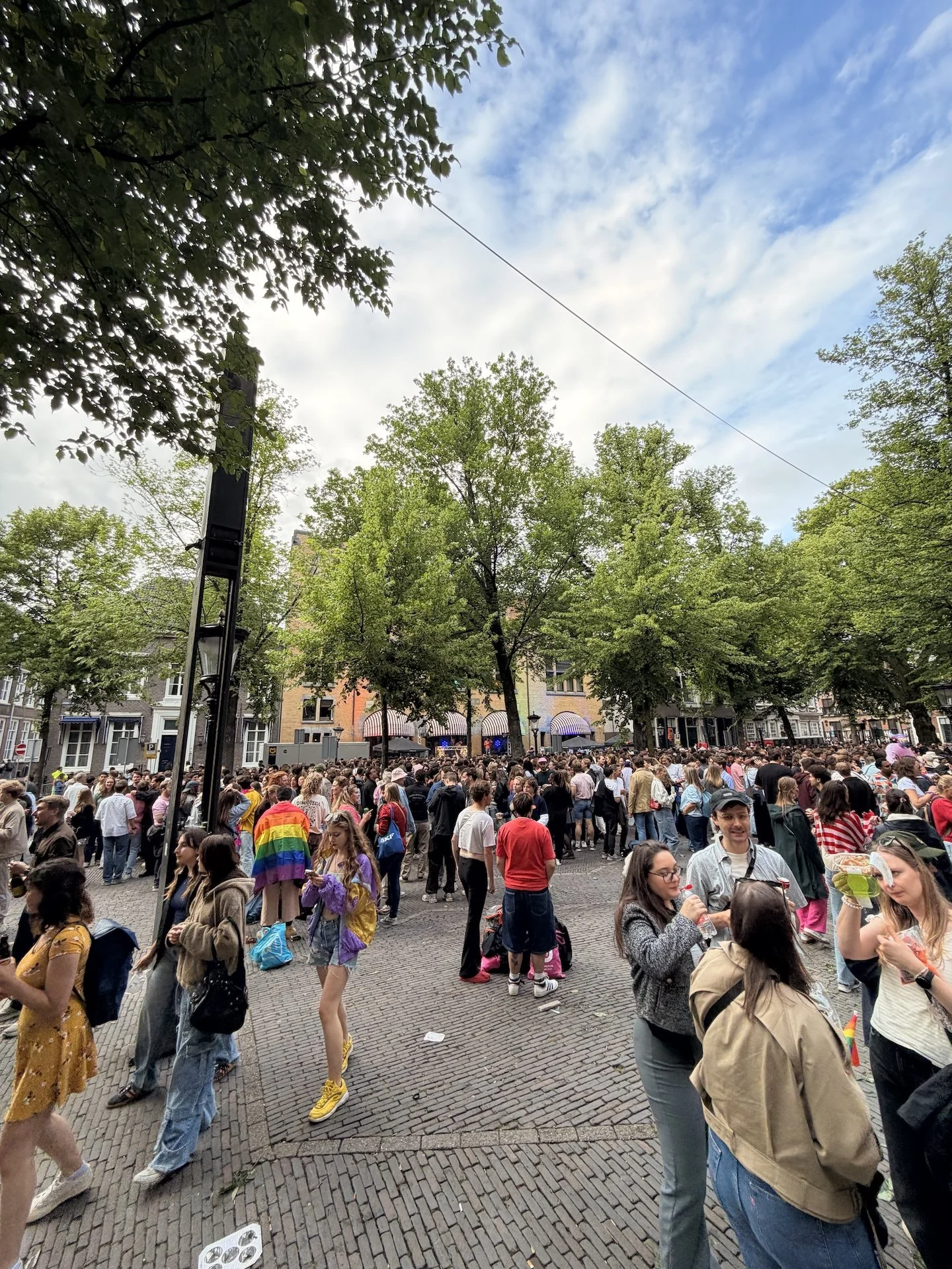
I don't know if it always lines up this way, but Utrecht Pride fell on Saturday during our visit, and the city was absolutely alive.
Entertainment, color, energy, music everywhere: an interesting contrast to the quieter area around the hotel. If you have time to explore during show weekend, do it!
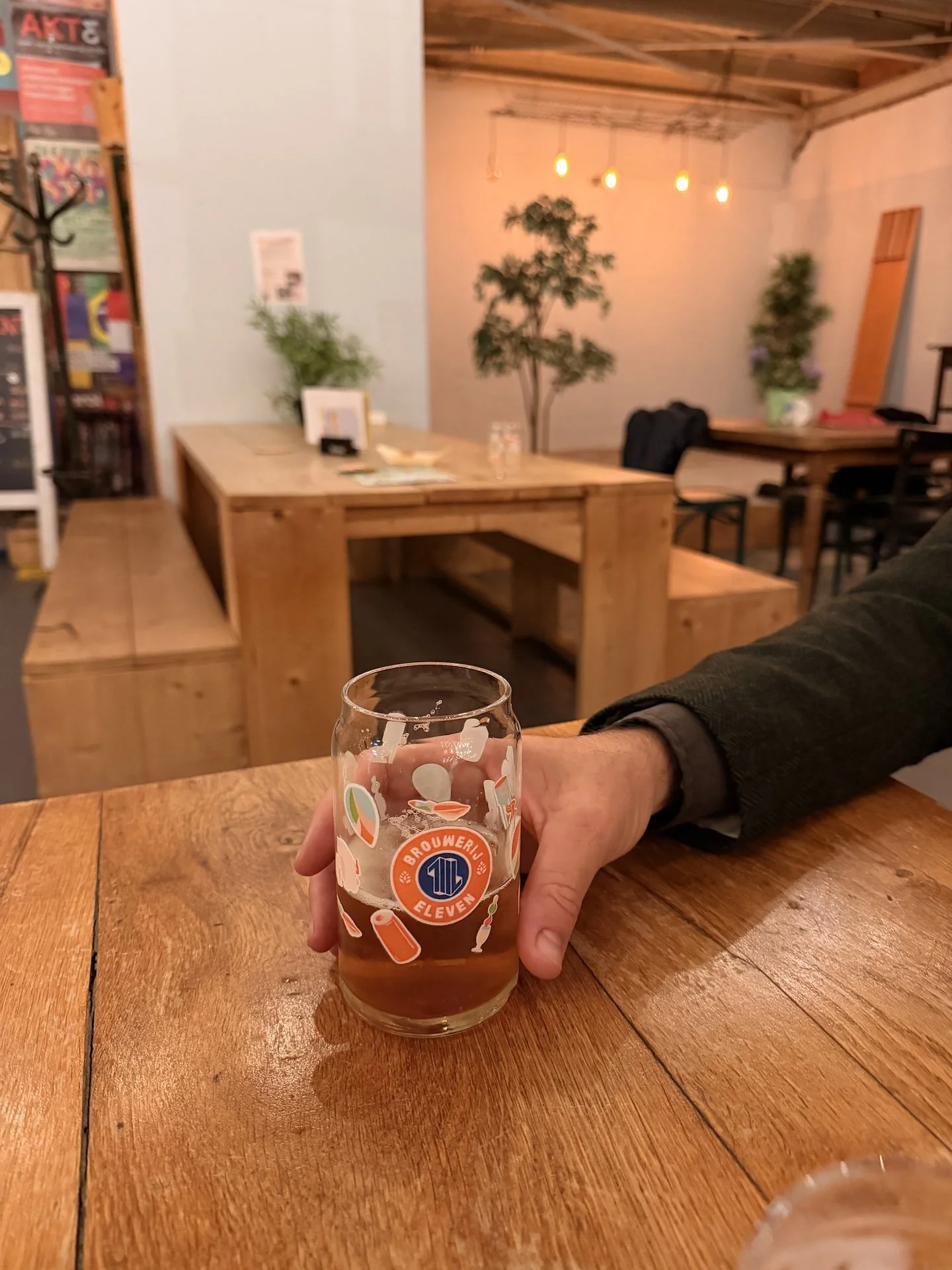
Hanging out at ElevenBar (with huge tables!) and taking the tran to explore Utrecht Pride in the City Centre.
Stuff Only I Care About: Branding & Signage
Okay, designer hat on for a moment!
The Dutch Pen Show's theme this year was Love Letters, and there were some lovely nods to it throughout: red balloons at the entry, a red vintage-style mailbox where you could drop off a postcard (a detail I loved), and the three show pens were all red. Love a good theme.
That said, I think the show was missing some of the storytelling that could have really brought that theme to life. Walking up to the hotel, there was no exterior signage indicating that an event was happening, no sense of "you've arrived, something special is here,” even outside of the theme of it all. I spoke with several attendees outside who mentioned feeling disoriented, unsure if they were even in the right place. That arrival moment is such an opportunity to set the tone, a photo opportunity for sure, and it felt like it went a bit untapped.
Inside, the same issue extended to the workshop rooms, which were located outside the main show entry point. The only indicator of where to find them was a small sign at the hallway entrance which was easy to miss if you didn't already know to look for it. With a little more intentional wayfinding, some photo moments, and stronger thematic branding carried through the space, it all could have really come together visually.
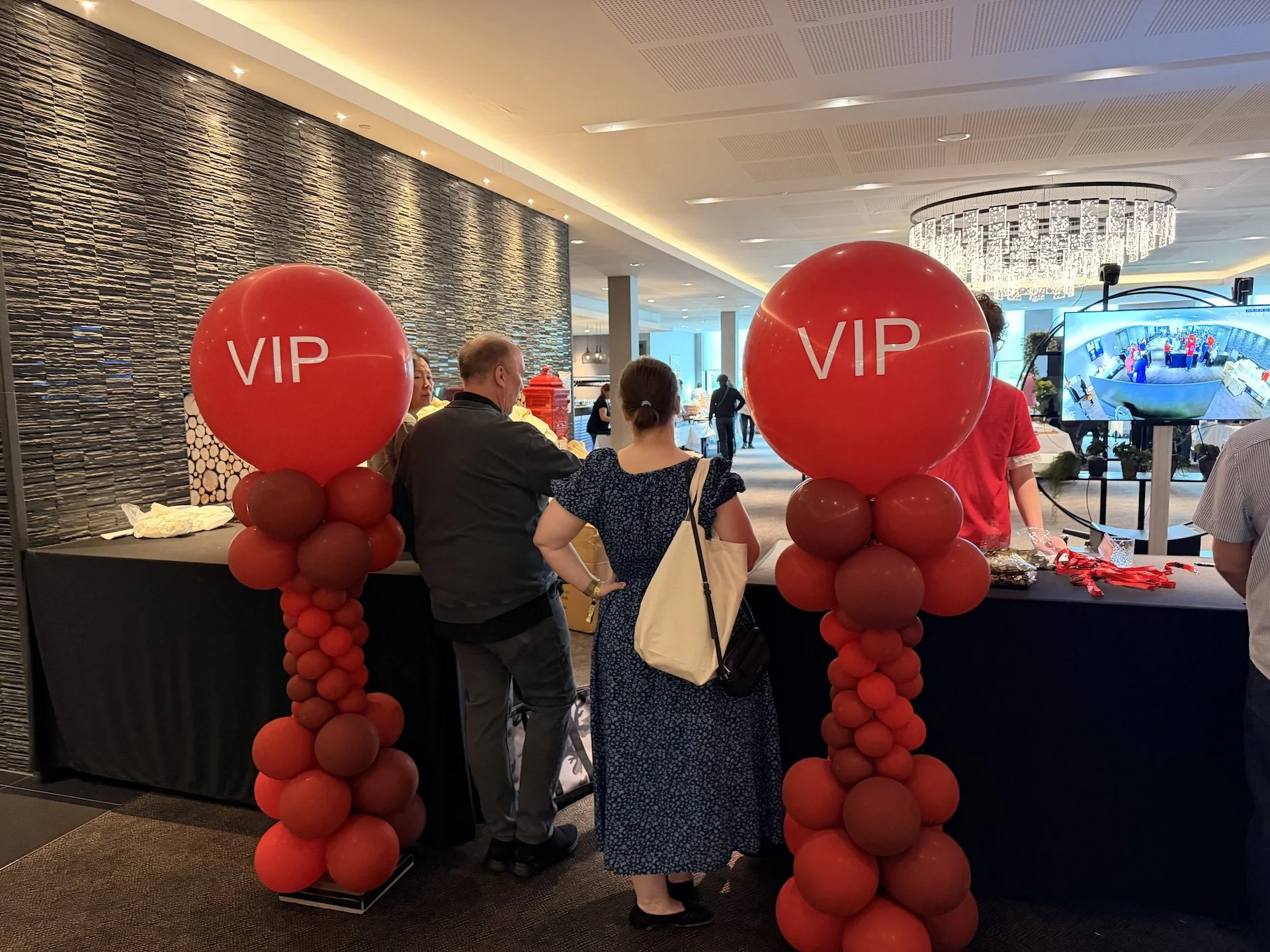
Pen show entry balloons and (in background) postcard box.
Closing Thoughts
If you're considering the Dutch Pen Show and wondering whether it's worth the trip: it absolutely is. Two days felt like the right amount of time; it was enough to be thorough without being exhausting, even if I'm pretty sure I didn't make it to every table.
What made this show truly special wasn't just the shopping, though the vendor mix was refreshing in a way I didn't fully anticipate. It was the people. The pen friends old and new, the viewers who came up to say hello and talk about the show, the sweet gifts and samples and stationery that people just wanted to share. Going somewhere completely new, on the other side of the globe, and feeling like you had friends because of pens is something that’s so wild and something I personally cherish to no end. A big thank you to the Dutch Pen Show organizers and sponsors for putting on such a wonderful two-day event. I hope I can make it back one day. If you want even more detail on the haul I brought back from the show, I recently posted a video over on my YouTube channel where I show and tell all the things!
Enjoying the show with Anne Nossack.
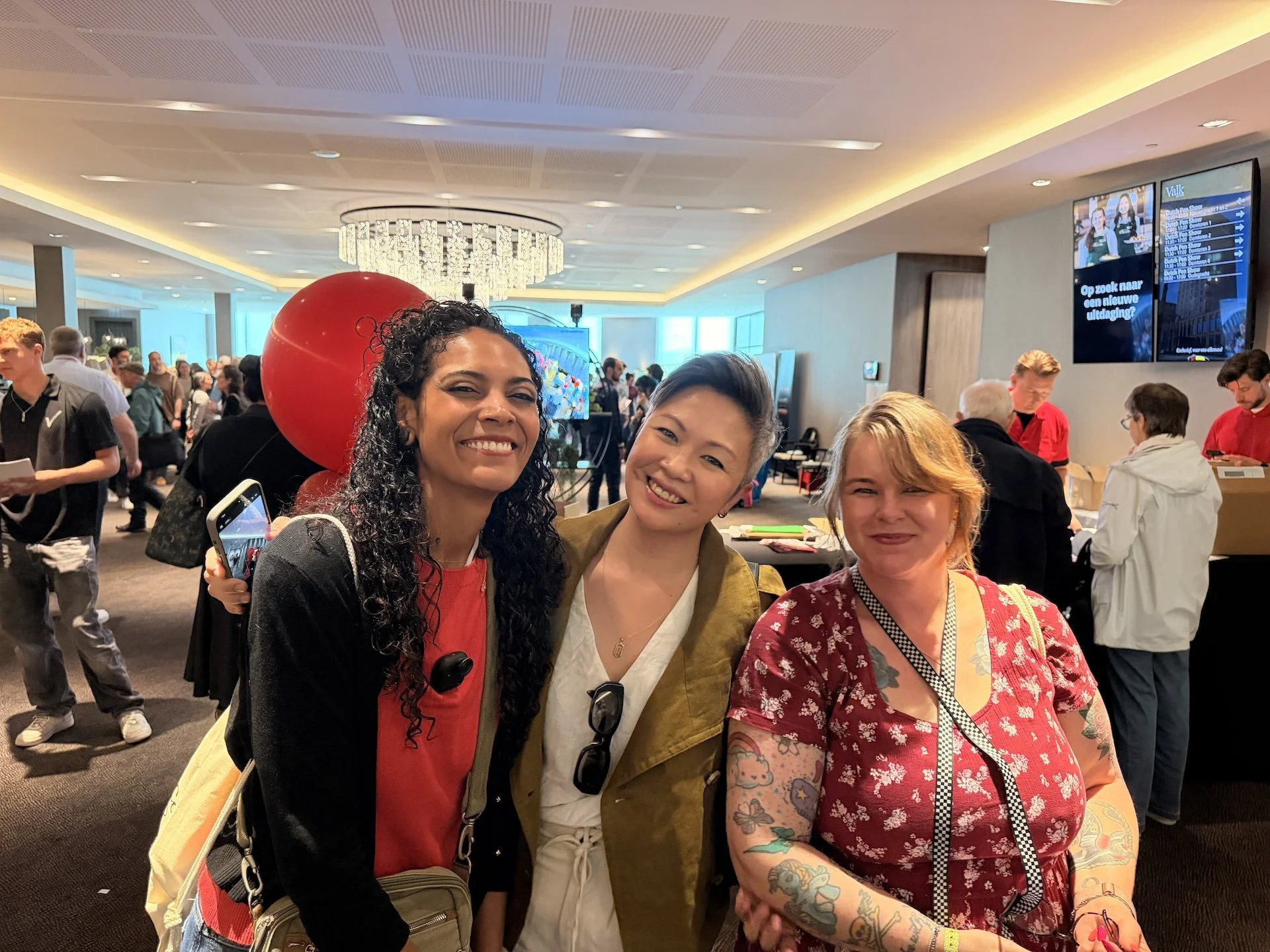
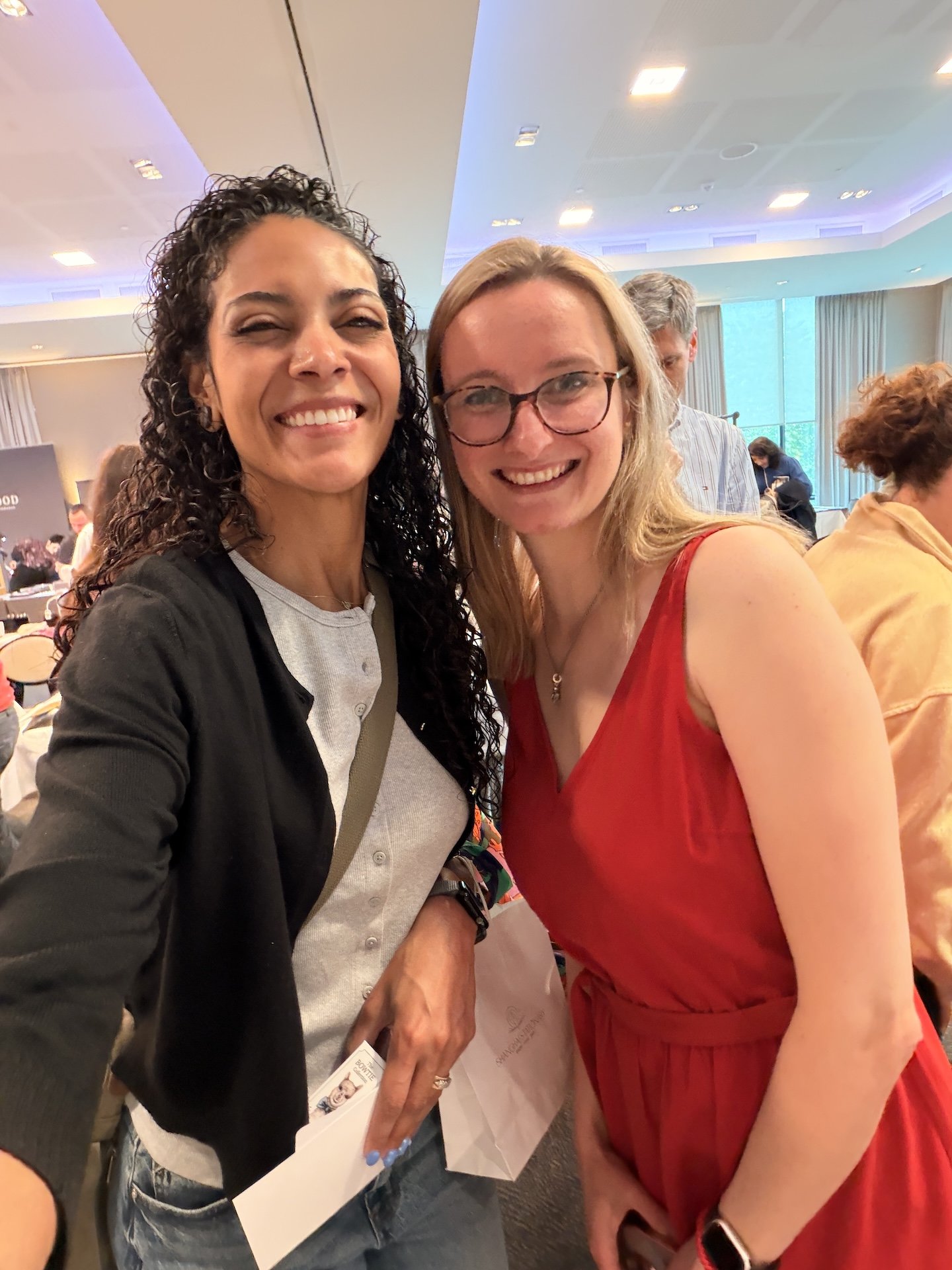
Enjoying the show with Tercia Goh (SkyBambi) and Kirsten Tebbens.
Next up for me: Stationery Fest in New York, where I'll be teaching a workshop called Inksploration Station!
❤️ J
Enjoy reading The Pen Addict? Then consider becoming a member to receive additional weekly content, giveaways, and discounts in The Pen Addict shop. Plus, you support me and the site directly, for which I am very grateful.
Membership starts at just $5/month, with a discounted annual option available. To find out more about membership click here and join us!