Posts filed under Rohrer & Klingner

Rohrer & Klingner sketchINK Carmen Fountain Pen Ink Review

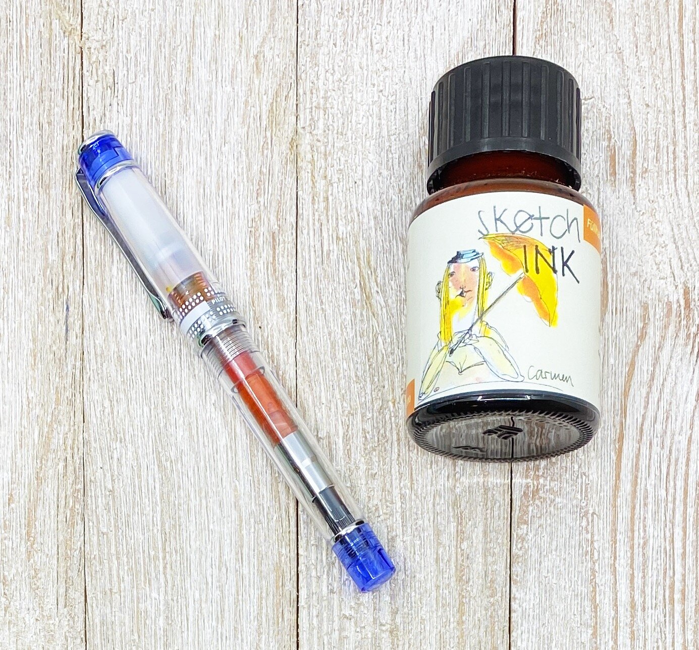
Let’s get one thing cleared up real quick: Choosing a demonstrator barrel fountain pen may not have been the choice for this review. As you will soon find out, Rohrer & Klingner sketchINK Carmen is a pretty darn good ink, but I must admit that “Liquid Rust” or “Damp Tang” are suitable monikers for how it appears in this pen.

The odd color is actually there for a reason. Rohrer & Klingner sketchINKs are pigmented inks, and they tend to have a more cloudy appearance than their standard fountain pen ink friends. That’s a feature if you are looking for a waterproof, lightfast, and quick dry ink for general writing, journaling, and artwork.

I skipped over these when they first launched, thinking why do I need an ink with all of these additional features that I traditionally don’t care about? Well, I still don’t need to draw with ink pens over a layer of sketchINK, or wash over them with a watercolor brush, but others do, and maybe they would like to explore a little.

And, as it turns out, sketchINKs are pretty good general writing inks, too.

I chose a Pilot Prera with a CM (Calligraphy Medium) nib for this review, which is Pilot’s cursive/stub hybrid nib that checks in around 1.0 mm wide. While Carmen, and other sketchINKs are designed to work well with any nib width due to their ink flow, I wanted to see what character was in this shade.

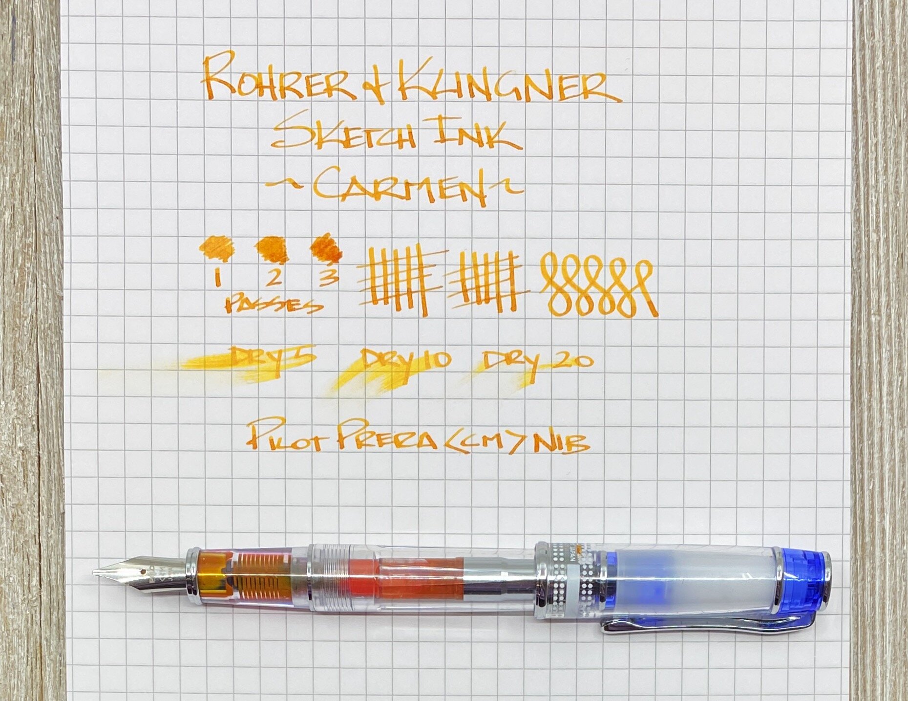
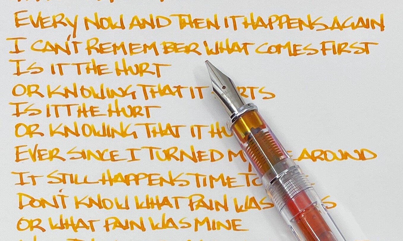
The orange-yellow color is bright, and exhibits a decent amount of shading that I was surprised to get. The ink flow is fantastic, as advertised, and the dry time is average to above-average on Rhodia paper. I also did a quick test on Field Notes stock paper to see how it would perform, and it wasn’t good at all. Bleeding and feathering galore, which is the expectation from a pigment ink on this paper. Other lighter, thinner, absorbent papers will perform similarly.

The only downside to pigment inks are that you need to ramp up your pen cleaning program. JetPens recommends cleaning your pigment inked pens every four to six weeks, or if you don’t plan on using them for more than a week. They tend to clog up when not being used, but the actually cleaning part is easy and normal if you keep up with it.

Rohrer & Klingner sketchINK comes in 10 different shades, and I have picked up Frieda to test out as well, but with an extra fine nib. At $12 for a 50 ml bottle that decision was simple. For more on how sketchINKs work in more artistic situations, take a look at this great review from Parka Blogs.

(JetPens provided this product at no charge to The Pen Addict for review purposes.)


Enjoy reading The Pen Addict? Then consider becoming a member to receive additional weekly content, giveaways, and discounts in The Pen Addict shop. Plus, you support me and the site directly, for which I am very grateful.

Membership starts at just $5/month, with a discounted annual option available. To find out more about membership click here and join us!

Posted on January 6, 2020 and filed under Rohrer & Klingner, sketchINK, Ink Reviews.

Rohrer & Klingner Verdigris Ink Review

(Jeff Abbott is a regular contributor at The Pen Addict. You can find more from Jeff online at Draft Evolution and Twitter.)

As another part of the Ink Drop subscription from January, I finally got around to inking up the Verdigris sample from Rohrer & Klingner. This, like most of the samples, was one that I was completely unfamiliar with, so I looked it up online to see what I could expect. From what I could tell, I was expecting a black-green or black-teal color, which seemed like an interesting color that could add some interesting pop to the page. So, I inked it up in a Lamy Vista with a fine nib.

First, let's talk about the properties of the ink. This is my first experience with this brand, so I was really interested to see how it behaved in the pen and on the page. I've heard many, many great things about several of the other inks from the brand.

This ink is exceptionally smooth on the page. It's a real joy to write with. Dry time leaves something to be desired, but it's not terrible. If you're a left-handed writer, you might not do well with this one. There's a very small degree of shading that's really only noticeable under bright light. Even with a wide nib, it was difficult to coax out any shading. I didn't notice until taking pictures with an off-camera flash that there's a bit of sheen visible in this ink. If only this were visible under normal light, that would be fantastic! As it is, though, shading and sheen are hardly noticeable in real situations.

Now, I don't intentionally sniff new inks, but I do notice any scents that come up while writing. This ink does have a slight scent, but it's not bad. It's very similar to other ink smells that I've noticed in the past.

Cleaning the ink out of the pen is incredibly easy. I don't believe that this ink has the same reputation as other inks, such as Scabiosa, which has warnings about leaving it in a pen for long without being used because it's an iron gall ink. Of course, it's not a great idea to leave ink in a pen unused for too long, but Verdigris is more in line with "normal" inks.

As far as a drip test, the ink did not do well. Not surprising, but worth mentioning since it does have some black in it.

Which brings me to the color. This is a green-black ink that sometimes has some blue showing through, so maybe a teal-black. Either way, the black side of the ink is predominant in a way that makes the other colors difficult to detect. I've always disliked (insert color name here)-black inks that lean really far into the black territory, and this one is no exception. Keep in mind, this is just my own personal preference, but when using this ink, I'm disappointed by the lack of color on the page. Again, only in bright light is it possible to see the green (and sometimes blue) peeking through. For me, I like just a bit less black in these types of mixed inks, and Verdigris is just too dark.

Is it a great ink? Absolutely. Is it one that I'll use again? Probably not. Why? The color (or lack thereof) just isn't for me. Keeping all that in mind, this might be just the ink you've been looking for, and, if so, I highly recommend it to you. Otherwise, I'd stay away unless you're looking for a black ink that sometimes lets a tad of green/blue peek through.

Posted on March 4, 2015 and filed under Rohrer & Klingner, Ink Reviews.

Rohrer & Klingner Scabiosa Review

Rohrer & Klingner Scabiosa

I don't ever think I have seen a picture of Rohrer & Klingner Scabiosa that accurately reflects what it looks like in person, the above picture included. That is why it took me so long to get on the bandwagon quite honestly. It never looked like a good fit. A sample vial from my friend Thomas changed all of that.

From the very first time I inked it up I was hooked. I talk a lot about products that get everything "just right" and Scabiosa is one of them. The color - a dusty purple with hints of brown and grey - is just right. The amount of shading is just right. The dry time is just right. The ease of cleaning, even for an iron gall ink, is just right.

I like blue black fountain pen inks because they look classic - even historic - on the page. Scabiosa gives that same look. It stands out from the crowd while remaining professional enough to use in any situation. I have been keeping my TWSBI Mini 1.5 mm stub nib inked with it recently as my letter writing pen (this is also the pen used for this review). What a wonderful combination!

I owe everyone a Top 5 fountain pen inks list, which I promise I will get to very soon. Look for Rohrer & Klingner Scabiosa to rank highly when it comes out.

Rohrer & Klingner Scabiosa

(JetPens is an advertiser on The Pen Addict and I received this product at no charge.)

Posted on October 4, 2013 and filed under Ink Reviews, Rohrer & Klingner.