
The Visconti Mirage Mythos series of fountain pens is not new to the market - Sarah first reviewed it on the blog two years ago - but they have remained interesting to me because of their wide range of styles, and the comfort of the pen every time I had the opportunity to try one out.
While I’d argue that comfort is the more important aspect of any writing instrument, I want to talk about the style of the Mythos, because that’s what made me pick up the pen in the first place.
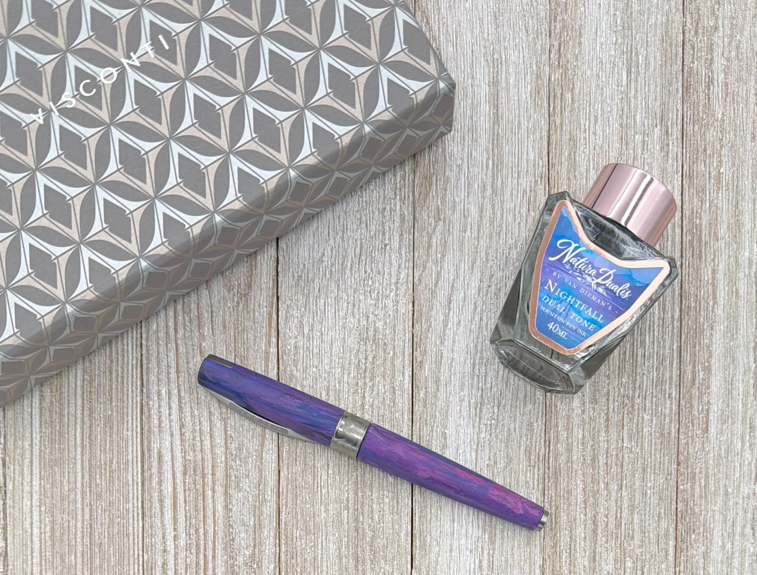
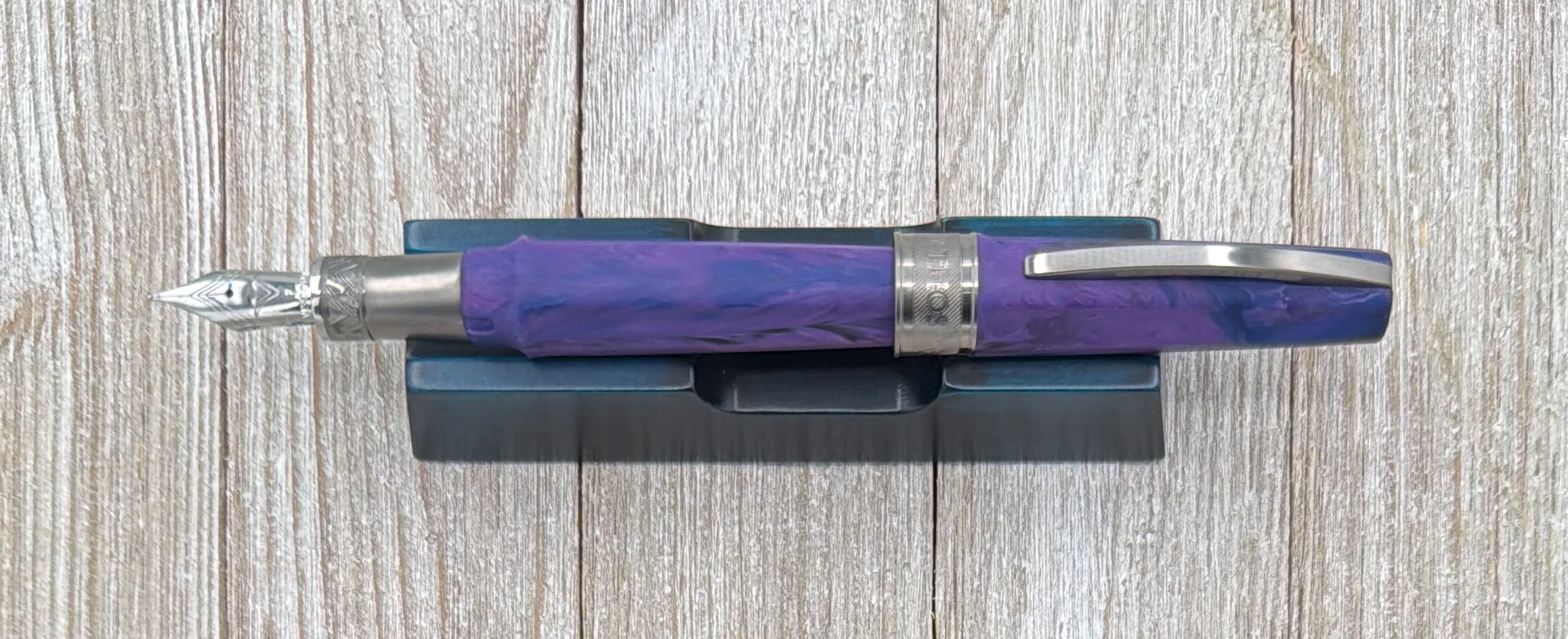
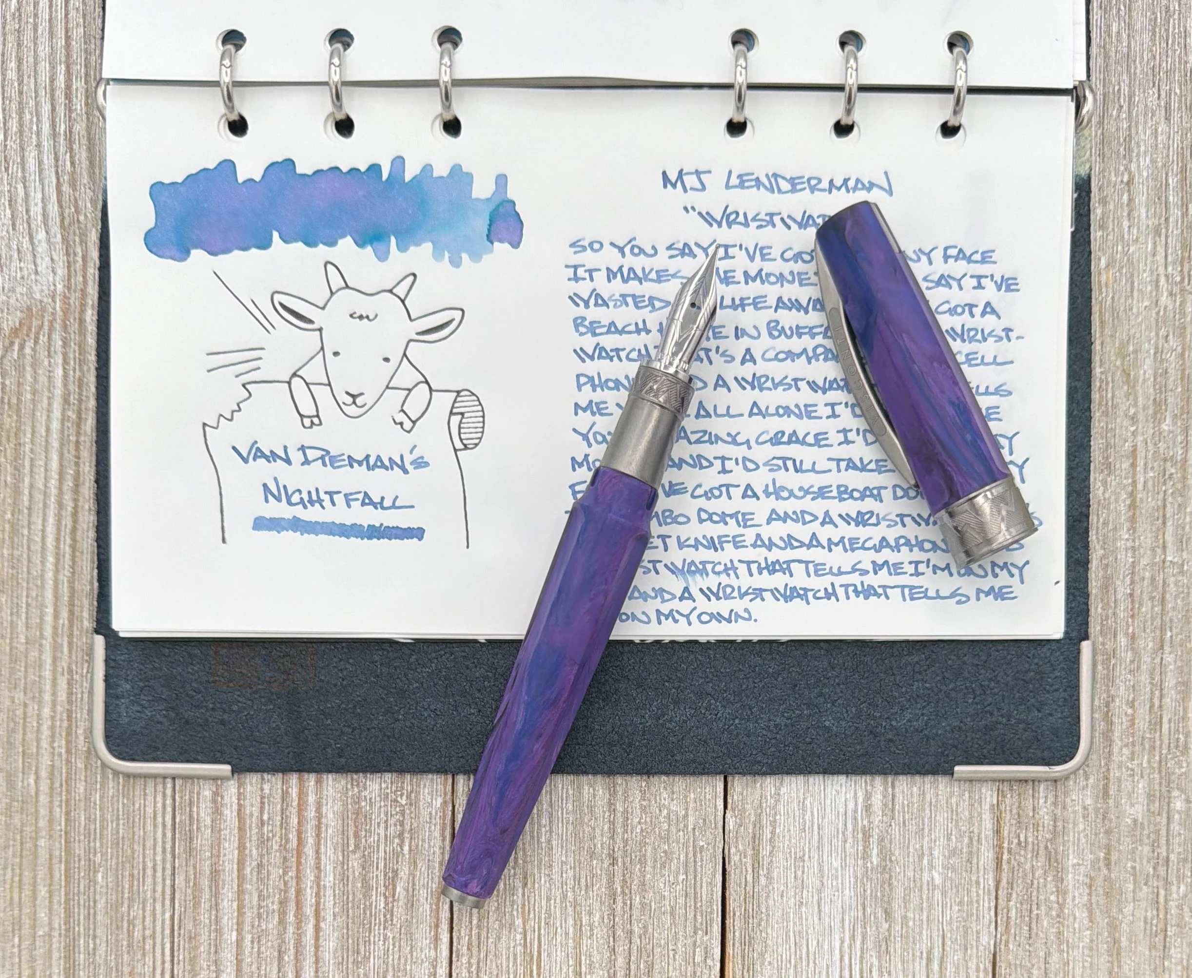
One look at their product page and you’ll see why I gravitated to them. Sarah’s Athena model was tough to pry from my hands, and picking out my own was a challenge as well. The Orange Demeter model was a contender, and the Blue Black Poseidon was nearly the selection, but the Purple Persephone combined the brightness of the Demeter and the darker trim of the Poseidon into a fun pen I want to use all the time.
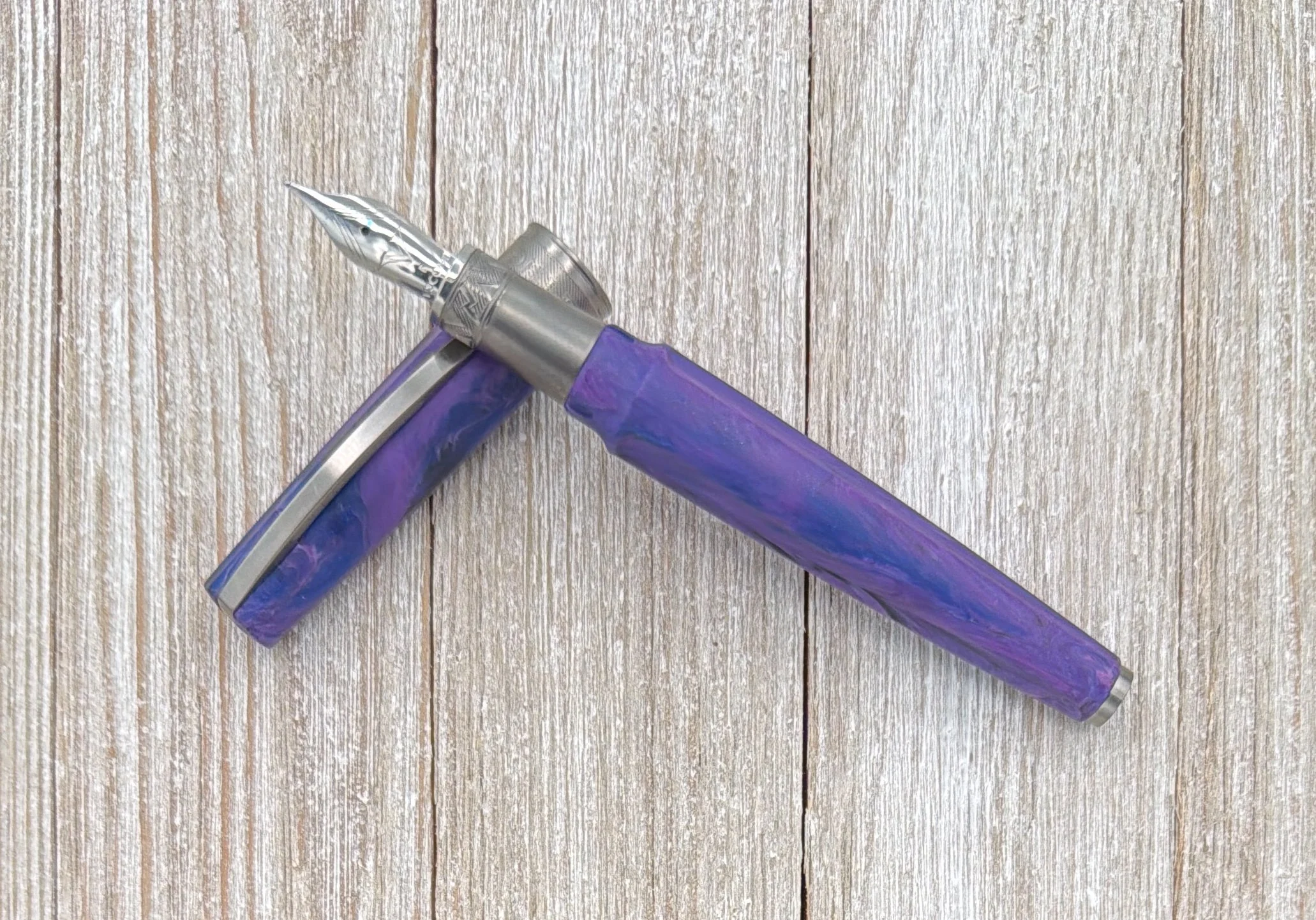
A few other points on the style of this pen that I enjoy. One, the finish is matte, which feels great. I wouldn’t care if it were glossy - there is a mixture of both in the series - but this finish works well with the hardware on the pen. Speaking of which, the Ruthenium trim is a perfect compliment to the Purple, Pink, Blue, and Black of the acrylic. I could hear Persephone herself calling to me to pick this one up because it looks so cool.
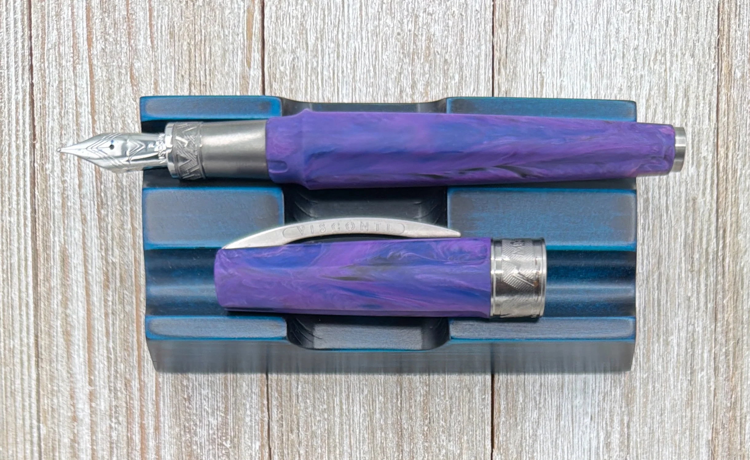
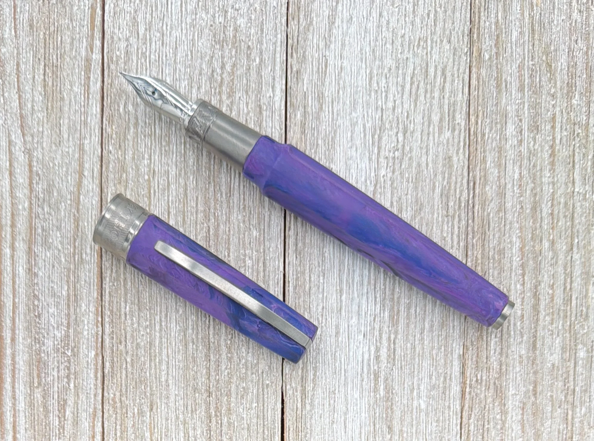
The fluting on the barrel runs cleanly through the pen from end to end, giving it a good tactile feel to go along with the matte finish. And finally, the famous (or infamous, depending on your preference,) Visconti clip looks to be at a lower profile than what I’ve seen on other models, but it could be a visual trick.
What’s not a trick of the Mirage Mythos is the nib. Only available in three sizes - Fine, Medium, and Broad - and in Steel, mine was perfect out of the box. I went with Fine, and it has been a clean, smooth writer, with a line width meeting my expectation of a European-sized Fine tip. Would I prefer Extra Fine? Sure, but I’m not going to tell the Queen of the Dead that to her face.
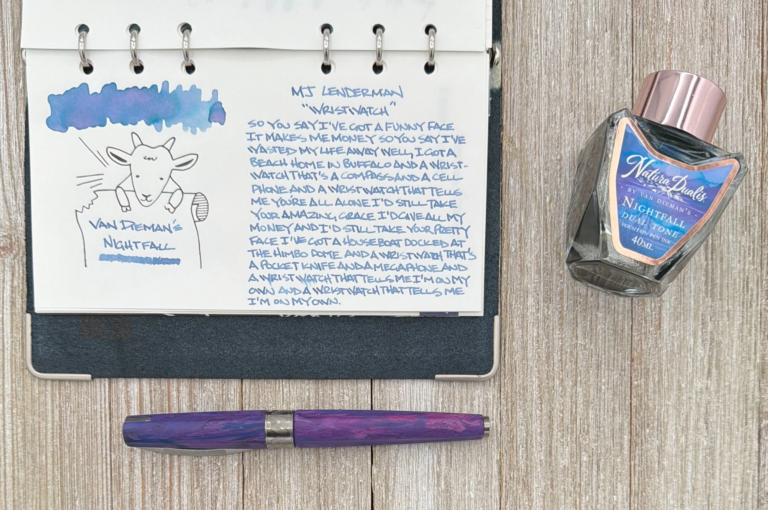
Van Dieman’s Nightfall on Canopus paper. I think this is the most proper representation of the ink color.
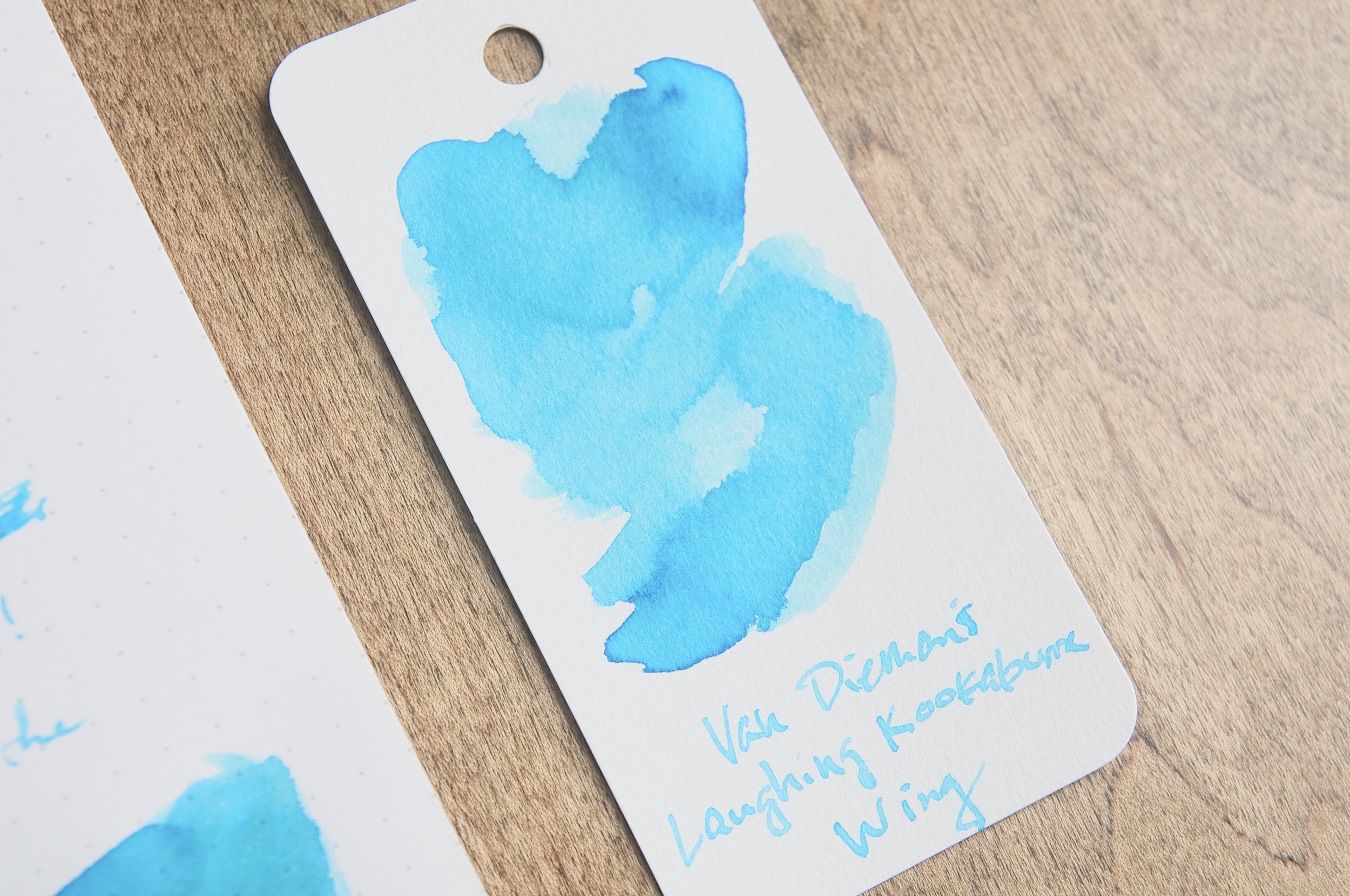
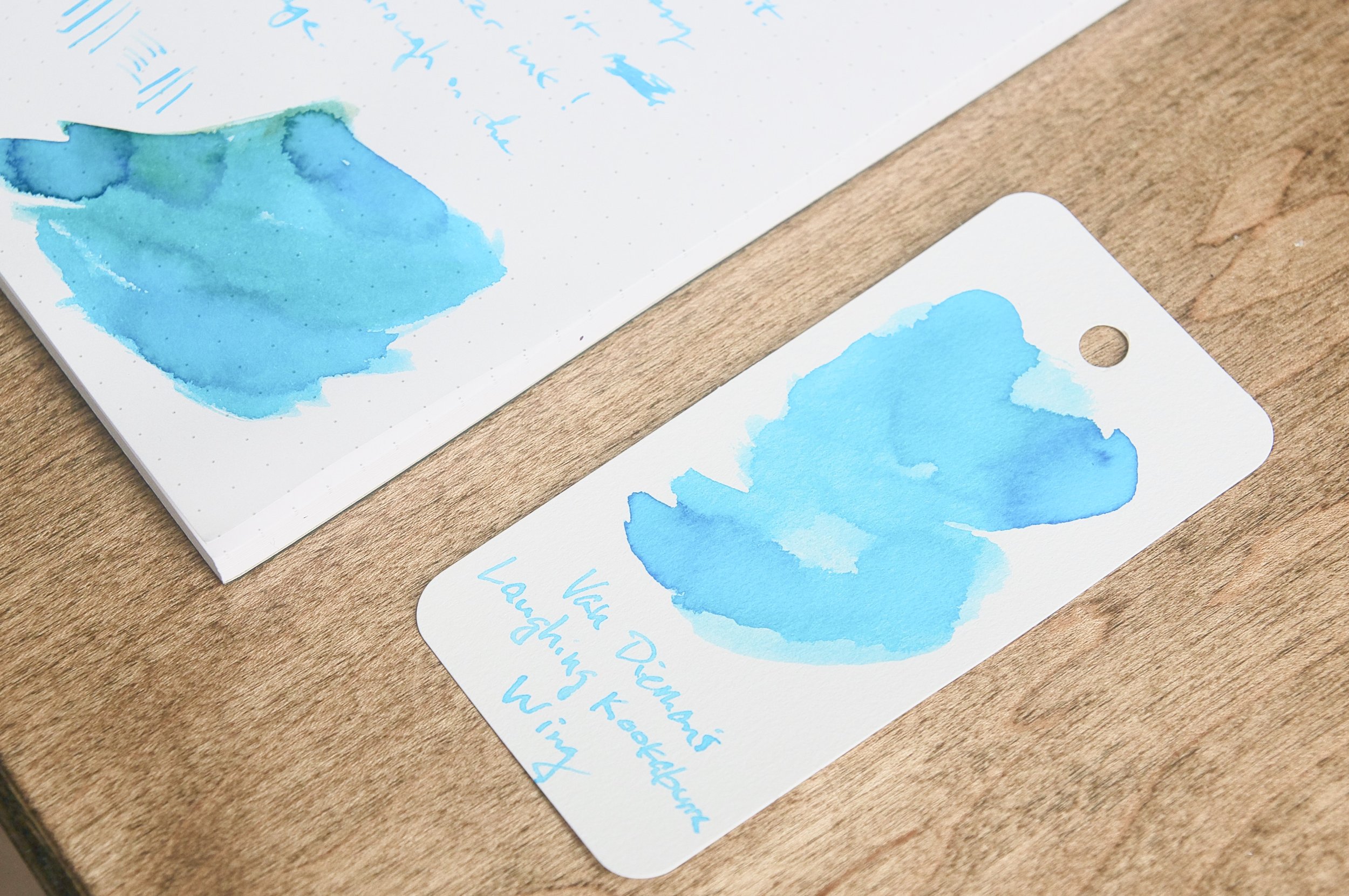
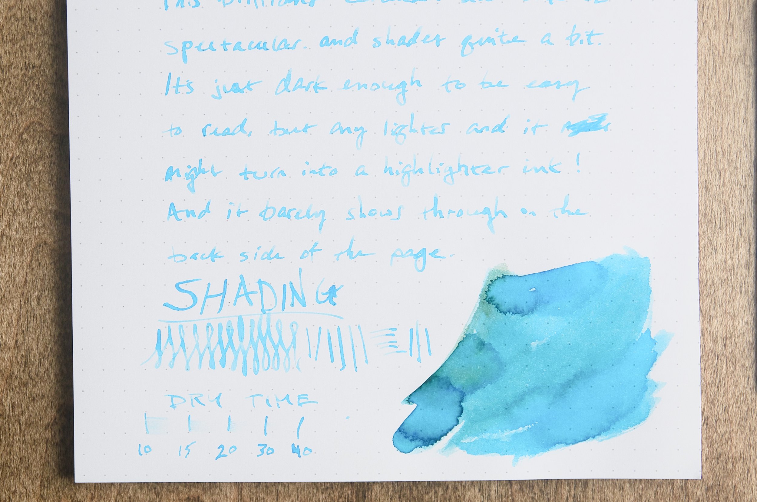
I inked this pen with Van Dieman’s Nightfall from their Natura Dualis dual-shading ink series, and it’s a perfect match. Well, mostly a perfect match, because on some papers - like Mitsubishi Bank - it turns bright Blue. That would be great for Athena, but I prefer the Purple for Persephone. Such is the life of a dual-shading ink!
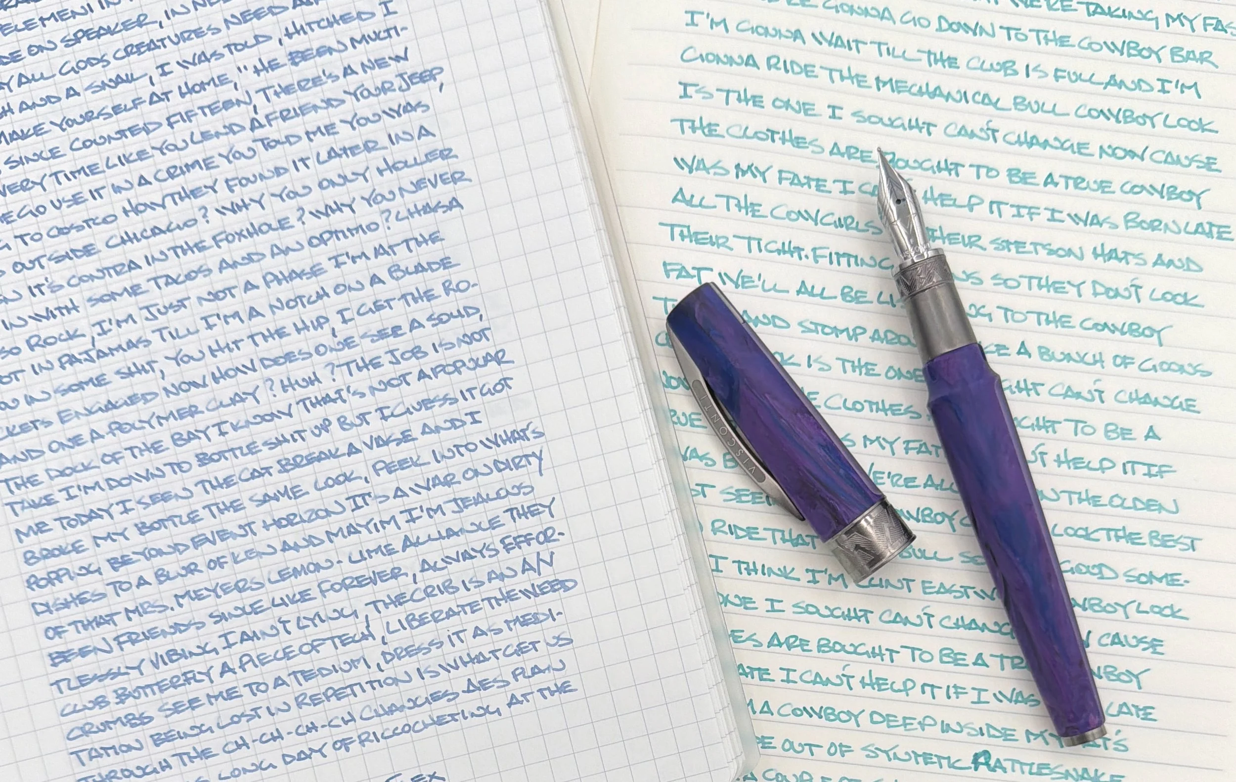
This is the same ink!!! The left is Kokuyo Good Tools, and the right is Mitsubishi Bank Paper.
The Mirage Mythos does have one questionable design element I can think of, but mostly it’s a pen of “considerations.” That means it’s great all the way around for me, but may not fit what you are looking for in a pen.
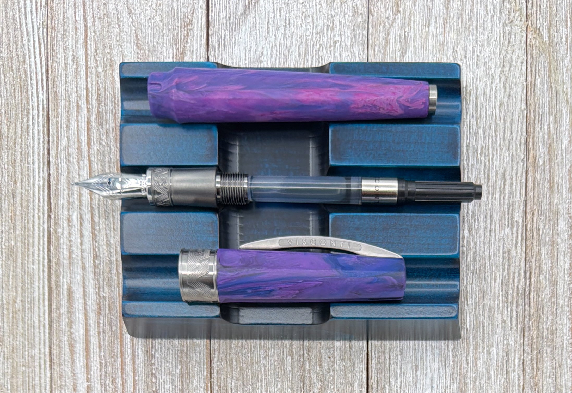
The design element I’m most curious about is the added band on the bottom quarter(-ish) of the grip section. It looks cool, and matches the aesthetic of the cap band specifically, and the hardware overall, but why? I think grip section designs need to be all or nothing. I like textured grips - like knurled or grooved - but a smooth area into a raised, rough area is an odd tactile choice.
I say all of this knowing that the grip doesn’t bother me, especially as a rough/knurled grip fan. I’m also a low-gripper and I’m all over the raised edge of this section and it doesn’t affect my comfort, but I’m not sure others will enjoy it.
Another consideration is the magnet cap. The attachment is strong enough to be protective, but light enough to be able to remove the cap without much force. It is also designed to magnetically post with the addition of a metal finial on the end of the barrel. It is a satisfying click, but if you are a fidgeter like myself, don’t keep clicking the cap on and off the front of the pen to prevent pressurized ink burping. I did get a few dots of ink on the nib from playing around too much, but nothing too dramatic.
At $215, the Visconti Mirage Mythos is priced fairly for the design and functionality of the pen. Is it expensive? Yes, but in the category where it resides it is a solid choice, and is far and away my favorite Visconti Steel nib pen. Hopefully they will continue to expand on this lineup in the future.
(This product was purchased from Dromgoole’s at a discounted price.)
Enjoy reading The Pen Addict? Then consider becoming a member to receive additional weekly content, giveaways, and discounts in The Pen Addict shop. Plus, you support me and the site directly, for which I am very grateful.
Membership starts at just $5/month, with a discounted annual option available. To find out more about membership click here and join us!


