Posts filed under Pilot

Pilot Custom Heritage 912 - Ranking the Nibs

(Kimberly (she/her) took the express train down the fountain pen/stationery rabbit hole and doesn't want to be rescued. She can be found on Instagram @allthehobbies because there really are many, many hobbies!.)

Last year, I was fortunate enough to get to test 14 of Pilot’s #15-sized 14K gold fountain pen nibs on the Pilot Custom 743, so I could see which ones would be my favorites. This year, I not-so-shyly asked Jaclynn Burleigh of Pilot USA if I could test their #10-sized 14k gold nibs in their Pilot Custom Heritage 912 pens and she said yes! The biggest difference between the 743 & 823 and the 912 & 742 is the size of the nib - the former utilizes the size 15 nib and feed while the latter takes size 10.

Side note: August sees the two of the largest US pen shows (DC and San Francisco), so you should take advantage of the opportunity to try all the nibs for yourself at the Pilot USA tables and let me know which ones are your favorites! But if you can’t, read on!

I have several pens with size 10 and 15 nibs, but I don’t have them all (nor do I want to, for now ;-) ) so I was curious to see if my favorites from last year’s 743 nib ranking would translate to the 912 nibs. It’s been a year since I’ve used some of these nibs in the 743 size, so I tried not to bias myself by re-reading last year’s article (I did rearrange them according to new rankings). I had limited time with these pens (as they needed to be sent back to Pilot so they can take them to different shows), which is a good thing because this would end up being a 10 page article, lol. I decided to follow a similar approach as in my last nib ranking, which was based off of the one the Bossman did in his Custom Heritage 912 writeup.

A few things to keep in mind:

  • I am right-handed but have a “stupid steep” writing angle - 75 degrees isn’t uncommon for me, while most people have a 45-50 degree angle.
  • I tend to write primarily in cursive, and occasionally in print (but not like the Bossman’s block print), typewriter font and calligraphy-esque styles like Copperplate and Italic. My go-to nib size from any maker/country/region is Medium. I also prefer broader nibs as well as stubs/italics. I rarely reach for Extra Fine, especially since I own very few of them.
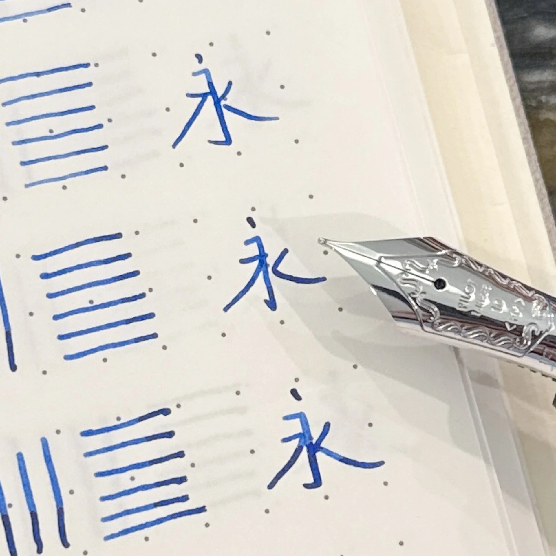
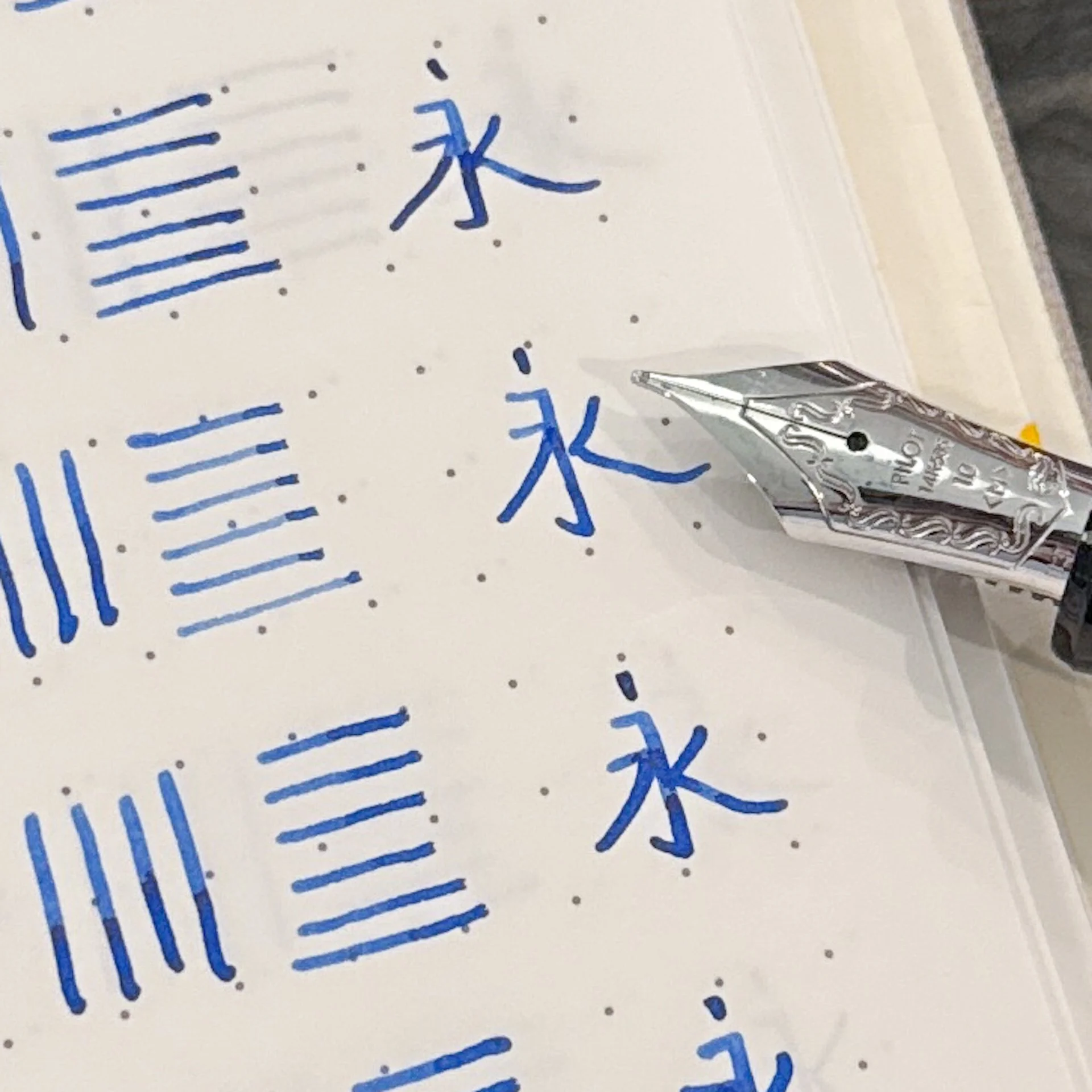
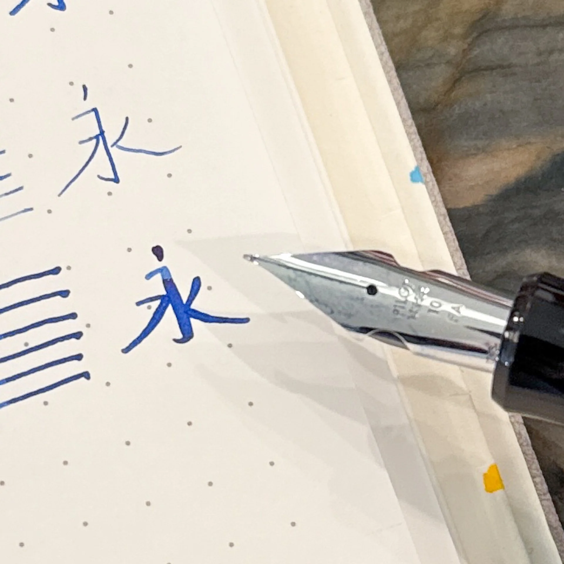
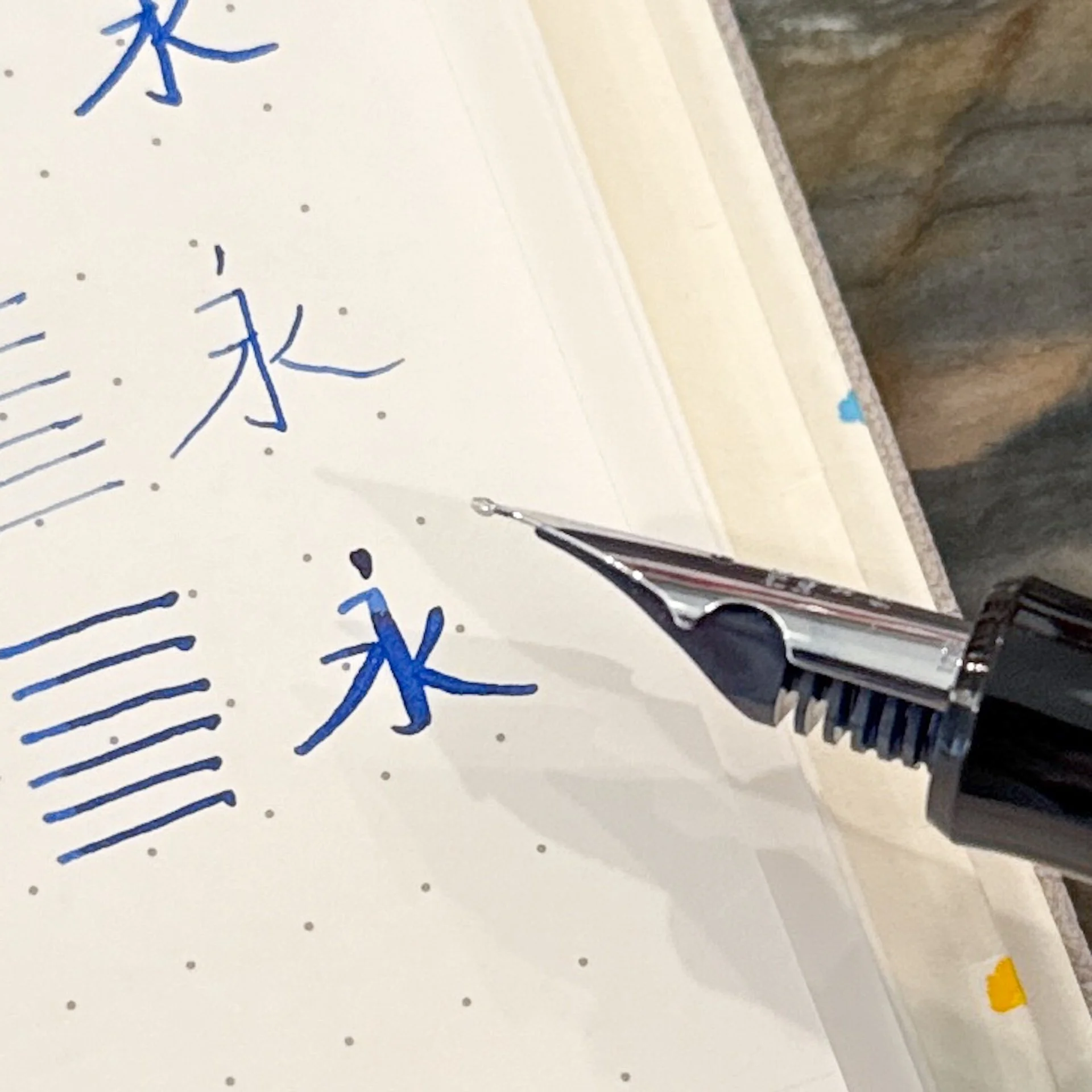
  • Pilot asked that I dip these pens instead of inking them up, which I don’t think is the best way to test the flow in the nibs, but it’s enough for short writing samples. I dipped, then dragged the tip across the ink vial so there wouldn’t be blobs of ink on the page.
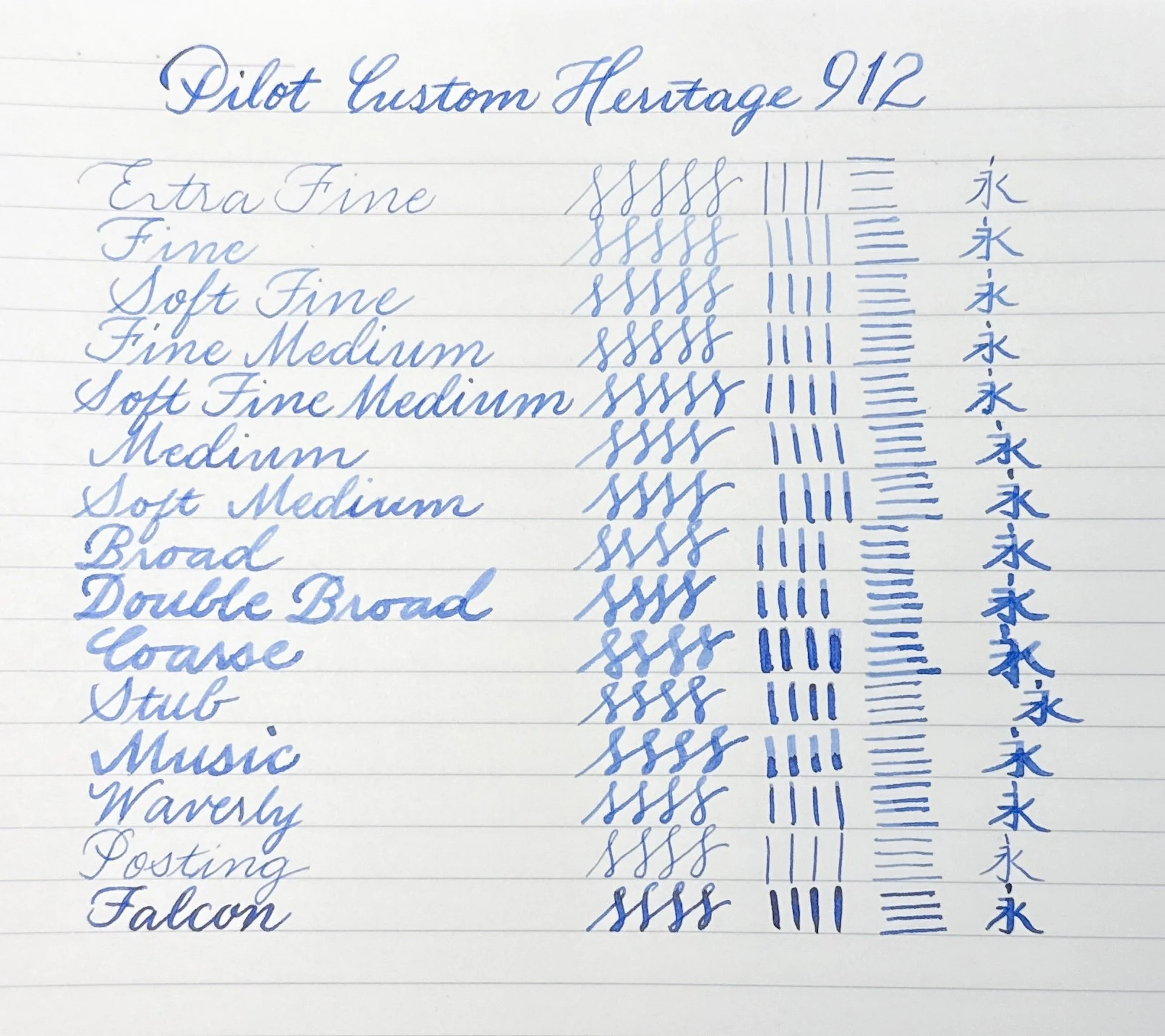
  • The first writing sample with all the nibs was done in the Maruman Bodoni A5 Notebook, while the others were written in an Endless Recorder with 68 gsm Tomoe River. I used a sample of Pilot blue ink.
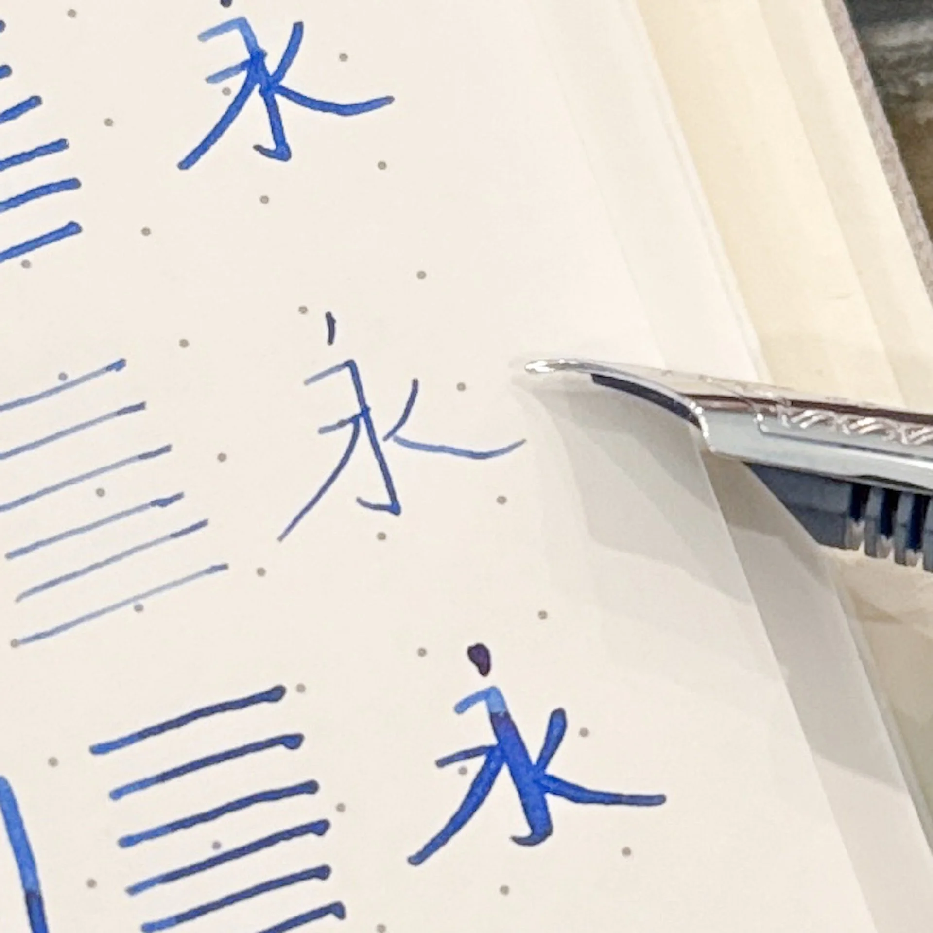
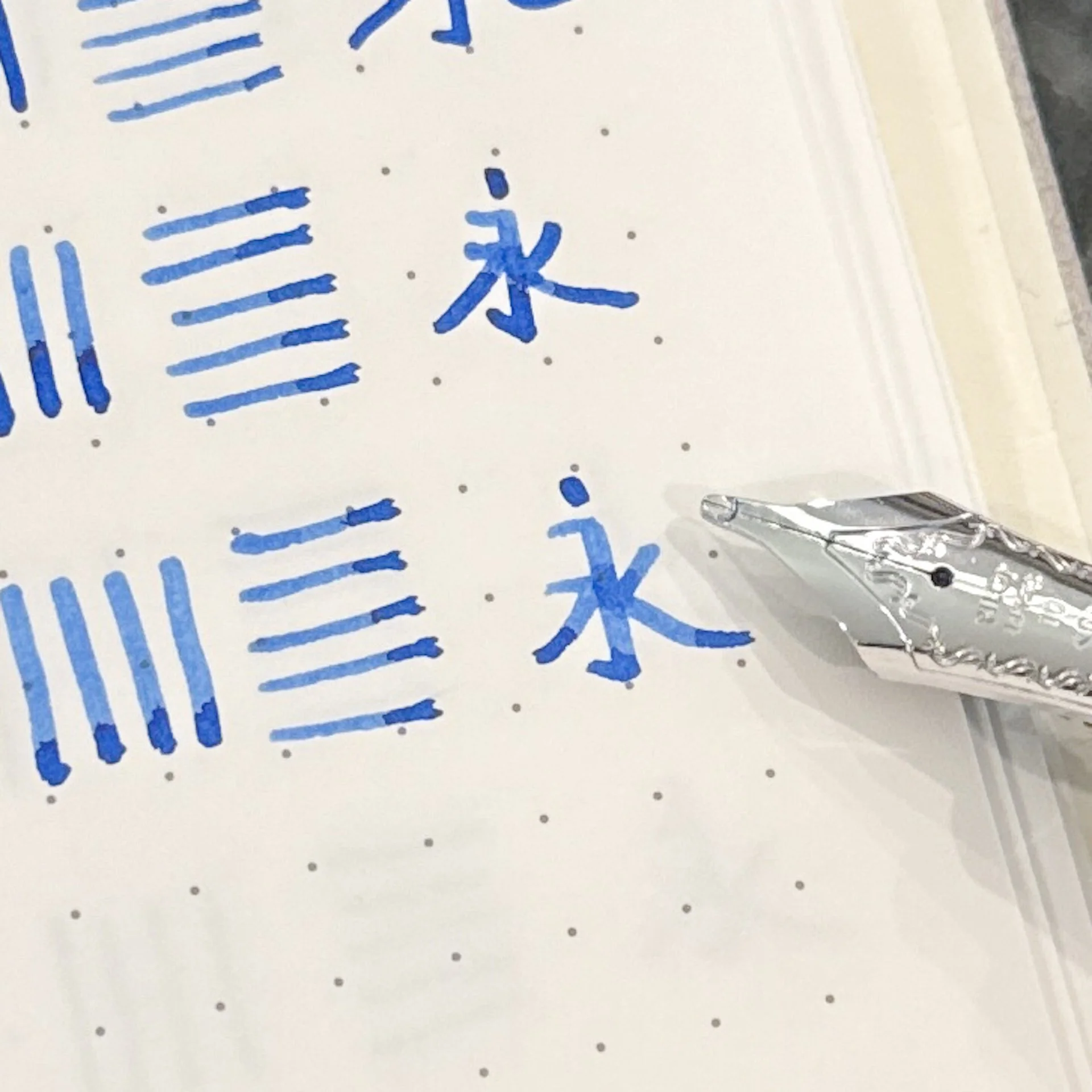
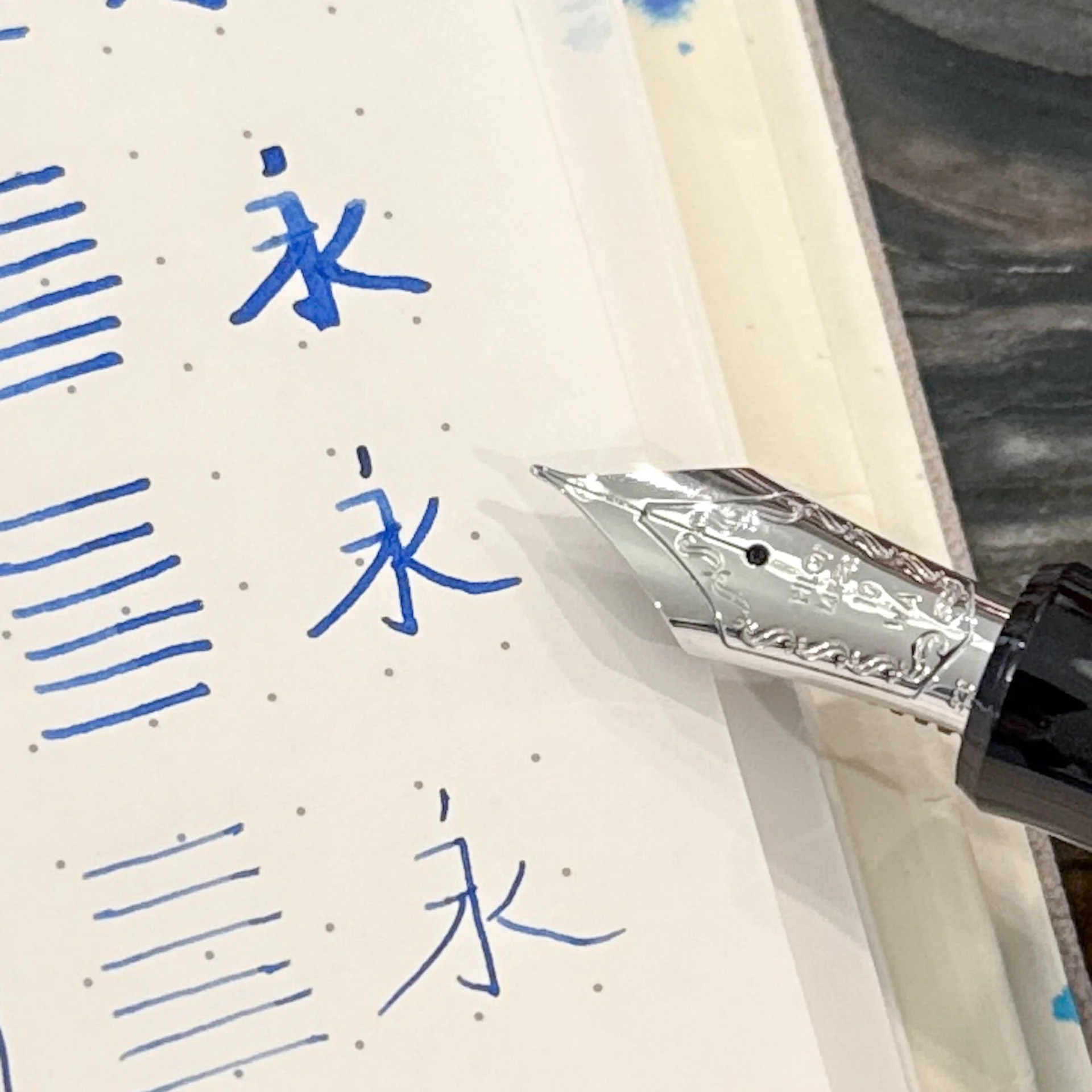
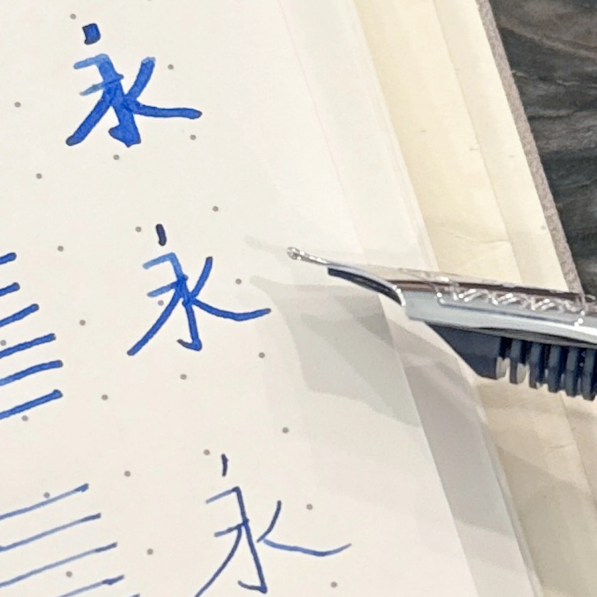
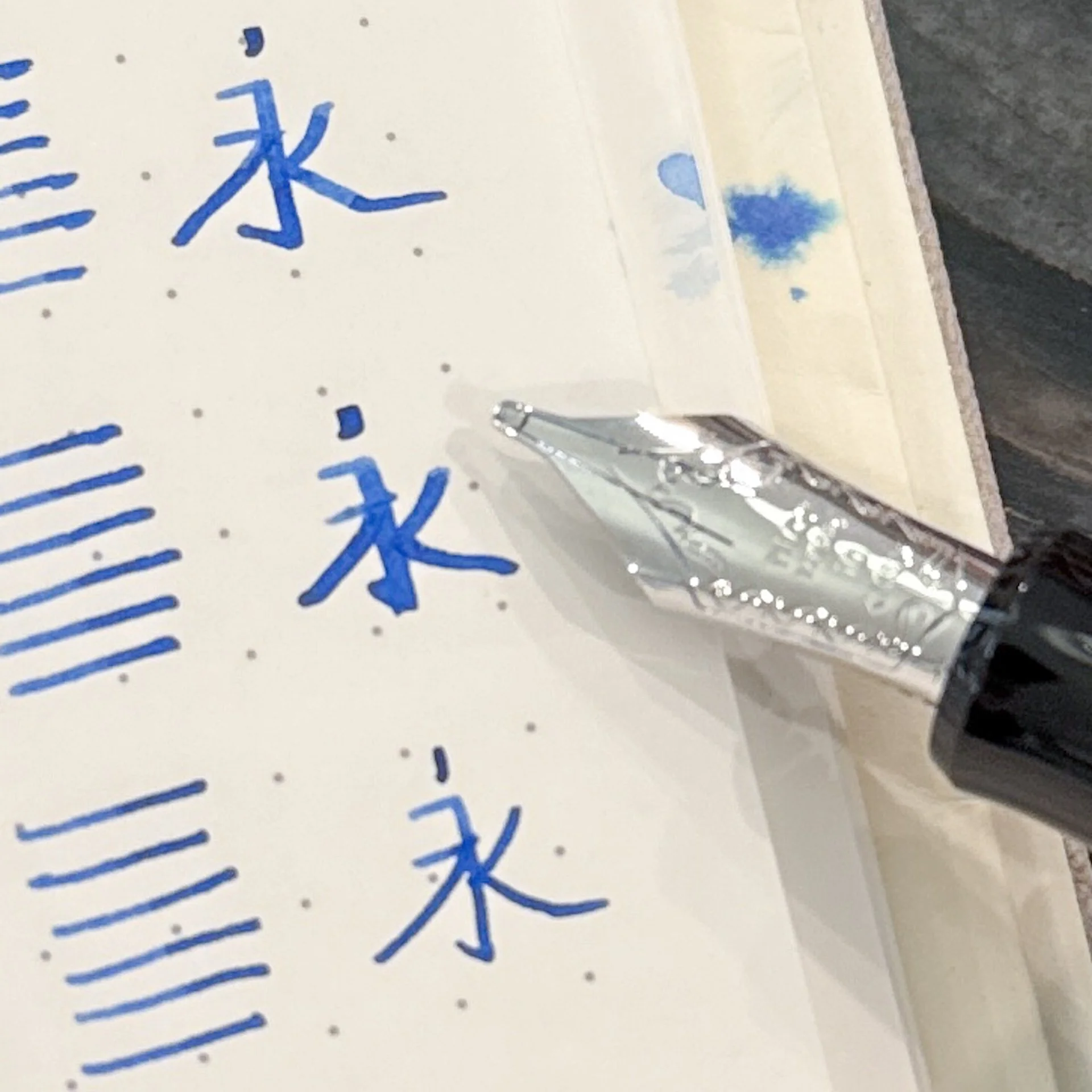
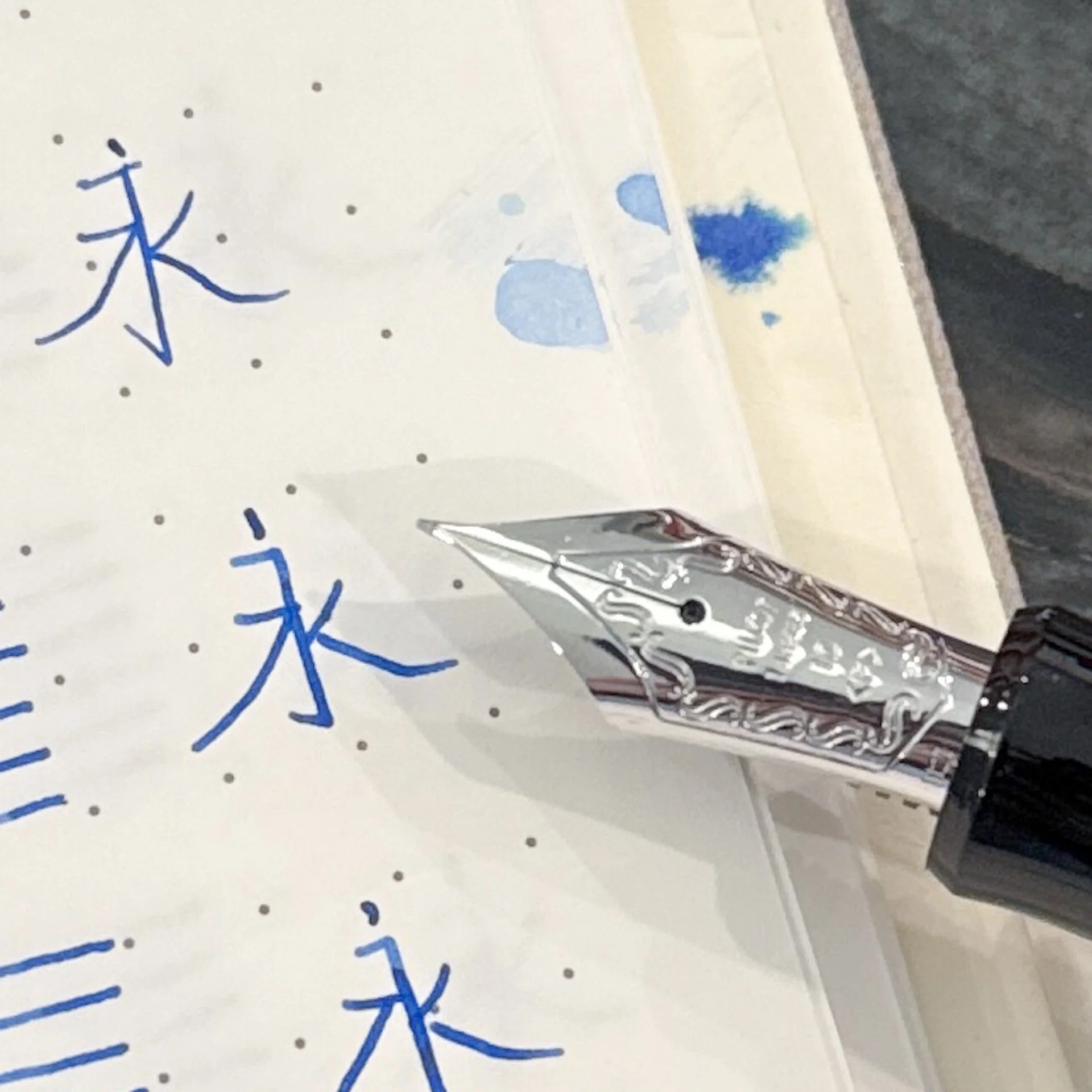
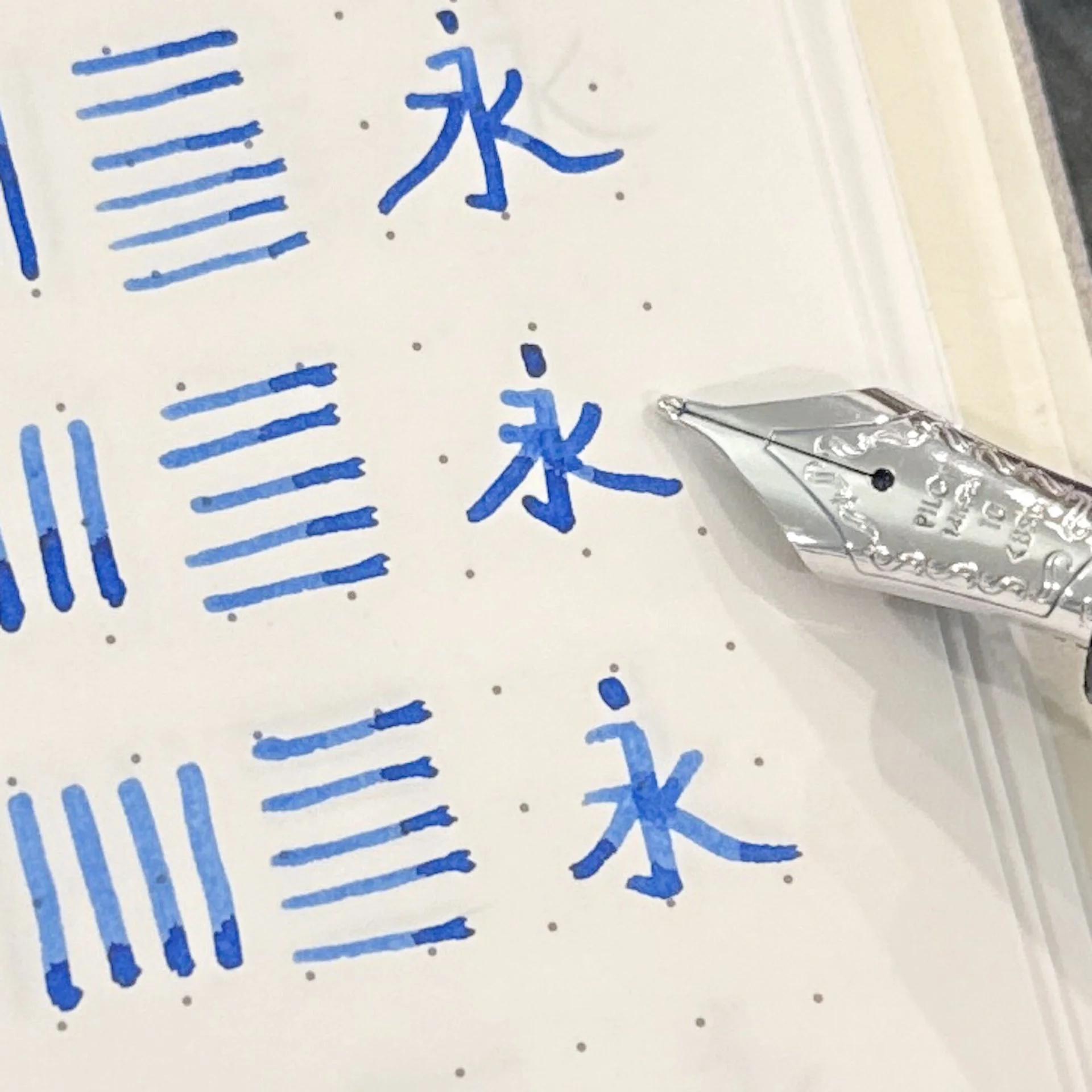
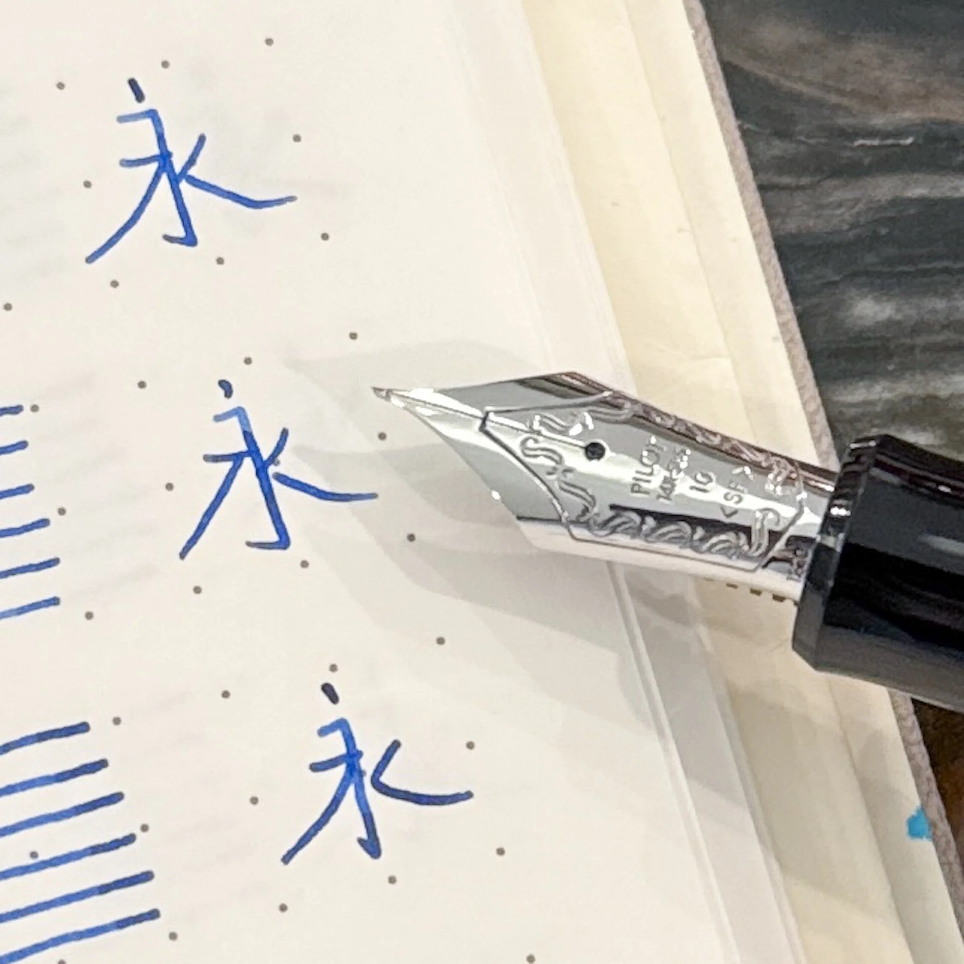
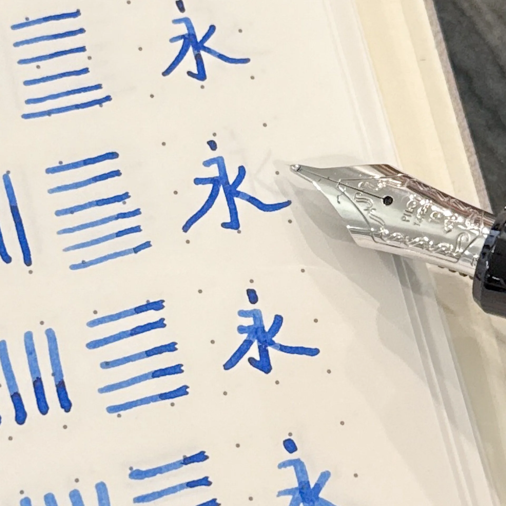
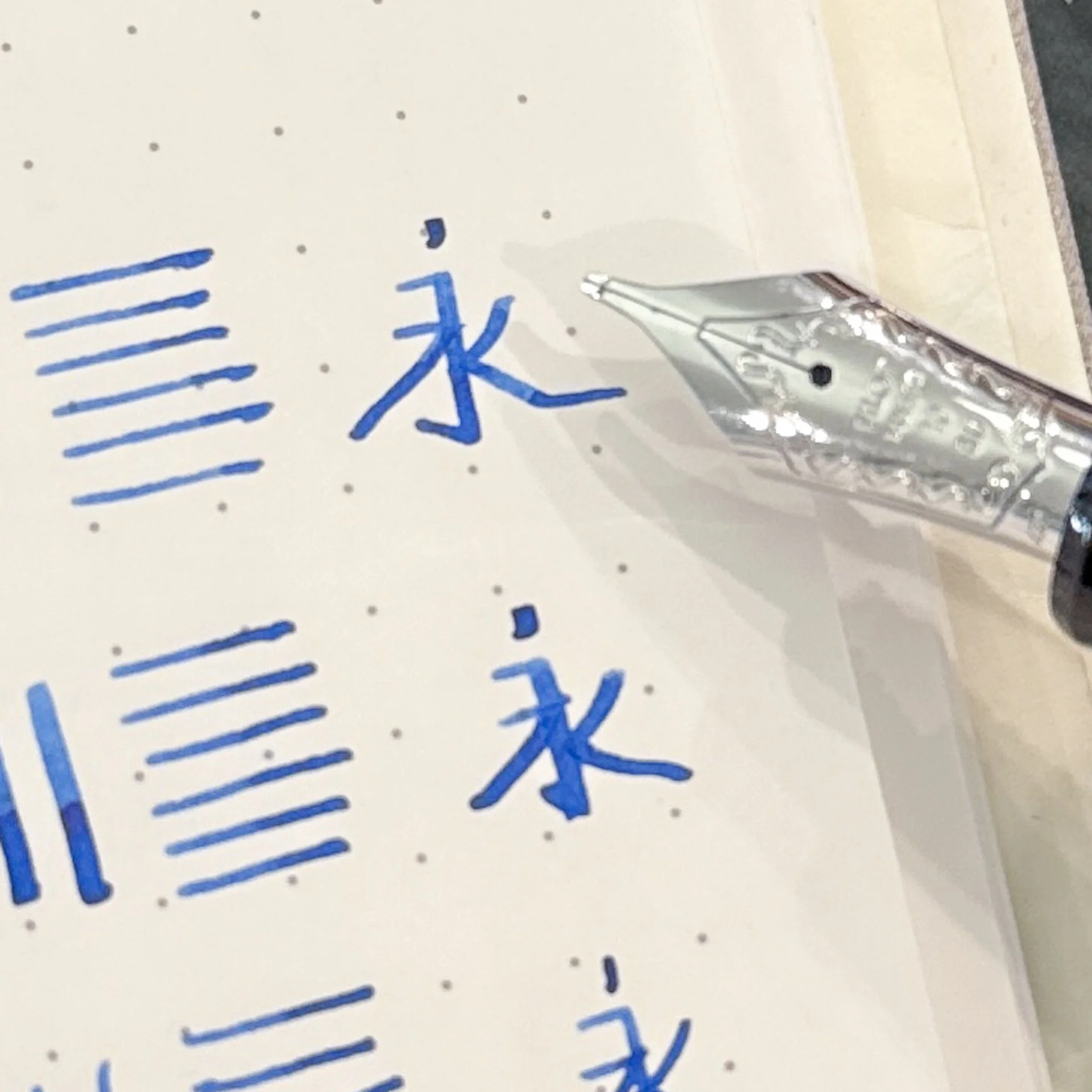
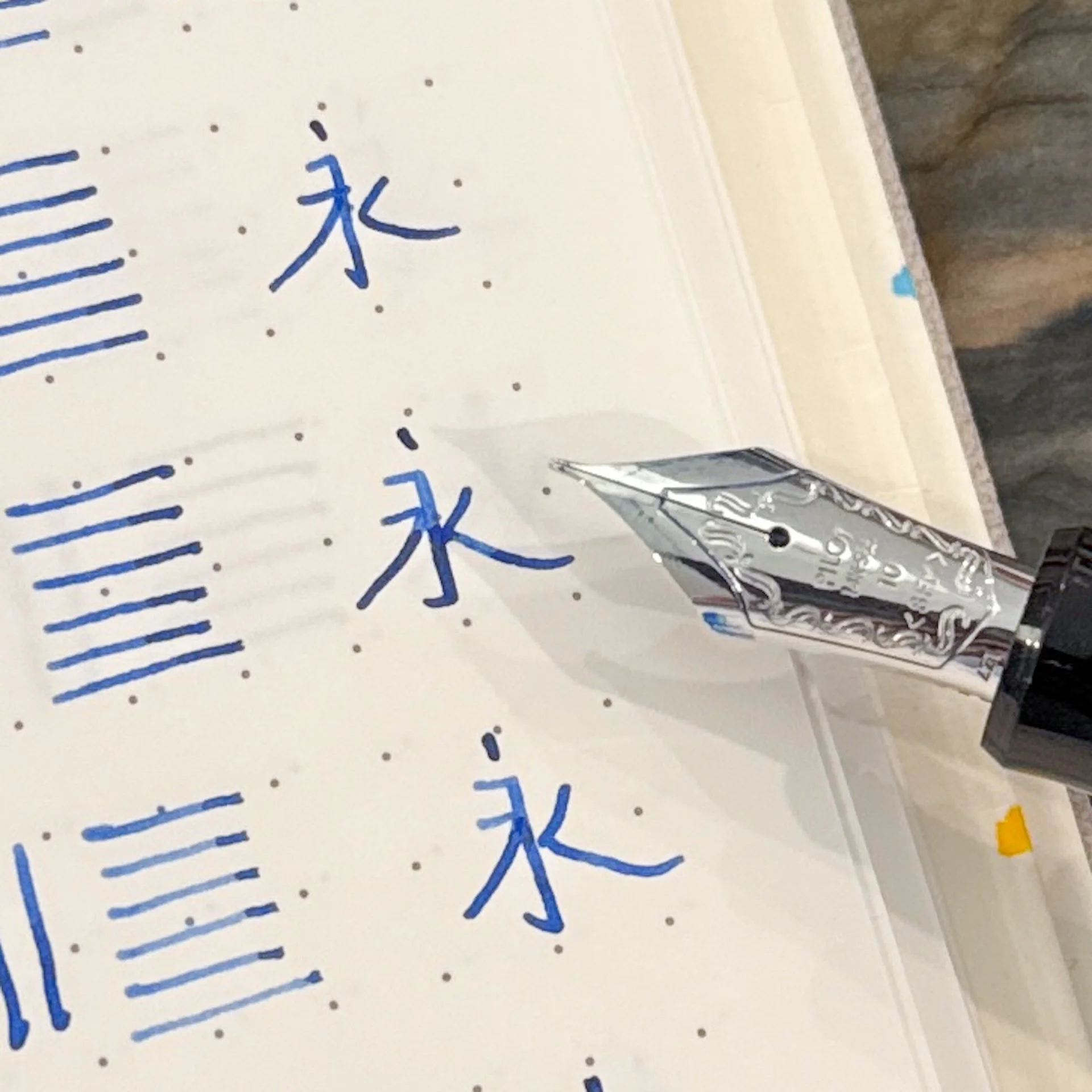
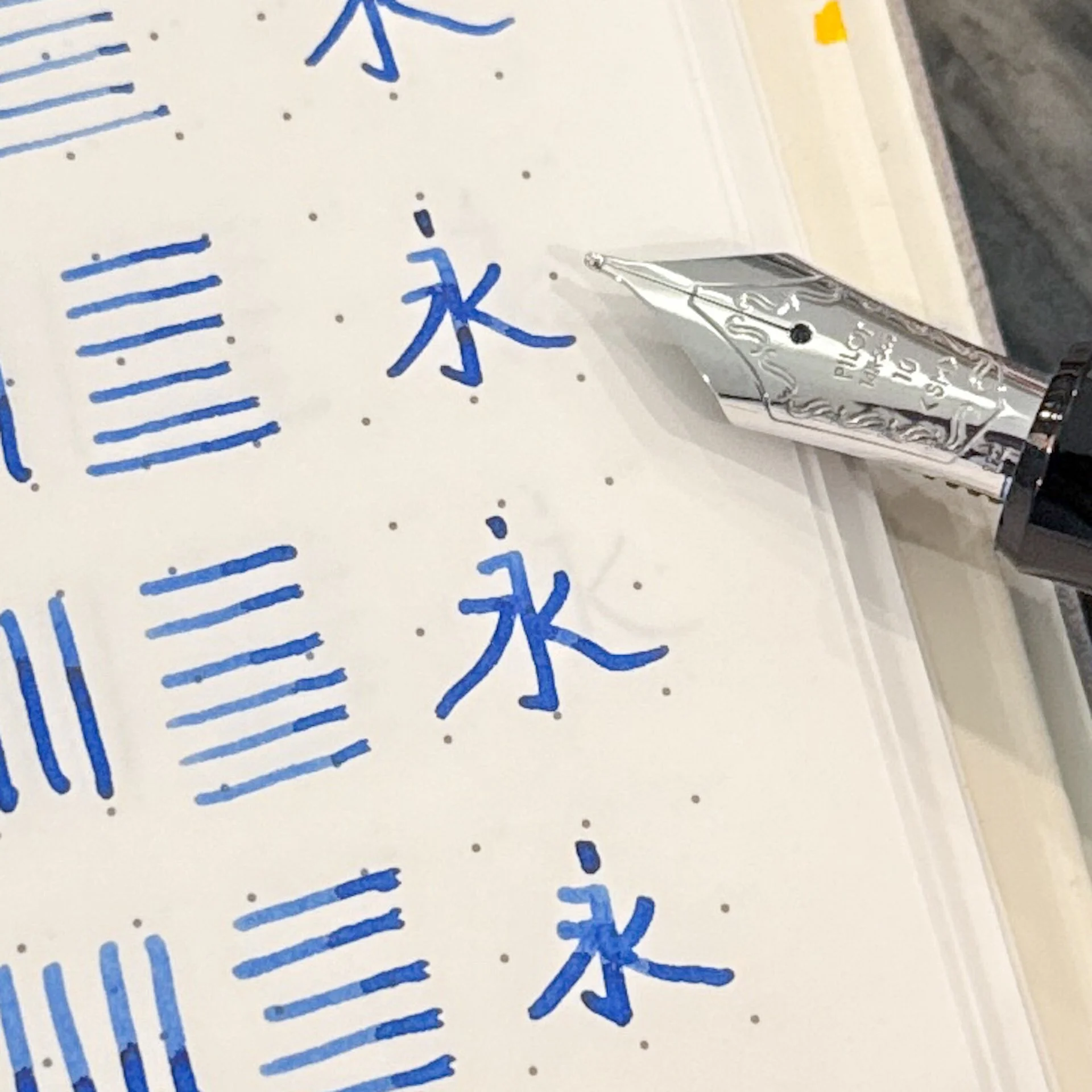
  • My Chinese teachers from high school would be shuddering, but hey, it’s accurate, just not beautiful. The character means “always” or “forever”.
  • Thank you Pilot USA for sending these 912s so I could do a nib showdown!
  • Last but not least, I mostly followed Brad’s formatting but I did not read his ranking (nor mine from the 743 ranking) so I wouldn’t be biased.
Pilot 912 Fountain Pen

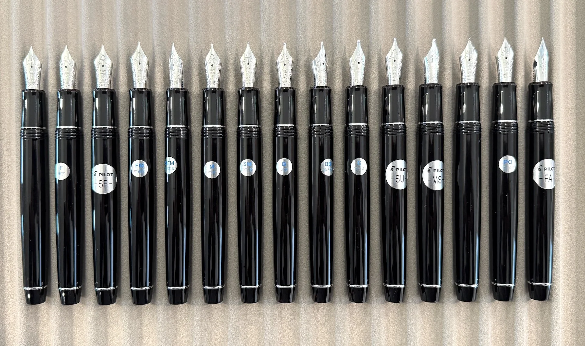
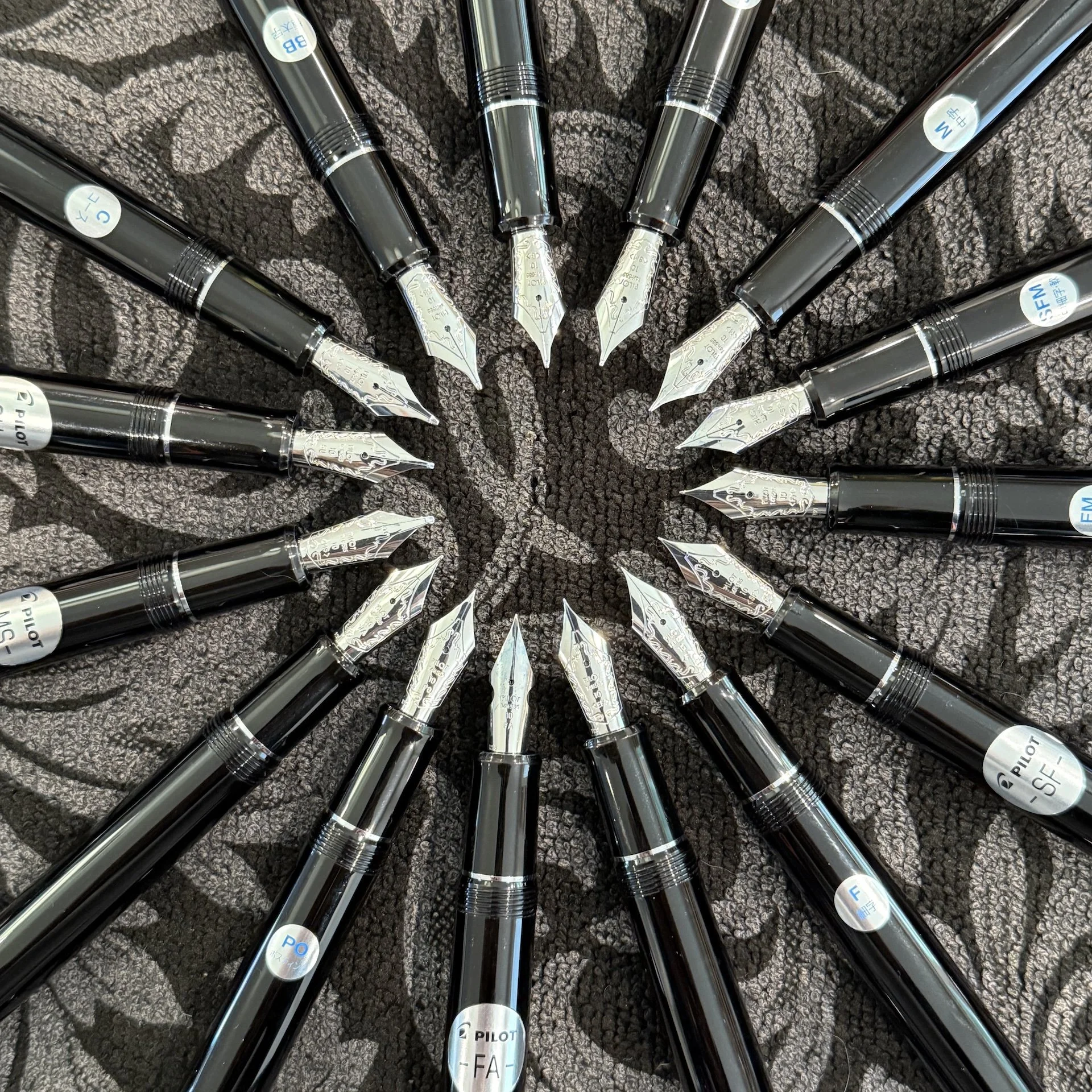
My aging eyes were so happy to be on #teamsticker even if the stickers didn’t all align with the front of the nib.

Based on writing samples of all of these nibs, do you think you can tell which ones I will like more than others? (Bodoni notebook)

Writing sample of the “regular” nibs on Tomoe River 68 gsm.

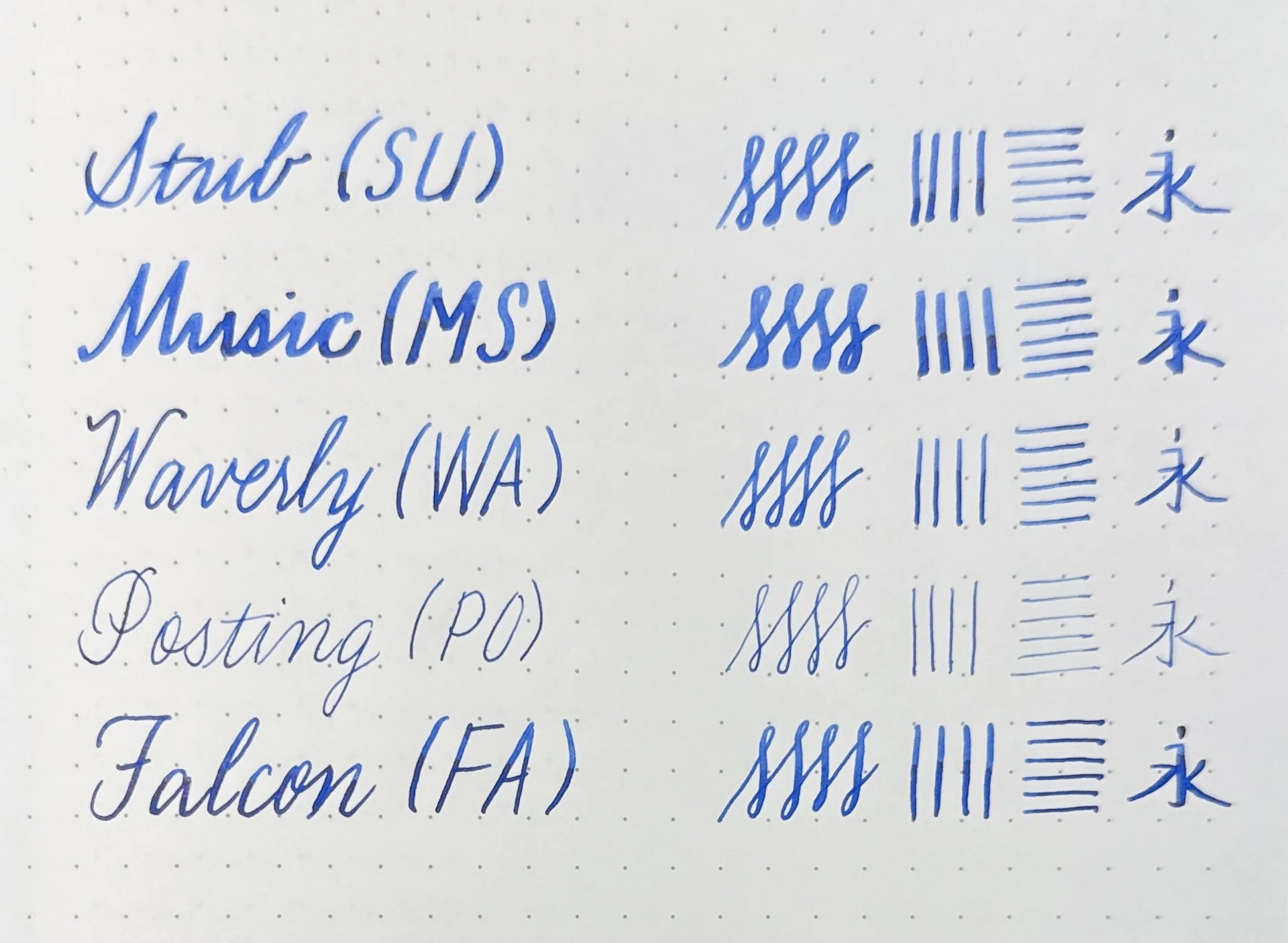
Specialty nibs - Stub, Music, Waverly, Posting, Falcon/FA.

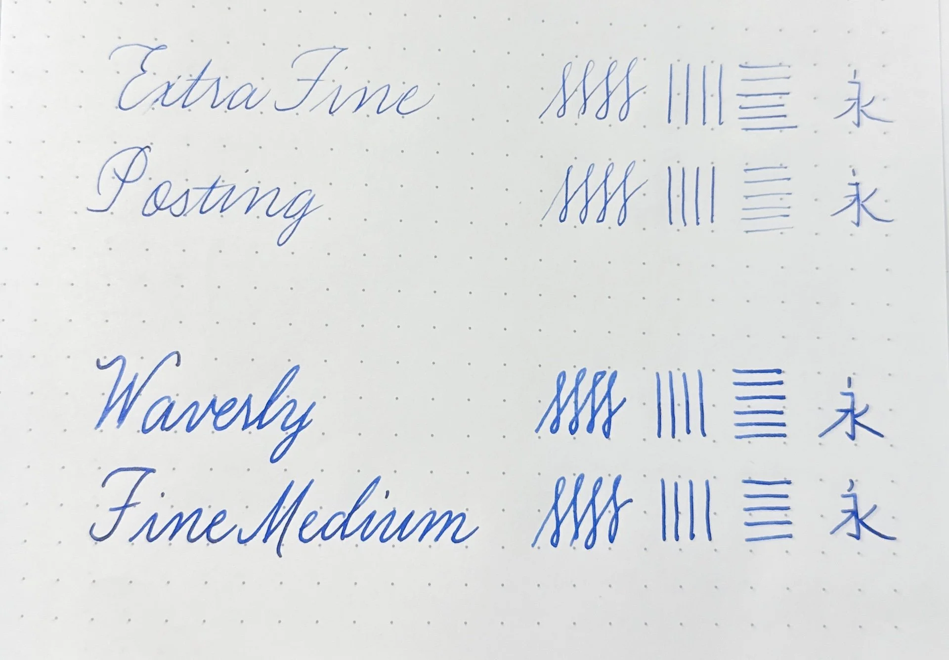
Line width comparison of the Extra Fine & Posting nibs, and the Waverly & Fine Medium.

15 - Extra Fine

Admit it, you knew this was coming. I don’t hate EF nibs, I just really don’t prefer them most of the time from any brand. That said, I was expecting to like this more than the PO nib because I remember disliking the size 15 PO the most. For some reason, that wasn’t the case here. The EF gave me more feedback than I liked, so it was my least favorite of the nibs.

Pilot 912 Extra Fine

14 - Posting

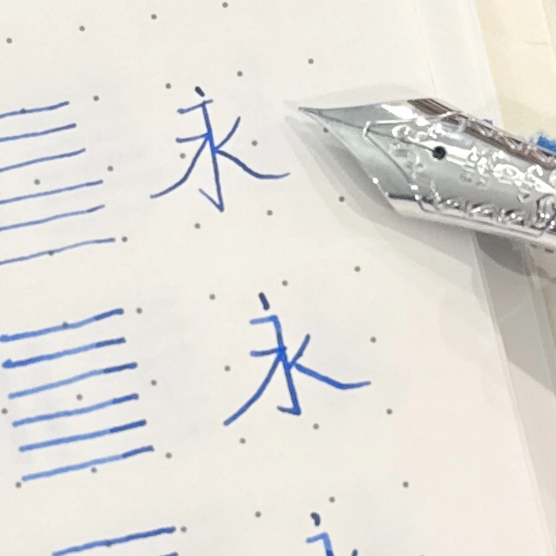
The size 15 Posting nib was my least favorite to use because it felt like I was writing on the top of the nib, with it almost curving backwards on the paper. The original idea behind the nib was to write on postcards, which had limited space and therefore the extra fine line allowed you to fit more words. The angle of the nib also made it very stiff, unlike their regular and soft nibs, so you could also write on multiple sheets, like with carbon paper (does anyone remember what that is?) or forms in duplicate/triplicate. I’m not sure if it’s because the nib is smaller but this wasn’t as uncomfortable to write with, and while it was still uncomfortably fine for me, I liked it more than the EF>

Pilot 912 Posting PO
Pilot 912 Posting PO side

You can see the downturn of the Posting nib, which gives it a firmer writing experience as well as a drier line.

13 - Coarse

You would think that I’d love this mega broad line because I love showing off inks, but like its size 15 sibling, this nib lays down quite the Sharpie line! It gives a smooth writing experience but since I don’t have large handwriting, this isn’t a very practical nib. This would still be a great platform for a nib grind, but I’d probably get a Broad or Double Broad for grinding before I’d get the Coarse.

Pilot Custom 912 Coarse

Of COARSE this is a fun nib if you need a thicc line.

12 - Waverly

Unlike the Posting nib, the Waverly was designed with a slight upturn on the tip of the nib, which makes it much more pleasant for folks who “push” their nibs, like lefties. As a rightie, I didn’t really notice the difference as it still wrote with a smooth, slightly broader than Fine Medium line. I’m sure I’d rank this much higher if I was a leftie, but since I’m not, I’d pick any of the remaining nibs instead of trying to hunt this one down.

Pilot Custom 912 Waverly

The Waverly’s upturn is more noticeable from the side.

11 - Music

The Music nib was not offered in the 743, so I was not able to test this last year. The writing experience is very stub-like, wider down strokes and narrow side strokes. The down strokes are wider than the Stub’s. Similar to the Coarse, its lines are a bit too thick for my writing, so it’s less practical for me, but I do like the line variation, which is why it gets a higher rating that the Coarse.

Pilot Custom 912 Music

10 - Fine

The Fine gives a nice writing experience with a fine line. As I mentioned earlier, I like laying down ink and this Fine just doesn’t give me as much as I’d like.

Pilot Custom 912 Fine

9 - BB / Double Broad

I liked the not-quite-as-insane width of this nib compared to the Coarse but it is still too broad for my everyday use. As with the Coarse nib, this would also be a great canvas for a nib grind. Even though this is impractical for me, I ranked it higher because I’d picked this over a Fine if I had to choose between the two.

Pilot Custom 912 BB

This BB has one too many Bs for me.

8 - Soft Fine

I liked this more than the Fine because the slight bounce from the softer nib gives it an almost imperceptibly wider line and ever so slight line variation (more from the release of pressure than from adding pressure). That said, it’s still a bit too fine for me.

Pilot Custom 912 Soft fine

Soft Fine, you’re finally number nine! (it was #10 last year.)

7 - Fine Medium

The top seven are much harder to choose from, so I used two criteria to help me decide: (1) what would be a better everyday writer for me and (2) what nib would I pick to buy next.

This one was REALLY hard for me to put in this spot, but having owned this nib in both the size 10 and 15 sizes, I have come to accept that while it is a great writer, it is, say it with me, just a bit too fine. It is a very practical size for every day but this inkophile wants to lay down more ink, and go through fills quickly and this FM is too fine to do that.

Pilot Custom 912 Fine Medium

6 - Medium

Yep, my go-to nib size, Medium, barely made the top half of this list! It is such a nice and smooth writer that it’s one of my favorites, but I have enough Mediums so it barely made the top half of this list.

Pilot Custom 912 Medium

Medium is 7th because I’d rather get one of the other remaining nibs first, it’s not cuz I don’t love you.

5 - FA or Falcon nib

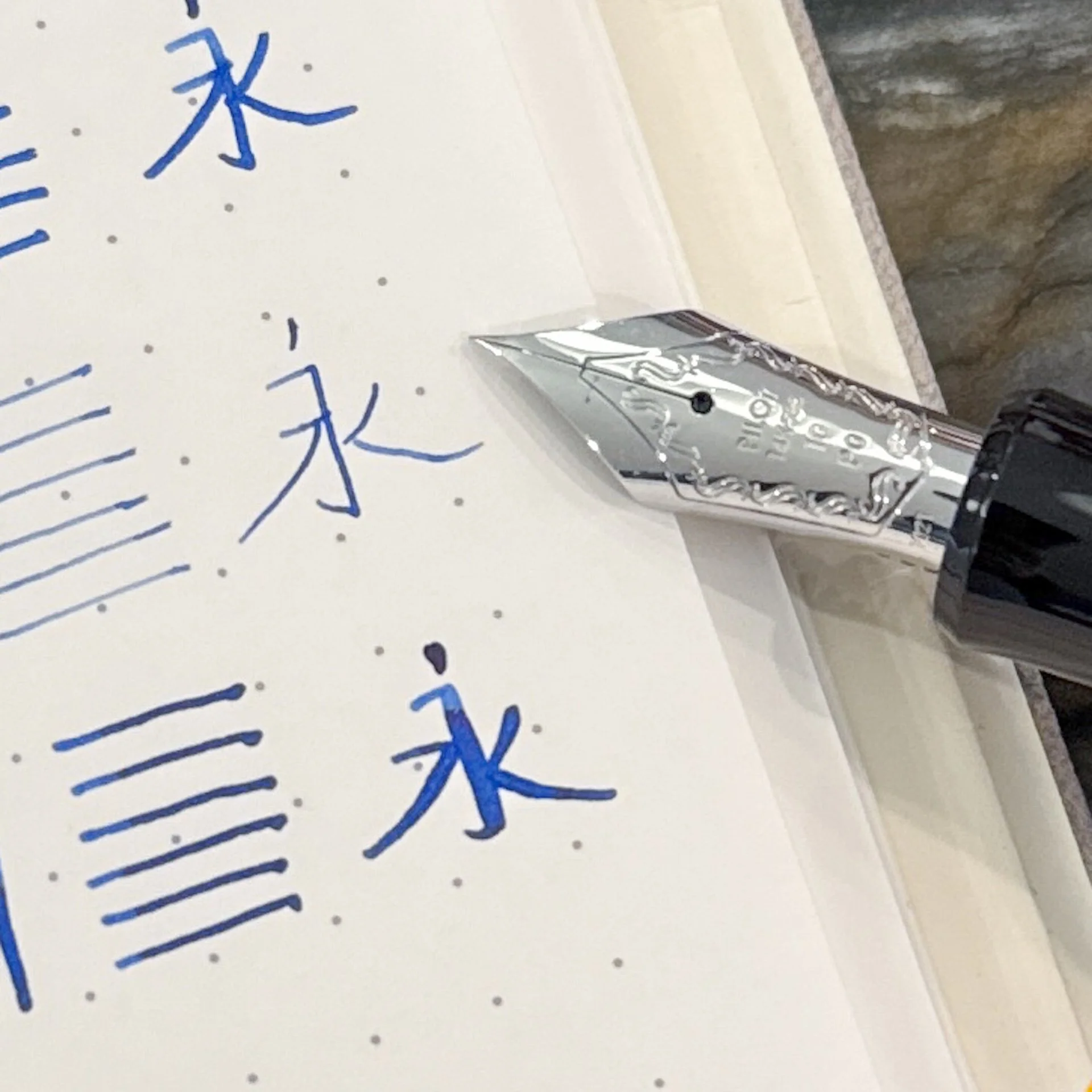
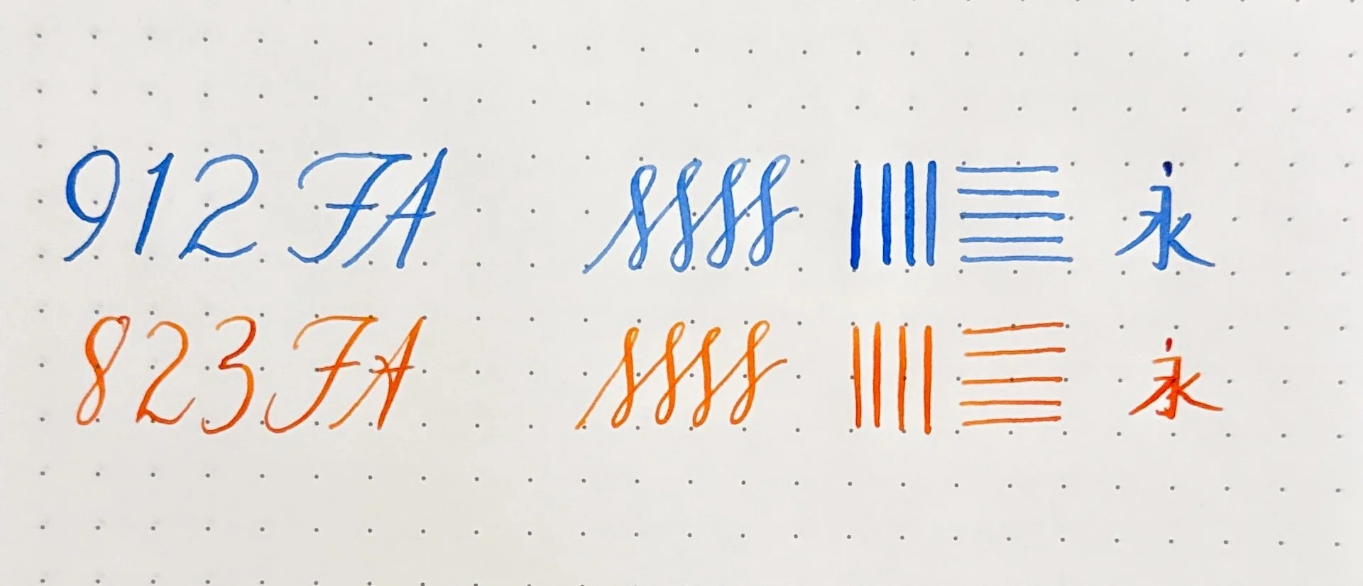
Not to be confused with the Falcon pen (aka Elabo), the FA nib has cutouts on the side of the nib that gives it the ability to flex a bit. It is not like vintage flex, more like semi-flex. The size 10 FA is actually softer/flexier than the size 15 FA, and gives a bit more line variation than the 15. I have both and prefer the 10 FA because I do like to really slow down and write in a Copperplate-like style when using it. Even though I already have one, I wouldn’t turn down another FA if it were to cross my path, but having both means it’s lower in the list for me.

Pilot Custom 912 FA

You can see the cutouts from the top of the FA nib.

A better view of the side cutouts.

#10 vs #15 size comparison.

Writing samples of the 912 FA vs the 823 FA, inked up with the Bossman’s Fire on Fire on Fire! You can see that I can get slightly wider down strokes with the 912 FA vs the 823 FA.

4 - Broad

I am shocked that I still don’t have any Broad nibs in either the 10 or 15 size, though I do have it in a VP nib and I love it. This would be a great ink layer-downer nib without having an overly broad line and as such would be a great addition.

Pilot Custom 912 Broad

Broad. It me.

3 - Stub

As someone who occasionally likes to do italic calligraphy, as well as write cursive with stub nibs, I was really curious to see how Pilot’s stub nib would feel. I absolutely loved writing with it! It is a fairly smooth stub, unlike Pilot’s sharper steel nibs like the ==CM== (Calligraphy Medium) which are more like italics. The only reason this is ranked third is because this wouldn’t be as practical for me as an everyday writer, but it’s definitely high on my list of nibs to get next.

Pilot Custom 912 Stub

Stub, where have you been all my life?

2 - Soft Fine Medium

I ranked the Size 15 SFM as #1 and I already knew that I loved the size 10 SFM since I’ve had it for several years now. Going into this test, I wondered how it would rank against the Soft Medium and while I still love this nib a lot, if I had to choose between a SFM and SM, I’d choose the latter. The slight softness of the nib makes the line a bit broader than the regular FM, which means it is the perfect width.

Pilot Custom 912 Soft fine medium

Soft Fine Medium, I still love you, even if you’re #2.

1 - Soft Medium

I don’t have this nib and I want it. I love the slight bounce that this gives over the Medium, but it also makes the line a touch wider too. I could have easily swapped the SFM and SM spots but this one ranked higher because I don’t have one. Yet.

Pilot Custom 912 Soft Medium

Soft Medium, I need this so much.

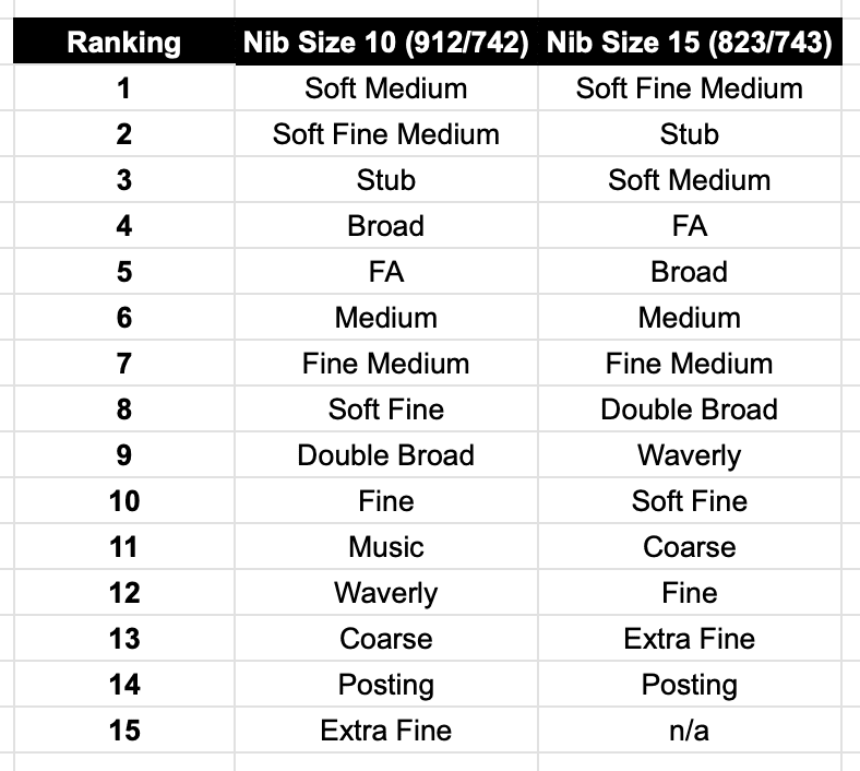
How did the size 10 nibs do compared to the size 15 nibs?

Ranking:

Pilot Nib Ranking

There was a bit more movement in the bottom half of the rankings versus the top half, but I was surprised that I liked the Waverly and Coarse nibs more last year than I did this year.

And there you have it, my ranking of the size 10 nibs from the Pilot Custom Heritage 912 collection! We already know that the Bossman and I don’t agree on most nibs and this is no exception (how dare he rank my #1 Soft Medium as #13??). That’s the beauty of this rabbit hole - we all like different things and that’s ok!

It’s the circle of life, I mean, nibs!

Oh, one more thing, this article also marks my 4 year anniversary of writing for The Pen Addict! Thank you so much to Brad “The Bossman” Dowdy for taking a chance on me four years ago and you still put up with the longest articles ever (barely over two thousand words in this one!). And an even bigger thank you to all of you for reading, commenting and encouraging me - it really means a lot! Can’t wait to see what the next year brings!


Enjoy reading The Pen Addict? Then consider becoming a member to receive additional weekly content, giveaways, and discounts in The Pen Addict shop. Plus, you support me and the site directly, for which I am very grateful.

Membership starts at just $5/month, with a discounted annual option available. To find out more about membership click here and join us!

Posted on July 31, 2025 and filed under Pilot, Nibs, Fountain Pens, Pen Reviews.

Pilot Vanishing Point with Special Alloy Nib Review

(Kimberly (she/her) took the express train down the fountain pen/stationery rabbit hole and doesn't want to be rescued. She can be found on Instagram @allthehobbies because there really are many, many hobbies!.)

As a self-professed Pilot Vanishing Point (or Capless) fan, I was a little surprised at myself for not owning one with the “Special Alloy” nib, which I will be referring to as “steel” even though I don’t know for certain what alloy they used. I think “old me” had fallen into the trap of gold must be better than steel, especially since all the VP/Decimo/Fermo/etc pens had gold nibs, so I never really gave it much thought. At one point, I wanted to have Hiroko Makino of Bokumondoh do some urushi & raden work on a VP for me, so I went and ordered this steel VP because it’s significantly cheaper than a gold one, and I didn’t have the time to wait for a deal on the secondary market. I figured I could always swap in one of the other gold VP nib units later. I opted to send her different pens, so I decided to ink up this VP anyway to see how it wrote.

Pilot Vanishing Point with Special Alloy Nib Review

Pilot Vanishing Point, Deep Yellow with steel Fine nib (left), Blue Carbonesque with 18kt gold Fine nib (right.)

I originally put Jacques Herbin Brun Eiffel in the Deep Yellow VP cuz you know me and matchy matchy inks. I inked up the Blue Carbonesque VP with De Atramentis Sherlock Holmes (aka “Night Blue”). Paper is Kokuyo Perpanep Tsuru Tsuru.

Pilot Vanishing Point Writing

Blue Carbonesque VP (top) and Deep Yellow VP (bottom.)

Despite both nibs being Fine, the gold nib felt just a wee bit softer and also gave a slightly wider line. The steel VP nib definitely felt more nail-like by comparison, not that the gold nib was bouncy or flexy by any stretch. But I could definitely feel the difference between the two.

So then I thought, well, maybe it’s the ink, so I put Brun Eiffel in the 18kt gold VP nib, and both nibs felt a bit more similar.

Both had similar line widths in print but it was more obvious with cursive, that the steel nib had a finer line.

Zooming in on some lines and squiggles, you can see that the top lines (18kt gold) are slightly wider than the bottom ones (steel.)

While I wouldn’t say the Jacques Herbin Brun Eiffel was a dry ink, it certainly isn’t as wet as De Atramentis, so I went and cleaned out the Deep Yellow VP and inked that up with DA Sherlock Holmes. I was surprised that the wetter ink didn’t produce a wider line, if anything, it almost looks like it is finer than it was with the Brun Eiffel, especially in print. I did a bit of writing after cleaning and inking to make sure it wasn’t due to a wet feed, etc., so it doesn’t make any sense.

Both pens inked up with De Atramentis Sherlock Holmes, the steel nib gave a thinner line, especially with print. The difference is less obvious with cursive.

Once again the 18kt gold nib (top) produced wider lines than the steel nib.

Before you jump to any conclusions about steel vs gold, I would also like to add that the steel writing experience was quite nice. I definitely prefer Medium nibs (in general) to Fine nibs, but the Deep Yellow VP with the steel nib wrote well and I didn’t have any problems with it in the 3 months that it’s been inked up. I’ve used it on 10 different occasions (thank you, FPC, for that handy data) and never had any hard starts, despite Brun Eiffel not being a super wet ink. I don’t love the EF VP nibs (or most EF nibs, for that matter), so this steel Fine is about as fine as I would want to write with on a regular basis. I was very pleasantly surprised at the experience and am glad I bought it.

The “special alloy” nib Pilot Vanishing Points are also available in Medium (I didn’t see any when I was originally shopping for it) as well as Fine, and seem to only be available in Black, Dark Blue, and Deep Yellow. I would assume that the Medium steel nib would feel similar, e.g. finer than the gold Medium, with a stiffer/firmer writing experience. To my knowledge, these steel nib Vanishing Points aren’t sold by US retailers besides Amazon, which was where I ordered mine. Prices range from $75-95 before sales tax. Considering a VP nib unit alone costs about $90-110, this is a pretty good way to try a real Pilot VP (not clone, homage, etc) to make sure you really like it.

(Disclaimer: I purchased mine on Amazon last year and it seems to be currently unavailable in Fine in the Deep Yellow. Here is a non-affiliate link to the Dark Blue VP, Fine, Special Alloy.)

Posted on June 13, 2025 and filed under Pilot, Vanishing Point, Pen Reviews.

Pilot Iroshizuku To-ro Fountain Pen Ink Review

Pilot Iroshizuku To-ro Fountain Pen Ink Review

Pilot has been actively updating the full Iroshizuku Fountain Pen Ink lineup over the past few years by removing underperforming colors, and adding new shades to fill in the gaps. Their choices have been questionable these past few rounds, but they nailed the newest three additions that launched in Fall 2024.

The newest shades are the Wintery-Blue Rikka, the deep Purple-Red-Black Syun-gyo, and the one I’m discussing today, the Warm Lantern Yellow-Orange of To-ro. Universally, these have been well-received, although did they really need another Blue? Rikka is fine, but I believe the least interesting of the bunch. Syun-go seems to lead the sales and usage charts - anecdotally, at least. To-ro, well, that’s a Brad ink, so let’s get into it.

Pilot Iroshizuku To-ro

Several years ago, as part of Pilot’s 100th Anniversary celebration, they launched an ink called Daikokuten, which quickly became one of my favorites. I classify it as a Yellow ink, and it is shockingly legible. I had been waiting to see if Pilot would bring it, or something similar, to the main Iroshizuku lineup, and instantly wondered if To-ro was it.

Not exactly, but To-ro may be better for more people with shades of Orange mixed with Yellow. A comparison swatche shows the differences:

Daikokuten vs To-ro

To-ro is clearly more Orange on the page, but not as Orange as Pilot’s other options in the lineup, Yu-yake and Fuyu-gaki. I think Yu-yake is closer to a standard shade of Orange, and Fuyu-gaki is the Red-Orange option. To-ro leans more yellow, and has an interesting vibrancy about it, making it perfectly legible on the page, even with my small handwriting.

Like all other Iroshizuku inks I’ve tried, the performance is right down the middle. They have great flow, good color, average dry time, moderate shading, and almost no sheen. In short, they are a Goldilocks performer. Price-wise, at $28.50 for 50 ml, they creep over into the expensive side of the ledger, but I think that’s fair for the quality. The bottle design is top-notch, as well.

Pilot Iroshizuku To-ro Lines

Given all that, how does To-ro rate among the new three inks? I still think Syun-gyo is the best - and most popular - of the new colors, for good reason. It is the most different shade, and most usable on the page. To-ro is a good addition to the lineup, but with it, we are now teetering on the edge of maximum Oranges for a 24 ink collection. Will Pilot continue to discontinue underperforming inks and create new ones? I wouldn’t be surprised, but I’m not sure this is an every year thing unless they grow the SKU count of the Iroshizuku lineup.

Pilot Iroshizuku To-ro Writing

To-ro is an ink that is right up my alley, and a good switch up from the hotter Oranges I frequently use. It clears the light shade barrier by a good margin, and is easily readable on the page. I see this being a frequent refill option for many of my pens, and I can’t wait to see where it lands next.

(JetPens provided this product at no charge to The Pen Addict for review purposes.)


Pilot Iroshizuku To-ro Line Art
Posted on June 9, 2025 and filed under Pilot, Iroshizuku, Ink Reviews.