Posts filed under Ferris Wheel Press

Ferris Wheel Press Madam Mulberry Ink Review

(Sarah Read is an author, editor, yarn artist, and pen/paper/ink addict. You can find more about her at her website and on Twitter. And her latest book, Root Rot, is now available for pre-order!)

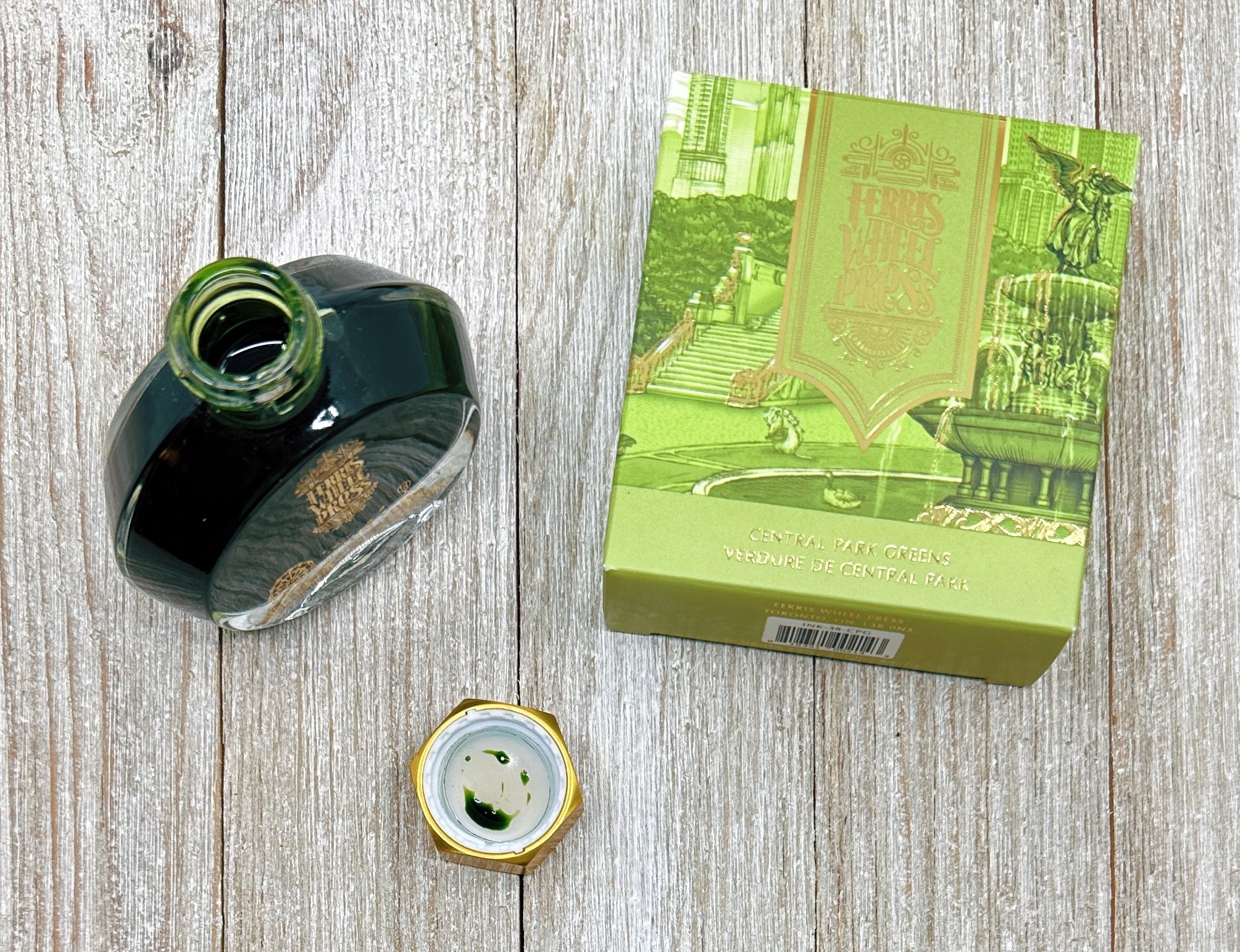
I don't often buy ink anymore because I likely have enough ink that I'll never use it all before I die, even if I live to be 150. But every now and then, a color calls to me, and, well. That's what happened here with Madam Mulberry. I got too close to the Atlas Stationers booth at the Chicago Pen Show. It happens.

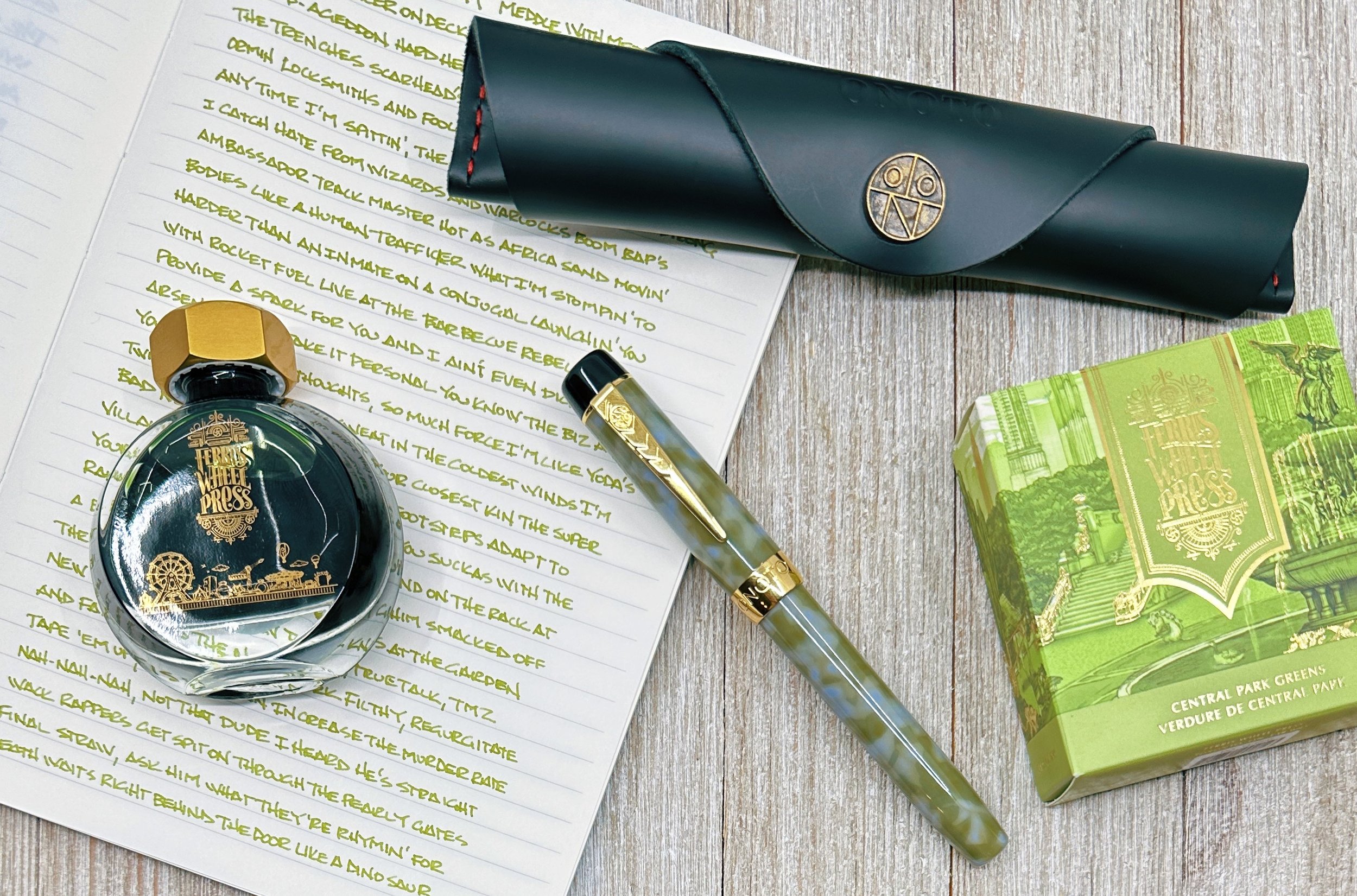
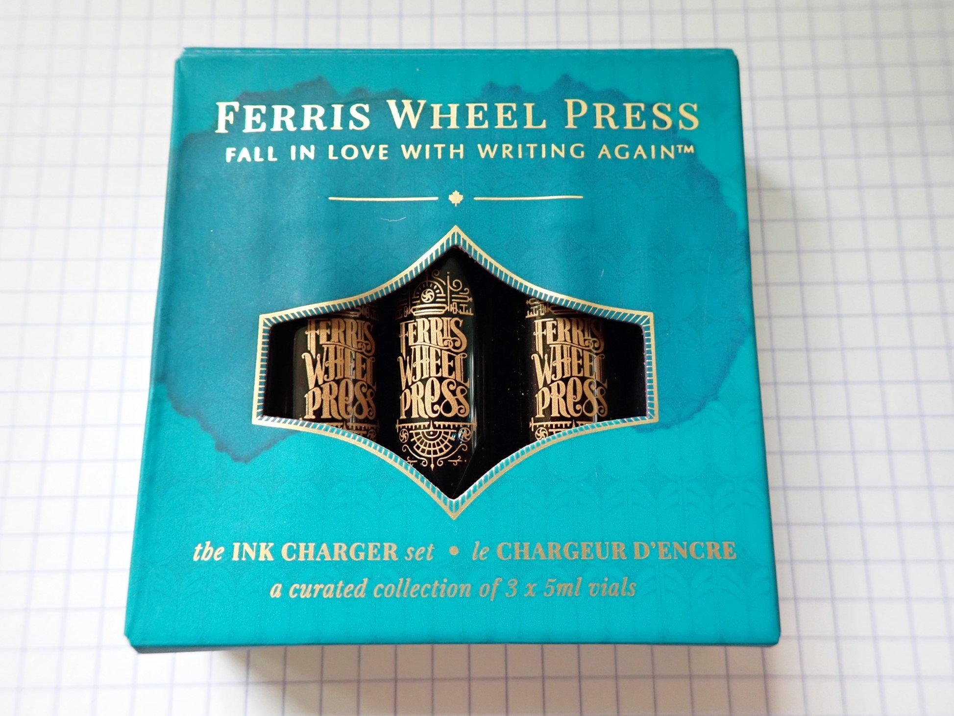
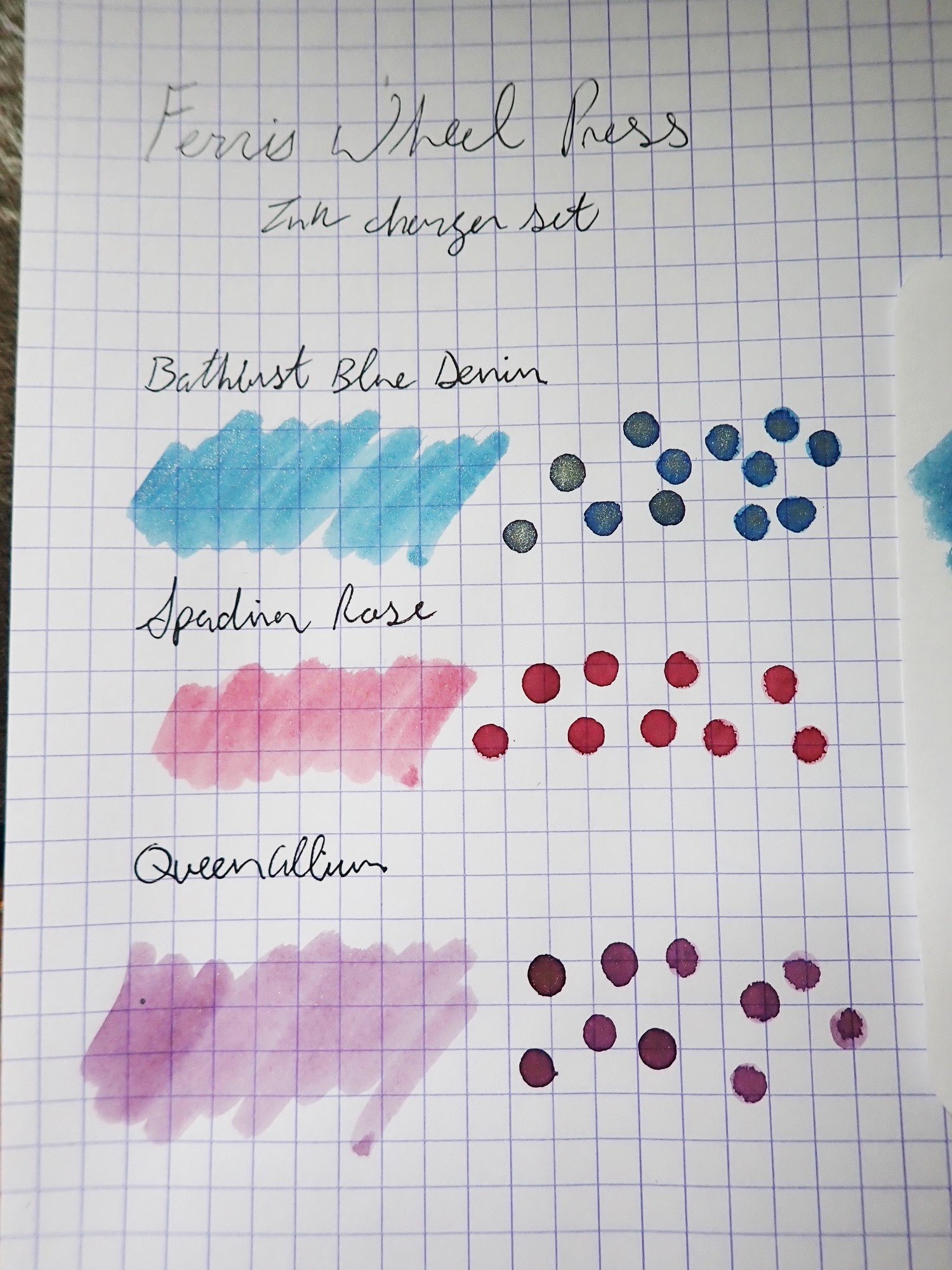
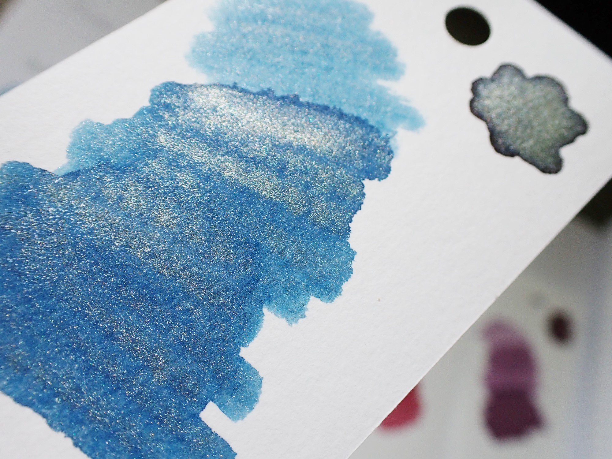
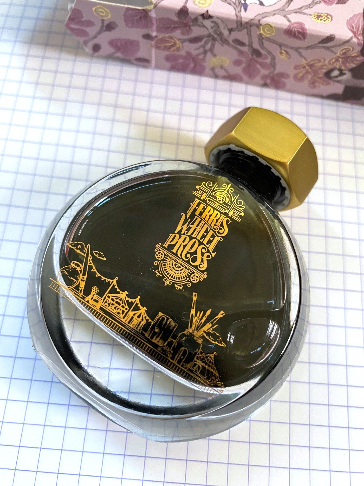
Ferris Wheel Press has made quite a splash with their ink offerings the past few years. They have fun, creative colors, elegantly designed packaging, and reasonable prices.

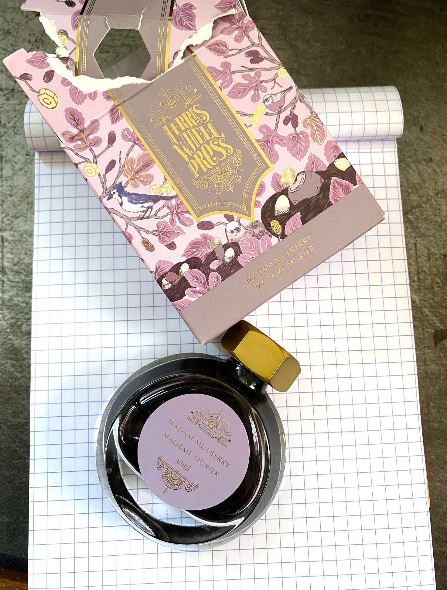
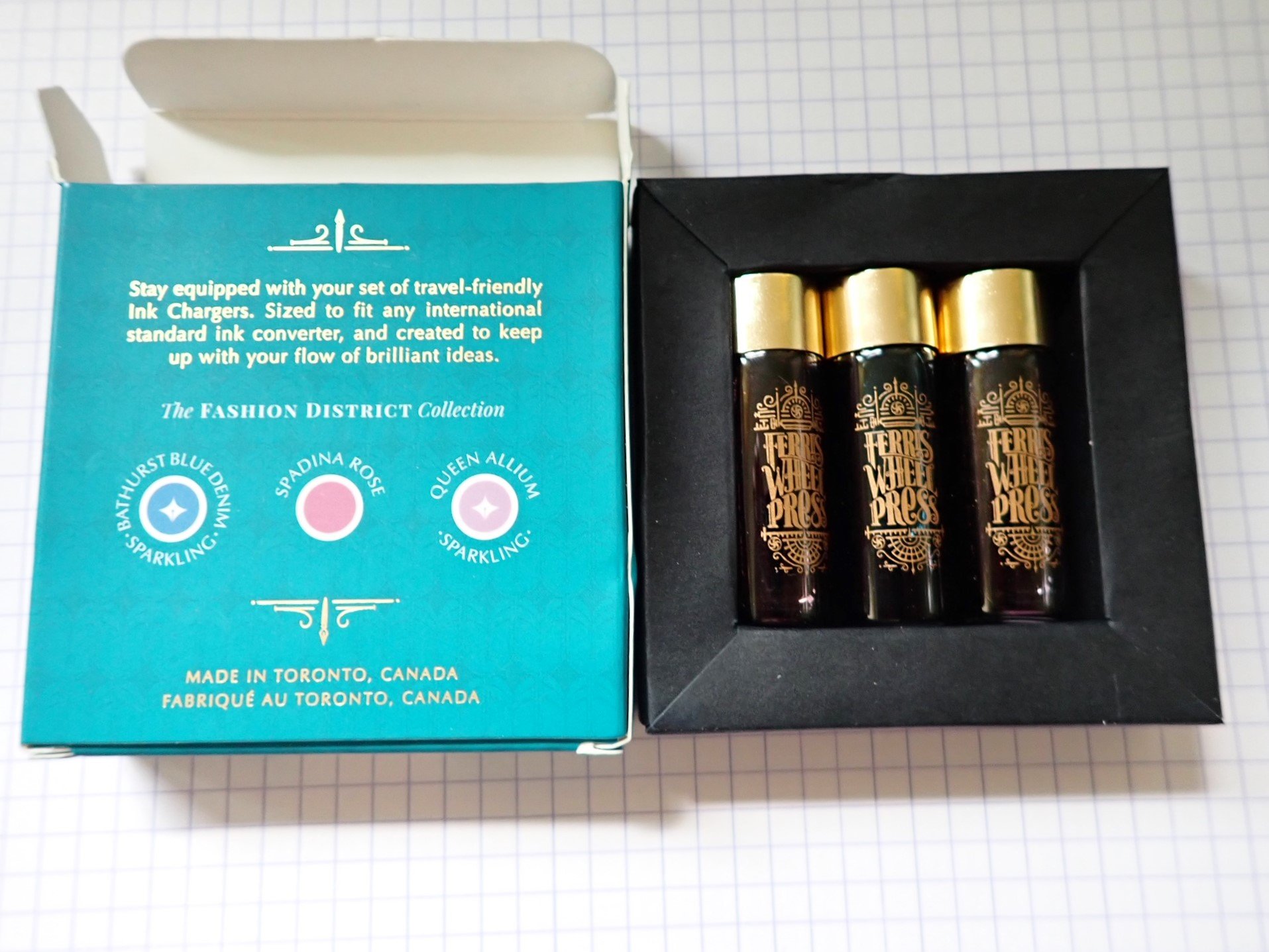
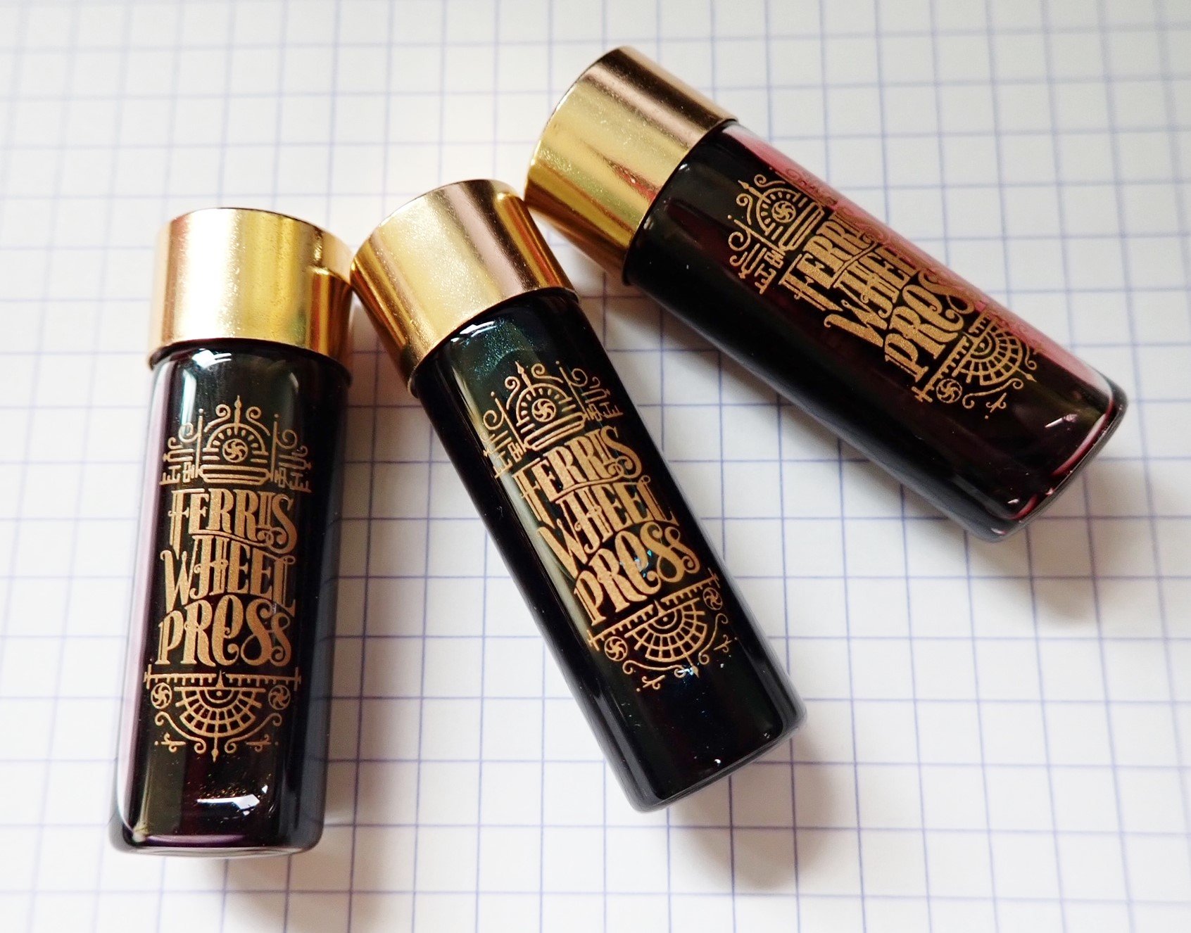
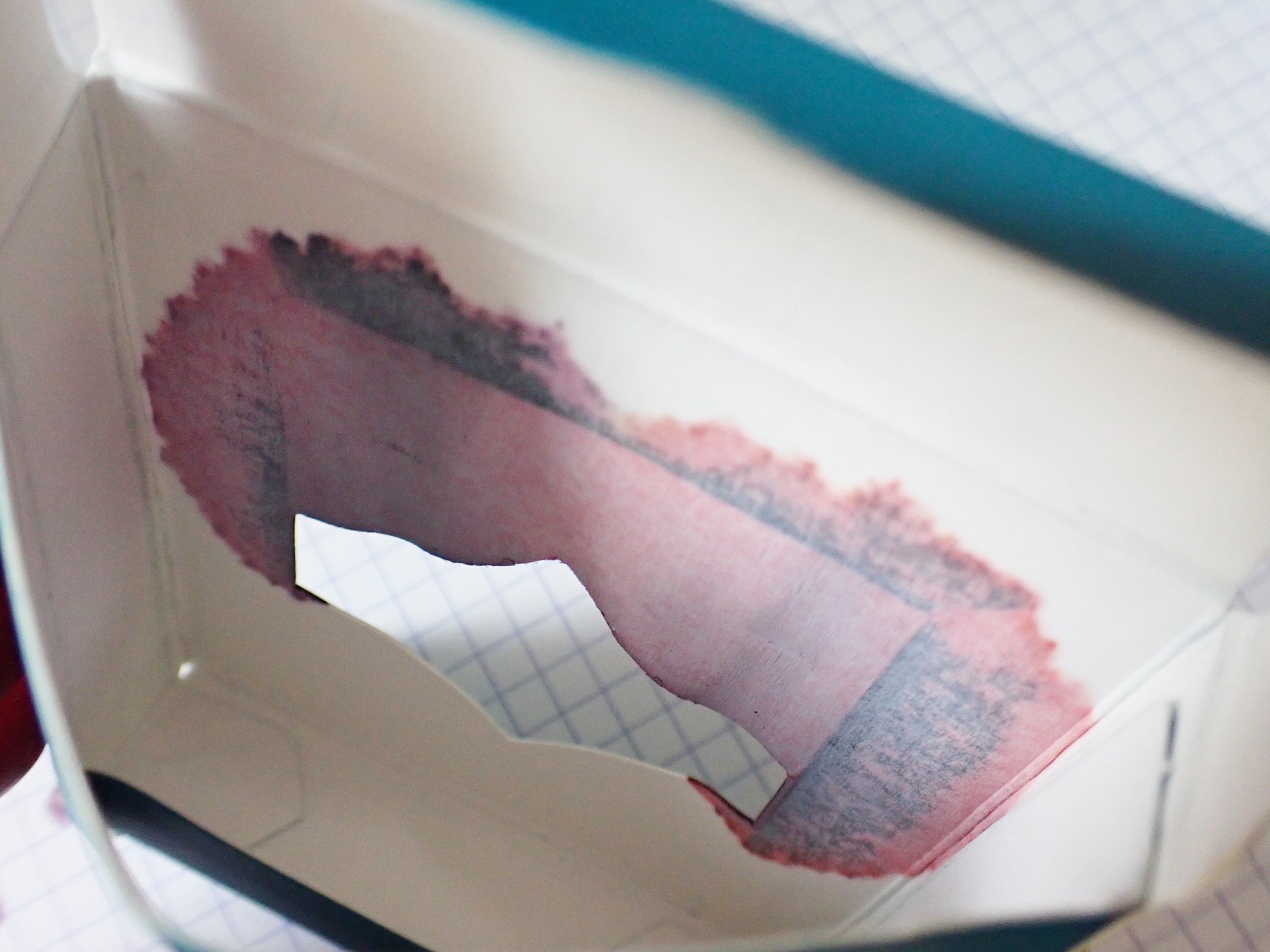
To get my only criticism out of the way up front, that elegant packaging drove me bananas. The cardboard box was like a puzzle box that I ended up just hulking open. The beautiful bottle is too narrow to be sturdy, with an opening too small for nearly any pen, and the lid doesn't seal as well as I'd like, which led to some leaking. This bottle is the high heels of ink bottles--lovely, but hardly functional.

But once you get past the box and the bottle, you get to the beautiful ink, and that's the whole point.

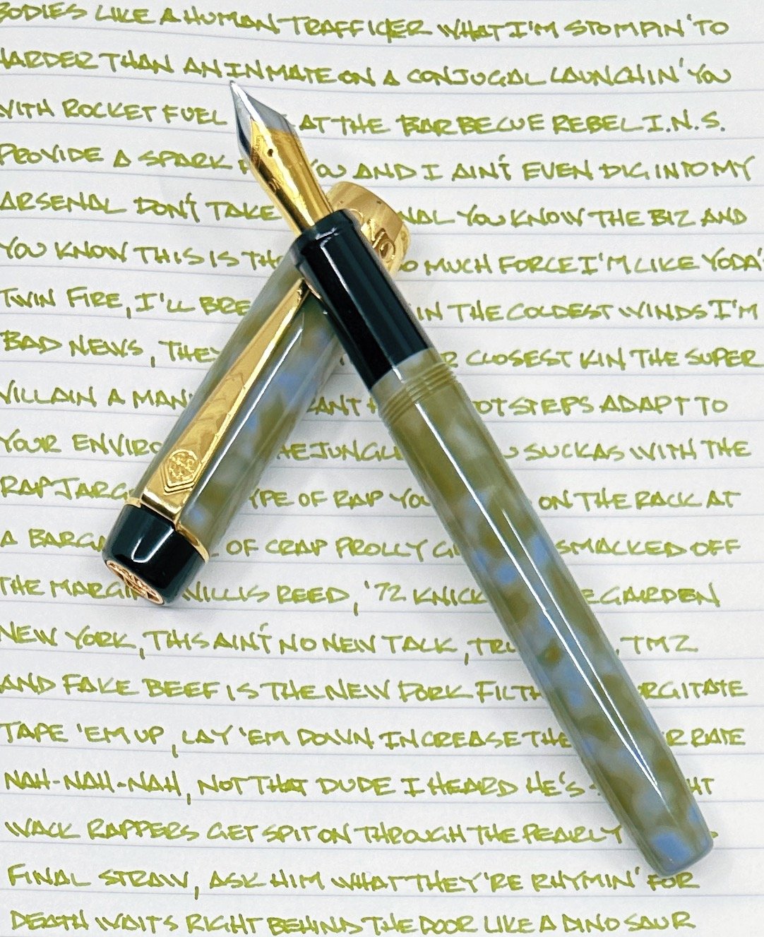
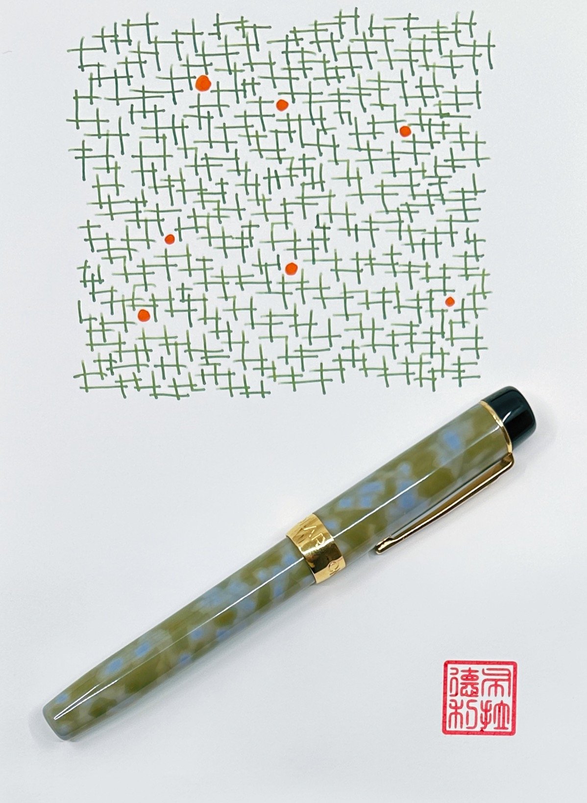
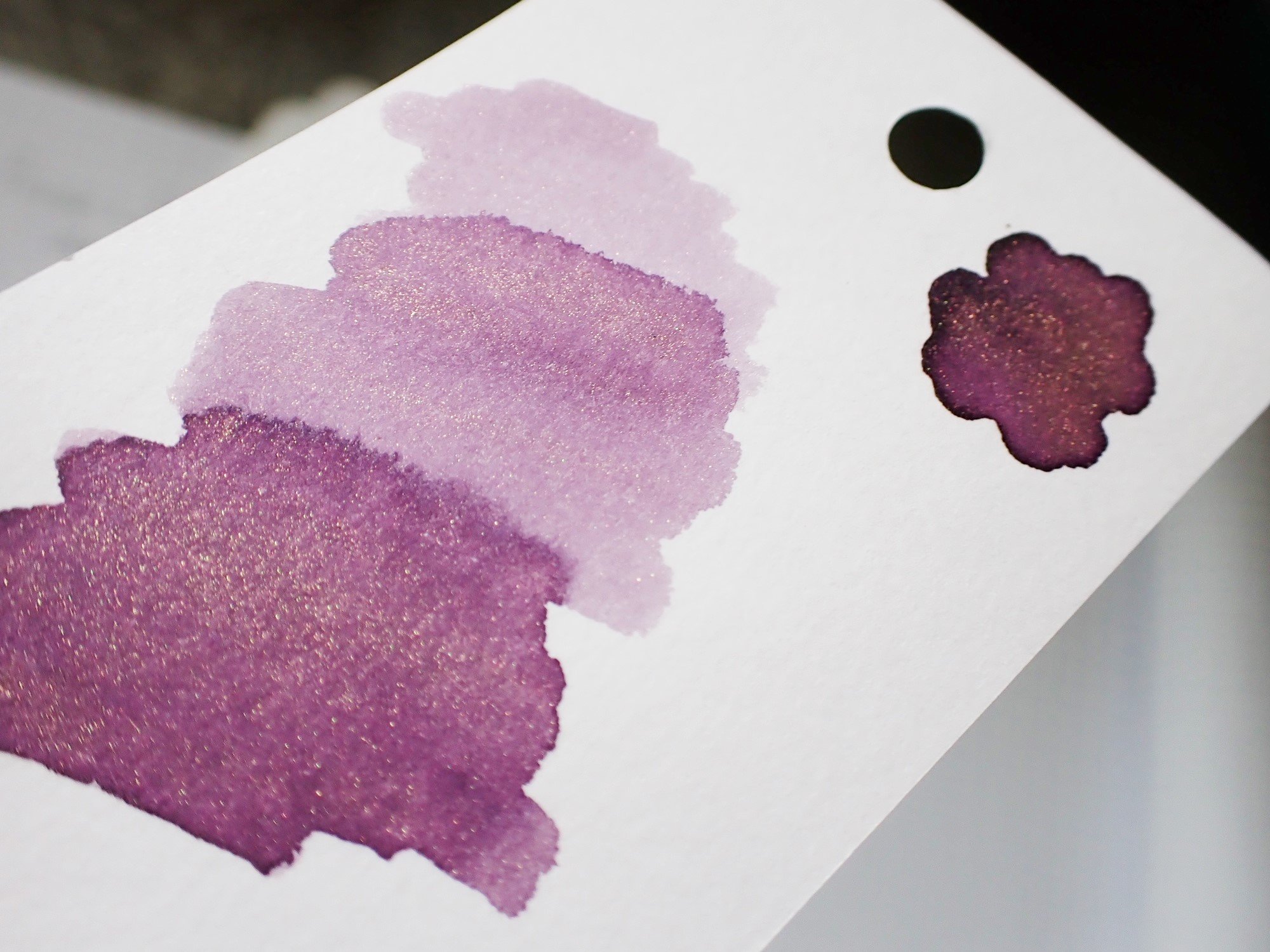
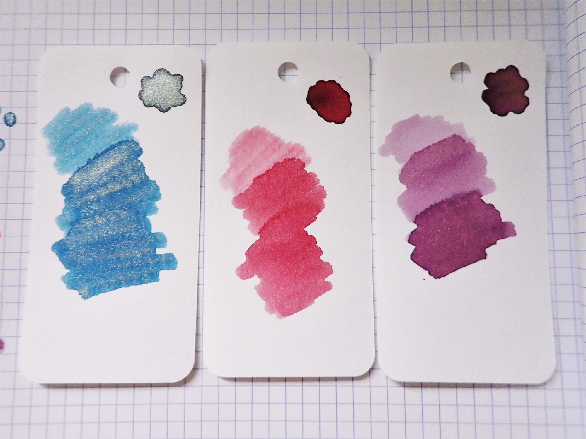
If you could bottle Victorian Gothic, it would be this. It's a soft, smokey purple-rose color that looks like antique dried flowers. Chromatography shows a lilac base with pink, gold, and sky blue all making color magic together. The overall tone has a lot of character that looks different depending on the angle, lighting, pen, and paper you use.

In addition to lots of subtle color shifts, the ink shades beautifully. The dark spots show an almost grey color with a hint of lilac, and the pale spots are a light amethyst. It can be a bit faint for reading in low light when used with a fine nib, but unless you're a nocturnal creature writing by candlelight, you should be fine. I was fine just adding an extra candle.

The ink does have a bit of a dry feel to it when writing, and it has a quick dry time of just over 15 seconds. It's not unpleasantly dry, though. It had some resilience when faced with water spills, as well. It washed out a bit, but some faint lines were still visible.

Overall, it's a great writing experience, and this is one of my favorite ink colors. I purchased it for $22, which is a fair price for 38ml of lovely ink. It's not inexpensive, but it's not the most expensive, either. I would definitely try other FWP inks based on this experience, though I'll likely decant them into a different container for use. In any case, I'm looking forward to getting too close to the Atlas table again this year, and hopefully coming home with another ink to try.

(I purchased this ink at regular price from Atlas Stationers at the 2023 Chicago Pen Show.)


Enjoy reading The Pen Addict? Then consider becoming a member to receive additional weekly content, giveaways, and discounts in The Pen Addict shop. Plus, you support me and the site directly, for which I am very grateful.

Membership starts at just $5/month, with a discounted annual option available. To find out more about membership click here and join us!

Posted on February 22, 2024 and filed under Ferris Wheel Press, Ink Reviews.

Pairings Party: Onoto Scholar Highland, Ferris Wheel Press Central Park Greens

Onoto Scholar Highland

We stationery lovers love picking out perfect product matches. Whether that is a wooden pencil paired with a textured paper, or a fountain pen inked with a complimentary color, we all spend way too much time and effort getting things just right. It’s our nature, and we love it!

One thing I am going to start doing is sharing some of the pairings I make, especially when testing new fountain pens and inks. I have plenty of both that come across my desk, and do consider how products work together, even if it is mostly aesthetic.

Onoto Scholar Ferris Wheel Press

I went matchy-matchy with this pairing of the Onoto Scholar Highland Fountain Pen, inked with Ferris Wheel Press Central Park Greens. The greens of both work well together, with the ink color bringing out the subtle shades of green in the acrylic pen barrel.

This is my first experience with the Onoto Scholar, from the classic British pen maker. Onoto’s original run as a manufacturer ran from 1905 to 1958, with the Onoto we know today re-launching in 2005, restoring these British-made pens back to their former glory.

Onoto Scholar Highland Fountain Pen

As great as Onoto packaging is, I’m not sure I need two pen sleeves. The leather option is beautiful, but removing that and dropping the total price to under $250 might be an easier sell.

Modern Onoto pens are classically-styled, and feature amazing craftsmanship at many different price points. Up until the release of the Scholar, there wasn’t a dedicated introduction product lineup to the brand. To jump into an Onoto at a base-level would cost you somewhere in the $400-$500 range, but the Scholar brought that down to a more reasonable $270 price point, while keeping the high quality they are known for. Yes, that is still pricey, but is a far better solution for those wanting to test out the brand for the first time.

Onoto Scholar Converter

That’s what I’m doing with the Scholar, and it has been great in every way. This gold trim model (silver trim is also available) features a uniquely-patterend green and grey polished acrylic barrel and cap material, with a polished black grip section and top finial. The Fine Steel two-tone gold-plated Onoto #7 nib is rock-solid, with a firm feel and a smooth line. It works perfectly with the overall size and feel of the pen, which checks in at a mid-range 25 grams in total. It uses a cartridge/converter filling system.

Onoto Scholar Nib

This is a Fine nib, and was a wet writer out of the box.

As a fan of classic designs for modern times, I would be remiss if I didn’t call out the beauty of the Onoto chevron clip. That, in conjunction with one of the best logos in the business on the top finial, completes this British design wonderfully.

Onoto Scholar Writing

To match the Highland, I went with another first-time test in Central Park Greens. Despite being around for years, this is my first Ferris Wheel Press experience. This is a standard ink, with good flow, average shading, no sheen, and a moderate dry time. The green ink leans slightly yellow, but is more than legible on most pages. In short, it is an excellent writing ink, and a great choice for putting words on the page.

The Onoto Scholar comes in many classic solid barrel colors including the vintage-styled Mandarin, and Rosso-both of which harken back to classic fountain pen barrel colors found in the early 1900’s. Along with Highland, Onoto has done a fantastic job bridging design philosophies of old and new, and now price points as well.

Ferris Wheel Press

I stuck the converter directly into the bottle to fill due to the small opening, and unbalanced bottle.

As for Ferris Wheel Press, the choice is endless. I will say, as great as the ink is, and as beautiful as the bottles are, they are some of the least functional from a pen filling perspective. Syringes or pipettes may be required for wider-barreled pens, and a more solid bottle base maybe be required, less you end up with an inky mess on your hands-or counter top.

Ferris Wheel Press Central Park Greens

This pairing was a party, and a fun way to look at two products together-especially when both products are new to me. I’ll be looking for ways to work in more pairings posts into future reviews.

(Vanness Pens loaned this product to The Pen Addict for review purposes.)


Enjoy reading The Pen Addict? Then consider becoming a member to receive additional weekly content, giveaways, and discounts in The Pen Addict shop. Plus, you support me and the site directly, for which I am very grateful.

Membership starts at just $5/month, with a discounted annual option available. To find out more about membership click here and join us!

Onoto Scholar FWP Ink
Posted on March 20, 2023 and filed under Onoto, Ferris Wheel Press, Fountain Pens, Ink Reviews, Pen Reviews.

Ferris Wheel Press Ink Charger Set Review

Ferris Wheel Press

(Sarah Read is an author, editor, yarn artist, and pen/paper/ink addict. You can find more about her at her website and on Twitter. And check out her latest book, Out of Water, now available where books are sold!)

Ferris Wheel Press inks have been catching my eye a lot lately and I even bought a bottle at the Chicago Pen Show, despite my resolution to not buy more ink until the stash diminishes a little. It's even more tempting to cave in when the inks come in these adorable 5ml sample bottle sets.

Ferris Wheel Press
Ferris Wheel Press
Ferris Wheel Press

The Fashion District Ink Charger Set is just that--adorable and tempting. It includes three tiny bottles of FWP ink in themed color sets. This one has Bathurst Blue Denim, Spadina Rose, and Queen Allium. The bottles come packaged in a nest inside of a box, but heads-up that mine were leaky. You can see the ink stains on the inside and outside of the cardboard, and two of the bottles were about 1/3 empty. They continued to leak a bit as I worked with them, and now I have a rose-colored ring on my desk mat. The bottles are also very narrow--made to fit a converter, but not a pen nib. So they won't work with any pens that have internal fillers, like piston or vacuum-fill pens.

Ferris Wheel Press
Ferris Wheel Press
Ferris Wheel Press
Ferris Wheel Press

Inside the adorable-but-kind-of-annoying bottles are three lovely ink colors. The Bathurst Blue Denim is a very nice grey-blue with a fine gold shimmer. The shimmer really comes through, even in finer lines, and the blue tone is just different enough to be more fun than a standard blue. The Spadina Rose is a really lovely dusty pink color, no shimmer, that looks like the perfect shade for a Victorian tea party. It's on the pale side for writing with very fine nibs, but has excellent shading with broader writing. The Queen Allium is a pink-toned purple shade with gold shimmer. It is also a pale, soft color that might be difficult to see in a fine nib, but it is also very rich where the ink shades and pools. The shimmer is slightly less visible in the finer/paler areas, but looks excellent with heavier application.

Ferris Wheel Press

All three shades are beautiful and go really well together. The set costs $16 at Vanness Pens, which is just over a dollar per ml of ink, which is fairly standard for sample sizes. However, as I mentioned, I lost a few ml to a leak in the bottle's cap seals. In general, I'm a big fan of these inks. I like the softer colors, and I have had no issues with the full-sized FWP ink bottle I own. So while I'm not sure I'd recommend this wee set, I do recommend the inks themselves.

(Vanness Pens provided this product at no charge to The Pen Addict for review purposes.)


Enjoy reading The Pen Addict? Then consider becoming a member to receive additional weekly content, giveaways, and discounts in The Pen Addict shop. Plus, you support me and the site directly, for which I am very grateful.

Membership starts at just $5/month, with a discounted annual option available. To find out more about membership click here and join us!

Posted on July 7, 2022 and filed under Ferris Wheel Press, Ink Reviews.