Posts filed under Dominant Industry

Ink Showdown: Dominant Industry Goryeo Celadon & Wearingeul Dewy Starlight

(Kimberly (she/her) took the express train down the fountain pen/stationery rabbit hole and doesn't want to be rescued. She can be found on Instagram @allthehobbies because there really are many, many hobbies!.)

When I was at the Atlas Stationer’s Fountain Pen Day event last November, I spent time flipping through their ink swatch binders and saw two inks that I couldn’t decide on: Dominant Industry Goryeo Celadon & Wearingeul Dewy Starlight (I will refer to them as Celadon & Starlight). Normally, I would have had to flip a coin but since the Bossman let me pick some inks for review, I thought, why not both?

Dominant Industry Goryeo Celadon (left) & Wearingeul Dewy Starlight.

Celadon (left) & Starlight bottles.

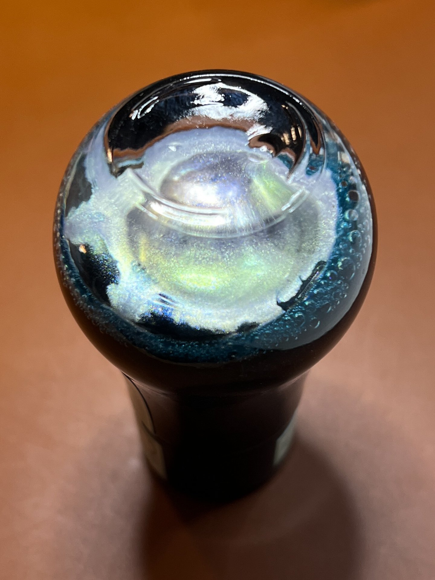
Celadon has an opalescent/silver shimmer.

Starlight’s shimmer is gold.

You’re going to think I am colorblind because the colors on the two boxes aren’t the same. Celadon has minty green packaging and Starlight is dusty blue.

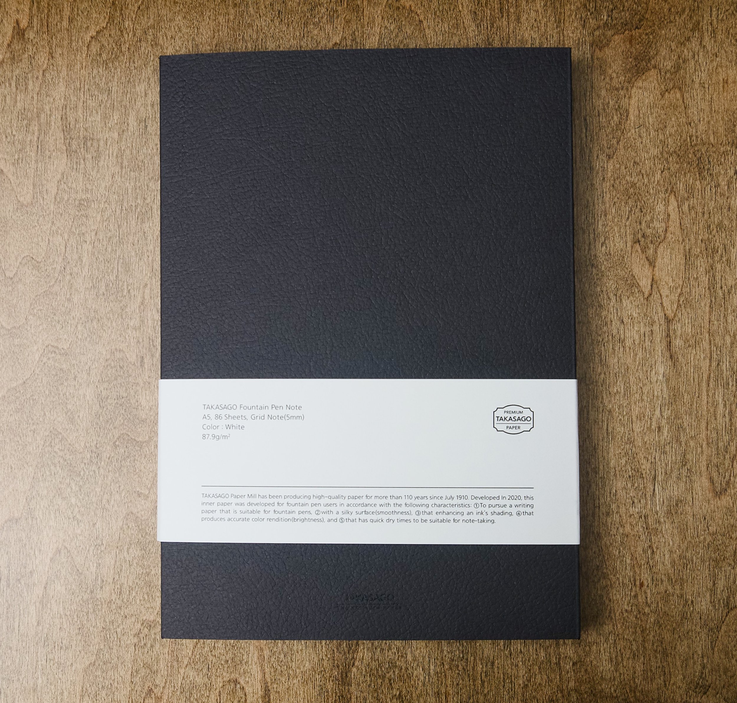
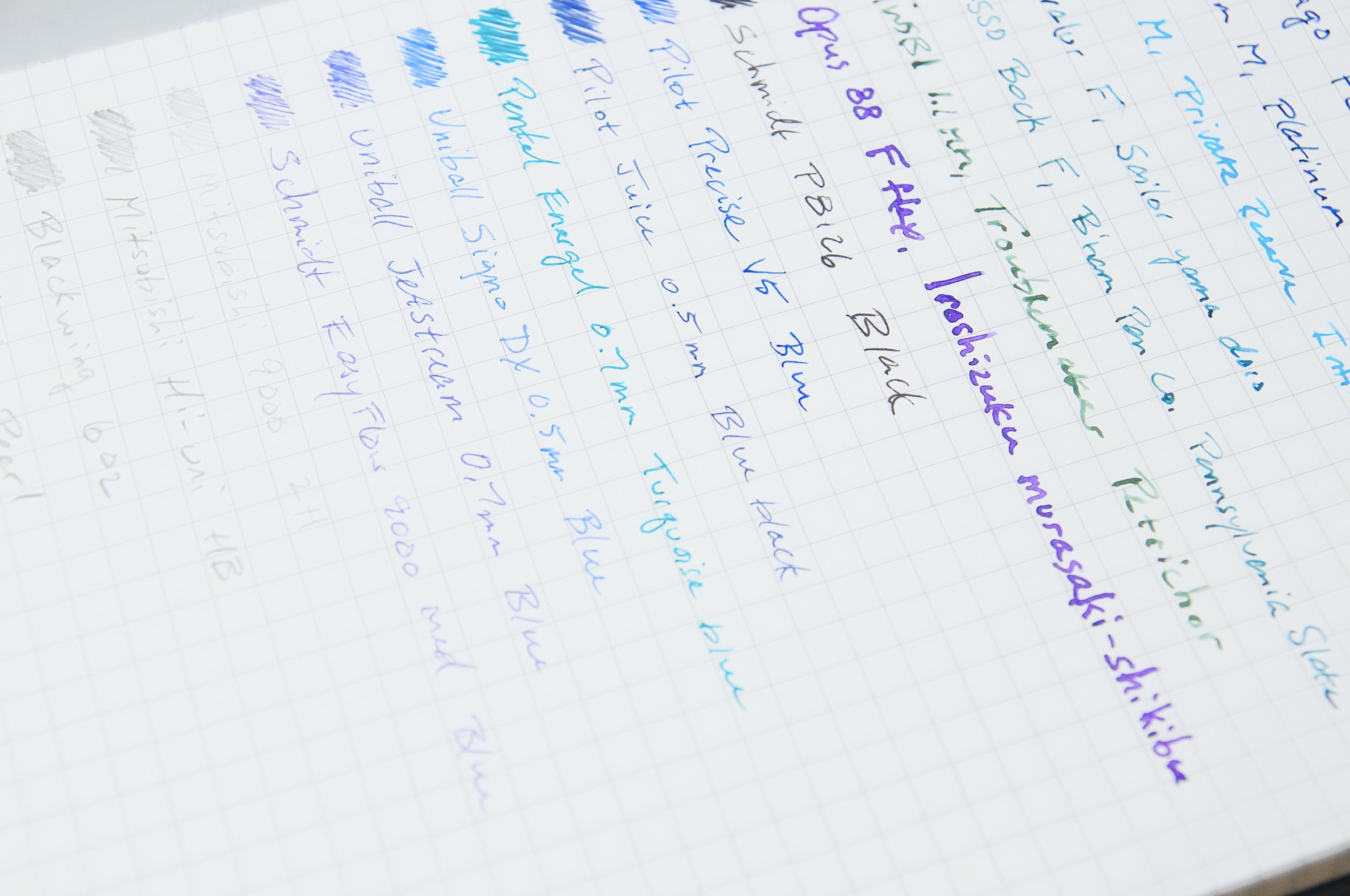
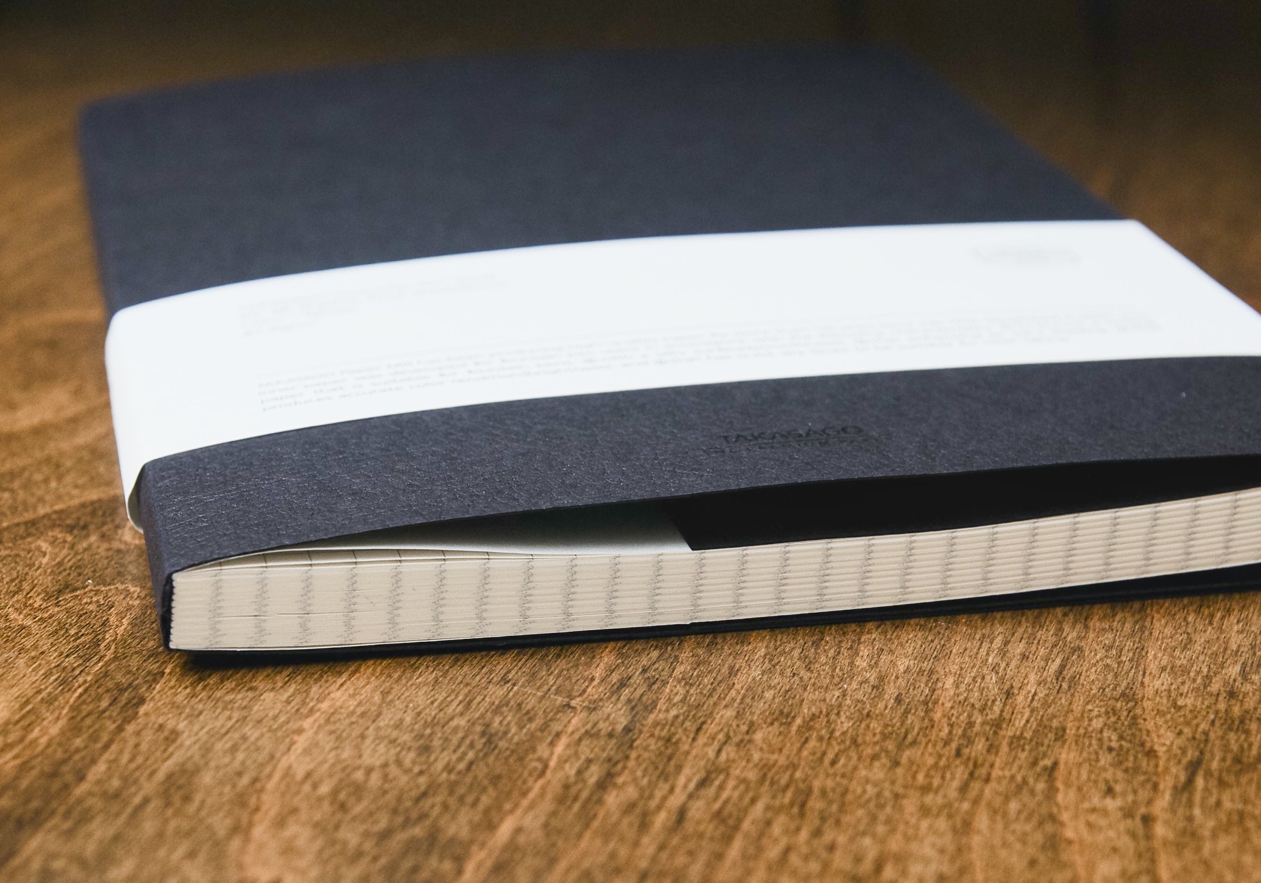
As in the past, all swatches were done on Col-O-Ring cards using a Kakimori steel dip nib and the non-brush end of a paintbrush, while writing samples were done with a TWSBI Go with a Medium nib and a Lamy Vista with a steel Medium nib. The TWSBI Go is a wetter writer and the Lamy is a drier writer, so these two give me a good idea of how an ink will look from different pens. The notebook used for writing samples is from Endless Recorder with 68 gsm Tomoe River paper. Dry times may be a bit slower on 52gsm TR or with wetter nibs or faster on papers like Rhodia, copy paper, Cosmo Air Light or with drier or finer nibs.

Swatches of Celadon (left) and Starlight and now the difference isn’t as obvious as the packaging. Still, you can see that Celadon is a bit lighter and leans a little more green while Starlight is a bit more saturated (albeit barely) and a little more blue.

Celadon writing sample on 68 gsm Tomoe River Endless Notebook.

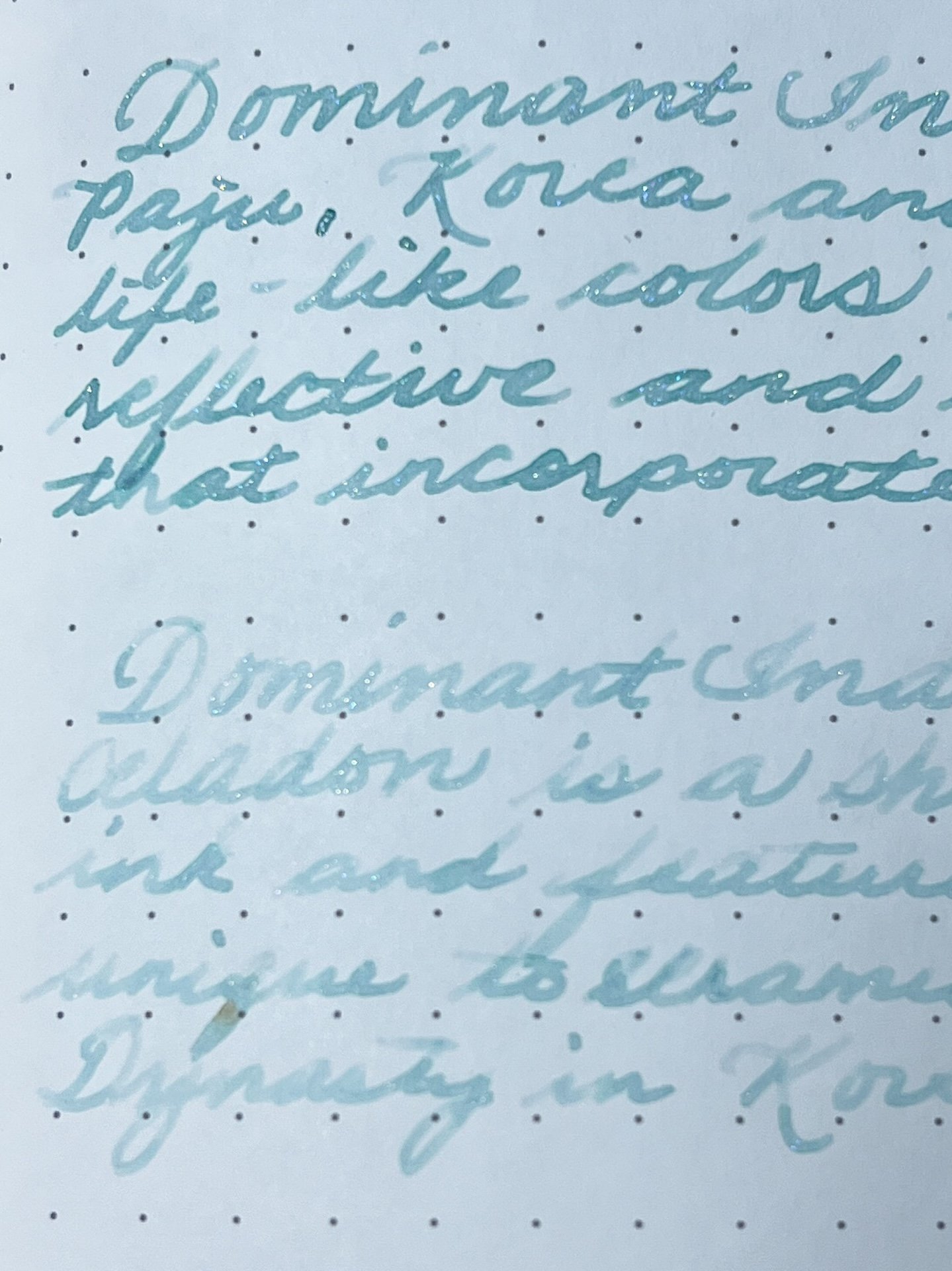
You can really see the difference between the Go and the Vista.

Celadon chromatography shows a bit of yellow near the line and faint blue shading above it, but that’s about it.

Celadon is a nice minty, muted pale green with opalescent silver shimmer in a wet writer like the TWSBI Go, but in the Lamy Vista, it is almost unreadable and there is barely any shimmer (I shake the bottle before filling each pen). The shimmer makes this ink look bluer than it really is.

Starlight writing sample on 68 gsm Tomoe River Endless Notebook.

Much like Celadon, Starlight is almost unreadable with the Vista.

The golden shimmer of Starlight makes this slightly bluer ink look greener than it really is. This is the opposite of Celadon which looks bluer because of the shimmer! This is probably why the two inks look much more similar when swatched than from the packaging. Like Celadon, Starlight is almost unreadably light in the Vista and hardly has any shimmer. The shimmer is much more pronounced in Starlight with the Go. Both inks had an average dry time of 30-40 seconds. The chromatography is subtle, with undertones of pink near the line and spreading out to light blue as expected.

Similar inks include Pennonia Zuzmo Lichen , Celadon, Sailor Ink Studio 162 , Starlight, Vinta Inks Perya, Pennonia Patina, Visconti Self Portrait, Wearingeul Wuthering Heights, Kobe 68 Nishimaiko Pearl Blue and Sailor Manyo Haha.

I don’t usually gravitate towards lighter inks so I don’t have any inks that are dupes but there are some similar ones like Pennonia Patina for Celadon and Vinta Perya for Starlight, though neither of them are shimmer inks.

And a little bonus - I decided to start using the Wearingeul swatch cards for my Wearingeul inks, so I decided to swatch Starlight on the Wearingeul Puppy Swatch Cards which I had ordered from Atlas.

Used the TWSBI Go to write the name of the Starlight ink.

I used the paintbrush to spread the ink over the design. Puppy looks like it should be named “Spot.” 🙂

After the swatch was dry, I wiped the puppy’s face and now we have a happy dog!

The cost of the two inks are comparable - you can get a 25ml of Dominant Industry Goryeo Celadon for $20 or 30ml of Wearingeul Dewy Starlight for $22.

Now that I’ve swatched and written with both inks, if I had to pick just one, I’d go with Wearingeul Dewy Starlight over the Dominant Industry Goryeo Celadon. The Starlight is slightly wetter (noticeable during swatching as well as writing), is a bit darker and therefore, easier to read, and it also has more shimmer. Both inks need a wetter pen/nib to really shine and the Lamy Vista showed that it definitely isn’t the right pen for either of these inks.

(Disclaimer: Both inks were purchased at a discount from Atlas Stationers during their Fountain Pen Day event and the swatch cards were ordered on my own, also from Atlas.)

Posted on February 9, 2024 and filed under Dominant Industry, Ink Reviews, Wearingeul.

Dominant Industry Decade in the Desert Fountain Pen Ink Review

Pen Chalet has their collaboration game on point, including this recent release with South Korean ink maker Dominant Industry. And by recent, I mean Summer 2023, which means that Decade in the Desert, the two inks created to celebrate Pen Chalet’s 10th anniversary, are already sold out.

My apologies.

Even though they are no longer available, I wanted to discuss these two inks - Arizona Sky Citrus and Arizona Sky Crimson - because I’m not only enjoying them individually, but also in use together.

Dominant Industry is known around the hobby for their wild interpretation of inks, including many that are made for dip pens only, less they clog up the inner workings of a fountain pen. Take one look at their Alchemist Inks for Calligraphy and you’ll see exactly what I mean.

This commitment to ink making translates well to their standard ink lineup, too, and I have been impressed with every Dominant Industry ink I’ve tried - to the point where they have become a core choice for my writing.

Cotton swabs on Yamamoto Bank Paper (left) and Sanzen Tomoe River 52 gsm.

Heavier application with a Kakimori Dip Nib on Sanzen.

As the product names indicate, these two inks were created to represent the brilliant shades seen in the Arizona skies during sunset. Even if you’ve never been in Arizona to see the beauty in person, these inks do a great job of capturing the scene.

The orange-leaning Citrus is a knockout in my book - to the shock of no one - but Crimson is the real surprise here for me. Normally, burgundy shades are not my thing, but this one has two things going for it: hints of purple, and a perfect pairing with its counterpart.

Basic testing on Kokuyo Business paper.

Both inks exhibit slight amounts of shading, and no sheen. Dry times are moderate, if not quick - at least for a fountain pen ink. Both flow nicely from the nib, although Citrus could be a little drier. That is par for the course for yellow dye inks. Overall, these inks were a joy to write with.

Line art in the Yoseka Notebook.

Joy. That’s a common term I use with Dominant Industry inks. The bottles are a joy to look at, the inks are a joy to use in my pens and on the page, and the price - $9.60 for a 25 ml bottle for standard inks - is a joy to my bank account.

What’s not to love?

(Pen Chalet provided this product at a discount to The Pen Addict for review purposes.)


Enjoy reading The Pen Addict? Then consider becoming a member to receive additional weekly content, giveaways, and discounts in The Pen Addict shop. Plus, you support me and the site directly, for which I am very grateful.

Membership starts at just $5/month, with a discounted annual option available. To find out more about membership click here and join us!

Posted on January 29, 2024 and filed under Dominant Industry, Ink Reviews.

Dominant Industry Takasago Fountain Pen Notebook Review

(Jeff Abbott is a regular contributor at The Pen Addict. You can find more from Jeff online at Draft Evolution and Twitter.)

The Takasago Fountain Pen Notebook is a simple softcover notebook that really delivers on its name since it handles fountain pen inks like a champ. The paper is from Takasago Paper Mill, which is where the name of this notebook comes from. With 86 sheets of white 88gsm paper with a 5mm grid pattern, you'll have plenty of space to think, record, or whatever else you decide to take down.

88gsm is fairly common for paper weight in notebooks that make the rounds in our stationery circle, but this paper has a particularly lovely smooth feel that sets it apart. It's not a thick paper, but it handles fountain pen ink so well. The smoothness is apparent both to your fingers and when writing. Nibs float across it with ease, and there's hardly any resistance or feedback. It's quite an enjoyable paper to write on.

Whenever you use a paper that feels this smooth, it's likely due to some sort of coating on the paper that reduces friction. This can have unwanted side effects, like slow dry times, feathering, and skipping. Fortunately, there aren't really any negative side effects with this paper. I have noticed that the couple of fountain pens that lean toward the dry side don't perform particularly well on this paper. They're totally usable, but I can tell that the ink flow is a little diminished. Aside from those two dry-ish pens, I've had a really good experience. For most pens and inks, this paper is fantastic.

The paper is smooth and maintains the true ink color once it dries. And speaking of drying, it does tend to shed a couple seconds off the dry time. It's not a magical difference, but it definitely helps. You'll still have to choose your inks wisely if you plan to jot down notes and close the book quickly, or if you're a left-handed or non-traditional grip user. The quick dry time is part of the marketing on this notebook, so that's why I paid special attention to it. I'm not sure if I'd notice the slightly faster dry times if it wasn't called out on the packaging and marketing materials.

One thing that really surprised me is the lack of show-through on the back of the page. Based on how thick the paper feels, I assumed there would be moderate show-through (meaning, it feels thin enough for that to be an issue). To my surprise, show-through isn't an issue at all. You can barely see the writing on the reverse side of the page, and you can easily use both sides of the page. You'll get full use of all 86 pages here!

The outside of the notebook is sparse. There isn't any Dominant Industry branding to be found, and there are only a couple of markings on the front cover that are really difficult to see since they're black on black. The bottom center of the front cover has a small "Takasago Paper Mill" printed on it, and there's an even smaller vertical spot next to the upper left-hand side that says something about Fountain Pen. It's honestly so small and light that I can't make it out with 100% certainty. Let's just say that this notebook is minimally branded.

Inside, the covers are blank. There's no printed spots for your name or contact info. Both front and back covers have some additional material folded back on the interior to act as either minimal pockets for stray pieces of paper or for marking a place in the notebook. In my use, I haven't used the extra material and I'd prefer it not being there.

There's a blank page at the beginning and end to sandwich the 86 grid pages, and the pages are also very sparse. Besides the grid pattern, there's no other printing. No page numbers or spots to put a date or subject. This notebook is minimal both inside and out.

The binding is strong but flexible and easy to open and close. I haven't had any trouble with the notebook staying open, and it closes and stays shut on its own without any elastic banding.

Personally, I really love the minimal aesthetic of this notebook. It fully delivers on the paper quality, and I like the sparse look. Writing in this notebook is a great experience, which keeps me coming back to it. It makes my pens and inks look and feel great, and the grid pattern provides structure when I want it, but easily disappears if I want to go more free-form.

This notebook is only available with a black cover. The cover and paper pattern are tied together, so the white cover only has plain paper, and the gray cover only has lined paper. This makes it easy to tell them apart if you have all three, but I wish I could pick and choose between the pattern and cover colors.

The Takasago Fountain Pen Notebook is $25 and makes a great companion to your favorite fountain pens and inks. The price is fair for the quality you get, and it's comparable to other notebooks in the same price range. I really enjoy the glossy paper feel, but that's not something that everyone enjoys. If you do like smooth papers that show off your inks, this is a great notebook for you!

(Brad purchased this notebook at regular retail price from Smruti Pens at the 2023 Orlando Pen Show.)


Enjoy reading The Pen Addict? Then consider becoming a member to receive additional weekly content, giveaways, and discounts in The Pen Addict shop. Plus, you support me and the site directly, for which I am very grateful.

Membership starts at just $5/month, with a discounted annual option available. To find out more about membership click here and join us!

Posted on January 24, 2024 and filed under Dominant Industry, Notebook Reviews.