Posts filed under Fountain Pens

Pilot Lucina Fountain Pen Review

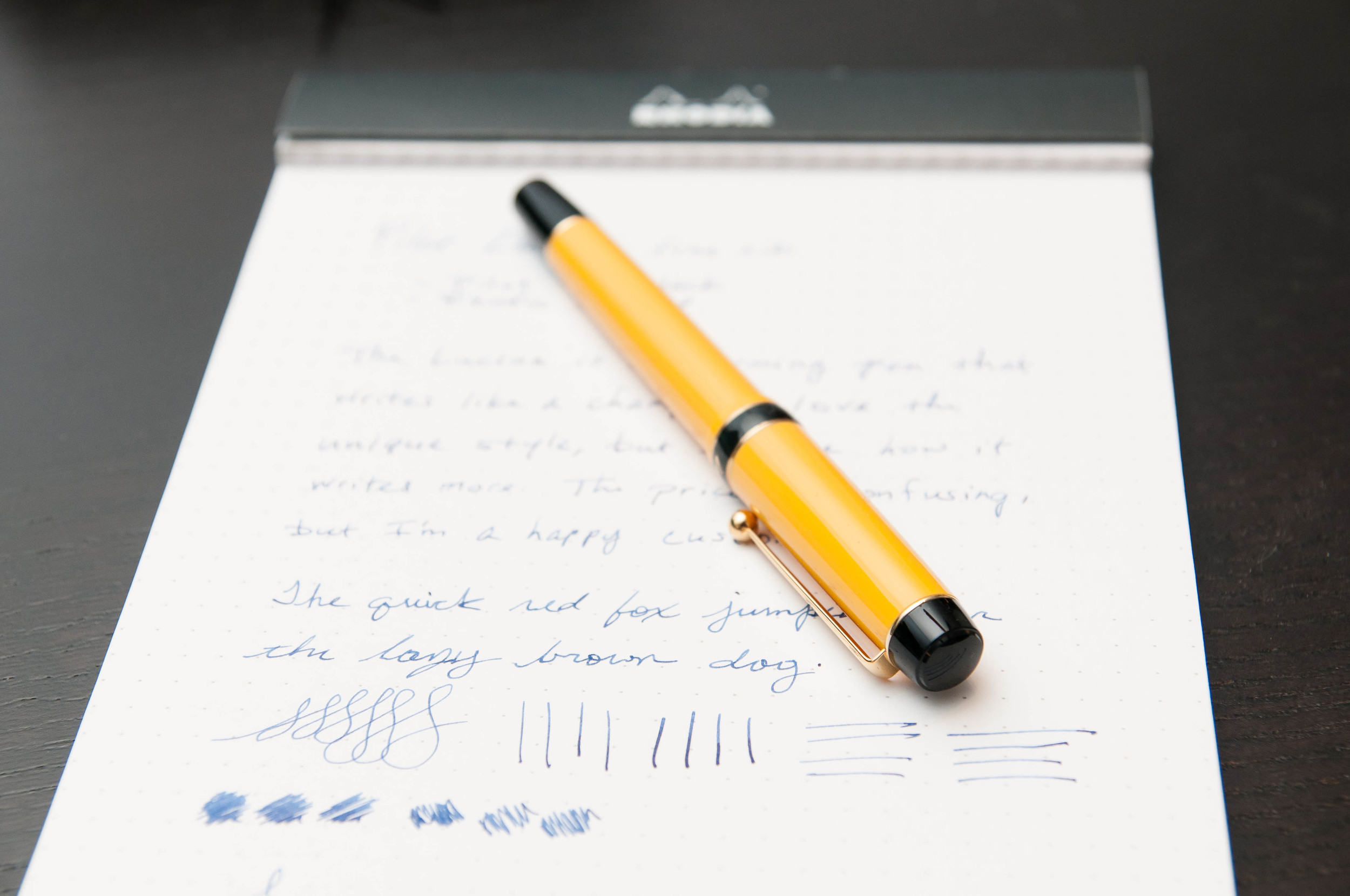
The Pilot Lucina is a pen that I've often thought about getting, but couldn't really justify the almost-premium price tag. I'd look at pictures and read about it, but I couldn't understand why it was in the mid-$80 range. Basically, it's a unique design for Pilot, and it has some really fun colors. What else? Well, not much. But, if you like the looks of it, I guarantee it will charm you if you decide to pull the trigger on the purchase.

Aesthetics

The Lucina comes in a standard Pilot flip box – nothing fancy, but classy and reserved. It's tucked into a plastic sleeve inside the case, which is something I wish the pen manufacturers wouldn't do. It takes away from the experience of opening a new toy.

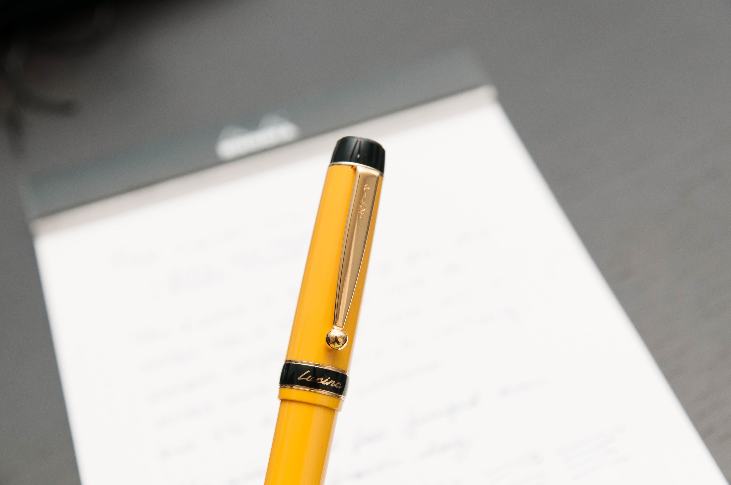
After getting the pen out of its packaging, you notice that it's a lightweight pen and really well balanced. The plastic doesn't feel cheap, and the attention to detail is superb. I'm not a huge fan of gold trim, but I think it works well on the Lucina. It has the right style to sport the gold trim well. The black accents also add more punch to the main color. In my case, I went with yellow because I really had no other choice. The red also looked interesting, but not nearly as much as the yellow. It pops.

The cap screws on and off, and posts perfectly. The nib is also gold in color and has a bit more decoration than the cheaper Pilot nibs. There's some scroll work and a Pilot logo above the standard Pilot name and nib size. The clip is what I consider to be the perfect mixture of strength and flexibility. It just works and never requires fiddling.

One thing I dislike about the looks of the pen is true of every lighter-colored pen barrel that secures the cap with threads – dirt gets into the threads and shows up instantly. My hands are pretty clean, but the dark specks still get into the threads and I can't stand it. When I uncap the pen it's the first thing I see. Yes, you can clean them, but it's not easy and it's never quite perfect again. I prefer snap on caps, but I can get over my silly OCD tendencies if the pen writes well enough. And the Lucina does.

Writing

In my experience, Pilot always delivers a well-behaved nib out of the box, and the Lucina is no exception. The steel nib is a smooth and dependable writer. I've used it on a number of different papers, and it works well on them all. Being so fine, it doesn't bleed much on cheap paper, although it can tend to snag if the paper surface is rough. On smooth paper like Rhodia and Clairefontaine, it glides like an ice skate and fresh ice.

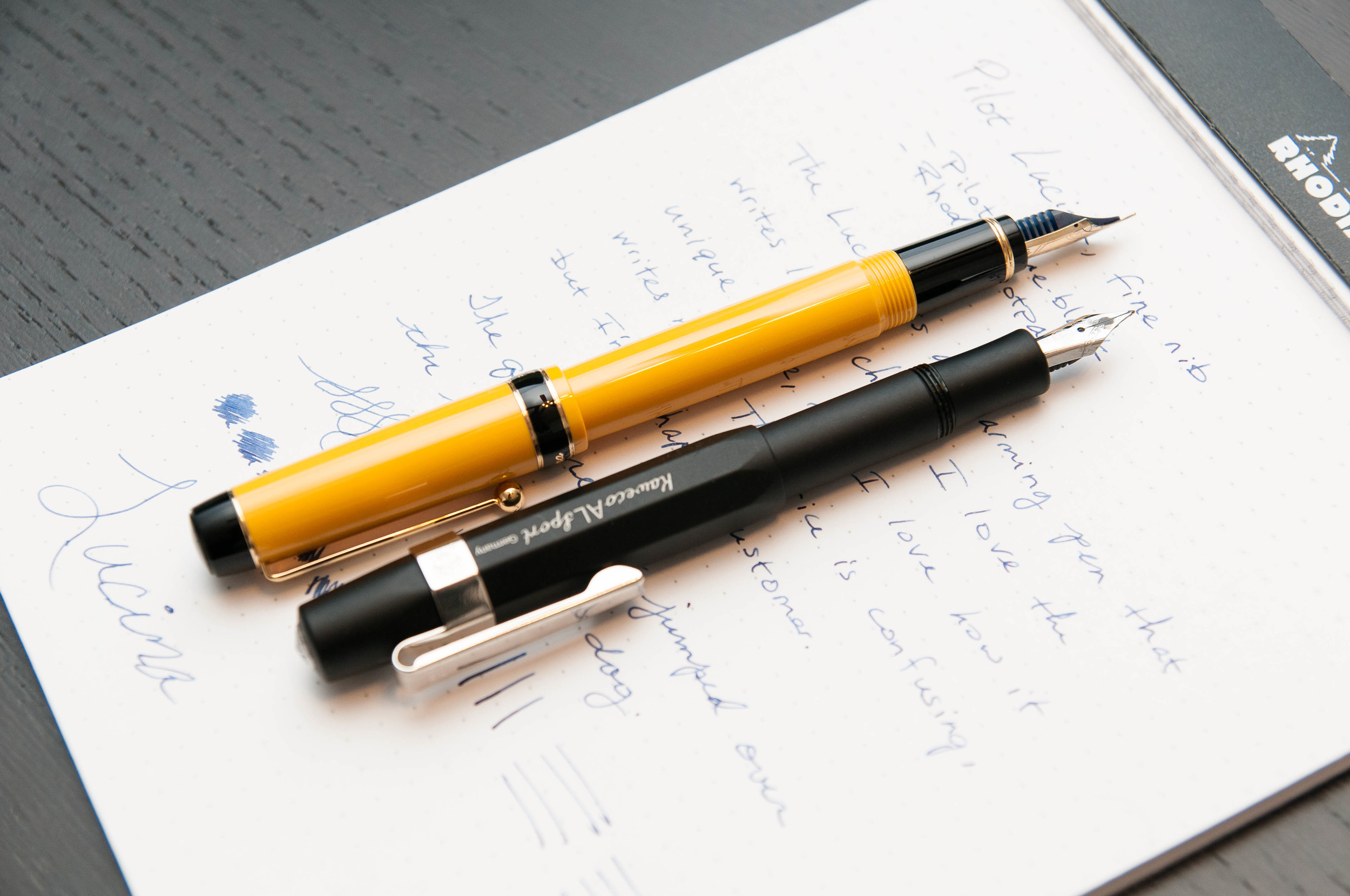
I typically write unposted when using normal pens. The Lucina is about the size of a Metropolitan, but I really enjoy writing with this pen posted. I think it was designed to be used this way because the balance is perfect when it's posted. It feels a bit off when unposted – like writing with a Kaweco sport or TWSBI Mini unposted, but not as exaggerated.

I bought a pack of Pilot blue-black cartridges with this pen, and tried them out first. The ink flows well and the pen never skips or has issues starting – even after being idly uncapped for a few minutes. That's rare with the rest of the pens I own. They get a bit dry after a minute or two of being unused and uncapped.

The grip section feels good on this pen. I'm not very picky when it comes to how the grip feels when I'm writing as long it doesn't distract me. I don't notice the grip when I'm writing with this pen, and that's good.

The nib is extremely forgiving. There's no sweet spot on this nib, it just works however you're holding it. Fantastic.

Drawback

Here's the deal. I love this pen. It's a great writing instrument and I think the style is charming and unique. I get a great deal of enjoyment out of the pen, and I have no issues with what I paid for this pen.

However, unless you're just really attracted to the unique style and colors of this pen, I can't say it writes better or offers any other advantages over the Metropolitan. The Metropolitan is a killer pen, and I could say many of the same things about it as I said about the Lucina. The main difference is the price – a Metro runs under $20 while the Lucina is right over $80. That's four Metropolitans.

It's not a pen for beginners just because of the price, but it's still a fantastic pen. If you like the way it looks, then I say go for it. It won't disappoint. If you're still trying things out, I'd put this one on a lower priority list for now.

If you decide to grab one of these beauties, you have a choice of black, blue, red, and yellow bodies. All of them have gold trim, and only the black ones offer different nib sizes than fine.

So, there it is. The Lucina is a fantastic pen in a confusing price category. I love mine.

(You can find more from Jeff online at Draft Evolution, Twitter, and App.net.)

Posted on August 20, 2014 and filed under Fountain Pens, Pen Reviews, Pilot.

Lamy 2000 Fountain Pen Review

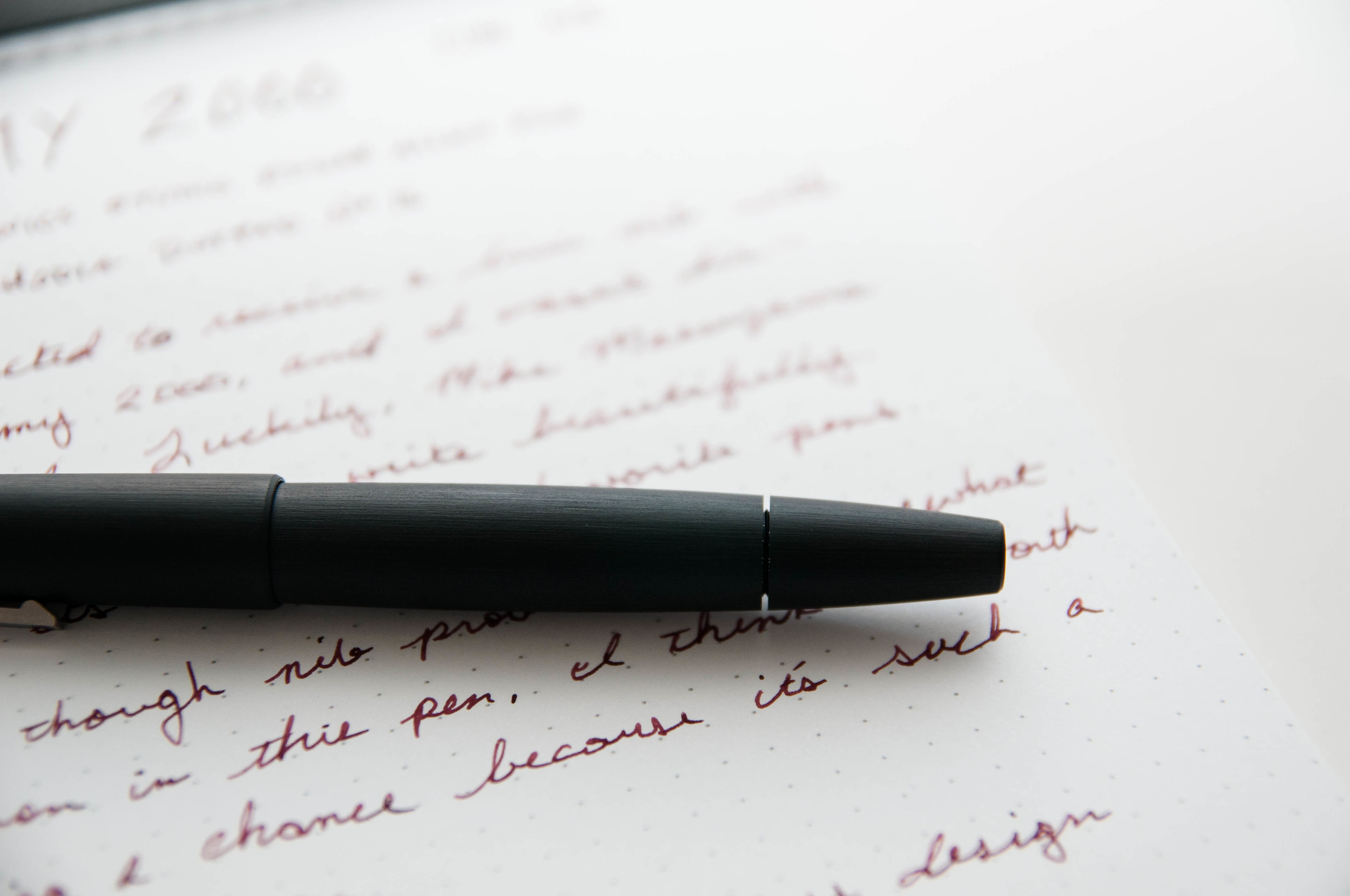
There are few pens that match the iconic design of the Lamy 2000. That's a bold statement, but this is a pen that's included in the Museum of Modern Art.

It's not uncommon to hear negative thoughts on the 2000 because of it's finicky nib. It seems Lamy have a quality control issue with this model, because it happens far too often. Yes, I'm starting this off with the negative aspect first because I want to get it out of the way.

Full disclaimer: the Lamy 2000 that I bought had a problematic nib out of the box. It wrote, but it wasn't smooth and it wasn't enjoyable. It caused anxiety and frustration more often than good feelings. With a pen that looks so awesome (and cost this much), you expect it to write with 100% consistency.

I bought my 2000 before the 2014 Atlanta Pen Show. I did this on purpose so that I could bring it along in case it had a bum nib. I'm glad I made that choice, because it did have a bum nib, and I was able to have Mike Masuyama fix it for me. If I didn't end up going to the show, I would've sent it off to a nib meister shortly after receiving it.

I love my Lamy 2000, and I think it's a great pen. But, if you buy one, it might be wise to set aside a little bit of money for nib work – just in case. That's my advice, but I really hope that the pen you buy is perfect right out of the box.

Now, on to the good stuff about this pen.

Looks

Not to be superficial, but I kind of think other pens are jealous of how hot this pen is. I know that's just personal preference, but I'm smitten.

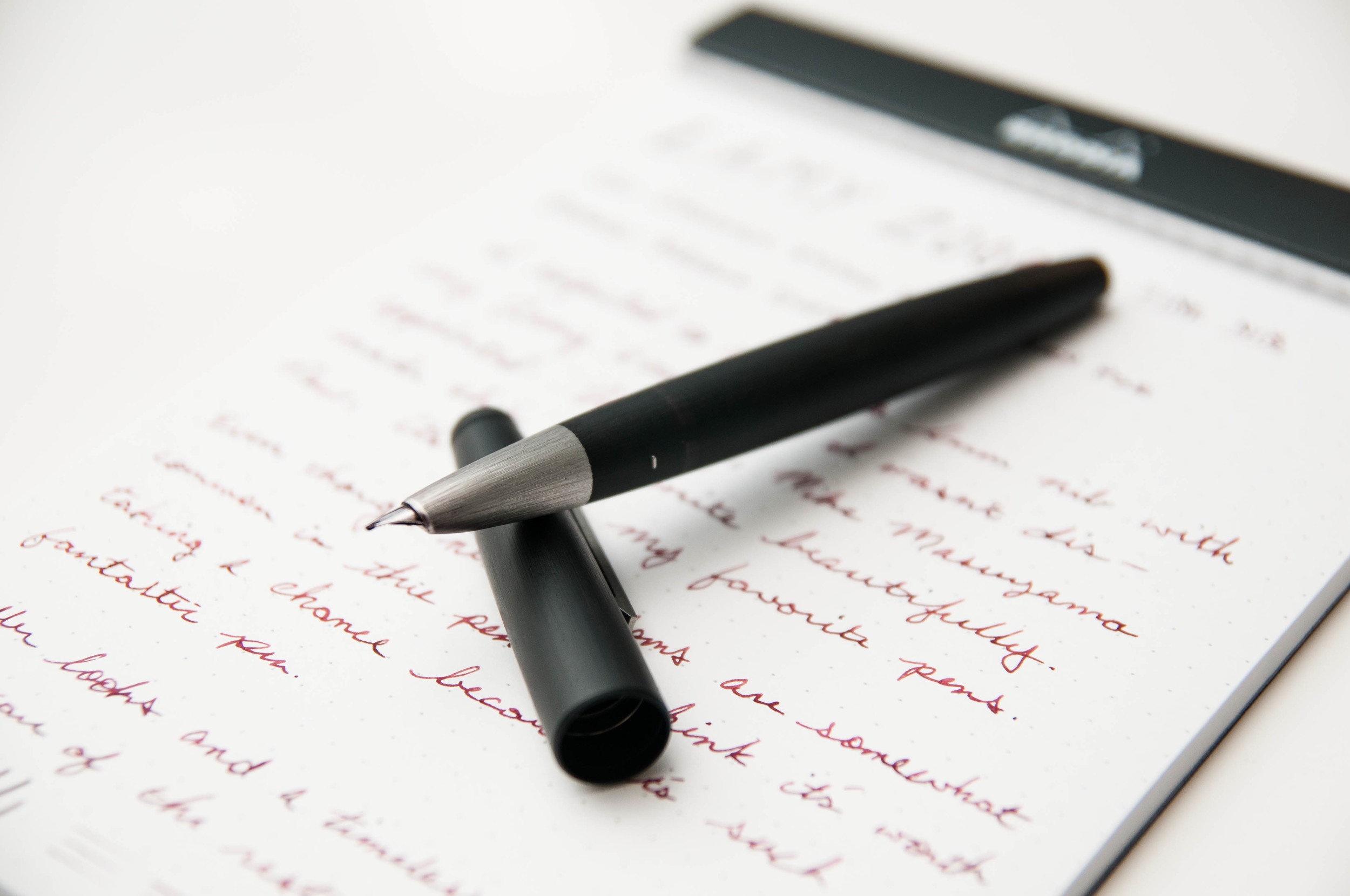
The Lamy 2000 is unique. There isn't another pen like it in design. It's sleek, modern, and welcoming at the same time. It looks like a pen meant to write, but classy at the same time. It works with casual and dress clothes splendidly. It always gets comments out in the wild.

One of my favorite aspects of the pen is the grip and nib section. The nib is hooded, and looks very small since most of it is hidden beneath the metal grip. Now, I'm no expert in metals, but I think the grip is stainless steel. Whatever it is, it feels fantastic to hold.

The body is made of Makrolon, a form of fiberglass. It looks unique, but it also feels unique. It's a subtle difference, but I always notice it. After you write for a while, the body warms up as it rests on your hand. When writing, my fingers rest on the stainless steel grip and the body rests on my hand. I've written with this pen over numerous long writing sessions, and it never got uncomfortable. It's a great material, and well-balanced in the hand.

I normally write with this pen unposted, but it also feels well-balanced when posted.

The pen is a piston filler, and the piston section is so flush with the rest of the pen body, that it's often easy to miss. I love this aspect of the design. It makes the pen look like a solid, single piece.

Another fascinating design feature is the ink window. Toward the grip section of the barrel, some of the Makrolon is thin enough to let light through so you can see (roughly) how much ink is left. This is nothing similar to a demonstrator body – it's in no way completely transparent, but it does allow you to keep an eye on your ink level. It's a great feature.

Writing

Ah, the writing. At the start, the nib was inconsistent with ink flow, and it tended to stick to the page a bit. It's hard to describe, but it was dry and seems to be held to the page with some sort of really mild adhesive. Despite cleaning the pen numerous times, this didn't go away. I took it to Mike Masuyama in April, and he smoothed it out and increased the flow. Now it writes like a dream.

This is my first gold Lamy nib, and it's not dramatically different from the steel nibs, but I do notice it every now and then. There's more give in the gold nib compared to a steel nib.

Even after being adjusted, the nib still requires a fairly strict angle of attack on the page. I've grown used to this unique aspect of the pen, and after a few sentences, I don't even have to think about it.

As I said earlier, I love writing with this pen, and that's really all that matters. I'm really happy with the work Mike did on the nib, and I hope that everyone who owns or purchases one of these little beauties has a good nib to begin with or a good nib meister that can help.

Overall, I recommend the Lamy 2000. I've heard that some vendors will check the nib before they ship the pen to you – if you ask them to. Sure, you might get a bum nib, and I don't think that's right considering the price tag. That considered, a well-writing Lamy 2000 is a glorious thing. I think it's worth the risk.

I personally bought a fine nib model, but they have extra fine, medium, and bold as well. I'm tempted to have Mike put a cursive italic on it next time, but we'll see.

(You can find more from Jeff online at Draft Evolution, Twitter, and App.net.)

Posted on August 6, 2014 and filed under Pen Reviews, Lamy, Fountain Pens.

Pilot Vanishing Point Gun Metal Black Matte Fountain Pen Review

I didn't need another Pilot Vanishing Point. I already had two: the famed Black Matte, which became one of the "pens who shall not be named" on the podcast, and a retro Black Faceted model, which is a mainstay of my collection. So why did I NEED this new Gun Metal Black Matte Vanishing Point? I rarely need any new pen, but this one I had to have.

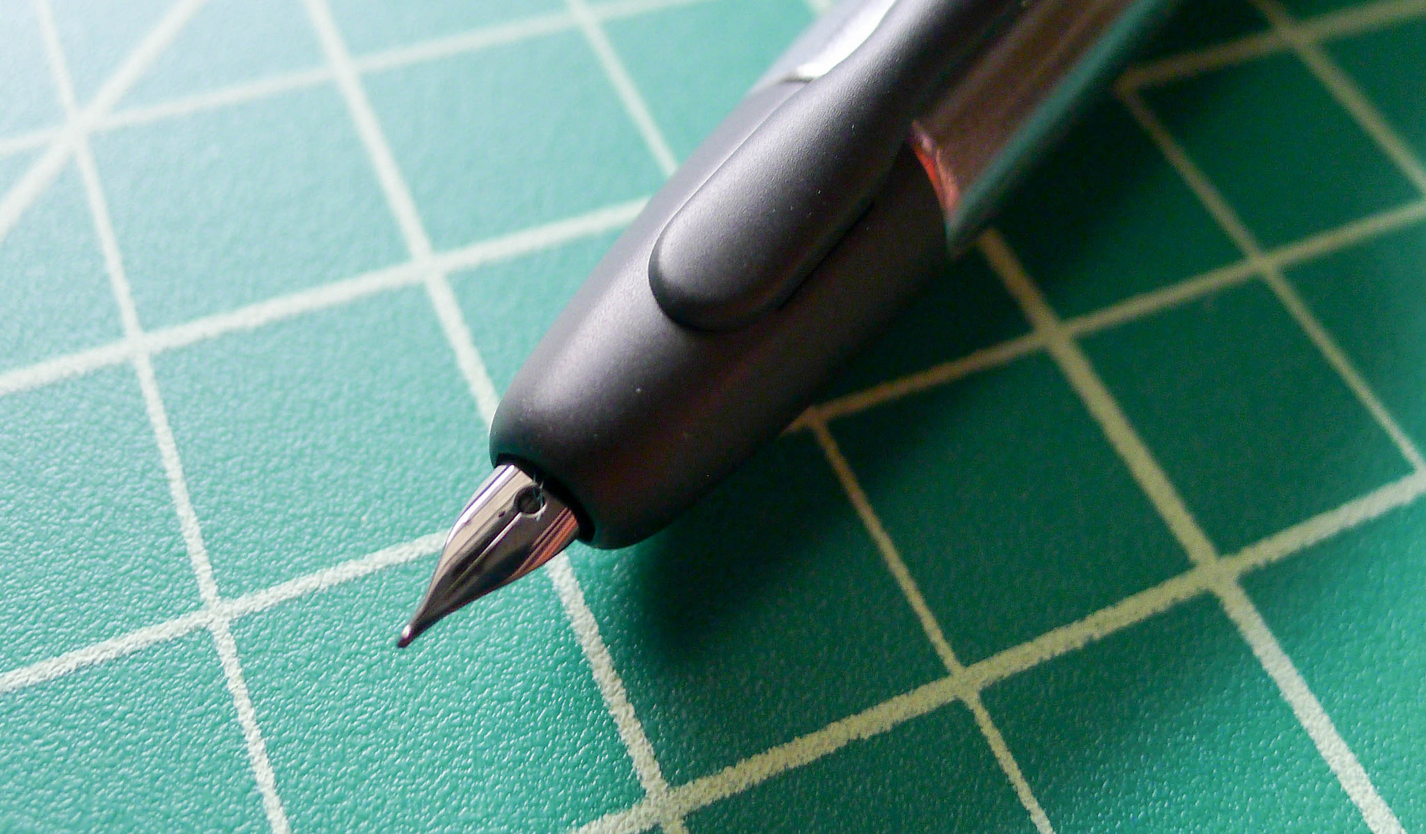
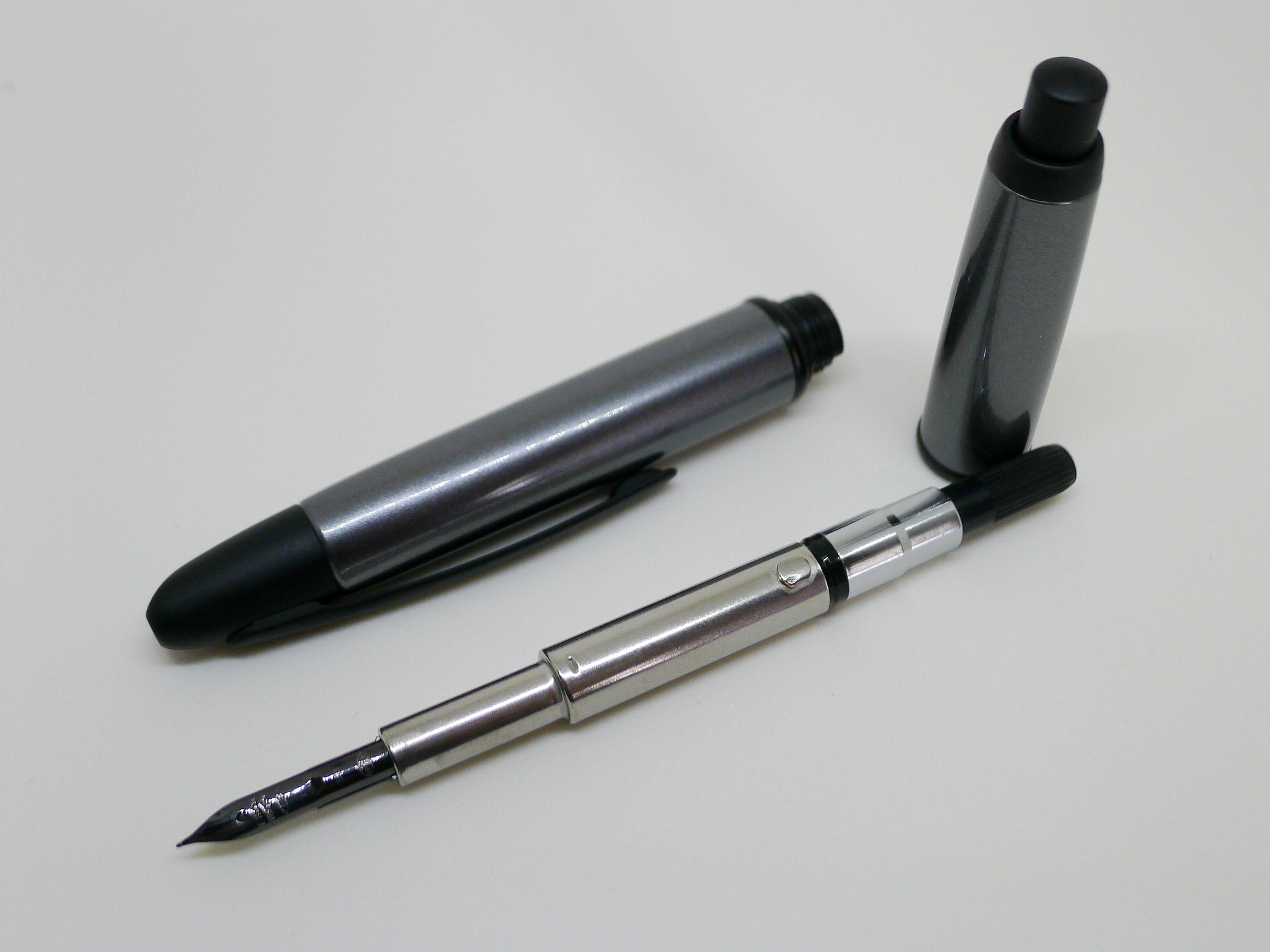
It took a while for me to get on the Gun Metal bandwagon. I wasn't sure of the color scheme at first, but after seeing multiple pictures of it and checking it out in person I went for it. The barrel is slightly different than the full black matte version, with the grey area being smooth as opposed to a satiny matte feel, which is reserved for the tip, clip, middle band, and knock. It's quite a stunning look, especially in person.

It also sports one of the recently introduced black nib units, which I am in love with. I went for the EF nib, which is ridiculously small, even for me. I never recommend this size to anyone but I love it. Paired with a well lubricated ink like Sailor Nano Black, this nib writes wonderfully smooth and consistent. But boy is it fine. You really need to manage your writing angle with this one to make sure you are hitting the sweet spot.

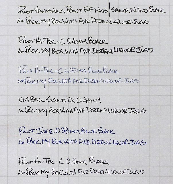
Many people have asked what fountain pen best compares to the Pilot Hi-Tec-C 0.3 mm/0.4 mm gel ink pens. Pilot's EF nibs, as found in the Penmanship (which can be swapped into the Metropolitan or Prera) and the Vanishing Point, are the closest I have found. Looking at the writing sample in my Field Notes it is closest to the 0.28 mm Uni-ball Signo DX and 0.3 mm Hi-Tec-C, so that seems like a good range. Ink and paper will cause this to vary of course.

But back to this whole idea of needing this pen. Although yes, I got this pen for free as part of my JetPens sponsorship, I still couldn't justify it without selling one of my current Vanishing Points. I didn't see myself actively using two similar pens, so my trusty black matte VP, one of my first big fountain pen purchases, has found a new home. More than any other fountain pen I own, the Vanishing Point is made to be used, anywhere and everywhere. That is this pens job, so having one sitting around collecting dust would be doing it a disservice.

My friend Mel found the words I was struggling to find about my Field Notes Butcher Orange, and it applies here too: "By using it, it is now truly yours and you've fulfilled its purpose." Words to live by.

(JetPens is an advertiser on The Pen Addict and I received this product at no charge.)

Posted on July 21, 2014 and filed under Pen Reviews, Pilot, Vanishing Point, Fountain Pens.