Posts filed under Fountain Pens

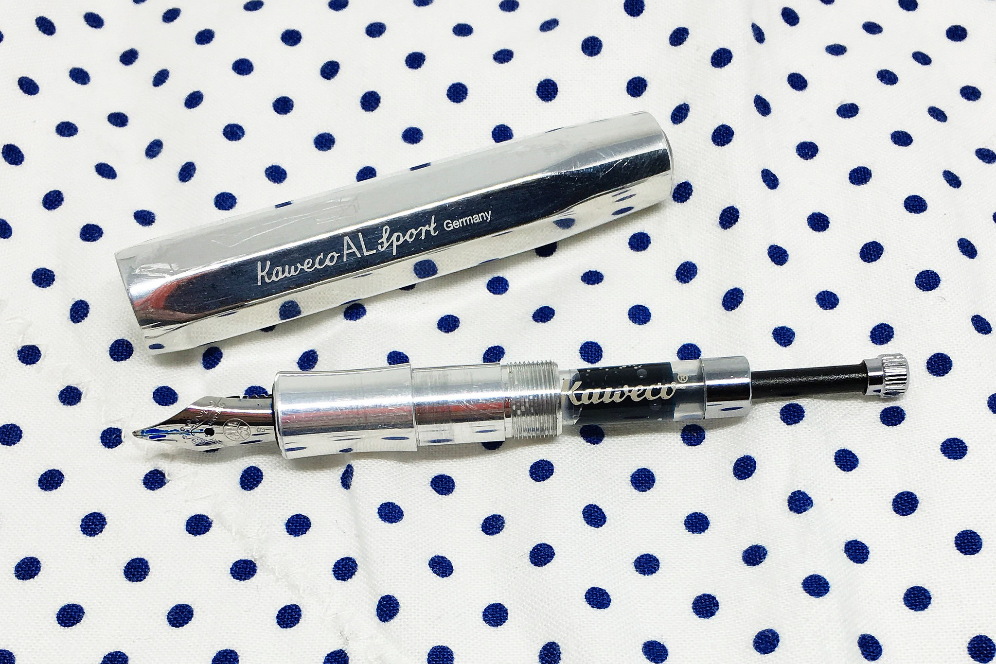
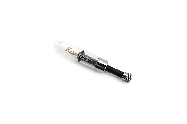
Kaweco Mini Fountain Pen Converter Review

Image via JetPens.com

Image via JetPens.com

There was an attempt.

Those are my thoughts in a nutshell on the Kaweco Mini Fountain Pen Converter. This isn’t a bad product, but it’s not a good one either. Let’s dig in.

Converters for Kaweco fountain pens have always been sought after. The small barrels in the Sport and Liliput lines don’t take traditional converters - the barrels are too short. But people love their Kaweco’s - myself included - so news of any converter that fits is always met with excitement.

The previous attempt was the Kaweco Squeeze Converter, and it was a failure. Good idea, but it didn’t work. You could barely pull in enough ink to get you through the day, which made trying to use it a frustrating experience.

The new Mini Converter is a piston style converter that does pull in more ink than the Squeeze, but it is only slightly less frustrating to use.

Liliput for scale. If it doesn't fit, you must acquit.

Liliput for scale. If it doesn't fit, you must acquit.

First of all, it only fits the Sport models, not the Liliput. I didn’t realize this initially, thinking the piston rod would somehow remain flush with the end of the converter when filled. That’s not how this converter works. You attach it to the nib unit, dip the nib into the bottle, pull the piston back to fill, and leave it in that position. That added length doesn’t fit inside of the Liliput, as I found out the hard way when screwing the barrel back together. #InkyFingers

Once I realized the mistake I made, I grabbed an AL Sport and started over. The second issue, which you will see in the video below, is that it is a two handed operation to fill. That’s not abnormal, but due to the small size I had to stick my left thumb and index finger practically inside the top of the ink bottle to pull back the piston properly. There isn’t a lot of room to work with. And this bottle is 90% full. I imagine you will have an even harder time with ink bottles under 50% full.

Filling the new Kaweco Sport piston converter. #Kaweco #fountainpen

A video posted by Brad Dowdy (@penaddict) on

When I went to screw the AL Sport back together, the fully extended piston still hit the back end of the barrel. This caused ink to once again to come out of the nib as I tightened everything back up. In the end it fit, but it wasn’t a smooth process.

Kaweco converters add frustration to what should be a simple process. Including this one, they are 0-for-2 in making a functional product. I would love to be able to recommend one of these to you, but they just aren’t worth the headache.

This leaves you two options: Use short international cartridges or syringe fill empty cartridges from your ink bottles. Fortunately, we are seeing more short international options hit the market, including great colors from Waterman, Diamine, and Caran d’Ache. Waterman Mysterious Blue has been my go-to short cartridge recently, and works well with all of my Kaweco’s.

Time to move on to other ideas Kaweco.

(JetPens provided this product at no charge to The Pen Addict for review purposes.)

Posted on March 27, 2016 and filed under Kaweco, Fountain Pens.

Monteverde Invincia Orange Carbon Fiber Fountain Pen Review

(Jeff Abbott is a regular contributor at The Pen Addict. You can find more from Jeff online at Draft Evolution and Twitter.)

My experience with Monteverde is fairly limited, as I only have one fountain pen from the company. That being said, that one fountain pen is one of my favorite and most dependable pens I own.

The Artista was a complete impulse purchase — I had no clue about the company at the time, but I liked how it looked. That pen grew on me quickly for its smooth writing experience, mesmerizing demonstrator body, and silver accents. I still highly recommend that pen to new fountain pen users as a 2nd or 3rd pen after trying out cheaper pens.

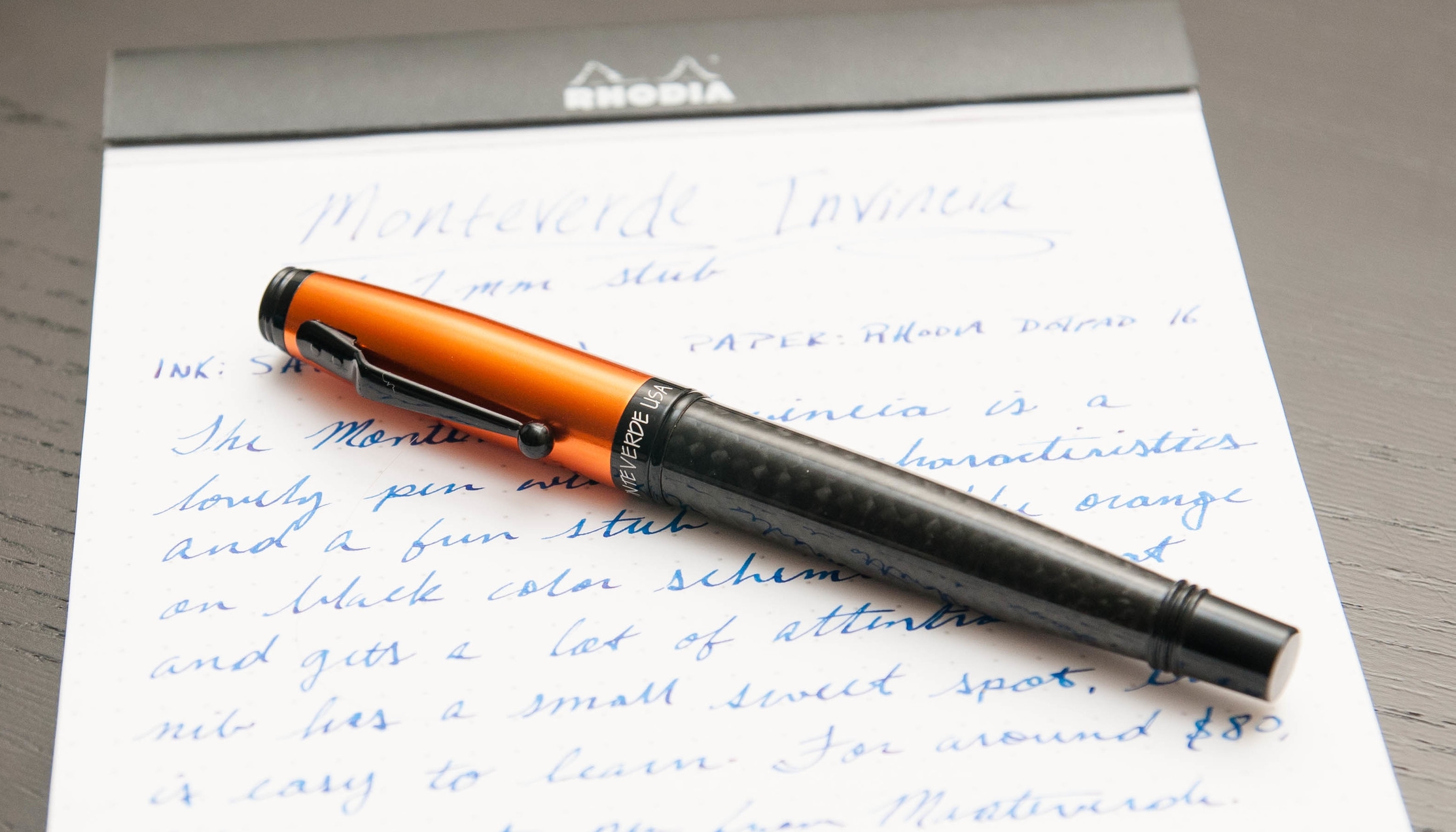
Trying out a Monteverde Invincia had me excited from the start. I've seen these pens at every pen show I've been to and have always been drawn to the design and colors. For some reason, I'd never pulled the trigger. Well, I finally had a chance to try one out and put it through the paces. The Invincia, like the Artista, is a solid fountain pen that many people will enjoy.

Look and feel

The Invincia has a nice heft to it that lets you know that the barrel and cap are made of some type of metal. It's not as heavy as a Karas Kustoms Ink, but not as light as a Pilot Metropolitan. It's a nice weight when writing unposted.

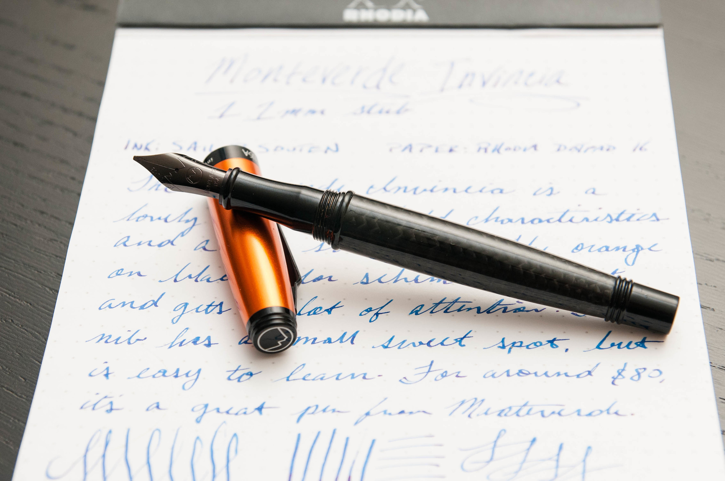
The model I have is the Orange Carbon Fiber. Now, the name implies that it's made out of an orange-colored carbon fiber material, but that's (sadly) not the case. Instead, the cap is a bright, shiny orange and the body is made of a carbon fiber (or carbon fiber imitation — I'm not good at telling the difference). Overall, it's a stunning combination of textures and colors. I love the dark gray carbon fiber mixed with the bright orange pop.

The clip is a unique shape, and one that I've only seen from Monteverde. It has a sharp angle just outside off the cap, but has a nice ball shape at the end to make clip use easy when clipping or removing it from different things.

The cap is a twist off, but only requires a quick turn to cap or uncap — not like your average screw lid. It's somewhere between a friction cap and a screw cap. I really like the secure motion of using the cap on this pen. I never have to wonder if I'm over-tightening or if it's really secured. The cap posts perfectly, but makes the pen feel a bit too top-heavy, so I normally write with it unposted.

The grip section is made of metal, and is very smooth and nicely contoured. There's a nice lip at the end of the grip to provide a place for your finger tips to rest when writing. For me, the grip section is very comfortable. Even though it's smooth, I haven't had any issues with grip or slippiness.

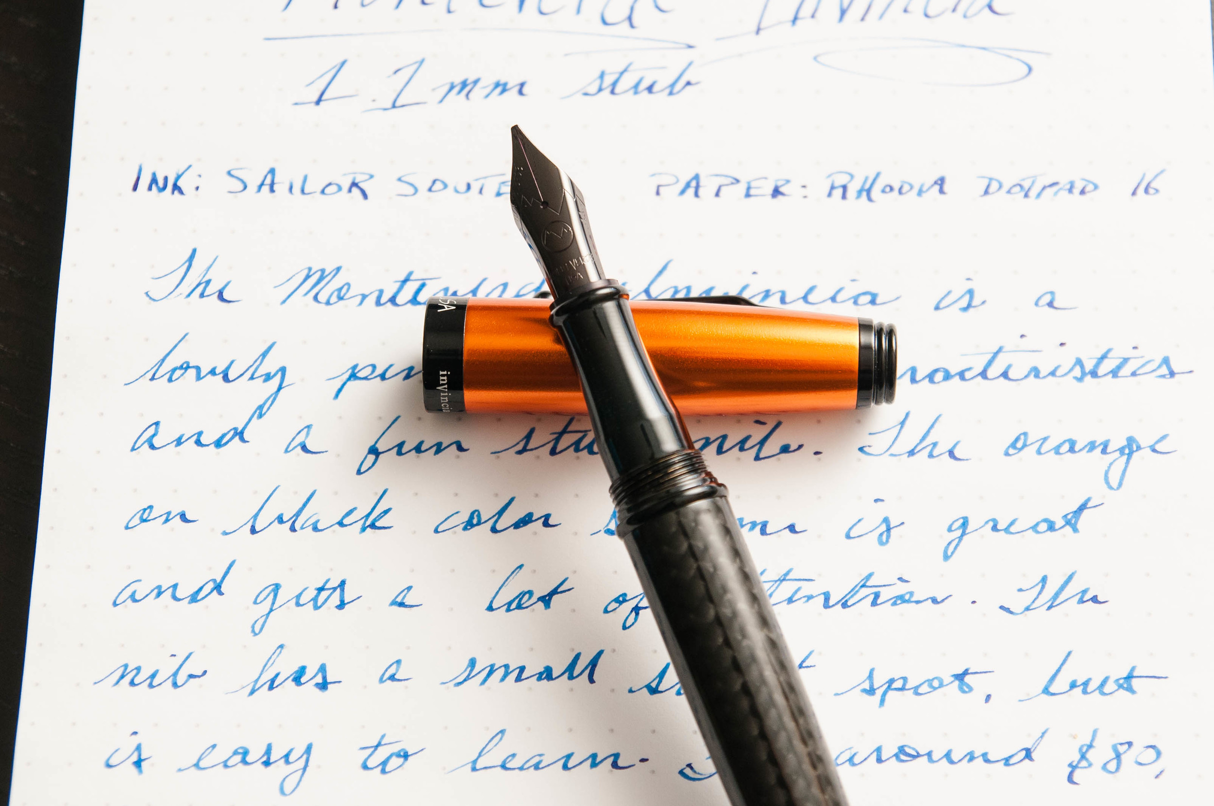
The nib on this pen is one of the most striking visual pieces. It's a long, elegant shape, but it's also completely black. It has minimal branding etched into it, so that shiny black goodness can really take the spotlight. I'm never expecting a black nib when I open a pen, and this one still delights me when I uncap the pen. It's a really well-shaped nib and the black color really sets it off.

Writing

A pen might look and feel amazing, but a bad nib can ultimately ruin it. These pens come with a range of nib options, from Fine, Medium, Broad, and Stub. The stub nib is a 1.1mm nib that lays a very nice line. I have the stub version, and I've mostly been happy with it.

First, the good things about the nib. It's smooth, flows well, and makes some fantastic line variations from the stub nib. Even though they call it a stub, it has some distinct line edges that resemble a couple of italic nibs I have. Stub nibs usually have softer edges, but each manufacturer interprets these nib sizes and specifications differently. In the case of Monteverde, it looks like the value a crisper line over a forgiving position. And that brings me into the bad part of the nib.

When you move into specialized nibs, one of the first things you'll encounter is certain characteristics and nuances that only exist in specialized nibs. For example, stub and italic nibs have a large flat edge designed to create dramatic line variation. The trade-off in these nibs is that there's a small "sweet spot" when using the pen. You have to hold the pen a certain way against the paper in order to keep it writing smoothly. If you rotate either way, it will either scratch, skip, stop, or a combination of all three.

In the case of the Monteverde stub nib, it has a fairly small sweet spot. It's nothing that I classify as a deal-breaker, but it is something that causes me some frustration. Like all pens, it has a personality when it comes to writing, and I've come to learn how it likes to be treated when writing. When held properly, it really is a beautiful, well-behaved nib.

That being said, specialized nibs create specialized opinions. What I dislike about a nib, another person might love. So, take my quibble with a grain of salt.

Overall

As a pen, the Invincia is beautiful, eye-catching, well-balanced, and fun to use. I love the amount of variation I can get from the steel stub nib, and I love the weight and feel of the pen in my hand when writing. Apart from my own nib preferences, this pen has no downsides for me. I'm happy that it's part of my collection alongside my Artista.

You can find the Invincia in a variety of colors and nib types from Goulet Pens. As I'm writing this, they have black, blue, lime green, and orange in stock, all of which look as nice as this one.

(Goulet Pens provided this product at no charge to The Pen Addict for review purposes.)
Posted on March 23, 2016 and filed under Monteverde, Fountain Pens, Pen Reviews.

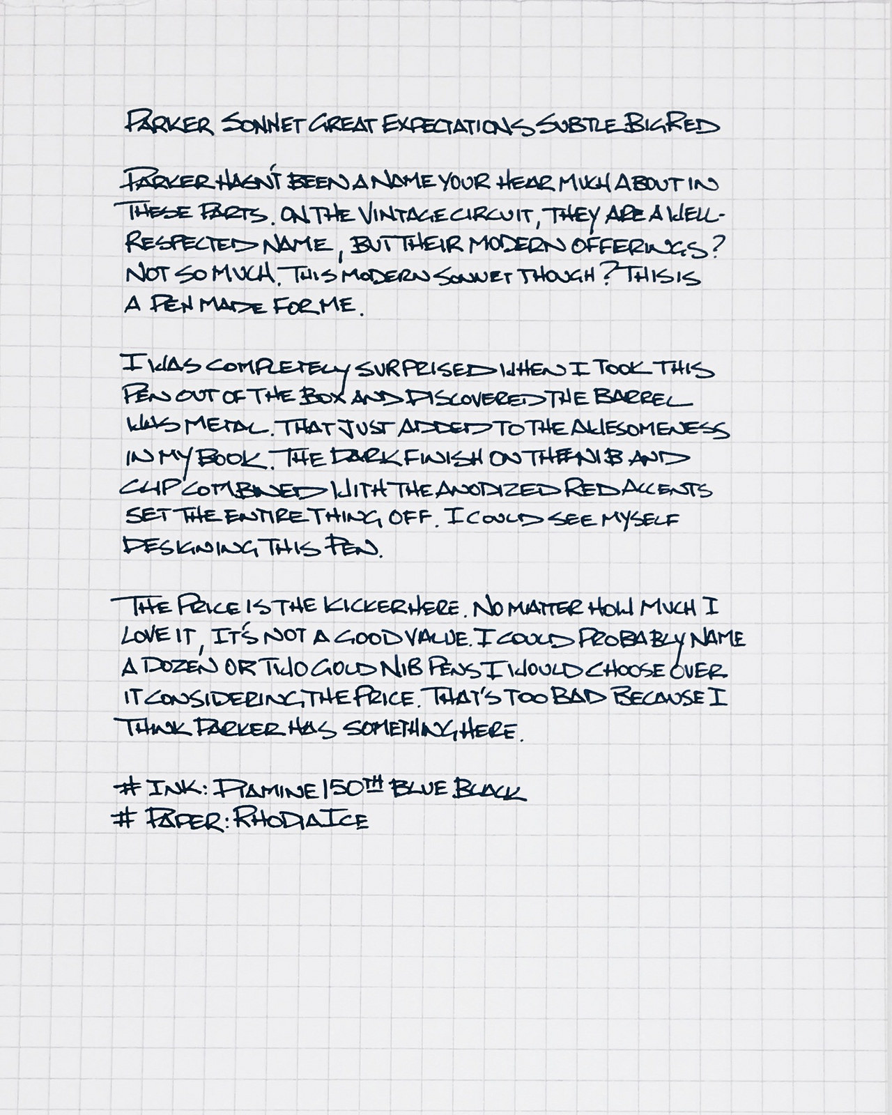
Parker Sonnet Great Expectations Subtle Big Red Fine Fountain Pen Review

It has been a long time since new Parker pens have earned the respect of the pen buying community. Vintage Parker’s are highly sought after, but a down few decades for the brand has them off many people’s radar.

A couple of years ago, things started to pick back up for Parker, with the introduction of pens like the IM Premium, which was a pleasure to use. They created a beautiful pen and gave a nod to the amazing Parker Vacumatic. What’s not to like about that? It performed very well too.

Since that positive experience, I kept my eyes peeled for other interesting Parker designs, and the Parker Sonnet Great Expectations Subtle Big Red looked right up my alley, so I asked Goldspot if I could take it for a spin.

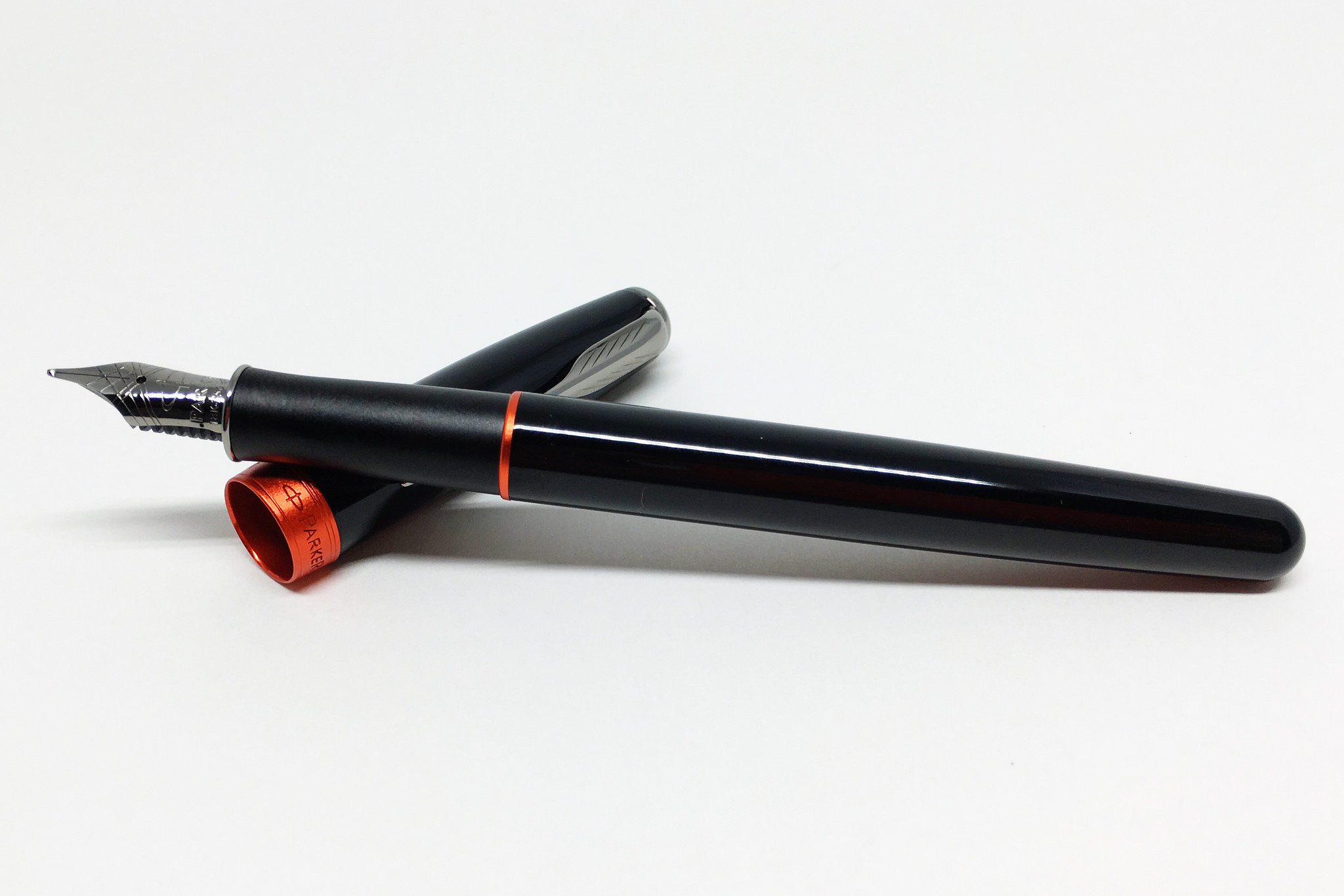
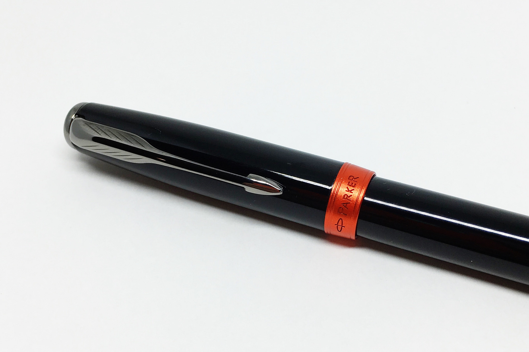
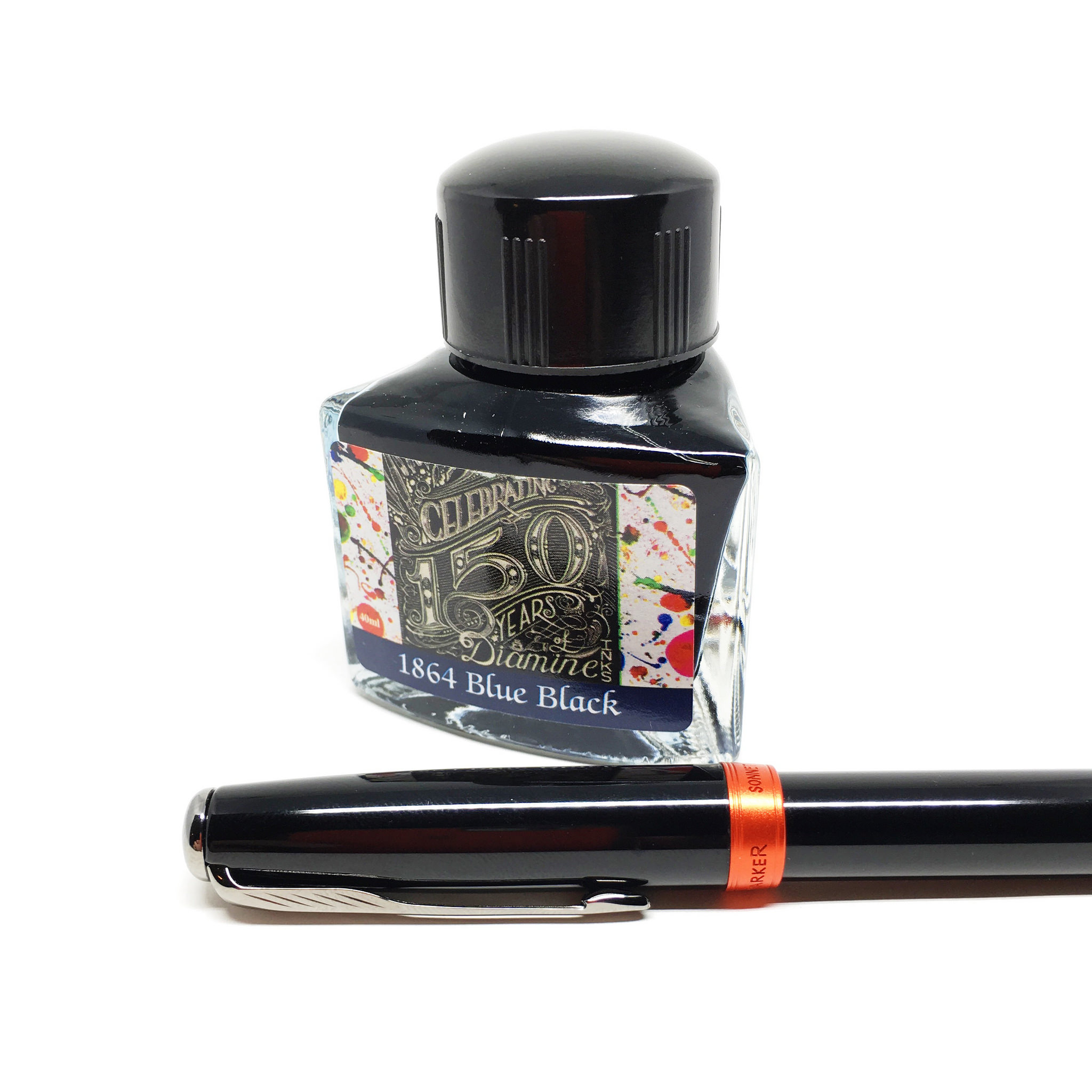
Despite thinking this was a great looking pen in pictures, I wasn’t prepared for what would arrive in the box. This is a metal barrel pen, and an awesome one at that! I guess I was thinking this was an acrylic pen for some reason, but nope. The black glossy finish is cool to the touch, with beautiful anodized red cap and section bands.

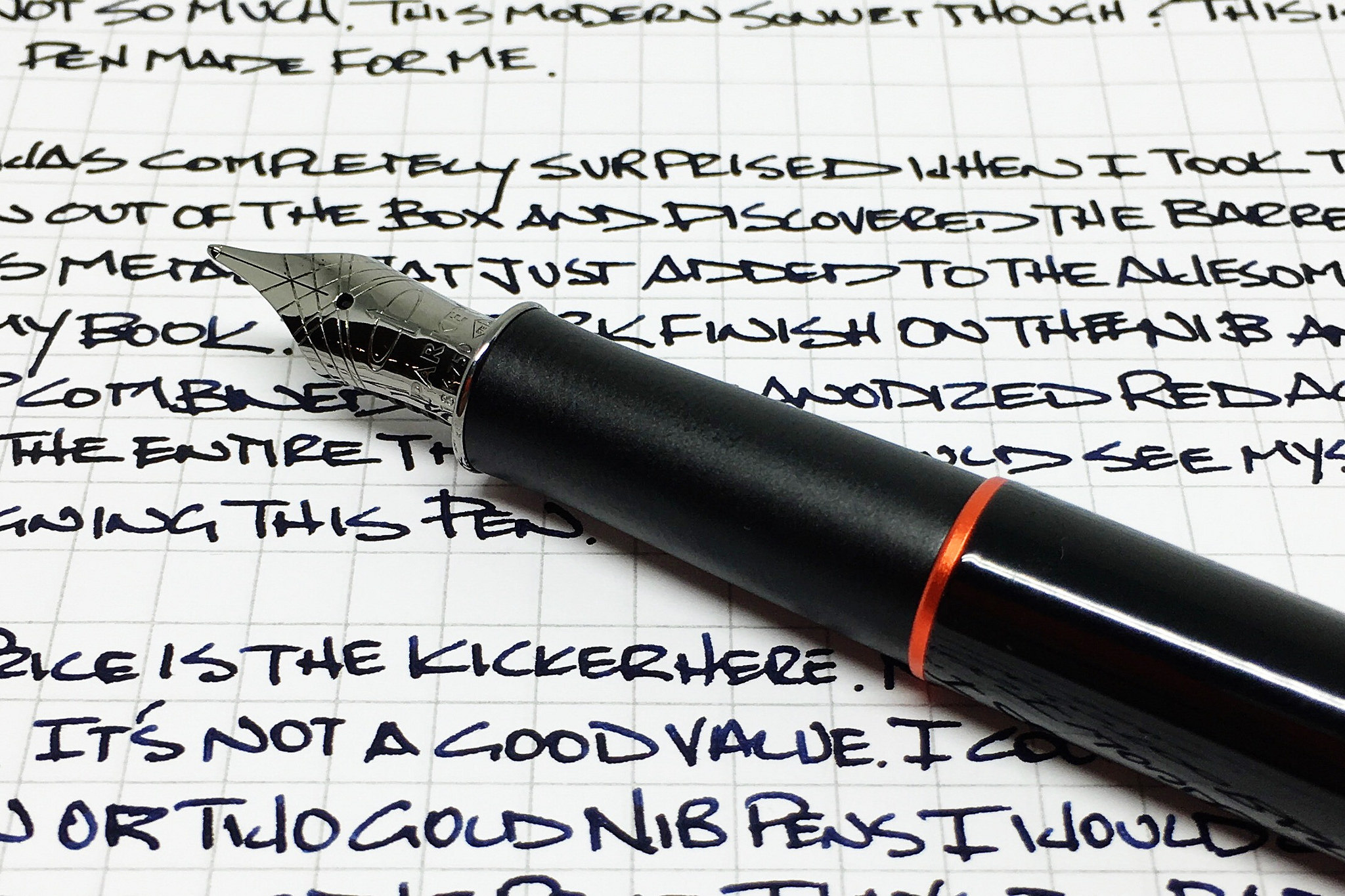
The grip is metal as well, but has a satin finish to contrast the glossy finish found on the body. I don’t know the exact finish color on the clip and finial but they are more of a nickel or pewter color as opposed to a bright chrome. The nib takes on that colorway as well, and shows off the stunning cross hatch pattern.

As much as I am in love with the look and feel of this pen, I was very nervous about the performance not living up to the hype. Thankfully, the Fine 18k nib was up to the task and writes wonderfully. If I had my way I would want a finer nib, but this is a good stock gold fine nib.

It’s not all roses with the Sonnet though. While there are many pens I will pay a premium for, Parker is asking for even more than that here. $270 is way, way too much. $150 maybe? $200 tops. There is no way I could recommend this pen over almost any gold nib Pilot, Sailor, or Lamy. Pelikan is about the only one I’ve seen that can pull off the pricing premium successfully, and this pen is no Pelikan.

Hardcore Parker fans may pay the price, but I’m not one of them. I love everything else about this pen though, so maybe if their pricing model changes (not likely) or these go on a big sale (possible) I might be interested.

(Goldspot provided this product at no charge to The Pen Addict for review purposes.)

Posted on March 14, 2016 and filed under Parker, Fountain Pens, Pen Reviews.