Posts filed under Fountain Pens

Cleo Skribent Classic Palladium Fountain Pen Review

One of the best parts about this job is there is no shortage of products to review. Whether it is a new release of a favorite Japanese gel pen or a new-to-me German pen brand, I love exploring, learning, and sharing what they are all about.

Cleo Skribent falls into the latter category. I had heard the name in passing, but had never tried one until my friend Renso at Papier Plume sent me one to check out.

Founded in 1945, this brand is everything you would expect from a respected German manufacturer. The designs are classic, the build is quality, and the performance is excellent.

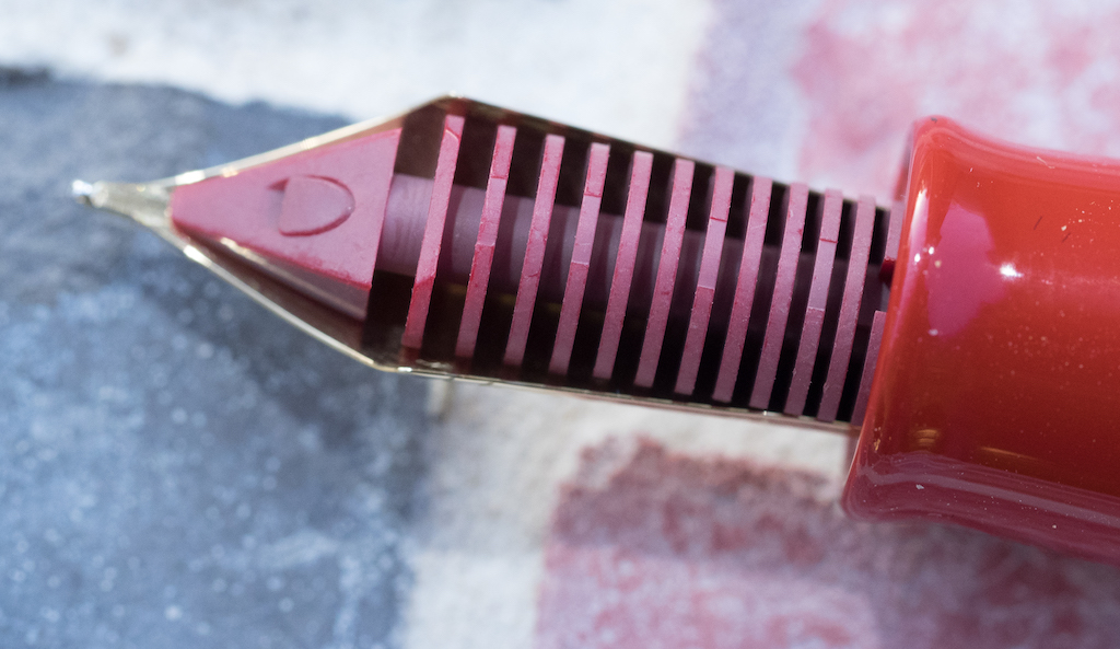
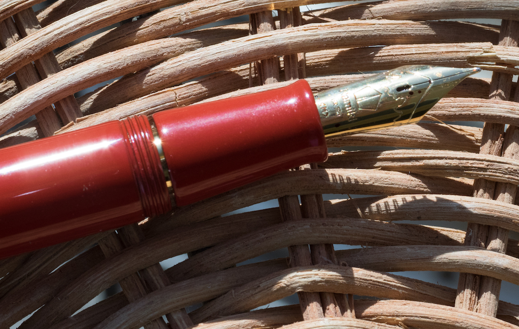
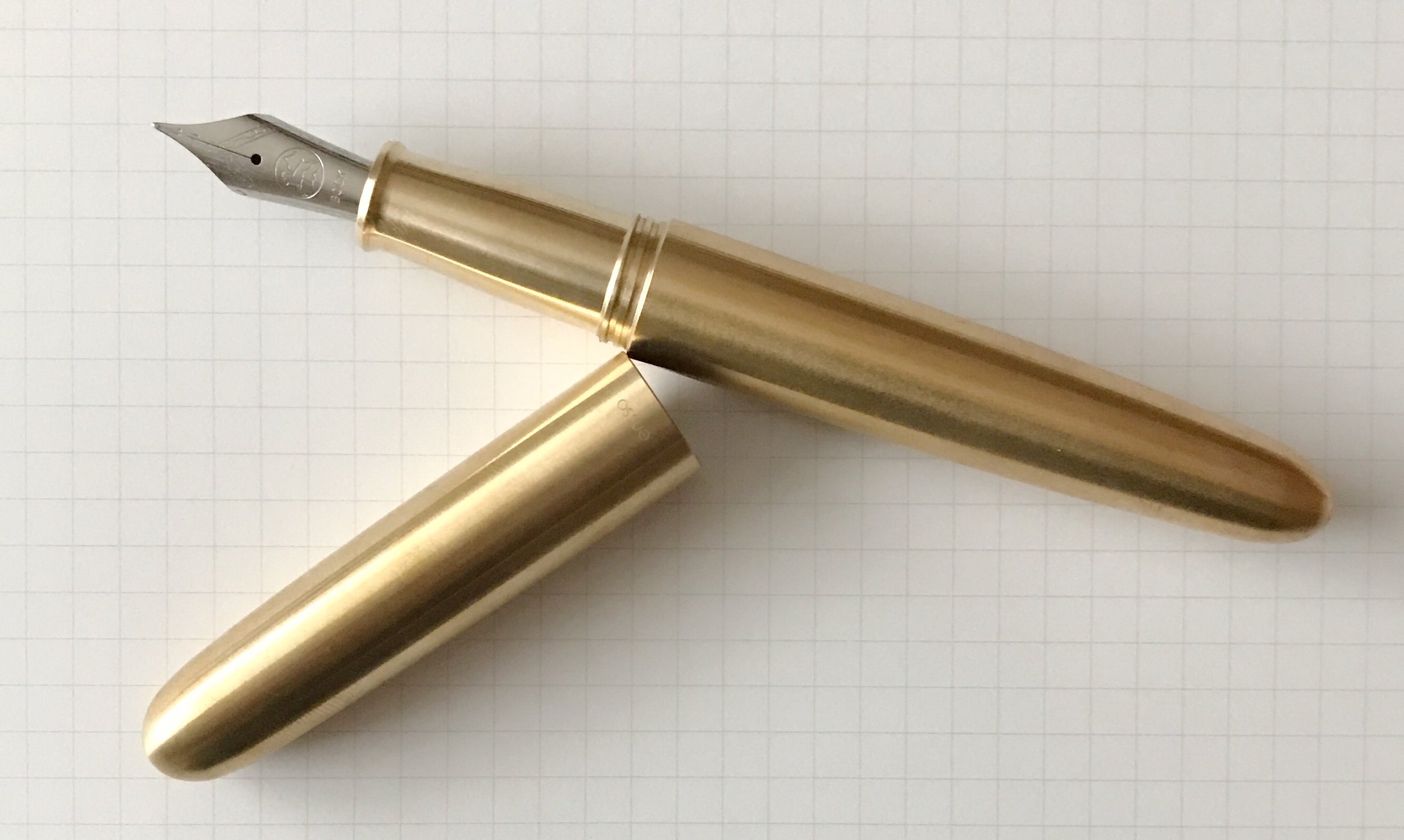
The model I have on loan is the Cleo Skribent Classic Palladium, one of their entry level steel nib models. While it looks simple on the outside, it has a few added touches that make it a very enjoyable writer.

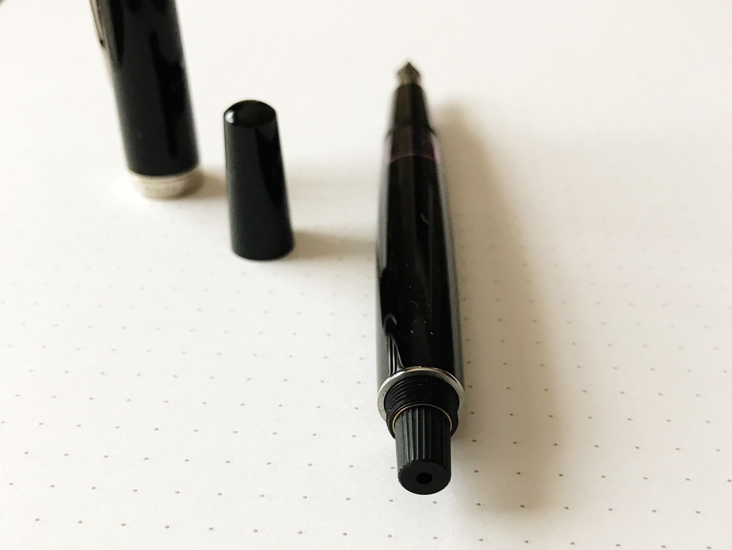
First of all, it is a piston filler. Hidden under a blind cap at the end of the barrel, the piston works smoothly and effectively. I had no issues drawing a full barrel of ink into the pen on my first go. And I have a soft spot for any pen with a full, clear ink window like this pen does.

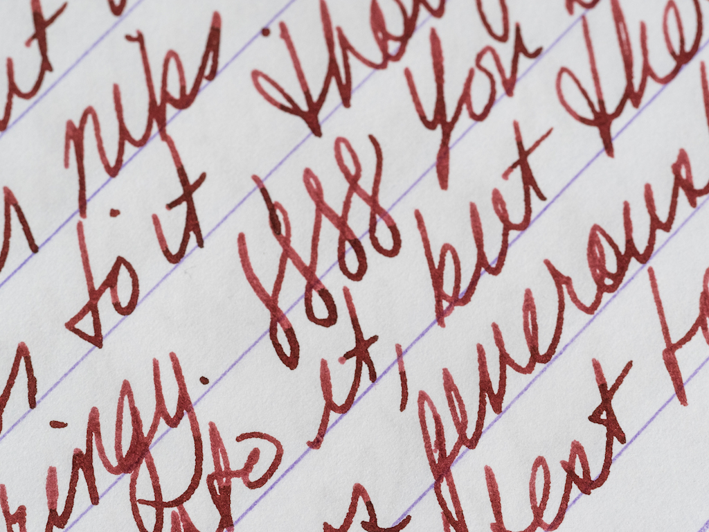
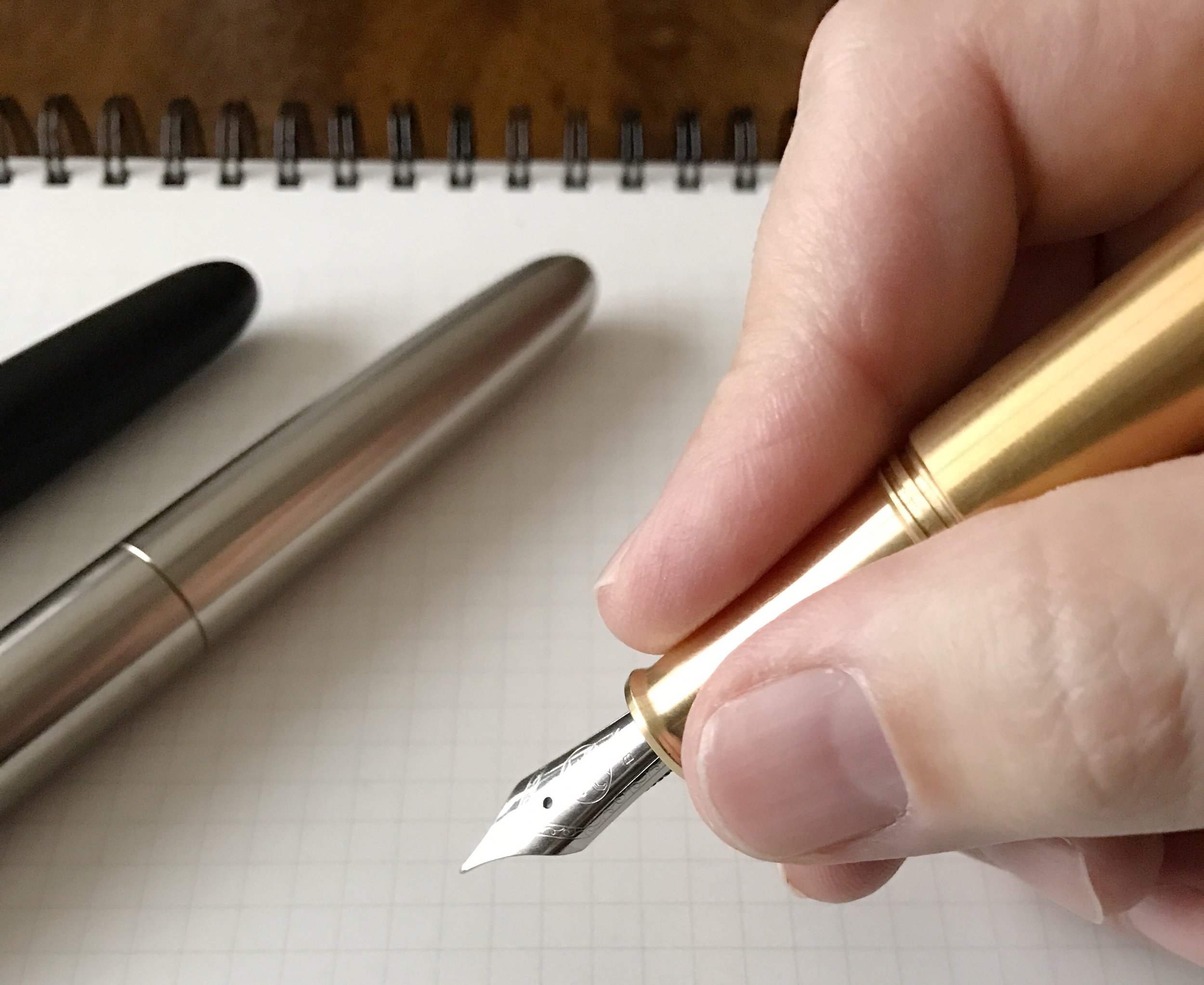
Secondly, the nib is fantastic. I shouldn't be surprised given its German heritage, but wow, this steel nib sings. The model I'm testing is a Fine nib, and from the moment it hit the page it was smooth, clean, and had excellent flow.

Finally, the price. At $110 it is cheaper than the pen it compares most favorably to: The Pelikan M200 series. I think the piston mechanism in the Pelikan is better, likely because it might be the best in the world, but other than that, these pens are very comparable.

The Cleo Skribent Classic is longer than Pelikan's entry level model, and has a straight-taper section as opposed to Pelikan's lip at the end of the section. And, gun to my head and recency bias and all that, I think I prefer the Cleo steel nib.

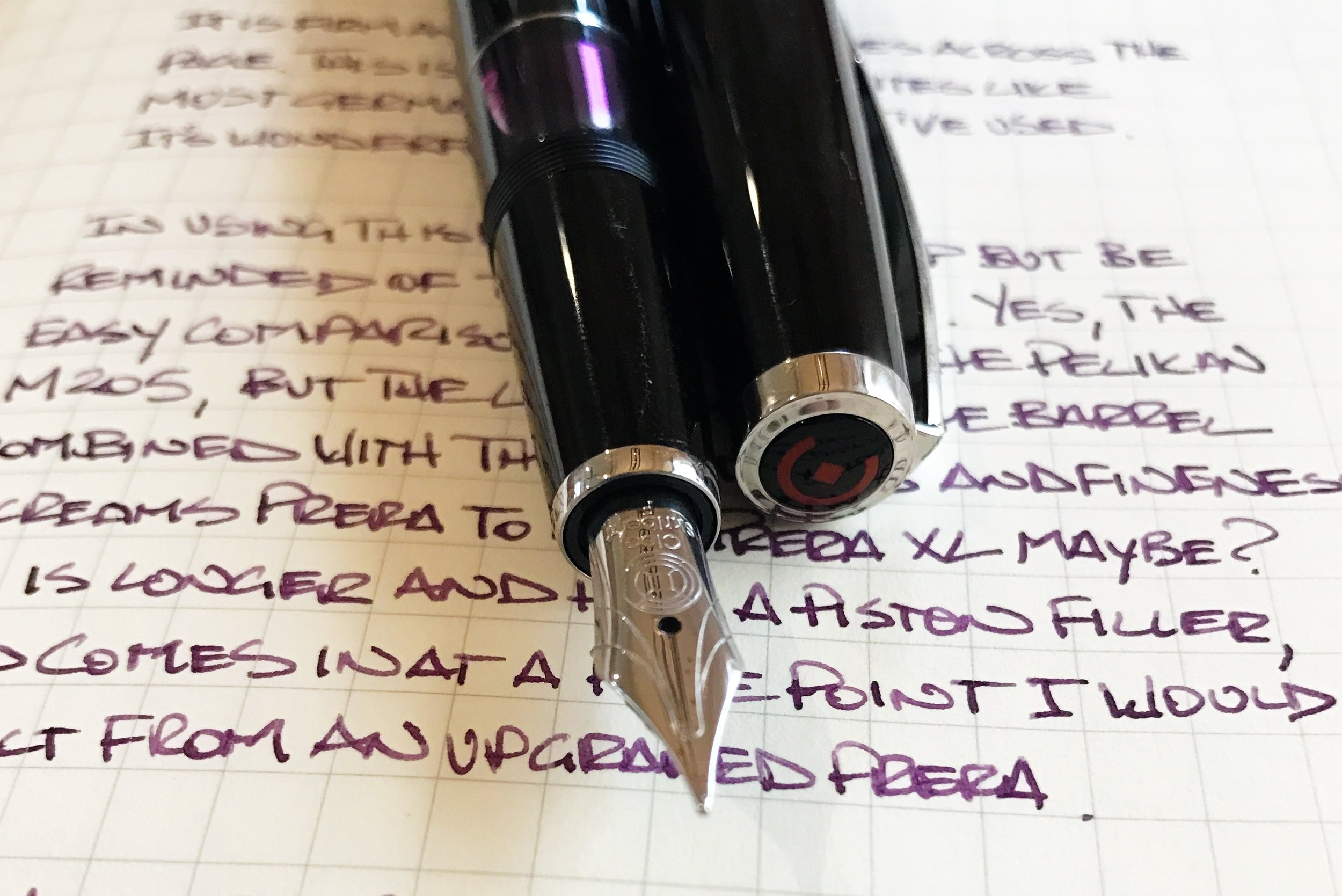
Even though the comparison is made most easily to Pelikan, there is one thought I couldn't get out of my head the entire time I held this pen: This is a bigger, awesomer Pilot Prera. The Prera XL if you will.

If you have ever used a Prera, you will understand what I am about to say. It is an airy pen to write with. Lightweight, but somehow rock solid. That's why it is so well loved. The Cleo Skribent Classic feels the same way to me, except in a larger size and with a better filling system. If this pen were stamped Pilot at this price point we would all be having puppies over it.

Consider me a fan of Cleo Skribent. I'd like to try a few of their other models, especially in the brighter barrel colors they offer. The Classic has been an excellent introduction.

My thanks to Papier Plume for loaning me this pen for purposes of this review.


Enjoy reading The Pen Addict? Then consider becoming a member to receive additional weekly content, giveaways, and discounts in The Pen Addict shop. Plus, you support me and the site directly, which I am very grateful for.

Membership starts at just $5/month, with a discounted annual option available. To find out more about membership click here and join us!

Posted on January 2, 2017 and filed under Fountain Pens, Pen Reviews, Cleo Skribent.

If Ever There Was a Christmas Pen, This Is It: The Namiki Yukari Royale Vermillion

(Susan M. Pigott is a fountain pen collector, pen and paperholic, photographer, and professor. You can find more from Susan on her blog Scribalishess.)

Happy holidays to all the pen addicts out there! I’m certain we all asked for at least one fountain pen (or fountain pen related gift) for Christmas or Hanukkah, and I hope you all get what you wished for. Me? I asked for a Montblanc Rouge et Noir in Coral which I got in July and already reviewed. But I was a very good girl. I put it back in its box and am waiting to open it for real on Christmas day.

In the meantime, however, I wound up purchasing what I consider to be a true Christmas pen due to its vibrant red color: The Namiki Yukari Royale Vermillion.

The Namiki Yukari Royale is a large pen made of brass and coated with Urushi lacquer. The vermillion color is an intense, deep red that simply glows. The artist achieves this glow with a polishing method called Roiro Urushi Shiage (Non-oil lacquer finish). The artist polishes the pen with a special charcoal and then repeatedly rubs raw lacquer over it. The process can take as long as three months. (Source: Chatterly Luxuries).

The pen comes in some very impressive packaging, as you would expect at this price point (see below). There’s an outer golden-hued cardboard box. Inside is a large softwood box stamped with the Namiki logo. When you open this box, the pen and a large bottle of ink are nestled in plush red velvet. It’s a beautiful presentation, and it elicited a happy “ooooh” from me. Normally, I don’t care about packaging, but I appreciate a bit of pizzazz when I buy an expensive pen, and Namiki does pizzazz well.

The pen comes with some paperwork: a warranty card, a certificate of authenticity, and instructions for filling.

This is one elegant pen. It is made entirely of brass coated with urushi. The adornments are limited to a gold clip embedded in the cap (not around the cap) and a circlet of gold at the base of the cap.

The clip is engraved with the Namiki name, and on the top is a lot number.

The pen uses the Pilot Con 70 converter. Although it works well (it’s a push button converter), it is not my favorite filling system, mainly because it is almost impossible to get clean. That said, it is simple to use and it holds a respectable amount of ink (.9ml).

Because the pen is made of brass, it has some heft to it. It weighs 45 grams uncapped, so people who prefer light pens will probably find this pen too heavy. I, however, love the weight. When you pick this pen up, it feels substantial yet it is perfectly balanced. The barrel sits comfortably in the space between your thumb and index finger offering an effortless writing experience.

You can see how thick the barrel of the pen is.

The pen is about 150mm capped and 135mm uncapped. I would not advise posting this pen because it is already so heavy.

Of course, the most important quality of a fountain pen is the writing experience which is largely determined by the nib. This nib is a #20 in single-tone 18k gold with the Namiki logo and Mount Fuji engraved on it. It has a long oval breather hole. On the side of the nib the number 914 appears, which I think means the pen was manufactured in September of 2014.

The feed is red plastic coated in urushi. It is one of the few pens you can get with a matching feed. I love how the vermillion feed lends a unity to the overall aesthetic quality of the pen.

I chose a medium nib because Japanese nibs tend to be much finer than their Western counterparts. The medium writes smoothly with just a hint of feedback, but no scratchiness. The nib is not flexible, but it isn’t hard as a rock either. You can certainly press into it and feel its softness, but it doesn’t create line variation. The ink flows generously from the nib most of the time.

I flossed the nib to create more flow, and that seemed to help. However, sometimes I have to shake the pen a bit to get the ink flowing. I’ve been using Robert Oster Astorquiza Rot in the pen, but I need to try other inks to see if they have better flow. It may be my imagination, but Japanese pens seem to write better with Japanese ink.

One irritating thing I discovered about the Namiki is that when I unscrew the cap, the barrel tends to unscrew as well. I’m not sure what causes that, but I usually have to tighten the barrel before I begin writing.

Though some would say this pen’s design is boring and uninspired, I find it incredibly elegant. Its color is stunning but the pen remains zen-like because of its simplicity. As John Mottishaw writes on Classic Fountain Pens, “Perhaps this is what a haiku would look like if it took the shape of a fountain pen?”

I purchased this pen from Chatterley Luxuries after stewing for a long time over a Danitrio I had ordered previously. Bryant was very patient with me as I tried to decide between the Danitrio and the Namiki. Ultimately, I chose the Namiki and I’m very pleased with this pen. The retail price for the Namiki Yukari Royale is $1200. However, if you go to Chatterley Luxuries, they will email you their price which is significantly less than retail.

Pros

  • The Namiki Yukari Royale was a grail pen for me, and it has definitely earned its status in my view.
  • This pen is absolutely stunning both because of its gorgeous smokey-red color and simple, elegant design.
  • This pen feels amazing. The urushi lacquer warms to your hand, and even though the pen is heavy, it is perfectly balanced.
  • The nib is excellent, soft and smooth.
  • The converter holds .9ml of ink and is easy to fill.

Cons

  • This is a very expensive pen.
  • When you unscrew the cap the barrel unscrews as well which is rather irritating.
  • The Con 70 converter is difficult to clean.
  • I’ve had some flow issues with the pen, but I need to try it with some different inks. It’s just that Astorquiza Rot goes so well with the pen I’ve not wanted to change inks!
Posted on December 23, 2016 and filed under Pilot, Namiki, Fountain Pens, Pen Reviews.

First Look: PIUMA Fountain Pen

I had Mike Dudek on the podcast last week, and it was inevitable we were going to talk Kickstarter pens. He is one of the few people that is as crazy as me, and possibly crazier seeing some of the projects he has backed.

When the PIUMA Fountain Pen came up in the conversation, Mike mentioned it “looked nice, but…” then struggled to come up with more. I chimed in with "…but this was done four years ago.” He agreed, and we both elaborated on the point we were trying to make. The PIUMA pen does not break any new ground in design, functionality, or materials, but that doesn’t keep it from being a damn fine pen.

I backed the brass model early on, and Ensso, the maker of the PIUMA, sent me a prototype of each pen for a quick peek. That has made me happy with my initial decision, and now I’m wondering if that is the only one I’ll end up with.

Let’s start with the Black Matte model. It is killer - full stop. The finish is smooth, the branding is minimal, and the addition of the black nib turns this into possibly the darkest pen I’ve handled. It looks fantastic, and the lighter weight of the aluminum makes it great for every day carry.

When backing new pens and I have the opportunity to choose titanium, I usually do. Not this time though - I have too many. The titanium PIUMA is fantastic, and I feel you should go ahead and add on the titanium nib to get the full effect. At least that’s what I would do. This one feels great, and is weighted just right.

The brass PIUMA is the big daddy of the bunch, weighing in capped at over three ounces. That is a heavy pen! I’m giving this one a shot because I wanted to try something different. After using all three I thought I might change my mind and go with the black aluminum model, but something about this pen makes me smile. Plus, the patina looks very cool already after just a short time handling it.

All of the pens are outfitted with Bock nibs, which are available in various sizes, and materials including steel, titanium, and gold. I’ve used all three varieties and have had a great experience with all.

If I can pinpoint any downside, it’s one thing that Ensso considers a feature of the PIUMA - the cap and barrel threads. From the Kickstarter campaign:

“The cap threads are wider and allow a fast opening and closing of the pen.”

I want more threads on a metal on metal connection rather than less. That may put me in the minority on this minor issue, but bumps and vibrations can loosen caps. I want the cap to have to travel more so it stays secure rather than travel less and get loose. This matters less on acrylic and ebonite pens than it does metal. I haven’t noticed any issues yet, but haven’t had the pen long enough to run it fully through the paces.

PIUMA borrows its name from the Italian word for feather, which is what the first, and simplest, pens were made from. Ensso has succeeded in making a simple fountain pen, while retaining beauty and functionality. Getting a first look at these pens only confirmed my original thoughts when backing the project, and I look forward to getting to use it in the new year.

My thanks to Ensso for loaning me these pens for the purposes of this review. Ensso is also a current and future sponsor of The Pen Addict.


Enjoy reading The Pen Addict? Then consider becoming a member to receive additional weekly content, giveaways, and discounts in The Pen Addict shop. Plus, you support me and the site directly, which I am very grateful for.

Membership starts at just $5/month, with a discounted annual option available. To find out more about membership click here and join us!

Posted on December 21, 2016 and filed under Ensso, Fountain Pens.