Posts filed under Fountain Pens

Lamy Joy 1.1 mm Calligraphy Fountain Pen: A Review

(Susan M. Pigott is a fountain pen collector, pen and paperholic, photographer, and professor. You can find more from Susan on her blog Scribalishess.)

The Lamy Joy Calligraphy Fountain Pen is a black resin pen that comes in nib sizes of 1.1, 1.5, and 1.9.

The pen is packaged in a red cardboard box with a plastic sleeve. It comes with one blue Lamy ink cartridge.

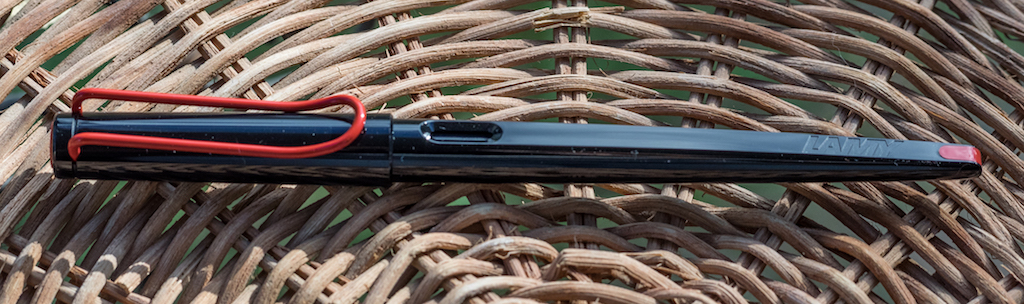
The design is sleek with only the red stainless steel clip, the red finial, and the red tip on the bottom of the pen as accents. But, boy do those accents pop! Although there are two ink windows, they are embedded deeply in the barrel and the cartridge is so dark, it’s difficult to tell how much ink is left in the cartridge. The cap snaps on and off and can be posted.

Lamy is lightly enscribed near the bottom of the barrel. The barrel itself has two flat sides and two rounded sides. If you use the pen unposted, the flat sides of the barrel will keep the pen from rolling off your desk.

The pen is longer than average fountain pens, measuring 179mm capped, 169mm uncapped, and 176mm posted. But it is quite light, weighing only 11 grams unposted.

The Lamy Joy comes with one blue ink cartridge, but you can purchase a Lamy converter if you wish to use bottled ink.

Like Lamy Safari pens, the Joy has a triangular-shaped grip meant to keep your fingers in the proper position. Some people love this grip, others (like me) don’t. It’s a matter of personal preference.

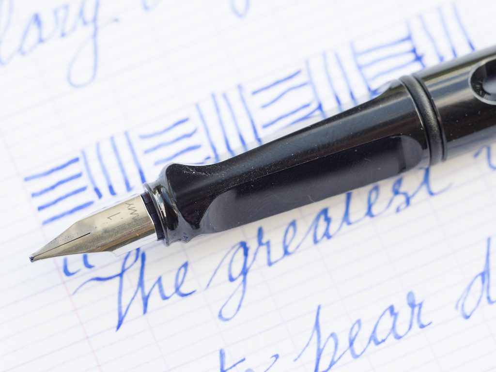
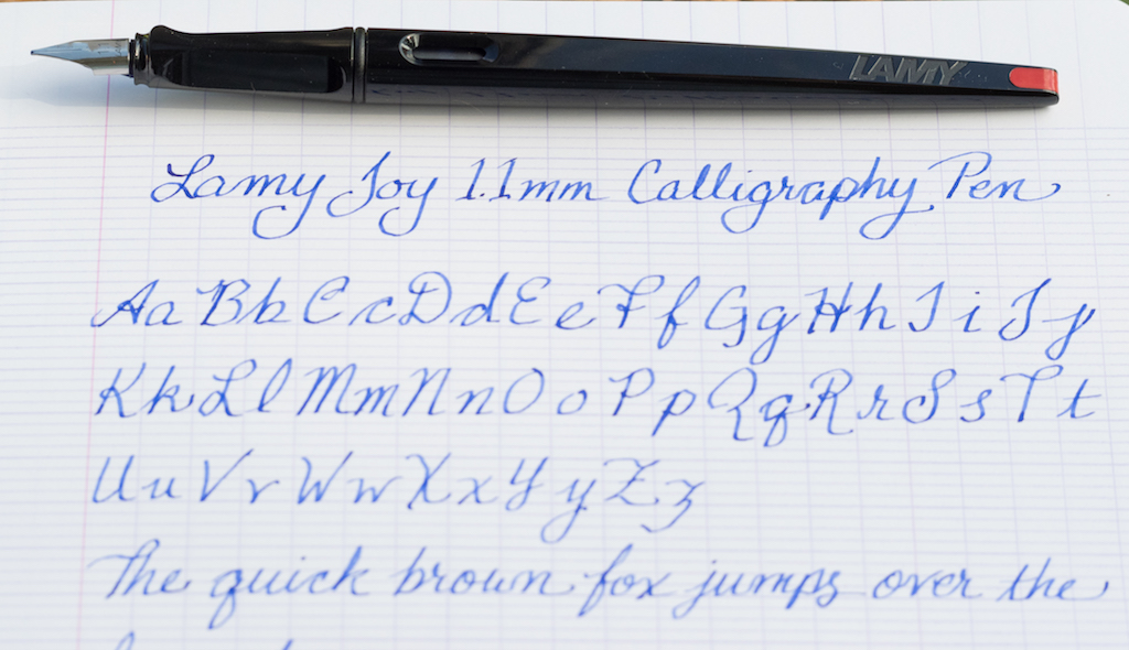
This pen has the 1.1mm nib. It’s a stainless steel nib and, in typical Lamy minimalist fashion, it is unadorned. It bears only the nib size and the Lamy name.

So, how does it write? Well, I’m no calligrapher, but I do use italic nibs quite often, and this nib is, after all, a 1.1mm italic. I found it to be adequate in terms of wetness, though I like my nibs much juicier. However, it isn’t a smooth nib. I’m not sure if the tines are slightly misaligned or if there’s some tipping material causing the scratchiness, but it feels like the nib is digging into the paper on every stroke. In other words, my writing experience was not pleasant. Perhaps a bit of micromesh would fix the problem.

In any case, I wrote a couple of test pages, and the 1.1mm offered some line variation and shading with the Lamy blue ink.

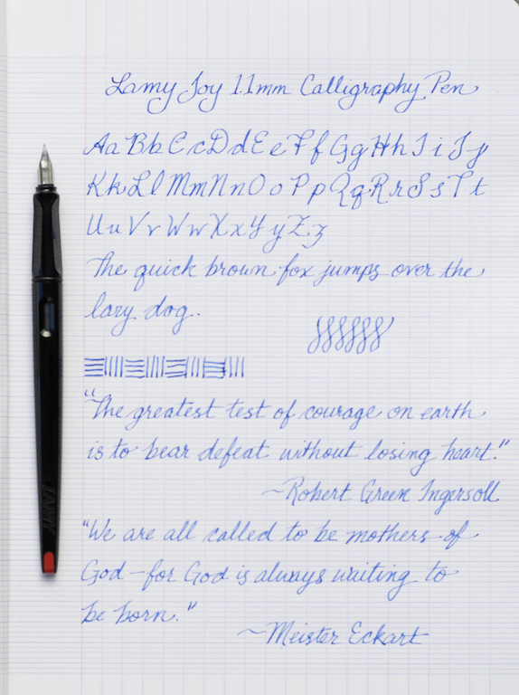
For calligraphy, I would suggest choosing the 1.5 or 1.9 size nib since the 1.1 seems a bit narrow.

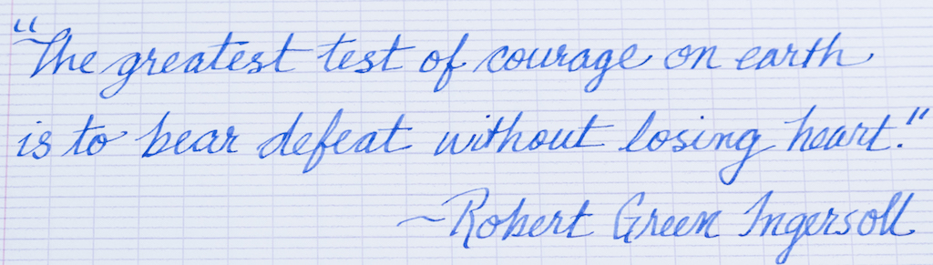
Neverthless, for everyday writing, the 1.1 nib is a good choice as you can see with the following writing sample.

You can purchase the Lamy Joy from Pen Chalet for $28.00. The converter is an additional $4.70.

At $28.00, the Lamy Joy is quite a bit more expensive than other plastic calligraphy pens, such as the Pilot Parallel ($8.00 at JetPens). Granted, the Lamy Joy looks much nicer than the Pilot Parallel. But if you’re wanting a decent calligraphy pen for a good price, the Pilot Parallel pens are excellent. I own the 1.5mm and the 2.4mm Pilot Parallels and both nibs are smooth.

Pros

  • The Lamy Joy is a sleek resin calligraphy pen. The red accents make the pen pop.
  • The pen is very light, so it is easy to work with during long writing sessions.
  • It sports a grip that many users find very comfortable.

Cons

  • I honestly think the Lamy Joy is overpriced at $28.00.
  • Although many people like the triangular grip, I find it inhibiting. I tend to rotate my pens a bit when writing, so I feel like I have to fight the grip on this pen.
  • The nibs on Lamys can be hit or miss. This steel 1.1mm nib was scratchy.

(Pen Chalet provided this product at no charge to The Pen Addict for review purposes.)


Enjoy reading The Pen Addict? Then consider becoming a member to receive additional weekly content, giveaways, and discounts in The Pen Addict shop. Plus, you support me and the site directly, for which I am very grateful.

Membership starts at just $5/month, with a discounted annual option available. To find out more about membership click here and join us!

Posted on October 6, 2017 and filed under Lamy, Fountain Pens, Pen Reviews.

Faber-Castell Ondoro Fountain Pen Review

As a brand, Faber-Castell has become more and more interesting to me. I know, I’m a little slow, seeing how they have been in existence for over 200 years. I always considered them a pencil company, and a great one at that, but could they make a quality fountain pen? I had my doubts, based on no facts whatsoever. And I’m glad to be proven totally and completely wrong.

The Faber-Castell Ambition set me down this path, and the Faber-Castell Ondoro Smoked Oak solidified my thoughts.

Fun fact: This isn’t my first Ondoro. I bought the Orange resin model a couple of years ago from one Stephen Brown. It had a broad nib, which I promptly had converted into a cursive italic. Despite this being a perfectly styled Brad pen, the nib and I never clicked, even after modification, so I sold it. I think my mistake was the modification, because what I have discovered in retrospect is that Faber-Castell nibs are perfect right out of the box.

The Ambition in EF solidified that thought, so I chose another EF in the Ondoro since I love the design of the pen and missed having one after selling my first. I think it may be my favorite steel German nib too, better than both Lamy and Pelikan in this size. It is finer and firmer, allowing for a clean and defined lined. It looks great too, especially inked with something like Faber-Castell’s own Deep Sea Green.

The Ondoro is described as a chunky pen, and that is accurate. The barrel is wide, and the cap is wider. It’s not a heavy pen though, and I find it comfortable to use. The Smoked Oak feels and looks great, and it comes in various resin models too, like the aforementioned Orange.

If there is one thing to consider with the Ondoro, it is the grip section. It’s short in length as well as concave. For my grip, which is very standard, it’s not an issue. If you have larger hands or a non-standard grip I could see it being an issue. The Ambition had similar questions with it’s lack of a grip section. Faber-Castell definitely does things differently in this area. Additionaly, the metal cap does make this pen heavy when posted as well as when clipped to something thin like a shirt pocket.

Price-wise, Faber-Castell pens aren’t cheap compared to the competition, but I think they are fairly priced. They are very similar to Pelikan in that regard. High quality German design and performance is generally worth the cost. If I enjoy a pen I never think twice about the price, and I certainly enjoy the Ondoro.

I’ve been mentioning how impressed I am with Faber-Castell as a brand for a while now. I think it is time to continue this exploration and see what else they have to offer.

(JetPens provided this product at no charge to The Pen Addict for review purposes.)


Enjoy reading The Pen Addict? Then consider becoming a member to receive additional weekly content, giveaways, and discounts in The Pen Addict shop. Plus, you support me and the site directly, which I am very grateful.

Membership starts at just $5/month, with a discounted annual option available. To find out more about membership click here and join us!

Posted on October 2, 2017 and filed under Faber-Castell, Fountain Pens, Pen Reviews.

Conklin Herringbone Burgundy Fountain Pen: A Review

(Susan M. Pigott is a fountain pen collector, pen and paperholic, photographer, and professor. You can find more from Susan on her blog Scribalishess.)

The Conklin Herringbone is a metal fountain pen etched with the herringbone pattern, then coated with lacquer and epoxy for a shiny finish. The herringbone pattern gives the pen a nice tactile feel, plus it is absolutely gorgeous in sunlight. Although this pen is called “burgundy red” it’s really more of a cherry red, in my opinion. Regardless of what you call the color, it’s quite striking.

The pen comes packaged in a blue clamshell box with a soft, cream interior.

Stainless steel, conical finials adorn the cap and the bottom of the pen’s barrel. Because it is made of metal, it’s a fairly heavy pen for its size, weighing 42 grams. It is 146mm capped, 125mm uncapped, and 160mm posted.

The screw-on cap comes with a solid clip engraved with the Conklin name. This clip will hold the pen firmly to a shirt pocket or a tablet.

The cap is also adorned with a stainless steel ring engraved with the word “Herringbone” and crescents on either side.

The Conklin Herringbone is a cartridge/converter fountain pen, and the converter holds about 1ml of ink.

This pen came with a 1.1mm stainless steel stub nib. It has Conklin’s signature crescent-shaped breather hole and is engraved with the Conklin name, Toledo, USA, and the nib size.

Unfortunately (for me, at least), the grip is also stainless steel. I’ve discovered I’m not a fan of metal grips because they can become slippery if you have sweaty fingers (which I often do). The grip on the Conklin Herringbone is also pretty slim (9.1mm). I prefer wider grips because they prevent hand cramping, which is becoming more of a problem for me as I get older.

Aside from being a bit too narrow, the pen is comfortable in the hand. I’ve been using it at school for the last two weeks inked with Robert Oster Astorquiza Rot, and it has performed well in my Hobonichi notebook. I also tested it on a page of Baron Fig Mastermind paper which I keep at my desk to write notes. I spent some time writing out the alphabet and a quote from the current Harry Potter book my First Year Seminar is reading.

The pen writes well—I didn’t experience any hard starts or blobs while writing. However, I did notice that sometimes the pen skipped a little bit on the downstrokes of letters like “l” and “f.”

The Conklin Herringbone retails for $70.00, but you can purchase it on sale from Goldspot Pens for $55.95. It comes in burgundy red, gun metal gray, and navy blue, and you have a choice of fine, medium, and 1.1mm stub nibs.

Pros

  • I really like the look of the Conklin Herringbone. The pattern is eye-catching, and the lacquer and epoxy make it shine.
  • The pen is a reasonable size for most writers, though some may find it a little heavy since it’s made of metal. Others, like me, will find the grip to be too narrow for comfort.
  • The 1.1mm stub nib wrote well. On Tomoe River paper (in my Hobonichi) the nib produced a generously wet line. On the Baron Fig paper, the ink soaked in a bit more and the nib seemed less wet. Regardless, I found it wrote pretty consistently aside from a few skips on downstrokes.
  • This pen is reasonably priced, especially on sale.

Cons

  • Although I like hefty pens, I don’t care for thin, hefty pens. The Conklin Herringbone is too thin for my aging hands. I need a wider grip to write for long periods without hand cramps.
  • If you struggle using pens with metal grips, like I do, then you probably will not like this pen.
  • As stated above, the nib performed well, but skipped occasionally on downstrokes.

(Goldspot Pens loaned Pen Addict this Conklin Herringbone fountain pen for review purposes.)

Posted on September 22, 2017 and filed under Conklin, Fountain Pens, Pen Reviews.