Posts filed under Fountain Pens

Faber-Castell Loom Fountain Pen Review

(Sarah Read is an author, editor, yarn artist, and pen/paper/ink addict. You can find more about her at her website and on Twitter.)

Faber-Castell has been in the fine writing instrument business since 1761--an incredible legacy. Many of their pens are very high-end, elegant, and unique--but even their more affordable pens show the design and craftsmanship you'd expect from a company that clearly knows what it's doing. I would consider the Faber-Castell Loom to be slightly above entry-level on the pen enthusiast scale. At $40, it's an expensive jumping-in point. But if your first impression of fountain pens is the Loom, there's a good chance you'll soon be referring to yourself as a pen addict.

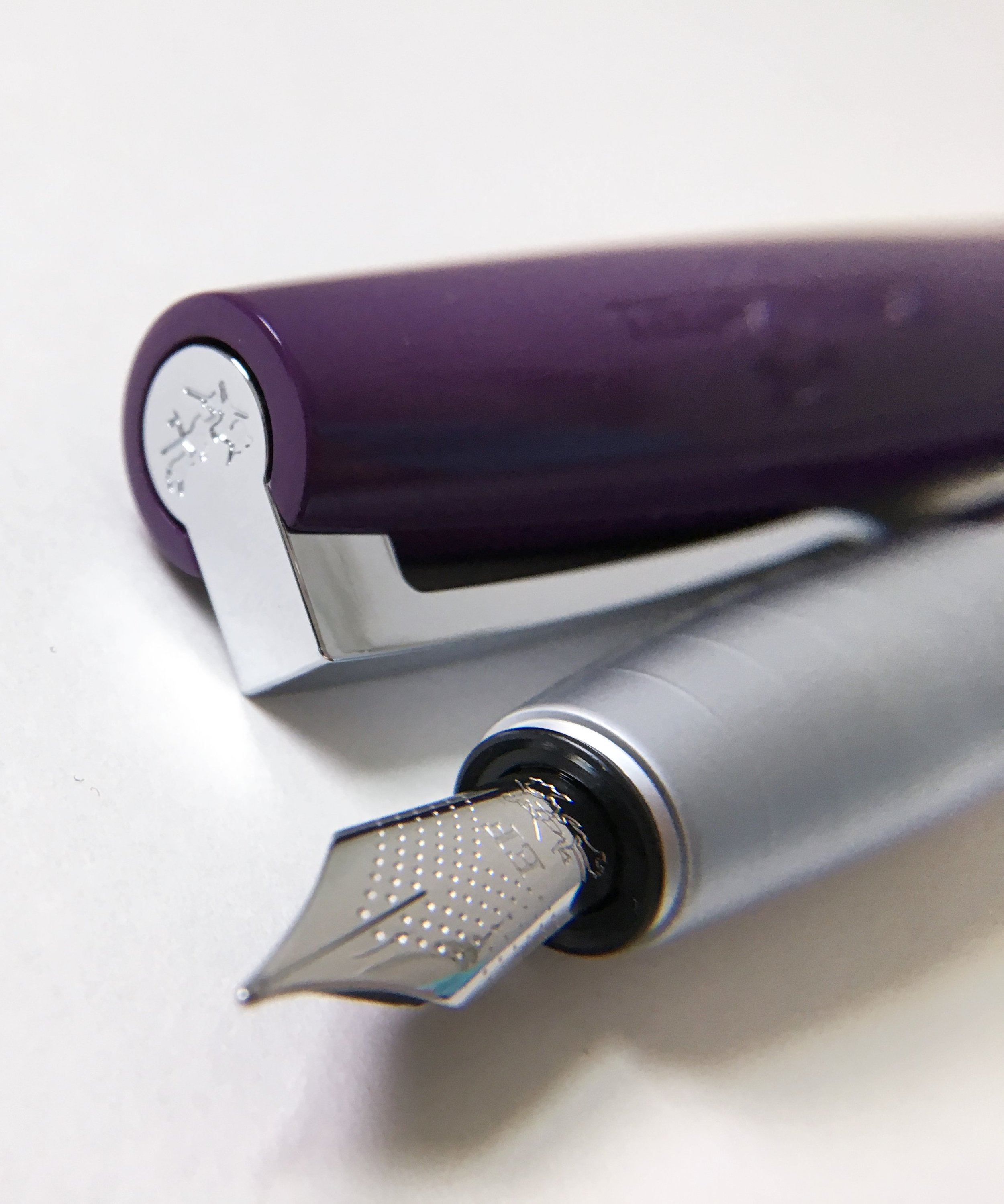
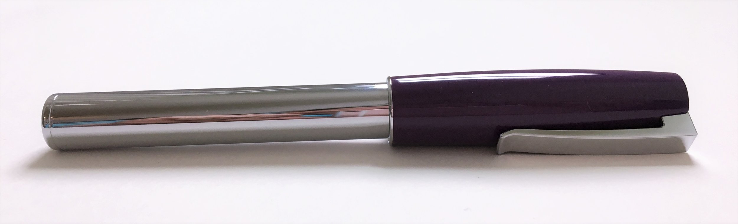
This model is the plum color in piano finish. There are a lot of other fun colors to choose from. It took me a little sleuthing to figure out that piano finish are the shiny chrome bodies, and metallic are the matte bodies. It's glossy and looks quite fancy on the desk or when writing, but it collects dust and fingerprints very easily. The body is made from aluminum, so it's also quite heavy, while the plastic cap is very light compared to the rest of the pen. The body is a straight tube that tapers to the grip section, which has a matte texture and five raised ridges meant to aid in grip. As much as I think it looks snazzy, this grip section doesn't work well for me. It's a very wide pen and the tapering is a bit too severe--so my fingers just keep slipping down to the nib. I have to focus on maintaining my grip, and it makes my handwriting look terrible. This may not be a problem for someone with larger hands--but a larger hand may find that the pen feels a bit short to them. The proportions are just a bit unusual. Posting the pen solves this, but there is a risk of scratching that glossy finish.

The pen takes a standard international cartridge or converter, and comes with a short cartridge and a dummy cartridge meant to hold the short cartridge in place. It does not come with a converter, which is a shame.

The cap is wider than the body, tapered at each end. The clip is sturdy and spring-loaded, and my favorite clip ever. It's flexible but sturdy, and feels reliable. It's attached at the finial, which is stamped with the Faber-Castell insignia, the jousting knights. The name and logo are also stamped into the plastic of the cap. The stamping isn't terribly clear--I had to squint a bit to see what it was, but it's a complex image to shrink down to the size of a pen cap. It's a snap cap, and the snap is very aggressive. It takes more force to remove than it feels like it should. It's nice to know it's so secure, but I hope it relaxes a bit over time.

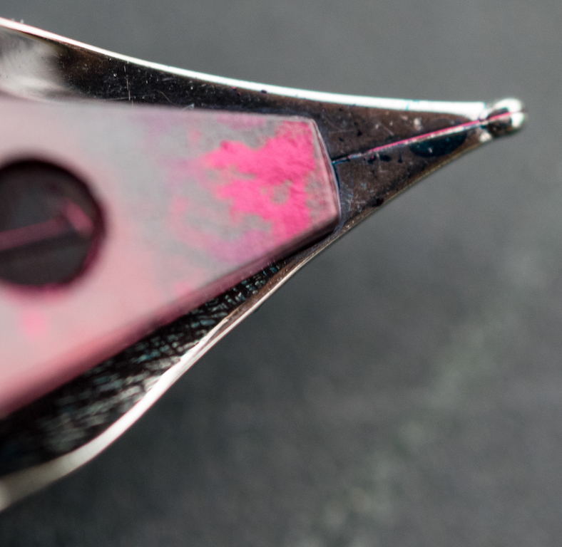
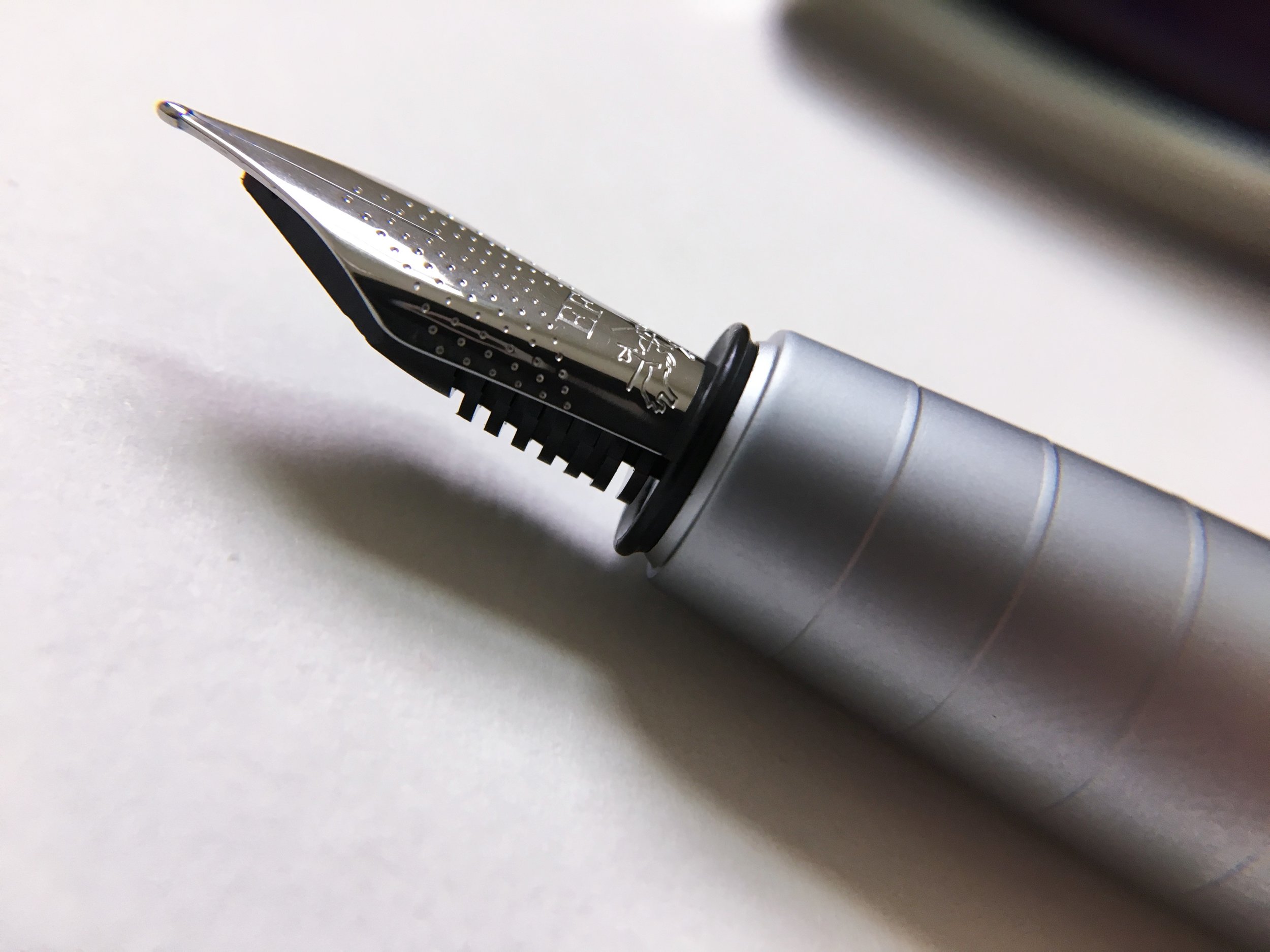
The nib, of course, is where this pen reels you in. It's smooth and perfectly tuned, so it's not too wet, but not at all dry. It has no breather hole, but is dimpled all over. It also attempts to squeeze the jousting knights logo into an even smaller space, with limited success--but it still looks fancy. The EF is definitely a western EF--comparable to a Kaweco, but close to a Japanese M. It's a pleasure to write with. There is just enough feedback to give you control of the pen, but it feels butter smooth. I can see why it's said that Faber-Castell has the best steel nibs on the market.

Overall, it's an excellent pen. That wide, tapering grip makes it not work for me, unfortunately. I wish it did, because I can tell I'm missing out on something special. It's definitely a good buy for its cost, and I think it would make an excellent gift--it's in that perfect price range to be something fancy without being extravagant.

I think I'll be trying out more Faber-Castell pens in the near future, looking for one that fits my hand well, and that nib is going to haunt me until I succeed.

(Vanness Pens provided this product at no charge to The Pen Addict for review purposes.)


Enjoy reading The Pen Addict? Then consider becoming a member to receive additional weekly content, giveaways, and discounts in The Pen Addict shop. Plus, you support me and the site directly, for which I am very grateful.

Membership starts at just $5/month, with a discounted annual option available. To find out more about membership click here and join us!

Posted on December 14, 2017 and filed under Faber-Castell, Fountain Pens, Pen Reviews.

Pilot Kakuno Clear Fountain Pen Review

When I talk about the best fountain pens for beginners, the list goes something like this:

Pilot Metropolitan

TWSBI ECO

Lamy Safari

And every time I rattle off that list, I want to add the Pilot Kakuno to it. In all honesty, I think the three above are the best choices going into it blind. But if you want to add the caveat of “fun” into the mix, then the Kakuno may be the best choice.

Not only is this pen fun, it functions extremely well. I expect nothing less from Pilot in the fountain pen market, even in the entry level realm.

The Kakuno is designed purposefully for beginners. The grip section is triangular in shape to teach you the proper way to hold a fountain pen. The smiley face on the nib teaches you to always keep the nib facing up at the correct angle. Even the hex barrel and cap indention are designed to make the pen easy to handle.

From that description, the Kakuno sounds like a kid’s pen. It’s certainly designed with kids in mind, but in reality it is so much more. It’s a well designed, highly functional fountain pen that anyone can use and enjoy. I know I enjoy the heck out of it.

My first Kakuno was the grey barrel with lime green cap. I backed that up pretty quickly with the orange cap model, because orange. At the time, the Kakuno only came in fine or medium nib widths. In the second round of pens - white barrel with pastel caps - Pilot added extra fine into the mix. This is important because many first time fountain pen buyers that read this site what to know if there is an inexpensive fountain pen with a line to match their favorite micro gel ink pen. Pilot extra fine has always been the answer, but there was never an easy way to get the nib. There is now.

I’ve seen the clear barrel Kakuno making the rounds in Japan, and as a demonstrator pen fan, I couldn’t wait to get my hands on it. The build is identical to all of the Kakuno’s before it, but now you can see the insides better. I’m a big fan of pen guts and ink blood. :D

It’s as great as expected, and the extra fine nib is an added bonus. On my Rhodia Ice Pad, the line width is comparable to the Pilot Hi-Tec-C 0.3 mm gel ink pen. That’s impressive for a fountain pen.

The only question remaining is if you can eyedropper the Kakuno. You will need to fill the two holes on the back end of the barrel with epoxy for starters, then add silicone grease to the barrel threads. My only concern is that the feed is friction fit and there is not an extra spot to silicone the nib unit threads, because there aren’t any. Cartridges and converters obviously work fine, but they seal off around the feed post. I’m not sure how ink would handle just floating around that area.

Speaking of converters, I used the Pilot Con-70 in mine. This is Pilot’s largest capacity converter, and most expensive as well. You don’t need this one for the Kakuno, but I have a couple not in use so I put it into action. All of Pilot’s other converters will work, as will all of their cartridges. For the clear barrel Kakuno I’d look at using more fun colors, like the Pilot Mixable cartridges.

The Pilot Kakuno is a great pen for any level of experience. The most beginning fountain pen user will enjoy its cool looks and ease of use, and the most experienced user will love the great nib and build quality. It’s an all-around great pen.

(JetPens provided this product at no charge to The Pen Addict for review purposes.)


Enjoy reading The Pen Addict? Then consider becoming a member to receive additional weekly content, giveaways, and discounts in The Pen Addict shop. Plus, you support me and the site directly, for which I am very grateful.

Membership starts at just $5/month, with a discounted annual option available. To find out more about membership click here and join us!

Posted on December 11, 2017 and filed under Pilot, Kakuno, Fountain Pens.

Monteverde Giant Sequoia Fountain Pen: A Review

(Susan M. Pigott is a fountain pen collector, pen and paperholic, photographer, and professor. You can find more from Susan on her blog Scribalishess.)

The Monteverde Giant Sequoia fountain pen is a large resin pen with a stainless steel nib. It comes packaged in a substantial clamshell box with two cartridges as well as a converter.

The green Sequoia has sheeny turquoise, black, and silver stripes. It’s a really beautiful resin.

The pen itself is cylindrical in shape with a flat top and barrel bottom. The cap has an unadorned silver clip and a band engraved with “Monteverde USA Sequoia.” The cap screws on, and although it is postable, doing so throws the balance off considerably.

The Sequoia is a large pen both in length and girth. It is 5.7 inches (145mm) capped, 5 inches (127mm) uncapped, and 6.7 inches (170mm) posted. The grip is 10.8mm in diameter and the barrel is 15.4mm. In spite of its size, the pen itself is not heavy, weighing 33 grams capped and 19 grams uncapped.

William Hannah Notebook

The pen fills by cartridge or converter. Since it is made of resin and there are no metal parts on the barrel, you could probably eyedropper the pen if you wished.

The Sequoia comes with a #6 stainless steel nib. My review pen has a fine nib width. The nib is engraved with the Monteverde logo, and the Monteverde name appears twice, once near the base of the nib and once along the perimeter near the tip.

Unfortunately, this nib is scratchy, hard, and dry. Writing with it is not a pleasurable experience. It skips occasionally on downstrokes, and if you stop writing for any length of time, you have to re-wet the nib to continue.

You can see where the nib skipped on the downstroke

My macro photos of the nib don’t reveal any obvious problems, such as misaligned tines or tipping issues. I think the nib is just scratchy and ink-stingy. A nibmeister could probably get it writing better, but that’s an added expense.

The Sequoia is a beautiful pen, and I really like its size. My middle-aged hands prefer pens with a larger girth, especially for long writing sessions. But, the nib is a deal-breaker for me. If a pen doesn’t write well, no amount of beauty will make up for it.

You can purchase the Monteverde Giant Sequoia in green, blue, or brown from Vanness Pens. It costs $90.00 and comes in fine, medium, broad, and stub nib sizes.

Pros

  • The Monteverde Sequoia is a beautiful, large-sized pen that is light and comfortable in the hand.
  • The pen offers at least two filling methods (cartridge and converter), and it probably can be eyedroppered as well.
  • I really like the resin on this pen. It reminds me of the ao-tamenuri color Nakaya used to offer.

Cons

  • Unfortunately, the nib on this pen is scratchy and unyielding. It is also stingy with ink.

(Vanness Pens loaned this product to The Pen Addict for review purposes.)

Posted on December 8, 2017 and filed under Monteverde, Fountain Pens, Pen Reviews.