Posts filed under Fountain Pens

Sailor Profit Realo Tenku-Gensou Special Edition with Music Nib: A Review

(Susan M. Pigott is a fountain pen collector, pen and paperholic, photographer, and professor. You can find more from Susan on her blog Scribalishess.)

I own several Sailor fountain pens, but I’ve always been interested in their Realo model. I never bought one because I don’t like the colors offered by American companies (black, maroon, and nibs.com has a special edition in yellow). Luckily, I stumbled upon a Japanese-only edition Realo in the Sale forum on Fountain Pen Geeks. This special Realo is called “Tenku Gensou” which I believe means something like “sky illusions” (someone who speaks Japanese please correct me if I’m wrong).

This pen is absolutely stunning. It is a dark, translucent blue acrylic with subtle sparkles.

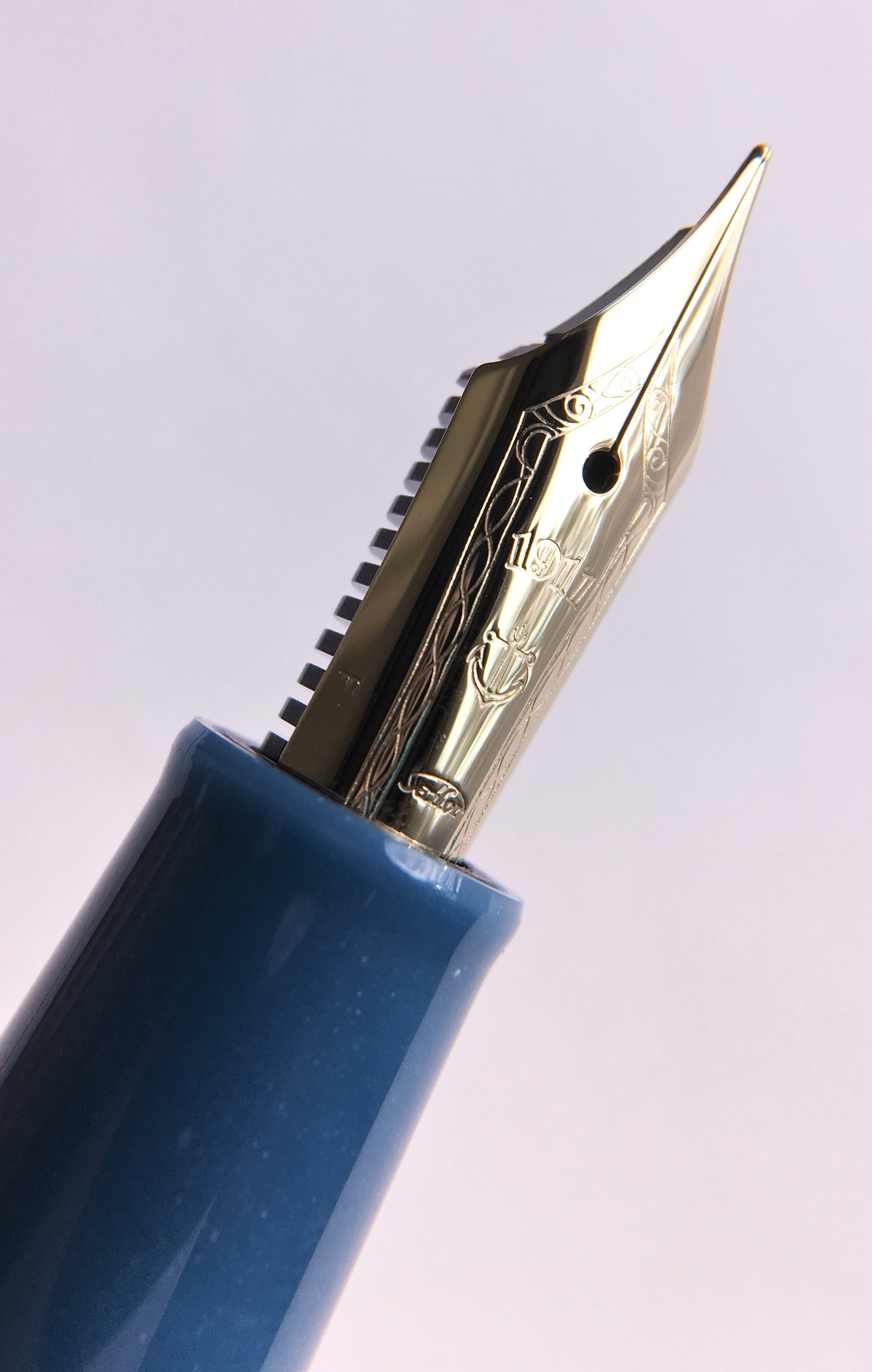
It has rose gold accents and a rose gold 21k music nib. Just look at that gorgeous fat nib tip.

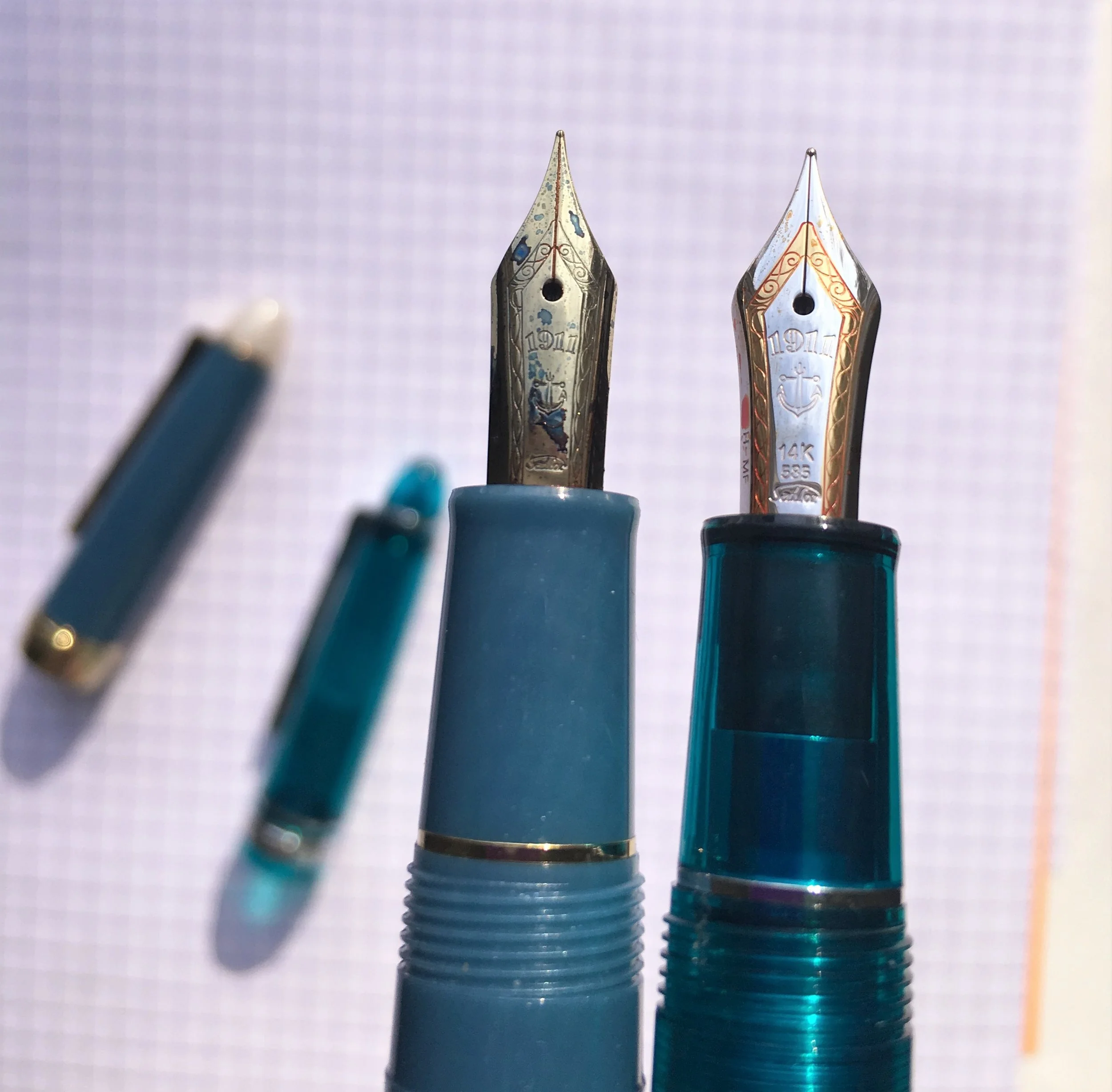
The Sailor Profit Realo is exactly the same size as the large 1911 model.

But, the Realo differs from the 1911 in several ways. First, the cap band is much wider (about 1/2 inch). It is engraved with “Sailor Japan Founded 1911.”

Second, the Realo has an ink window, beautifully accented with two gold rings.

Third, the Realo is a piston filler, unlike most Sailor pens which are cartridge/converters. The Realo only holds 1ml of ink, so it isn’t a large-capacity piston filler. Sailor cartridges hold 1.2ml and their converters hold 0.7ml. Even though the pen doesn’t hold as much ink as a Pelikan M800 (1.5ml), it’s still nice to have a piston filler on a Sailor pen, especially one with a juicy music nib.

The music nib is absolutely fantastic. Unlike most music nibs which have three tines, Sailor music nibs only have two.

The nib provides a juicy broad line on down strokes and thin lines on horizontal strokes.

I inked my Realo with Iroshizuku Asa Gao, and the music nib shows off this ink’s shading properties well.

Sailor’s Realo fountain pens are more expensive due to the piston mechanism. A regular 1911 cartridge/converter costs around $250+ (depending on the color and style). A Realo costs $328. And, if you want a Japanese-only Realo, expect to pay even more. My Tenku-Gensou is currently $353.57 plus shipping on Rakuten (at current exchange rates).

I’m really happy with my special Tenku-Gensou Realo. The color is spectacular, I love how it sparkles in sunlight, and the rose gold accents are gorgeous. I’m very happy with the music nib—it’s smooth and wet.

Pros

  • This special edition Sailor Profit Realo Tenku-Gensou is stunning— deep translucent blue with sparkles and rose gold accents. It is one of the prettiest blue pens I own (and I own a lot of blue pens).
  • A Sailor with a piston mechanism is wonderful. Even though the pen doesn’t hold copious amounts of ink, it holds more than a converter, and the ink window adds another beautiful design element to the pen.
  • Sailor nibs are gorgeous and well made. The music nib on this pen writes perfectly.

Cons

  • Sailor Realos are more expensive than Sailor’s other pens.
  • If you buy a Realo from an American retailer, you’re stuck with two color choices: black or maroon (unless you want to pay $520 for Classic Fountain Pens 22nd Anniversary yellow Pro Gear Realo).
  • If you want this glittery blue special Realo, you’ll need to purchase it from a Japanese retailer and pay the shipping costs. I was lucky to find a used one.

Enjoy reading The Pen Addict? Then consider becoming a member to receive additional weekly content, giveaways, and discounts in The Pen Addict shop. Plus, you support me and the site directly, for which I am very grateful.

Membership starts at just $5/month, with a discounted annual option available. To find out more about membership click here and join us!

Posted on March 9, 2018 and filed under Sailor, Fountain Pens, Pen Reviews.

A Comparison of Three Modern Flex Nibs

(Susan M. Pigott is a fountain pen collector, pen and paperholic, photographer, and professor. You can find more from Susan on her blog Scribalishess.)

I am on a Holy Grail search for the best modern flex nib. I realize I am doomed to fail, as modern nibs just can’t match vintage ones, but, like Don Quixote, I like to dream impossible dreams.

I did a review of the Aurora 88 Anniversario with flex nib back in March 2017. If you remember that review, I wasn’t much impressed. But, because I am a nutcase, I became obsessed with owning the blue Aurora 88 Anniversario in spite of the fact that I wasn’t impressed with its flex. I believe I bought the last blue Aurora 88 flex on earth. Isn’t it gorgeous?

I purchased a Pilot 912 with FA nib a long while ago and reviewed it here. It’s a great pen, and I love the FA nib.

And, recently, I purchased a Franklin-Christoph 14k SIG flex nib. I put it in my Iterum 03 reviewed here.

Since I own three modern flex nibs, I thought it would be fun to compare them. I realize that various factors make this review less than scientific. First, I used different inks in each pen, and ink can affect line width due to variances in viscosity and saturation. But, I used different inks mainly so I could more easily distinguish the pens. Second, although I tried to use the same pressure with each pen, there’s no way to guarantee exactitude with the human hand. The Aurora, in particular, required quite a bit more pressure to get some flex. Third, the three nibs are quite distinct though all are made of gold. The Aurora nib relies on the flexibility of long tines to create line variation. The FA nib and the Franklin-Christoph nib both use cutouts to increase line variation.

I compared the nibs with various writing tests. First, I did swirls.

Pilot

Franklin-Chistoph

Aurora

In this test, the Pilot 912 with FA nib definitely showed more line variation. The Franklin-Christoph SIG flex nib came in second with good line variation, and the Aurora was last with the least line variation. Plus, the feed didn’t keep up with the flex resulting in railroading.

My second test was writing the “Quick Brown Fox” line. Here, the differences between the nibs isn’t as obvious. The Pilot still wins first place for line variation, but the Franklin-Christoph and Aurora are very similar

Pilot

Franklin-Christoph

Aurora

In the third test, I simply drew vertical lines while flexing the nib. Once again, the Pilot provides the most flex, measuring a little over 1mm, but the Franklin-Christoph and Aurora were pretty similar, both just under 1mm.

Pilot

Franklin-Christoph

Aurora

After comparing these three modern flex nibs, I have to give first prize for line variation to the Pilot 912 with FA nib. This nib simply flexes more easily and with more line variation than the other two nibs.

The Franklin-Christoph SIG Flex Nib gets second place. Not only is this nib a pleasure to write with, it offers good line variation and the nib can be used in any Franklin-Christoph pen that accepts a size #6 nib. Unfortunately, when I use my FC SIG flex nib for regular writing (such as when I’m taking notes in class), it has a tendency to dry up and require a little tongue lick (I know, gross) to get the ink flowing again. Still, I love the bounce that the cut outs give, and the pen itself is light and easy to write with.

In third place is my very expensive Aurora 88 Anniversario. I just cannot get this nib to flex without putting lots of pressure on it. That said, it is my favorite pen of the three, mainly because it is a piston filler and it’s blue. What can I say? I love blue pens and Aurora nibs are incredibly well made. True, the Aurora struggles as a flex nib. Of the three, it was the only one that railroaded. But, as an every-day writer, the Aurora is excellent.

After comparing these three modern flex nibs, my conclusion is that the Pilot FA nib is the best nib for creating line variation using flex. If you want a more interesting pen design, then I suggest you go with any Franklin-Christoph model that accepts their #6 SIG flex nib. I still cannot recommend Aurora’s flex nib if you want excellent line variation. It simply requires too much pressure and the feed does not adequately supply ink when you use flex (thus, the railroading).

That said, Aurora is offering flex nibs in their newest Optima models. If you really want an Aurora flex nib, I encourage you to purchase one from Dan Smith. He can tweak the feed and nib for better flex and ink flow.

You can purchase the Pilot Custom Heritage 912 from Vanness Pens for $225.00. Although most (if not all) of the Aurora 88s with flex nibs are sold out, Optimas will be available in March (retail $650), and I suggest you contact Dan Smith to pre-order one of these. Franklin-Christoph offers numerous pen styles that accept the #6 SIG flex nib. Prices vary between models.

**Author’s note: My comparison omits one other modern flex pen: the Wahl-Eversharp Decoband (reviewed here). In terms of flex, this pen surpasses all three of the pens I reviewed above. However, two factors made me decide not to include it in this comparison. First, it truly is an oversized pen, much larger (and heavier) than the three pens discussed above. Second, it is a great deal more expensive (retail $850) than the other pens, especially the Franklin Christoph and the Pilot 912. Please read my review if you think an oversized pen would suit you best.

Posted on February 16, 2018 and filed under Aurora, Franklin-Christoph, Pilot, Fountain Pens.

Sailor Shikiori Tsukuyo-no-Minamo Fountain Pen, Shimoyo (Frosty Night) Review

(Sarah Read is an author, editor, yarn artist, and pen/paper/ink addict. You can find more about her at her website and on Twitter.)

I was in public when I first saw the new Sailor Shikiori pens hit the JetPens site. Worse than public, I was at work, where I do my best to appear as a perfectly normal human who doesn't make noises like that when they see a picture of a pen. I lost some serious cred that day--but I gained an excellent pen. So, overall, I came out ahead.

The pen build is the same as their Procolor 500 series, and very similar to the 1911 Standard—almost identical, until they are held side-by-side and examined closely. The plastic of the Shikiori feels a bit softer and the edges are a little less crisp than the Standard model. The weight is about the same. The nib on the Shikiori is gold finished steel, rather than the 14k gold of the Standard nib. I had to double check this, because the nib is so smooth and pleasant, I wasn't convinced it wasn't gold. There is a small amount of feedback with the fine nib, but in a good way. The steel nib of the Shikiori is more slender than the Standard. It looks a bit small in the pen, but it still has the beautiful Sailor branding stamped into the metal. It's the same size and shape as the Procolor 500 series, but with the added gold finish.

It's difficult to capture the pearlescent sparkle of the material--the photos don't do this pen justice. This Shimoyo color was named for the frost that appears on ponds on a winter's night. The other colors of this series are the deep blue of the full autumn moon on the lake (Yonaga), the red of a summer night bonfire (Yodaki), and the delicate pink of evening cherry blossoms (Yozakura).

All four colors have matching inks that are just as stunning as the pens themselves. If I wasn't trying to slow the encroaching ink tide in my home, I'd have picked them up like Pokemon, but I resisted and filled mine with Akkerman #8 Diep-Duinwaterblauw. It's a good match, I think, though the ink is more greeny where the pen is a bit more grey.

If you're looking for a relatively inexpensive way to become hopelessly addicted to Sailor pens, this is a great place to start. I say relatively, because at $70, this is more of a next-level pen, rather than entry-level in terms of cost--but the experience you get for that price is an excellent value. This is definitely one of the best under-$100 pens that I own--and it's better than a few I paid over $100 for.

You may have to do a little bit of hunting for these, or keep your eyes peeled for the Jetpens restock. They aren't widely available outside of Japan. I hope Sailor does more of these models in other fun themes and colors. It would help me out a lot if I could indulge in beautiful Sailors without paying for the gold nib every time, especially when the steel nibs are as nice as this one.

(JetPens provided this product at no charge to The Pen Addict for review purposes.)


Enjoy reading The Pen Addict? Then consider becoming a member to receive additional weekly content, giveaways, and discounts in The Pen Addict shop. Plus, you support me and the site directly, for which I am very grateful.

Membership starts at just $5/month, with a discounted annual option available. To find out more about membership click here and join us!

Posted on February 8, 2018 and filed under Sailor, Fountain Pens, Pen Reviews.