(Susan M. Pigott is a fountain pen collector, pen and paperholic, photographer, and professor. You can find more from Susan on her blog Scribalishess.)
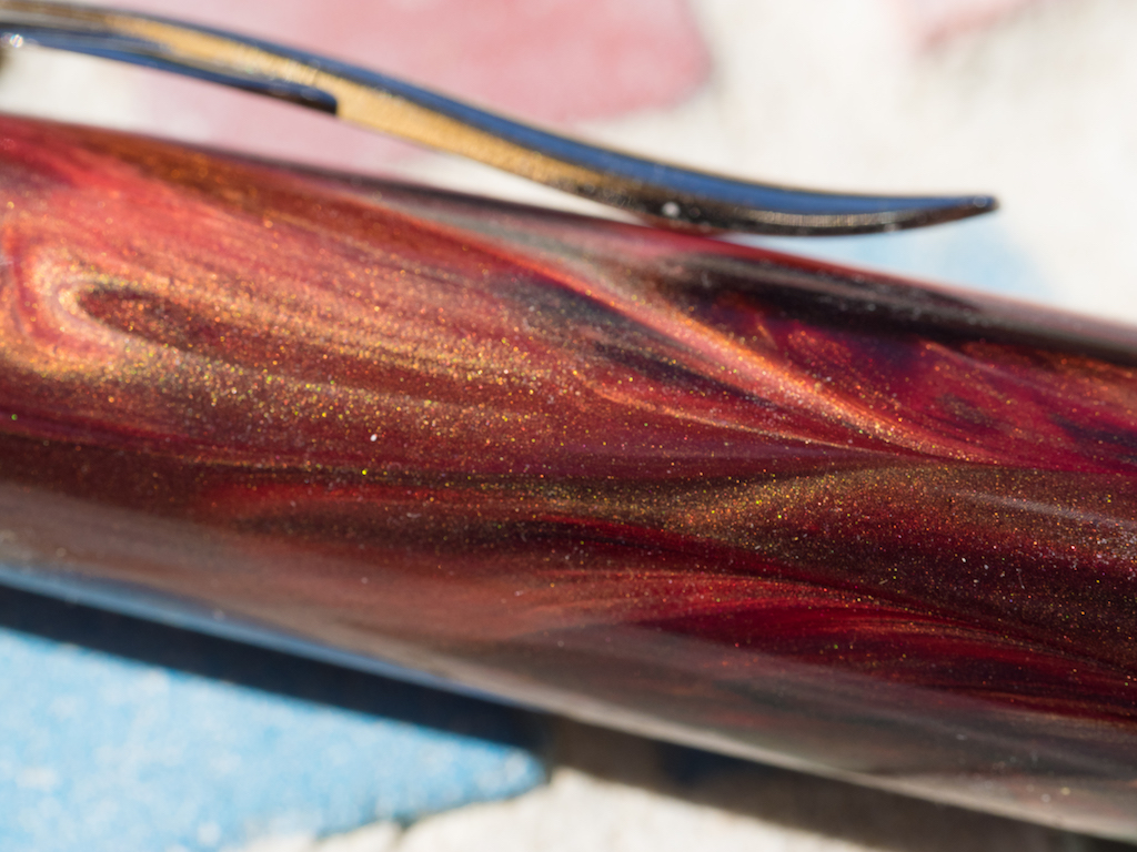
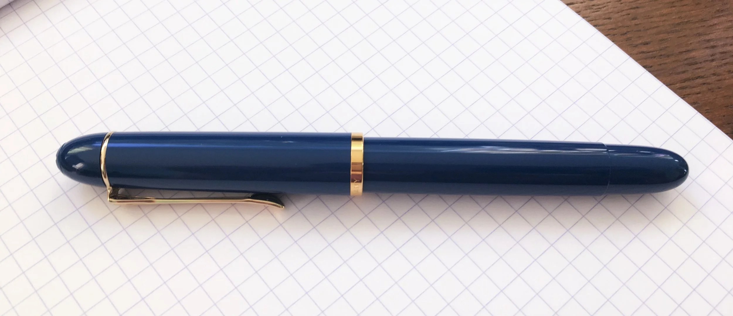
I’ve never owned or written with a Pineider fountain pen, so I was very excited to receive the La Grande Bellezza on loan from Vanness Pens. “La Grande Bellezza” means “the great beauty” and this pen certainly is beautiful. “La Grande Bellezza” is made of resin, but it doesn’t feel like other resin pens. Pineider mixed in marble dust to create the gemstone-like colors. This also makes the resin harder and weightier so that it almost feels like celluloid. The resulting finish is extraordinary with swirls of color and chatoyance.
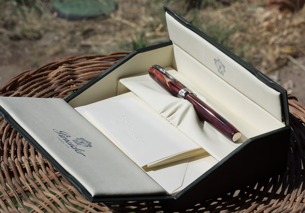
A unique box unfolds to reveal the pen nestled in leather-like cream material. In addition to information about the pen, the box contains a nice selection of Pineider stationery and envelopes. It’s a really nice presentation—much nicer than I’ve seen with far more expensive pens.
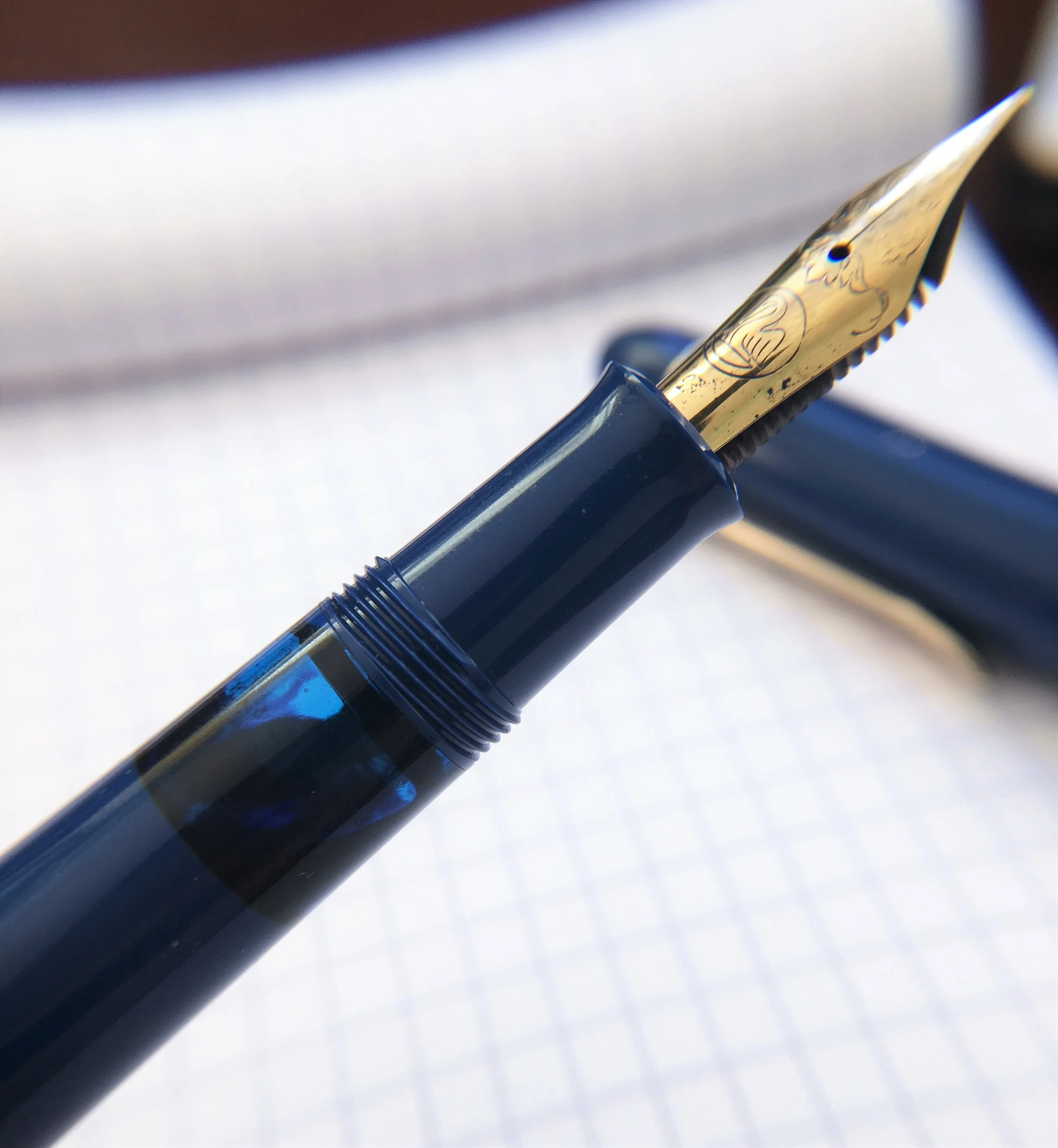
The pen itself is thoughtfully designed. Normally, I do not like metal grip sections, but the grip on this pen is shaped to hold your fingers steady. Plus, the area closest to the nib is textured, making it easy to maintain your grip.
The cap has a silver finial with the Pineider name in raised cursive.
The clip is spring loaded and emulates a goose quill. I love the attention to detail here.
The textured cap ring has “Pineider” on one side and “The quick brown fox jumps over the lazy dog” in tiny lettering on the other. I didn’t even realize the “brown fox” quote was there until I starting taking macro shots. So even though I find the quote a tad strange on a ring band, it is tiny and certainly does not overwhelm the design. I think I’d like it better if it was a quote from The Lord of the Rings in Elvish.
One of the coolest things about the cap is its magnetic closure. When you slip the cap on the pen, you can feel the magnet pull it into position—no screwing or unscrewing necessary. Posting works the same way: a magnet holds the cap on the barrel of the pen while you write. Unfortunately, posting throws off the balance of the pen, and the cap rattles when posted (though not when the pen is capped).
The barrel is resin with a metal grip. There’s no branding on the body of the pen. A plain silver medallion adorns the bottom of the barrel. This is a medium-sized pen. It is 5.5 inches/139.8mm capped, 5 inches/126.5mm uncapped, and 6.5 inches/165.1mm posted. It weighs 23 grams uncapped and is nicely balanced.
The pen comes with a Pineider-brand converter (or you can use standard international cartridges). The converter fits tightly and holds a little over 1 ml of ink.
I was especially intrigued by the nib. It is a fine, 14k gold, palladium-plated nib with flex. The design is gorgeous with wing cut outs and beautiful scroll work. Pineider calls it a “quill nib.”
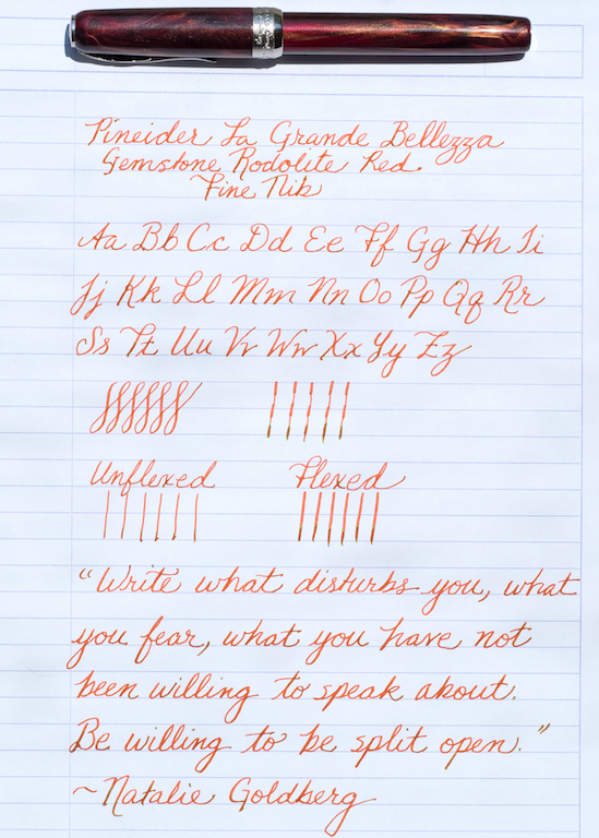
The nib is bouncy when you write using normal pressure. When you press into it, the soft gold and wing cut outs give you some very nice flex.
Honestly, this is the first modern flex nib I’ve tried that feels as soft and malleable as vintage flex. I am not saying that this nib offers the flex of a wet noodle, but it does provide nice line variation without having to press the nib too hard. It is much softer and flexible than my Aurora 88 flex or my Franklin-Christoph flex nib (see comparison review here).
The feed and converter keep up well as long as you have a full converter of ink. I found that after a page or so of writing, I had to manually push ink down into the converter to keep the ink flowing. I tried the pen with two different inks. Krishna Jungle Volcano, which I selected because it goes so well with this pen, worked fairly well at first. But I noticed lots of skipping on downstrokes after writing a page and a half.
Iroshizuku Tsukushi seemed to work much better in the pen, flowing well for several pages, though I did notice some skipping on downstrokes once the converter was about half empty.
I took my “La Grande Bellezza” on vacation to Lake Powell and filled it with Jungle Volcano before we left on our trip. I wrote in my journal with it one day during the first week. But by the second week, the nib had dried out. I wet the tip, and the pen cooperated at first, but then it started skipping quite a bit. When I checked the converter, most of the ink had evaporated. Sure, the Arizona/Utah border is dry, but the pen was ensconced in a pen case in the dark, cool closet of our RV. I suspect that the magnetic cap system (while convenient) does not provide a tight enough seal.
You can purchase a Pineider “La Grande Bellezza” in six stunning colors: Hematite Grey, Lapis Blue, Malachite Green, Rodolite Red, Dolomite Green, and Sunset Red from Vanness Pens for $398.00. A seventh version called “The Key of Heaven” is white and gold resin with a two-tone 18k nib. It’s a limited edition and costs $638.00. Nib sizes range from extra fine to broad with a stub option as well.
I must say that overall I am very impressed with this Pineider fountain pen. The marble-infused resin is simply gorgeous, and the pen design is outstanding. The nib feels very much like my vintage Montblanc 146 (which cost a ton more than the Pineider does), though the skipping is frustrating. Nevertheless, I’ve grown quite fond of this pen, and I will likely purchase one for my collection.
Pros
- “La Grande Bellezza” is truly a beautiful pen. The resin and marble dust create a beautiful combination of color, strength, and chatoyance. This pen does not feel like a resin pen. It honestly feels much more like celluloid but at half the cost.
- All the extra details make this pen feel special. The finial reminds me of Visconti finials. The goose quill clip is exquisite and functional. The cap band, while wide, suits the pen, and even though I’m not fond of the “brown fox” quotation, the print is so tiny that it is unobtrusive. The silver medallion at the base of the pen is another handsome touch.
- The pen feels wonderful in the hand. At 23 grams, it has good heft, and it is well balanced. The metal grip is shaped perfectly to keep your fingers in place and the band of textured metal stops your fingers from slipping.
- I love the nib on this pen. It is springy and soft and it provides good line variation if you press into it. Of all the modern flex nibs I’ve tried (and I’ve tried many of them), this nib offers the best vintage-like flex. Again, it’s not a wet noodle or superflex, but in terms of how it feels when you write, it comes very close to writing like a vintage nib. Compared to the Aurora 88 flex pens and the Wahl-Eversharp Oversized Decoband, which also feature flex nibs, Pineider’s “La Grande Bellezza” is much less expensive.
- The magnetic cap is quite convenient, especially if you open and close your pen quite often.
Cons
- This Pineider “La Grande Bellezza” fountain pen is a sizable investment at nearly $400.
- While the nib is soft and springy, providing nice line variation, unfortunately it skips, especially on downstrokes, after about a page and a half of writing. This seems to be related to the amount of ink in the converter. In order to keep the ink flowing, I had to manually push the ink down into the feed using the converter. Depending on the wetness of the ink, I had to do this every few paragraphs (dry ink) or every second page or so (wet ink).
- Although the magnetic cap is convenient, it does not seem to provide a tight enough seal. This allows ink to evaporate over time resulting in a dry nib and an empty converter.
- You can post the cap on this pen, but it rattles noisily and throws off the balance.
(Vanness Pens loaned this product to The Pen Addict for review purposes.)
Enjoy reading The Pen Addict? Then consider becoming a member to receive additional weekly content, giveaways, and discounts in The Pen Addict shop. Plus, you support me and the site directly, for which I am very grateful.
Membership starts at just $5/month, with a discounted annual option available. To find out more about membership click here and join us!


