Posts filed under Fountain Pens

Leonardo Furore Deep Purple with Rose Gold Trim: A Review

(Susan M. Pigott is a fountain pen collector, pen and paperholic, photographer, and professor. You can find more from Susan on her blog Scribalishess.)

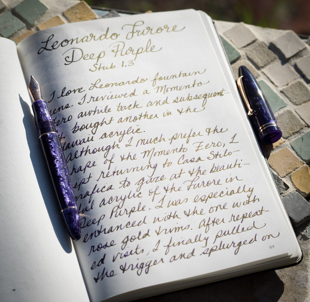
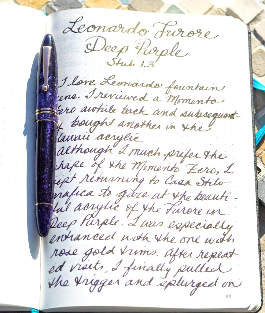
I love Leonardo fountain pens. I reviewed a Momento Zero awhile back, and subsequently I bought another Momento Zero in Hawaii resin. I suspect more Leonardo pens are in my future.

Although I much prefer the shape of the Momento Zero, I kept returning to Casa della Stilografica to gaze at the beautiful resin of the Furore in Deep Purple. I was especially entranced with the model with rose gold trims. After repeated visits, I finally pulled the trigger and splurged on the Furore with a 14k rose gold stub nib (1.3mm).

The pen arrived in record time from Casa della Stilografica. I couldn’t help from exclaiming, “Fra-jee-lay!” when I saw the package (you know, A Christmas Story). It was a box from Italy after all. And, apparently, “Furore” is pronounced “Foo-róh-ray,” so I was basking in Italian pronunciation anyway. The Furore box looks like an Italian countryside--floral and colorful.

I love it when I open a new fountain pen and gasp. I gasped upon seeing the Furore’s purple resin. The purple is dark in some places and sparkles in others with lighter purple flecks. You can arrange the cap so the lighter purple flecks align.

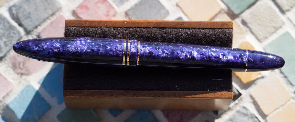
Or you can cap the pen so there are alternate dark and light portions.

Usually I’m OCD about getting pen patterns aligned, but with the Furore, I like having alternating light and dark patterns.

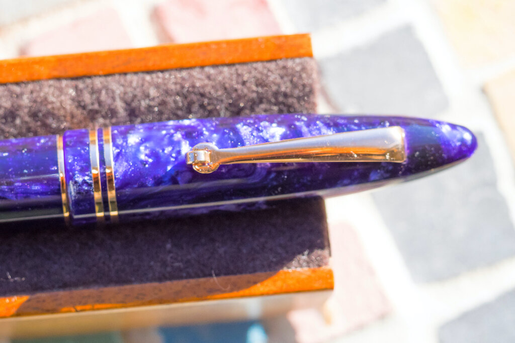
The barrel is engraved with “Leonardo Officina Italiana” and the pen number, mine is No. 327.

The pen is cigar-shaped, though the ends are much narrower than, say, a Montblanc 149. In fact, I might call the Furore “torpedo-shaped.”

The rose-gold trims are lovely and complement the purple perfectly. The clip has a tiny roller on it, making it easy to clip the pen onto a notebook or shirt pocket. Two rings adorn the cap and two more adorn the top and bottom of the barrel.

The pen is a cartridge/converter filler. Like other Leonardo pens, you can fill the converter by removing the blind cap on the bottom of the barrel so that it functions more like a piston.

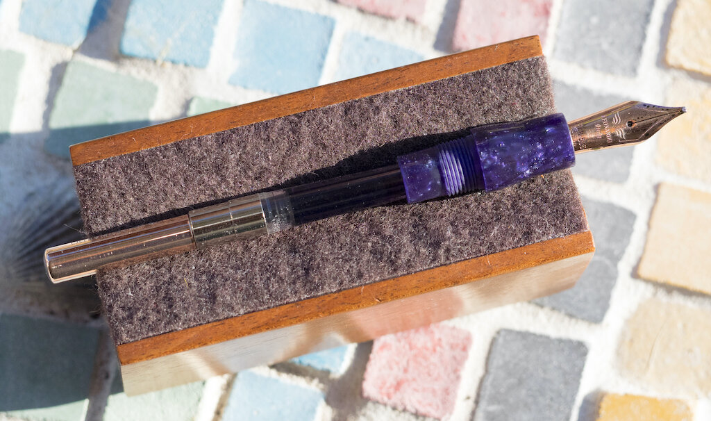
Or, you can remove the barrel to expose the entire converter. I love Leonardo converters. They are well made and sturdy--far superior to the cheap plastic converters that come with so many other fountain pens.

The 14k rose-gold nib is glorious with the simple Leonardo branding and a generous 1.3mm stub.

The feed offers excellent ink flow, and the stub has nice line variation.

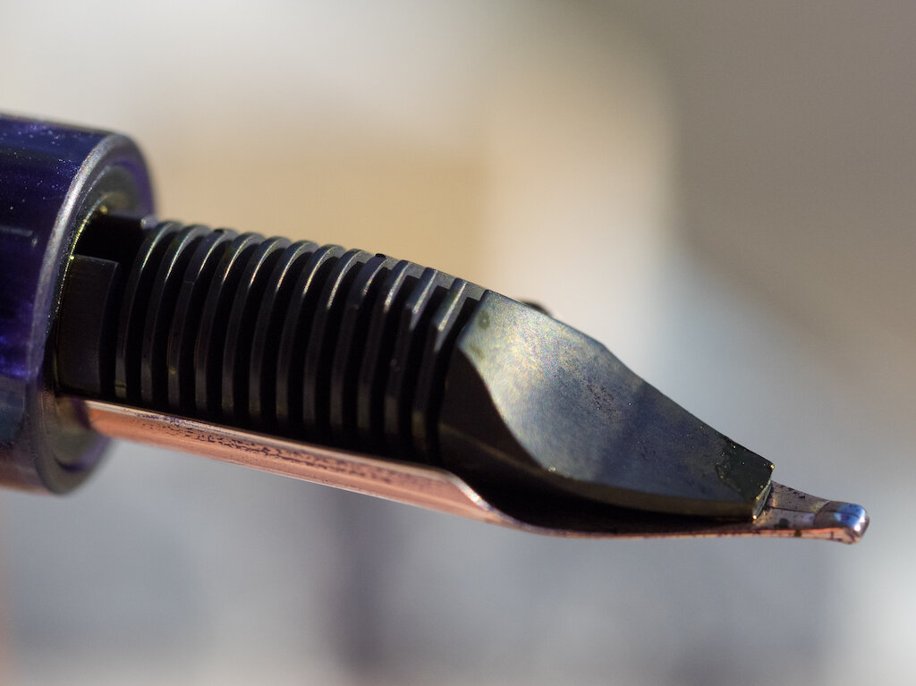
It’s a satisfying, smooth, wet nib.

I honestly can’t tell a difference between the gold stub nib and the steel stub I have on my Leonardo Momento Zero Hawaii. That’s how good the steel nibs are. I suppose the gold nib might have a little more give to it, but, frankly, if you are torn between gold and steel, I think the steel nibs are just as good as the gold.

I purchased my Leonardo Furore from Casa della Stilografica. You can get this pen in various trims--gold, rose gold, and HT (rhodium), and you can choose steel or 14k nibs. A Furore with a steel nib costs €145.90 (= $161.29 at current conversion rates) and the gold nib costs €309.24 (= $341.96 at current conversion rates). I highly recommend Casa della Stilografica. They have all the varieties of Leonardo pens (unlike many American dealers who have more limited options), plus, their customer service is top notch.

My Leonardo Furore in Deep Purple is one of my happy pens. What I mean by that is this is a pen that makes me happy when I look at it and even happier when I use it. It’s a color that delights me, and the stub nib suits my writing style perfectly.

(I purchased the Leonardo Furore in Deep Purple with my own funds.)


Enjoy reading The Pen Addict? Then consider becoming a member to receive additional weekly content, giveaways, and discounts in The Pen Addict shop. Plus, you support me and the site directly, for which I am very grateful.

Membership starts at just $5/month, with a discounted annual option available. To find out more about membership click here and join us!

Posted on January 24, 2020 and filed under Leonardo, Fountain Pens, Pen Reviews.

Sailor Nagasawa Pro Color Fountain Pen Review

(Sarah Read is an author, editor, yarn artist, and pen/paper/ink addict. You can find more about her at her website and on Twitter. And check out her latest book, Out of Water, now available where books are sold!)

The Sailor Pro Color has a new special series from the Nagasawa Stationery Center in Kobe, Japan--this time in a lovely array of seven slightly shimmery pastel colors. I'm a big fan of the Pro Color model. To be fair, I'm a big fan of most Sailors that I've used. From their low-end, entry-level pens to their fancy-pants budget-breakers, there's an attention to detail and dedication to quality that makes all of them special.

The Pro Color isn't quite entry-level. With a price tag of $87, it's a stage past that, into the "generous gift" category, by my scale. It just crosses the impulse-buy threshold, though these pretty pens could easily blur that line with their charm.

Like the Shikiori Tsukuyo-no-Minamo that I reviewed last year, the primary difference between this pan and its fancier cousin, the 1911 Standard, is the nib material. The 1911 has a gold nib, while these models have a gold-colored steel nib. The resin of the body also feels, to me, a little bit less substantial. The edges are just slightly less finished. All of these differences have to be studied to be noticed at all. The steel nib is so smooth and perfectly tuned that I had to double-check that it wasn't gold.

The nib on this Nagasawa edition has different stamping than the regular Pro Color series. Instead of the scroll work and anchor, there's a rooster weathervane with 1882 on it, with Nagasawa and Kobe written around it. Sailor is written below that. It's a really lovely nib, and it's fun to see something different and special on it. The looks would mean nothing, though, if it wasn't also a dreamy writer. It is perfectly smooth, even with this fine nib, and it has the perfect wetness to show off the characteristics of whatever ink you're using. I don't often see much ink shading with a Japanese fine nib, but I do with this pen.

This model is the Kobe Water Blue color. It's a lovely, soft, robin's egg blue. It's also available in Ijinkan Mint (I need this color also), Nunobiki Lavender, Rikyu Moon Yellow, Hatoba Coral Pink (this one, too), Samura Sand Beige, and Oji Cherry. They're all gorgeous. The spring colors bring a nice pop of cheer to the deep winter.

All of the pens have gold-colored furniture. The cap band says "Nagasawa" and "pen style den". The clip is plain, but functions well. The grip section is comfortable, and made from the same plastic as the body. It can use Sailor cartridges or a Sailor converter. It comes with both, so you can choose your preference. I loaded mine with Sailor Ink Studios 773, which I'll be reviewing next week.

In my experience, you can't go wrong with a Sailor pen. It might be possible to spend too much on one, though. This Pro Color model gives you a wonderful writing experience for a fraction of the price of their middle- and high-end pens. If you haven't tried a Sailor yet, and are in the market for a step up from entry-level, this is a fantastic choice. Having a wonderful, inexpensive Sailor will not, however, make you immune to the allure of high-end Sailor pens. While this pen is perfectly good enough, there are never enough Sailors.

(JetPens provided this product at no charge to The Pen Addict for review purposes.)


Enjoy reading The Pen Addict? Then consider becoming a member to receive additional weekly content, giveaways, and discounts in The Pen Addict shop. Plus, you support me and the site directly, for which I am very grateful.

Membership starts at just $5/month, with a discounted annual option available. To find out more about membership click here and join us!

Posted on January 23, 2020 and filed under Sailor, Nagasawa, Fountain Pens, Pen Reviews.

Fine Writing International Bronze Age Fountain Pen Review

(Sarah Read is an author, editor, yarn artist, and pen/paper/ink addict. You can find more about her at her website and on Twitter. And check out her latest book, Out of Water, now available where books are sold!)

I first saw the Fine Writing International Bronze Age in one of its many Instagram glamour shots. There was definitely an element of love at first sight--it's a really beautiful pen. But I was a bit wary, too. I had never heard of the brand before, and it seemed a bit underpriced, actually, for a brass pen. While I thought it was lovely, I was suspicious of its quality. So when the opportunity arose to review it, I was doubly excited--excited to try out this mysterious beauty of a pen, and excited to satisfy the lingering curiosity I'd held onto since I first saw it.

My curiosity is happily satisfied, and this pen is as nice as it looks. The first thing you can't help but notice, when you hold this pen, is that it is very heavy. The cap, end, and grip section are solid brass, and the pen weighs in at 53g before it's even inked. Most of that weight alone is the cap. Because of that, I worried about what it would feel like to write with, but the grip section and end cap are very well balanced, so I didn't actually experience any hand fatigue, even during a longer writing session. The cap is lined with a special plastic sleeve that seals the pen when closed to prevent dry-out. It works very well, but it does prevent the cap from posting at the back end. You really wouldn't want to post this pen, though. It would be incredibly back-heavy if you did.

The body of the pen is clear acrylic. It bears the claim of being nearly indestructible. It's a bold claim, and I get a bit nervous any time I see metal pen parts that thread directly onto plastic ones. But so far, I see no signs of any stress to the acrylic. Despite the fact that I forgot I put this pen into a pocket of my notebook cover, and then it fell out of the pocket inside my backpack and spent an afternoon tossed around in my bag like in a tumble dryer. I had a moment of panic when I realized what had happened, followed by surprised delight when it was entirely unscathed. There wasn't even the slightest leak from its eyedropper fill.

I was also nervous to eyedropper fill this pen. The brass is exposed to ink inside the pen, which I thought was a big no-no, but apparently it's okay with brass. And so far, so good. I also thought that the metal/acrylic join would probably leak, but it doesn't. There's a slender o-ring at the join that is there for reinforcement, but no ink has ever even made it that far up the threads. The body holds a whopping 4ml of ink, which will last even the most devoted scrivener a good while. The pen even comes with its own syringe for filling. It also comes with a converter, which it can use--or it can take any standard international cartridge. Lots of options! The included converter is pretty, and looks good inside the clear body.

The nib is gold-plated steel, and is available in EF, F, M, B, and 1.1 stub. This model has the stub nib. The nibs are made by Jowo and are engraved with the lovely quill design for Fine Writing International. My nib writes perfectly, with a consistent line that's just wet enough to show off the ink, but not too gushy. The feed keeps up with the stub very well. It's a #6 nib, and it can be interchanged with any other #6 nib that you like.

Despite all those very practical details, my favorite thing about this pen is the beautiful engraving. The images represent the Taotie, a beast from ancient Chinese mythology that often appeared on bronze vessels during the Shang and Zhou dynasties. The Taotie is one of the four evils of the world, said to be representative of gluttony and known for eating people, namely human sacrifices. While all that sounds a bit scary, that's the image intended for those on the outside of the mask. For those inside, the Taotie is a symbol of strength and protection. It is believed that the alarming visage would serve as a warning for those who were covetous.

That warning didn't come through on Instagram, where I think we all became a bit covetous of this pen. And, fortunately, it's very fairly priced at around $100. That's still an expensive pen, but reasonable, given the build and materials. I've certainly paid more than that for pens that are not as good as this one. This is one I see myself continuing to use on a very regular basis, especially when I travel for writing, where I'll need a durable pen with a high ink capacity. I'm delighted that this pen exceeded my expectations.

(JetPens provided this product at no charge to The Pen Addict for review purposes.)


Enjoy reading The Pen Addict? Then consider becoming a member to receive additional weekly content, giveaways, and discounts in The Pen Addict shop. Plus, you support me and the site directly, for which I am very grateful.

Membership starts at just $5/month, with a discounted annual option available. To find out more about membership click here and join us!

Posted on January 16, 2020 and filed under Fine Writing Int., Fountain Pens, Pen Reviews.