Posts filed under Fountain Pens

Esterbrook Estie Lilac Fountain Pen Review

There is a style of pen that I have been enjoying immensely over the past year or two. I don’t know if this particular grouping has a name, but they share the same style of design, and fall in the same general price point. Leonardo Officiana and Montegrappa make pens that meet whatever this artificial criteria is, as does Esterbrook, which I am finally getting around to reviewing.

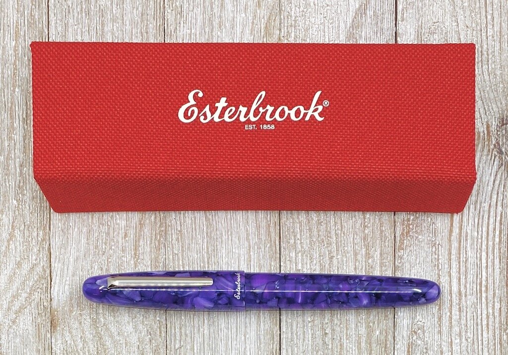
I know, I’m a little late to the new Esterbrook party, but I’m here now. And the Esterbrook Estie in Lilac has been proven to be worth the wait.

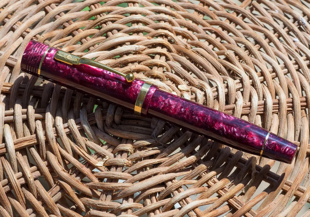
The story of Esterbrook is a long one, primarily as one of the great American writing brands for a period of over 100 years. It saw a small, yet ultimately failed, reappearance in 2014, prior to being bought out by US luxury goods distributor Kenro Industries in 2018. And from what I’ve seen so far, Kenro has Esterbrook on the right track as a new representation of the brand, not a direct throwback to history.

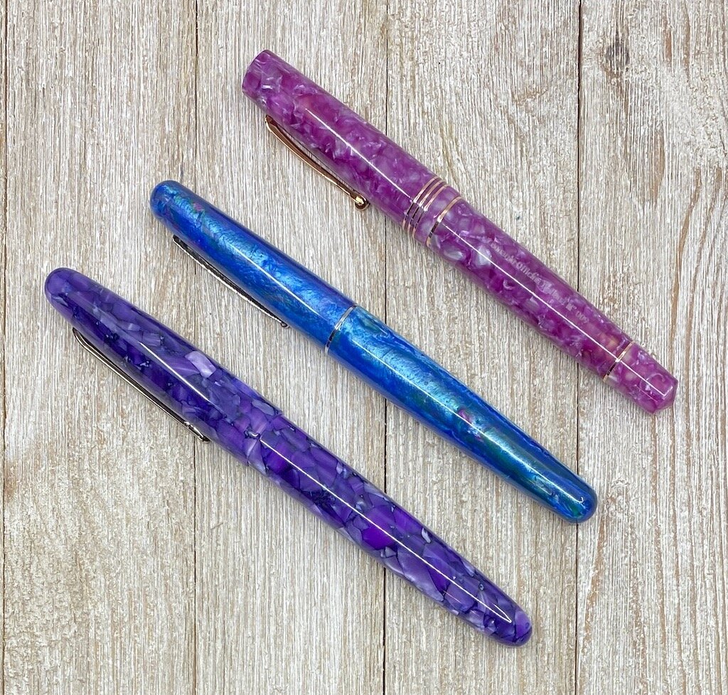
Any expectation that Kenro would mimic the past was thrown out quickly with the release of the flagship pen in the lineup, the appropriately named Estie. It is a traditional cigar-shaped pen, made in various acrylics from basic Black, to Tortoise Shell, to the Lilac I am currently using, and many more in between - including some limited editions.

The barrel sizes offer range as well, with a Slim model, a Standard, such as this one, and a few Oversized models mixed in for good measure.

While they may not look like your grandparents Esterbrook pens, Kenro did make sure that you could use your vintage Esterbrook nibs with these new pens by creating the MV Nib Adapter. It’s an add-on, but well-worth it if you have a hoard of vintage Esterbrook nibs laying around (I know who you are!) It’s a great way for the brand to be able to discuss the wonderful history of the product while bringing in a group of new users, like myself.

So let’s get into why I like it, and why I think this range of pens in the overall market is as strong as its been in years. First off, the Lilac acrylic is stunning. That’s what caught my eye originally, but there were plenty that came before it, such as Honeycomb and Blueberry, and hopefully many more to come after.

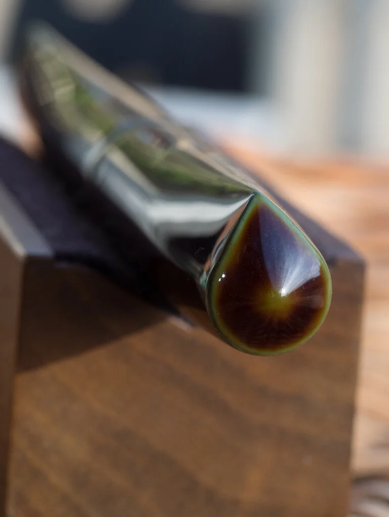
Secondly, the build quality is excellent. This is not an inexpensive pen at $156, nor is it a budget-breaker in the grand scheme of fountain pens. It uses Esterbrook-stamped Jowo Steel nibs, fills by standard international cartridge or converter, and has a cushion cap to keep the nib from drying out when closed.

Finally, the Esterbrook Estie feels wonderful to write with. It’s a large pen which you won’t want to post, but not too large or weighted poorly to make it uncomfortable to use. The acrylic has some density to it, and even my preferred Extra Fine nib glides across the page. I’ve thoroughly enjoyed using it since Kenro provided it to me at the Philadelphia Pen Show in January, and I can see more Esterbrooks in my future.

The one thing I can’t figure out about the Esterbrook Estie - and Leonardo Momento Zero and Montegrappa Elmo that I mentioned above - is why this section of the market is popping off, at least in my eyes. You can buy gold-nibbed pens for cheaper, and you can buy small-batch custom poured and machined acrylic pens for around the same price. And many of the existing designs in the $150-$200 range are considered all-time classics.

Is it that we like the new shiny materials of the pens? I know I do. The louder the material the better as far as I am concerned. And we already have the inks to match. I talk about fountain pens as being the most customizable writing instruments on the market, and these are prime examples. Are manufacturers now willing to break the black and gold mold of yesteryear into more modern styles? And have them perform as well, if not better? Is the modern fountain pen market separating itself from a sometimes stodgy history?

I don’t know what it is, but as a fountain pen fan, I like it. And I want more of it. Show us what you got in 2020, Esterbrook. I’m here for it.

(Kenro Industries provided this product at no charge to The Pen Addict for review purposes.)


Enjoy reading The Pen Addict? Then consider becoming a member to receive additional weekly content, giveaways, and discounts in The Pen Addict shop. Plus, you support me and the site directly, for which I am very grateful.

Membership starts at just $5/month, with a discounted annual option available. To find out more about membership click here and join us!

Posted on April 6, 2020 and filed under Esterbrook, Fountain Pens, Pen Reviews.

Conway Stewart Lustrous Burgundy Pearl Fountain Pen with a Fine Semi-flex Nib: A Review

(Susan M. Pigott is a fountain pen collector, pen and paperholic, photographer, and professor. You can find more from Susan on her blog Scribalishess.)

I reviewed a beautiful Peppered White Conway Stewart Churchill awhile back for Pen Addict. Because I was so impressed with that pen I’ve kept an eye out for another Churchill in a different color scheme with a more interesting nib. I constantly monitor Fountain Pen Hospital’s “The Back Room,” and I’ve gotten some really great pens at terrific prices from them. When I saw this Conway Stewart, I snapped it up.

My first Conway Stewart came in a rather simple box, so I was quite surprised when I received an enormous package from FPH. Inside was a large, green, hinged box with clasps.

A tiny book about Winston Churchill, a cigar (!), the pen, and a bottle of Conway Stewart orange ink were tucked inside the white sateen interior. I wasn’t expecting such a fine tribute to Winston Churchill! However, I’m not quite sure what to do with these items other than store them in the box. I guess I have a cigar handy for some special occasion . . . when people smoke cigars . . . which is basically never?

The pen is exquisite. Lustrous Burgundy is a good name for this acrylic with deep burgundy and lighter pink swirls exhibiting lots of chatoyance. The luminescent color only appears in two vertical swaths down the barrel. The other sides of the pen are dark burgundy. I’d prefer more consistent color over the entire surface, but the dark and light contrast is beautiful, nonetheless.

The barrel is engraved with “Conway Stewart ‘Churchill’ Made in England” along with the limited edition number out of 500.

The Churchill model is distinctive with its slightly rounded top finial, bold lines, and tapered bottom finial. It’s definitely a large pen, measuring 5.71 inches/145mm capped, 5.4 inches/137mm uncapped, and 7.1 inches/180mm posted (as if!).

Deep grooves encircle the cap finial, and the 18K gold clip is engraved with the Conway Stewart logo.

A total of five 18K gold rings adorn the pen: two on the cap and three on the body. This is one classy looking pen.

I wish a pen of this size and price was a piston filler, but it’s a cartridge/converter. That’s not the end of the world, because a converter is a bit easier to clean than a piston filler. However, a pen this large could do with greater ink capacity.

The 18 karat fine, semi-flex nib is adorned with the Conway Stewart logo and name. I prefer this nib design to the more recent version that has the British flag on it--not that I have any problems with the British flag, mind you! I just prefer this simpler design.

When I first started to write with the nib, I was quite pleased with how smooth and bouncy it was. As a fine semi-flex, it doesn’t have a huge amount of line variation, but there’s enough to enhance my writing. I inked the pen with Iroshizuku Yama-Budo, which is a well-behaved ink and a good match for this pen.

Unfortunately, the more I wrote, the more frustrated I became. The nib writes beautifully for about one page, and then it exhibits skipping and hard starts. I have to unscrew the barrel and push more ink down into the converter, which is unpleasant and interrupts my writing. I don’t know if this is a converter problem or an issue with the feed, but it’s disappointing.

This limited edition Conway Stewart was produced in 2007 and is not readily available for purchase. In fact, my Google search resulted in one hit--an eBay listing for this pen (without the ink) for $1,800! “Holy &##@!” said I. I’m happy to report that I did not pay anywhere near that much, thank goodness. I realized that I got a Churchill Burgundy Pearl at a super price from FPH! Now I just need a nibmeister to work some wonders with the ink flow.

(I purchased this pen with my own funds.)


Enjoy reading The Pen Addict? Then consider becoming a member to receive additional weekly content, giveaways, and discounts in The Pen Addict shop. Plus, you support me and the site directly, for which I am very grateful.

Membership starts at just $5/month, with a discounted annual option available. To find out more about membership click here and join us!

Posted on March 27, 2020 and filed under Conway Stewart, Fountain Pens, Pen Reviews.

Nakaya Dorsal Fin 2 in Heki-Tamenuri: A Review

(Susan M. Pigott is a fountain pen collector, pen and paperholic, photographer, and professor. You can find more from Susan on her blog Scribalishess.)

Nakaya pens are all grail pens in my opinion, but there’s one model, in particular, that has always captured my imagination: the Dorsal Fin 2. To me, the pen mimics the soft curve of a Samurai sword more than it does a dorsal fin. But I’ve never much liked the Dorsal Fin 1 model, even though it more obviously evokes a dorsal fin. Dorsal Fin models (especially the Dorsal Fin 2) are in high demand and are constantly on backorder. When nibs.com announced last summer that they were expecting a shipment to arrive in the fall, I preordered one immediately and received it in October.

Nakaya pens come packaged in a softwood box with a red velvet-like interior. Included with the pen are a box of cartridges and a kimono. The pen is also supplied with a converter.

Heki-Tamenuri is a lovely urushi with organic, earthy tones of brown and green.

One of the reasons I chose the Dorsal Fin is because the model’s unique lines show off the underlying green urushi so well.

When you uncap the pen, you see even more of the green in the threads and grip section.

This pen is pure zen. It is perfectly balanced capped and uncapped, and it feels absolutely luscious in the hand. Urushi warms to your body temperature, so the pen becomes an extension of you. Writing with it is a simple pleasure.

For this Nakaya, I chose a medium-soft nib with added flex, ground to a stub by John Mottishaw. The Nakaya branding on the nib is gorgeous and the nib performs exactly as I hoped it would.

You can see the flex of the tines in this photo.

I inked the pen with Iroshizuku Tsukushi. I’ve found that Nakaya pens work especially well with Iroshizuku inks. This nib is wet and smooth. It is bouncy when writing without flex and it offers good line variation when you flex the nib.

The Nakaya Dorsal Fin 2 retails at $1,500 plus additional charges if you want nib modifications like mine. It’s obviously one of those pens you think about long and hard before purchasing. I’m absolutely pleased with my purchase. Not only is this pen a piece of beautiful art, it is one of my best writers as well.

You can purchase the Nakaya Dorsal Fin 2 from nibs.com. The Dorsal Fin 2 comes in various colors, including Heki-Tamenuri, Kuro-Tamenuri, Aka-Tamenuri, Midori-Tamenuri, Toki-Tamenuri, and various Ishime colors.

(I purchased this pen with my own funds after selling several beloved pens so I could afford this one!)


Enjoy reading The Pen Addict? Then consider becoming a member to receive additional weekly content, giveaways, and discounts in The Pen Addict shop. Plus, you support me and the site directly, for which I am very grateful.

Membership starts at just $5/month, with a discounted annual option available. To find out more about membership click here and join us!

Posted on March 13, 2020 and filed under Nakaya, Fountain Pens, Pen Reviews.