Posts filed under Fountain Pens

Esterbrook JR Pocket Fountain Pen Review

Esterbrook JR Pocket Fountain Pen Review

(Jeff Abbott is a regular contributor at The Pen Addict. You can find more from Jeff online at Draft Evolution and Twitter.)

If you've ever been to a pen show, you've certainly seen a few Esterbrooks on the tables of various vendors. Back in the 40s, these pens were as ubiquitous as the Bic ballpoint or Pilot G2 gel pen today. They were affordable, dependable, and offered enough variety to match your personal sense of style. Even today, decades later, they still work and offer a fantastic writing experience as long as they've been cared for and/or restored properly.

Esterbrook JR Pocket Fountain Pen

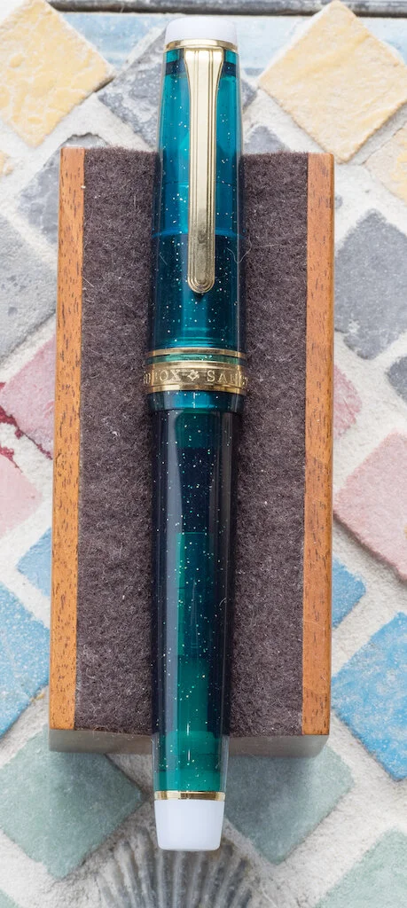
Esterbrook has made a comeback in the past couple of years. Under the ownership and direction of Kenro Industries, this classic brand has been reborn into the 21st century. This idea of rebirth runs deep in the company's new vision, and is baked into the name of their JR Pocket Pen. Modeled after the classic Esterbrook J, this petite pen bears a striking resemblance to the J while also offering the amenities that modern manufacturing and materials provide.

Esterbrook JR Pocket Fountain Pen Barrel

If you've ever handled an Esterbrook J, you'll know just how petite and slim those pens are. The JR doesn't fall far from the tree in this case. The body of the pen is just as slim as the classic J, and it's similarly lightweight and comfortable to hold while writing. One small deviation from the original that I'm still not sure about is the cap. It's quite a bit larger in diameter than the body of the pen. While this doesn't change anything functionally, it does make it look a bit different than the original J. That being said, there's no reason that the JR has to be a complete replica of the original J. This pen is quite attractive as an individual piece of art, and I completely adore how it looks on my desk. Any decision to deviate from the classic form — either aesthetic or functionally — is completely acceptable because this pen is just what Esterbrook says in their marketing materials: a rebirth of the J.

Esterbrook JR Pocket Fountain Pen Converter

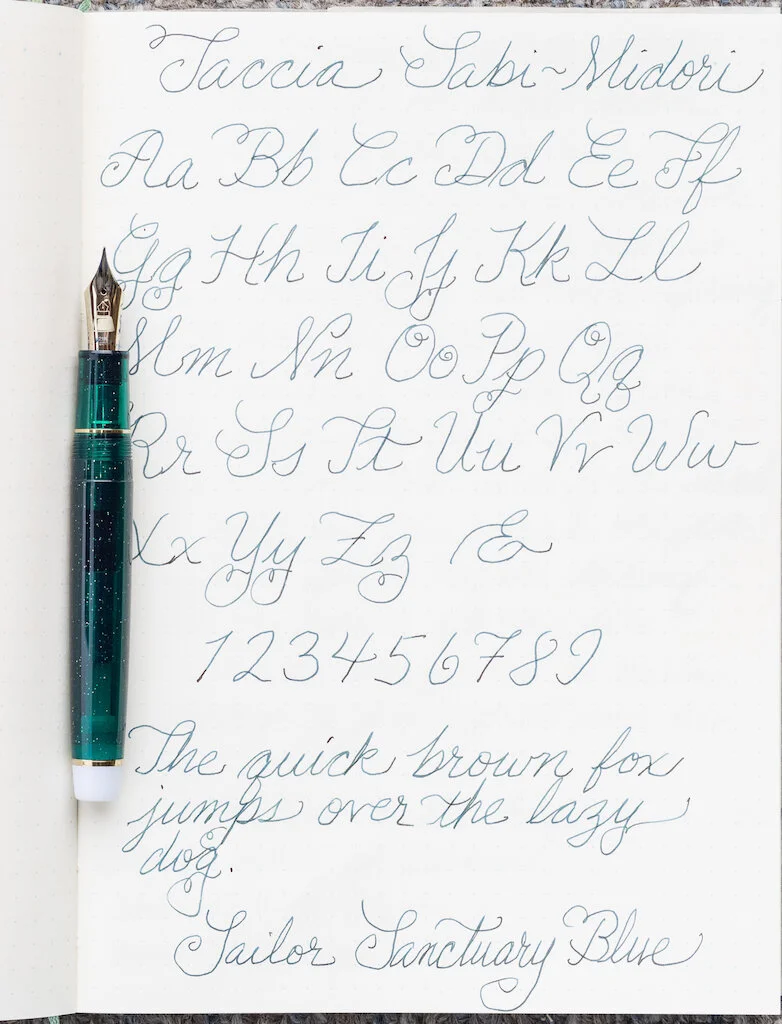
Writing with the JR is quite a pleasant experience. The lightweight acrylic is comfortable to hold and quickly warms up to your touch. The grooved section has a convenient place to rest your fingers while writing and is small enough to stay out of your way if you use a different grip. I've used this pen for some fairly long writing sessions, and it's been extremely comfortable.

Esterbrook JR Pocket Fountain Pen Nib

The nib is what really stands out to me on this pen. It's a medium point, but it's just so smooth and crisp. Writing with it is such a pleasure because of how smoothly it glides across the surface of the paper. Straight out of the box, it was a fantastic writer and I'm always really appreciative to this level of quality control and attention to detail.

Along with everything else that makes this pen so great, the colors and materials are so pretty. I have the Capri Blue version with gold trim, and the depth and variety of blues in this material is gorgeous. I still think it would look amazing with paladium trim and wish that was an option, but the blue and gold combo is also quite nice. I've found myself staring at this pen and discovering new pockets of color under the surface of the body that just fascinates me.

Esterbrook JR Pocket Fountain Pen Comparison

Along with Capri Blue, you can also choose from Carmine Red and Tuxedo Black. Each color has a similar depth of color and shading that adds a lot of visual interest to the pen.

The MSRP for this beauty is $175, but you can normally find it for about 30 bucks cheaper. I think this is a fair price considering the buttery smoothness of the nib, the quality of the body/cap materials, and the amount of finish and attention to detail that went into this product. Oh, they also include a nice box and a full size cartridge converter as well so that you're ready to ink it up and go as soon as you get it out of the box.

Esterbrook JR Pocket Pen

The Esterbrook JR Pocket Pen is an adorable and highly useful reincarnation of the classic Esterbrook J. It doesn't matter if you're new to Esterbrook or just trying out the reborn offerings, this is a fantastic representation of what I think the traditional brand offered. It's a well-made pen that look sharp and writes beautifully.

(Kenro Industries provided this product at no charge to The Pen Addict for review purposes.)


Enjoy reading The Pen Addict? Then consider becoming a member to receive additional weekly content, giveaways, and discounts in The Pen Addict shop. Plus, you support me and the site directly, for which I am very grateful.

Membership starts at just $5/month, with a discounted annual option available. To find out more about membership click here and join us!

Esterbrook JR Pocket Pen Review
Posted on December 23, 2020 and filed under Esterbrook, Fountain Pens, Pen Reviews.

Bungubox Sanctuary Blue Sailor Professional Gear Fountain Pen: A Review

Bungubox Sanctuary Blue Sailor Professional Gear Fountain Pen Review

(Susan M. Pigott is a fountain pen collector, pen and paperholic, photographer, and professor. You can find more from Susan on her blog Scribalishess.)

When Bungubox announced their limited edition Sanctuary Blue Sailor Professional Gear fountain pen, I was immediately smitten: blue and green, sparkles, unusual white finials, and a wee, little raden turtle on the cap finial. I sent an email right away and bought the pen.

It arrived from Japan in a Sailor clamshell box, the outer cardboard sleeve decorated with the turtle theme.

Bungubox Sanctuary Blue Sailor Professional Gear Fountain Pen Packaging

Inside was a card explaining the origins of the pen. It is based on a green-blue ink called Sanctuary Blue. Off the coast of Enshunada, Japan, the sea is a deep blue color. That color, and the beach's white sand and sea turtles, became the inspiration for the pen.

Bungubox Sanctuary Blue Sailor Professional Gear Fountain Pen

The pen is Sailor's Professional Gear model. It is 128mm/5.04 inches capped, 115mm/4.5 inches uncapped, and 150mm/5.9 inches posted. It weighs 25 grams (capped and inked).

Bungubox Sanctuary Blue Sailor Professional Gear

I absolutely love the colors of this pen. The cap is translucent blue with gold sparkles and gold trims.

Bungubox Sanctuary Blue Sailor Professional Gear Cap

The white finial provides a striking background for the little raden turtle twinkling in the sun. This detail makes me happy every time I look at it.

Bungubox Sanctuary Blue Sailor Professional Gear Finial

The cap ring is engraved with "Bungubox Sanctuary Blue" and tiny turtles.

Bungubox Sanctuary Blue Sailor Professional Gear Cap Ring

The body of the pen is translucent green with gold sparkles, and twin gold rings adorn the barrel where it meets the grip and above the bottom finial.

Bungubox Sanctuary Blue

A cartridge/converter filler, this pen is supplied with a unique converter that has a white knob to match the white finials on the pen.

Bungubox Sanctuary Blue Converter

The nib is a 21k hard medium-fine. It is engraved with an ink bottle because the pen is based on an ink color. I wish the nib had a turtle engraving instead.

Bungubox Sanctuary Blue Nib

I usually don't order anything smaller than a medium-fine with Sailor nibs because they can be scratchy (or, as some say, "They have feedback.") This nib is super smooth and writes like a Western extra fine.

Because the pen is small and light, it is a joy to write with. I can write for long periods of time without any fatigue. I inked the pen with Taccia Sabimidori (reviewed here) and wrote the alphabet and a section from Harry Potter and the Sorcerer's Stone.

Bungubox Sanctuary Blue Writing
Bungubox Sanctuary Blue Writing Close

I love doing doodle patterns, so I attempted one I saw on Instagram (mine didn't turn out nearly as cool as the original, but oh well). Sailor nibs are wonderful for drawing because they are so fine, and I love how juicy this particular nib is.

Bungubox Sanctuary Blue Pattern
Bungubox Sanctuary Blue Drawing

Unfortunately, the Sanctuary Blue pen is sold out. However, the good news is that Bungubox now has an English-based online store so you no longer have to email them to place an order. The store currently has a few special Sailor models in stock: the Mangata, the Omotesando, and the Hello San Francisco. You'll also find the gorgeous Bungubox inks in special bottles on the site.

For a person who typically likes larger pens, I've grown quite a collection of Sailor Pro Gears. They are a bit like candy--colorful, shiny, and sweet. It's hard to resist these jewels, and the nibs are impeccable.

(I purchased the Bungubox Sanctuary Blue fountain pen with my own funds.)


Bungubox Sanctuary Blue Translucent
Posted on December 4, 2020 and filed under Bungubox, Sailor, Fountain Pens.

Fountain Pens as a Left-Hander

Leonardo Pelikan

As much as I have enjoyed writing with pencils during my newfound left-handedness, I have struggled with using fountain pens. Why is that?

For starters, fountain pens are a more rigid writing experience. There are rules - such as the angle of attack with the nib, and the correct amount of pressure on the tines - that other writing instruments don't have.

In my case specifically, my preference for very fine nibs and nibs with a sharp edge (think cursive italic) work against me as I try to learn to write with my left hand. Now, life-long lefties should have no trouble with fountain pen nibs on the far ends of the writing spectrum. But coming in fresh, after decades of opposite hand writing, is more of a challenge for me given my current nib inventory.

So, how do I make my left-handed fountain pen writing experience more enjoyable? Use bigger nibs.

Leonardo Pelikan Nibs

I knew exactly which one I'd go for too, seeing how I own so few of them. It's hard to beat Pelikan nibs when you are looking for an ultra-smooth, wide line, so I grabbed my M800 Demonstrator with a medium stub nib and inked it up with Akkerman Dutch Masters 05 Israel's Zeeblauw to play around with.

For comparison, I matched it up against my Leonardo Momento Zero Grande with a stock extra fine nib, inked with Akkerman 28 for good measure. This is normally one of my favorite all-around writing nibs when writing righty, but I haven't gotten along with it as well from the opposite side.

Left-handed Writing

The difference was immediately clear to me. My extra fine lines were shaky, and my medium stub lines had that nice “I’m just learning to write left-handed” look that I've come to enjoy. Like my pencils.

My writing state requires larger nibs for now. That's why pencils work so well, and why wider tipped fountain pen nibs do too.

I do miss my regular handwriting, and I hope to get back to it around the New Year. But until then, I'll keep learning about what works well for me now, and why. Maybe I'll try out gel pens next?

Left-handed writing pens
Posted on November 30, 2020 and filed under Fountain Pens, Left-handed.