(The is a guest post by Andrew Coon. You can find more of Andrew’s fountain pen favorites on Instagram.)
I like big nibs. A lot. Over the course of exploring the various nooks and crannies of the pen world, I have managed to acquire and play with most of the big nibs that are in production today. I thought there might be some use in collating my impressions and experiences with the big nibs, so here are a few thoughts.
First, though, why bother with big nibs? Simple – the longer the nib, the more character there can be to the writing experience based upon how the manufacturer uses that length. Different nib geometries/shapes, as well as differences in what metals are included in the gold alloy, can lead to dramatic differences in how the nibs write. Yes, a nib that is 14K or 18K is either 58% or 75% gold, but what are the other metals used? And how is that nib shaped, to allow that metal to move, bounce, and flex? Is the overall nib thicker or thinner? Different combinations of these factors determine how each nib feels.
One final note, a caveat. What I write is based upon the nibs that I have used, so the sample size is small. If your experience is different, please let me know. With all that said, here we go.
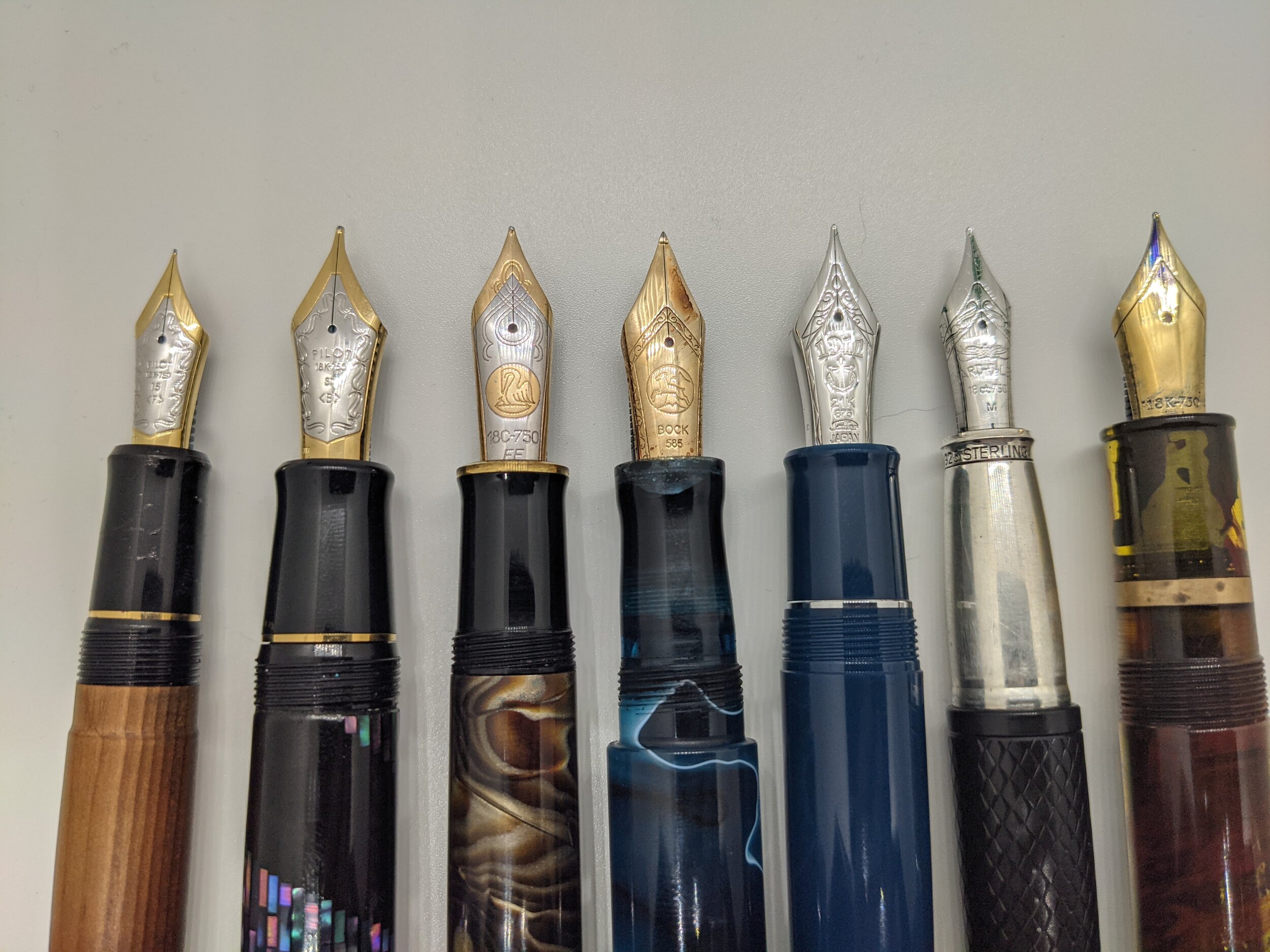
From L to R: Pilot 15, Pilot 30, m1000, Bock 8, King of Pen, Yard O Led Grand Viceroy, Jowo 8
The Pilot 15, commonly found on the 823, is the smallest of the group of big nibs. It is beloved by almost everyone who gets one, and is commonly referred to as a workhorse of a nib. A bit of bounce, with the expected level of detail to tuning that Pilot gives to its nibs, and this is the nib that many people love. It is not much bigger than the Jowo 6, but it is just enough bigger that it does perform differently. I do wish that Pilot would make the 743 available in America, so that more people could experience the full range of what this nib can do. The 823 only comes in F/M/B, and the 743 has the full range of Pilot’s nibs.
(The Namiki 20, found on the Yukari Royale, is the same length of nib as the Pilot 15, and has a similar performance in my limited experience.)
The Pilot 30, only found on the Pilot Custom Urushi, is a nib that is elastic in character. Using terminology which I learned from Leigh Reyes, I describe this nib not as a flex nib, but as an elastic nib. Flex is the classic Western “wet noodle,” which has significant line variation when pressure is applied. Elastic nibs do not do this – they are more like brushes. They bounce, but can easily railroad. Due to this, a light hand is needed, and may take some practice to get used to. But, it is worth the effort. This is one of the most distinctive nibs of all the big nibs – my only critique of it is that it is only available on the rather expensive Custom Urushi model, which can be a touch too girthy for many people.
(Watch what happens when pressure is applied to the first nibs used, which are elastic, as compared to what happens when pressure is applied with the nibs at the end of the video. If you want to experience elastic nibs without the cost of buying a large nib, look at a Pilot FA nib or a Platinum Soft Medium.)
The Pilot 50, found on the Namiki Emperor, looks like it should be an even more extreme version of the Pilot 30 and be the nib that is as bouncy and expressive as is possible. This is not the case. It writes like a perfectly tuned Jowo 6. I really don’t know what to say about it, other than it is such a surprise that this is the case.
I have not written with one and so can't speak from experience, but the large nibs by Tohma seem to be everything that a Pilot 50 would be expected to be. Produced in small batches, they are brutally expensive. (See more here.)
The Pelikan m1000 is a polarizing nib - some love it and some cannot stand it. Being among the last of the modern line of Pelikan Souveran models to launched, being released in 1997, it uses a very different nib than the m800. It is the same shape as the smaller Pelikan nibs, but as I understand it, the m1000 is made with thinner metal. This leads to it commonly being experienced as "mushy." That has been my experience. I have one that I enjoy now, but it suffers from the common trend across all Pelikan gold nibs - my m1000 xf writes likes a juicy medium.
The Bock 8 is the vanilla option among the big nibs. It is not the perfectly tuned Pilot 15, nor the bounce of the Pilot 30. It is not the firehose of the Pelikan, nor available in all the options of tip size like a Mont Blanc 149. Like with many other Bock nibs, they frequently have to be tuned to write well. Both of mine had to be tuned by nib workers before they worked well. Once tuned, I enjoy a Bock 8 more than almost any smaller nib … and I enjoy almost every other big nib more than a Bock 8.
Montblanc makes the nibs for the 149 in house, and makes these large nibs in a wide variety of sizes. From Extra Fine to Double Broad, there are also options beyond Double Broad. The Bespoke options include an impressive Music Nib and the truly ludicrous Signature Nib. Modern 149 nibs are rather similar to Bock 8, in that they are good, but not particularly unique or expressive in character. In previous decades the 149 nibs have had more character, bounce and flex. To explore the history and variety of Mont Blanc nibs is beyond my expertise, other than to say that older is preferred.
The Sailor King of Pen may very well be the perfect nib. This nib is the perfect combination of bounce, flex, with a touch of feedback. Using one of these, you are always aware that it is a large and wonderful nib without having to worry about railroading, not being tuned out of the box, or misbehaving in any way. I have three of these, and cherish them. Yet the pricing is so crazy that I would never recommend buying one. The bodies are just injection molded plastic. There is a piston filling version, but it is nigh on impossible to find, and so the best of the large nibs is stuck using one of the most despised converters on the market. It would be nice to have an option other than Medium or Broad. I could complain about this pen all day, but once the nib actually touches the paper, it is clear that this is indeed the King.
Yard O Led also makes a larger nib, the nib that they use on the Grand Viceroy. I don’t know who makes their nibs, but they do seem to be different in shape than any other large nib. They are tuned in house, and among the examples I have used, I can vouch for whoever it is that is setting their nibs. They are masters of the craft. The best comparison would be to the Pilot 15 - it is a workhorse of a nib in that it is distinctly different than the smaller Jowo 6, and completely comfortable for extending writing sessions. Plus, it is a snap cap. A large nib with a snap cap is exceedingly rare.
Even more rare is the Jowo 8, which may seem surprising considering the dominance by Jowo in the smaller, 6 sized nibs. I recently was able to use a Jowo 8, and now understand why it is so rare. It is a bit short compared to the other oversize nibs, not capitalizing on the opportunity to be a longer and more interesting nib. In addition to being rather bland as a writer, there seems to be something off about the feeds of the Jowo 8. If I carry one at all, the ink falls off the feed and pools in the cap. The maker who sent me this nib has had this experience with multiple Jowo 8's, and does not use them anymore. I will be following his lead. While the Jowo 8 does seem to be available to purchase from FPNibs.com, I would pass. The Jowo 8 seems to be as finicky as the Jowo 6 is dependable.
The titanium Bock 8 is, by far, the most affordable large nib. Titanium is a polarizing material - a bit too easy to spring, and more soft than bouncy, it also has a tendency to "sing" as you write. The matte finish can also be hard to match to the trim of a pen, clashing with both rhodium/silver and gold. I have used these, and have not owned one. This, along with the Pelikan m1000, are probably the nibs that you most need to try before buying.
A common accessory to these large nibs are collars/feeds from Flexible Nib Factory. Here you can find affordable and dependable options for using King of Pen nibs in Bock 8 based pens, as just one example. It is worth knowing what options are out there, as a person explores these large nibs. More options are being introduced each year, so it is worth checking back to see what the new interesting permutation is.
When buying the larger nibs, they are usually coming on more expensive pens. I wish that meant that each one would be perfectly tuned before being shipped, but that has not been my experience. Though it happens less often than with less expensive pens, multiple of my large nibs have needed attention by a nibmeister before living up to their potential.
Except the King of Pen. They have always been amazing, from the first downstroke. But I am not recommending them. Nope.
Did I miss any? Has your experience of any of these been different? Let me know.
(P.S. If you want to get into the vintage large nibs, look up the Waterman 10, the Parker 12, the Parker Giant, and the Bexley Giant #12. And I hope your credit card survives.)