Posts filed under Fountain Pens

Sailor Pro Gear Cocktail Series Après Ski: A Review

Sailor Pro Gear Cocktail Series Après Ski: A Review

(Susan M. Pigott is a fountain pen collector, pen and paperholic, photographer, and professor. You can find more from Susan on her blog Scribalishess.)

The Sailor Pro Gear Cocktail Series has been all the rage the past few months, ever since Sailor reissued all the pens as a set and individually. I already owned the Tequila Sunrise (reviewed here), and I managed to resist the urge to buy any of the reissued pens even though I desperately wanted the Blue Lagoon and Après Ski. That is, I managed to resist, until all the Blue Lagoons were gone and I found what I thought might be the last Après Ski on the planet at CultPens. I succumbed even though it was only available in a fine nib (not my preference with Sailor nibs).

Sailor Pro Gear Cocktail Series Après Ski Nib

The pen arrived in the usual Sailor box, and since all the boxes look the same, I didn't include photos here. If you happened to purchase the entire set, you got a spiffy acrylic display case with your insta-collection.

Sailor Cocktail 10th Anniversary Display Case.jpg

Après Ski means "after skiing," and the name apparently refers to a variety of cocktails one can enjoy after you sweep into the bar from the slopes. The color of this pen suggests some sort of mint-based cocktail. The clear finials might symbolize either the ice in the cocktail or the crystal snow from the peaks.

Sailor Pro Gear Cocktail Series Apres Ski

Let me clarify that I did not buy this pen because of any love for skiing. No. My one skiing experience on the slopes in Santa Fe, New Mexico, on New Year's Day over twenty-five years ago was a complete and utter disaster. Imagine a brand-new skier who rocked the bunny slopes only to be taken on the ski lift to the very top of the mountain. Imagine this brand-new skier having her first all-out panic attack on the ski lift (fear of heights), tumbling face first off the ski lift, and being dragged out of the way of other skiers. Then envision said skier snow plowing (in tears and terror) down the mountain whilst snow boarders swish madly past, blowing scornful snow in her face. See how she eventually plops down beside a tree and covers her head whilst her husband yells at her to keep going? Somehow I made it down that mountain, but I've never skied again.

I bought the Après Ski purely for its delicious, creamy soft green color. It reminds me of spring (not snow) and tender shoots of grass and new leaves.

Sailor Apres Ski Pen Uncapped

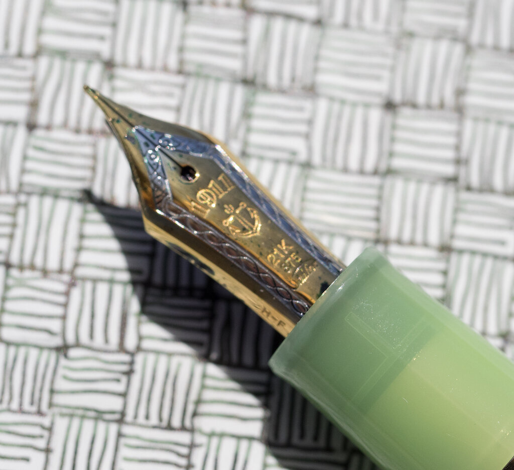
The pen has a translucent cap with gold trims. The top finial is clear with a red and gold anchor logo that really pops against the more subtle colors of the pen.

Sailor Apres Ski Cap
Sailor Apres Ski Finial

The body of the pen is also translucent, but not as much as the cap. It may be that the plastic of the barrel is simply thicker than the cap or, perhaps, it was purposefully made more opaque. The bottom finial is clear.

Sailor Apres Ski  Body
Sailor Apres Ski Bottom Finial

The Sailor Pro Gear is a small pen. It is 5 inches/128mm capped, 4.6 inches/116mm uncapped, and 5.9 inches/150mm posted. The grip is 11mm, and the barrel at its widest is 13mm. It weighs 25 grams inked and posted and 16.62 grams inked without the cap.

Sailor Apres Ski Cap Band

In my opinion, the weakest and worst feature of Sailor pens is the converter. I. Hate. Sailor. Converters. Not only do they hold a dinky amount of ink, but this particular converter unscrews itself when I try to fill it with ink. It's a compete mess and extremely frustrating.

"@##*& it, Sailor! Why can't you engineer a decent converter???”

"@##*& it, Sailor! Why can't you engineer a decent converter???”

The nib is a two-tone 21k gold fine. I think Sailor nibs are absolutely gorgeous, and this one is no exception. The tines are perfectly aligned, and, with a wet and dark ink, they produce a smooth, visible line.

Sailor Apres Ski Nib
Sailor Apres Ski Nib 2

A fine Sailor nib writes like an extra fine, and it has that famous Sailor feedback. Although I don't mind the feedback, the fine nib does not do my handwriting any favors.

Sailor Apres Ski Alphabet
Sailor Apres Ski Alphabet Close

If I write in teeny, tiny caps, like Brad, this nib is perfect! But that's not my usual style.

Sailor Apres Ski Tiny Writing

For longer periods of writing, the fine nib allows me to fit lots of words on the page, but my hand fatigues more quickly than with broader nibs. I think the finer nib causes me to write in a more cramped fashion.

Sailor Apres Ski Longer Writing

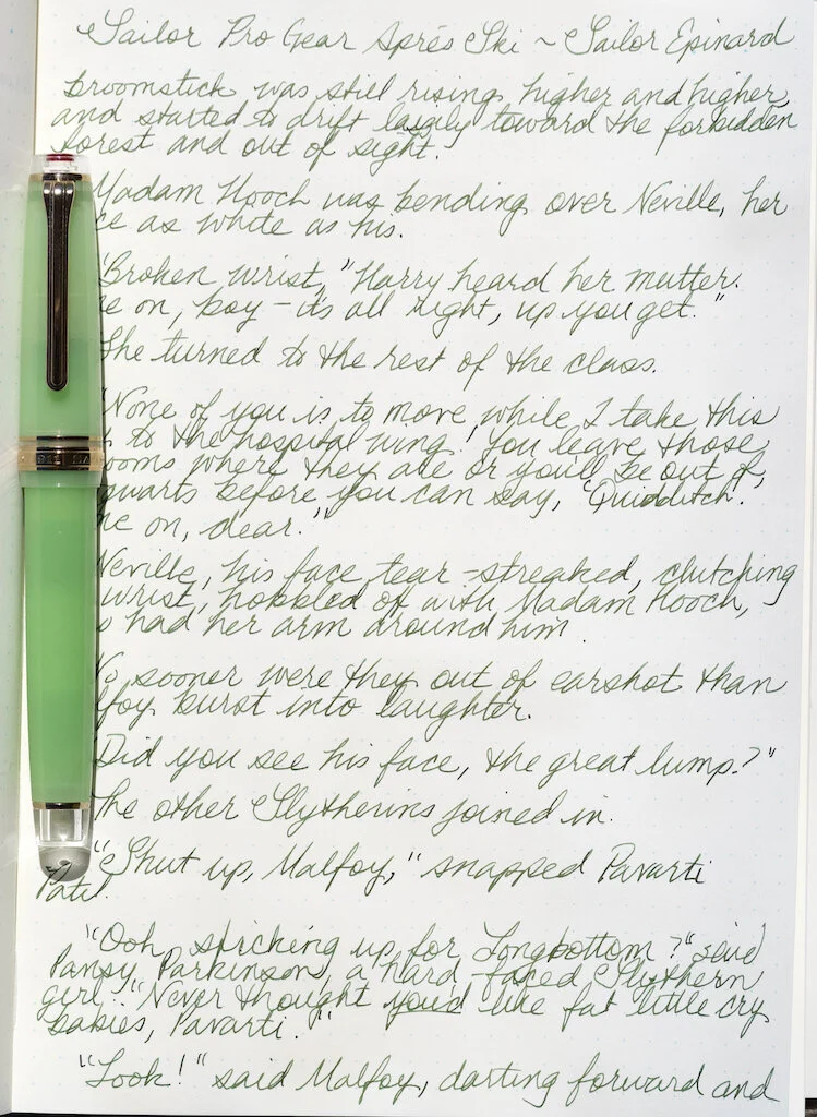
This is a great nib for detail work. I planned to do a whole page of the tiny woven pattern. I gave up after filling half the page. But, hey, it looks pretty cool!

Sailor Apres Ski Woven Pattern

Most of the Sailor Pro Gear Cocktail Series pens are sold out by now. You can find a few of the less popular colors, but Après Ski is almost impossible to locate (except on eBay and for ridiculous prices). I somewhat regret not buying the Blue Lagoon as well (or instead of) the Après Ski. But over the past couple of years, I've managed to buy way too many Sailors, most of them Pro Gears.

Sailor Collection

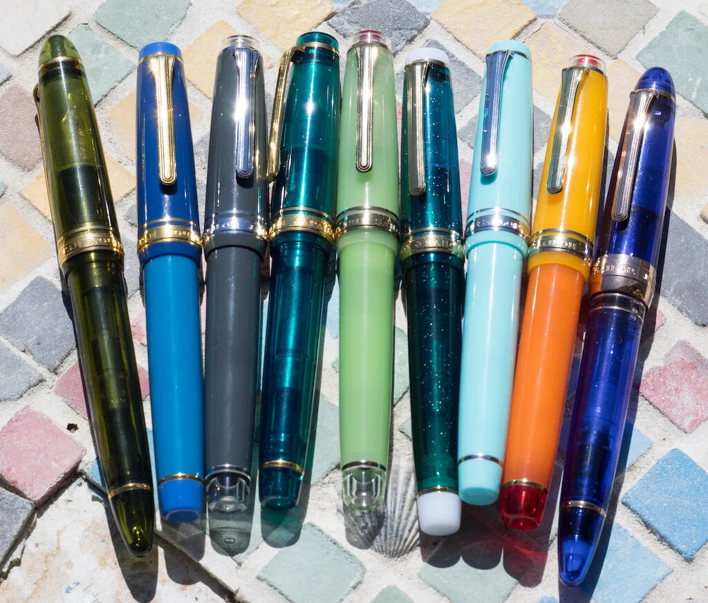
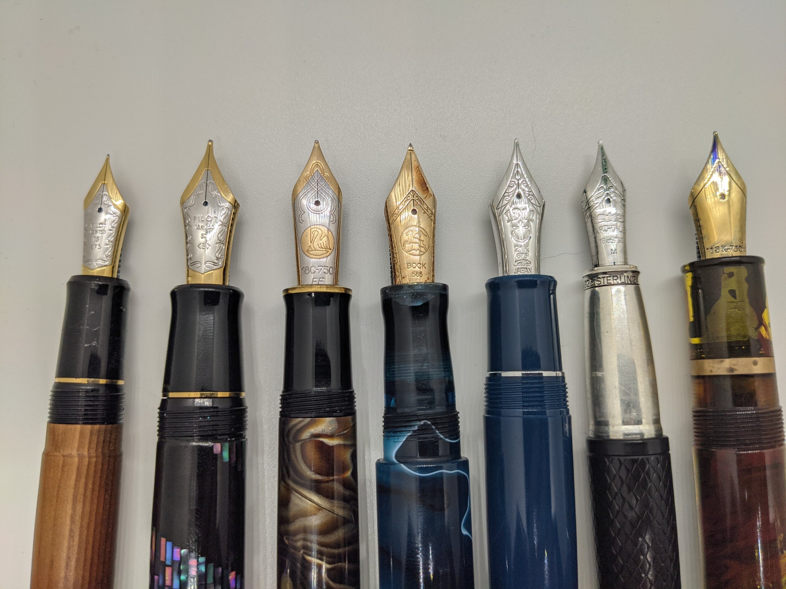
See what I mean? And that's why I call myself a pen addict.

(I purchased the Sailor Pro Gear Après Ski with my own funds from CultPens.)


Enjoy reading The Pen Addict? Then consider becoming a member to receive additional weekly content, giveaways, and discounts in The Pen Addict shop. Plus, you support me and the site directly, for which I am very grateful.

Membership starts at just $5/month, with a discounted annual option available. To find out more about membership click here and join us!

Sailor Apres Ski Outside
Posted on March 19, 2021 and filed under Sailor, Fountain Pens, Pen Reviews.

In Praise of the Big Nib

(The is a guest post by Andrew Coon. You can find more of Andrew’s fountain pen favorites on Instagram.)

I like big nibs. A lot. Over the course of exploring the various nooks and crannies of the pen world, I have managed to acquire and play with most of the big nibs that are in production today. I thought there might be some use in collating my impressions and experiences with the big nibs, so here are a few thoughts.

First, though, why bother with big nibs? Simple – the longer the nib, the more character there can be to the writing experience based upon how the manufacturer uses that length. Different nib geometries/shapes, as well as differences in what metals are included in the gold alloy, can lead to dramatic differences in how the nibs write. Yes, a nib that is 14K or 18K is either 58% or 75% gold, but what are the other metals used? And how is that nib shaped, to allow that metal to move, bounce, and flex? Is the overall nib thicker or thinner? Different combinations of these factors determine how each nib feels.

One final note, a caveat. What I write is based upon the nibs that I have used, so the sample size is small. If your experience is different, please let me know. With all that said, here we go.

From L to R: Pilot 15, Pilot 30, m1000, Bock 8, King of Pen, Yard O Led Grand Viceroy, Jowo 8

From L to R: Pilot 15, Pilot 30, m1000, Bock 8, King of Pen, Yard O Led Grand Viceroy, Jowo 8

The Pilot 15, commonly found on the 823, is the smallest of the group of big nibs. It is beloved by almost everyone who gets one, and is commonly referred to as a workhorse of a nib. A bit of bounce, with the expected level of detail to tuning that Pilot gives to its nibs, and this is the nib that many people love. It is not much bigger than the Jowo 6, but it is just enough bigger that it does perform differently. I do wish that Pilot would make the 743 available in America, so that more people could experience the full range of what this nib can do. The 823 only comes in F/M/B, and the 743 has the full range of Pilot’s nibs.

(The Namiki 20, found on the Yukari Royale, is the same length of nib as the Pilot 15, and has a similar performance in my limited experience.)

The Pilot 30, only found on the Pilot Custom Urushi, is a nib that is elastic in character. Using terminology which I learned from Leigh Reyes, I describe this nib not as a flex nib, but as an elastic nib. Flex is the classic Western “wet noodle,” which has significant line variation when pressure is applied. Elastic nibs do not do this – they are more like brushes. They bounce, but can easily railroad. Due to this, a light hand is needed, and may take some practice to get used to. But, it is worth the effort. This is one of the most distinctive nibs of all the big nibs – my only critique of it is that it is only available on the rather expensive Custom Urushi model, which can be a touch too girthy for many people.

(Watch what happens when pressure is applied to the first nibs used, which are elastic, as compared to what happens when pressure is applied with the nibs at the end of the video. If you want to experience elastic nibs without the cost of buying a large nib, look at a Pilot FA nib or a Platinum Soft Medium.)

The Pilot 50, found on the Namiki Emperor, looks like it should be an even more extreme version of the Pilot 30 and be the nib that is as bouncy and expressive as is possible. This is not the case. It writes like a perfectly tuned Jowo 6. I really don’t know what to say about it, other than it is such a surprise that this is the case.

I have not written with one and so can't speak from experience, but the large nibs by Tohma seem to be everything that a Pilot 50 would be expected to be. Produced in small batches, they are brutally expensive. (See more here.)

The Pelikan m1000 is a polarizing nib - some love it and some cannot stand it. Being among the last of the modern line of Pelikan Souveran models to launched, being released in 1997, it uses a very different nib than the m800. It is the same shape as the smaller Pelikan nibs, but as I understand it, the m1000 is made with thinner metal. This leads to it commonly being experienced as "mushy." That has been my experience. I have one that I enjoy now, but it suffers from the common trend across all Pelikan gold nibs - my m1000 xf writes likes a juicy medium.

The Bock 8 is the vanilla option among the big nibs. It is not the perfectly tuned Pilot 15, nor the bounce of the Pilot 30. It is not the firehose of the Pelikan, nor available in all the options of tip size like a Mont Blanc 149. Like with many other Bock nibs, they frequently have to be tuned to write well. Both of mine had to be tuned by nib workers before they worked well. Once tuned, I enjoy a Bock 8 more than almost any smaller nib … and I enjoy almost every other big nib more than a Bock 8.

Montblanc makes the nibs for the 149 in house, and makes these large nibs in a wide variety of sizes. From Extra Fine to Double Broad, there are also options beyond Double Broad. The Bespoke options include an impressive Music Nib and the truly ludicrous Signature Nib. Modern 149 nibs are rather similar to Bock 8, in that they are good, but not particularly unique or expressive in character. In previous decades the 149 nibs have had more character, bounce and flex. To explore the history and variety of Mont Blanc nibs is beyond my expertise, other than to say that older is preferred.

The Sailor King of Pen may very well be the perfect nib. This nib is the perfect combination of bounce, flex, with a touch of feedback. Using one of these, you are always aware that it is a large and wonderful nib without having to worry about railroading, not being tuned out of the box, or misbehaving in any way. I have three of these, and cherish them. Yet the pricing is so crazy that I would never recommend buying one. The bodies are just injection molded plastic. There is a piston filling version, but it is nigh on impossible to find, and so the best of the large nibs is stuck using one of the most despised converters on the market. It would be nice to have an option other than Medium or Broad. I could complain about this pen all day, but once the nib actually touches the paper, it is clear that this is indeed the King.

Yard O Led also makes a larger nib, the nib that they use on the Grand Viceroy. I don’t know who makes their nibs, but they do seem to be different in shape than any other large nib. They are tuned in house, and among the examples I have used, I can vouch for whoever it is that is setting their nibs. They are masters of the craft. The best comparison would be to the Pilot 15 - it is a workhorse of a nib in that it is distinctly different than the smaller Jowo 6, and completely comfortable for extending writing sessions. Plus, it is a snap cap. A large nib with a snap cap is exceedingly rare.

Even more rare is the Jowo 8, which may seem surprising considering the dominance by Jowo in the smaller, 6 sized nibs. I recently was able to use a Jowo 8, and now understand why it is so rare. It is a bit short compared to the other oversize nibs, not capitalizing on the opportunity to be a longer and more interesting nib. In addition to being rather bland as a writer, there seems to be something off about the feeds of the Jowo 8. If I carry one at all, the ink falls off the feed and pools in the cap. The maker who sent me this nib has had this experience with multiple Jowo 8's, and does not use them anymore. I will be following his lead. While the Jowo 8 does seem to be available to purchase from FPNibs.com, I would pass. The Jowo 8 seems to be as finicky as the Jowo 6 is dependable.

The titanium Bock 8 is, by far, the most affordable large nib. Titanium is a polarizing material - a bit too easy to spring, and more soft than bouncy, it also has a tendency to "sing" as you write. The matte finish can also be hard to match to the trim of a pen, clashing with both rhodium/silver and gold. I have used these, and have not owned one. This, along with the Pelikan m1000, are probably the nibs that you most need to try before buying.

A common accessory to these large nibs are collars/feeds from Flexible Nib Factory. Here you can find affordable and dependable options for using King of Pen nibs in Bock 8 based pens, as just one example. It is worth knowing what options are out there, as a person explores these large nibs. More options are being introduced each year, so it is worth checking back to see what the new interesting permutation is.

When buying the larger nibs, they are usually coming on more expensive pens. I wish that meant that each one would be perfectly tuned before being shipped, but that has not been my experience. Though it happens less often than with less expensive pens, multiple of my large nibs have needed attention by a nibmeister before living up to their potential.

Except the King of Pen. They have always been amazing, from the first downstroke. But I am not recommending them. Nope.

Did I miss any? Has your experience of any of these been different? Let me know.

(P.S. If you want to get into the vintage large nibs, look up the Waterman 10, the Parker 12, the Parker Giant, and the Bexley Giant #12. And I hope your credit card survives.)

Posted on March 17, 2021 and filed under Fountain Pens, Nibs.

Tibaldi Perfecta Fountain Pen Review

Tibaldi Perfecta Fountain Pen Review.JPG

I’ve been watching the relaunch of the Tibaldi brand closely over the past serval months, and finally decided to pick one up for review. My intent was to grab the Bononia model, with its Leonardo-esque material design and barrel shape, but a different model caught my eye on the way to adding to cart.

Tibaldi Perfecta Fountain Pen.JPG

The Tibaldi Perfecta is a throwback to the early-to-mid 1900’s safety pen model, a pen shape and design that I have always loved. Now, the modern Perfecta does not have all of the interior features that those classic pens had - this is a cartridge/converter filling pen after all - but on the outside, this is a nice throwback.

Tibaldi Perfecta Fountain Pen Barrel.JPG

Tibaldi kept that classic style with the Rich Black model, featuring a full black barrel and cap, but it was the Tortoise Beige model that got me with its black and tan mosaic cap making all the difference.

Tibaldi Perfecta Fountain Pen Feed.JPG

When the pen arrived and it was time to ink up, I knew there was only one color I was filling it with: Black. A classic color for a classically designed pen. I even ordered a new bottle to mark the occasion. A perfect match.

Tibaldi Perfecta Fountain Pen Converter.JPG

It only took a minute or two of writing to feel at home with the Perfecta. The stainless steel EF nib, marked with the Tibaldi logo, worked perfectly out of the box. The lines were clean, and the ink flowed well. The upgrade to an ebonite feed likely helped in that area.

With all of my fawning words so far, you’d think this would be a no-brainer recommendation, right? Wrong. As much as I am enjoying it, there is a lot to consider when checking off the pros and cons for the Perfecta.

Tibaldi Perfecta Fountain Pen Nib.JPG

First off, the barrel design. Specifically, the grip section. It keeping with its classic safety pen aesthetic, the cap threads on the barrel hit smack in the middle of where most people would grip the pen. It looks great in pictures, but at the expense of functionality. I can grip below the threads, I can grip above the threads, and I can even grip on the threads (they aren’t that sharp,) but the fact I can’t grip the pen consistently in one spot is a bit frustrating. Picking it up blindly from the desk always requires an adjustment to get into the proper writing grip.

Tibaldi Perfecta Fountain Pen Writing.JPG

Secondly, I really don’t like the clip. It’s a poor design that stands out on an otherwise well—designed pen. It’s strong and sturdy enough, but it doesn’t look right. Maybe it they finished it in the same glossy style as the rest of the barrel instead of the satin/matte finish they used? I don’t know. It looks cheap.

And that leads me to last issue: It’s not cheap. At $187 this pen has all of the competition in the world, and it beats very few of them in that range.

Tibaldi Perfecta Fountain Pen Close.JPG

That’s the dilemma I am having with the Tibaldi Perfecta. Despite is flaws, I enjoy using it. Despite how much I enjoy using it, I would never recommend it over the Leonardo Momento Zero or Furore, Montegrappa Elmo or Fortuna, and a whole litany of other pens in the $150-$200 price range.

If that’s the game you are going to play, you better bring your A-game. The Tibaldi Perfecta is a B. That’s a great grade in a vacuum, but the fountain pen market is a competition, and I think it falls one grade short from the best.

(I purchased this pen at 10% off from PenChalet.)


Enjoy reading The Pen Addict? Then consider becoming a member to receive additional weekly content, giveaways, and discounts in The Pen Addict shop. Plus, you support me and the site directly, for which I am very grateful.

Membership starts at just $5/month, with a discounted annual option available. To find out more about membership click here and join us!

Tibaldi Perfecta Fountain Pen Lines.JPG
Posted on March 15, 2021 and filed under Tibaldi, Fountain Pens, Pen Reviews.