Posts filed under Fountain Pens

Otto Hutt Design 04 Wave Blue Fountain Pen Review

Otto Hutt Design 04 Wave Blue Fountain Pen Review

Two months ago, I reviewed the Otto Hutt Design 03 Fountain Pen. I remember that one well, because it took a little bit of time to understand exactly what I had in that pen. The more time I spent with it, the more then pen and I clicked, and I’ve ended up loving it.

You could repeat the exact same process, and same result, with the Otto Hutt Design 04 Wave Blue Fountain Pen.

Otto Hutt Design 04 Wave Blue Fountain Pen

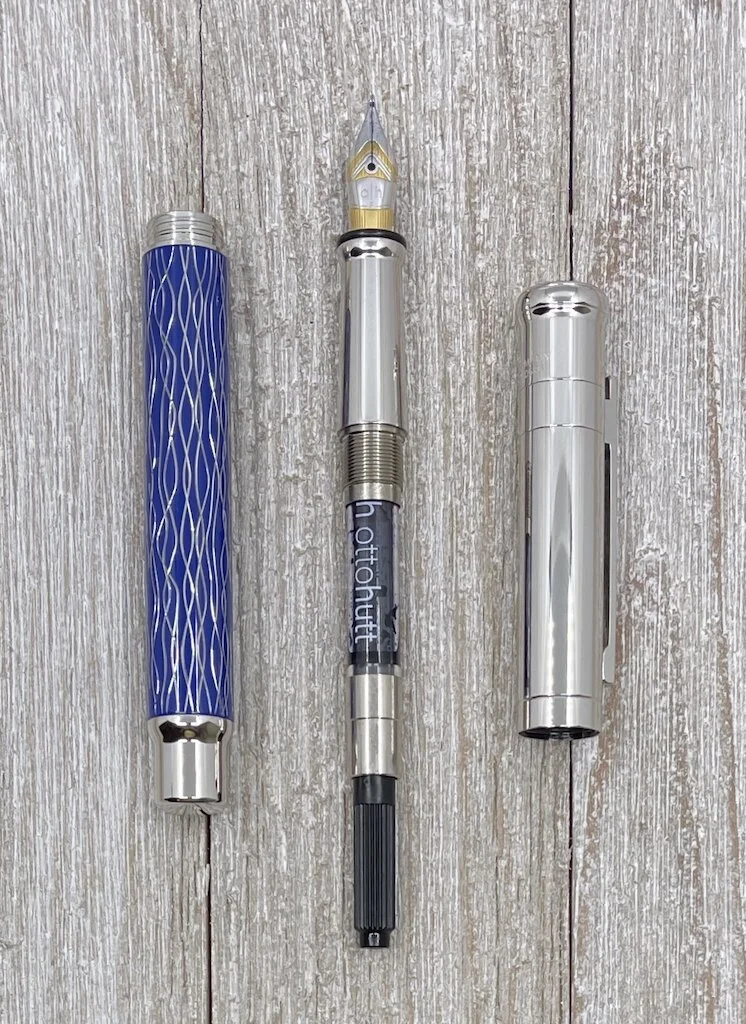
The Design 04 is a classically designed and manufactured German pen. Otto Hutt has been making pens for themselves, and other brands, for nearly a century, and that experience shows in the end result. The quality is exceptional all the way around.

There are seven pens in the Design series, and the 04 sets itself apart with a lacquered barrel, which allows for several different color and design choices. These range from standard solid colors - such as black, white, pink, and green - to an all black model, to different inlays and guilloche patterns, like with this Wave Blue. There are even different hardware colors depending on the pen. There are more individual models on the Design 04 than there are numbers in the Design series!

Otto Hutt Design 04 Wave Blue Open

The metal barrel of the Design 04 is not overly heavy. You feel some weight, but it is balanced in the hand. Posting the cap is possible, but that does alter the balance of the pen significantly and I wouldn’t recommend it.

Balance with this pen is important due to the narrow nature of the grip section. As someone who prefers this size of grip, it is ideal for me, but I know others will find it to be too narrow. The section is long enough to allow you to grip low up against an upturn towards the nib, or pull back to the middle and reside on the taper. Neither the cap threads or barrel step pose any real challenge to a standard grip.

Otto Hutt Design 04 Wave Blue Nib

The stainless steel Fine nib was perfect out the box. And in true German fashion, it is wide and wet. Do I personally prefer finer nibs? Yes. But I’ll be darned if this isn’t a perfect writer. It also started up immediately every time it sat on my desk for several days between use.

Otto Hutt Design 04 Wave Blue Writing

I was able to choose which Design 04 I wanted to review, courtesy of my friends at Kenro Industries - the US distributor for Otto Hutt. As I mentioned above, there are a ton of options, and the Wave Blue stood out not only for the pattern, but as a design style I don’t have in any other pen. That said, Otto Hutt didn’t make it easy with all of the great options!

Otto Hutt Design 04 Wave Blue Cap

The price varies from $200 to $316 in the Design 04 lineup at Pen Chalet, with this exact model checking in at $280. From a value perspective, I think it is right on the mark. I only have to look back to my Tibaldi Perfecta review to realize that the base Design 04 is a much better bang for your buck. From there, you can choose from a slew of designs and features that suit your needs the best.

Right now, the Otto Hutt Design 04 suits my needs for a well-made, classically-designed, wonderful-writing, German-engineered fountain pen, with other models from the brand residing firmly on my radar.

(Kenro Industries provided this product at no charge to The Pen Addict for review purposes.)


Enjoy reading The Pen Addict? Then consider becoming a member to receive additional weekly content, giveaways, and discounts in The Pen Addict shop. Plus, you support me and the site directly, for which I am very grateful.

Membership starts at just $5/month, with a discounted annual option available. To find out more about membership click here and join us!

Otto Hutt Design 04 Wave Blue Lines
Posted on April 12, 2021 and filed under Otto Hutt, Fountain Pens, Pen Reviews.

Conklin Duraflex Elements Fountain Pen Review

Conklin Duraflex Elements Fountain Pen Review

(Sarah Read is an author, editor, yarn artist, and pen/paper/ink addict. You can find more about her at her website and on Twitter. And check out her latest book, Out of Water, now available where books are sold!)

I have a small family of Conklin pens, and I have been lucky with them in that I haven't experienced the inconsistent quality that some users have. (Essentially the reverse of my luck with TWSBIs). All my Conklins have been beautiful and well-performing, so I was excited to try the new Duraflex Elements Fountain Pen, especially when I saw the fire color. I am happy to say that my luck has continued--and I must call it luck, as our own Susan had a very different experience with her version of this edition.

Conklin Duraflex Elements Fountain Pen

I'm really enjoying this pen. The color of the acrylic is fantastic, with black, charcoal, red, dark rose, and clear all tossed like a flow of lava. The pen is sturdy, and very solidly made. It does not feel light or cheap, and the cap, clip, and finials are well fit. The cap screws on securely, and I haven't had any leaking or drying out, even when the pen sat for a few weeks without use. The clip is springy but firm, so it fits well over a stack of paper, but won't slip too easily.

Conklin Duraflex Elements

The pen is a nice medium size--bigger than a Sailor Pro Gear but smaller than a TWSBI 580, so it should suit most hands comfortably. The grip section is made of the same acrylic as the body. It's a little slick, but it contours nicely to keep your grip in place. It takes cartridges or a converter, which comes with the pen.

Conklin Duraflex

A lot of the criticism Conklin receives concerns the quality of their nibs. It's not unearned--there's a lot of inconsistency in user experience, and you don't know if you've gotten a good one or not until you try it. My Conklin Word Gauge is one of the best writers in my collection, but others have had experiences so negative that they've sworn off the brand altogether.

Conklin Duraflex Nib

This Elements pen has the Conklin Omniflex nib--a semi-flex nib with cutout wings designed to allow for some degree of line variation. Of course it does not flex the way we all want it to. It can't meet the bendy standards of vintage pens or dip nibs designed for fancy script. But it does flex a bit, and it adds some lovely character to your writing. Much like a stub nib adds a little bit of italic flavor to writing, this Duraflex nib adds a little bit of flex flavor. Not enough, it could be fairly argued, but I don't think it ever promised that.

Conklin Duraflex Nib Side

My nib performs about how I expected it would. It's wide for a fine line when writing normally, largely because it is a very wet writer--a feature it needs in order to keep up with ink flow when flex writing. When pressure is applied on downstrokes, the line widens, creating an effect that would be very graceful and beautiful if I were any good at this at all. But even with my poor handwriting skills, I like the way this pen makes my writing look, and that's enough to make me reach for it when I need to fill a page. (Note: the slight feathering on the flexed strokes is a result of the paper I was using. I had better experiences with fountain pen friendly paper.)

Conklin Duraflex Writing

While my friends' experiences make me hesitate to recommend buying this pen, my own experiences lead me to encourage you to try one, if you have access. If there's a pen store or pen show near you, this is a great pen to try in person, before you decide whether or not to buy. It's a total bargain at $60--so long as you get a good one.

(JetPens provided this product at no charge to The Pen Addict for review purposes.)


Enjoy reading The Pen Addict? Then consider becoming a member to receive additional weekly content, giveaways, and discounts in The Pen Addict shop. Plus, you support me and the site directly, for which I am very grateful.

Membership starts at just $5/month, with a discounted annual option available. To find out more about membership click here and join us!

Conklin Duraflex Flex
Posted on April 8, 2021 and filed under Conklin, Fountain Pens, Pen Reviews.

Sailor Pro Gear Cocktail Series Après Ski: A Review

Sailor Pro Gear Cocktail Series Après Ski: A Review

(Susan M. Pigott is a fountain pen collector, pen and paperholic, photographer, and professor. You can find more from Susan on her blog Scribalishess.)

The Sailor Pro Gear Cocktail Series has been all the rage the past few months, ever since Sailor reissued all the pens as a set and individually. I already owned the Tequila Sunrise (reviewed here), and I managed to resist the urge to buy any of the reissued pens even though I desperately wanted the Blue Lagoon and Après Ski. That is, I managed to resist, until all the Blue Lagoons were gone and I found what I thought might be the last Après Ski on the planet at CultPens. I succumbed even though it was only available in a fine nib (not my preference with Sailor nibs).

Sailor Pro Gear Cocktail Series Après Ski Nib

The pen arrived in the usual Sailor box, and since all the boxes look the same, I didn't include photos here. If you happened to purchase the entire set, you got a spiffy acrylic display case with your insta-collection.

Sailor Cocktail 10th Anniversary Display Case.jpg

Après Ski means "after skiing," and the name apparently refers to a variety of cocktails one can enjoy after you sweep into the bar from the slopes. The color of this pen suggests some sort of mint-based cocktail. The clear finials might symbolize either the ice in the cocktail or the crystal snow from the peaks.

Sailor Pro Gear Cocktail Series Apres Ski

Let me clarify that I did not buy this pen because of any love for skiing. No. My one skiing experience on the slopes in Santa Fe, New Mexico, on New Year's Day over twenty-five years ago was a complete and utter disaster. Imagine a brand-new skier who rocked the bunny slopes only to be taken on the ski lift to the very top of the mountain. Imagine this brand-new skier having her first all-out panic attack on the ski lift (fear of heights), tumbling face first off the ski lift, and being dragged out of the way of other skiers. Then envision said skier snow plowing (in tears and terror) down the mountain whilst snow boarders swish madly past, blowing scornful snow in her face. See how she eventually plops down beside a tree and covers her head whilst her husband yells at her to keep going? Somehow I made it down that mountain, but I've never skied again.

I bought the Après Ski purely for its delicious, creamy soft green color. It reminds me of spring (not snow) and tender shoots of grass and new leaves.

Sailor Apres Ski Pen Uncapped

The pen has a translucent cap with gold trims. The top finial is clear with a red and gold anchor logo that really pops against the more subtle colors of the pen.

Sailor Apres Ski Cap
Sailor Apres Ski Finial

The body of the pen is also translucent, but not as much as the cap. It may be that the plastic of the barrel is simply thicker than the cap or, perhaps, it was purposefully made more opaque. The bottom finial is clear.

Sailor Apres Ski  Body
Sailor Apres Ski Bottom Finial

The Sailor Pro Gear is a small pen. It is 5 inches/128mm capped, 4.6 inches/116mm uncapped, and 5.9 inches/150mm posted. The grip is 11mm, and the barrel at its widest is 13mm. It weighs 25 grams inked and posted and 16.62 grams inked without the cap.

Sailor Apres Ski Cap Band

In my opinion, the weakest and worst feature of Sailor pens is the converter. I. Hate. Sailor. Converters. Not only do they hold a dinky amount of ink, but this particular converter unscrews itself when I try to fill it with ink. It's a compete mess and extremely frustrating.

"@##*& it, Sailor! Why can't you engineer a decent converter???”

"@##*& it, Sailor! Why can't you engineer a decent converter???”

The nib is a two-tone 21k gold fine. I think Sailor nibs are absolutely gorgeous, and this one is no exception. The tines are perfectly aligned, and, with a wet and dark ink, they produce a smooth, visible line.

Sailor Apres Ski Nib
Sailor Apres Ski Nib 2

A fine Sailor nib writes like an extra fine, and it has that famous Sailor feedback. Although I don't mind the feedback, the fine nib does not do my handwriting any favors.

Sailor Apres Ski Alphabet
Sailor Apres Ski Alphabet Close

If I write in teeny, tiny caps, like Brad, this nib is perfect! But that's not my usual style.

Sailor Apres Ski Tiny Writing

For longer periods of writing, the fine nib allows me to fit lots of words on the page, but my hand fatigues more quickly than with broader nibs. I think the finer nib causes me to write in a more cramped fashion.

Sailor Apres Ski Longer Writing

This is a great nib for detail work. I planned to do a whole page of the tiny woven pattern. I gave up after filling half the page. But, hey, it looks pretty cool!

Sailor Apres Ski Woven Pattern

Most of the Sailor Pro Gear Cocktail Series pens are sold out by now. You can find a few of the less popular colors, but Après Ski is almost impossible to locate (except on eBay and for ridiculous prices). I somewhat regret not buying the Blue Lagoon as well (or instead of) the Après Ski. But over the past couple of years, I've managed to buy way too many Sailors, most of them Pro Gears.

Sailor Collection

See what I mean? And that's why I call myself a pen addict.

(I purchased the Sailor Pro Gear Après Ski with my own funds from CultPens.)


Enjoy reading The Pen Addict? Then consider becoming a member to receive additional weekly content, giveaways, and discounts in The Pen Addict shop. Plus, you support me and the site directly, for which I am very grateful.

Membership starts at just $5/month, with a discounted annual option available. To find out more about membership click here and join us!

Sailor Apres Ski Outside
Posted on March 19, 2021 and filed under Sailor, Fountain Pens, Pen Reviews.