Posts filed under Fountain Pens

Cross ATX Fountain Pen Review

Cross ATX Fountain Pen Review

(Jeff Abbott is a regular contributor at The Pen Addict. You can find more from Jeff online at Draft Evolution and Twitter.)

It's been several years since I've tried out a new Cross fountain pen, so I was excited to use the new ATX I received. My experience with the Cross Townsend was really good, so I had high expectations for the ATX as well. Luckily, I wasn't let down.

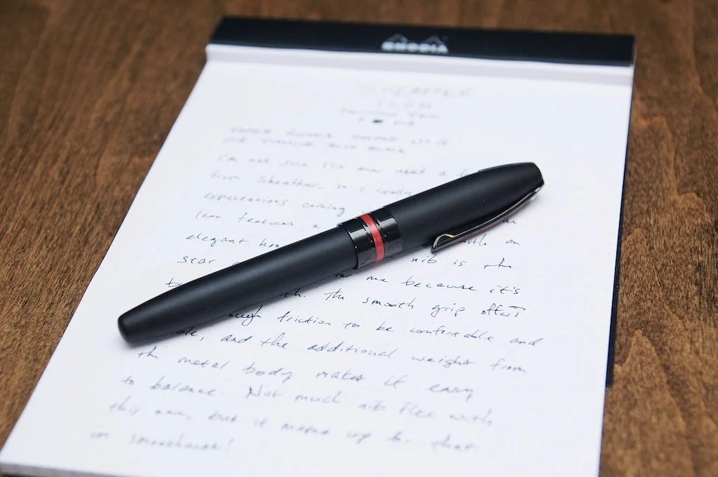
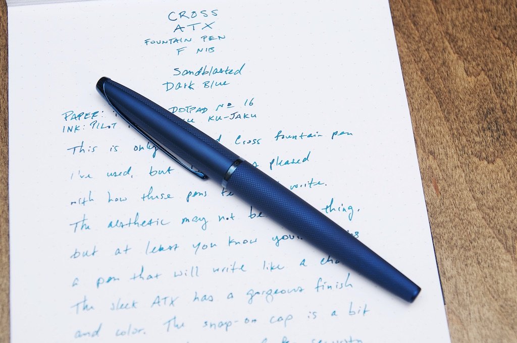
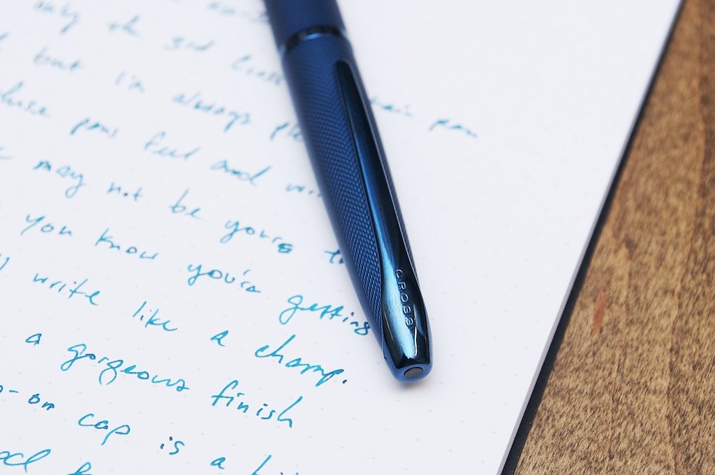
The Cross ATX is a sleek and modern fountain pen that's made of a lightweight metal material. The color is a lovely blue/teal with very little shine. I'd say it's matte, but there's just enough gloss in the finish to give it a little glimmer. The texture on the exterior of the pen is also something that catches your eye. It's a wavy line that looks like hatch marks from more than 10 inches away. The etching is light enough to still feel smooth, but there's plenty of tactile grip left to make sure you can hold onto it easily.

Cross ATX Fountain Pen

I really enjoy the blue/teal color of this pen. In certain light, it looks like a dark blue pen with a subdued texture. In brighter light, you can see more of the green and the wavy lines make it look like it's changing colors between blue and teal. It's a fantastic finish.

I'm less enthusiastic about the finish on the grip section and the nib plating. They're both a similar color as the exterior, but they're quite shiny and reflective — and this means they collect fingerprints easily. It's a minor gripe, but I do wish they'd used a slightly more matte finish for the grip so it would have a better grip feel.

Cross ATX Fountain Pen

The same shiny blue material is used on the band around the opening of the cap as well as the clip. Since these elements are so small, they work nicely with the textured matte finish of the pen body and cap. The shiny grip section feels like too much, and the nib sharing the same color as everything else contributes to the pen feeling a bit too monochromatic. The different finishes provide a drastic amount of contrast, but they could have done so much more with a little color contrast as well!

Getting into the actual performance of the pen, I couldn't be happier. Several years ago, I was really surprised by how much I liked the Townsend, and the same thing is true with the ATX today. The nib is a petite fine, but it flows smoothly and lays down plenty of ink to keep pace with my sloppy writing. It was buttery smooth out of the box and has a great line width for what I'd consider a fine nib from a non-Japanese pen brand.

Cross ATX Fountain Pen

The pen writes perfectly after being stored for a bit. There's no hard starts or sputtering. Part of this equation is down to the ink I've chosen to use here, but a larger part is the cap system. The cap uses a push/pull system that relies on a friction fit to keep everything sealed and secure. There's a small click once you've fully seated the cap onto the pen body to let you know it's capped securely. When uncapping the pen, there's a satisfying pop (albeit a quiet one) that goes with the motion. I was worried at first that the tight seal would create enough suction when uncapping the pen that it might spurt a small amount of ink onto me, the floor, or anything near me, but this hasn't been the case so far. As long as you use a smooth motion to uncap the pen, I don't see any issues here. It does require a good bit of force, but I'd rather than than the opposite (a cap that's too loose to stay on securely).

The cap also posts to the back of the pen and results in a slightly longer overall pen without being too long. For me, the unposted pen is a great length for writing, but posting the cap only changed the feel a small amount. This is one of those pens that I'll post every time since it feels great in the hand either way. When it's posted, I don't have to worry about where the cap is.

Cross ATX Fountain Pen

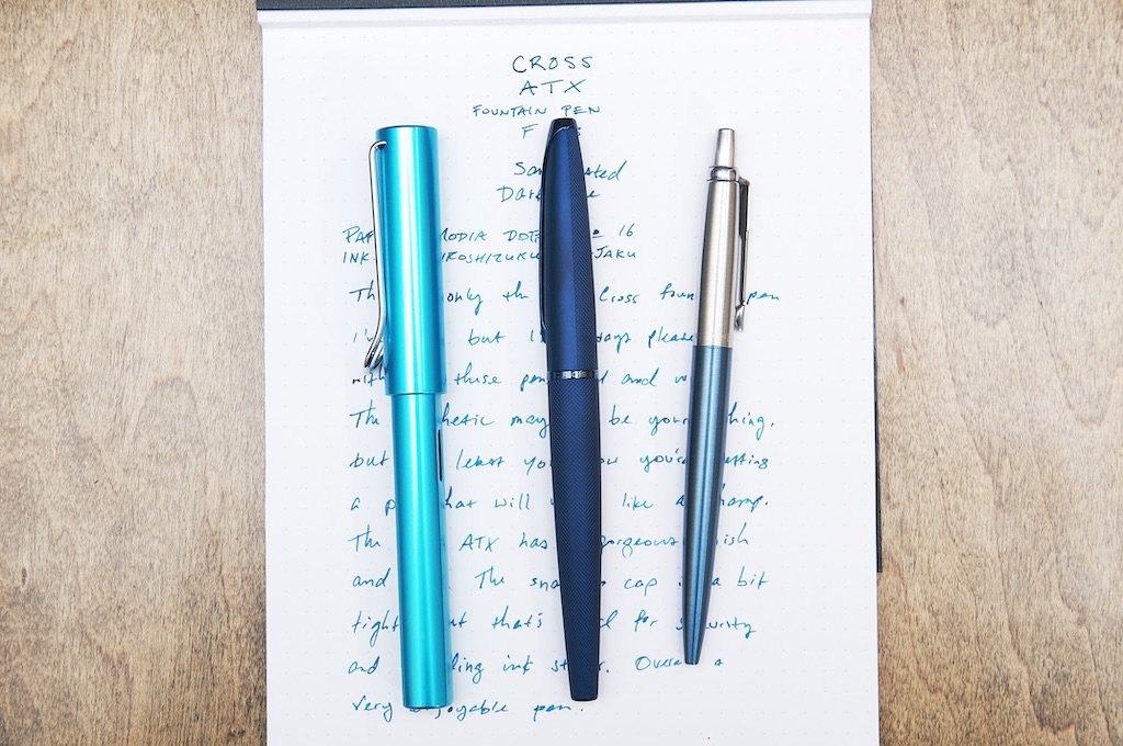
The ATX is a fairly slim pen, so it fits any pocket, bag, sleeve, etc. that fits any generic gel pen size barrel. The clip is nice and strong, but it is mounted very close to the cap, which means you'll have trouble clipping this onto thick fabrics or other thick materials. In most cases, the clip has no problem working as intended.

I'm really happy to report that the ATX is another great pen from Cross. I only have two or three fountain pens from Cross, and they've impressed me every time.

Cross ATX Fountain Pen

The ATX comes with a couple of black ink cartridges. It's important to know that Cross uses a proprietary cartridge fitting, so you'll either need to pick up a converter to go with the pen, or buy some extra cartridges that fit it. The Cross converter is only a few bucks, but it's one of those things that I wish all large pen companies would just include in the box with the pen.

If you like this pen, check it out on Pen Chalet. There are a couple other colors to pick from (like Black PVD, Brushed Chrome, and Sandblasted Titanium Gray) and they're available in either a fine or medium nib (except for the Black PVD option — medium only!).

(Pen Chalet provided this product at no charge to The Pen Addict for review purposes.)


Enjoy reading The Pen Addict? Then consider becoming a member to receive additional weekly content, giveaways, and discounts in The Pen Addict shop. Plus, you support me and the site directly, for which I am very grateful.

Membership starts at just $5/month, with a discounted annual option available. To find out more about membership click here and join us!

Cross ATX Fountain Pen
Posted on February 9, 2022 and filed under Cross, Fountain Pens, Pen Reviews.

Kaweco Perkeo vs. Ferris Wheel Press Carousel - A Showdown

(Kimberly (she/her) took the express train down the fountain pen/stationery rabbit hole and doesn't want to be rescued. She can be found on Instagram @allthehobbies because there really are many, many hobbies!.)

As I’ve mentioned before, I am a big fan of the Kaweco Sport (and AL Sport) and have a possibly unhealthy number of them, but I don’t own any other Kawecos, so I was excited when the Bossman sent me the Jungle GreenKaweco Perkeo for review (Perky-oh? Or Per-KAY-oh? Tomato, tomahto? Someone please find out!). I had already started using it when I watched one of his Twitch streams where he was unboxing a Ferris Wheel Press (FWP) Carousel pen in Seaside Glass that looked very similar, so I called dibs so I could review that too. And here we are, staring down at 20 paces for a little head to head review (queue the western showdown music). Who will be left standing? Let’s find out!

Packaging/Presentation

Ok, I’m not really one that cares about packaging for most pens. In fact, I’d happily pay less to get a less ostentatious, normal-sized box than one that I can use to store treasured heirlooms or a Monopoly board (yes, that’s a thing!). So it doesn’t bother me in the least that the Perkeo is “packaged” in a Kaweco-branded plastic sleeve. But if you were going to give the pen as a present, I’d have to go with the Carousel as it looks nicer in the color-coordinated box.

Round 1: Carousel

Kaweco Perkeo vs. Ferris Wheel Press Carousel

It’s a low bar to beat Kaweco’s cellophane (left), but FWP (right) really does a good job with their presentation.

Kaweco Perkeo vs. Ferris Wheel Press Carousel

I like that the back of the Carousel box has a cutout to show the pen and howthe box matches the pen too.

The Carousel has an inner box/”tray” that slides out.

What’s Included

Packaging aside, the Perkeo, like other Kawecos, includes a Kaweco blue standard international cartridge and an empty cartridge “spacer” (which can be used to refill with other bottled ink, or just kept inside the barrel with the other cartridge), but no converter. Contrast that with the Carousel which does include a standard international converter, but no cartridge. I don’t know who makes the converter but I don’t think it is one from Schmidt (who makes a lot of branded and unbranded standard international converters).

The Carousel has an inner box/”tray” that slides out.Ferris Wheel Press Carousel Converter

Carousel’s standard international converter is included with the pen.

If instant inking is a requirement (like if you’re gifting this to someone and not giving them a bottle of ink), then the Perkeo would be the better option, but I personally would rather have the converter any day over a cartridge.

Round 2: Carousel (cuz I like converters)

Feel

How does it feeeeeel? Like a rolling stone. Sorry, I just had an iMyke moment and couldn’t help myself, lol. This one is very subjective as it relates to how the pens feel when you are holding them. They are very similarly sized, though the Carousel is a bit smaller. Both are made from plastic/acrylic, so they are both lightweight. Both have faceted caps which snap on/off, which is great for quick writing.

Kaweco Perkeo vs. Ferris Wheel Press Carousel

You can see that the Perkeo (left) and Carousel (right) are similarly sized but the Perkeo is just a bit longer and girthier.

Kaweco Perkeo vs. Ferris Wheel Press Carousel

Comparison with other budget-friendly pens (L to R): TWSBI 580 ALR, Pilot Metropolitan, FWP Carousel, Platinum Plaisir, Kaweco Perkeo, Faber-Castell Grip, TWSBI Eco, Lamy AL-Star.

Kaweco Perkeo vs. Ferris Wheel Press Carousel

The barrel on the Perkeo is also faceted (I LOVE facets) and has a triangular grip reminiscent of the Lamy Safari but not nearly as drastic, while the Carousel has a faceted grip. Neither bothered me in any way or were even something I noticed (and that’s a good thing) but I use a fairly standard tripod grip when holding pens so your mileage may vary depending on how you hold your pens or if you don’t like triangular grips. Those similarities aside, the Perkeo just felt a bit more substantial. Both are “plastic pens”, yes, but there’s something about how the acrylic feels in hand that differentiate the two. The Carousel is also a slimmer pen all around, from the barrel to the cap to the grip. Perhaps it’s the slightly matte texture of the Perkeo vs the very smooth feel of the Carousel combined with its slightly lighter weight, which makes the Carousel feel just a little “cheaper” than the Perkeo to me.

Round 3: Perkeo

Nib

The nib on the Perkeo is the same as the ones in the Kaweco Sport. I tried, unsuccessfully, to pull the nib/feed from the Perkeo. Maybe it’s possible but I couldn’t do it and I didn’t want to try too hard. Mine was great out of the box, though I know that some folks have had problems with their Sport nibs, especially the fine and extra fine.. The Carousel’s nib is a similarly sized nib, and has custom engraving. It does not appear to be a Jowo, Schmidt, nor Bock nib or feed. FWP says that the Carousel’s “custom-ground steel nib is…able to produce beautifully nuanced lines with its subtle flexibility”. This was NOT my experience as the nib is very stiff and I could not get any line variation unless I used significant pressure, which I don’t recommend. Regardless, despite not being a remotely a soft or flexible nib, the Carousel wrote well out of the box.

Kaweco Perkeo vs. Ferris Wheel Press Carousel

Nibs from left to right: Jowo 5 nib unit (with Franklin-Christoph branding), Carousel, Perkeo, ystudio Schmidt nib.

Kaweco Perkeo vs. Ferris Wheel Press Carousel

Back side: as you can see, none of the feeds are the same.

I inked up both pens with Diamine Inkvent 2019 Mistletoe. The Perkeo was inked up about 3 weeks longer than the Carousel, which I think contributes to the slightly darker line. Both are medium nibs but the Perkeo is also just a wee bit broader than the Carousel.

Kaweco Perkeo vs. Ferris Wheel Press Carousel

Both wrote well out of the box with the Perkeo having slightly broader and wetter lines than the Carousel.

The Perkeo isn’t a “wet writer” per se, but it felt ever so slightly wetter than the Carousel, which didn’t feel like a dry writer either. Both have worked flawlessly even after 2 weeks of non-use.

Round 4: Tie

Nice Touches

Both caps are branded - “Kaweco” branding is subtly embossed on the cap while “Ferris Wheel Press” is debossed on one side of the cap, while the other side says “the CAROUSEL”. I like both the subtlety of the Kaweco branded cap as well as the silver debossing on the FWP.

Kaweco Perkeo vs. Ferris Wheel Press Carousel

Aside from what I’ve already mentioned in the first two rounds, the Perkeo has a groove on the grip section where the barrel screws onto it. You really only notice this during the last quarter turn, making it feel extra secure. Whether it’s really necessary or not, I’m not sure, as most pens don’t just unscrew themselves easily, but that gave it a nice feel. More of “luxury/quality” experience than I would’ve expected.

Kaweco Perkeo vs. Ferris Wheel Press Carousel

It was a nice touch to feel how securely the barrel screwed onto the grip.

The Perkeo also has the metal Kaweco finial in the cap, which just looks nicer than the Carousel.

Kaweco Perkeo vs. Ferris Wheel Press Carousel - A Showdown

End of the caps on the Carousel (left) and Perkeo (right).

The Carousel’s little dimple looks unpolished and sadly, felt cheap in comparison. It was close but it was the finial that gave the win to the Perkeo on this round.

Round 5: Perkeo

Variety

The Carousel, which was released in the fall of 2021, is available in 6 solid colors (the Tattler’s Teal and After Midnight are calling my name!). The Perkeo, which was launched in 2017, comes in 11 colors, not including the Blue Calligraphy set, and has some interesting color combos along with solid color options, too. I personally like more of the Carousel colors compared to the Perkeo’s, but since everyone’s tastes are different, having more color choices wins. But will the Carousel be released in more colors? Guess we’ll have to wait and see!

Round 6: Perkeo…for now

Price

The Kaweco Perkeo retails for $16 USD/15 EU with VAT/12.50 EU without VAT and the Ferris Wheel Press Carousel Pen retails for $28 USD/29 EU with VAT/24 EU without VAT. So both pens are budget-friendly. But the Carousel is nearly double the price, so if you’re on a really tight budget, the Perkeo’s got the upper hand.

Round 7: Perkeo

In summary, both the Kaweco Perkeo and the Ferris Wheel Press Carousel fountain pens are both solid, budget-friendly pens that come in fun color options. In the end, with a score of 5-2 and 1 tie (and yes, this western shootout appears to have turned into a boxing match), the Perkeo is the winner for me. It checks off more of what’s important to me and does so at a lower price point. There are other pens in the Carousel’s price range that I would pick instead, like any of the others in the comparison shot above, but you really can’t go wrong with either.

(Thank you to Vanness Pens and JetPens for sending the Ferris Wheel Press Carousel and Kaweco Perkeo, respectively, for review. The Diamine ink was from my own stash.)

Posted on January 28, 2022 and filed under Kaweco, Ferris Wheel Press, Fountain Pens, Pen Reviews.

Sheaffer Icon Fountain Pen Review

Sheaffer Icon Fountain Pen Review

(Jeff Abbott is a regular contributor at The Pen Addict. You can find more from Jeff online at Draft Evolution and Twitter.)

It's been quite some time since I've had a Sheaffer pen on my desk. As far as I can remember, the only other Sheaffer pen I've ever used was a calligraphy pen that I picked up at Staples when I was in middle school. It was a horrible pen, and I quickly gave up on it. Since then, I've rarely even thought about Sheaffer as a brand.

Sheaffer still exist, and they're (thankfully) doing more than those poor-quality calligraphy pen sets these days. The fountain pen I've enjoyed using lately is the Sheaffer Icon with a fine nib. When opening this pen, I really had zero expectations. I knew it wasn't fair to compare it to a pen I had used so many years ago that was obviously in a different price/quality bracket, but I was honestly intrigued to know what else the brand had to offer. With the Icon, I've been delightfully impressed.

Sheaffer Icon Fountain Pen

The body and cap of the pen are made of metal and coated with a matte PVD material that feels great. The grip section is made of plastic, but also feels great in the hand. The top of the grip section features a red band with the Sheaffer name in bold, black print. The contrast of black and red is striking, and I'm sure it won't be everyone's cup of tea. I like it, as it reminds me of Star Wars or Thinkpads.

The real star of this pen is the nib. The hooded nib is tucked into the grip section perfectly and certainly makes you think of the predecessors from decades ago when this nib design was more popular.

Sheaffer Icon Fountain Pen

The tiny nib is a real star. My unit is incredibly smooth and easy to use. It didn't require any tuning out of the box, and I've been incredibly happy with how it writes. The fine tip is smooth and consistent, the ink flow is great, the steel nib is firm and dependable. With such a small nib and feed assembly, you also don't need to dip the pen very far into the ink bottle to draw up ink.

The Icon includes two black ink cartridges as well as a cartridge converter. I'm really happy that they included the converter since they use a proprietary fitting — especially given the price of the pen! It's incredibly frustrating to buy a cool new pen only to discover that it takes a unique converter that you don't have — meaning you have to place another order and wait for it to arrive before you can use the pen with the inks you choose instead of the boring black that they include in the box.

Sheaffer Icon Fountain Pen

There's really a lot to like about this pen. The aesthetic won't be universally liked by everyone, but it certainly fits a certain bill that will appeal to many. The writing experience is fantastic, it feels great in the hand, and it looks great on the desk. But does that mean it's an easy recommendation? Not so fast.

When reading over the marketing materials for this pen, I'm a little disappointed by the target audience for this pen. (I'm not sure why they mention millennials specifically because generational affiliation is irrelevant.)

New Icon Collection targets Sheaffer® enthusiasts, first-time fountain pen users and millennials seeking a meaningful first pen.

But more importantly, the bit about a meaningful first pen means I have to compare this pen to other pens that I associate with "first-time pens" — like the Lamy Safari, TWSBI ECO, Pilot Metropolitan, Platinum Preppy, and Kaweco Sport. The obvious problem here is the giant price gap between those excellent pens and the Icon. At the $75 price point, it finds itself in an incredibly awkward price bracket. There are so many compelling products at a cheaper price that you'd have a hard time choosing just one. Alternatively, if you spend a few more dollars, you can pick from more premium pens that pack a lot more value than the Icon when you compare the quality/features/price ratios.

Sheaffer Icon Fountain Pen

Ultimately, the price is the most damning thing about this pen as a product in a vast sea of competitive and compelling offerings. For the price, they'll only attract hardcore Sheaffer fans and people who may not know any better. For this pen to be truly compelling, it needs to be closer to $40.

It's a shame that Sheaffer priced this pen so high! If you ignore the retail price of the pen, it's really quite enjoyable as a fantastic pen. That being said, it's currently sold out at Goldspot, so my opinion is obviously just one very insignificant detail in this equation. If you're interested, check out the Sheaffer Icon over at Goldspot!

(Goldspot provided this product at no charge to The Pen Addict for review purposes.)


Enjoy reading The Pen Addict? Then consider becoming a member to receive additional weekly content, giveaways, and discounts in The Pen Addict shop. Plus, you support me and the site directly, for which I am very grateful.

Membership starts at just $5/month, with a discounted annual option available. To find out more about membership click here and join us!

Sheaffer Icon Fountain Pen
Posted on January 19, 2022 and filed under Sheaffer, Fountain Pens, Pen Reviews.