Posts filed under Fountain Pens

Ranking 15 Pilot Fountain Pen Nibs

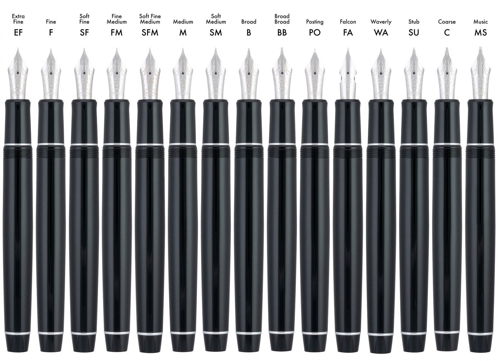
I had the pleasure of testing all 15 of Pilot’s #10-sized 14K gold fountain pen nibs recently, and wanted to share my thoughts on them as a group.

For starters, I am thrilled that Pilot made these nibs available in the US market, via the Custom Heritage 912 lineup. The basics were always available here - Fine, Medium, Broad, etc. - but the specialty nibs - Coarse, Stub, Posting, and so on - were traditionally only available in the Japanese market. That changed a couple of years ago, and Pilot fans, such as myself, rejoiced.

When thinking about reviewing these, I had several thoughts. Should I do one review per nib? Should I group them in use-case batches? What about videos? Pictures? It was a lot to consider! My friend Mike Matteson at Inkdependence review this entire set a few months ago, so be sure to check out his great videos on these nibs.

For me, I decided on something different, and specific: How would I rank these nibs for my own use? Do I worry this is too specific for a broader product review? A little. In the end I think it is going to work out, as I’ll be able to discuss my specific preferences, and the pros and cons that go along with those preferences. Nibs that don’t work for me may be perfect for you, and I hope to be able to explain that throughout this list. They are all good nibs, Brad!

A few notes before we begin:

  • I write in a block print style, never cursive or script. I prefer fine lines, or wide lines with an edge that benefit my writing style. Needless to say, those nibs will be near the top of my list.
  • Pilot requested that I only dip test these nibs. I don’t believe that is the best way to give you the most accurate commentary on nib performance. That said, Pilot’s nibs and feeds are so good that I am able to get good results from only dipping the nib.
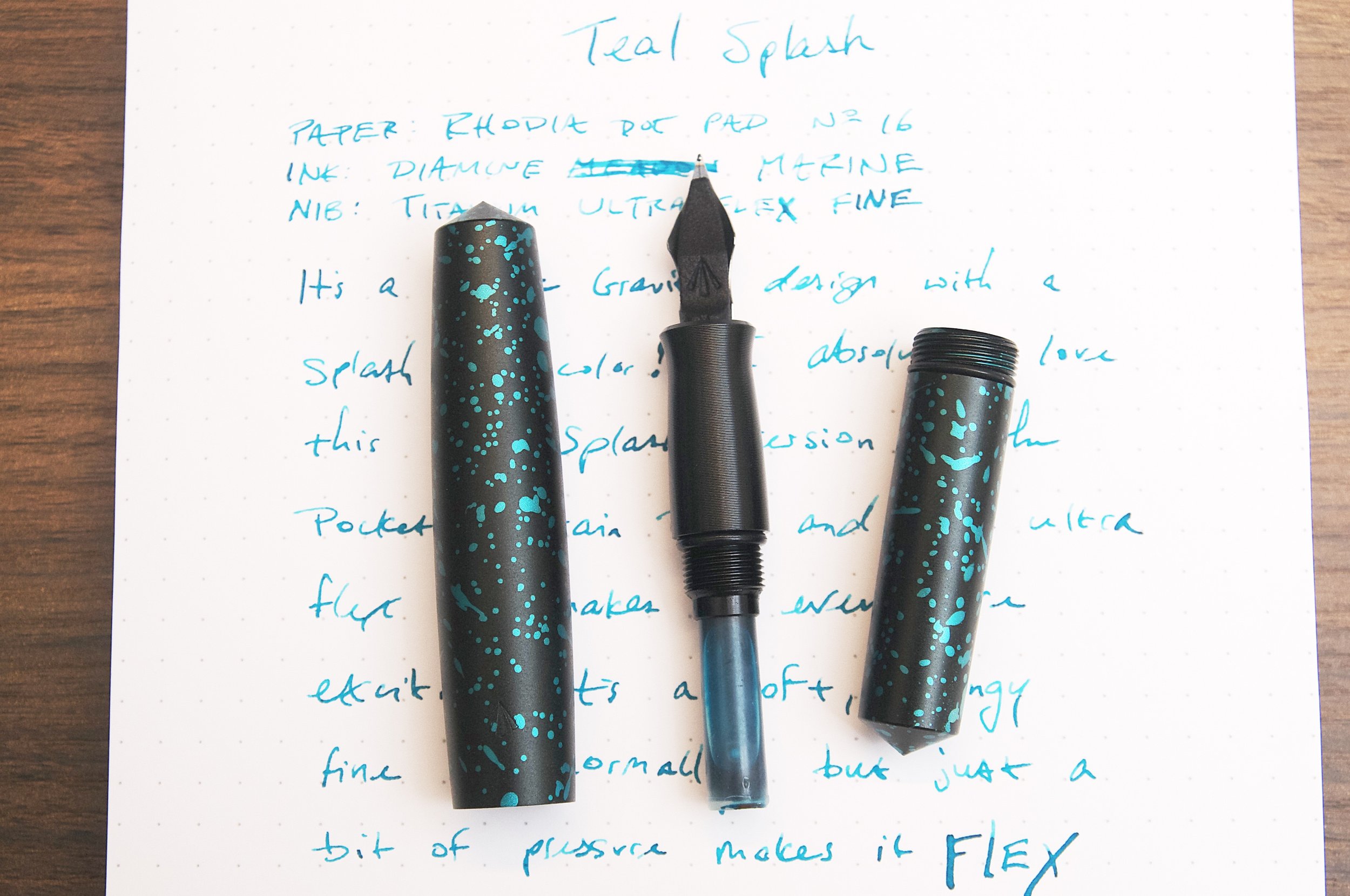
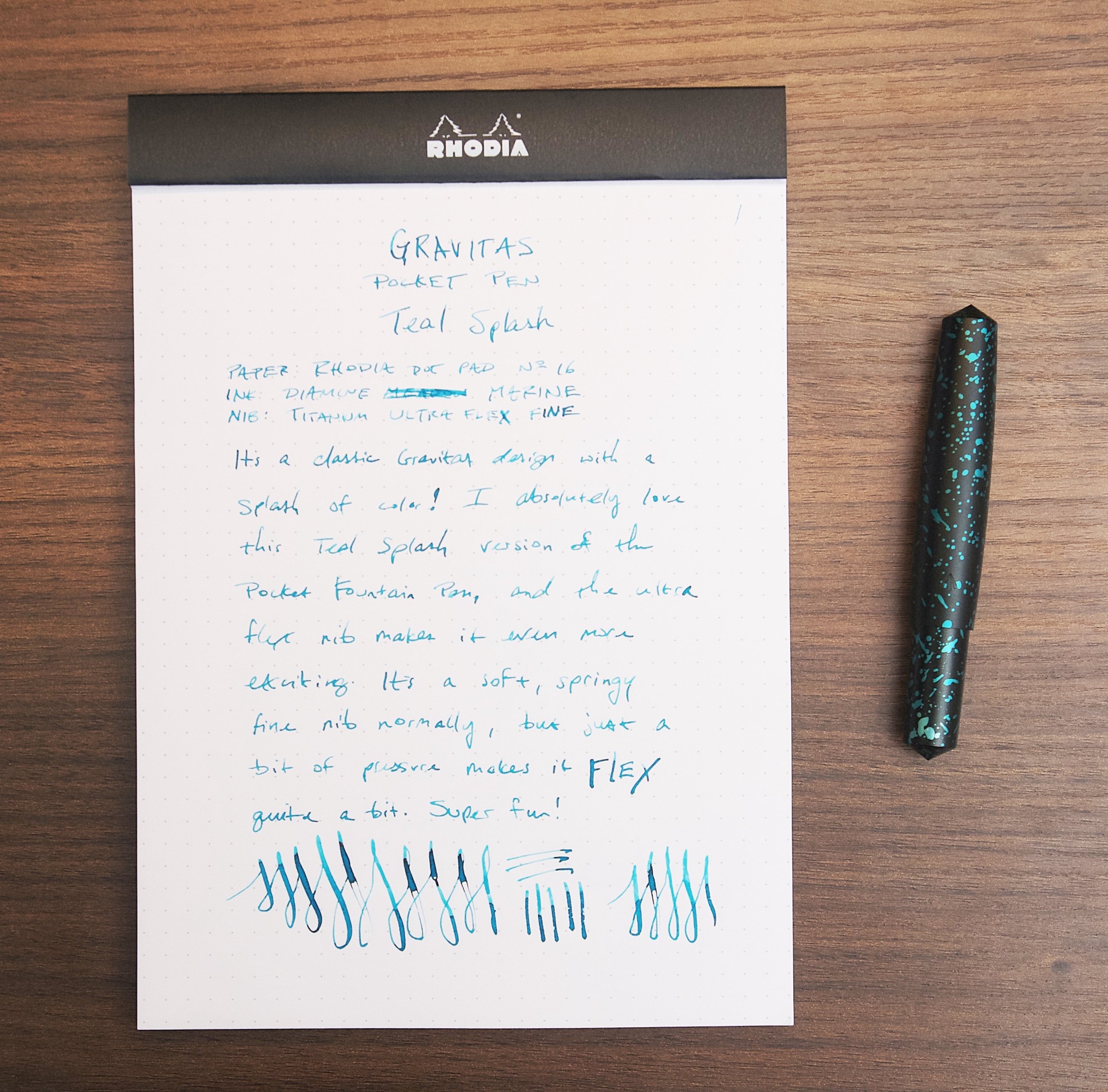
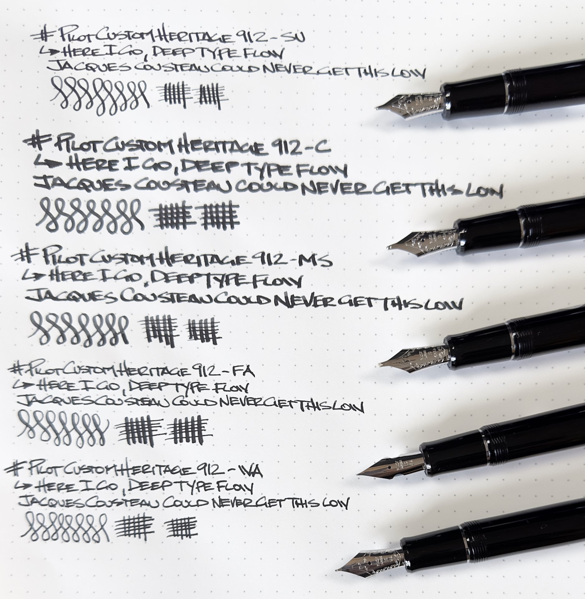
  • All nibs are tested on Maruman Spiral Note Basic A4 Dot Grid paper, and with Pilot Iroshizuku Take-Sumi ink.
  • Once I dip the nib, I wipe the bulk of the ink off on the bottle edge, then write several lines on scrap paper to even out the flow before testing the line.
  • The lyrics used are from the start of ODB’s verse on “Da Mystery of Chessboxin’” by the Wu-Tang Clan.
  • Wu-Tang is for the kids.
  • If you have any questions if a certain nib is for you, please don’t hesitate to leave a comment, or get in touch.
  • Thank you Pilot USA for loaning me these nibs!

On to my rankings:

15) Coarse

Someone has to finish last, and for me it is the Coarse. It is a marker tip, so if you are looking for that type of line, then take a look at this one. There is no line variation, just a bold, round, line. I will say that given the size and shape of nib tipping, the Coarse is a perfect platform for big and interesting nib grinds.

The Pilot Coarse Nib, perfect for big nib grinds.

14) Broad Broad

Similar to the Coarse, but with a little more ink application on the page. The Coarse nib seems to spread the ink thinner on the page, while the BB just unloads it.

Left to right: Broad, Broad Broad, Coarse.

13) Soft Medium

There is a group of nibs with no true home in the list, starting with the Soft Medium. I think it is the worst of the “Soft” group, offering less line variation than the other options. That’s what you want with a nib like this, but it is too similar to the Medium.

12) Fine Medium

Ditto here, but with a little more line variation. I will say that even with the Soft designation, the speed at which I can write is great. This is a fun one, but there are better choices for my style.

Pilot SU, left, and Music nibs.

11) Music

This traditional two slit, three tine Music nib setup is fantastic, I just prefer the Sutab (SU, aka Stub,) so much more that I knocked this one down the list a bit. It is much wider than the SU on both vertical and horizontal strokes. Think 1.5 mm vs. 1.1 mm. I prefer the narrower on both accounts.

The upturned Pilot Waverly nib.

10) Waverly

This was my first time with the Waverly nib, and I expected more from it. The idea is that it is great for writing at any angle, so if you hold the pen in a non-traditional manner, this nib could work well for you. For me, there was no benefit to it, although I wouldn’t mind spending more time with it to see what I could sort out.

9) Medium

An excellent stock writing experience. Japanese Medium nibs are the recommendation sweet spot for every day writing. I prefer finer lines, as seen below, but there is no arguing with this one.

8) Soft Fine

It’s fine, but not fine enough. This is a good example of expectations when choosing a nib. Japanese Fine nibs are very fine, and the Soft style makes lines wider due to the tines spreading further than on a standard nib. I’d rather have a standard Fine.
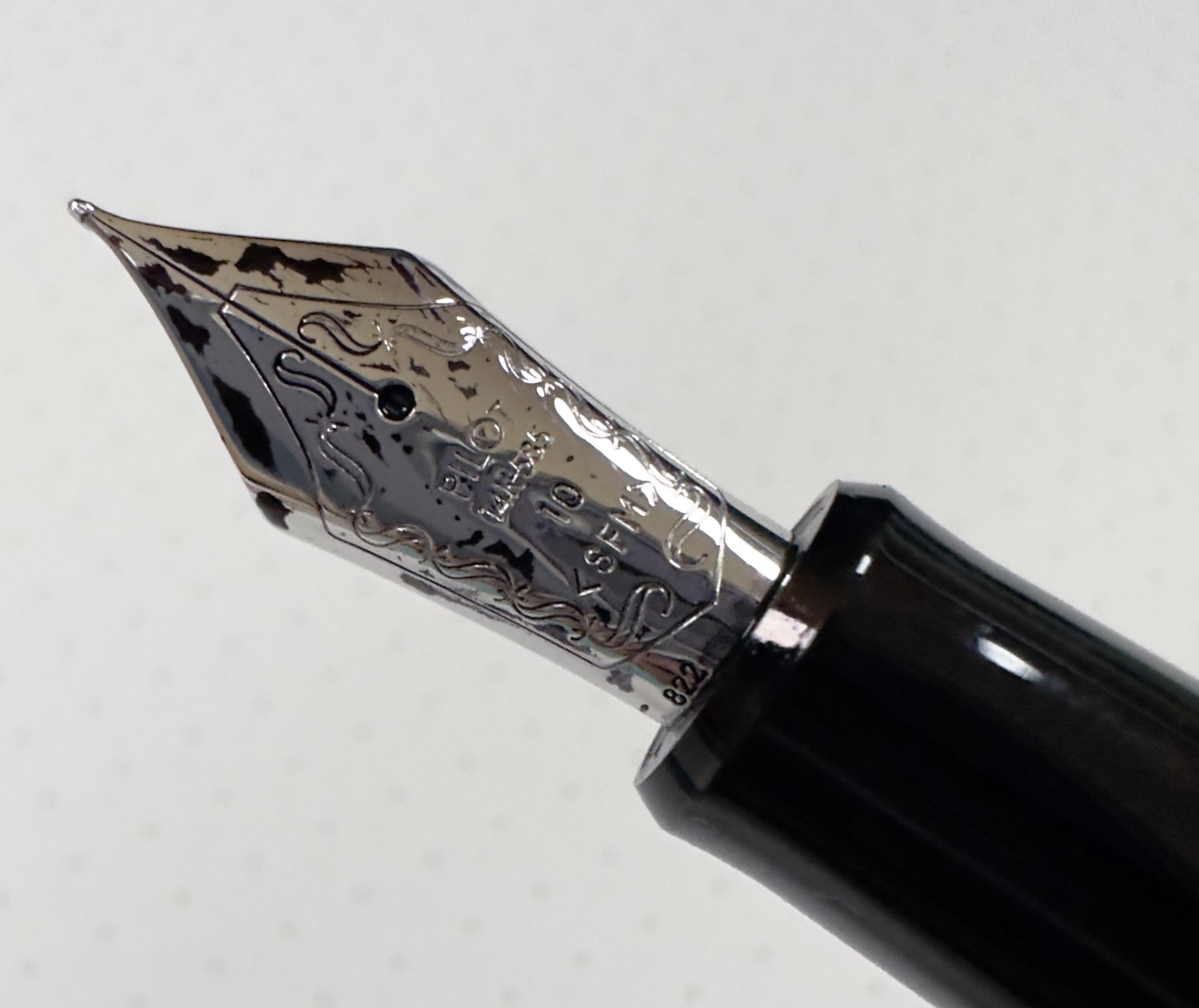
7) Soft Fine Medium

But the Soft Fine Medium is great! My expectation is that it would be wider, given “Medium” in the name, and it is. It is also finer than a stock Medium, and has more character on the page.

Pilot Posting nib, left, and Extra Fine.

6) Extra Fine

Why so low? It’s mostly the PO (Posting) nibs fault, but maybe more so that Pilot’s Fine nib is my favorite all day, every day writer. The Extra Fine is great, but I don’t see a place for it given my fondness of other nibs. Now, if those nibs didn’t exist, this one could top the rankings.

5) Broad

Surprise, surprise, surprise! Something happened to me when I tested this nib out, and no, it wasn’t an alien abduction. I want to be able to control my lines in wide nibs, and most nibs I’ve tested in this category have been too wide, too wet, too rounded, or all of the above. I thought I would easily prefer the Medium nib over this one, but it wasn’t that close. Again, the Medium makes for a great recommendation, but the Broad is more enjoyable.
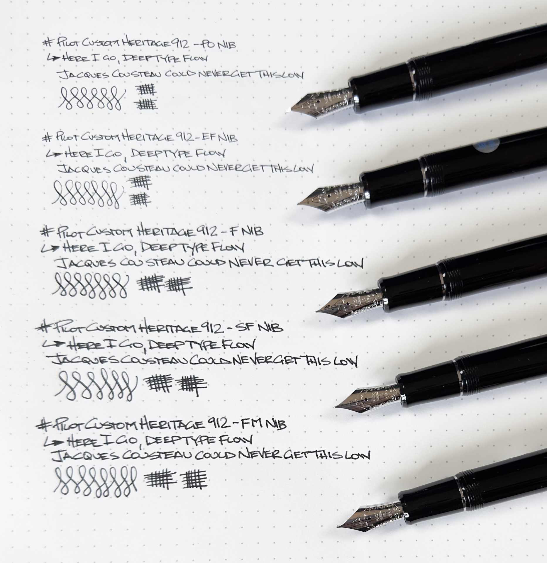
4) Fine

My favorite pick up and write nib. Yes, the line is very narrow, but not too much. It remains legible for all types of writing, and the nib feels more stable and stronger than the Extra Fine.

3) SU

I’ve owned a Sutab nib previously, but didn’t get on with it that well. Testing this one out made me wonder if there was something wrong with mine, which I no longer own. With any stub-type nib, you want to see line variation. My old SU had very little, and I found it boring. This one has a wide range from thick to thin, and I think I’m going to need to buy a new one.

The unmistakable Pilot FA nib.
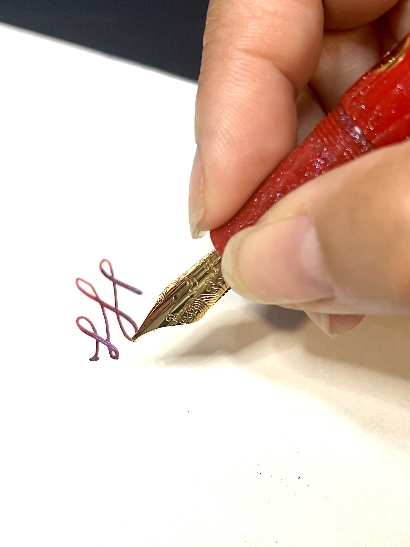
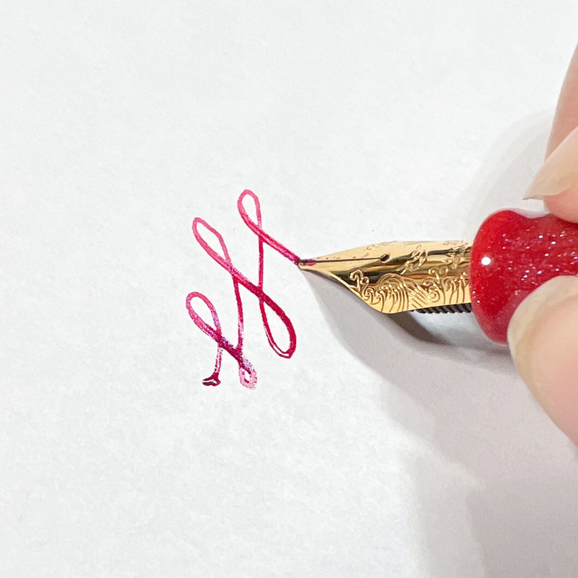
2) FA

This is the most fun Pilot nib. The flexible FA nib has more bounce than most other modern flex nib pens, while retaining a great standard writing line if you aren’t actively pushing the nib. It gives my standard block print writing a ton of character. I wouldn’t mind having this nib inked and in the rotation on a permanent basis.

1) PO

Do not buy this nib without trying it first. That’s how I acquired my Posting nib. I raved about the loaner I reviewed, a reader went out and bought one, instantly hated it, and sold it to me. 10 years on, I’m still in love. PO nib fans refer to this nib as nail-like, and that is accurate. The line is finer than the stock Extra Fine, while also being firmer due to its turned down tip. I wouldn’t be surprised if Pilot sells less of this nib than any other, but it is the one nib I own that I can’t live without.

That’s a wrap! My biggest takeaway from this experience is that Pilot makes amazing nibs. I already knew that, but it is nice to have that confirmation across the board. If you have a fountain pen writing need, Pilot as a nib for you. My thanks to Pilot North America for loaning me this set of pens for review.


Enjoy reading The Pen Addict? Then consider becoming a member to receive additional weekly content, giveaways, and discounts in The Pen Addict shop. Plus, you support me and the site directly, for which I am very grateful.

Membership starts at just $5/month, with a discounted annual option available. To find out more about membership click here and join us!

Posted on August 28, 2023 and filed under Pilot, Nibs, Fountain Pens.

Nahvalur x Enigma Stationery "Brilliant Bunny" Nautilus Fountain Pen Review

(Kimberly (she/her) took the express train down the fountain pen/stationery rabbit hole and doesn't want to be rescued. She can be found on Instagram @allthehobbies because there really are many, many hobbies!.)

I have been a fan of the Nahvalur pens for a couple years now - I could have sworn I’ve written more reviews than the recent review about their Galen exclusive - so when the opportunity came up to review one with a gold nib, I said sign me up, even if it’s red! Little did I realize, it was a special Nahvalur Nautilus pen, created for Enigma Stationery, named Brilliant Bunny.

The Nahvalur Nautilus Brilliant Bunny was released earlier this year by Enigma Stationery in honor of the Year of the Rabbit which started on January 22, 2023 and goes to February 9, 2024 (at which point the Year of the Dragon begins). Only 50 pens were made for this edition.

Following the Nautilus’ nautical theme, this submarine-shaped pen sports 3 circular “portholes”, which function as ink windows and remain visible when capped. The Nautilus has a yellow gold-colored clip and cap band with the same wave pattern and logo as similarly-sized Nahvalur models (I compared it to another Nautilus as well as a Voyage). The pen does not post. For this exclusive, the Brilliant Bunny was made from a bright red resin mixed with “teal, blue and purple sparkle” and comes with a yellow gold-colored 14kt gold nib in Medium with the Nahvalur logo.

I like the design of the 14kt gold nib more than the steel version. You can also see how this yellow gold nib compares to their rose gold.

The Nautilus next to the Schuylkill (left) and Voyage Tromso (right.)

They are quite similar once uncapped, though the Schuylkill is a touch less girthy than the other two.

Since I had a good experience inking up other Nahvalurs with shimmer ink, I went for a matchy matchy red shimmer ink and picked Wearingeul Dracula. I had no problem with either the ink flow or seeing shimmer on the page, even when I didn’t use the pen for a few weeks (I deliberately set aside review pens for days and weeks at a time to test both evaporation and flow). As with all shimmer inks, to prevent clogging, periodically tilt the pen up and down so that the shimmer particles don’t all settle into the nib/feed.

The sparkles are subtle, which makes it difficult to photograph, but much easier to see in person, and pairs perfectly with Wearingeul Dracula.

The Nautilus feels balanced and comfortable in hand. It has a short, smooth step from the cap edge and threads, and tapers towards the nib where it flares to prevent your fingers from sliding forward.

I hold my pens pretty close to the nib, but neither the threads nor step felt intrusive when holding the pen further back.

The pen worked flawlessly each time, producing a nice, wet line. The nib is nice and smooth and softer than its steel counterpart. I could get a wee bit of line variation if I tried to “bounce” the pressure while writing, but I don’t recommend flexing the nib, but I did a little, for science :-) The softness of the 14 kt gold medium means that the line is a tad bit broader than the steel medium.

Writing sample on 68 gsm Tomoe River in an Endless Recorder.

Comparison of the Nautilus with the 14kt gold medium, steel medium as well as Platinum 3776 14kt gold medium, TWSBI Eco Steel Medium Architect and Sailor Pro Gear Slim 14kt gold medium.

Getting this bit of line variation made me nervous. I had to use more than my usual pressure (which, according to Pilot’s handwriting analysis, is fairly light). I don’t recommend pushing it further than this.

I’ve had this pen inked up for over 2 months and used it about a dozen times. Like other Nahvalur pens, cleaning the pen is pretty easy: you can either use the piston to get water in/out of the barrel or you can unscrew the nib unit and syringe clean it. Just be careful not to blast it too hard or you may get water behind the piston. If that happens, you can also disassemble the pen with a Nahvalur wrench (I don’t believe it was included with this pen since the Bossman literally handed me the pen by itself at one of the shows, lol).

L to R: Leonardo Momento Zero, Leonardo Momento Zero Grande, Nahvalur Brilliant Bunny, Pelikan M800, Visconti Homo Sapiens.

Pros:

  • Lovely bright red pen with gorgeous shimmer
  • Piston-filler
  • 14kt gold nib is smooth and wrote well
  • Very comfortable in hand

Neutral:

  • Nib writes slightly broader than steel medium
  • Slightly girthy pen
  • Pen does not post (I didn’t take posted comparison pictures for this reason)

Cons:

  • Only nib option is 14kt Gold Medium - I understand having just the 14kt gold option, but it would have been nice if it was also available in Fine.
  • Price point? - I struggled with whether this was a Con or a Neutral, as there are plenty of gold nib piston pens that cost more than this pen (like Pelikan M6xx and M8xx), but also some that cost less (like the Pilot Custom Heritage 92). But there aren’t many in this price range that are made from a custom resin either.

I knew that I’d enjoy this pen (as I already have a Nautilus which I liked) but was pleasantly surprised by the smoothness and wetness of the 14kt gold nib. As of this writing, it is still available on the Enigma Stationery website for $295 USD.

(Disclaimer: Thank you to Dan of Enigma Stationery for sending us this pen for review. All other items in this article are my own.)

Posted on August 18, 2023 and filed under Enigma Stationery, Nahvalur, Fountain Pens, Pen Reviews.

Gravitas Pocket Fountain Pen in Teal Splash Review

(Jeff Abbott is a regular contributor at The Pen Addict. You can find more from Jeff online at Draft Evolution and Twitter.)

The Gravitas Pocket fountain pen is no stranger around here, but there's nothing like an injection of some fun colors to spice up something you've already seen. Teal Splash features a black pen with beautiful blobs of teal scattered over the body to make this pen really stand out.

If you're new to the Gravitas Pocket, here is the summary. It's a short pen that looks and feels similar to a Kaweco AL Sport, but with plenty of unique design choices that bring this pen close to the top of my pocket pen list. The cap unscrews and posts to the back of the pen to make it a more comfortable length for writing, and it takes short international cartridges due to the short body. You can fit some converters into this pen, but they have to be short — a standard converter won't fit.

Where this pen departs from the ordinary is obvious once you take a closer look. The cap features a flat edge that keeps the pen from rolling away, while the rest of the cap and body are round. The tips taper from a cylinder to a point in a really pleasing distance, and there's no branding outside of a tiny Gravtias logo debossed on the lower part of the cap.

Once you uncap the pen, you'll notice the grip section is much larger than the typical pocket pen. This makes for a really comfortable writing experience once you've posted the cap. The grip section also has micro grooves cut into it that provides a soft but tactile grip. The grip also flares out a bit at the end to provide a nice butt for your fingers to rest while writing. Overall, it's a really comfortable pen.

There's a nice feature on both sets of threads for this pen — both for the cap and the section. There's a small o-ring at the base of both of these threads that make for a snug and secure fit when the section or cap are tightened down. I don't know if this is technically necessary for the pen to function properly, but it definitely feels nice.

Something different for me on this model is the nib. This unit has a titanium flex nib that really fits my writing style. When writing with soft pressure, it puts down a line that is similar to any European fine nib. The line is crisp and the ink flows well. But, if you want to add some flourish, just apply a little pressure to the nib to make those tines spread and really distribute the ink. This flex nib isn't as dramatic as some I've used, but this one is so incredibly easy to use. I'm guessing part of this experience is due to the soft titanium material as well as the shape, but it sure is fun to use.

While flexing is easy, you have to be careful not to flex too hard or else the feed can't deliver enough ink and you'll end up with some railroading. This will vary a bit depending on what ink and paper you're using, but it's something to keep in mind. In my use, using soft and moderate pressure to flex the nib is no problem. It's only when I try to max out the tine spread that the railroading happens.

The nib is a #6 size that Gravitas produces in-house. There aren't any markings on it, and I really appreciate the dull finish of the titanium against the shiny black grip and speckled body.

Finally, the finish on the outside of the pen. I absolutely love this edition of the Pocket fountain pen. Teal Splash is a perfect name, and I really enjoy looking at the splatter patterns that adorn the pen. The regular pen is so sleek and unassuming, but this treatment kicks it up a notch to an eye-catching piece of art when it's on your desk.

The Gravitas Pocket Fountain Pen in Teal Splash starts at €120, but the model featured here is €135 due to the titanium flex nib option. In my opinion, the €15 difference is totally worth it for this nib. Gravitas is definitely one of the brands I suggest you check out if you haven't already. If the pen featured here doesn't fit your fancy, there are so many other models and options to pick from, and they all feature top-notch quality and craftsmanship.

(Gravitas provided this product at no charge to The Pen Addict for review purposes.)


Enjoy reading The Pen Addict? Then consider becoming a member to receive additional weekly content, giveaways, and discounts in The Pen Addict shop. Plus, you support me and the site directly, for which I am very grateful.

Membership starts at just $5/month, with a discounted annual option available. To find out more about membership click here and join us!

Posted on August 9, 2023 and filed under Gravitas, Fountain Pens, Pen Reviews.