Posts filed under Fountain Pens

Sailor TUZU Adjust Fountain Pen Review

Sailor TUZU Fountain Pen

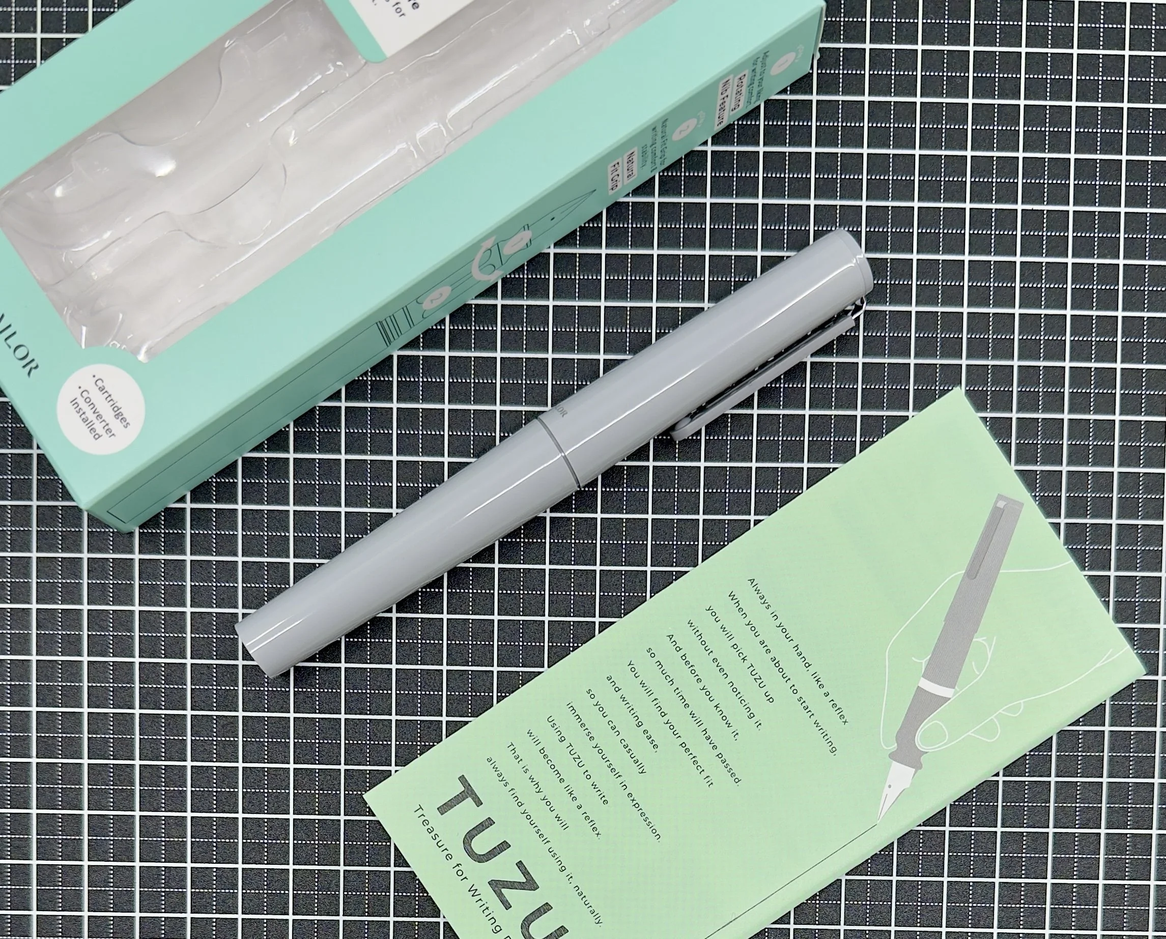
For a $44 fountain pen, I sure have a lot of thoughts on the Sailor TUZU. Some thoughts are straightforward (Does the TUZU provide good value?) while others are more complicated, such as if there is any benefit to its main feature.

Sailor TUZU Fountain Pen Converter

Ships with converter!

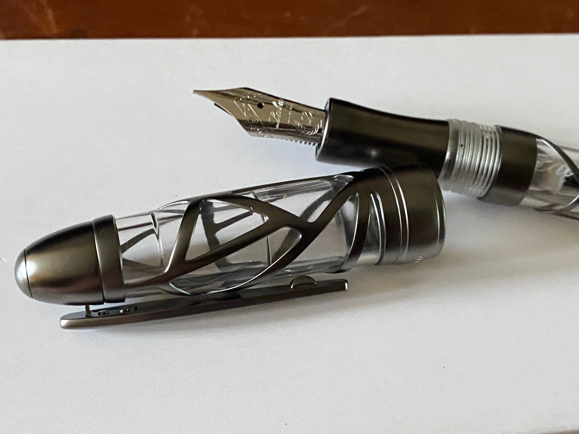
Let’s start here: what is the Sailor TUZU? It’s a fountain pen, with a twist. Literally. In short, the nib is designed to rotate around the barrel to better match your preferred writing angle. For a fountain pen, writing angle is everything. If not held at a certain angle, the nib on the page could feel terrible, or possibly not write at all. Sailor created a fantastic product page for the TUZU, which you can find here.

Sailor TUZU Fountain Pen Barrel

To assist with non-traditional writing grips and angles, the TUZU allows the user to rotate the nib in 10 degree increments. How? You unscrew the barrel, loosen the section ring, slide back the grip section, and rotate the nib to a new position. It’s quite simple, with guidelines to assist you in slotting the nib correctly in its new position.

Sailor TUZU Fountain Pen Band

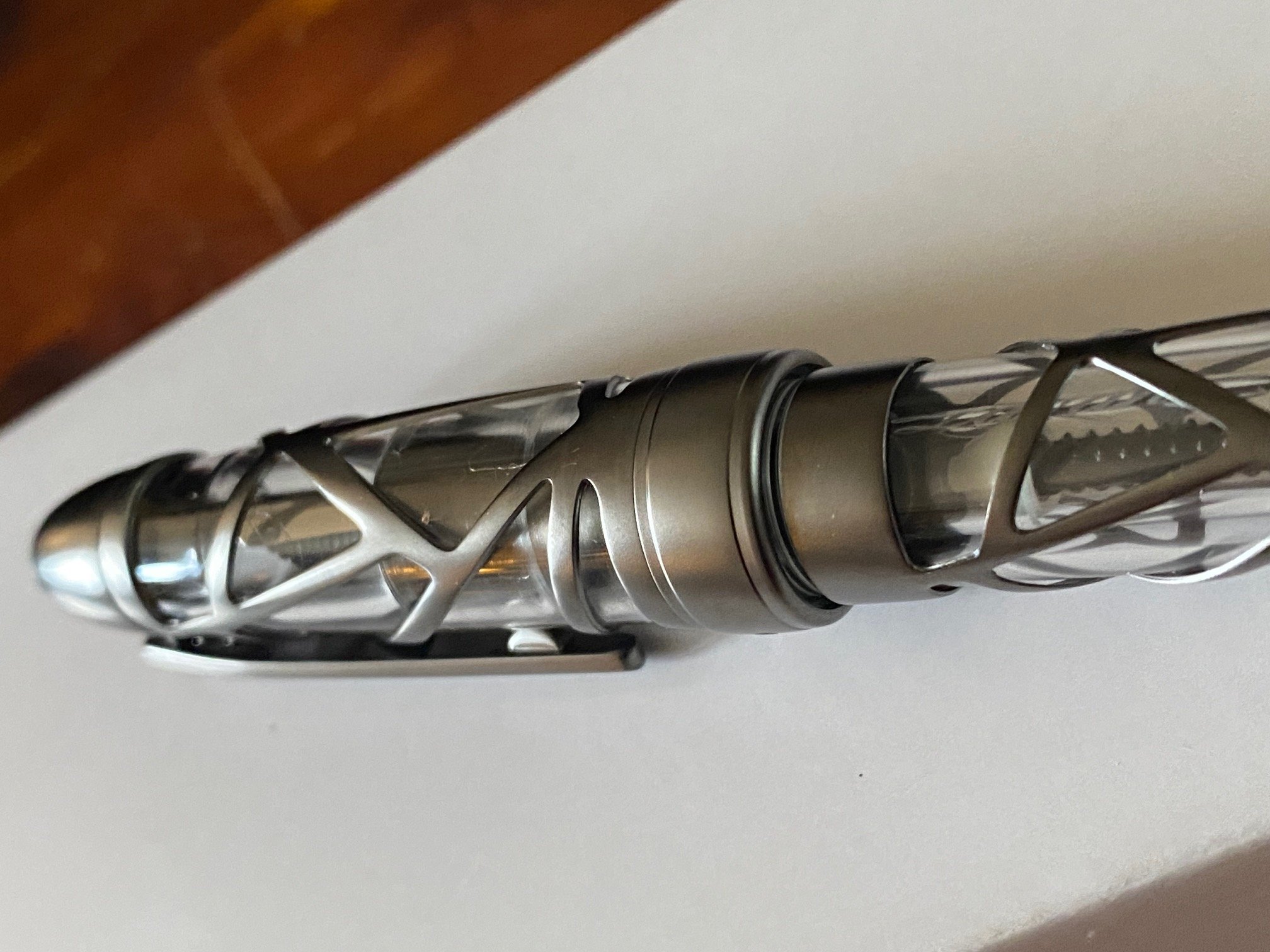
How it works: Unscrew the barrel, and loosen the Silver section band.

Sailor TUZU Fountain Pen Slide and rotate

Slide the section back, rotate the nib as needed. In this case, I went one station (10 degrees - you can see the guide lines,) to the left.

Sailor TUZU Fountain Pen Rotated

Tighten it all back up and Profit!

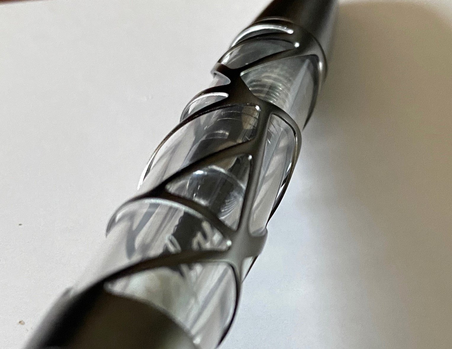
All of this can happen with the pen inked, so feel free to twist and adjust accordingly. The grip is molded in a triangular-style and you can rotate it, too, to give you a more personalized writing experience.

Sailor TUZU Fountain Pen Grip

My grip and writing angle.

From a technical perspective, it works perfectly. From a writing perspective? I can’t say. Well, I can say if you have a traditional writing grip and angle like I do. But that’s not the purpose of this pen, so I enlisted a friend who could provide some insight if the TUZU offers any benefits to non-traditional grips and writing angles.

Say hello to Toga, from Toga’s Stationery Vagaries:

Hi, I'm Toga, and I have a wonky grip. I'm not too sure when exactly I developed this way of holding a pen. I'm fairly certain I would have been taught the standard tripod grip at school, but at some point it morphed into whatever the heck you'd call what it is now. I only realised it had changed when a customer asked me: "Why on earth do you hold your pen like that?" I couldn't give them an answer. My index finger rests pretty much where it should, the underside of the pen rests on the first knuckle of my middle finger, and my thumb hooks over the pen, resting on my index finger.

Toga's TUZU

Because of this rather "innovative" way of holding a pen, I don't tend to go for ones with triangular grips if I can at all help it. That being said, I do have a few with these grips, with varying degrees of aggressiveness. The more aggressive the grip, the more uncomfortable it is for me to hold.

That's where the TUZU comes in with its moulded grip that can be rotated in 10 degree increments. The moulding is less aggressive than a Lamy Safari, and even in its default position the TUZU is more comfortable for me to hold than said Safari.

I wasn't sure if the rotation gimmick was actually going to be useful for someone like me or not, so when Brad mentioned that he was looking for people with non-standard grips to help him with the review, I was happy to volunteer. After some trial and error finding the position that worked best for me (140° clockwise) I can confidently say that it absolutely is useful for people like me. In fact, it has surprisingly become one of the most comfortable pens I have. My index and middle fingers sit comfortably in the moulded sides while my thumb rests nicely over the rounded end that would usually be the underside of the grip. It's a fairly chonky pen, too, but manages to remain lightweight without feeling cheap, all of which add to the comfort levels for me.

However, a comfortable pen isn't much good if the rest of the writing experience is poor. I initially had some issues with the nib as the tines were too tight, making it extremely dry to the point of barely writing. Opening tines is something that I'm comfortable with doing, but it can be daunting for new users—the kind of users who Sailor have marketed this pen towards. That said, provided you've bought it from a reputable seller you'll be able to return the pen for a new one should you be unlucky enough to run into this problem.

Knowing Sailor, I imagine this will be a fairly uncommon occurrence. It didn't take much to get the pen writing as it should, just a little gentle spreading of the tines with brass shims was enough to get the ink flowing as it should, with the Fine nib giving a line slightly wider than a western Extra Fine. Despite being a steel nib, it has the "textured" feel that their gold nibs are famous for. Not quite to the same level, but it's definitely there. That's not something I've noticed on their other steel nibs before, but I've only used the Fude models so it may be different for them. I do enjoy the almost pencil-like feedback of Sailor's gold nibs, so I'm happy to find it present on this new steel nib Sailor developed for this pen.

So, the gimmick certainly works, but is it worth the money? I'd say the major competition for this pen is the Lamy Safari, as it's a similar size and also has the moulded grip section. The TUZU is $12-$15 more expensive than the Safari, which at this price point is not an insignificant premium to pay. Despite this, I would go for the TUZU every time. For one, I prefer the way it looks, but more importantly the TUZU is so much more comfortable for me to use. If you have a non-standard or rotated grip I believe you will have a far nicer writing experience with the TUZU. Thank you Brad for sending me the pen and letting me help with the review!

How cool is that? Thank you Toga!

Since everyone’s writing experiences differ, I thought it was important for this review to bring in someone who could actually use the main feature this pen was designed for. This type of insight is invaluable, and has me giving Sailor their due for helping fountain pen users have an experience that I might take for granted.

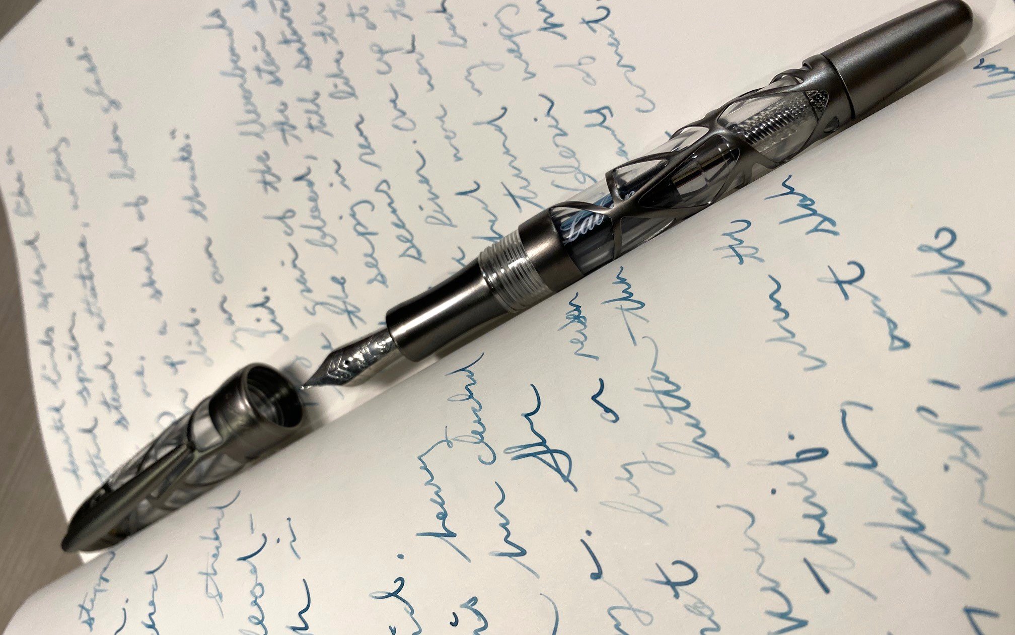
One bit from Toga’s talk that I wanted to elaborate on were his comments on the nib. My experience has been similar, but better in the fact that the nib has always written, but the tines are tight! That makes for an especially fine line from this Fine steel nib. It should come as no surprise to many long-time readers that I love it. This nib is a nail, and the only Sailor Steel nib I’ve ever enjoyed. If I was recommending the TUZU to a new user, I would recommend choosing either a Medium or Broad nib.

Sailor TUZU nib

Nails.

I’ll be interested to see if they take this redesigned LAMY-eqsue nib and feed into other entry-level products. I think it would do well, but is it Sailor enough for their more traditional pens, like the Compass?

What about the price point? $44 is more than fair for what Sailor has built, but at the same time, is the technology enough of a selling point to entice a new user to spend this much on a fountain pen? I think so, if they can get buying assistance, or have enough information available wherever they purchase to pen to take a chance on it.

TUZU Safari

Sailor TUZU vs. LAMY Safari.

For me personally, I love it, but am I choosing it over the Pilot Kakuno, Explorer, or Prera? How about the TWSBI ECO? The LAMY Safari or AL-Star? No to all of those, but maybe over some of Platinum’s entry level pens (Preppy, Prefounte, Plaisir,) purely because of barrel feel. As Toga alluded to, the TUZU is mostly comparable to the LAMY Safari. That’s one of my favorite pens of all-time, and also a pen that many people dislike due to the grip and/or design. In fact, I could see the TUZU becoming a pen favored by artists - like the LAMY Safari - because of how it is built, and the options and opportunities the nib angles could provide.

Will the Sailor TUZU be a long-term success? Only time will tell, but I think it is off to a good start. They are even launching a new barrel color, Translucent Violet, to the lineup this year, so it must be doing reasonably well. If nothing else, Sailor now has an entry-level fountain pen for people to consider, and one I think many users will be happy with.

(JetPens provided this product at no charge to The Pen Addict for review purposes.)


Enjoy reading The Pen Addict? Then consider becoming a member to receive additional weekly content, giveaways, and discounts in The Pen Addict shop. Plus, you support me and the site directly, for which I am very grateful.

Membership starts at just $5/month, with a discounted annual option available. To find out more about membership click here and join us!

Sailor TUZU Writing
Posted on March 3, 2025 and filed under Sailor, TUZU, Fountain Pens, Pen Reviews.

Laban Skeleton Fountain Pen Review

Laban Skeleton Fountain Pen Review

(Sarah Read is an author, editor, yarn artist, and pen/paper/ink addict. You can find more about her at her website and on Bluesky. And her latest book, The Atropine Tree, is now available!)

In my love for all things spooky, I've had my eye on the Laban Skeleton for a while, so I was excited to give it a try. Clearly it looks fantastic. The resin demonstrator body gives a fun view into the converter and ink inside the pen, and the gunmetal-colored brass lattice covering looks, somehow, both modern and ancient. The shape of the overlay looks both architectural and organic. Yaknow, like a skeleton.

Laban Skeleton Fountain Pen

The finial, endcap, cap band, clip, and grip section are also brass, but for all that metal, the pen feels very light. The clip is stiff, but it holds securely to whatever it is clipped to. The grip section has no texture, so it can feel a bit slick, but because the pen is so light, it's not too much of a problem.

Laban Skeleton Fountain Pen Nib

The pen has a stainless steel Bock nib and it writes well. It's smooth, but with a good amount of feedback. It has consistent ink flow. I prefer a wetter writer, but this doesn't feel too dry.

Laban Skeleton Fountain Pen Cap

For the most part, I enjoy writing with it, but it isn't super comfortable to hold. I had assumed that the metal overlay would be somehow attached to the pen body, but it actually sits around it like a cage, with space between the metal and the resin. One of the reasons the pen is so light is because the metal is very thin. The result is that this cage of thin metal is quite sharp, and the edges of it dig into the hand when you're holding it. On the plus side, grip! You're not going to drop it! But I don't enjoy using it for long writing sessions. I had expected the pen to be more precisely fitted and finished than that.

Laban Skeleton Fountain Pen Edges

One of the reasons I had those expectations is the price point of the pen. The Laban Skeleton costs $224, which is rather a lot. While fountain pen prices have gone up at an upsetting rate, I still think this price is too high for the pen. In terms of materials, feel, and performance, I'd compare this pen to a TWSBI Diamond ALR, and those cost between $65 and $90, depending on limited edition status. And those are perfectly good pens, as is this one, but for the price, I expected better than good.

Laban Skeleton Fountain Pen Writing

It does look better than good, though, so it definitely has that going for it. And when I took it out into public for a writing group gathering, it received much admiration. And while I don't like the way it feels, I do keep picking it up for quick notes--just not long writing projects. This is a pen you might enjoy very much, but its one I'd recommend you try out before you invest and see if you like the feel of it as much as you can't help but admire its good looks.

(JetPens provided this product at no charge to The Pen Addict for review purposes.)


Enjoy reading The Pen Addict? Then consider becoming a member to receive additional weekly content, giveaways, and discounts in The Pen Addict shop. Plus, you support me and the site directly, for which I am very grateful.

Membership starts at just $5/month, with a discounted annual option available. To find out more about membership click here and join us!

Laban Skeleton Fountain Pen Box
Posted on February 27, 2025 and filed under Laban, Fountain Pens, Pen Reviews.

Happy Pen/Ink Pairings

(Kimberly (she/her) took the express train down the fountain pen/stationery rabbit hole and doesn't want to be rescued. She can be found on Instagram @allthehobbies because there really are many, many hobbies!.)

While trying to figure out what I wanted to write about this week, I was struck by a few pen/ink pairings that were bringing me a little more happiness than I expected, and for very different reasons, so I thought I’d share why I’m enjoying them so much.

Kaweco Perkeo (Indian Summer) and Ferris Wheel Press Goose Poupon Despite being a long time Kaweco Sport fan, it wasn’t until 3 years ago that I first used the Kaweco Perkeo for this showdown article. I really liked the pen, but that particular color wasn’t my jam, so back it went to the Bossman for a giveaway. I eventually bought myself the Infrared one and more recently, this Indian Summer colorway. I’m not going to go into the merits of the Perkeo (you can read the review for why I like it), but this pen is “sparking joy” because I am loving the combo of this pen with Ferris Wheel Press Goose Poupon.

Kaweco Perkeo Indian Summer (Medium nib) with Ferris Wheel Press Goose Poupon.

For starters, I used to think that this color was gross, and years later I’m finding myself drawn to “weirder” colors like this yellow-green, which is kind of reminiscent of poopy diapers. It just reminds me that tastes can and do change, which is one way that I find myself “maturing” in this rabbit hole. This pen, at $20 (or less), is a reminder that pens don’t have to be expensive to be enjoyable. Also, this ink not only is a great, well-behaved match, but is also named Goose Poupon - a play on the Dijon-style mustard Grey Poupon - and the kid in me keeps giggling and calling it “Goose Poopoo”.

I love how this ink shades!

It is a nice shader, whether I’m printing or writing in cursive. The only time I had any issues was when the ink didn’t flow from the cartridge and I had to tap it a few times to get the ink to “unstick” itself from the walls (that happens with some inks if syringe-filling a cartridge). This combo is such a divergence from my usual pens/inks that it’s a welcome change to my lineup and a reminder to occasionally think (or ink) outside the box!

Kaweco Special (Red) and Diamine Noel This pen has no right being one of my favorite pens. For one, it’s red. This blue-and-gold girl (Go Bears!) is not a red girl, but over the years, fountain pens and inks have changed my tune. Still, the number of blue pens and inks far outnumber the red ones, so this really shouldn’t even be a contender! Also, it has brass accents, which goes well with the red, but is subject to patina-ing, which usually drives me crazy. And yet, for unknown reasons, it doesn’t really bother me.

This Kaweco is also a much slimmer pen than I typically prefer, but it’s still comfortable in hand. I think that its slightly heavier weight (due to it being metal, instead of the Perkeo’s plastic) balances out the slimness. What shouldn’t be a surprise is that it is faceted, which means automatic brownie points.

Yay for facets, but look at that patina! (shudder)

I have had this pen inked up with this ink since March 16, 2024. I filled a converter with it (once) and have used it 34 times since then (including today). I don’t always use it for lots of writing (maybe the day’s todo list or a page in a penpal letter), but it has never failed to write as soon as I uncap it. The pen’s o-ring means that it seals very well and your pen does not dry, despite traveling on many airplanes and even writing at 9000 feet in Colorado.

Lastly, I’ve inked up the pen with Diamine Noel multiple times since owning this pen. While it didn’t wow me when I first swatched it in 2019 as part of Diamine’s first Inkvent (it is a red ink, after all), I absolutely loved it once I wrote with it! Noel is a nice deep red ink with subtle green sheen and average to slightly wetter flow. I have a hard time picking a different ink for this pen, and vice versa.

The subtle greenish gold sheen is chef’s kiss!

Platinum 3776 (Shape of Heart, Chai Latte) with Lennon Tool Bar Sesame Oil No surprise that a Platinum 3776 with a Medium nib is something that I enjoy writing with, and I love this special edition with the light brown cap with crystals in the finial (just don’t make me find the 3 punched out nib-hearts!), but I am REALLY digging the pen with the Lennon Tool Bar Sesame Oil ink. The ink is a light brown ink that has great shading, especially when printing. Copying out Meditations with this pen/ink combo is so calming because the soft brown ink, despite not being a wet ink, just flows so perfectly out of this pen. Bonus was that a friend helped me get a bottle of this ink when it was sold out everywhere. No crazy revelations here, just a combination that I’m really loving.

Love this combo, not much more to it than that!

TWSBI Vac 700R (Kyanite) with Robert Oster Blue Denim I was hoping that the Jacques Herbin’s Kyanite du Nepal would be a good match for the TWSBI Vac 700R, Kyanite, but alas, the colors were off enough that it would drive me crazy, so I picked a better match that I hadn’t used in several years, Robert Oster Blue Denim.

Jacques Herbin Kyanite du Nepal is too blue for the TWSBI Kyanite which is more of a teal.

Cursive or print, both were equally enjoyable with this pen/ink combo.

I’ve really been enjoying writing with this larger TWSBI (with the size 6 nib) for transcribing another Italian kids book. The Medium nib feels great and I love seeing the ink matching the nib as it flows onto the page.

The ink/nib match really kicked it up several notches for me!

The ink is also a subtle sheener, with a touch of red sheen in some spots (more noticeable with print than cursive). I don’t usually love high capacity pens because I have so many pens inked up at a time, but it’s kind of cool watching the ink level slowly going down (9 pages down, maybe another 20 to go). The ink flow isn’t too wet nor dry and matches the wetness of the size 6 nib. Another happy combo.

Look at that subtle red sheen! Have I mentioned how much I love subtle sheen like that?

I’m sure I could come up with more happy combinations, but these really just struck me as some current favorites, and not just because of ink/pen matchy match, though let’s be real, a good color match also makes me happy. With everything happening in the world around us, we could all use anything that brings a little bit of joy and sunshine in our lives. After all, isn’t that why we use fountain pens? ☺️

PS - Bonus happiness is me finally getting around to starting a book journal for the books I read last year.

(Disclaimer: All products, pens, inks, papers, stamps, and washi tape are my own.)

Posted on February 7, 2025 and filed under Fountain Pens.