Posts filed under Ink Reviews

Monteverde Scotch Brown Ink Review

(Jeff Abbott is a regular contributor at The Pen Addict. You can find more from Jeff online at Draft Evolution and Twitter.)

Brown inks are certainly a rich and deep well of the fountain pen ink options out there today, but I've never really done more than dip my toes in this color. Who wants to use brown ink, right? Well, it's not as bad as it sounds. I've tried a couple, and I've always been pleasantly surprised after using them. Browns can be beautiful, so don't judge them by their name.

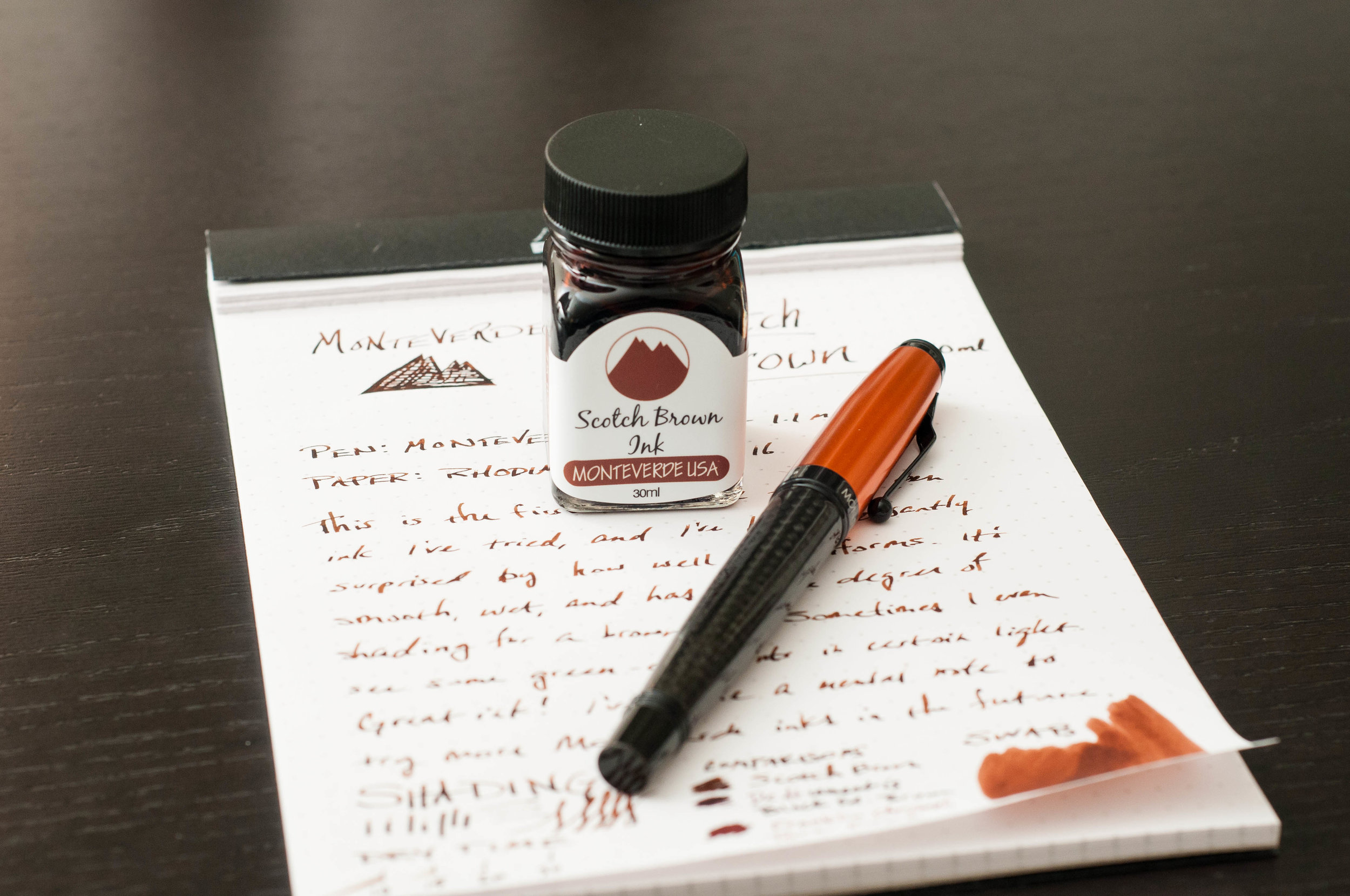
I've always had good experiences with my Monteverde pens and gel/roller ball refills, but I've never actually tried any of their many fountain pen inks. When Brad sent over a bottle of Scotch Brown, I was excited to try it out and see how well it performed. Also, I had to see how closely it resembled they whisky color.

Upon opening the clear plastic box that the bottle is packaged in, I noticed some info printed on the back side of the color card that promoted Monteverde ITF technology. Interesting, right? Well, ITF stands for "Ink Treatment Formula," and it really just means that the ink is formulated to flow well, resist drying in the nib, and lubricating the feed. With other inks, this normally isn't advertised as a trademarked ink technology, so it struck me as a bit odd. Despite that, this ink definitely gets a good score in my "does it behave well?" system.

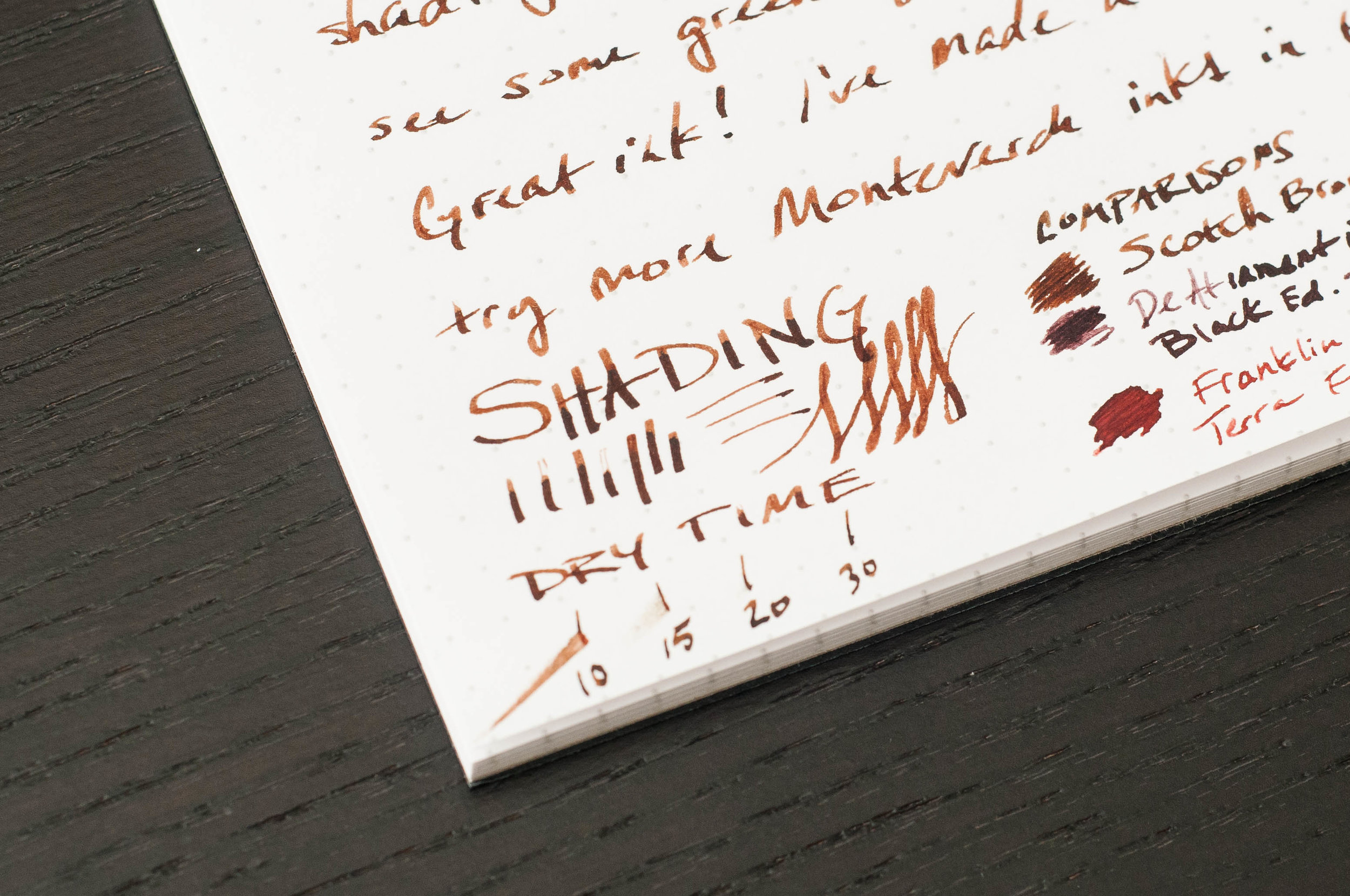
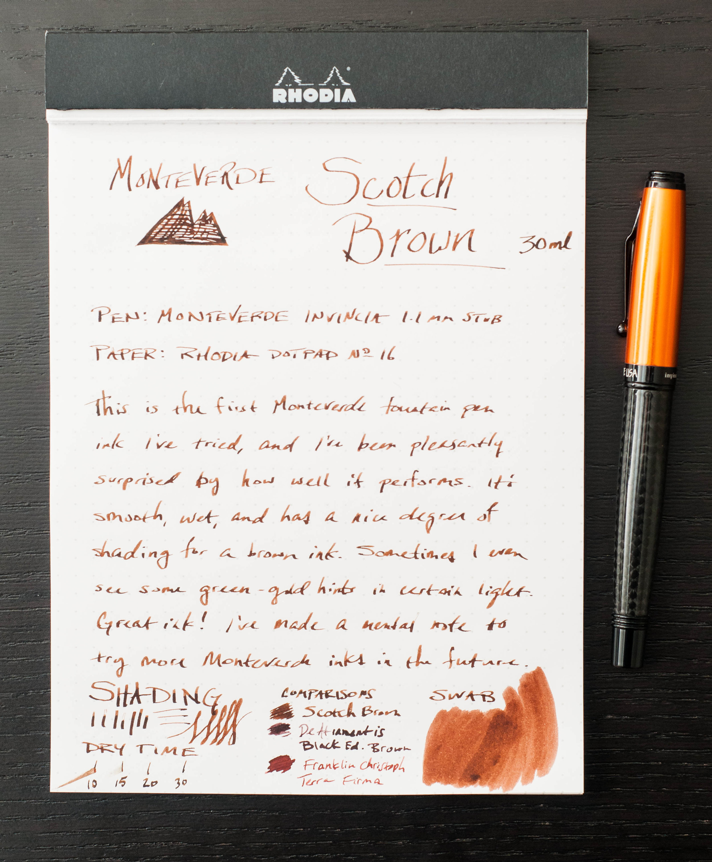
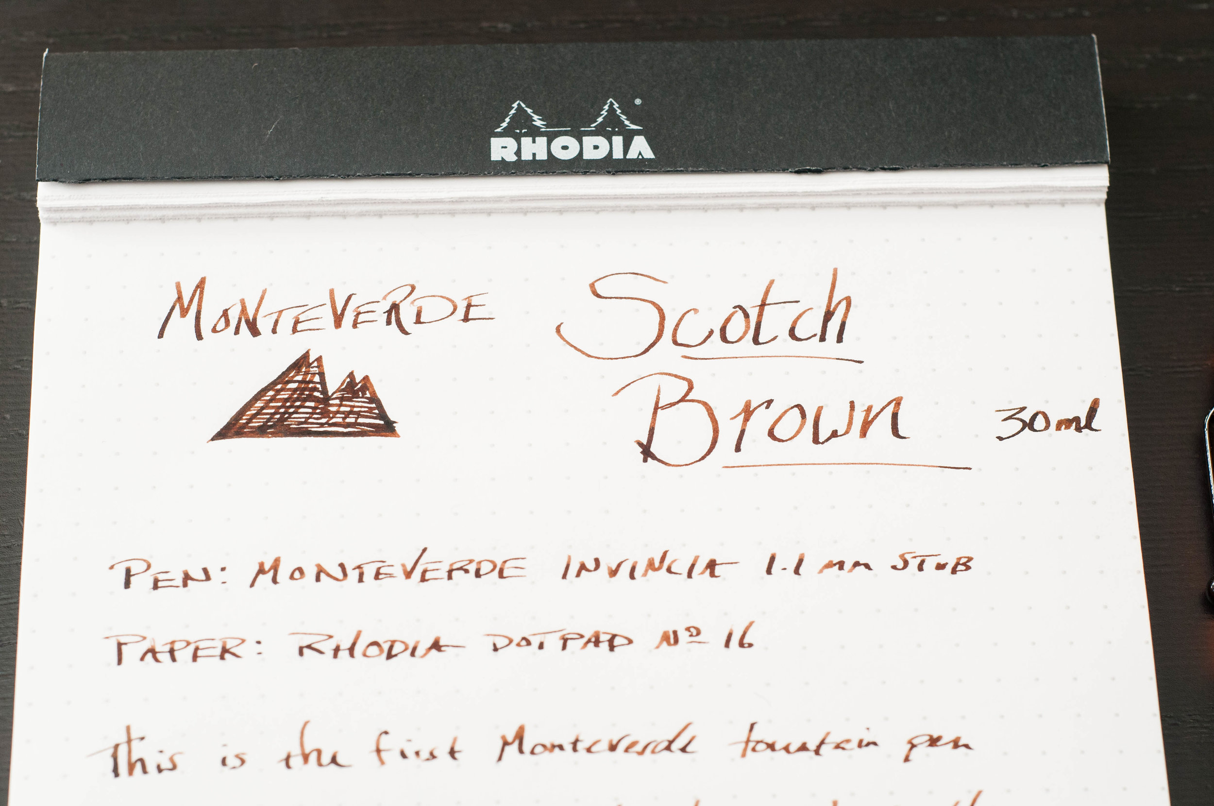
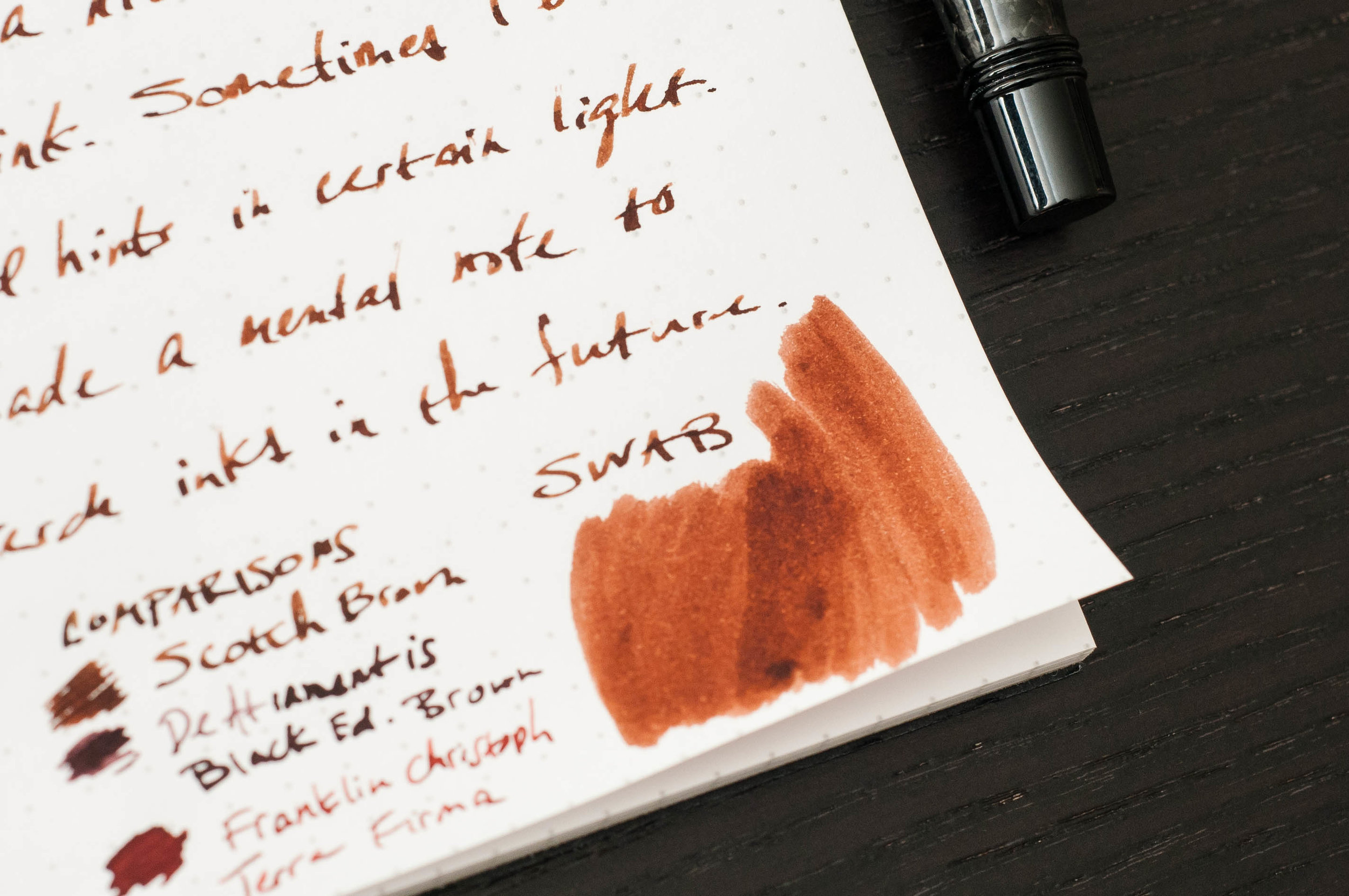
Scotch Brown is a medium brown ink that looks darker than most scotches I've seen. Still, it's a warm, pleasant color that looks great on the page. It's light enough that you can easily tell that you're using a brown ink. In some cases, I can even detect a hint of a green-gold sheen. If you want something more business friendly, you might want to look for a black-brown.

Given the medium hue, that provides opportunities to shade and vary depending on how ink is distributed on the page. I'm happy to report that this ink does a great job of shading from light to medium brown. In certain areas where the ink pools, it takes on a coffee or milk chocolate color, while the lighter areas remind me of rich caramel or whisky. It's a delicious color, but I can't say that I've tasted the ink.

So, how does the Ink Treatment Formula perform? Well, it behaves nicely in the pens I've tried. Ink flow is exactly what I expect, and it has no issue keeping up with fast writing. Dry time is in the unimpressive (but still good) range of about 15-20 seconds. It also does a good job of keeping the ink from drying on the nib when the pen is left uncapped for a couple of minutes. Even when it does dry, it easily starts up again after a couple of squiggles.

Show-through isn't terrible for a medium to dark color. The ink doesn't soak through the page, creating dark impressions on the back page. I've also been unable to detect any signs of feathering on the premium (Rhodia, Apica, Leuchtturm) papers I've tried with it. Overall, a solid performer.

In my book, this is a well-behaved ink, with or without the fancy technology to back it up. It easily ranks with Diamine as far as behavior goes, and that's a compliment. Once again, I'm being drawn in by a brown ink, and it's surprised me again. I'm not sure I'm predisposed against browns, but it's something I aim to cure. This Scotch Brown is a delicious color, and it's working well to change my perceptions. I'll also be delving deeper into the Monteverde line of inks. This Emerald Green is calling my name.

The pricing for Monteverde inks isn't bad, either. Monteverde Scotch Brown is available at JetPens as a 30ml bottle for $8.00, and the big brother 90ml bottle is only $16.00. For those of you following along at home, that's 3 times the ink for only twice the price. I'd recommend trying an ink before buying that much of it, though.

(JetPens provided this product at no charge to The Pen Addict for review purposes.)


Enjoy reading The Pen Addict? Then consider becoming a member to receive additional weekly content, giveaways, and discounts in The Pen Addict shop. Plus, you support me and the site directly, which I am very grateful for.

Membership starts at just $5/month, with a discounted annual option available. To find out more about membership click here and join us!

Posted on March 15, 2017 and filed under Monteverde, Ink Reviews.

Robert Oster Signature Ink Review: Peach

(Susan M. Pigott is a fountain pen collector, pen and paperholic, photographer, and professor. You can find more from Susan on her blog Scribalishess.)

Robert Oster signature ink has become one of my favorite brands primarily due to its wonderful shading properties, and, in many cases, the sheen. I’m partial to blue inks, but I picked up a sample of Peach when I purchased some other inks from Vanness Pens.

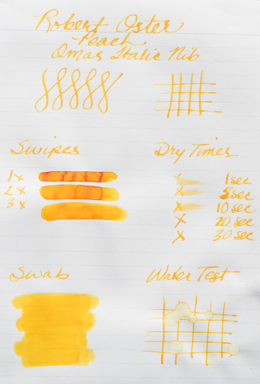
Robert Oster Peach is a fantastic yellow-orange ink. It is not subtle; it is flashy and sweet as the fruit after which it is named. Just look at the shading and color in the writing sample below:

Initially, I was a bit disappointed with the ink because my usual ink tests didn’t exhibit the qualities I expected, such as rich shading. For example, my swab looks flat and uninteresting as do my swirls, but the swipes show some of that gorgeous color where the ink pooled. The ink dried more quickly than other Robert Oster inks I’ve tried. I thought it would be a wet ink, but in my Omas italic, it was fairly dry. The ink is definitely not waterproof.

Chromatography reveals several colors, including pink, peach, yellow, and vivid orange.

Ink splats show off the rich colors and even a bit of deep orange sheen.

With wide nibs you’ll see lots of shading and ink pooling, and you might get some shimmer on the edges of your letters. Even in finer nibs the ink exhibits some shading. So if you like a vivid yellow-orange, you will definitely like Robert Oster Peach.

You can purchase Robert Oster Signature Peach from Vanness Pens, $16.00 for 50ml and $2.50 for a 4ml sample.

(This ink was purchased with my own funds.)


Enjoy reading The Pen Addict? Then consider becoming a member to receive additional weekly content, giveaways, and discounts in The Pen Addict shop. Plus, you support me and the site directly, which I am very grateful for.

Membership starts at just $5/month, with a discounted annual option available. To find out more about membership click here and join us!
Posted on March 3, 2017 and filed under Robert Oster, Ink Reviews.

Lamy Pacific Blue Al-Star Pen And Ink Review

(Jeff Abbott is a regular contributor at The Pen Addict. You can find more from Jeff online at Draft Evolution and Twitter.)

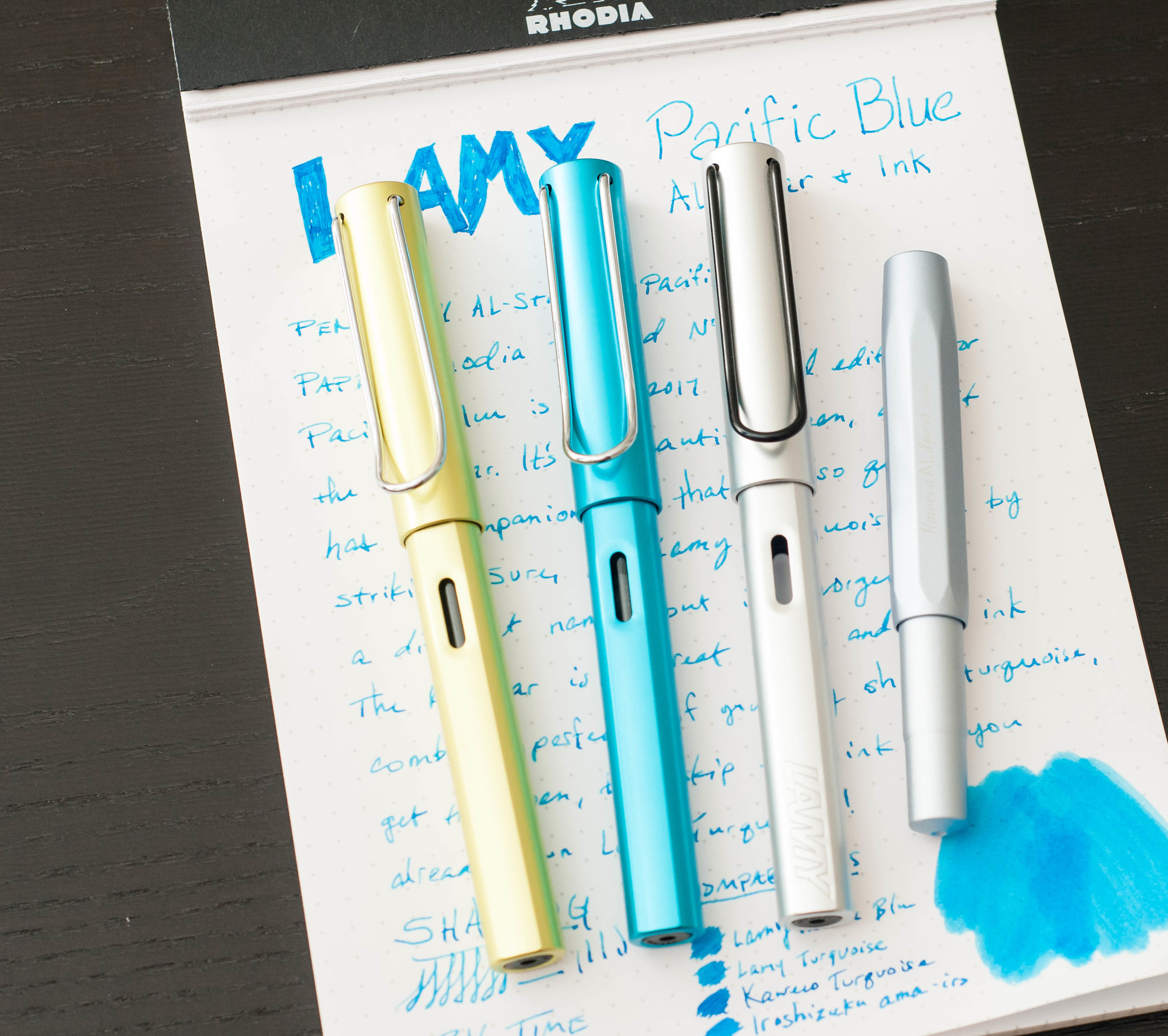
Every year, Lamy release a limited edition color of their popular Al-Star line, along with a companion ink of the same color. This year, I'm especially excited for the limited edition color: Pacific Blue. I'm admittedly a huge fan of turquoise and teal, and this pen is a delicious, shiny color that fits my bill perfectly. Pair that with an equally gorgeous turquoise ink, and we're all set for a killer combo.

The Pacific Blue Al-Star

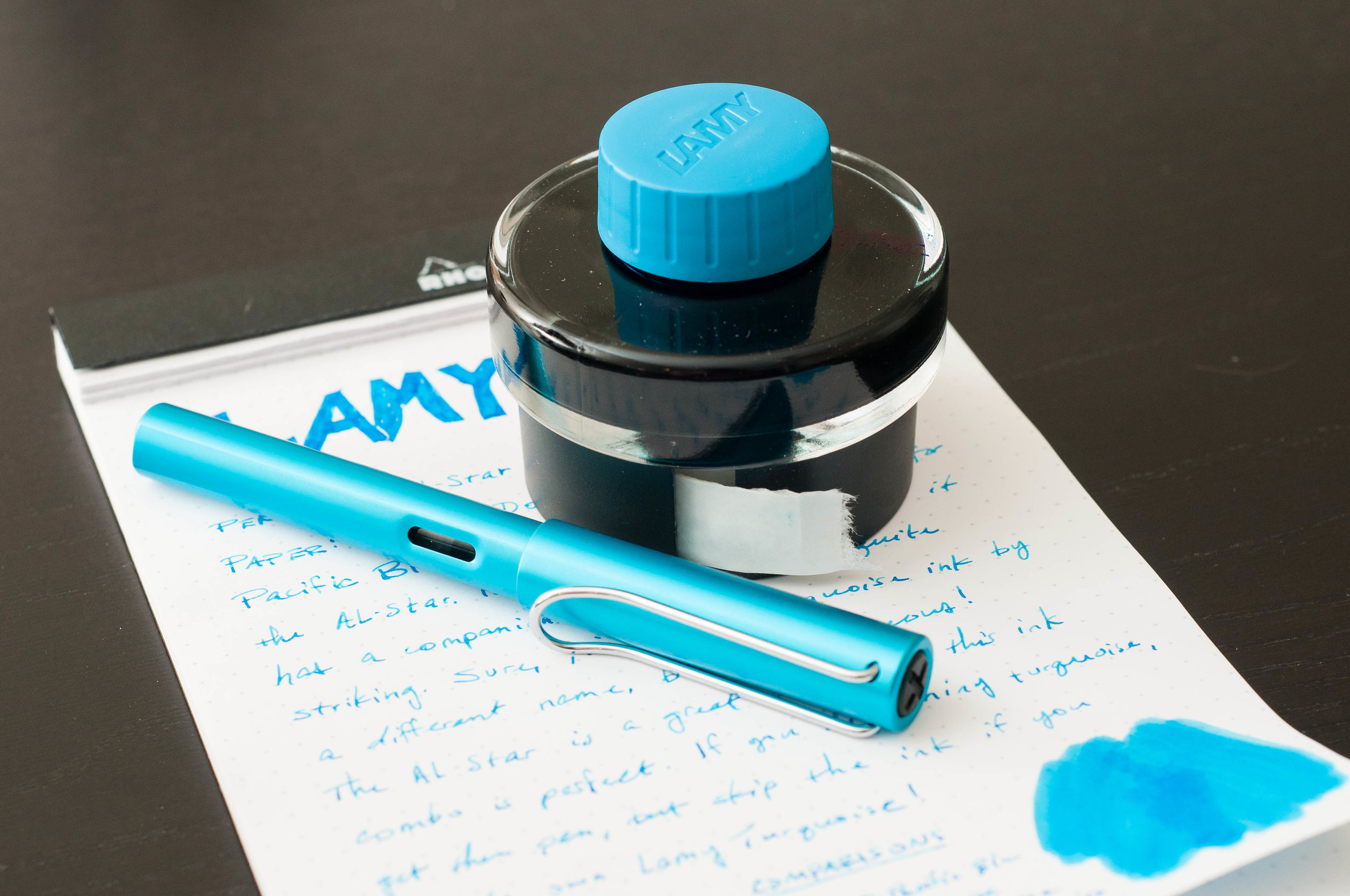
You might love the new color, or it might make you cringe. Either way, it's impossible to miss. This is a loud, shocking, electric blue with subtle green undertones that set it off. Obviously, the color is inspired from the Pacific Ocean, and it does a great job of factoring in all the factors of the sea. When looking at this pen, it somehow looks as if it might be partially liquid while it sits on the desk. For me, it's a color that makes me extremely happy, and I love the pen for that.

Since the only difference with this Al-Star is the color, I won't spend a lot of time on the details. Check out my review of the Charged Green Al-Star from 2016. Everything holds true for this copy as well!

The Lamy Al-Star is a solid fountain pen. It's not as affordable as the Safari line, and some people enjoy the Safari line more for many great reasons, but the Al-Star hits a nice balance of design, weight, feel, and awesome colors that set it apart from the Safari. If you haven't tried out an Al-Star (or a Safari...), then I highly recommend picking up this limited edition color.

The Lamy Al-Star in Pacific Blue is $36.00 and available with an EF, F, or M nib. Remember that Lamy nibs are easy to swap out with another size as well. Each Al-Star ships with a single blue cartridge, or you can purchase a cartridge-converter separately.

Lamy Pacific Blue ink

The other half of this year's Lamy special edition combo is the Pacific Blue ink. You might have heard, but it's no secret that Pacific Blue is, in fact, the same ink as Lamy Turquoise. I don't understand why Lamy released Turquoise under a limited edition moniker instead of formulating a unique ink, but that's not the point of this review. As such, keep that in mind if you already own Lamy Turquoise! You can safely skip this ink knowing that you already have it.

Lamy Pacific Blue is a beautiful turquoise ink that leans toward the lighter and blue spectrum. For example, I found that Kaweco Turquoise was a bit darker than the Lamy version. Iroshizuku ama-iro is actually very similar to Pacific Blue, but I think it has better shading qualities. Regardless, it's a gorgeous blue-green that radiates on the page! I love using this ink because of the color, and it's been difficult for me to switch back to Ama-iro over the past week. It's a great color.

Shading is great with this ink, which is something I haven't been very excited about with other Lamy inks. There isn't a massive range of variation, but it's tasteful. Again, it's intended to remind you of the Pacific ocean, so a degree of shading is expected. Lamy delivers this with high marks. The shading behavior is easy to notice in this medium nib, but it shows off a bit more in larger nibs. There's a minimal degree of shading in small nibs, but that shouldn't be a surprise.

The ink performs really well. I've not had any issues with skipping, starting, or clogging. Cleaning is a breeze, and lubrication is very balanced.

I haven't been able to detect any bleeding or feathering so far on my normal papers. There's a degree of feathering on cheap copy paper, but that is expected. Being on the light side, show-through isn't a problem in most cases. Using Rhodia paper, the opposite side of the page is completely usable after the top side is used.

Dry time is average compared to other fountain pen inks I use. It dries consistently by 15 seconds, while pooled areas take about 20 seconds to dry completely. Not bad, but not exceptional.

One unique feature with any Lamy bottled ink is the ink blotter included at the base of the bottle. This is convenient for cleaning the grip section and nib after you fill it with ink. These blotting strips do a great job and prevent you from using a tissue or paper towel to do the same job. Much less waste.

You can purchase Lamy Pacific blue in a 50ml bottle, or as a 5-pack of cartridges. Personally, I think the bottle is a better bargain. And remember — if you already own Lamy Turquoise, you don't need this!

(JetPens provided this product at no charge to The Pen Addict for review purposes.)


Enjoy reading The Pen Addict? Then consider becoming a member to receive additional weekly content, giveaways, and discounts in The Pen Addict shop. Plus, you support me and the site directly, which I am very grateful for.

Membership starts at just $5/month, with a discounted annual option available. To find out more about membership click here and join us!
Posted on March 1, 2017 and filed under Lamy, Fountain Pens, Ink Reviews, Pen Reviews.