Posts filed under Ink Reviews

Robert Oster Honey Bee Ink Review

2018 was an ink desert for me. The inky landscape exploded, and I was overwhelmed. That feeling made me slow way, way down on ink acquisitions, but in 2019 I am getting back into the ink game. I am interested in testing out new colors and types of inks, and, primarily, things outside of my wheelhouse. It’s time for me to mix it up!

While Robert Oster Honey Bee wouldn’t be considered a stretch for many people, this is not a color normally found on my ink shelf. I’ve had similar shades pass through some of my pens for a single fill here and there, but nothing I’ve been committed to using on the regular. I think Honey Bee might change that.

If you look closely at the online samples you will see a lot of the orange that drew me in to choosing it, but in actual use, you see more of the brown and yellow that you would expect from an ink called Honey Bee.

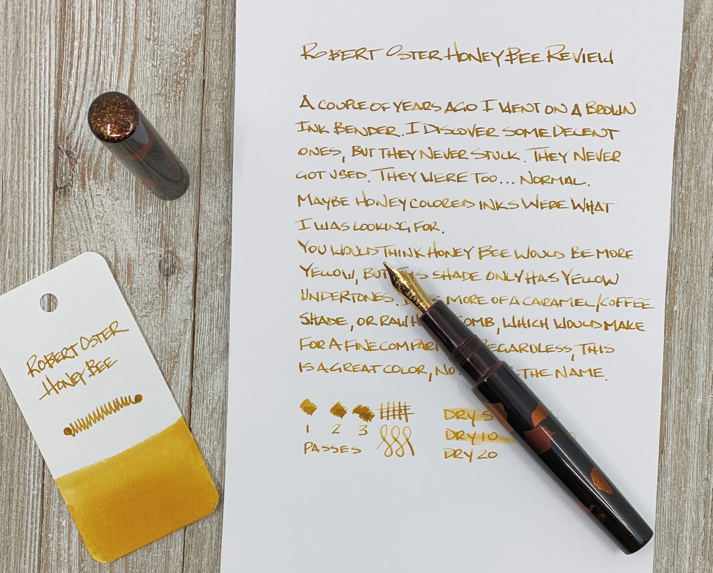
With my new focus on inks, I will also need to use wider nibs to really see what the inks are all about. My blue black, orange, and turquoise inks work well in my favorite extra fine nibs, but to see what an ink like Honey Bee is all about, I need to break out the stubs. Plus, I jumped at the chance to go matchy-matchy with my beautiful Stylo-Art Kinpaku and Pilot SU nib. Swoon indeed.

On the page, Honey Bee reminds me of the color of raw honeycomb. It has light browns and deep yellows and golds. It’s almost more of a light caramel, blonde roast coffee color. And I like it. I’m getting a good amount of shading too, which is what I want from my inks more than anything. The shading characteristic is not something a gel or rollerball ink pen can output on to the page.

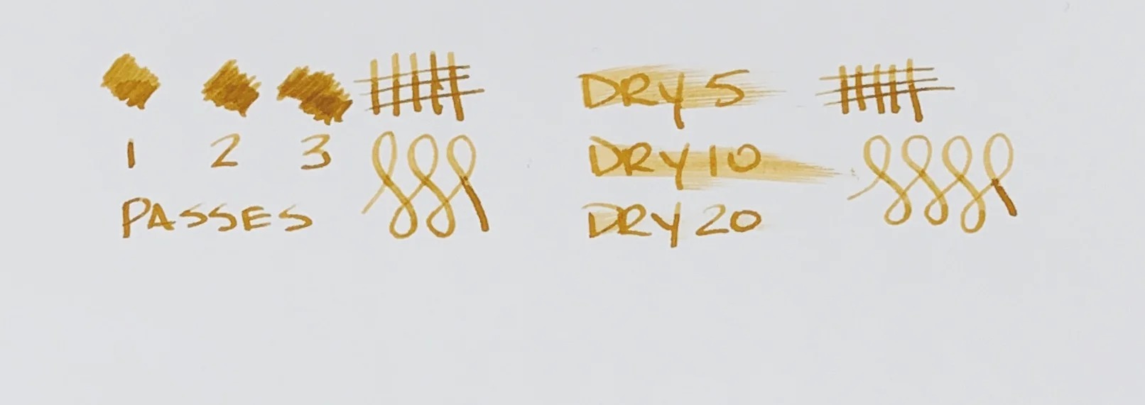
Like some of my other favorite inks (Sailor, Pilot, Diamine, etc.) Robert Oster inks always perform well, and Honey Bee is no exception. It is the perfect combination of flow, wetness, lubrication, and saturation. It’s right in the middle across the board, and that is what I want in an every day writing ink.

Choosing an ink is always a challenge. Over the years, I’ve learned what I liked, and resisted branching out to try new things. That could mean a new brand, a new category, or even, like Honey Bee, something as simple as a new color. I’m going to keep experimenting, and when I find something interesting, you can bet I will be sharing it with you.

(JetPens provided this product at no charge to The Pen Addict for review purposes.)


Enjoy reading The Pen Addict? Then consider becoming a member to receive additional weekly content, giveaways, and discounts in The Pen Addict shop. Plus, you support me and the site directly, for which I am very grateful.

Membership starts at just $5/month, with a discounted annual option available. To find out more about membership click here and join us!

Posted on January 14, 2019 and filed under Robert Oster, Ink Reviews.

Cult Pens + Diamine Maureen and Robert Iridescink Review

(Note: I'm not sure I've had a harder time accurately capturing two ink colors than these. It was challenging, and I'm still not happy with the results. No matter the lighting setup, I never fet I did them justice. YMMV.)

Over the past year or two I have taken a passive stance on two of the most popular ink trends: Shimmer and sheen. While I have admired them from afar, I haven’t wanted to use them myself. I’m not a big risk taker when it comes to fountain pen inks, although the siren’s call of their results on the page is breaking me down.

If I am going to head down one of these two shiny paths, sheen seems to be more my thing. And when I saw the first pictures of the new collaboration from Cult Pens and Diamine, I knew I was done for. Maureen and Robert are the ones for me.

Just look at the stock pictures and you will see why I am so enamored. The purple ink of Robert has a beautiful greenish-gold sheen, and Maureen’s deep and saturated blue ink pops with red. And these are not passive, slightly on the edge of the line, sheens. They are full-bore, 50-75% coverage sheens, if not more.

The kicker with these inks is do you like this type of effect when writing? Some people live for it. Others can do without. Big sheening inks have never been a priority for me because of my use of primarily extra fine nibs. Finer lines inherently don’t show off the ink properties as well, but Maureen and Robert are here to change my mind.

I inked up Maureen in my Pelikan M805 Ocean Swirl with an EF nib. This nib is essentially a Japanese Broad in line width, so I knew it would show off most of the ink properties, and it did. This is a rich, saturated blue, and I immediately though of Parker Penman Sapphire. Maureen may be a shade darker, but the way this ink behaves is awfully similar.

Robert was put into use in my Pilot Falcon. I purposely chose this soft fine nib to see how the ink would perform, and I have to say, it’s better than I thought. It may be the two nib choices, but I assumed I would prefer Maureen over Robert. I assumed incorrectly, as I’m enjoying the purple and green sheen out of the Falcon nib more.

To get the full effect of the sheen, you need to use a coated paper - like Rhodia - or the magic capabilities of Tomoe River. Basically, a paper where the ink takes longer to dry than is sometimes acceptable. That is the tradeoff to get the beautiful sheen of these inks to pop. Using them on a faster-drying paper like Leuchtturm deprives you of the main feature of these inks.

Swabs on Tomoe in a lightbox

With specialty inks like this, my main concern is: “Will I be able to use these for more than special occasions?” For Maureen and Robert, undoubtedly yes. I’ve enjoyed general every day writing with them, but I do make sure to use Rhodia for the most part. When I’ve used them on my favorite Nock and Studio Neat notebooks I haven’t enjoyed them nearly as much. I think you may even be able to get away with these in an office environment - if you bring your own paper.

Finally, and as I mentioned on the podcast recently, I have a soft spot for fun names, and fun stories about how they came to be. Fountain pen inks named Maureen and Robert? Sign me up!

There are many factors to consider when making a buying decision, and these inks tick all of my boxes. They are fun, functional, innovative, and have a great story behind them. They are also priced well, at £9.50 in the UK, or approximately $10.50 per 80ml bottle, minus the VAT. Big thanks to Cult Pens for send these my way for review.

(Cult Pens provided this product at no charge to The Pen Addict for review purposes.)


Enjoy reading The Pen Addict? Then consider becoming a member to receive additional weekly content, giveaways, and discounts in The Pen Addict shop. Plus, you support me and the site directly, for which I am very grateful.

Membership starts at just $5/month, with a discounted annual option available. To find out more about membership click here and join us!

Posted on October 22, 2018 and filed under Diamine, Ink Reviews.

Colorverse Strelka and JFK's Dog Pushinka Ink Review

(Susan M. Pigott is a fountain pen collector, pen and paperholic, photographer, and professor. You can find more from Susan on her blog Scribalishess.)

Colorverse’s Trailblazer in Space Series pays homage to animals, insects, and rockets that were launched into space. The Strelka and JFK’s Dog Pushinka set is based on the following story: in 1960, two dogs named Strelka and Belka boarded Sputnik 2. They were accompanied by forty mice, two rats, and several plants, and they successfully orbited Earth eighteen times. Strelka later gave birth to a litter of puppies. One of them, Pushinka, was given as a gift to John F. Kennedy (Dogs in Space).

The Strelka/Pushinka set comes with some pretty fabulous packaging. The outer box has pictures of both dogs with their respective color inks. The inner box is decorated with stars and the solar system.

In addition to the ink, the box contains some extra goodies: two branded napkins for wiping ink off nibs, a cardboard bookmark, a cardboard pen holder, and stickers.

Strelka

The Strelka ink comes in a 65ml teardrop-shaped bottle. It is a bright, peacock blue color with little shading or sheen.

I tested the ink using a Sailor Cross Point nib on Maruman Septcouleur paper. The ink flows extremely well and is definitely an eye-catching color. It’s a wet ink and is not colorfast.

My chromatography test showed little variation in color.

The color is really quite beautiful. But writers (like me) who enjoy shading and/or sheen will be disappointed that Strelka is so flat.

JFK’s Pushinka

The Pushinka ink comes in a tiny 15ml bottle. Pushinka is a rather odd color that looks tan in swabs. But with a nib it almost looks looks greenish. The ink does not contain any sheen.

I tested this ink using my Franklin-Christoph medium SIG Flex nib on Maruman Septcouleur paper. It exhibits a tiny bit of shading when you write with it, but is a flat tan color in swabs. It is much drier than Strelka ink, and it is not waterproof.

The chromatography test indicates that this rather bland color actually contains several interesting hues: gray, yellow, orange, and blue.

In spite of the cool chromatography, I’m not at all impressed with this drab color, though it does capture the tan colors of Pushinka’s ears and tail. Although the tiny bottle is adorable, it’s not practical for pens with large or long nibs. In fact, I filled the converter straight from the bottle rather than trying to draw ink up through the nib.

This is my first experience with Colorverse inks, and I’m definitely intrigued, even though the colors I tested didn’t have shading and sheen. I love the space themes Colorverse emphasizes, and I hope to try out some different colors in the future. You can purchase this Trailblazer set from JetPens for $33.00.

(JetPens provided this product at no charge to The Pen Addict for review purposes.)

Posted on September 14, 2018 and filed under Colorverse, Ink Reviews.