Posts filed under Ink Reviews

Kyo No Oto Nurebairo Ink Review

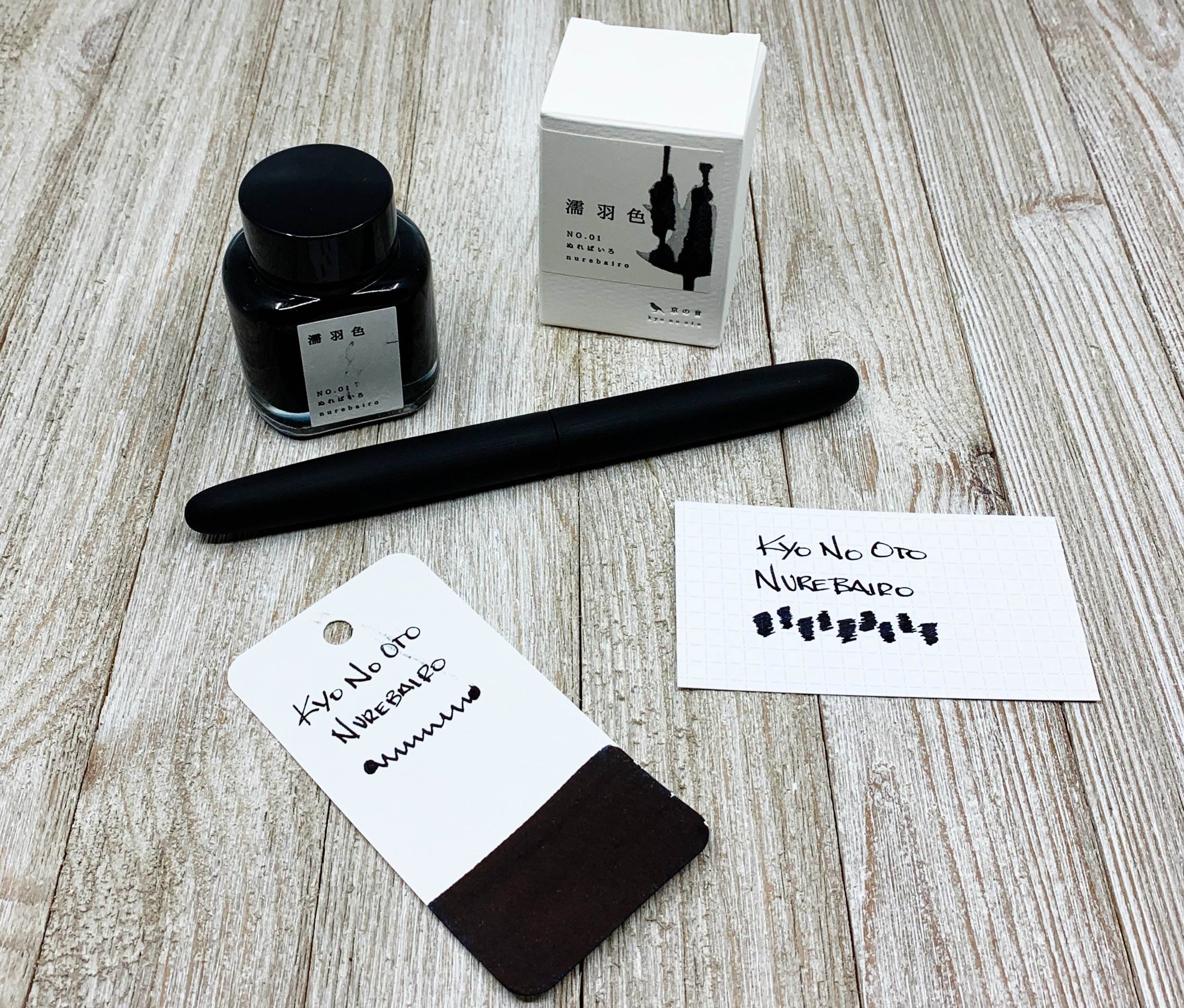
Kyo No Oto Nurebairo is a black ink that breaks the boring mold.

I’ve used other black inks in the past - primarily Sailor Nano Black - but there are no other black inks that I choose to use, unless forced to do so. That’s a common issue for black inks. Why use it when there are thousands of inks on the market with more color and character?

Nurebairo is the first black ink in recent memory that I actually look forward to inking up and using.

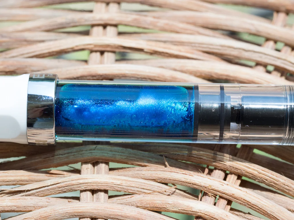
For starters, I see this as a very black ink on the page - especially when I’m using a wide, wet nib like this Nakaya broad stub. It goes down thick, and dries dark. I bring this up because some users see a dark blue undertone with this ink. I see that shade if I spread it on thin and dry, which I think is a feature. That undertone of blue is one of the reasons I love it.

Secondly, this ink sheens well. The full perimeter of my letters on the page show a bronze-tinted halo. But, it is a very office-friendly look at the same time. If your boss peeks over your shoulder at your notes they won’t have to wonder what wild shimmer ink you’re using. It is boring black from afar, but you can see how special it is from close range.

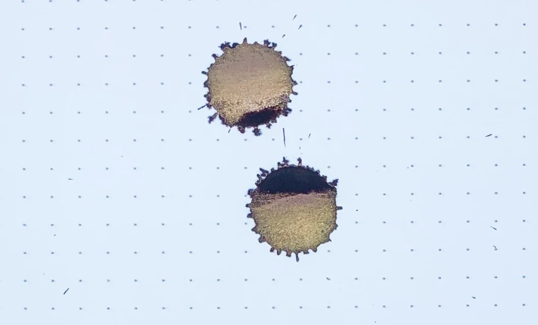
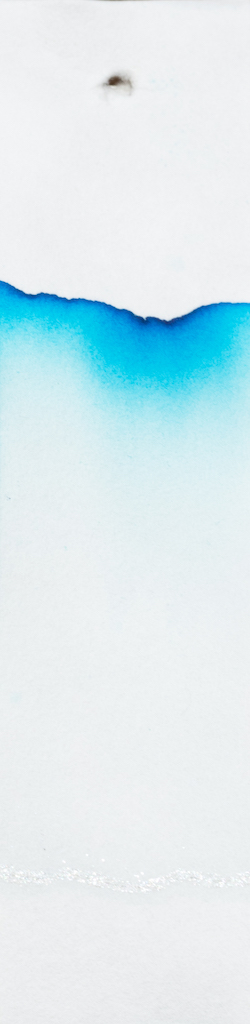
Thirdly, you can’t see any of this in my photos. The character of the ink was practically impossible for me to capture.

This is as close as I could get to showing the sheen. The page is angled in the light, picking up the added color in the top half of the image. (Yoseka notebook)

Nurebairo translates to “jet black,” which I think is fair. Many other users of this ink refer to it as Raven, which I think is a better description. Have you ever seen the iridescent shine on a raven’s feathers? That is what this ink is like. This color is not basic black, it is Black+.

Rhodia A4 Dot Pad

If I’m forced to list a downside to this ink it is that it’s not waterproof. That never changes my opinion of an ink, but I also don’t require waterproofness for daily use. If I did, the aforementioned Nano Black does the trick, along with the hugely popular Platinum Carbon Black, which is an artist favorite.

Is there another black ink on the market that is as interesting as Kyo No Oto Nurebairo? If so, I would like to try it, because I have no use for any other black ink than this one.

(JetPens provided this product at no charge to The Pen Addict for review purposes.)


Enjoy reading The Pen Addict? Then consider becoming a member to receive additional weekly content, giveaways, and discounts in The Pen Addict shop. Plus, you support me and the site directly, for which I am very grateful.

Membership starts at just $5/month, with a discounted annual option available. To find out more about membership click here and join us!

Pebble Stationery Co. 52 GSM Tomoe River Paper

Posted on July 1, 2019 and filed under Kyo-no-oto, Ink Reviews.

TWSBI ECO 1.1 mm Stub and Robert Oster Barossa Gilt Ink Review

What more can I say about the TWSBI ECO that I haven't said already? It is the best fountain pen for beginners in my book, and it provides experienced users with a fun, high-quality writing experience at a nice price.

The one difference for me this time around - aside from the transparent orange pen parts - is the 1.1 stub nib.

I love how fine and firm TWSBI’s extra fine steel nibs are, which is why they are my preferred nib for this pen. But sometimes I need to sling ink on the page, and that's where stub nibs come into play.

What this nib provides for me is character. Wide vertical strokes combined with thin horizontal strokes make my handwriting pop. This stub nib has enough variation to make that work for me, and an ultra-smooth feel from it's slightly rounded edges.

All of those things add up to be the perfect ink testing pen and nib for me. And what better to show off the shake and shimmy of Robert Oster Barossa Gilt.

I have a hard time not calling this ink Barossa Grape, because that is an ink color, too. But the “Gilt” nomenclature alludes to what is so special about this ink: The gold shimmer found within. And it shimmers a lot.

That’s one thing Robert Oster has made perfectly clear with his Shake ’N’ Shimmy ink lineup. There is no lack of shimmery particles on the page. When shimmer inks first became a thing, I found the shimmer-to-ink ratio inconsistent. Over time, manufacturers have figured out whatever magic it takes to give every stroke a full compliment of shine.

As hard as it is to describe an ink like this in words, it is even harder to show in pictures unless you angle the page just so in the light. Most of my straight-on pictures make the ink look flat, and maybe even boring. But if you get the light angled just right, you wonder where purple color is for all of the gold.

The underlying purple color reminds me of grape juice. More accurately, spilled grape juice where the color and shade changes depending on how much you now have on the paper towel you used to clean it up with. There is even a hint of blue around the edges.

When writing in my Yoseka Notebook for this review, I did run into a dry spot seven lines into it. I hadn’t picked up the pen for about two days at the point I started, and hit a hard stop where you see the word “flooding” show up lightly on the page. I wonder if that was a bit of clogging from the shimmer? I wouldn’t put it past that happening. A few taps of the nib and scribbles on a different page got it going again, and I had no more troubles. This is always a possiblility with shimmer ink.

This is a fantastic ink in a fantastic pen. Will I use this combination a lot? Not likely. I love the purple ink color, but I like my shimmer like I like my pen furniture: Silver in color. Plus, I think this will be my new ink testing pen, so it will be seeing many different inks pass through its feed in the future. That said, Barossa Gilt really does it’s job well, and makes for an impressive look.

(JetPens provided this product at no charge to The Pen Addict for review purposes.)


Enjoy reading The Pen Addict? Then consider becoming a member to receive additional weekly content, giveaways, and discounts in The Pen Addict shop. Plus, you support me and the site directly, for which I am very grateful.

Membership starts at just $5/month, with a discounted annual option available. To find out more about membership click here and join us!

Posted on June 24, 2019 and filed under Robert Oster, Shimmer Ink, Ink Reviews.

J. Herbin Kyanite du Népal Ink: A Review

(Susan M. Pigott is a fountain pen collector, pen and paperholic, photographer, and professor. You can find more from Susan on her blog Scribalishess.)

A new limited edition shimmer ink is on its way as part of J. Herbin’s 1798 Anniversary Ink Collection. It is due to be released on June 21, 2019.

Kyanite du Népal is named after a mineral mined in Nepal. It is a deep blue color which J. Herbin has captured well in this ink.

Parent Géry (CC BY-SA 3.0)

Kyanite du Népal is a saturated blue ink that is more turquoise than purple on the color spectrum. The ink contains silver shimmer that complements the blue nicely.

In my testing on Maruman Septcouleur paper, the ink demonstrated good flow, shading, and shimmer in both fine and broad nibs. It dried fairly quickly, but the ink did not seem dry in any of the nibs I used. It is not colorfast.

The chromatography test doesn’t show much in terms of color variation. There’s a faint line of silver shimmer at the bottom, and the color ranges from light blue to turquoise to darker blue.

Obviously, shimmer inks show up best in wide nibs and splatters. That’s definitely true of Kyanite as you can see in the following examples. The shimmer is quite stunning.

Because the ink contains shimmer, the particles settle to the bottom of the bottle or within the barrel of your pen. It’s always necessary to shake the bottle or pen (capped, of course) before using the ink. I relegate shimmer inks to my less expensive pens, such as my TWSBI Eco, simply because I don’t want shimmer particles possibly clogging up my expensive pens. This is probably just paranoia on my part, since I’ve yet to experience clogging in my less expensive pens.

Kyanite du Népal is a gorgeous shade of blue with burgundy sheen and silver shimmer. It’s a bit darker than Diamine Blue Lightning (which also has silver shimmer), and Kyanite contains sheen in addition to silver shimmer which gives it more character than the Diamine, in my opinion.

You’ll be able to purchase Kyanite du Népal on June 21 from your favorite retailers. A 50ml bottle is $26.00.

(This ink was provided to Pen Addict for review at no cost by Exaclair.)

Posted on June 7, 2019 and filed under J. Herbin, Ink Reviews.