Posts filed under Ink Reviews

Sailor Ink Studio 123: A Review

(Susan M. Pigott is a fountain pen collector, pen and paperholic, photographer, and professor. You can find more from Susan on her blog Scribalishess.)

Sometimes there’s an ink you see on the Internet in a review or on Instagram that you simply must have. It doesn’t matter if that ink is difficult to obtain or if it comes in a dinky 20ml bottle or if it’s expensive, or if you have to wait weeks for it to arrive from Japan--you buy it anyway. Sailor Ink Studio 123 is one of those inks.

I first saw 123 on Mountain of Ink’s review of Set 1 of Ink Studio inks. I was mesmerized by this strange and magical unicorn ink that shifts between gray, green, and purple depending on its mood.

Sailor Ink Studio is a collection of one hundred inks (out of 20,000 created!) that were blended by inkmeisters at Ink Studio events. Each number represents a unique blending code (source: Sakura Fountain Pen Gallery).

I purchased my 20ml bottle of 123 from an eBay seller who stocks the collection (although you’ll discover that 123 is often out of stock). I paid $21.49 for the bottle (including shipping). It took about two weeks to arrive.

Although the bottle is tiny, I am not disappointed with this ink. It really is unique and magical, but it isn’t necessarily the most practical color for writing since it can be very light and hard to read depending on the paper.

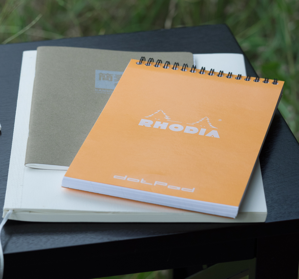
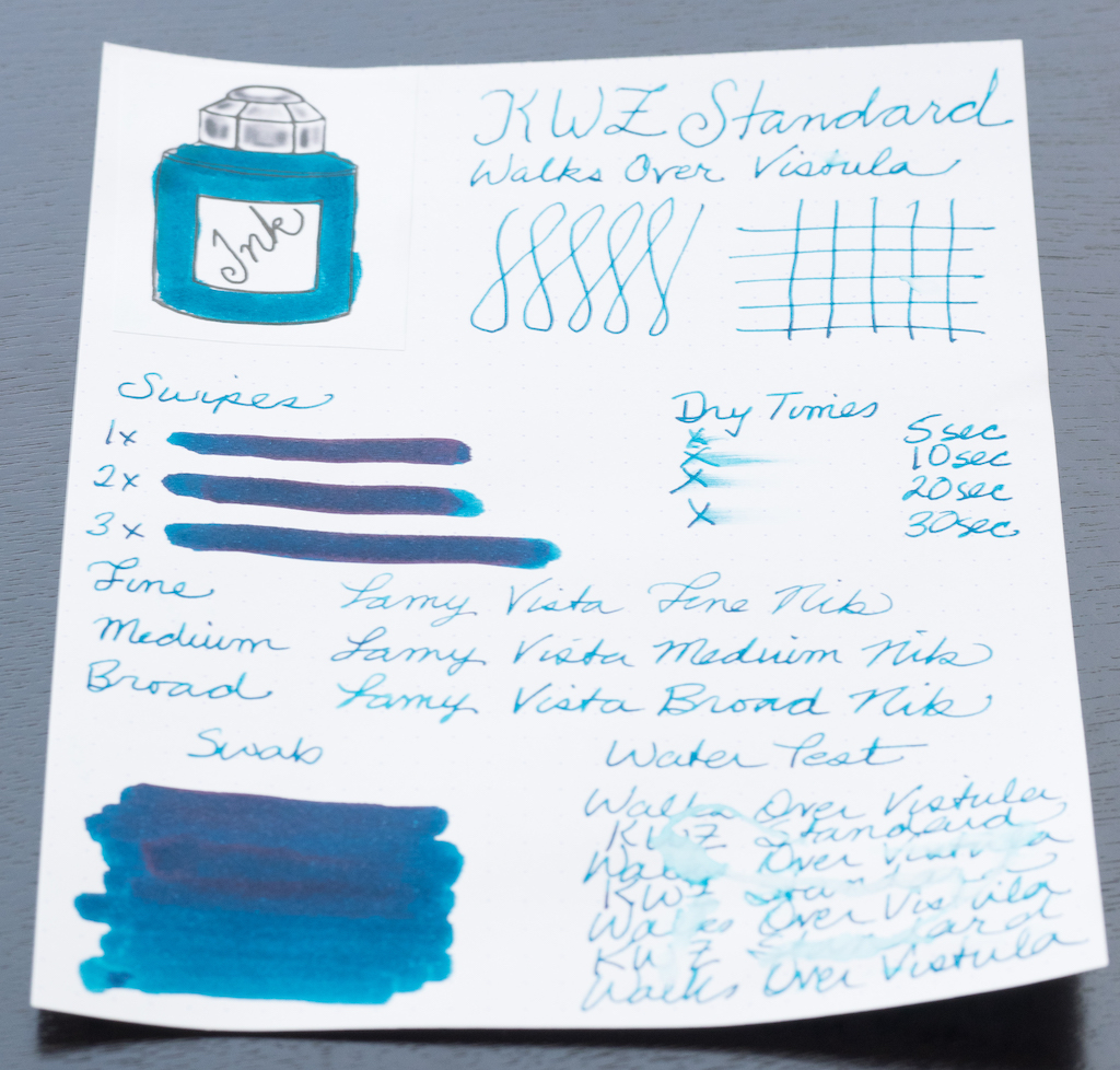
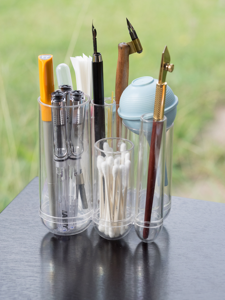
For my initial ink test, I used Rhodia paper and a TWSBI Eco with a 1.1mm stub. The ink shows up well on white paper and looks like a dusty purple with the stub nib. But, the swabs fluctuate between gray, green, and lavender. The ink is not waterproof, but it dries quickly.

Note: The ink is much more washed out in this photo than in person.

In my Lamy Vistas (fine, medium, and broad) the ink looks more gray than lavender, but it sort of depends on the light and angle.

On my Col-o-dex card, the swab looks like a summer storm in Texas, complete with that green tint that promises hail. The ink shades beautifully, but it doesn’t have any sheen.

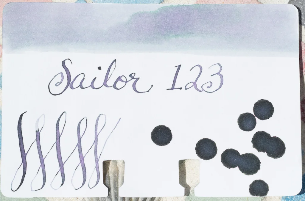
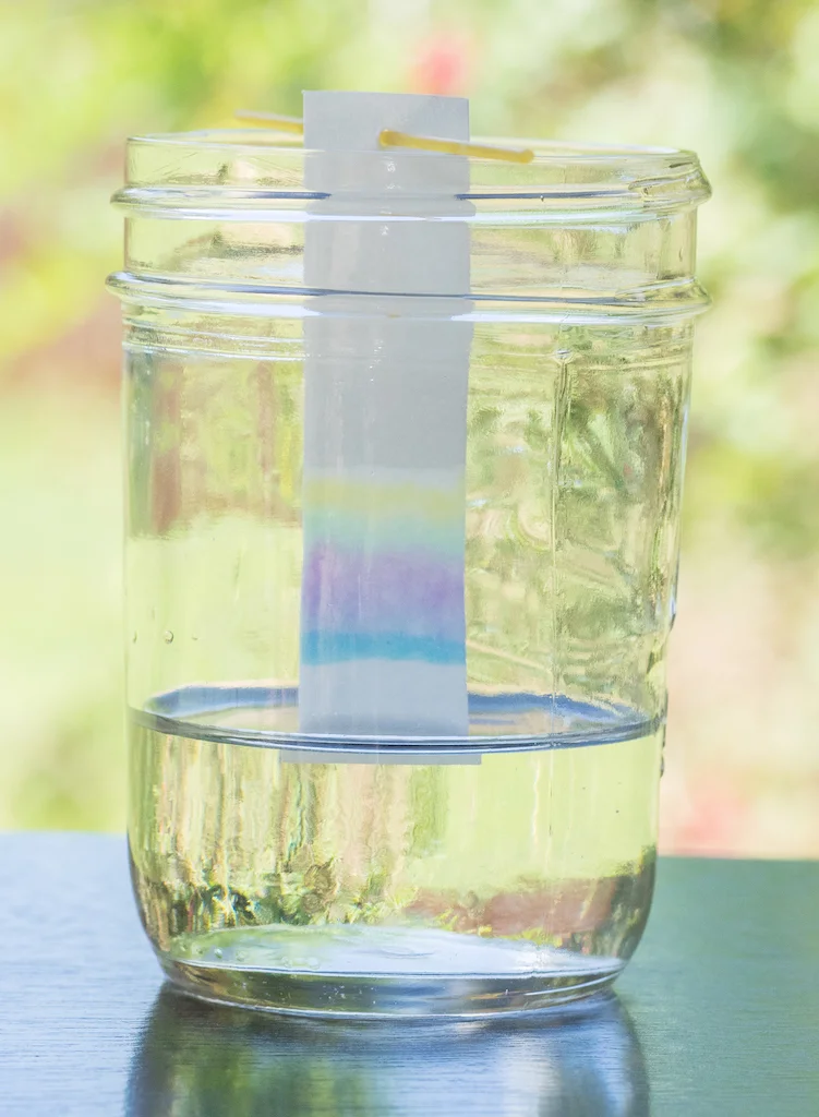
Chromatography reveals the complexity of this ink blend. I’ve never seen an ink separate out into so many different colors. This really is unicorn ink!

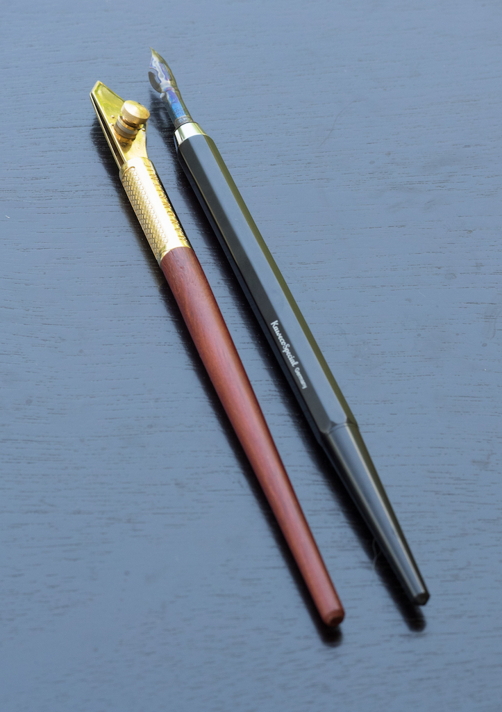
Sailor 123 shines in great, big, juicy nibs. Just look at that gorgeous shading and color shifting on MD Cotton paper:

The only time the ink fell short of expectations was (much to my surprise) on Tomoe River paper. I don’t know why, but the ink comes out as a super light lavender, and all that miraculous shading and color-shifting seems lost. Maybe it’s the cream color of the paper, I’m not sure, but I got the same results in my Kanso Sasshi booklet (picture below) and my Hippo Noto journal (both Tomoe River paper).

Regardless, I am in love with Sailor 123. It looks best on white paper with wide to super-wide nibs so you can see the color shifts. But, even in wet fine, medium, and broad nibs, it’s usable (though it looks more like a simple gray-lavender ink). This is also a terrific ink to use as a wash.

I ordered Sailor 442 as well, which is a darker color than 123. I’ll be reviewing it sometime soon. It’s certainly a more readable color than 123, but it doesn’t show the range of shades that 123 does.


Enjoy reading The Pen Addict? Then consider becoming a member to receive additional weekly content, giveaways, and discounts in The Pen Addict shop. Plus, you support me and the site directly, for which I am very grateful.

Membership starts at just $5/month, with a discounted annual option available. To find out more about membership click here and join us!

Posted on July 12, 2019 and filed under Sailor, Ink Reviews.

Robert Oster Bishop to King Fountain Pen Ink Review

(Sarah Read is an author, editor, yarn artist, and pen/paper/ink addict. You can find more about her at her website and on Twitter. And check out her first novel, The Bone Weaver’s Orchard, now available where books are sold!)

Robert Oster is one of my favorite ink brands. I love the wide range of colors, the way they are inspired from nature in Australia, the eco-friendly production of the ink and bottles. It's all good to me--and this is another great color in a winning lineup.

Bishop to King is a complex purple. It's very rich and royal, but violet enough to pass for blue under certain light, so it's a great ink if you want something with character but that you can still use in professional settings. It's purple with deniability. The chromatography shows a pretty even split between purple and blue, and the blue element has a slight touch of water resistance, too. On the water drop tests, standing water that was blotted dry left a hint of blue line behind. But when water is wiped up, it did wash all trace away.

The most noticeable element of this ink is a distinct dryness. It feels dry when writing or swabbing, and its dry time is so fast, I had to do it twice to make sure I hadn't imagined it. Despite this dryness, it does show some shading on Clairefontaine paper, but I could not get it to sheen, even when I let it pool.

I prefer wet inks, so this dry one isn't for me, but I highly recommend it for lefties, or for quick notes that must be jotted down on swiftly-turning pages. I think this makes it ideal for school or meeting notes, or for when you need to write a hasty note in your planner, slam the book shut, and hit the road.

The ink comes in a 50ml plastic bottle which is manufactured in a carbon-neutral plant. The bottles are fully recyclable. They're also a good shape for filling--narrow enough to allow for nib submersion even when the ink is running low, but sturdy enough that they don't tip over. The bottles aren't as glam as the handblown glass ones, but they also don't have the glam price tag. This bottle sells for about $17. In our world of climbing ink prices, I'll take that deal all day.

I think this is a solid, practical ink that fits some specific, practical needs. It's not one I'm likely to reach for often for my own needs, but I think it's an essential player on the field.

(JetPens provided this product at no charge to The Pen Addict for review purposes.)


Enjoy reading The Pen Addict? Then consider becoming a member to receive additional weekly content, giveaways, and discounts in The Pen Addict shop. Plus, you support me and the site directly, for which I am very grateful.

Membership starts at just $5/month, with a discounted annual option available. To find out more about membership click here and join us!

Posted on July 11, 2019 and filed under Robert Oster, Ink Reviews.

My Ink Testing Kit

(Susan M. Pigott is a fountain pen collector, pen and paperholic, photographer, and professor. You can find more from Susan on her blog Scribalishess.)

Over the years writing for Pen Addict, I’ve done many ink reviews. typically using whatever pens I had on hand. But over time I’ve accumulated some tools that I use for all my reviews. Plus, I decided to standardize how I do ink reviews so each one is more consistent.

I realize that not everyone wants to do in-depth testing of their inks (even I don’t go so far as calibrating my screen for exact color matching or swatching every single ink in my collection). But, for anyone who is interested in going beyond the occasional swab, here are the tools I use.

Paper

Although in the past I used the Maruman Septcouleur notebook for my ink tests, I switched to a Rhodia dot spiral because the Rhodia brand seems like a more popular choice among pen addicts. This is the paper I use for my primary pen testing pages.

I also test inks with a Tomoe River notebook (because this is such a popular paper) and the MD Cotton A4 plain for large lettering.

One of these days I’m going to shell out the money for an ink bottle stamp that I can use on my pen testing page. Until then, I drew my own bottle on my iPad, exported it into a Word document, duplicated it, and printed it out on regular copier paper. I paste this in the corner of the Rhodia page to add visual interest.

For ink swatches I use the wonderful Col-o-dex cards from Well-Appointed Desk. The paper is excellent for swatching. Plus, I love putting everything into my Rolodex where I can organize the swatches by color.

Another tool I use is chromatography paper. I ordered a set off of Amazon, but you can just use coffee filters or even paper towels. I like the strips I bought because they are consistent. I cut them in half, poke a little hole in the top, stick a piece of dry spaghetti through the hole, put tap water in a glass, and let the ink do its thing.

Pens

I use several pens to test my inks. Two instruments that I’ve used consistently in all my ink reviews are my Kaweco straight nib holder with a Brause Blue Pumpkin nib and my Handwritmic Ruling Pen. The Kaweco/Blue Pumpkin is for writing the ink name and creating swirls on my Col-o-ring Rolodex swatch cards. The Handwritmic is for big juicy lettering to test for shading and sheen on the MD Cotton paper.

I wanted to provide consistent examples of a fine, medium, and broad nib in all my reviews. That’s hard to do if you’re using different brands of pens. So, I decided to purchase some pens just for ink testing. After researching various possibilities, I chose the Lamy Vista ($29.60). Although I could have gotten some piston-filler pens for around the same price, I wanted a brand with a converter because they’re easier to clean. Pilot Metropolitans were first on my list, but they only come in fine and medium nibs. So, I purchased three Lamy Vistas in fine, medium, and broad, and one Lamy converter ($5.00), which I can easily move from pen to pen as I test the ink. This way I have a consistent writing sample with a western fine, medium, and broad nib.

Other Tools

An obvious additional tool is a cotton swab. I go through a lot of these with each review, swabbing the Col-o-dex cards and the ink testing page.

Another tool that comes in handy for making ink splats and doing water testing is a fine-tipped pipette. Although it’s disposable, I use it over and over, rinsing it out in between uses. My first one developed a leak, and I’m now on my second one. These are quite inexpensive and you can buy them in bulk (as in 200 pipettes!) from places like Amazon.

I found a toiletries holder at Target where I store my supplies. I love this one because it has a variety of round tubes to hold my pens, chromatography strips, and cotton swabs.

The last tool is my camera. I use an Olympus OMD EM1 with a 60mm macro lens for all my reviews. I shoot in our Florida Room using natural light, though occasionally I use a light box (but setting it up is a pain and the cats always climb in and get hair all over, so . . . yeah). In order to get semi-accurate color, I have to brighten the exposure when I take the photo and when I process it in Lightroom.

So, there you have it: my wondrous ink testing kit!

(Most of the above supplies were purchased with my own funds. A few items, such as the Col-o-dex Cards and Tomoe River Paper Notebook, were provided by a retailer for Pen Addict reviews.)

Posted on July 5, 2019 and filed under Ink Reviews.